by Alex Hogrefe | Jun 17, 2012 | Break Down, Styles / Effects |
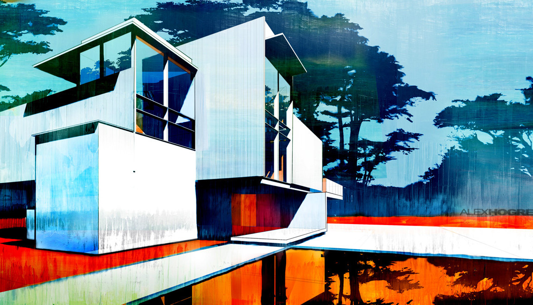
Every once and a while, there comes a time to produce an illustration that is a little more abstract in style. Such cases in the past included situations where the design wasn’t developed to the point that a full blown rendering could be produced, or where I...

by Alex Hogrefe | Jun 10, 2012 | Break Down, Uncategorized |
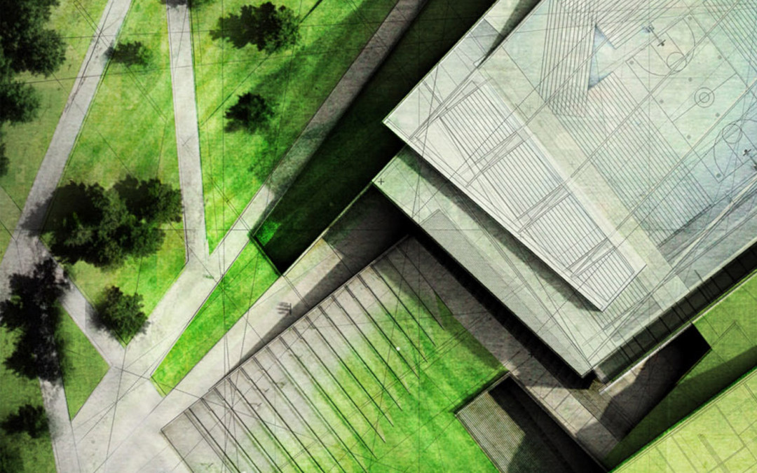
I spend a lot of my time going onto Google Earth/Bing maps studying sites and grabbing screen shots. However, I find these sources equally useful for textures and finding site plan elements. For example, in my last post, I uploaded an image of a site...

by Alex Hogrefe | Jun 5, 2012 | Uncategorized |
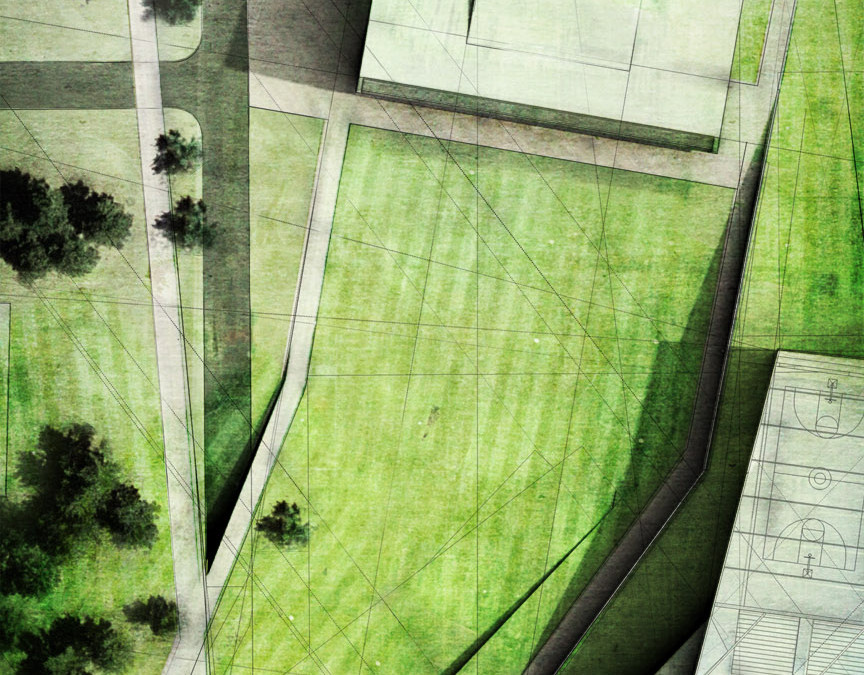
This image is taking a bunch of the different tutorials and posts on this website and mixing them together. Notice the lawn mower stripes in the grass haha. It’s all about the details. ...

by Alex Hogrefe | May 28, 2012 | Over Time |
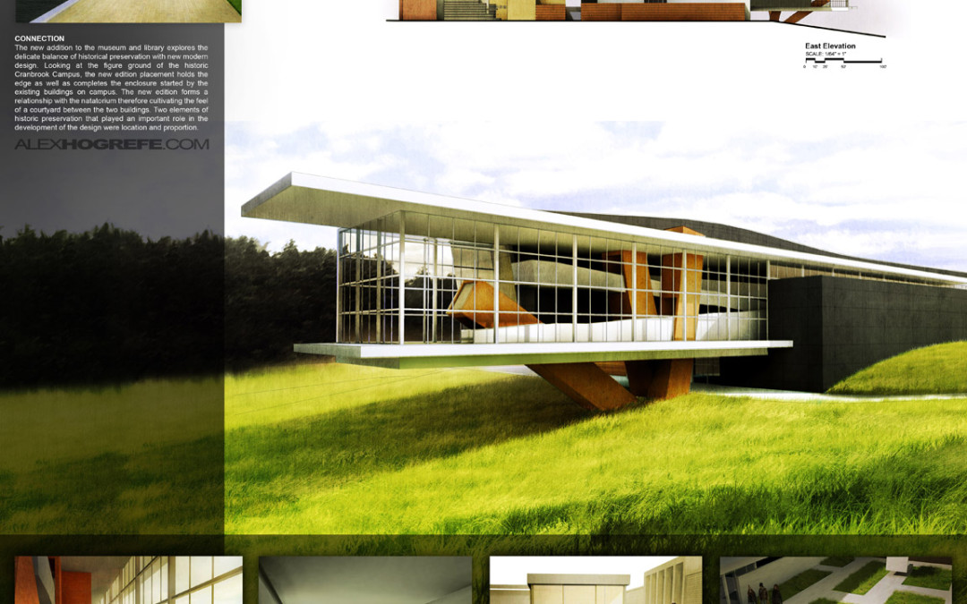
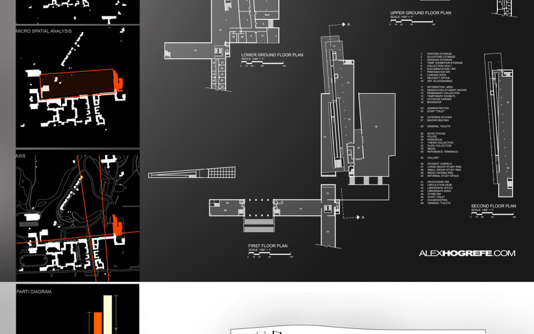
This post is continuing off of the 4 boards discussed last week. To get up to speed on what I have already done so far, read this first. For the most part, I kept the overall layout of the original presentation, however, I have been tweaking certain elements...

by Alex Hogrefe | May 20, 2012 | Over Time |
My last post discussed some architectural presentation boards that were, for the most part, poorly organized. I wanted to go into this week’s post discussing some presentation boards that were almost up to par, but just needed some tweaking. I also...
