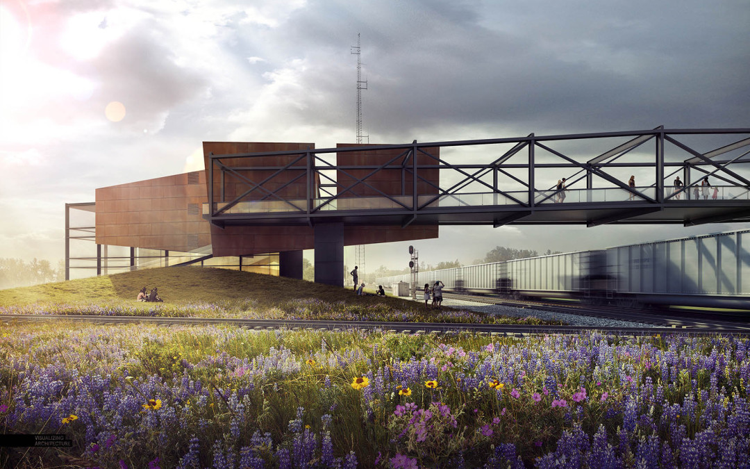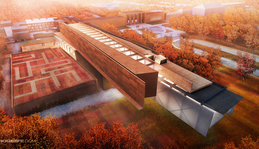
by Alex Hogrefe | Jun 7, 2015 | Fundamentals, Project 03 Crossroads Pavilion |
I can’t believe that I have not written a post about skies yet on this blog. In most cases, a sky can make or break an architecture illustration. It’s also something that I see a lot of people overlook or only spend a few minutes on in their renderings....

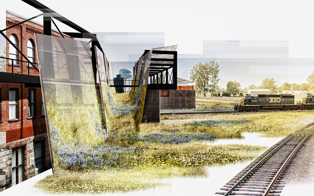
by Alex Hogrefe | Feb 7, 2015 | Break Down, Project 03 Crossroads Pavilion, Styles / Effects |
I was in need of some purely right brain thinking so I decided to skip modeling and V-Ray altogether and see what I could turn out with a half baked Sketchup model and some Photoshop. This meant generating a collage style illustration. These types of illustrations are...

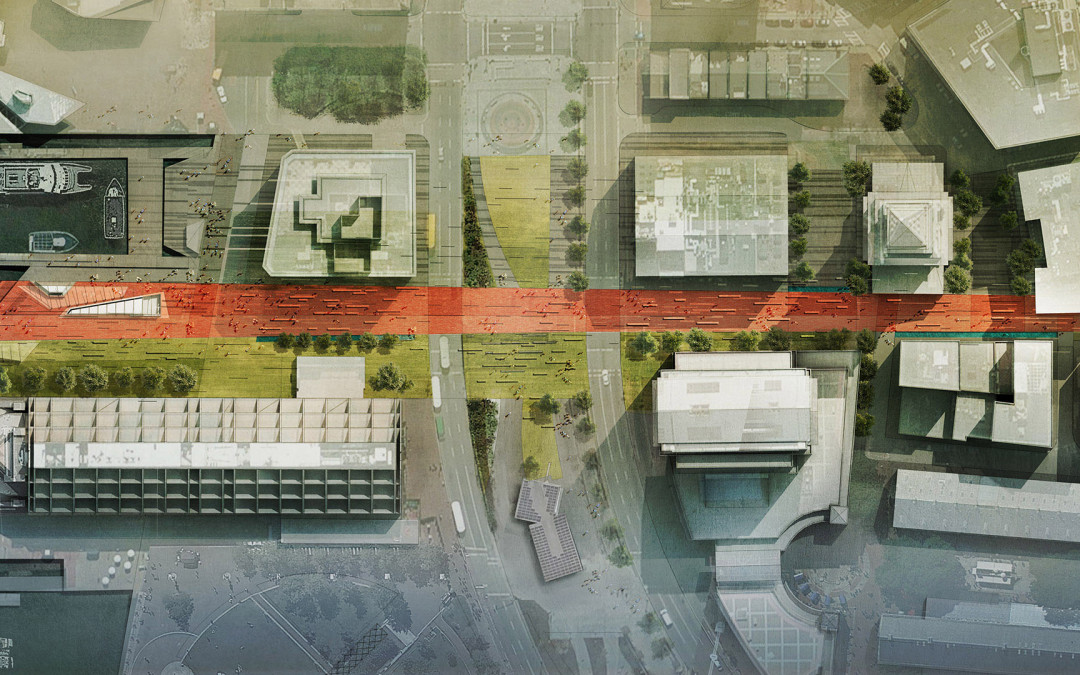
by Alex Hogrefe | Jun 8, 2014 | Portfolio Vol. 4, Project 01 Long Wharf, Uncategorized |
In the previous wharf post, I discussed black and white texture studies that focused on pattern and ground plane elements throughout the wharf. The above image builds off of those studies introducing color and material. Site plans are...

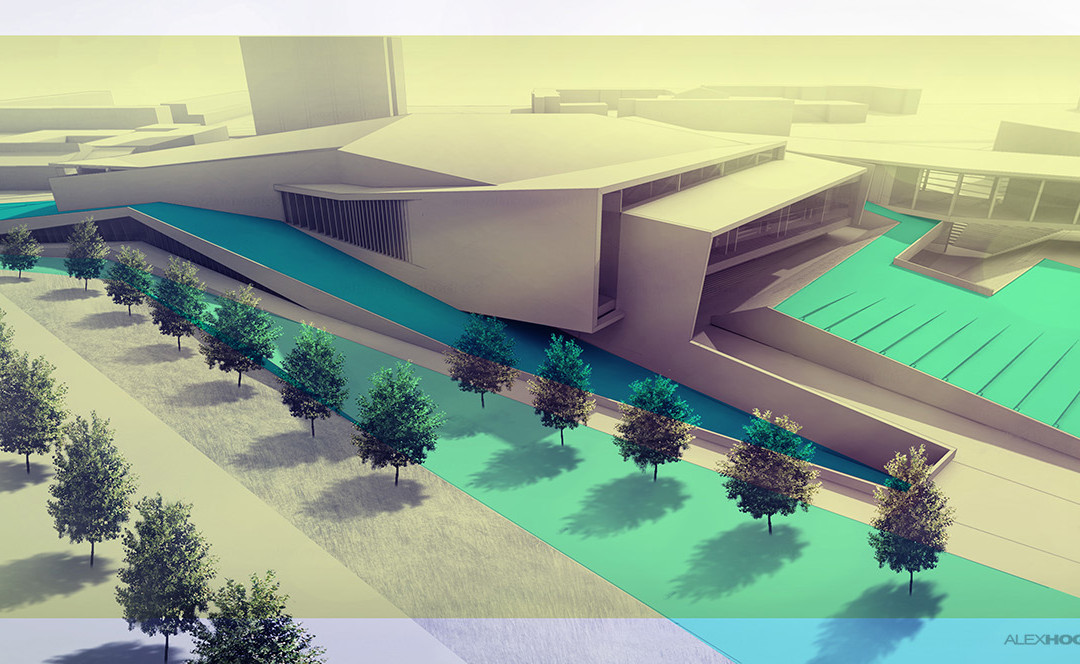
by Alex Hogrefe | Feb 16, 2014 | Fundamentals |
Adding trees to a perspective can be a daunting task, especially if there are a lot of them. Often what happens is the same tree gets copied over and over again. Everyone does it. It saves a ton of time compared to spending time cutting out several trees that...

by Alex Hogrefe | Nov 10, 2013 | Break Down, Portfolio Vol. 3 |
I have taken several trips up to Maine over the past month and experienced some beautiful landscapes with stunning fall foliage. This has inspired the latest illustration for my Cranbrook project. Autumn scenes are not that much different from your standard...
