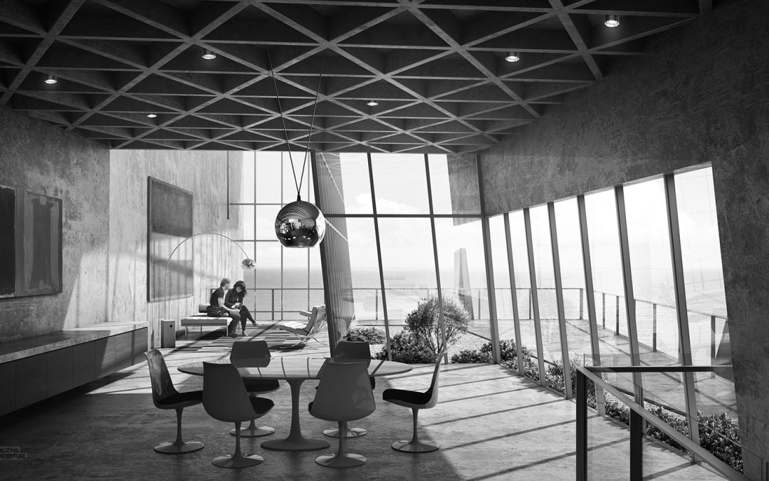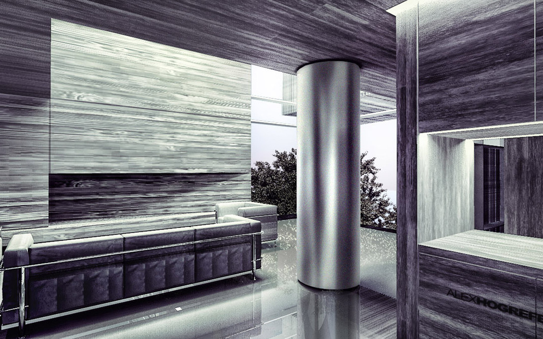
by Alex Hogrefe | Feb 12, 2016 | Break Down, Portfolio Vol. 4, Project 04 Cliff Retreat |
I was finally able to setup some interior scenes for the cliff retreat design. I decided to go black and white with these images to relate back to the black and white exterior images generated a few posts ago. However, the desaturated colors will also help play up the...

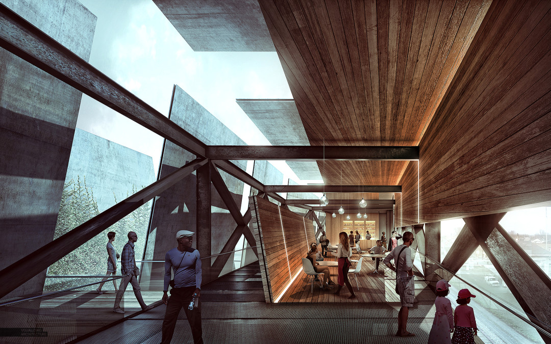
by Alex Hogrefe | Aug 28, 2015 | Break Down, Portfolio Vol. 4, Project 03 Crossroads Pavilion |
I have been experimenting with some interior illustrations and wanted to post a breakdown of this image. Determining the view for this shot has been difficult because there is so much going on in the design, and I wanted to find a view that properly captured...

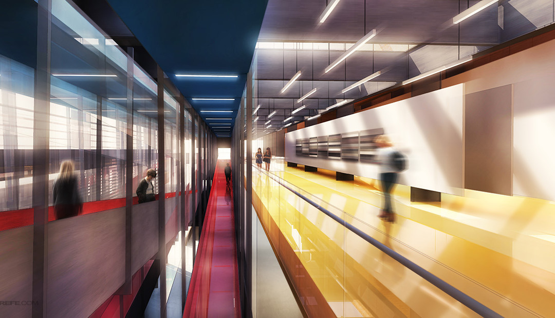
by Alex Hogrefe | Oct 17, 2013 | Portfolio Vol. 3, Styles / Effects |
I don’t use blurring techniques that often but every once and a while, I come across an illustration that needs a little extra kick. This was the case with the interior illustration introduced in the last post. The shot was looking down a long and...

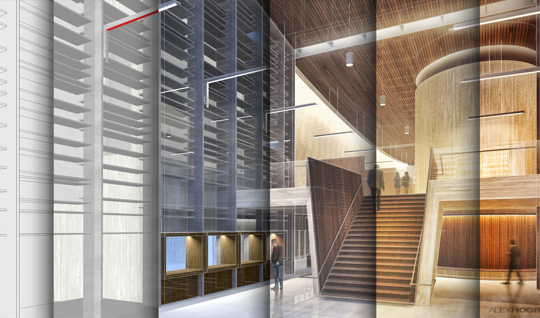
by Alex Hogrefe | May 25, 2013 | Break Down, Portfolio Vol. 3 |
This past post received a lot of feedback from you asking for a more detailed breakdown of the illustrations. The interior illustration in particular got a lot of attention so I am going to start with that one. Since several different parts of the...

by Alex Hogrefe | Jul 11, 2012 | Styles / Effects |
Every so often, there comes a time when I need to illustrate a brushed stainless steel finish like the column in the above image. In my experience, adjusting the “shininess” settings in any rendering program to get that brushed look dramatically...
