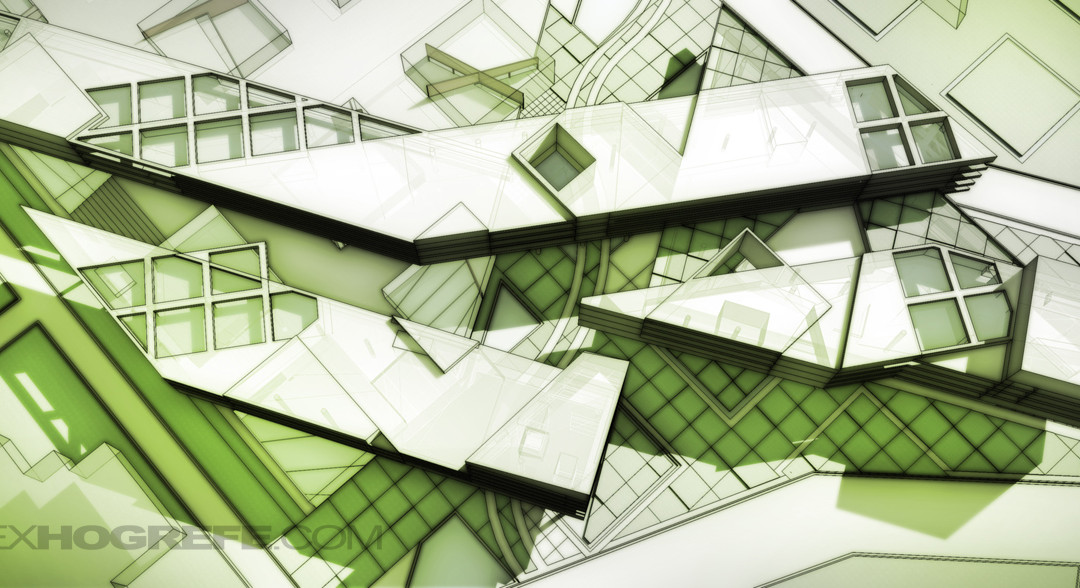
As the title implies, this architecture illustration tutorial doesn’t use a rendering engine. I have done a few other tutorials in the past that don’t involve a rendering program, however this tutorial does things a little differently, and in less time. You will probably notice some similarities to the Ambient Occlusion tutorial I posted a while back. I realized after making the ambient occlusion tutorial that I could take advantage of the export options of Sketchup, and use the line work of the model to generate the shading. Because of this, the process is extremely streamlined and can be done in minutes.
Here’s how it works,
1. In Sketchup, save a view/scene that you want to use for the illustration that way you can get back to the same view later if need be.
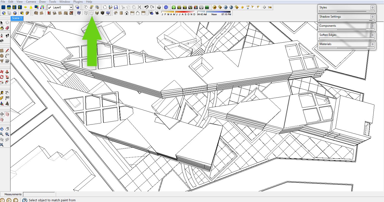
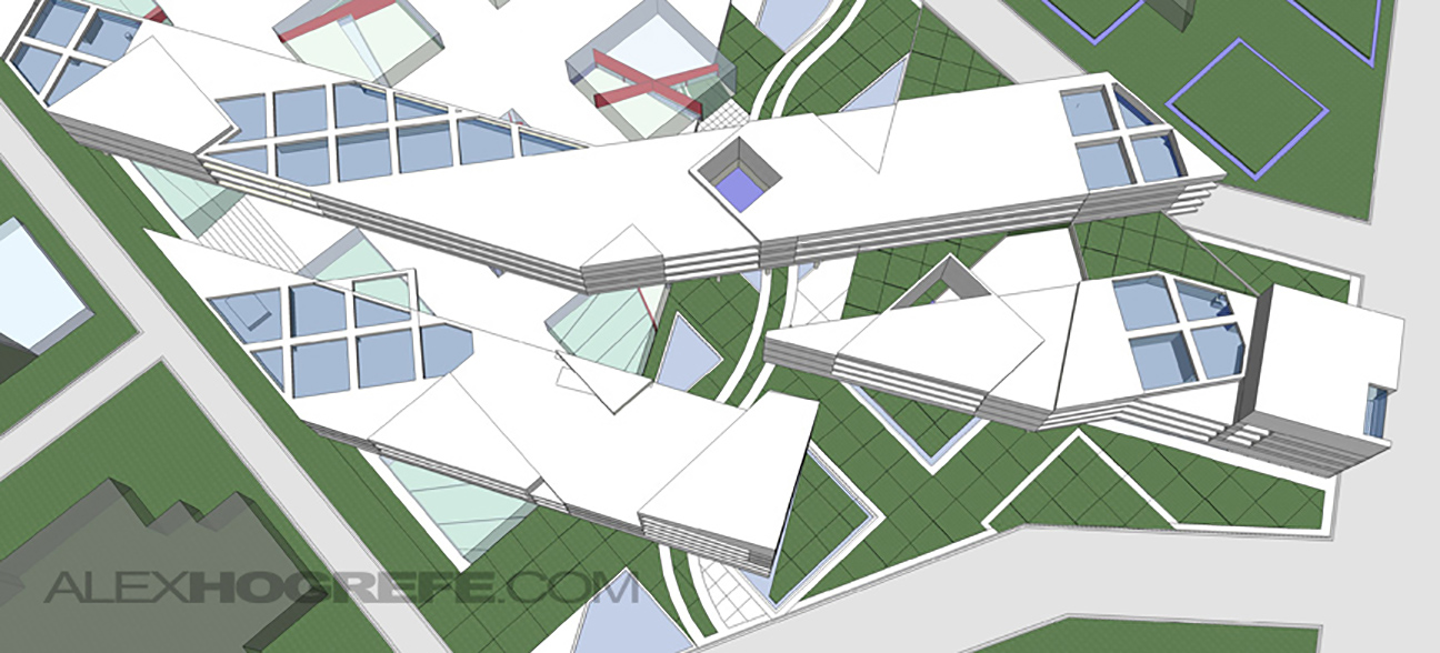
2. Switch the Face Style to “HIDDEN LINE”. Under VIEW>EDGE STYLE, check “DISPLAY EDGES.” Make sure shadows are off.
3. Go to FILE>EXPORT>2D GRAPHIC and save the image as a JPEG.
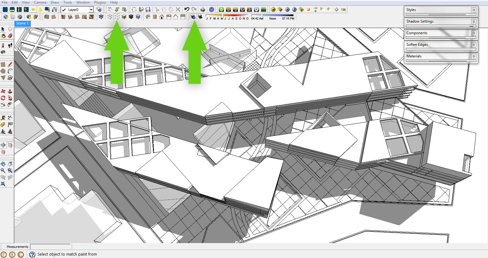
4. With the Face Style still set to “HIDDEN LINE”, turn ON shadows and again export the image as a JPEG.
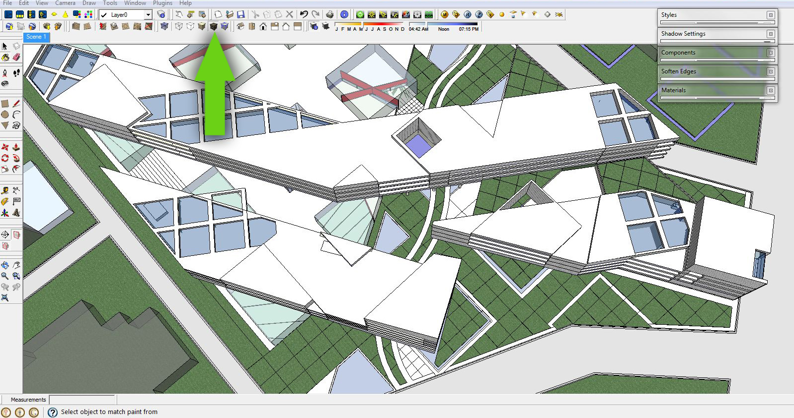
5. Now, switch the face style from “Hidden Line” to “Shaded with Texture.” Again, export the image as a JPEG.
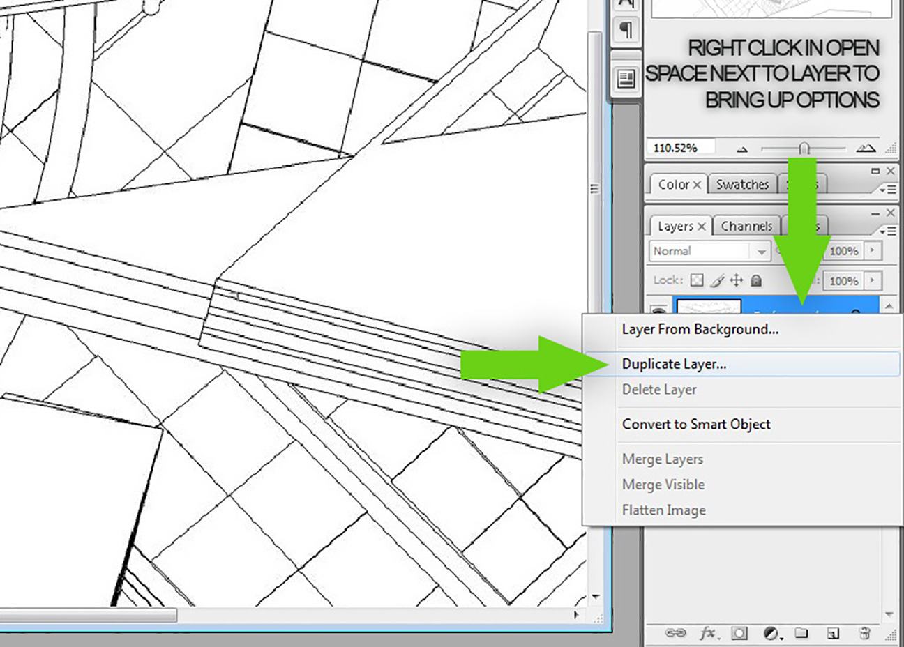
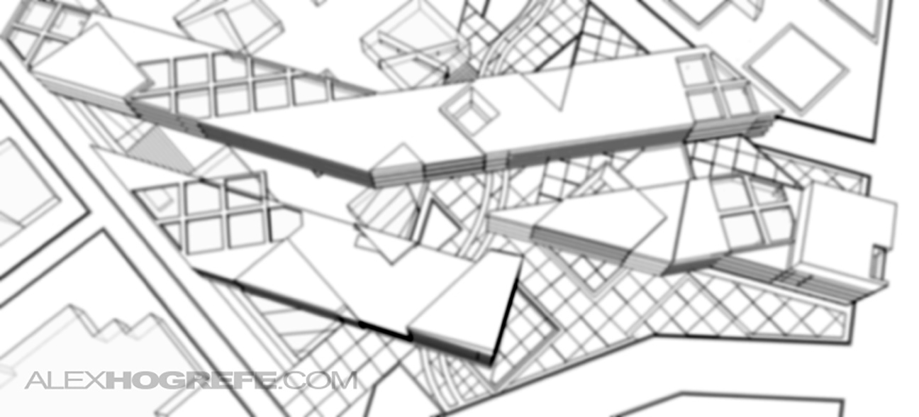
6. With the 3 images complete, it’s time to combine them in Photoshop. Begin by opening the first image (Sketchup export with only line work, no shadows) in Photoshop. Right click on the background layer (Click in the space next to name of the layer) and choose “Duplicate Layer”.
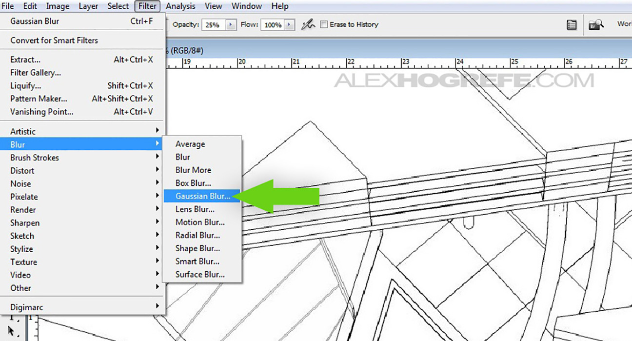
7. At the top, select “FILTER>BLUR>GAUSSIAN BLUR”.
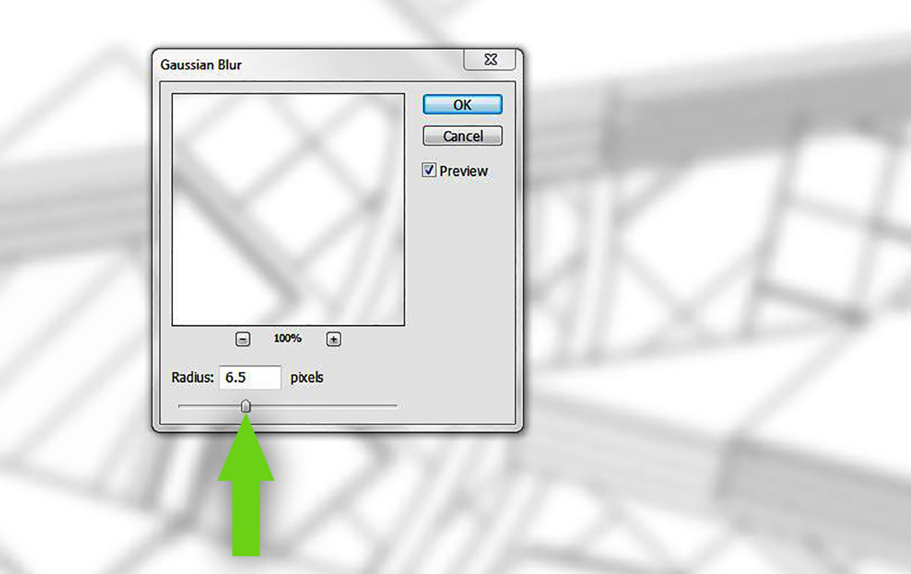
8. When the dialogue box appears, choose a radius of about 6.5. This number may need to change depending on the resolution of your image.
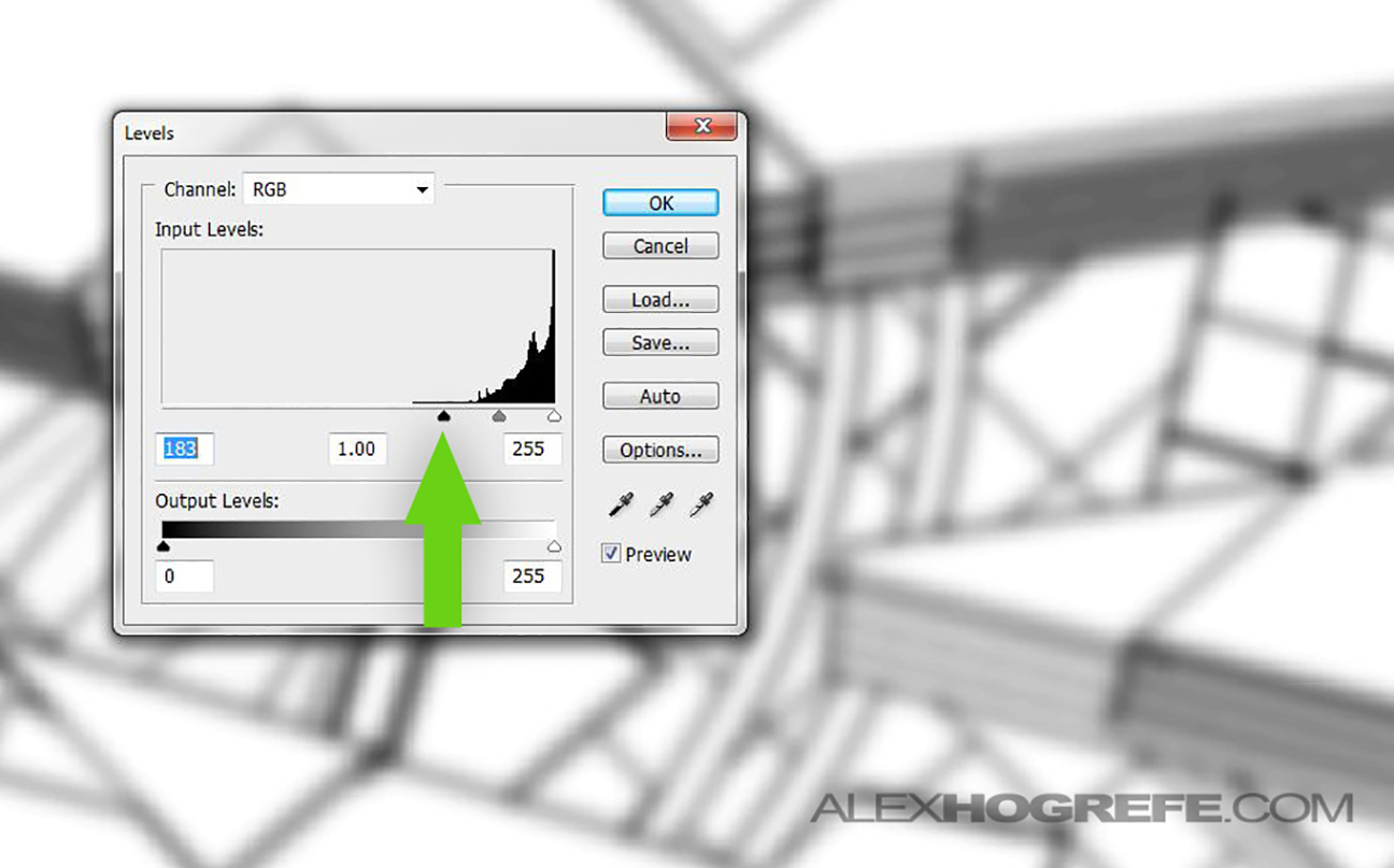
9. With the lines now blurred, we need to darken them. I prefer to use levels although you can probably get away with adjusting the contrast. For levels, go to “IMAGE>ADJUSTMENTS>LEVELS”. Move the left black triangular slider to the right until the line work darkens to almost black.
Below, is what the image should look like at this stage:
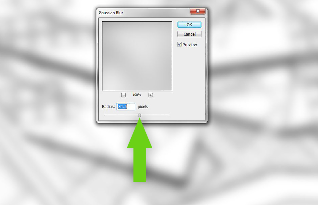
10. Next, duplicate the layer just created and move the new layer to the top. This duplicated layer will be blurred again using the Gaussian Blur Filter. However, use a higher radius such as 35 this time.
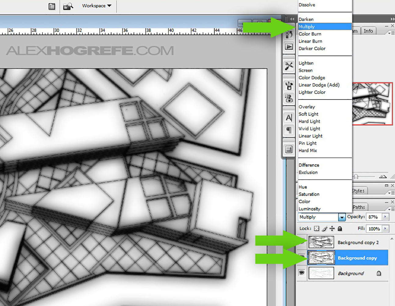
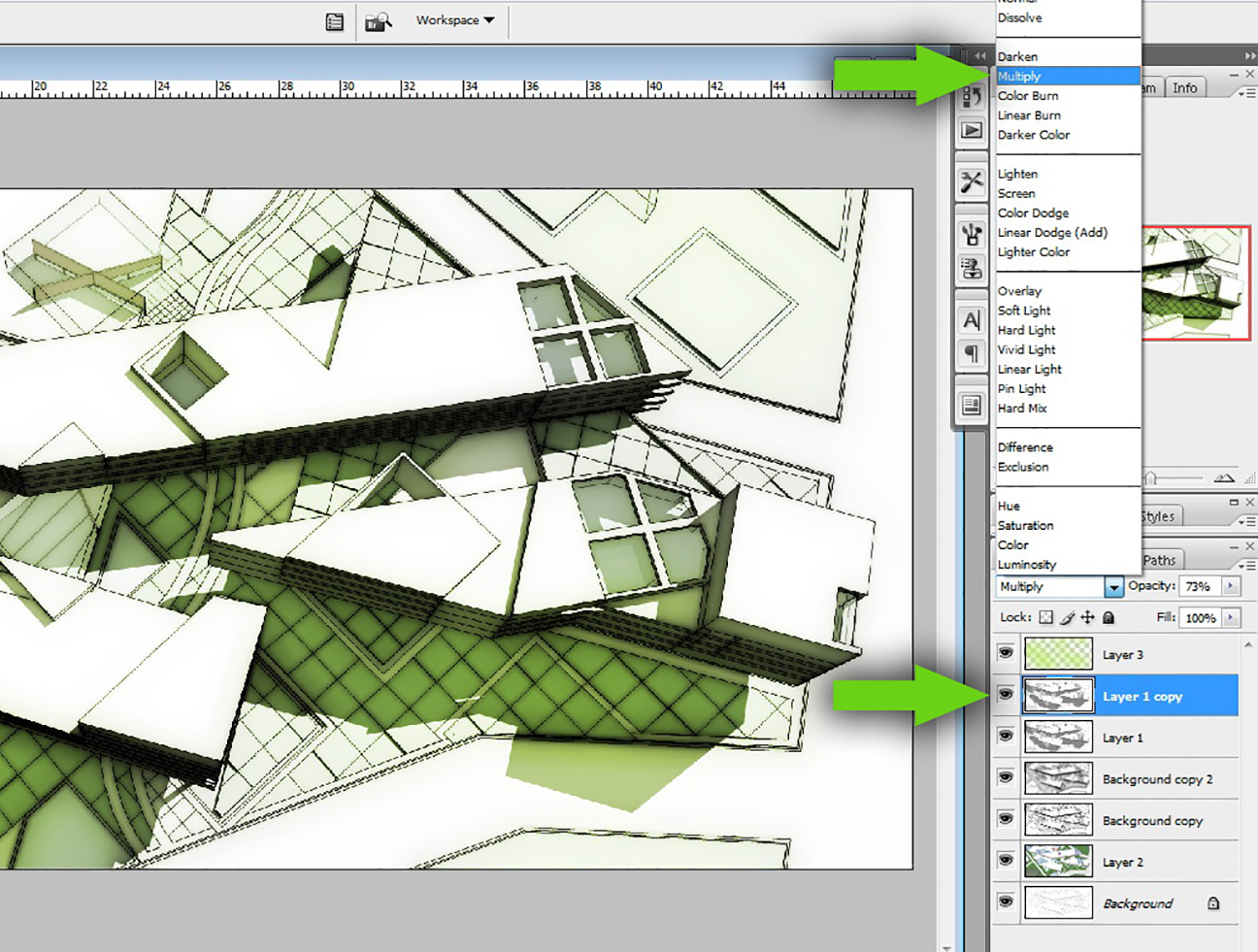
11. I want the original line work layer to show through the two, now blurred, layers just created. To do this, select the two blurred layers and set the layer blend mode to “Multiply”.
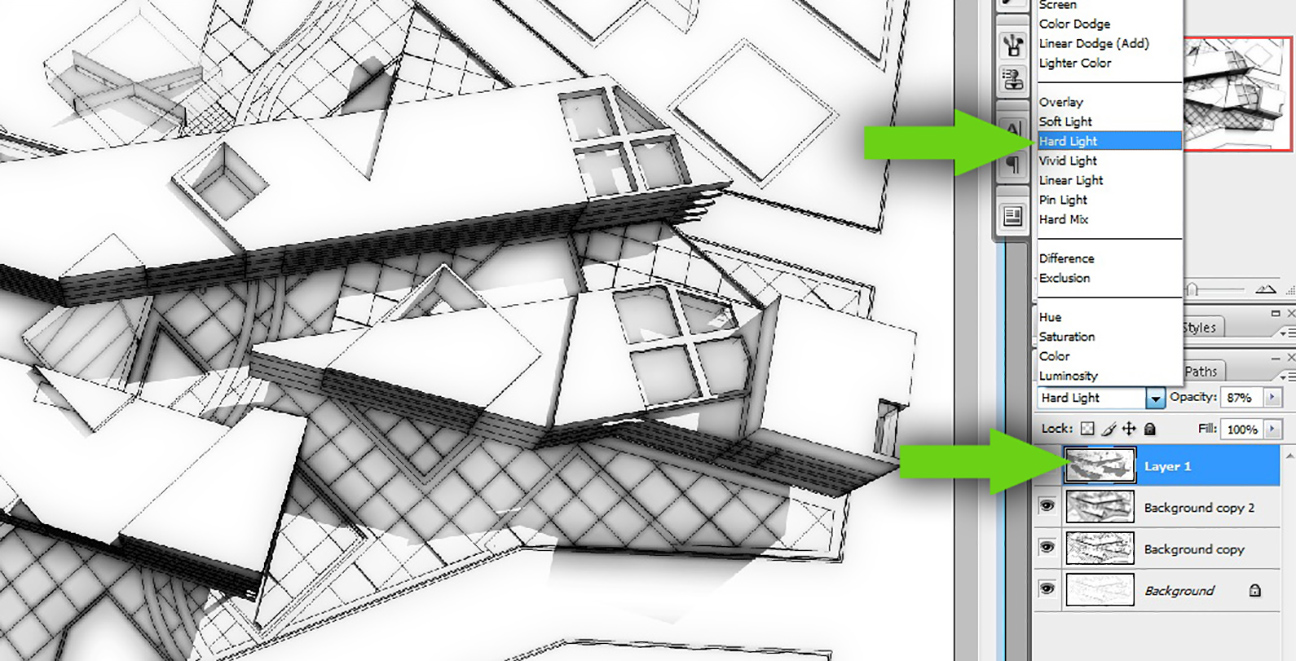
12. The next step is sort of the “secret sauce” of the tutorial. Open the Sketchup exported image that showed both the line work and shadows. Drag the new layer to the top layer. Set the Layer Blend mode to “Hard Light”.
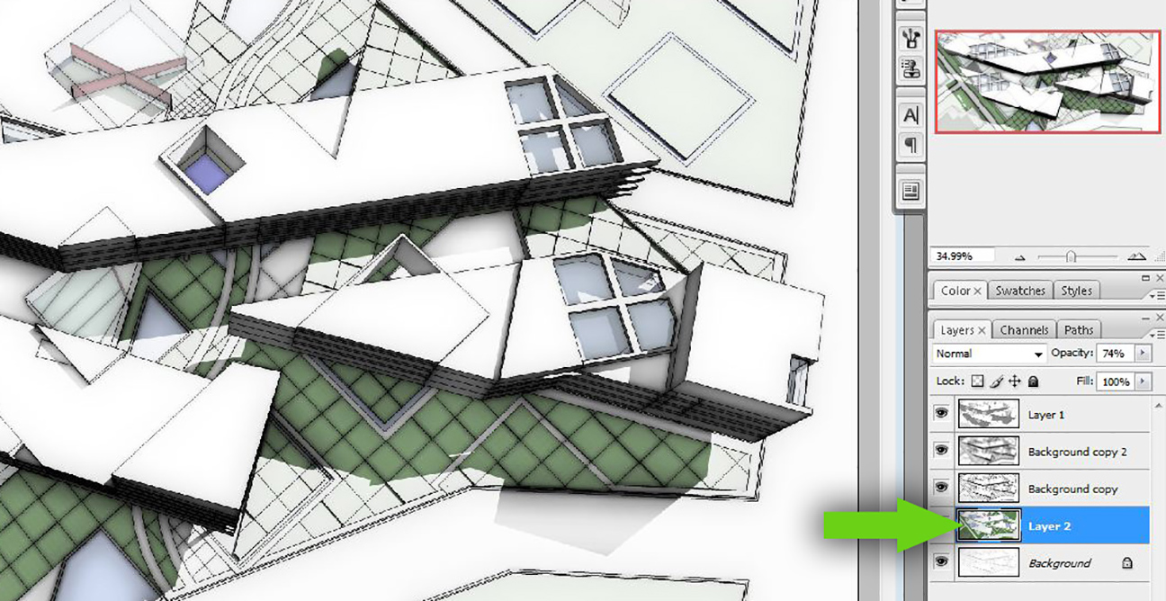
13. To add some color to the image, open the Sketchup exported image that had the face style “Shaded with Textures” turned ON. Drag the new layer to the bottom, just above the “Background” layer.
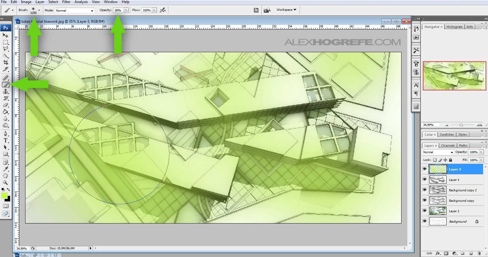
14. I like to add color overlays to my illustrations to give them more of a mood. Create a new layer and move it to the top layer. Select the “Brush Tool”, and adjust its settings to have 0 Hardness as well as lower the opacity down to 25 to 30%. Begin painting in color in areas you want more color.
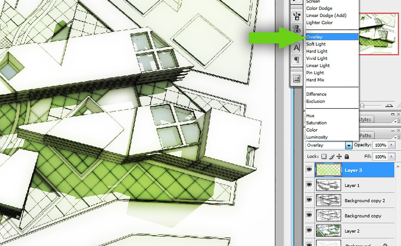
15. Set the Layer Blend mode to “Overlay”.
16. One last thing, I want the shadows to be a little more darker. To do this, select the layer with lines and shadows that was set to “Hard Light” in Step 12, and “Duplicate” it. Now, select the new duplicated layer and change the Layer Blend mode from “Hard Light” to “Multiply”. You can adjust the layer opacity if the shadows are too strong.
That’s it! It may seem like a lot of steps, but I think once you go through them a few times, you will realize they are relatively simple and the whole illustration can be created in a matter of minutes.
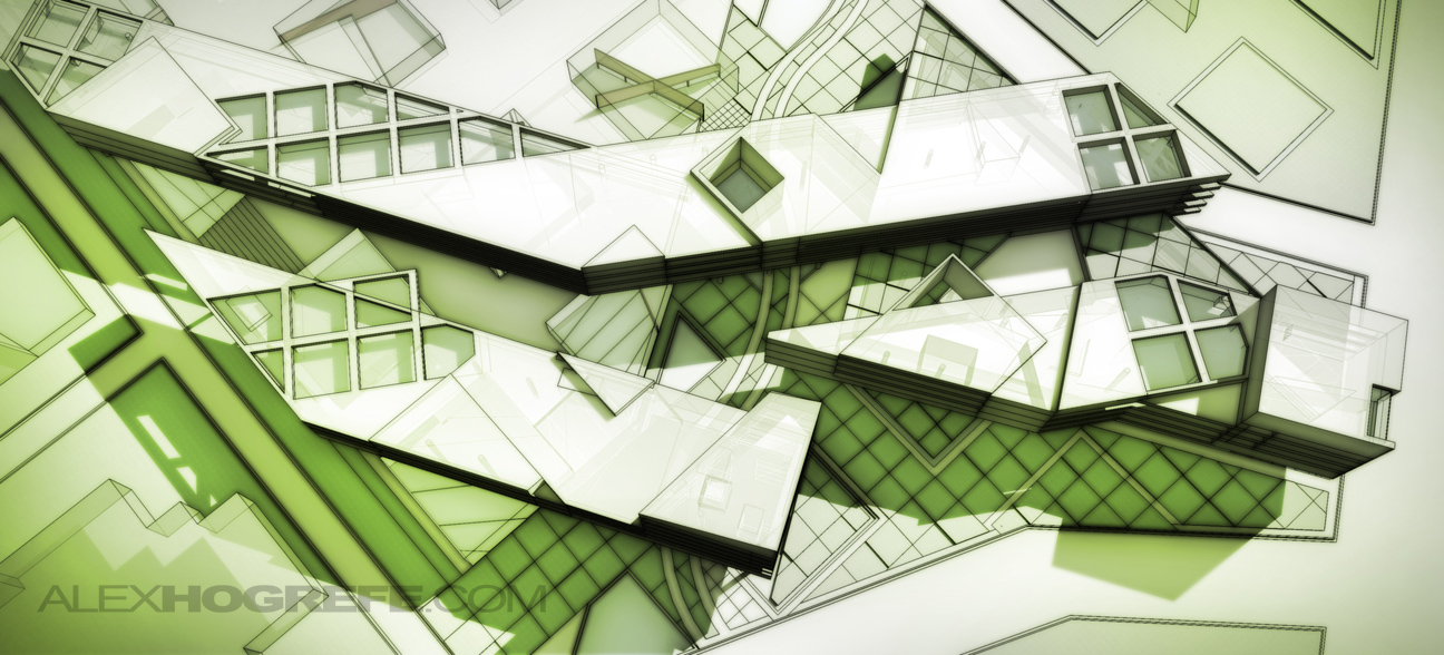
For the final shot below, I added some vignetting (tutorial HERE). I also overlayed another exported Sketchup image with the face style set to “Xray” mode for a more detail in the light areas of the illustration.



Just really wanna say thank you for all the tutorials you made. I'm an architecture student and I really appreciate all your effort.
I too want to thank you for your tutorials and tips, saved me at finals, thanks to you I had the best sections and got a lot of compliments on them. THANKS ALEX!!!
Me too, but this tutorial is pretty much useless.
Sorry, but the truth is that you look at the end result and you ask yourself: Am I gonna use this for something? Is it looking good? and the answer is NO and NO.
Alex, please continue to post tuts on your Photoshop post-work (like the "wet street look", "jindu illustration", "china villa rendering", "villa illustrations" and so on…), that's what's most difficult for most people.
Please don't take this the wrong way. I'm just trying to give you some feedback and I really (really!!!) appreciate all the hard work you put in here, sharing your knowledge and skills for free. 😉
This comment is baseless and unhelpful. Not only that, but the way it is presented is patronizing and bullish.
Alex, I enjoyed the tutorial and may play around with it in the future and modify, I “waste” so much time in my rendering program that this could really save on projects that don’t have the fee to produce photorealistic renders. Thanks for the creative direction!
@ Lucas, don't get me wrong, but just because this post didn't do anything to help you – it's not the case for everyone else.
I like the final rendering and Im thankful for this tutorial, so please keep them comming Alex 🙂
Not everyone can give thanks to please everyone. Not all the tutorials that Alex shares, can please everyone.
I personally do not seek any tutorial in particular. So all the tutorials that Alex shares make my days much more cheerful and happy because I just "drink" a little more wisdom from the master himself …!
I daily pay a visit to Alex's blog, always hoping that he has shared some more of is work with us.
Thank you Alex for another excellent tutorial and many more to come. I'm waiting for the next… … 🙂
(Sorry about my poor english, i'm portuguese)
Great job man! as always! Really enjoy how with such semplicity you can make such great images!
@Lucas… one of my sayings I never forget is "the more you know, the more you know". If you want to be one dimensional that's fine, but many others including myself really like this style. It is a quick and effect way of showing mass in an artistic form when you don't have the time to spend hours doing extremely detailed renders… your comment was fail.
@Dan I'm glad to know you understood what i said… :facepalm:
Thanks for your posts, how can I get my images for your apreciation?
@Lucas
"Me too, but this tutorial is pretty much useless.
Sorry, but the truth is that you look at the end result and you ask yourself: Am I gonna use this for something? Is it looking good? and the answer is NO and NO."
That is what you said right, basically b!tching cos he didn't do something that you would use, last time I checked he wasn't put on this planet to do tuts just for you dickhead.
Lucas was saying that in the professional workplace, few people know how to appreciate the "mood" and abstraction that Photoshop-heavy renderings tend to give. It takes a client well-versed in architectural discourse to appreciate non-photorealistic renderings.
In school, one's projects are not going to be built, material palettes are never fully considered, your only audience is a group of other architects, and everyone can speak the language of this rendering. But I think Lucas's comment is valid for the workplace.
@ Lucas,
I can appreciate your honest opinion. I would like to see some of the other
Photoshop post-work (like the "wet street look", "jindu illustration", "china villa rendering", "villa illustrations" that you mentioned, as much as the next person. However, Let's not forget that Alex isn't
getting a dime from making these tutorials that he so generously post for us. I'm greatful for Alex sharing
his techniques whether or not a person finds it useful. Atleast I do. Just my thoughts.
I'm an architecture student, you have refreshed my faith in SketchUp as a drawing tool. The simplicity and impact of your tips are great, keep up the good work.
I appreciate the comments, all of them. Its good to get feedback like Lucas’ to let me know what people are looking for as well as not looking for. However, at the same time, I try to keep tutorials refreshing with different techniques and styles. My hope is that if you don’t like the final outcome, you can at least pull from the tutorial, ideas or steps that you can apply to your own workflow to develop a style you do like. Thanks again for the feedback and keep the comments coming
@Rich I understand most clients want super photo realistic renders and most likely that is what Lucas wants so he can be like all the rest off the sheep that do renders like that… But saying this style and tut is useless in the real world is quite wrong, I would say this style would be great for urban/building massing and layouts to be shown to planning or clients etc. Or maybe I am a landscape designer and want the buildings to take a step back from my landscape work? Or maybe I can take Lucas approach of "I'm an architect do for me what I want and what I need now Alex".
@Gus I totally agree with you and am grateful too.
@Alex I was just trying to give you some feedback, not in anyway bitching and I'm glad to know you got my point. 😉
As for the troll who uses words like "dickhead": I'm not wasting my time with you.
@Lucas, nawwwwwwwwwwwwwwwwwwwwwww
Read again it was d!ckhead not dickhead. I understand you not wanting to waste your time on my comment as you know what I said was completely right, unless you don't even work in the industry? Given how thin your skin seems, I'm gathering you don't. Alex offered everyone free help on a tutorial on a style you didn't like, you b!tched, had a cry, and then tried to make it look like you were thankful.
Hello alex!
Thank you very much for this tutorial!
I used it today for some axio view at work, and it work very well for quick rendering!
With somes other setting of the layers, you can add more texture effect, good tutorial, and for the other, try some other setting, like always, alex, you give us the keys, after we need to find our right way to use as we want!
Wait for some other great tips
, a neewby in architectural rendering, and big fan!
one word for you mate… LEGEND!!! thanks for this help
THANK YOU!!!!!!!!!!!!!!!!!!!!!!!!!!!!!!!!!!!!!!
You are such an awesome chap for making these tutorials!
Comment sections: escalating petty bickering since 1995.
And on a scale of 1-10, Alex, you sir are a boss.
Christmas gift <h1>coach bags outlet</h1>
The most fashionable cheap <h1>coach outlet online</h1>
Christmas Specials <h1>authentic nfl jerseys</h1>
Beautiful and unique <h1>coach outlet online</h1>
2011 most unique design <h1>wholesale designer bags</h1>
Buy want to buy products <h1>coach outlet store online</h1>
Professional design <h1>coach handbags on sale</h1>
Single product sales <h1>coach bags on sale</h1>
Cheap and good-looking <h1>coach outlet store</h1>
With top design <h1>authentic jerseys suppliers</h1>
Male friend love <h1>nfl jerseys from china</h1> Very glad that you buy
Your tutorials are fantastic. I am an architecture student and the school focus is on design training, with literally zero emphasis on work presentation or production. These are a great resource for students like myself who will receive little to no training in proper methods of representation.
Amazing post! I love the elegance of the finished image. Thank you.
great…! thank for share..Alex Hogrefe
That's real nice…you are teaching us lots of great things! Thank you very much.
(Please don't confuse me with the "Lucas" in above posts. I'm Lucas Cole.)
I wanted to take a minute to thank Alex for his tutorials and videos. They are concise, understandable, and very useful, not to mention–free. I'm wrestling with a huge (for me) project that encompasses SketchUp, Photoshop, DrawPlus, and other assorted plug-ins, and I found Alex's tutorials a Godsend–literally–for the time and trials they have saved me. Thanks for this tutorial and the videos. Thank you for your time and professionalism. –Lucas Cole
desde argentina mil gracias!!!
Thank you so much for these tutorials, there is always at least one or more parts to each one that blow me away.
Cheers.
Hi Alex,
Your work is amazing, Thank you for some great advise.
Do you recommend a good sketch up tutorial?
j.
Thank you! I am also an architecture student who doesn't receive much training in Photoshop, and this tutorial really helped me explore new ways of rendering. I have a project due in two days and this is a perfect way to bang out some renderings without having to purchase more expensive software. I'm a big fan!
GREAT JOB !!
First of all, thank you so much for doing this blog! I have learned so much and it has really helped me improve my portfolio. I was just wondering if you had any ideas on how to spruce up 2d plan drawings?
Thanks!
THIS IS SO SIMPLE IT'S GOT TO BE STUPID. WHAT'S WRONG WITH IT?
1. Open your drawing in SketchUp and press Print Screen.
2. Open a new file in Word and paste your drawing into it.
3. Now Copy the Word version of your drawing.
4. Open PhotoShop and select Paste.
5. Behold your drawing–perfectly rendered!
Well I think your talent is matched only by your generosity! Thank you for sharing all these tips, Alex. Just in the couple of weeks I've been trying them Ive gotten great feedback on my renderings. Nicely done, I look forward to seeing more!
So many thank you! I always looking for one tutorial so simple and smart like this! THANK YOU from Brazil!
If the results are this beautiful, who cares if the technique isn't going to be popular with every architect and every client? I'm impressed. It's not such a bad thing to be working a little outside the mainstream. The mainstream makes a living, but it doesn't make history. Thank you.
just wanna say, your tutorials are simply astounding…
your works are amazing, your tutorials are easy to follow, and your techniques are simple yet effective
thank you so so soooo much for the help man you're a lifesaver !!!
Alex,thanks for all this amazing blog! I found this tutorial really interesting because the result reminds me of the old style transparent paper I used to drew on. It really communicate the material qualities of the paper. I got the idea that I can use this technique to create the illusion of a semitransparent panel which is lightened from behind. I simply inversed the B&W drawing with some level adjustments and than I used the screen mode instead of multiply in combination with blur and some noise.
If you are curious, please check out here: https://www.facebook.com/photo.php?fbid=644433432318073&set=pcb.644446038983479&type=1&theater
Dude you just save me….
I LOVE THIS BLOG,VERY GOOD AT PRESENT
Thank you Alex, thx for all the tutorials.
Hey Alex, every time i tried this, the image came out a lot yellow than they are and also the original colors never came. Any suggestions ?
This is an amazing and helpful website!!
Hello Alex ! Great step by step guide. I never thought this can be done so easily. You’re a champ. Wanted to say thanks and see more such cool posts. Also like the vignetting tips. Can we do this in illustrator too ? I personally like illustrator more then photoshop. TIA !
raelly nice tutorial, thanks for sharing , much appriciated this effort, Loved it 🙂