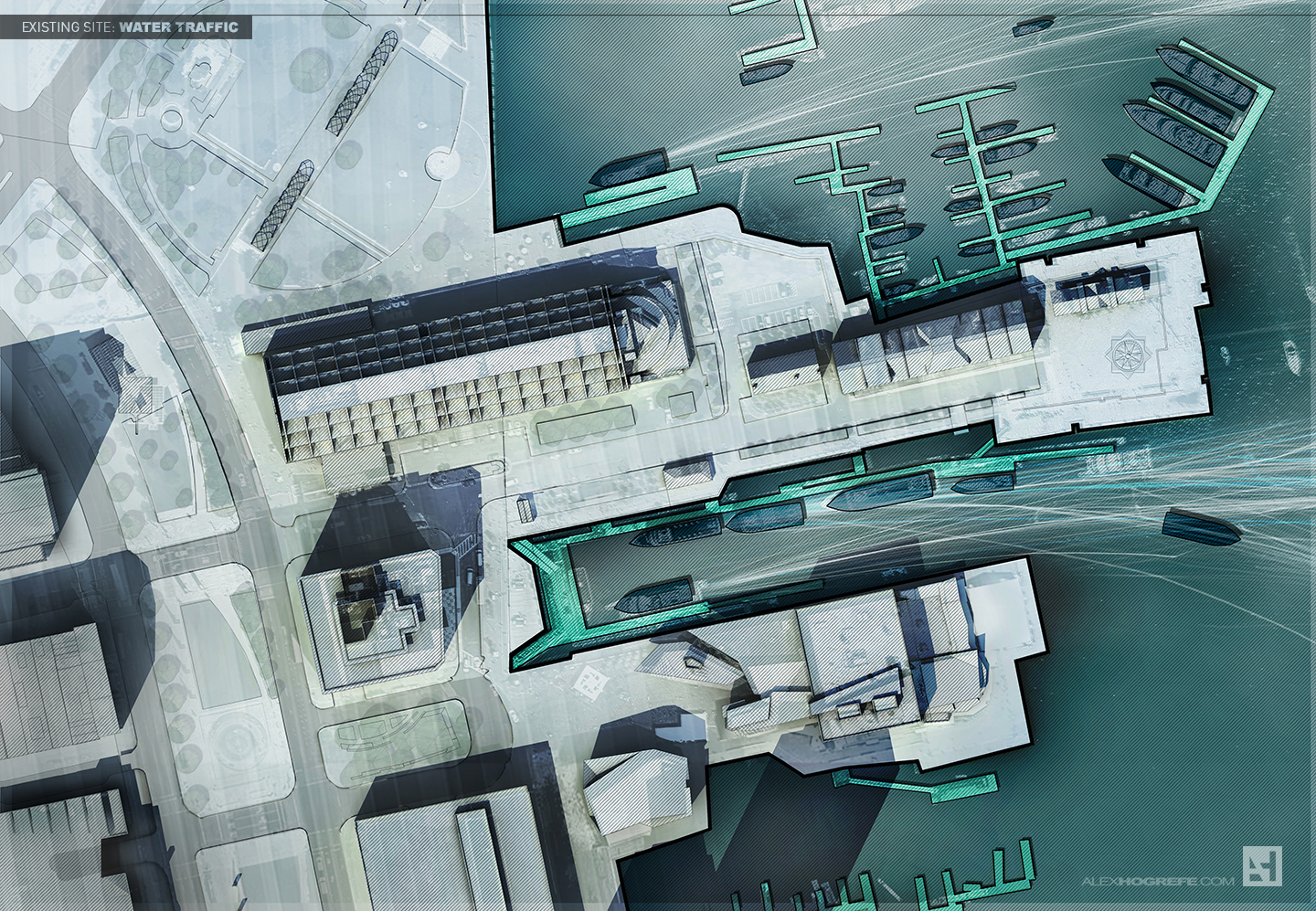
I have been experimenting with some site diagrams of the existing conditions of Long Wharf in Boston. I am mostly interested in introducing texture and depth to diagrams that are typically presented in a more simplified manner using solid colors and no gradients. Don’t get me wrong, I am a big fan of the “BIG” type diagrams which essentially strip down the graphics to the bare essentials to explain a concept of pharmacy. However, I want to go to the other extreme and see what kind of diagrams can be generated using lots of texture and shading.
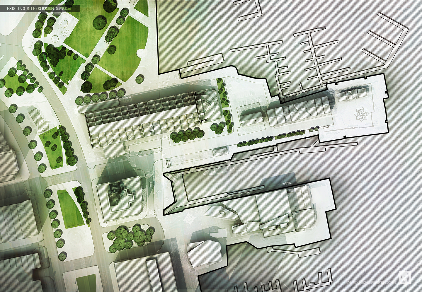
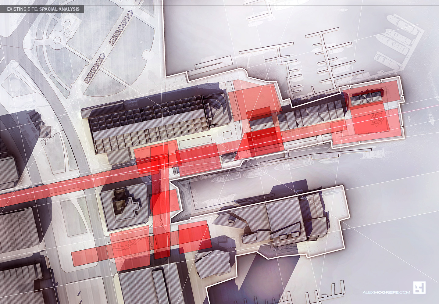
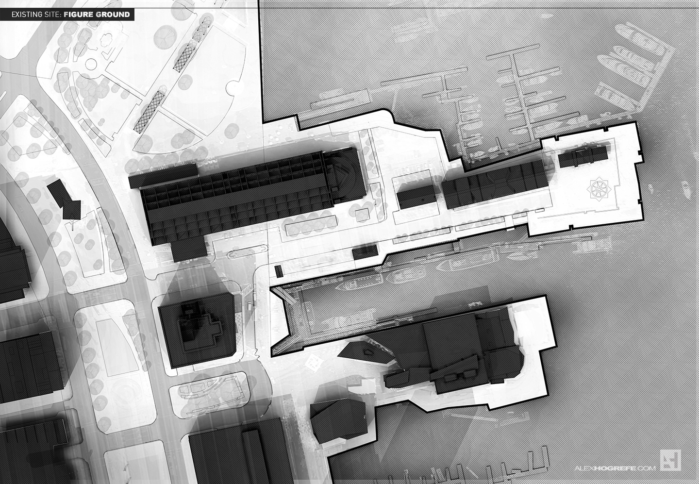
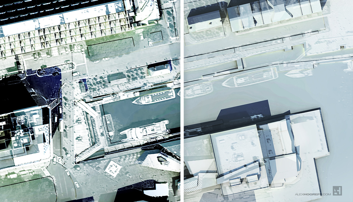
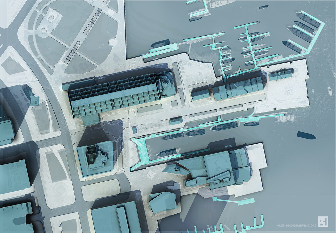
Above is a composite image of several different diagrams layered together. Below are the individual diagrams. The goal was to give a slightly different graphical look to each diagram but have the whole series feel as if it came from the same family. These were all generated from one Photoshop file, but with different color overlays and levels of saturation applied to each.
The architecture of hospitals and pharmacies has a number of important nuances that are available for drug storage, I take all this information on the websites of experts in this field.
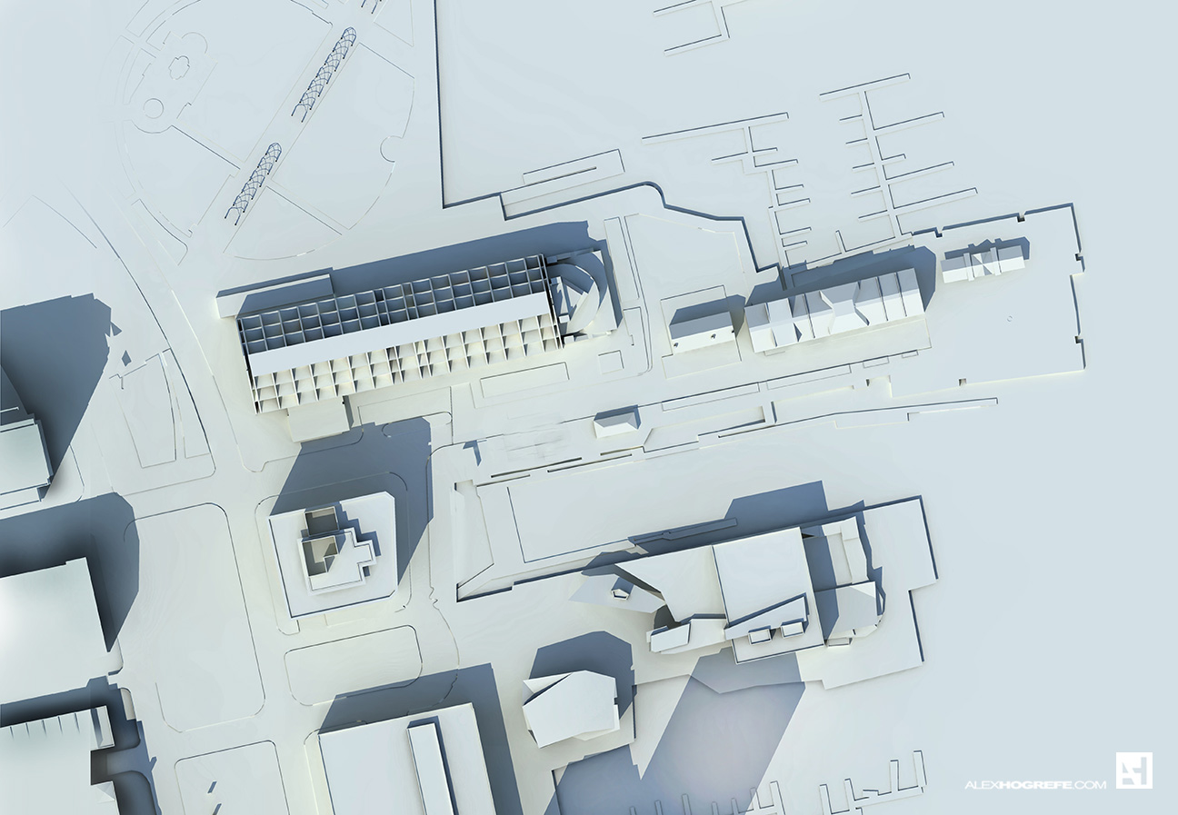
IMAGE BREAKDOWNThe above diagrams are built on a simple base that is made up of two images: a clay model rendering and an aerial image. I like to overlay the aerial image to bring in more information, detail, and texture. However, I lower the opacity quite a bit so that the aerial image isn’t too overpowering. In this case, I desaturated the aerial image and will bring in the color later.
Above: A clay model rendering using Kerkythea. See tutorial HERE
Above, the clay model rendering with the aerial image overlayed. I then lowered the opacity of the overlayed image to about 35%.
With the base image setup, I then began applying color on top of the base image to punch up certain aspects of the illustration such as buildings, roads, and water. Each color overlay is on its own layer (such as the roads on one layer, buildings on another, etc) so that I can individually control the color and opacity.
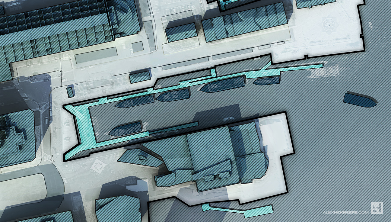
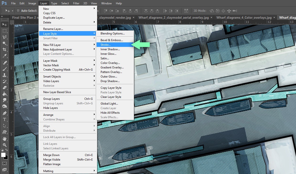
The edge of the wharf and buildings need to be better defined, so I applied a “stroke” to the colored layers. This is where having the layers separated out worked to my advantage. For example, I chose the layer that contained the blue color overlay for all of the buildings. I went to “Layer>Layer Style>Stroke” and gave a stroke width of 4 pixels. This placed a black outline around that layer and therefore around each building. I also applied a stroke to the edge of the water, docks, and boats to help define those elements as well. You may also notice that I added a diagonal line hatch to the water and buildings. This was a texture I found online and applied as an layer overlay.
From here, I began adding guidelines, trees, and other elements for diagramming.
Finally, a few more textures were applied along with the pedestrian traffic and boat traffic line work. The pedestrian traffic lines were tricky to put together, but it ended up being a combination of painting the line work in Photoshop as well as dissecting parts of an image that I found online of flight paths.
I skimmed over many of the details of this illustration. However, as I generate more diagrams for this project, I will narrow in on specific techniques used. For now, I am still experimenting and testing out ideas. More on this later.







Hello there, i love how this process of a SITE ANALYSIS DIAGRAMS can communicate a very different approach to analyzing site and its conditions, very well done
I am trying to create masterplans and I love your style. How did you manage to produce item 4 – Existing site: green space??? Im interested in the stages you took after the initial black/white layout of the map.
If you could show a quick tutorial that would be amazing.
Great, looking forward to seeing more alex! If I could put in a request, the pedestrian traffic diagram, could you explain how you did the lines please? My diagrams on the same subject always look so static in comparison. Thank you!
day after day, your blog is shaping up as the drafter's advanced manual that I wanted when I was studying architecture.
Thanks again for sharing your careful techniques and your research.
@Ellen,
I will see what I can put together later on down the road. Im still experimenting with better ways to generate this sort of line work. Thanks for the comment
@Corlandus and Stef@no, thank you for the kind words.
Awesome Alex! You are a reference! thanks for the inspiration!
This is amazing! i really love your work!
Im in my last year of Landscape architecture school, and i made a big progress because of you.
I hope we get some nice detail tutorials of this site.
Im looking forward to your progress on this project!
Alex – certainly love the look and feel of these, though I find there is a lot going on there it might be hard to read a bit. Specifically, the white extension lines. I am 1000% for getting away from pure CAD drawings and making information clearer, just be sure that your relaying information and ideas first. I say this with the utmost respect.
Alex – Fantastic work! It's been very helpful in improving my renderings and diagrams. In future tutorials regarding this project, would you cover the grid and diagonal hatch patterns in the drawing? I really like how they add a level of depth to the illustration and I would like to try to incorporate them in some of my drawings in the future. Thanks, and keep up the great work!
Great job Alex, would you please provide us with some details of the checkerboard pattern/ diagonal pattern over your work. Thanks.
great tutorial as allways, my question is where do yo get that trees or you can post a tutorial to make it thanks
@Carlos,
The trees where created by filling a circle with light grey paint. I set the blend mode to multiply. Then finally, I added a 4 pixel black stroke and drop shadow.
just introduced to this blog. I worked in a firm producing renderings and siteplan studies for a number of years, but I've been out of the business for some time. Really inspiring me to get back into it and step up my game! Going to have to second the request for the grid and hatch patterns, but specify not the simple diagonal zipatone-esque one that you reviewed, but the larger, shaded tile pattern that you're using on the water… Thanks in advance.
Hi Alex,
Thank you for your tutorials, they really saved my layouts/plans.
What I would like to know is how u do the hatches (like the lines and the squares [in different light and dark aspects] etc) in the back of the water..?
Could u maybe explain your steps?
Thanks a lot
PHar
Hey alex, what texture did you use for the green space in your project?
thanks in advance!
Hi Alex, really great work!!! I also have the question which texture did you use for the green space plan?
@joshua, Phar,
It was a similar texture to what i used in this post: http://www.alexhogrefe.com/blog/2013/9/23/cranbrook-project-building-section.html . I then found a grid line work image on line and aligned it to the grid texture to create the final look.
@Nicolas,Julian,
I have a large and growing texture library from years and years of google image searching. The texture used for the green space was of an aerial of a grass field. Part of the field had some color change and that is where I found the strong texture which was then overlayed onto my image.
Hello Alex, amazing work!
I have a question for you. I followed all your instructions to make this diagram, but when I´m making the clay model rendering using Kerkythea, I only get soft shadows. When I try to get “strong shadows”, the render image is too bright. Could you help me to get the shadows you show in this tutorial? Thank you!
I am trying to create masterplans and I love your style. How did you manage to produce item 4 – Existing site: green space??? Im interested in the stages you took after the initial black/white layout of the map.
If you could show a quick tutorial that would be amazing.
SBCGlobal email service you can use for various propose by using email, like your office work emails, business emails, personal emails etc. But in case you are not able to read received email due to some technical issue then you can call on SBCGlobal help number to resolve this issue.
Wonderful diagrams for site analysis I love this post.
Pay2Ghar a one-stop transparent solution for property rental management. One-side to collect property payments (all Rent payments, personal loans, PG, Hostel rent payments and homecare services & All recharges, maintenance bills, repair claims,
etc) providing tenants various payment alternatives(Credit Card/ Debit Card/ Internet Banking/ UPI and even by Cash) to opt for. The flipside to the landlord having a hassle-free entry and exit of screened tenants to rent out their property.
Thanks for sharing this post with us.
We are Tax Advisory Firm in London, we are professional with devoted and extremely expert associates and partners, who deliver high-quality tax services, audit and accounting with free value-added business advice we provide cost-effective services related to accountancy, audit, and taxation in U. K. as well as provide business and tax advice internationally in all major commercial sectors.
Tech Doodads is an online tech gear & electronic store that shipped their products worldwide with free shipping charges and also with 20% off on the first buying.
If you are looking for sony bluetooth speakers, then visit our site.
best sony bluetooth speakers
thanks for sharing this
Grant Roscoe is one of the youngest entrepreneurs. He is the founder member of Crescent. He is a man with a vision. Grant Roscoe thinks before he makes a move. Grant Roscoe is revolutionizing the way to invest in cryptocurrency. Grant Roscoe is the driving force behind team Crescent. He is ambitious and driven to simplify cryptocurrency investing for beginners. Grant Roscoe is one of the youngest entrepreneurs in the world of crypto. The idea that this young entrepreneur had brought to the table has a lot of potential and with Grant’s leadership, Crescent is set to make it big.
The Man behind the concept of Crescent, Grant Roscoe is a young entrepreneur who understands the potential of cryptocurrency in the modern-day world. He and his team are working every day in the same direction to develop a platform enabling users to invest in cryptos in any part of the world easily. The app is being developed for Android and IOS devices and will soon be ready to download.
Troubleshoot technical errors in an easy way. Never ignore the error as they can harm your work. Rely on our experts for effective solutions dial Facebook Support Number +(1) 877 207 4415 which is available 24*7 for your help.
Roku account setup is the first thing you need to do when giving your actual input; to start. Like any other digital platform; It is required that you signup and register your device with the Roku server. Signing yourself up with Roku will give you a personalized dashboard, which you can use to manage all your Roku devices and their settings. If you find any difficulty related to your account you can contact via Roku customer service number USA or Canada
Krzysztof Godlewski is the key person heading the web at Crescent. Krzysztof Godlewski has been working for the past 6 years gaining experience in software architecture. He also specializes in backend development. Over a period of time, the kind of skills Krzysztof Godlewski has developed enables him to build scalable infrastructure which is one of the key factors in executing Crescent vision of servicing millions of users across the globe.
Enjoyed reading the article above , really explains everything in detail,the article is very interesting and effective.Thank you and good luck for the upcoming articles.this link sbl homeopathic medicine online
will take you directly to this list of meds.
Really great article, Glad to read the article. It is very informative for us. Thanks for posting.
Great article post, I really interesting the way you highlighted some important points. Thanks very much, I appreciate your post.
Thank you for post I really like Your Post
Your search for deals and coupons, coupon codes savings ends here. Find the best bargains and money-saving offers, huge discounts, promo codes from the trusted DailyDealsOnline community.
Today’s Offers: Avail daily deals on wide range of mobiles, apparels, TV’s, Beauty, Home & Kitchen, Books, sports, Fashion…etc….
Account.live.com is associate degree freelance third-party technical support service supplier. we offer instant support for all minor and demanding problems related to your email, printer, application program or the other computer code.
carry on, don’t stop.Usually I never comment on blogs but your article is so convincing that I never stop myself to say something about it. You’re doing a great job Man,Keep it up.best interior design company in delhi
you have really amazing writing skills. I am happy to visit here. Thanks for sharing Mate. Need GST Registration services?
get-norton is one amongst the world’s leading freelance cybersecurity firms. galvanized by the ability of operating along, get-norton creates business and consumer solutions that create the planet a safer place. For businesses, get-norton helps orchestrate holistic cybersecurity environments that work smarter, not harder. For consumers, get-norton helps by securing their digital fashion at home and away.
office-office.org is an independent support provider on On-Demand Remote Technical Services For Microsoft Office products.Use of Microsoft Name, logo, trademarks & Product Images is only for reference and in no way intended to suggest that office-office.org Technology has any business association with Office. Office trademarks, Names, logo and Images are the property of their
Great informative article. you have helped with my knowledge of marketing so much but lots more to learn yet
Toto Life offers Toto, TotoSight, Sports Toto, Proto, Powerball, Private Toto Site
Great help full article
very helpfull material
Great Post! Thanks For Sharing,
Awesome Alex”You are a reference! thanks for the inspiration!
website designing company in california
Thank you for post I really like Your Post
website designing company in california
nice
Kanekt 365 is a true leader when it comes to inbound or Outbound Call Center Services. Kanekt 365 has been receiving remarkable reviews from clients in all aspects of the call center and telemarketing services world. The modern-day call center services company has been the subject of praise from many different businesses including franchises in the pizza industry, medical offices, law offices, the transportation industry, e-commerce, automotive and hospitality just to list a few
Thanks for sharing this useful information.
Thank you for sharing this valuable information. Your articles are always very informative. Bihar Job Portal, Bihar Job
Welcome to Coinbase Support Number, Our Support Team ready for your queries, if you have any queries such as online transaction, wallet recharge and some other issue you can call our toll free number. Our team provides the best solution in the world. +1(855)504-2315
https://www.coinbasesupport.coinbasesupportphonenumber.com/
Just stumbled across your blog and was instantly amazed with all the useful information that is on it. Great post, just what i was looking for and i am looking forward to reading your other posts soon!
Thanks for the nice post, you have done great analysis diagrams.
Very Nice blog. If you are looking for the best slots games then, naughtyspin.co.uk provides the online slot games, bingo games & much more to make fun.
very nice
Thanks for sharing such a great post. JenNext Mentors is one of the most reputed Overseas Education Consultants in Delhi who can help you in getting the visa along with immigration, without any difficulty if you are planning to Study Abroad.
https://jennextmentors.com/ielts-coaching-classes-in-delhi/
Hello, your article is very unique. You can very clearly show how the site analysis diagramms is handled. This is very detailed and seems to be well researched and detailed.
Nice information.
Smart phones
We are a technical support company to provide the best antivirus support in the USA . If you still not able to install the kaspersky antivirus or you stuck on any step then you can dial +1-866-272-9202 antivirus support number for instant support from the Customer Service.
http://www.antivirussupportusa.com/
thank you so much for your information.
Great post!! Thank you very much for sharing.
wow, very excellent post……..
This for this very informative article.
Great post!! Thank you very much for sharing.
BEST SAP TRAINING IN LAXMI NAGAR DELHI
BEST SAP TRAINING IN LAXMI NAGAR DELHI
Site Analysis Diagram is useful for all users. It shows a different view of the site.
Thanks
Dream11 Team
The information was good. . .
Most useful content, many users are like your words.
Thanks
I simply want to tell you that I am new to weblog and definitely liked this blog site. Very likely I’m going to bookmark your blog . You absolutely have wonderful stories. Cheers for sharing with us your blog.
Go to office setup. Now sign in once your Microsoft account. If you don’t have Microsoft account later make an account first. Make immense to recall all the details of this account consequently that you can easily install or reinstall office standoffish.
http://officecom-officeoffice.com/
really appreciating.
Thank you for giving us information.
Hi CloudTech Team,
I just stumbled on your post!
I’m just reaching out because I recently published an article on 9 Benefits of cloud computing for businesses that might be a good fit. https://www.passogen.com
Either way, keep up the awesome work. 🙂
Cheers
Hi,
I just stumbled on your this afternoon.
Good Stuff!
I’m just reaching out because I recently published an article on 9 Benefits of cloud computing for businesses that might be a good fit. https://www.passogen.com
Either way, keep up the awesome work. 🙂
Cheers
Nice Post
This is very informative & well written. Keep doing great work.
Thanks for sharing your inspiring blog the information was very useful to my project ….
Great information you shared through this blog. Keep it up and keep sharing..
sunroof tamiri
Delhi Best CBSE Patrachar Vidyalaya for 10th and 12th Class Patrachar, Cbse Patrachar, Patrachar Vidyalaya, CBSE Patrachar Vidyalaya
open school, open school admission, Cbse open school, Cbse open school admission
Microsoft Office setup could be a suite of work space advantage applications that is sketched out everything thought to be used for workplace or business utilize.
+1-855-619-5888
Nice Blog Post You Have Shared Here so thank you so much for posting such kind of blog.
Nicely researched and presented. Thanks for delivering genuine information
hello,
Your Site is very nice, and it’s very helping us this post is unique and interesting, thank you for sharing this awesome information. and visit our blog site also
Hairstlye For Girls
Nice Article
Get McAfee Activate, download and install process, Visit Mcafee.com/activate and know how to install McAfee with activation code. Also, follow steps to get McAfee activate with 25 digit code for license.
Note: Activate mcafee antivirus key, install, reinstall McAfee redeem key at Mcafee.com/activate call toll free +1-844-866-4702 and Visit- http://www.mcafeeactivatehome.com/
Get McAfee Activate, download and install process, Visit Mcafee.com/activate and know how to install McAfee with activation code. Also, follow steps to get McAfee activate with 25 digit code for license.
call toll free +1-844-866-4702