This tutorial looks at some grunge and sketch overlays to add a little artistic styling to an architecture image and break away from the “fresh from the rendering engine” look that too many architecture presentations have. Sometimes, illustrations need a little extra texture, and other times models just don’t have a ton of detail in the early stages of design. This will quickly add some interest to those illustrations.
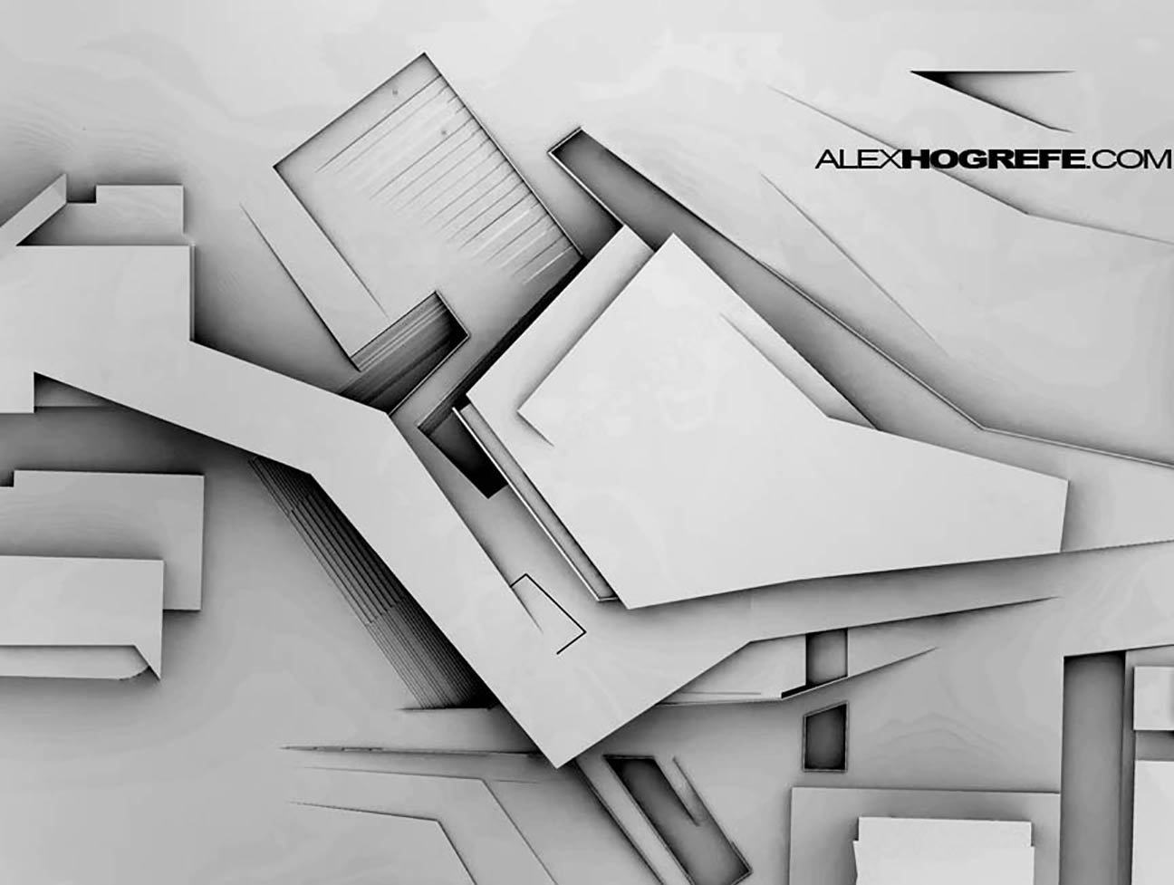
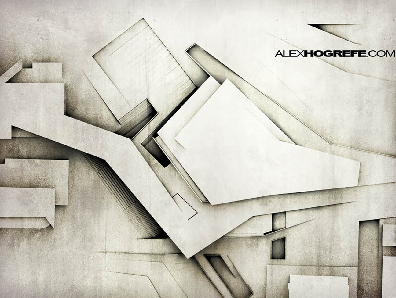
To begin, open an image in Photoshop. Below, is the image I will be using. There isn’t much color in it, however images with color will work fine too.
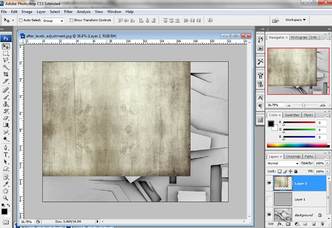
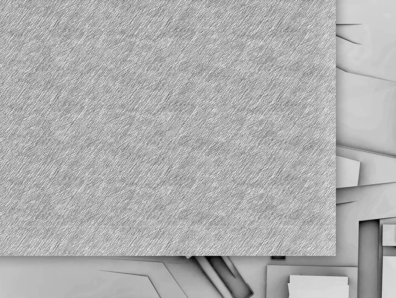
Next, open a grunge texture in Photoshop. These textures can be found all over the internet. Just do a Google search for “grunge textures” and you should find plenty.
Position the texture over the architecture rendering, on its own layer.
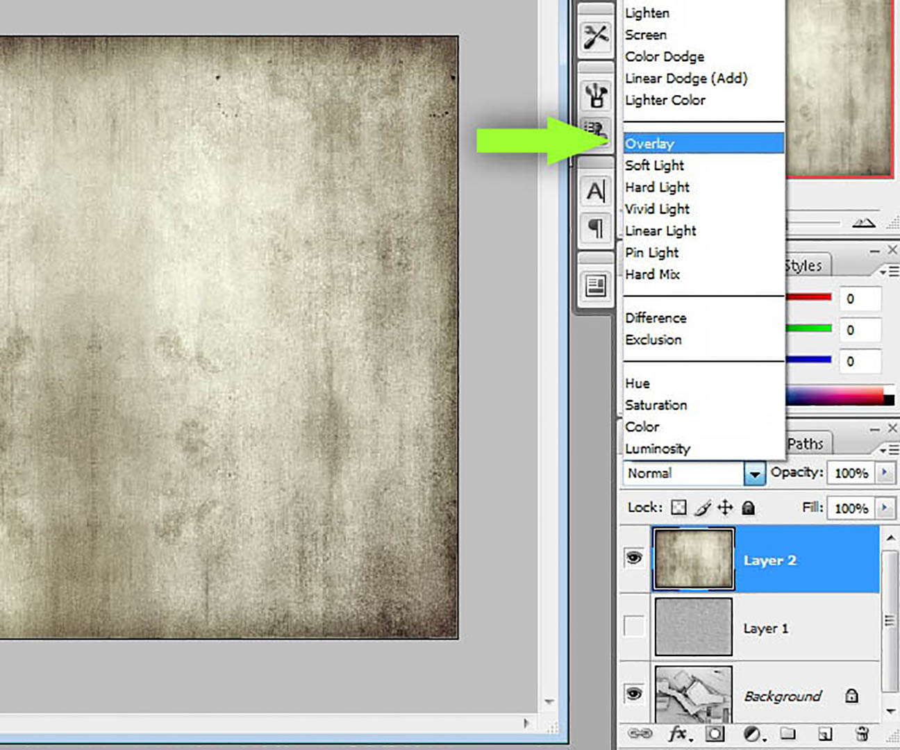
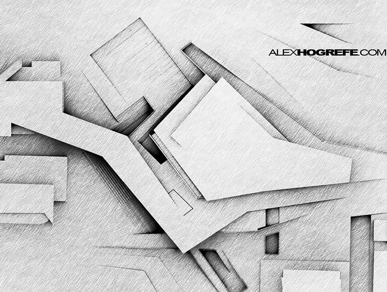
Finally, set the layer blend mode to “Overlay.” Other layer blend modes would work too, depending on the look you are going for. Overlay is usually a good place to start.
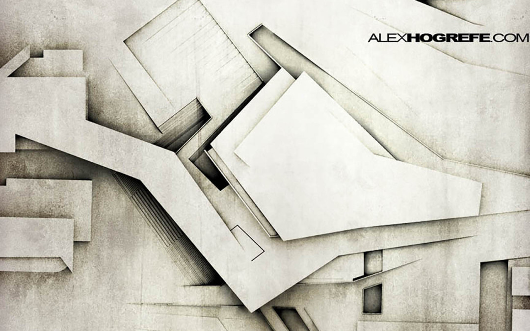
The final result gives the subtle feel of a hand rendered illustration.
The same steps can be used with a sketchy texture. Simply replace the grunge texture with any sketchy texture and again set the blend mode to “Overlay.”


–V-Yeah digital watches
UBB
Simply replace the grunge texture with any sketchy texture and again set the blend mode to "Overlay." ray ban
Where can we can get the sketchy texture!?! 🙂
hi i like you seomini
You are really good at this! It is really good, well done Alex!
Christmas gift <h1>coach bags outlet</h1>
The most fashionable cheap <h1>coach outlet online</h1>
Christmas Specials <h1>authentic nfl jerseys</h1>
Beautiful and unique <h1>coach outlet online</h1>
2011 most unique design <h1>wholesale designer bags</h1>
Buy want to buy products <h1>coach outlet store online</h1>
Professional design <h1>coach handbags on sale</h1>
Single product sales <h1>coach bags on sale</h1>
Cheap and good-looking <h1>coach outlet store</h1>
With top design <h1>authentic jerseys suppliers</h1>
Male friend love <h1>nfl jerseys from china</h1> Very glad that you buy
i do really amazed with all of this tuttorial, im a beginer designer and i need your suggestion about the step to make my very first rendering with sketchup and photoshop only.
i mean, what is the first thing to do to when my models on sketchup is done, and then what next.. and next.. and next until i get the perfect image like yours?
my english is not really good, i hope you understan what im trying to say..
thanks so much, Alex 🙂
Where can we can get the sketchy texture?
Hey thanks for your tutorials, they're really helpful…
But I'm interested in your original image that you used here, how did you add the shadow to it?
Hi Shara,
This tutorial should explain everything,
http://www.alexhogrefe.com/clay-rendering-tutorial/
Thanks
Thanks for the best blog.it was very useful for me. keep sharing such ideas in the future as well. this was actually what i was looking for,and i am glad to came here!
It seems to me all of them are really brilliant. Thanks for enhancing my knowledge.
the dark tower
Interesting article! Thank you for sharing them! I hope you will continue to have similar posts to share with everyone! I believe a lot of people will be surprised to read this article!
amazing
Just a smile and the rain is gone Can hardly believe it, yeah. There’s an angel standing next to me. Reaching for my heart Just a smile and there’s no way back .Can hardly believe it, yeah But there’s an angel calling me. Reaching for my heart I know that I’ll be okay now. This time, it’s real I lay my love on you It’s all I wanna do Every time I breathe I feel brand new You open up my heart Show me all your love and walk right through As I lay my love on you.
Only you can make this world seem right. Only you can make the darkness bright.
Only you and you alone. Can thrill me like you do And fill my heart with love for only you. Only you, only you can make this change in me. For it’s true you are my destiny When you hold my hand I understand. The magic that you do You’re my dream come true My one and only you.
cool.. you make it looks like really simple
I read some articles on this site and I think your blog is really interesting and has great information. Thank you for your sharing.
Alex… your site is awesome, i learn so much about rendering from this site,but i still want to know how to render from 3D modeling SU basicly become such a great render before get PS touch? can you make a tutorial? thx a lot Alex
Thanks for the site is the very generate the game gta game is very good keys play the game.
Thanks for sharing these useful information! This is really interesting information for me.
wow amazing tips. i always seen that you share the best.
How to login 192.168.1.1 192.168.0.1 192.168.l.l 192.168.2.1 192.168.1.254 10.0.01 192.168.2.l 10.0.0.1 10.0.0.0.1 192.168.l.254 192.168.l.2 https//192.168.l.254 192.168.0.1.1 192.168.01
Login to http //192.168.l.254 192168.1.1 192,168.1.1 http 192.168.l.254 http //192.168.l.254 192.168.0.1 192.168.0.l 192.168.o.1 192.168.o.l 192.168.1.254 192.168.l.1 10.0.0.1 10.0.0.0.1 192.168.01
Play minecraft games, minecraft games online, free minecraft games, unblocked minecraft games, minecraft free games, minecraft games free, minecraft games for free, minecraft mini games, minecraft online and more
Play best free stickman games and defeat every stick figure in stickman fight games. If you want to play stick war you can play stickman war games on our site and also you can play stickman sniper games, stickman shooting games, stickman rpg games. Meet powerful stick man in games and fight with them. Come on and fight all stickman. Play stickman figure games
Play zombie games, zombie games online, zombie shooting games, free zombie games, zombie killing games, zombie apocalypse games and more. Also you can play earn to die, infectonator, dead frontier outbreak, road of the dead, the last stand, zombotron, resident evil apocalypse and much more zombies game
Thank you for your post, I look for such article along time, today i find it finally. this post give me lots of advise it is very useful for me
It’s been a long time since I read a good article and such a meaning! I hope you will continue to write articles like these for hobbyists! Good luck!
I can feel that the articles contained in this blog is so interesting. I also get a variety informasin, thanks.
I look for such article along time, today i find it finally. this post give me lots of advise it is very useful for me
Thanks for sharing these useful information! This is really interesting information for me.
Thanks for this post. Tips on architecture is so helpful. Thumbs up
Helmet Heroes http://helmetheroes.games is a a greatly multiplayer function playing video game in which you can coordinate with your on-line pals and also discover areas as well as fight against opponents.
It features almost 40 opponents, numerous different weapons, helmets, armor, and accessories. You could choose in between being a warrior, archer, wizard, or cowboy. Or if you would certainly such as, you could combine courses and create you have mix. You can likewise twin wield tools as well as make use of guards. There are a a great deal of special skills to select from as well as the capability to unleash substantial planet trembling energy degrees to impress various other gamers and also assist you knock via waves of opponents. In your downtime from dealing with, you can fish for over 40 different fish, or you can cut down trees to acquire timber to craft new equipment. You can additionally buy animals which will certainly help you deal with enemies as well as you can also ride them!
very good. Thank you for sharing!
Very Helpful Information, I like it Very Much.. Thanks for this post
Very Helpful Information, I really like it Very Much. thank you for share this post
Thanks for sharing and follow the simple steps to download HP Wireless Assistant in Vista, Windows 7, 10 and above and also fix hp wireless devices errors.
Our Cash App Customer Service executives are available 24*7 to help you with all the solutions and information that you require to function your Cash App.
I’m very happy when I found your blog, I actually found you by mistake, while I’m watching on google about something else, I’m here anyway and might want to say thank you Thanks for a great article you shared!
Our Cash App customer support team will easily handle all technical problems related to the Cash App account. This support number gives quick, efficient and effective solutions on a single call. +1-855-504-2121
Cash App (starting at now know as Square Cash) is a Smartphone installment administration by Square, Inc., empowering the client to trade Cash to one another using a phone application. As of February 18, 2018, the organization recorded 7 million unique clients. Venmo’s exchange point of confinement is not the same as Square Cash’s, in any case. Get moment help from our master at Cash App Customer Support and feel free of every one of your questions and issues related with your record at the Cash App on the grounds that they are at your administration with the best answer for your each issue. You’re restricted to $299.99 every week except if you check your character by connecting your Facebook account or including your ZIP code, last four digits of your SSN, and birthdate, which ups your point of confinement to $2,999.99.