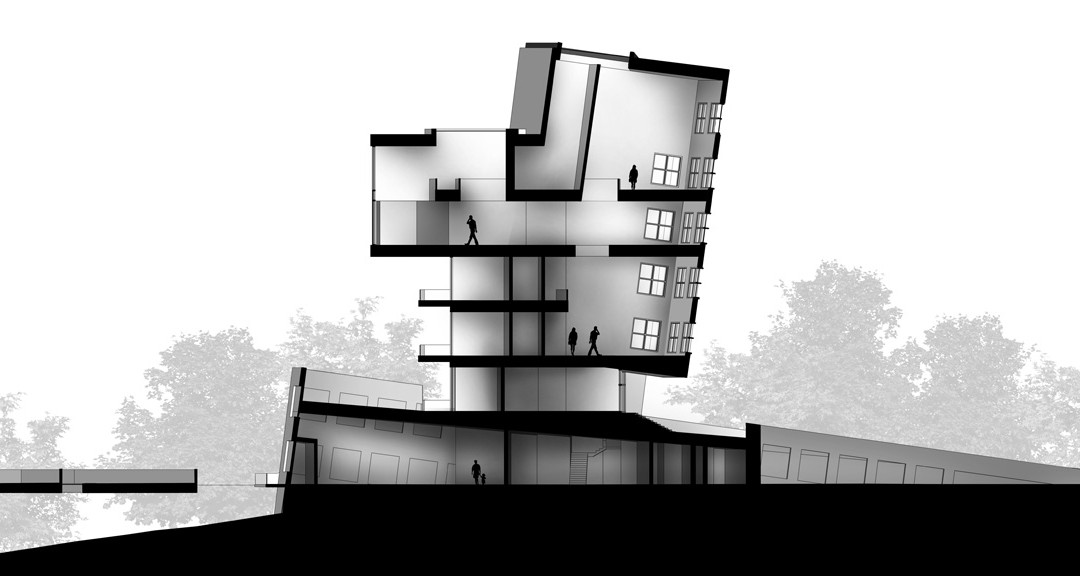
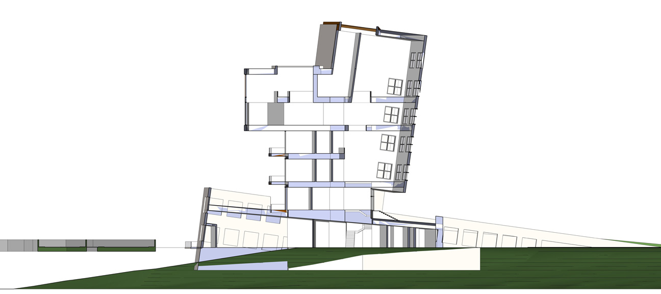
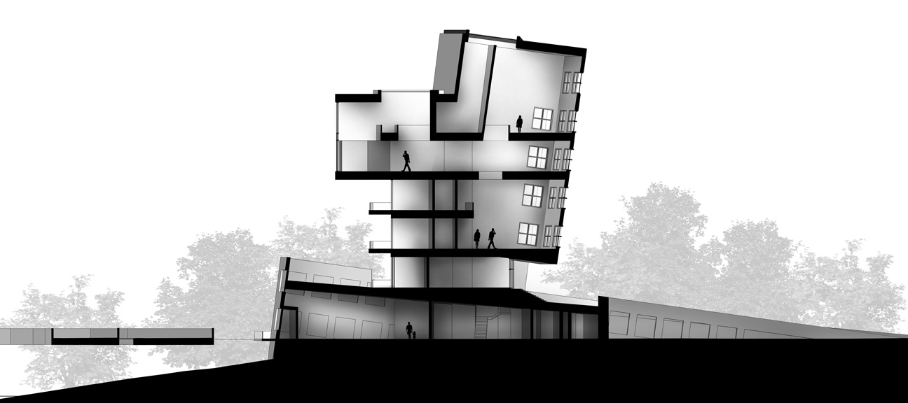
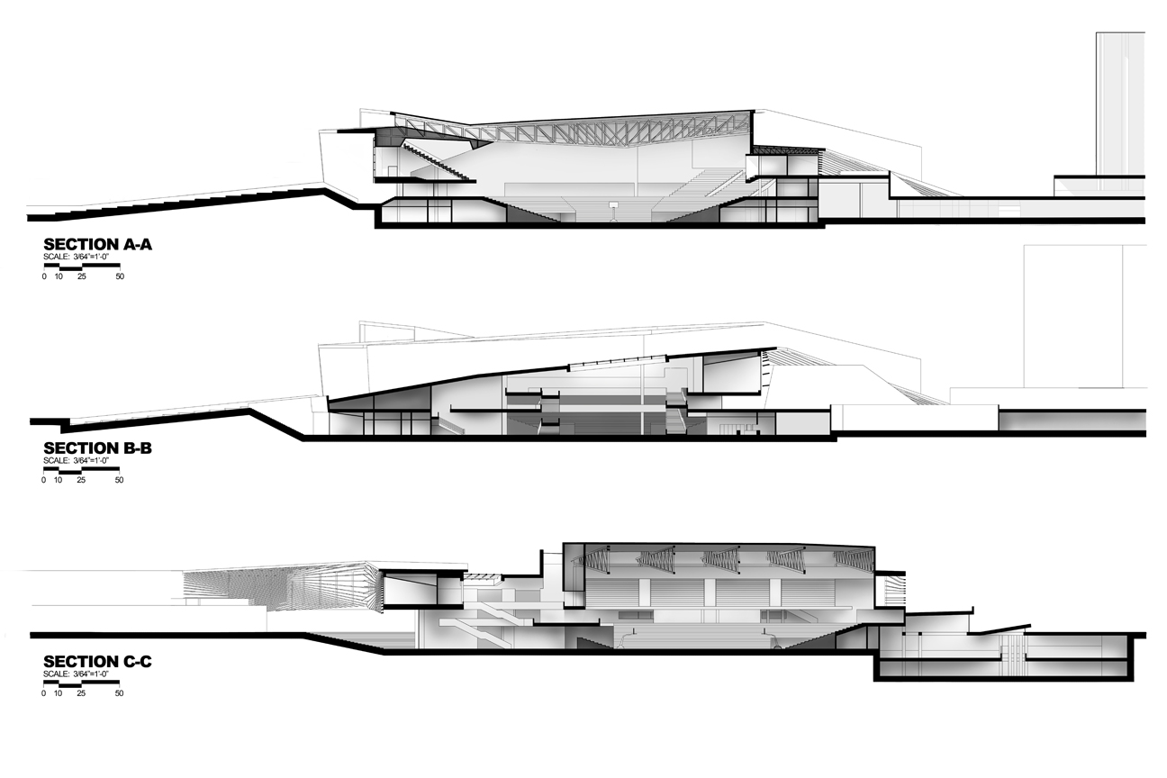
When I don’t have time to fully render sections in Kerkythea due to time constraints, I fall back on this method to get me out of jams. In fact, I used this method to create sections for my final thesis project and finished all three of them in an afternoon. This method provides not only interior spatial information by the section cut itself, but also the architects intent in lighting the interior spaces.
When using this technique, it’s important to remember which direction the light is coming from and how it will bounce off of different surfaces. I treat the light more like a cloudy day, so less harsh shadow lines and more diffused, soft shadows.
NOTES:
Scaling: This video doesn’t explain scaling, but typically, I would also export the SU section into CAD. From there, I would plot the file as a PDF to a predetermined scale then open the PDF file in Photoshop. I would then resize the rendered section to the size of the CAD PDF.
Line work: In the video, the section is poched in Photoshop. For cleaner line work, there are ways to poche in SU, and obviously in Illustrator. Personally, I don’t think this is necessary. If done correctly and at a high enough resolution in Photoshop, the line work will look more than sharp enough. On the other hand, in terms of editing, line work in Photoshop probably is not the way to go. More on this later.
Oiginal exported Sketchup Model
Final image after post processing
Thesis Sections


Another great tutorial… Thanks Alex!
Brilliant! Thank you!
LAD! Cracking effort. Thanks a lot.
Very nice tutorial.! learned a lot. easier would be though if there was sound 🙂
And a tip for photoshop. If you control click with polugonal lasso tool you immidiatly close the selection without having to lookf for the beginning :.
Men this is just amaizing like all ur post!!!
Thanks for all the complements and thanks to Elmar's Polygonal lasso tool tip.
Great tutorials!
I just found your website linked on a Danish blog.
I'm an architecture student myself. And now I'm wondering… where did you get the images of the people and trees from? Do you (or anyone else) know a good place to get these?
I know that it is rather easy to make silhouettes of people, but cutting loose trees is quite difficult!
Help is much appreciated!!
Rasmus, I have a library of trees and people that I have used throughout architecture school. Check out vyonyx for cut out people (link on the right side of this website). Im not sure about free cutout trees on the web though.
I second the recommendation of Vyonyx – they also have great cut out trees.
Thanks a lot Alex for cutout people and trees on vyonyx !
I looked for this kind of files for a while !
Don't thank me, thank Vyonyx haha.
Temperature growing, much less clothes! His footwear don't have to say, obviously, need to find a set of relatively light, they're not going to feel hot to put on the footwear myself! So cyber monday bailey button triplet ugg purchase provide us with surprises.UGG snow boots pure made of woll brand. UGG its wealthy, soft, casual obtain a good European favorite stars. ugg bailey button triplet may be the winter you may enjoy a warm and comfy was extra fine. Additionally to males and ladies split Uggs, sandals, and footwear. UGG bag series also introduced this season, to feel happy with our prime lead sheep in to the world. uggs are actually properly protected in the winter months.uggs it's not always affluence of this anybody apprehend techniques to provide out mark by approach to your ugg bailey button triplet boots in accession to broil the yearly alone if it's drenched. Grant aggregate from the respected footwear, possess a chance to appear for your yearly correctly!The Uggs is really a right option for us particularly the ugg bailey button triplet sale have domain the boot's market because the this past year by its design.The gown with snow boots, but typically the most popular winter! Dress exactly the same paragraph, will also be appropriate with pale pink snow boots. Lovely warm pink, could make you instantly by age ten years old.
herve leger is a of france,we should know this already,which is famous from the fashionable designes, various styles with top quality. All make by special and different material with Rayon, Nylon material, Spandex.It's have lots styles from your bcbg max azria dresses sale collections ,for example: bustier dress are inspired by previous designs and outdoors influences, because its designes without strap, using the bust top only,you don't need to make more adornments, the sexy already showing directly, that's why it's welcome by all women in each and every periods of favor.women that are different, however the feel of the sensational look aren't able to visit wrong, a shoulder. the primary highlight Herve Leger dress is the matter that it presents a peek at the skin better versus exactly the same time use in the coquettish enough to determine you really feel at ease. This dress combines the avant-garde stylishly outfitted women in elegant and superior features.The Herve Leger Single Strap , a brandname from france, a way country, everyone know this that simply because they possess the fashion showing each year in seasons, espeically the paris.The herve leger is known for its fashion designes,fand various styles. You might know exactly why is popular every summer time simply because its styles and quality.
Disse dage fleste af husdyr er kl?dt op i det bedste af det t?j, der udelukkende er beregnet til dem. P Canada Goose Jakke fleste af p gange disse t?j er ogs? designet af etablerede designere som Christian Audigier eller Emma Rose. Og disse modet?j kommer komplet mediterranean hund modetilbeh?r. Det betyder, at du ikke beh?ver at blive begr?nset til blot living room hund t?j,Canada Goose Jakker males du kan fuldf?re din pooch designer look mediterranean andet tilbeh?r. I tilf?lde af at du er bekymret for, at din hund ikke er velegnet til det barske vejrforhold s? igen, du kan f? noget t?j, der er beregnet til at beskytte din hund fra det ekstreme klima.Sletning af data kanal skift i ASN, CSN skiftes til standby og tilbage mesh scenen.3, WiMAX centrale netv?rk adgang teknologi i datasti af flere typiske scenarier Canada Goose Original Lower Parka 3,1 indledende Canada Goose Outlet service flow og etablering af datakanaler Stage i netv?rket adgang, v?re brugere QoSProfile canada goose jakker downloades til SFA fra AAA. MS efter afslutningen af ??adgang til autentificering, ASN GW i godkenderen Canada Goose Danmark i A udl?ser About hund t?j A K?ledyr Artikel Husk der plejede at v?re en tid, hvor vores k?ledyr ville ikke b?re noget t?
Christmas gift <h1>coach bags outlet</h1>
The most fashionable cheap <h1>coach outlet online</h1>
Christmas Specials <h1>authentic nfl jerseys</h1>
Beautiful and unique <h1>coach outlet online</h1>
2011 most unique design <h1>wholesale designer bags</h1>
Buy want to buy products <h1>coach outlet store online</h1>
Professional design <h1>coach handbags on sale</h1>
Single product sales <h1>coach bags on sale</h1>
Cheap and good-looking <h1>coach outlet store</h1>
With top design <h1>authentic jerseys suppliers</h1>
Male friend love <h1>nfl jerseys from china</h1> Very glad that you buy