If it seems like I have been posting less and less lately, it is because all of my time has been going into my next portfolio. This book has been in the making for the past 3 years. However, I have taken the last several months to invest all of my free time into developing tons of new content, finalizing the graphics, and writing. I finally feel I am in the homestretch with just a few more things to button up. The last steps will be getting some test prints and have a few friends give me their last minute critiques.
I am usually pretty good about managing my time and setting internal deadlines for myself, especially when it comes to renderings. However, with this book, I have become obsessed with having every square inch of it designed. This includes designing the table of contents, the title page, the forward, and all of the other non-project pages. For each one of those spreads I am creating multiple iterations to get to the final design.
I should also point out that with this portfolio and many of my others, I purposely don’t setup a conceptual framework that then informs the design and layout of all of the spreads throughout the entire book. Instead, I treat each spread as its own style which gives me freedom to explore with a lot of different ideas and experiment with multiple graphic approaches. This makes for what I think is an interesting book to look through as well as a place to pull ideas from. But, it also means it takes a lot of time to work through and design of each spread.
The one part of my portfolios that I always seem to get lost in the design of is the cover. Partly because I realize the importance of the cover and partly because I always struggle with how complex or minimal to go with it. Early on when I was in school, I tended to go more complex. Today, I lean minimal. Because the interior pages have such highly textured, colored, a geometrically rich graphics, I like the idea of contrasting the interior pages with a super simple cover. With that said, whether the cover is minimal or complex, I always have a ton of ideas, many of which I fall in love with early on and have trouble distilling down to one final choice. If it were up to me, I would print 10 different books all with different covers, but that obviously isn’t practical.
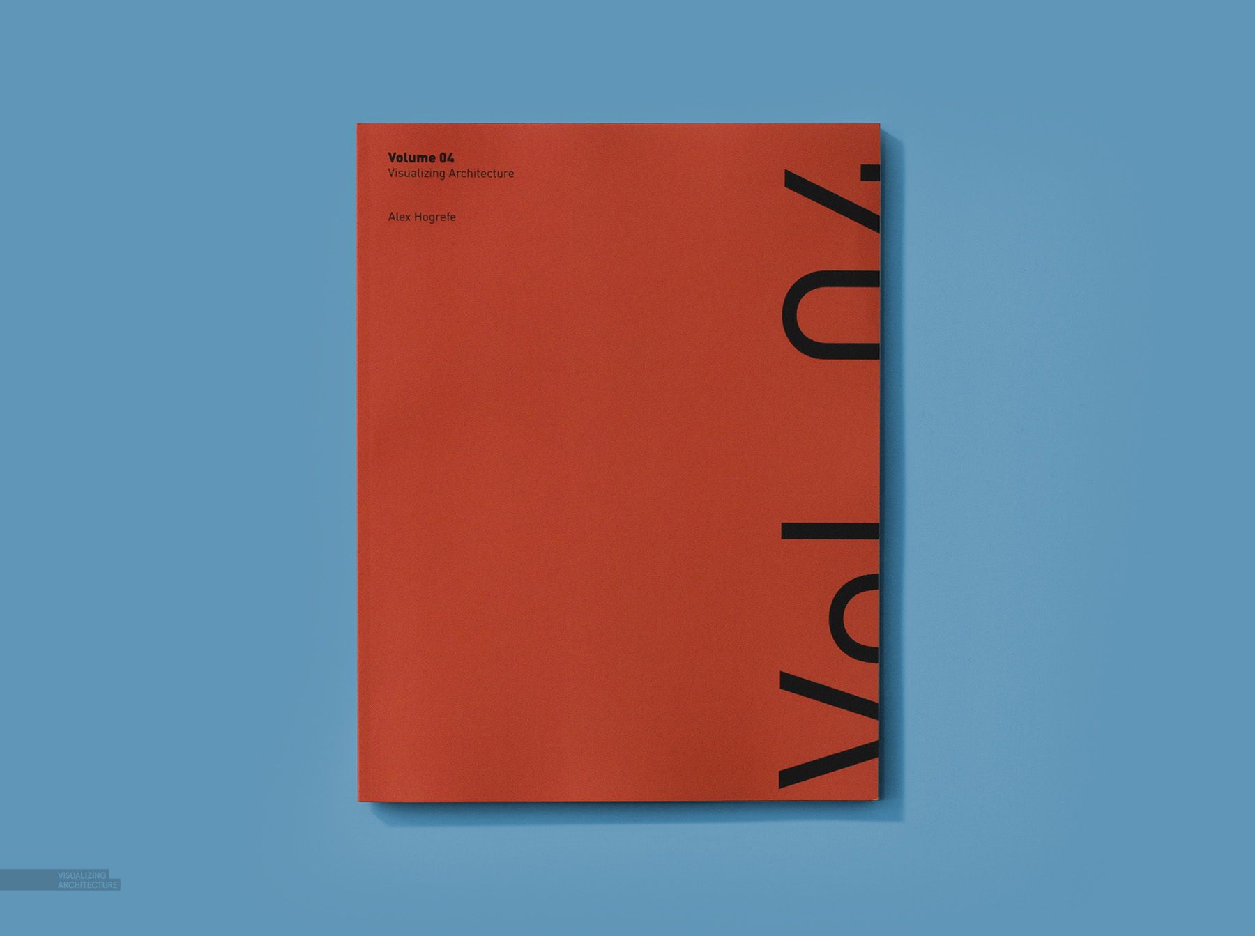
I see these portfolios all the time, so when I design them, they first and foremost must be something that I enjoy looking at. With my last portfolio, volume 04, it was extremely minimal and really came down to color. To this day, I like that red just as much as the first day I saw it.
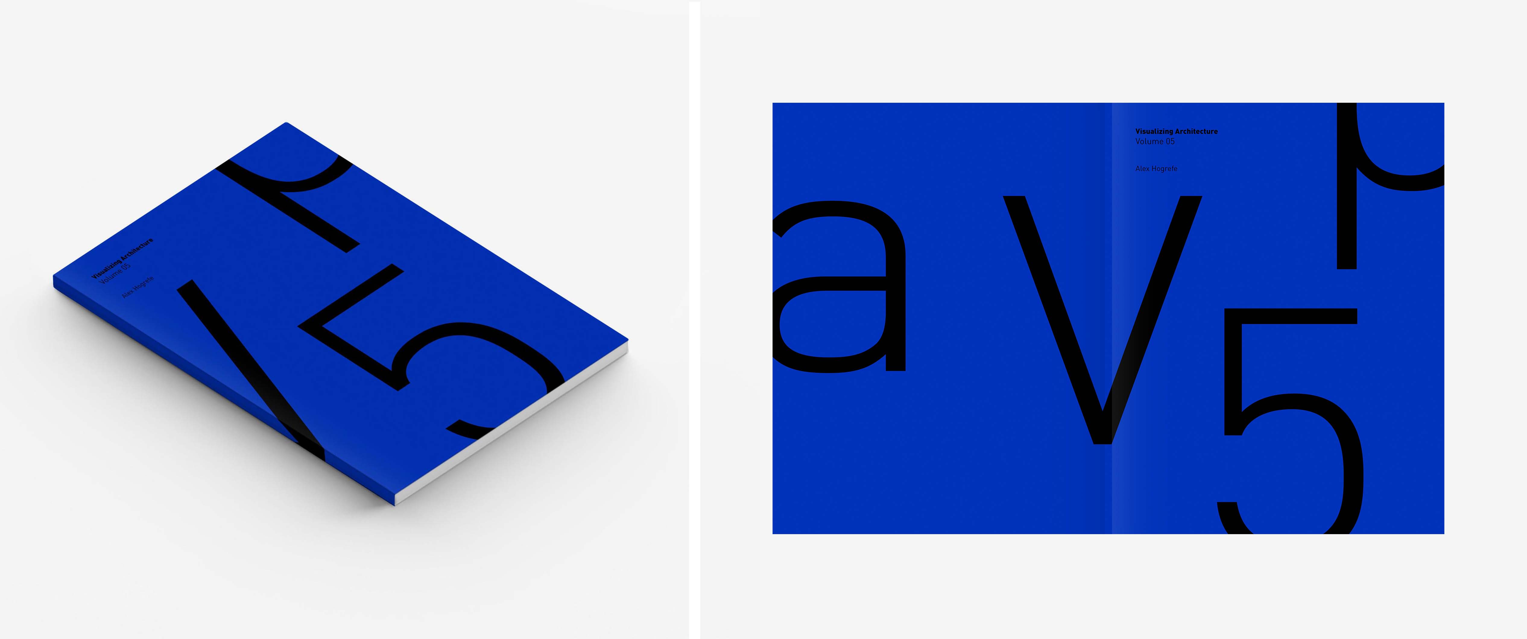
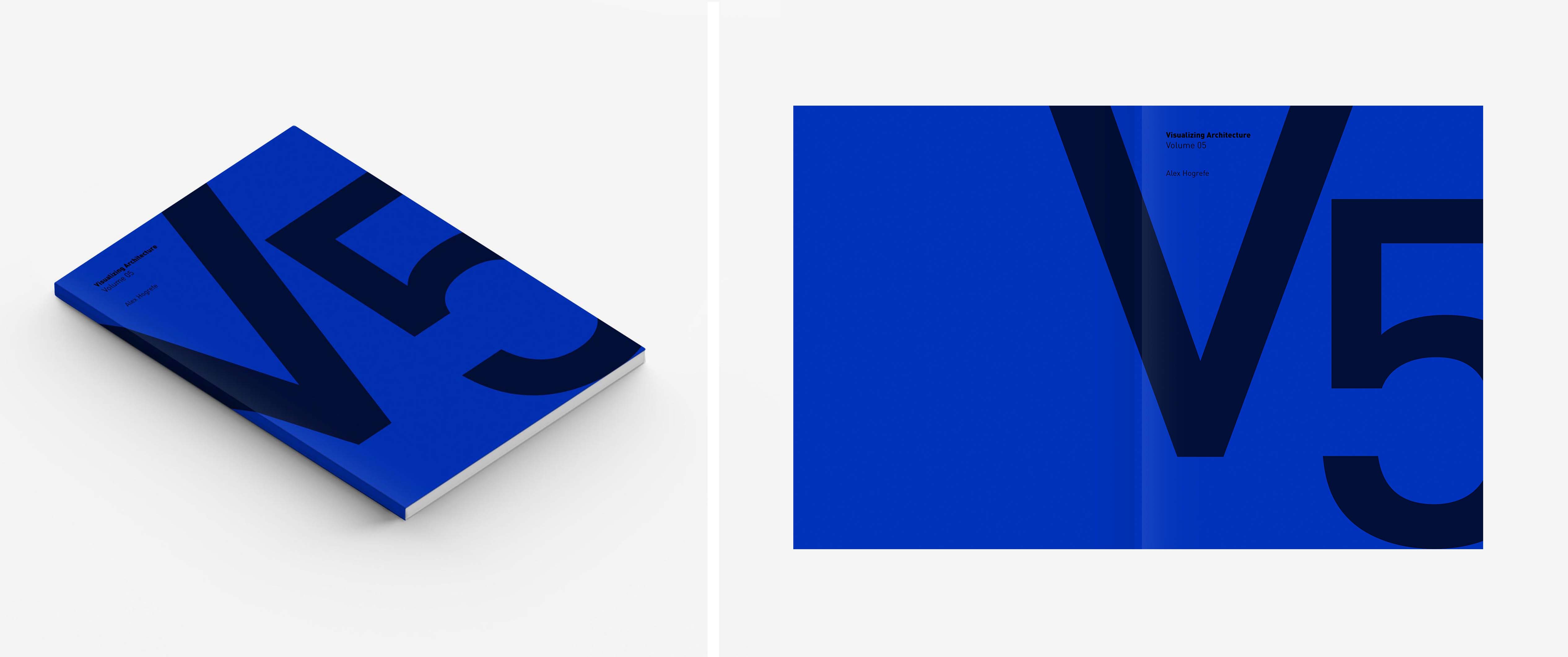
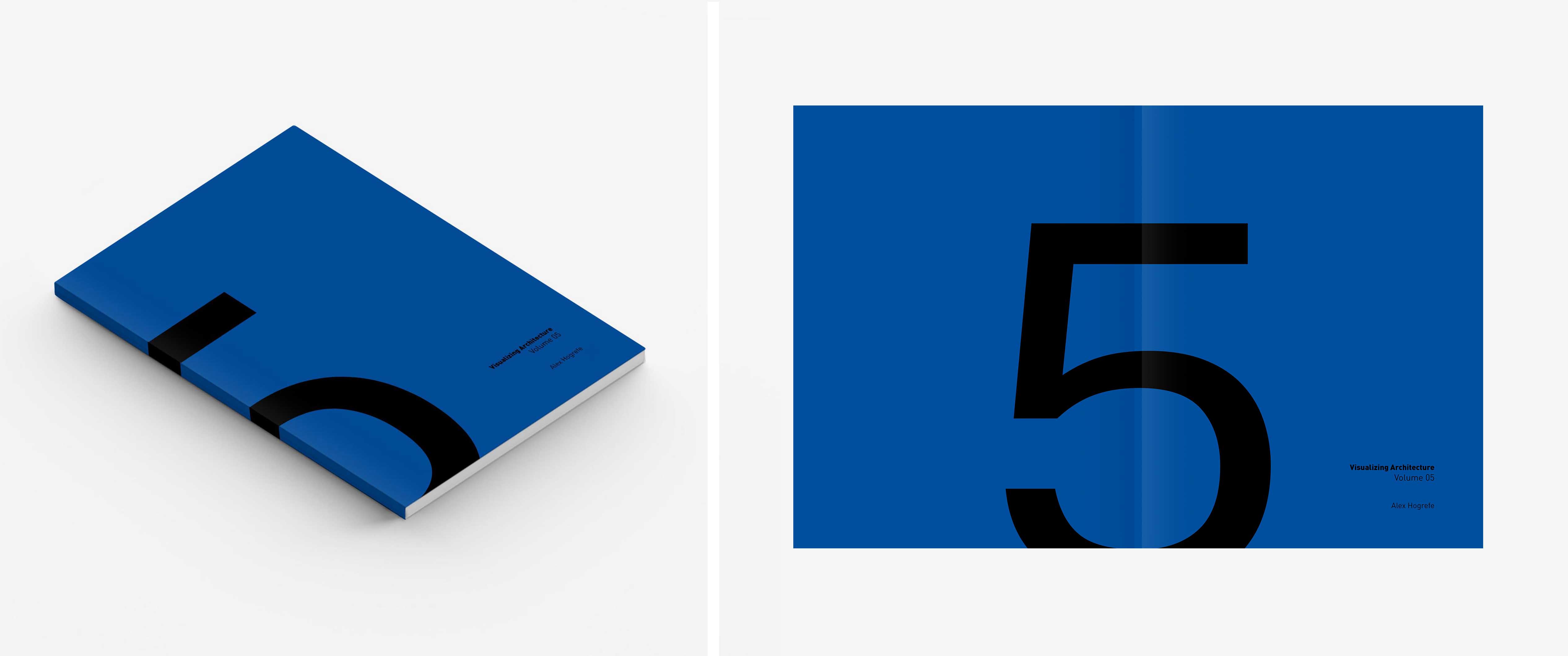
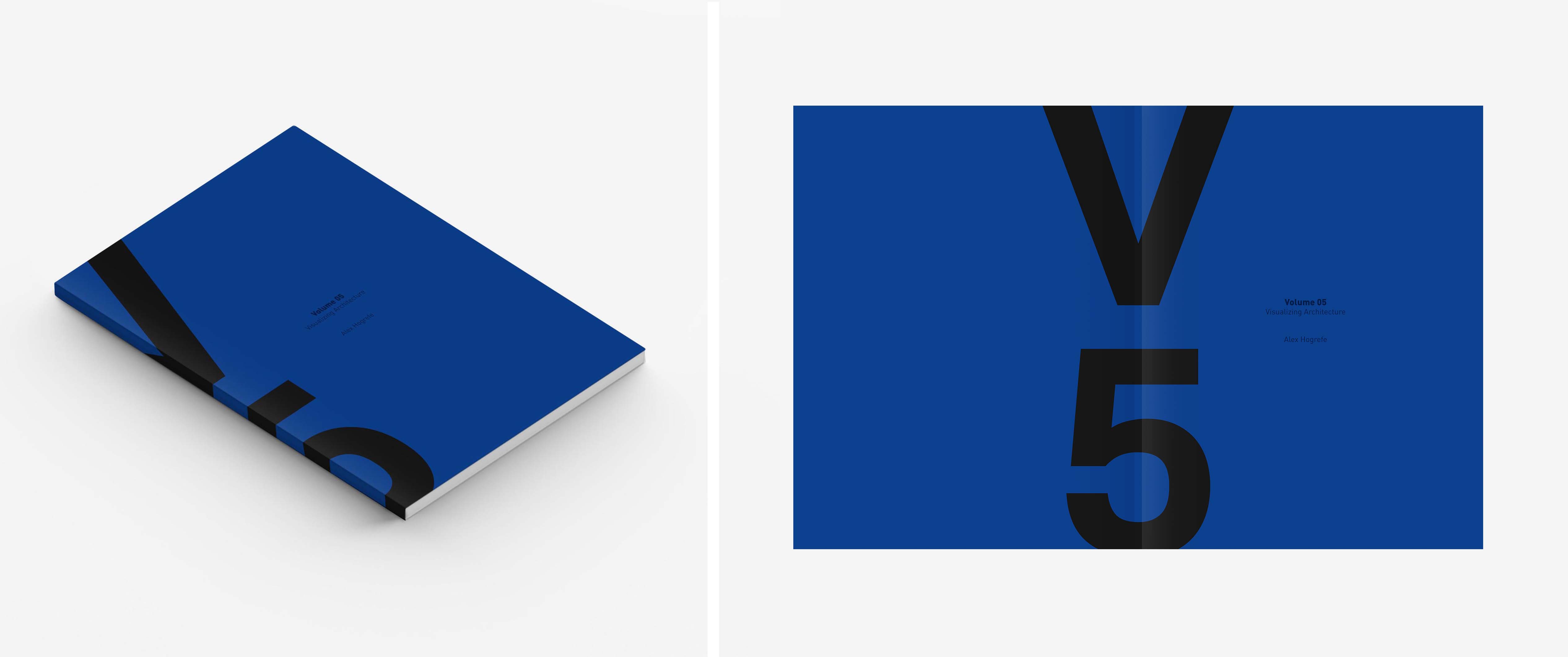
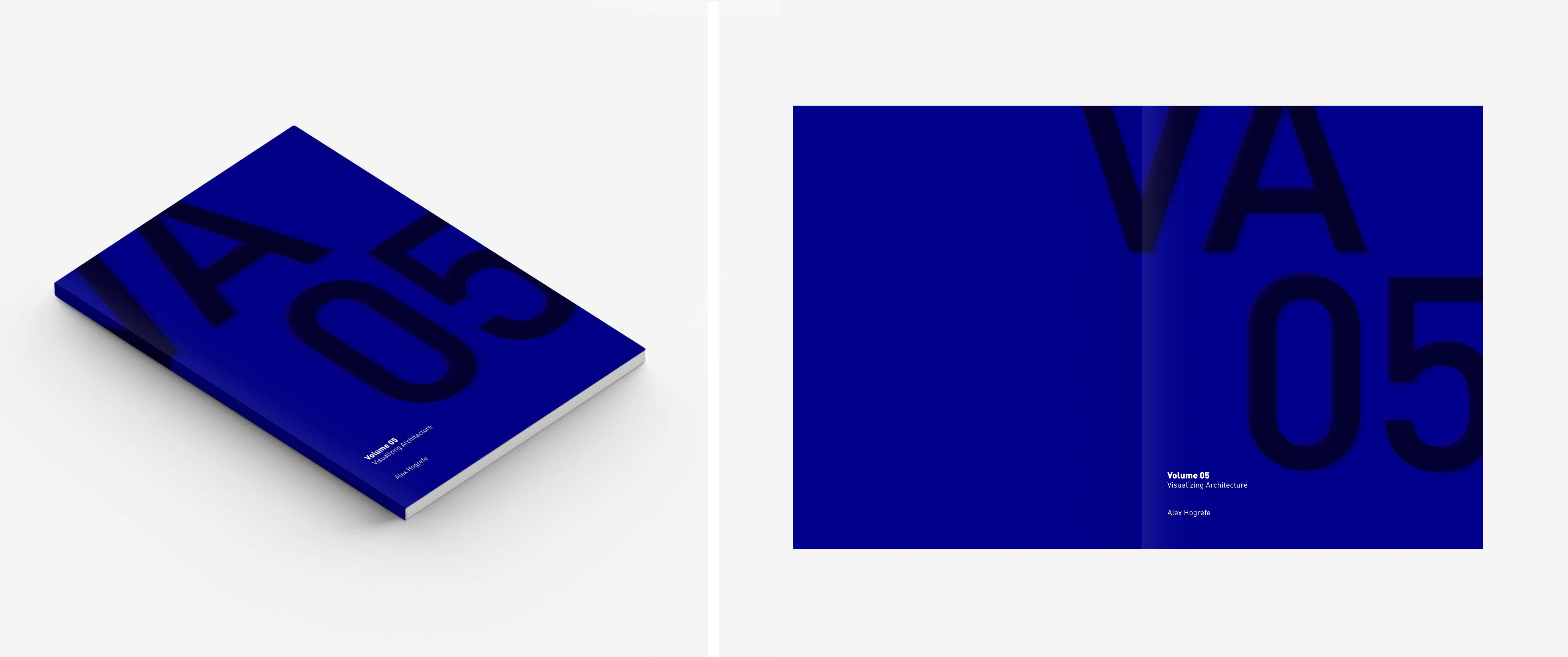
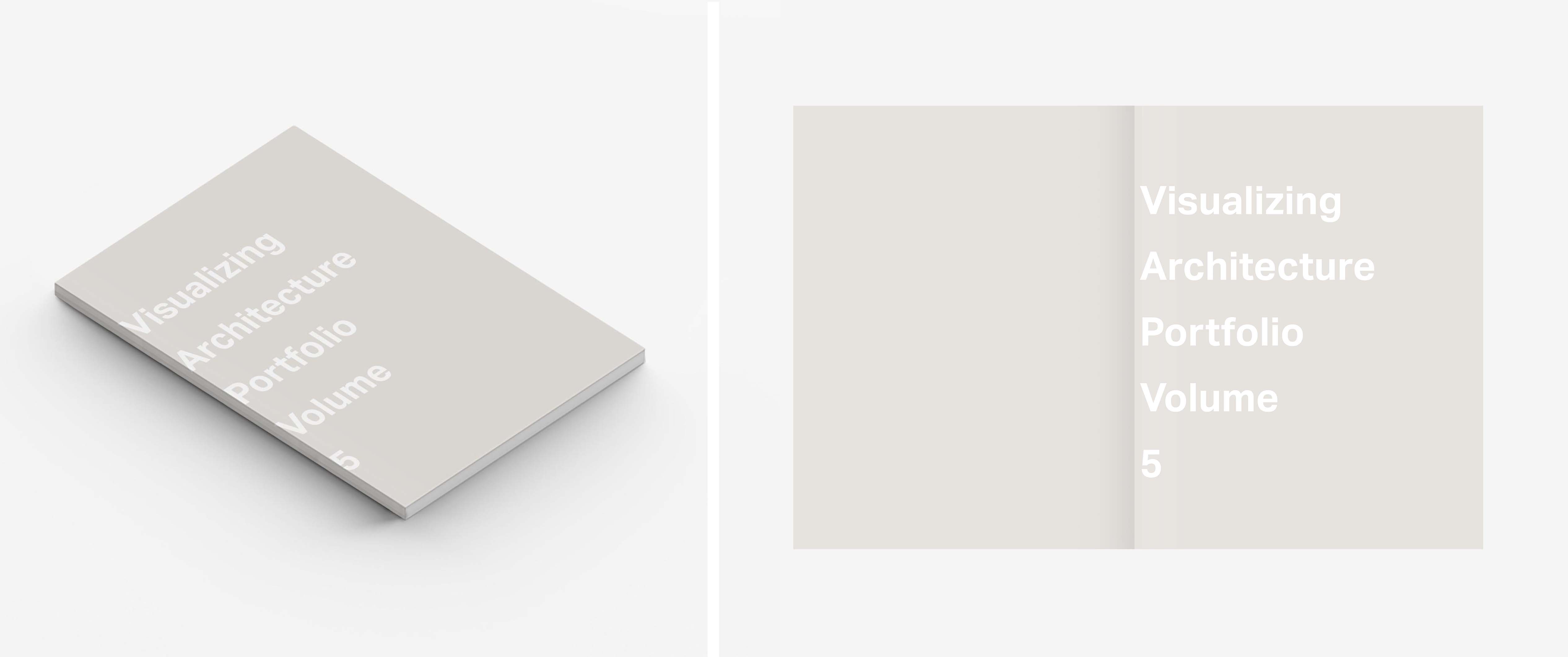
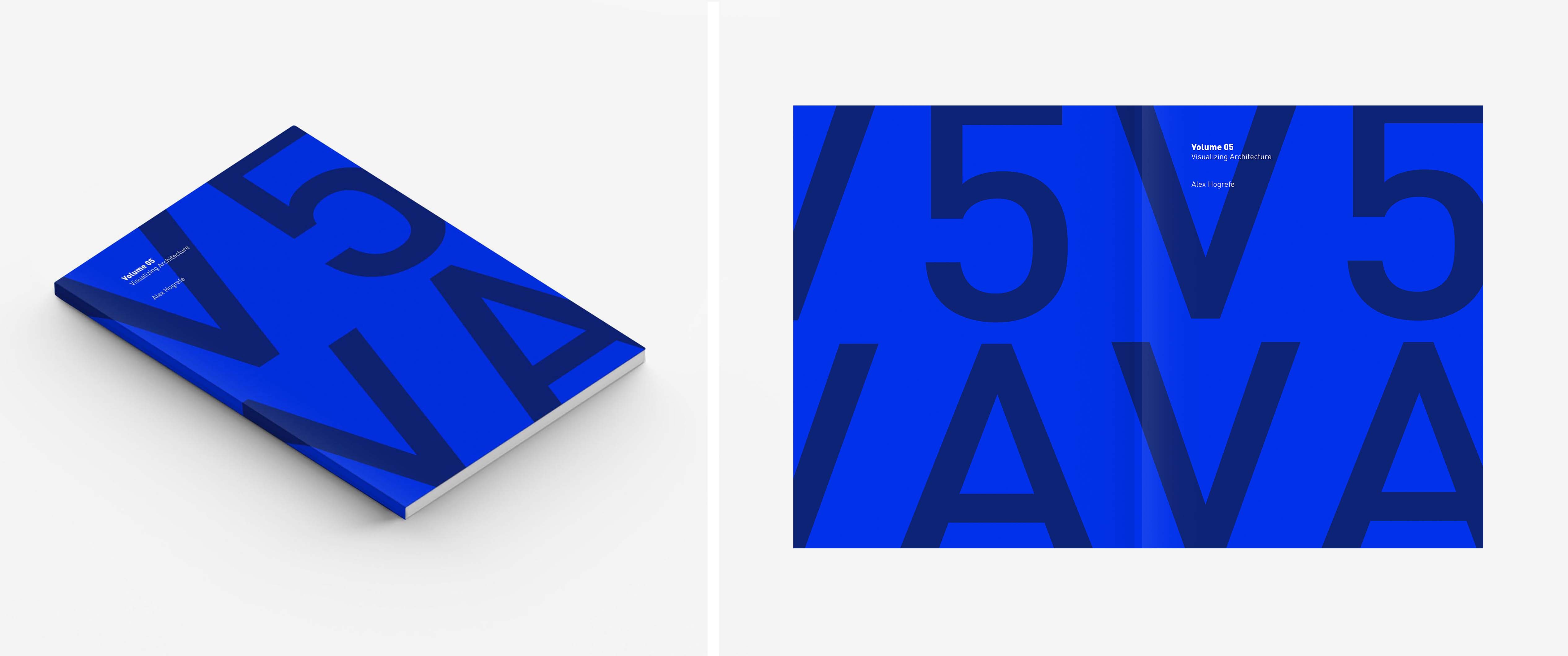
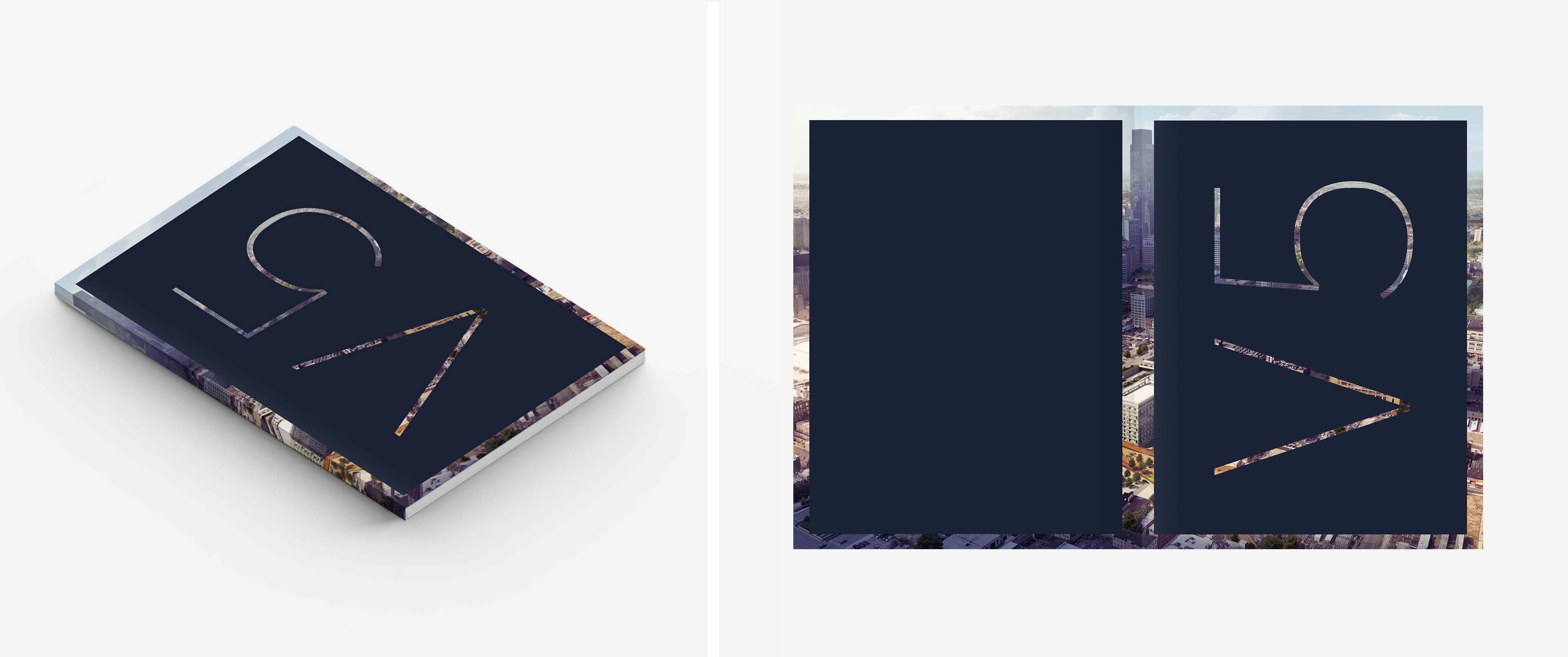
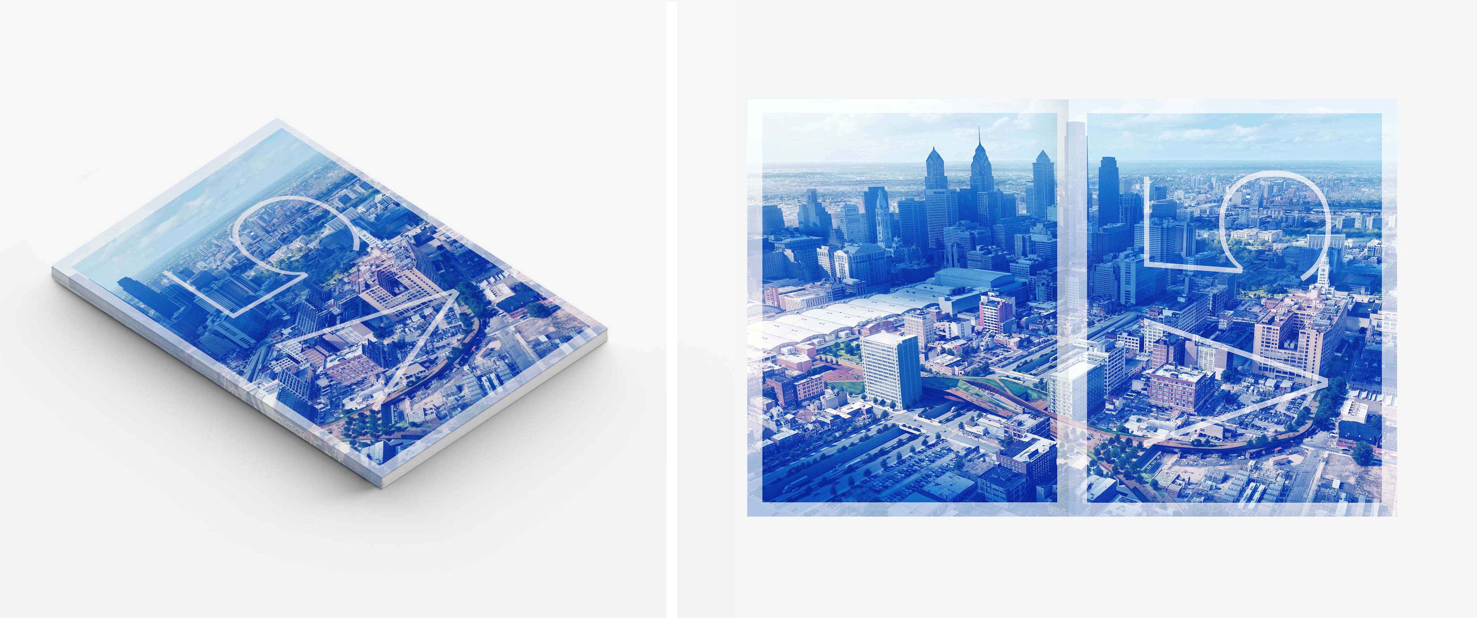
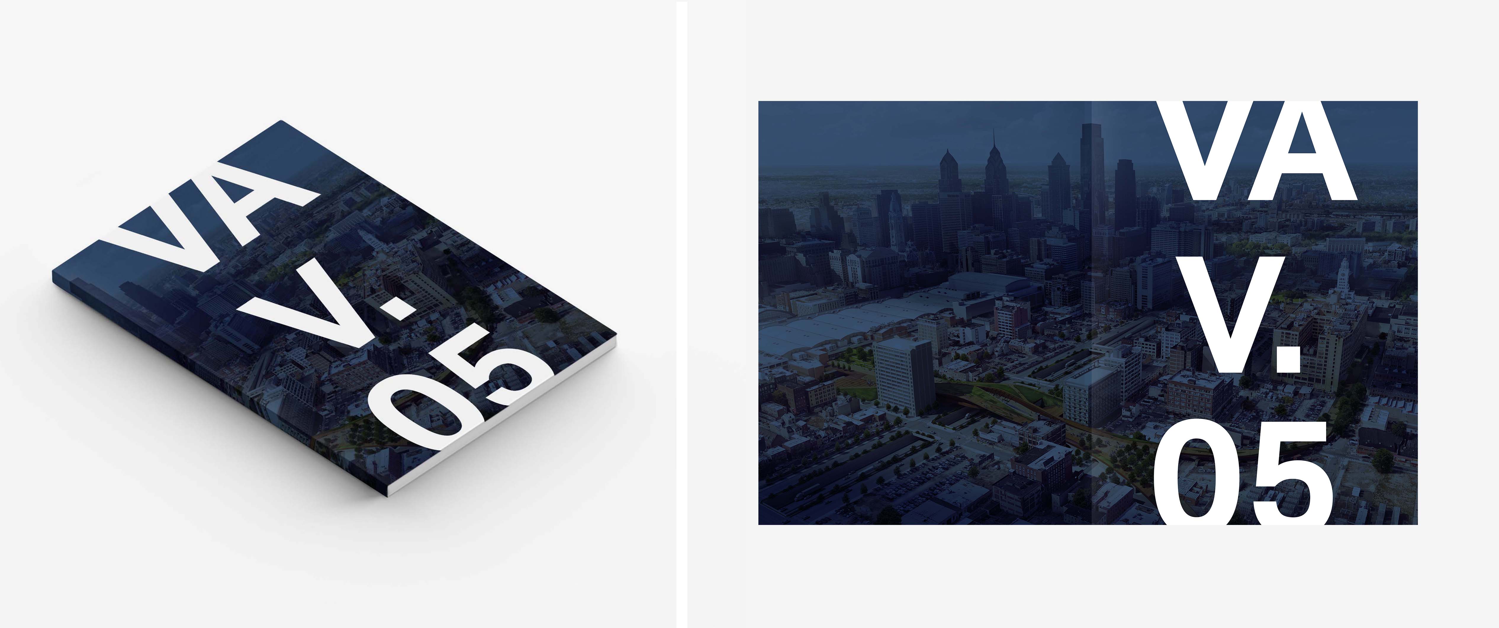
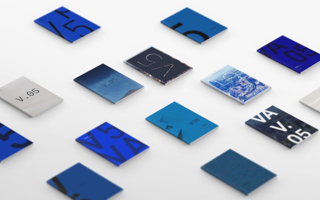
For Portfolio 05, I am leaning towards cool blue hues for the cover. I still have not decided whether I am going to relate the style to the Volume 04 cover or go with something completely different. There are positives and negatives to both options. Below is the group of designs that I have narrowed it down to. The final will most likely be some combination of the options below.
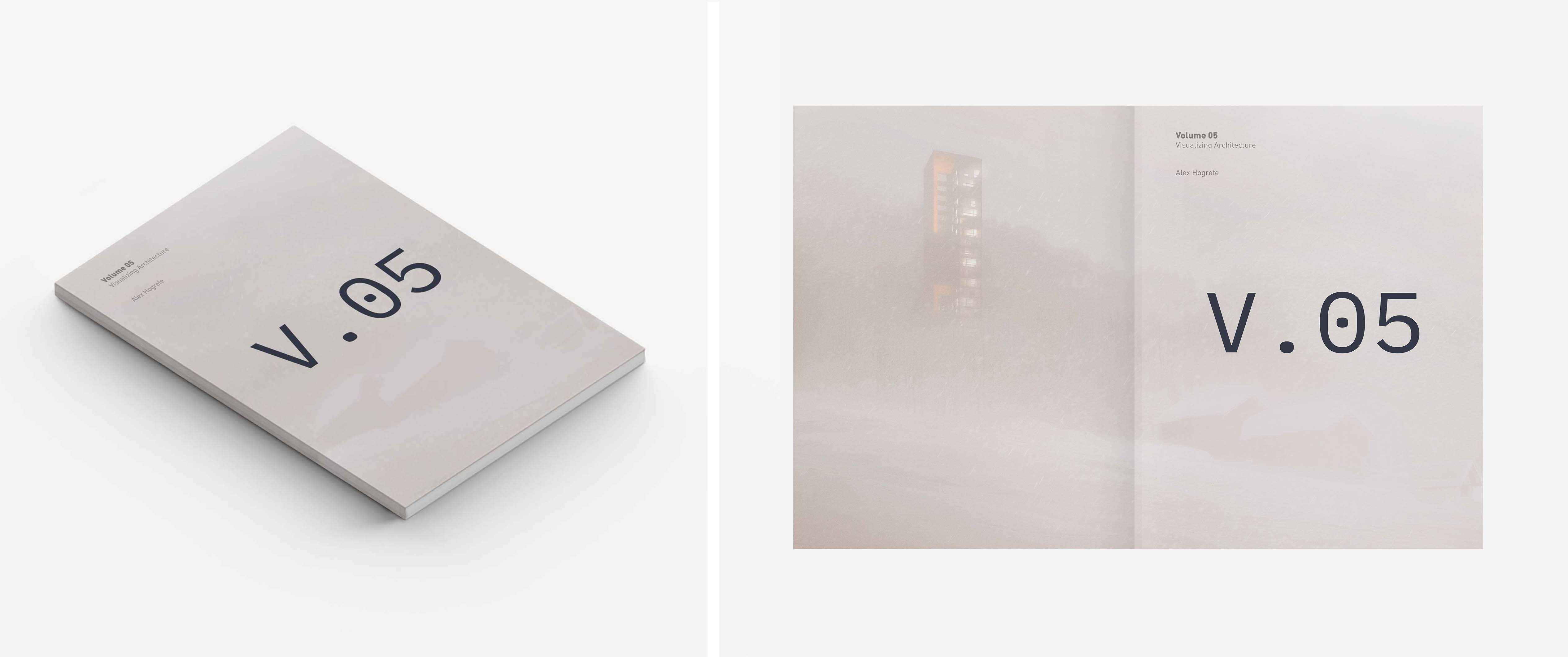
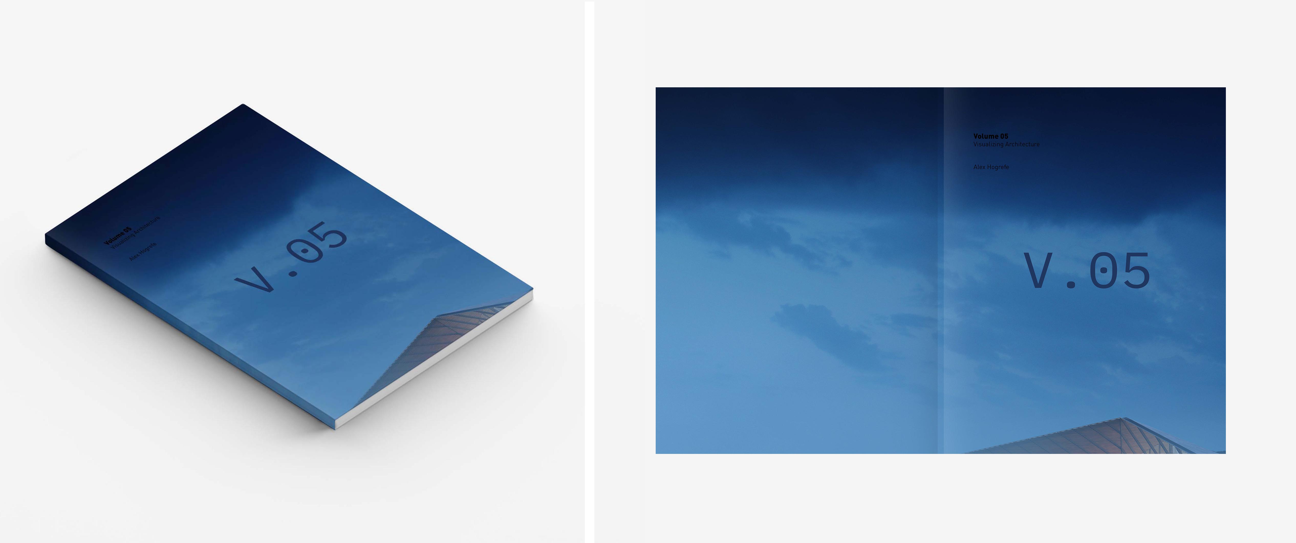
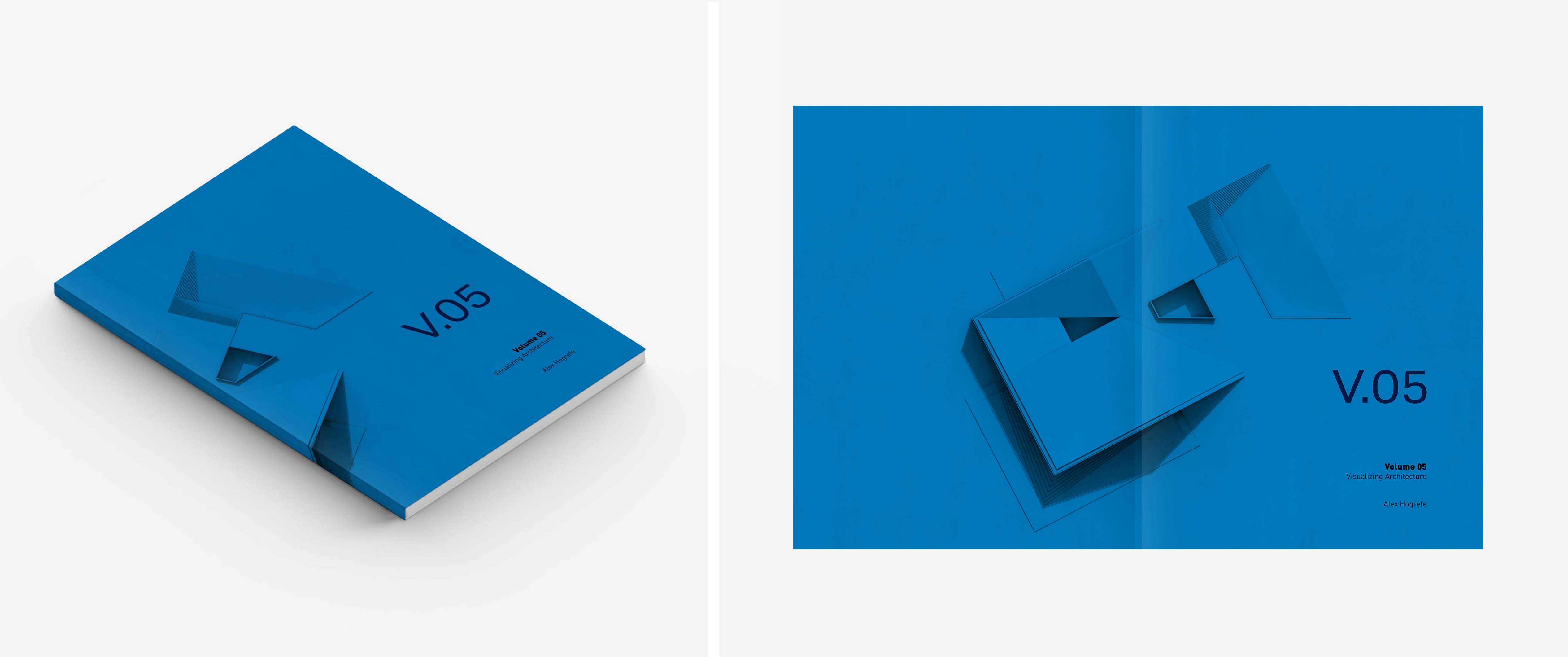
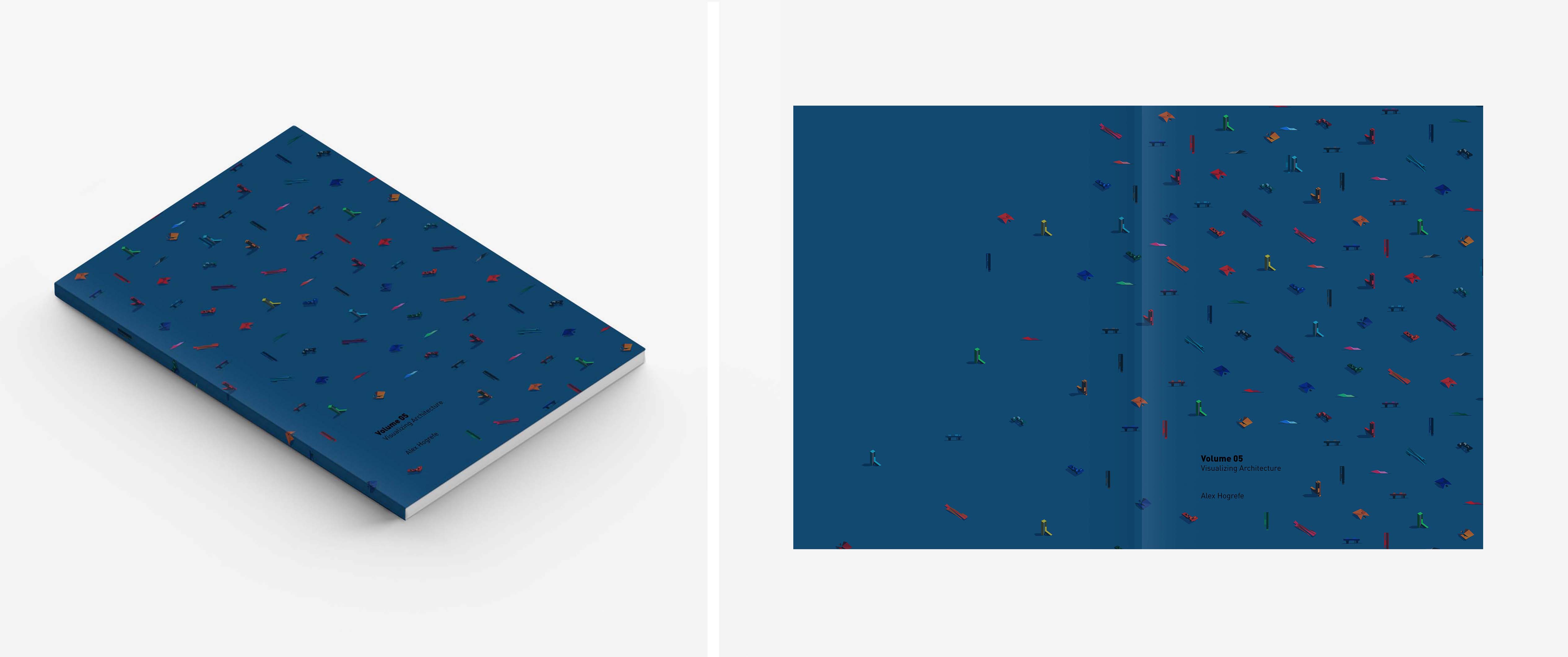


Love option 13…bad ass……can you explain how you compose road markings and asphalt…..such a minor detail but creates such a better image in the end.
3,4,8,10,13 I don’t mind number 9 either. Nice work as always.
Option 11 looks so promising. I think you can tone down the blue color or use some other color to highlight your project icons. This option also increases the curiosity of an individual to look inside the portfolio for detailed content.
Agreed. I like how it doesn’t limit the cover to just one of the amazing projects, but hints at all of them. Perhaps use the blue from option 10. Could potentially increase the size of the icons as well.
great work as always! what’s the release date?
Option 06, Option 08, Option 11, and I think option 13 looks really good but could have a similar gray to covers six and eight. As always I love to see your work. Excited for this one to come out.
Awesome designs! Love generating variants, a bunch for everything… although the power of the original idea is never dying. Volume 04’s cover is solid! So powerful. For the 05 Volume – at first I, immediately fell in love with No.10 (felt connection with the oldest tutorials and designs i saw and learned from you), at second look i liked the “trippy” deepness of No.07 (and it is pretty cool to discover the effect at the second glance, simple yet showing more). Keep searching and sharing you.
I personally prefer options 08 and 09 – they seem like a small departure from the Volume 04 cover while still keeping with the idea of a minimal design. I appreciate that they are a hint at a rendering without being a complete image or full color version. Keep up the good work, I’ll be hanging on my seat to buy this when it comes out!
Option 11 looks really cool!
Option 8,option 10, option 11 looks amazing for me. I love your working efforts.
Thanks
Actually all option good but Option 13 very good looking.
I love option 10 and 13. Both looks cool
option 8 and 10
I like options 2-4 because it plays off of the last volume and makes it read more like a series/collection. I also like options 8 and 9. Although they feature your work on the covers, its been subdued in ways that allows the text and work to both stand out. These look great. I’m excited to see what you end up choosing.
I guess the final result must be one of option 1,option 11 and option 12!
Great work! 🙂 I like the first one more (orange) and the Nr. 01.
Can I ask you what kind of blue (RGB or CMYK) did you used for the Option 7, 5, 2 and 1? Thanks 🙂
Hi Alex. These are looking great! I’m especially liking options 3 and 10. I love your work BTW. I’m a visual designer working in the architecture industry and I use your blog when I get to dabble in visualization. Thanks!
do option 14–it looks fantastic!
Hey Alex,
Read another post on your blog that’s very good. I like to read about your portfolio volume 5. It gives me more information about you.
Thanks for sharing…
Hello,
you always post great post with full of information so thank you very much for sharing such a valuable information. and keep posting.
In my opinion, the style of option 7 looked the best.