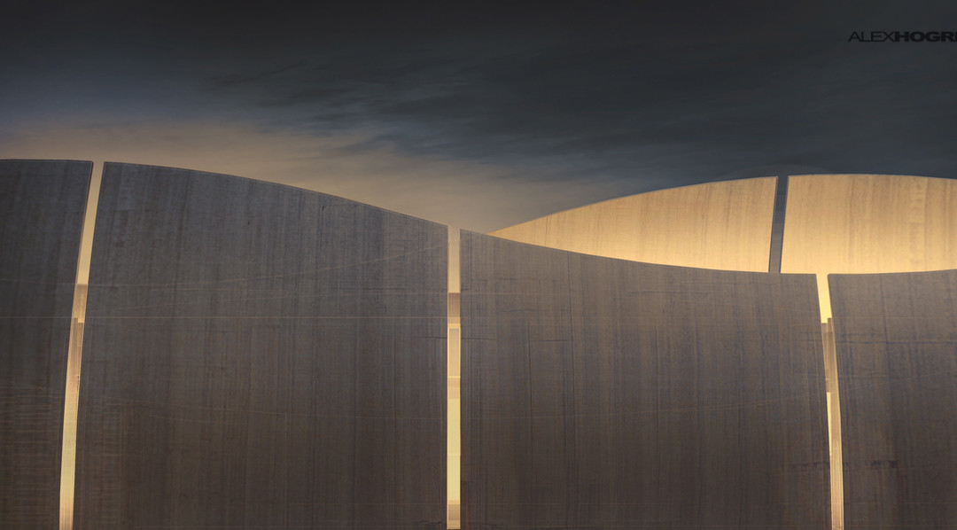
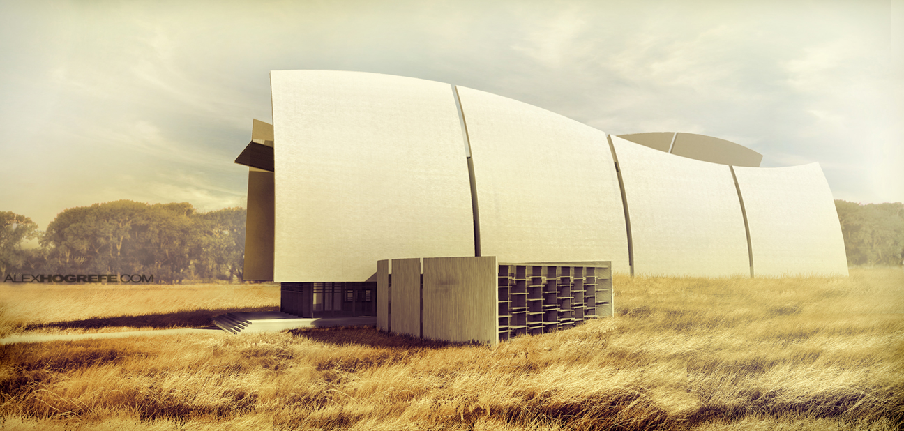
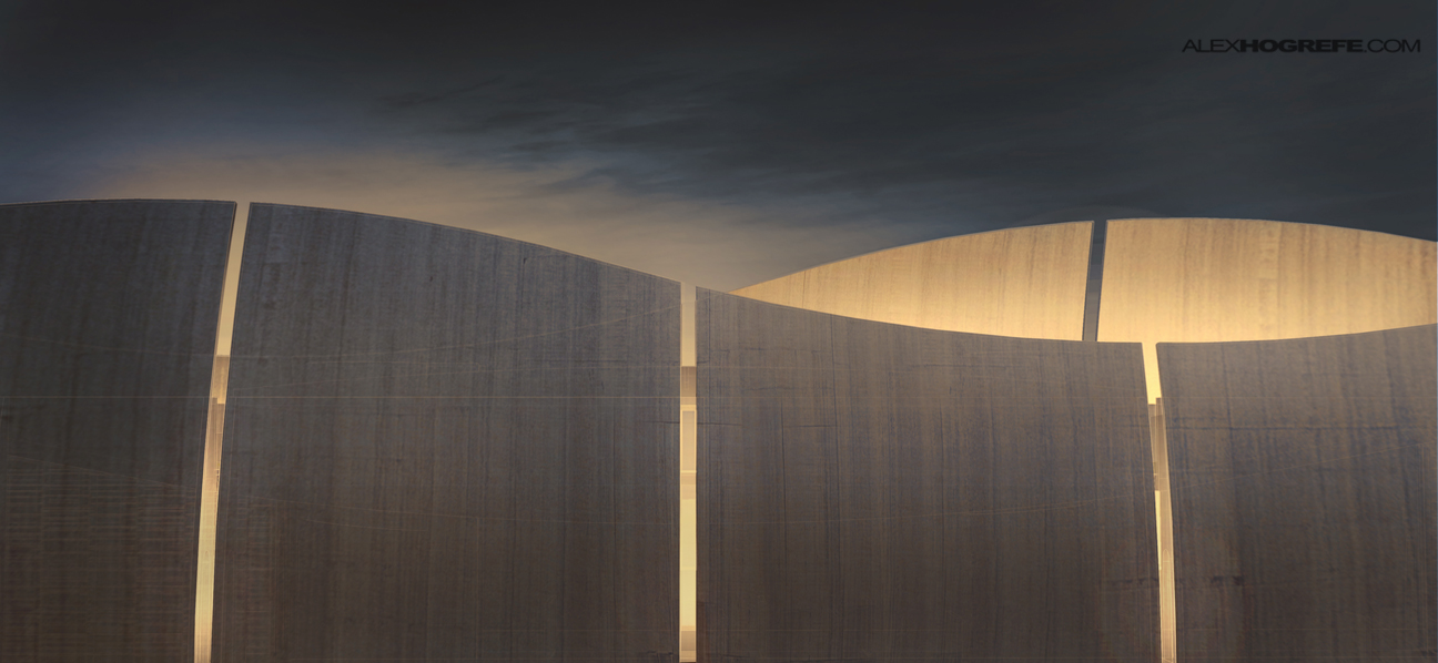
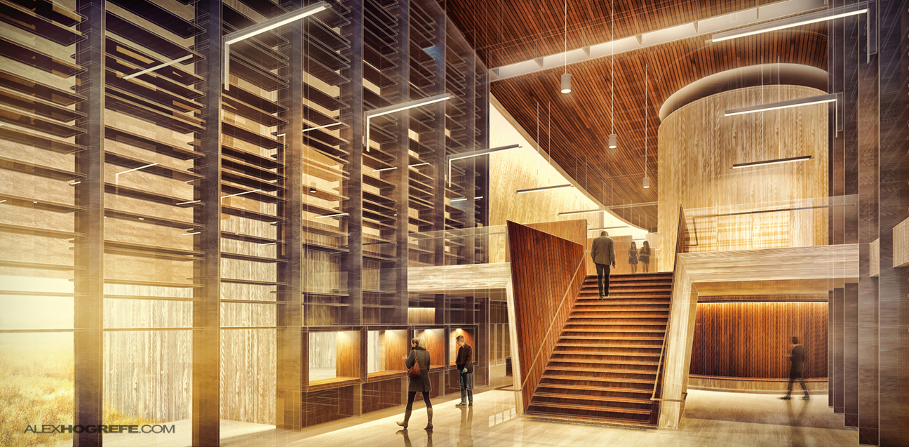
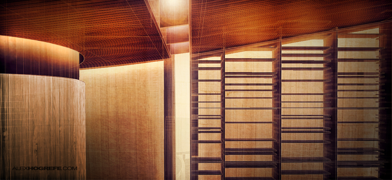
So much has happened in the past few weeks and I was amazed that it has been so long since I last posted. The past week in particular has been especially difficult to focus on the site. What I am posting this week is more or less a filler for a more in depth post that will soon follow. Below are a series of images for the visitor center portfolio pages that describe specific moments of the design. I have begun compiling the images into another 2 page spread but have not fully resolved the layout yet. More on all of this later.


Alex, your work is always amazing! I really love your style.
Hi Alex, really amazing work! The style of your first image is exactly what I try to achieve. Hope you can post the tutorial soon. Thank you for sharing all your impressive work!
It will be amazing posting a video tutorial about that interior… Best regards
Great work!
Great work!
Okay, you must post a tutorial for all of these images. they look great.
Alex, MERCI for sharing, amazing work!
Such a tease. Waiting for the follow up!
Goodness! That interior is gorgeous.
Would love to see a tutorial on the interior images
Great work as usual, again id love to see the tutorials for these renders. keep them coming Alex! cheers
Amazing. They are all tutorial-must!
Hi Alex,
Beautiful work as always, enough people have asked you for tutorials at this point so I'm gonna try a different tact!!! Is there any chance you would be willing to upload the psd file for the third image? I'd love to analyse it, see how you apply your overlays, adjustment layers, lighting, and so on.
Great work
Hi Alex,
Quick question – maybe more relevant to your interior elevation tutorials – what's a quick/easy way to flesh out room interiors other than modeling all the furniture or loading all that memory-taxing geometry from external sources? I see it as easily photoshop-able, no idea where I might find the images though.
Thanks
@Keith,
Im always hesitant to upload the PS files because of its size and also the fact that it is my personal design files. Maybe I could lower the resolution to the point that it solves both problems.
@Nick,
For perspectives, its too difficult to find images of furniture to match the perspective of the renderings and even then it never really looks quite right. I typically search for low poly furniture to keep the size down. If you are referring to elevations, then images work best because there is less of a need to match the perspective. To sum it up, I use 3d models for perspective illustrations and images of furniture for elevations.
Hey alex, any chance to share where do you get those 3d models for your scenes??
Great site btw!!! Always learning new things from your web.
Thanks.
Really a great job!
Awesome work, as usual!! I'm your huge fan and I learn a lot from your works and tutorials!! Thank you!
Do you think it's possible to create a tutorial of this rendering, where you can see a man going up the stairs?
I am sure, not only myself but also a lot of other people would appreciate this.. 🙂
Thanks again for all your great work!!!
Best Regards,
Inna from Frankfurt 🙂
Hi Alex,
I'm amazed by your work specially because when you explain it it seems so easy and that encourage me to give it a try!
Could you please, post a tutorial on how to make these interiors renders. I have a big problem trying to place lights and textures.
Thank you very much in advance!
Fabi
The style of your first illustration is awesome!!! did you use Topaz labs plugin for photoshop again? I`d be really thankful if you make a tutorial about it!
Thanks 😉
@Enrique,
I used Topaz on all 4 of them. Im still in the experimental phase but I like the results.
Hi Alex,
Great results. I really enjoy the exterior image. Where do you get your tall grass images from??