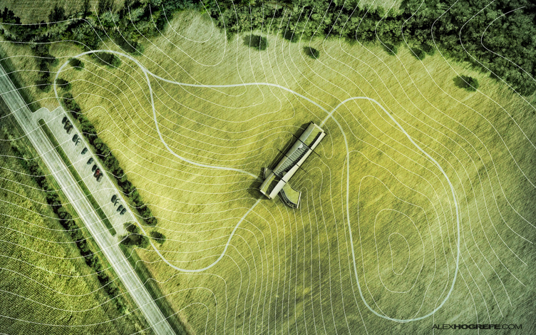
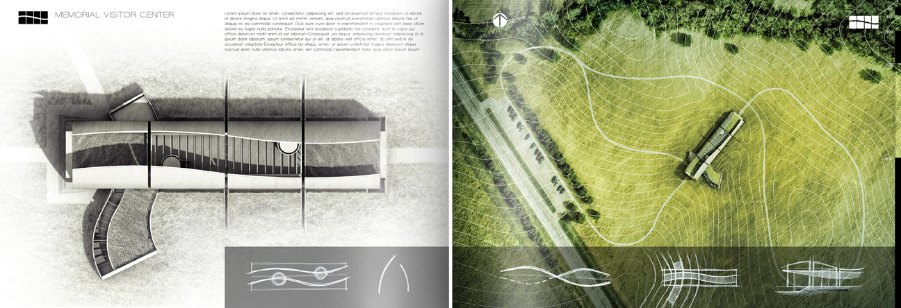
I put some more time into project portfolio upgrade continuing to develop the visitor center pages. The above sheets are a first pass at the layout and will serve as an introduction to the design and concept. Since the relationship to the landscape is such a crucial part of the design, I wanted the look to be bold and stand out in the opening pages. This meant desaturating the facing page and really playing up the color and texture of the site plan itself. Since the original project was designed so long ago, I had lost most of the information and therefore I had no idea where the exact location of the site was. All I had was an image of one of my old presentation boards. To get around this problem, I took snippets of satellite imagery and combined them together to create the final composition.
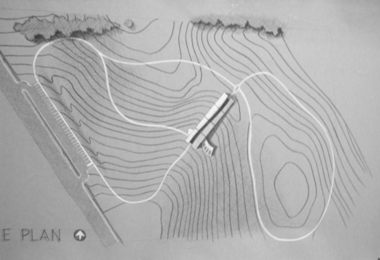
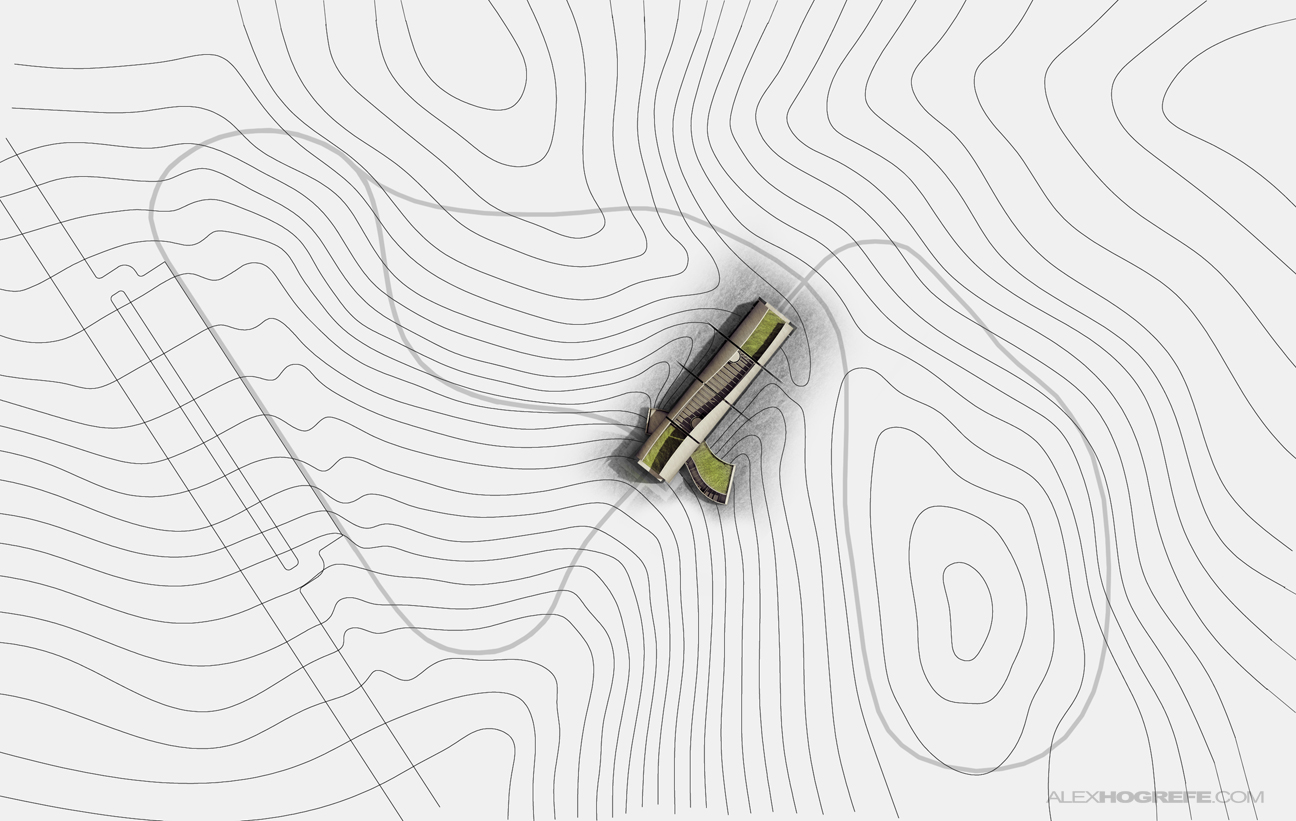
Above is the hand drawn site plan from the original project. I began by importing the image into AutoCAD and scaling it to the proper size. I then traced the topo lines and exported the line work as a PDF. This gave me a scaled base to work from in Photoshop.
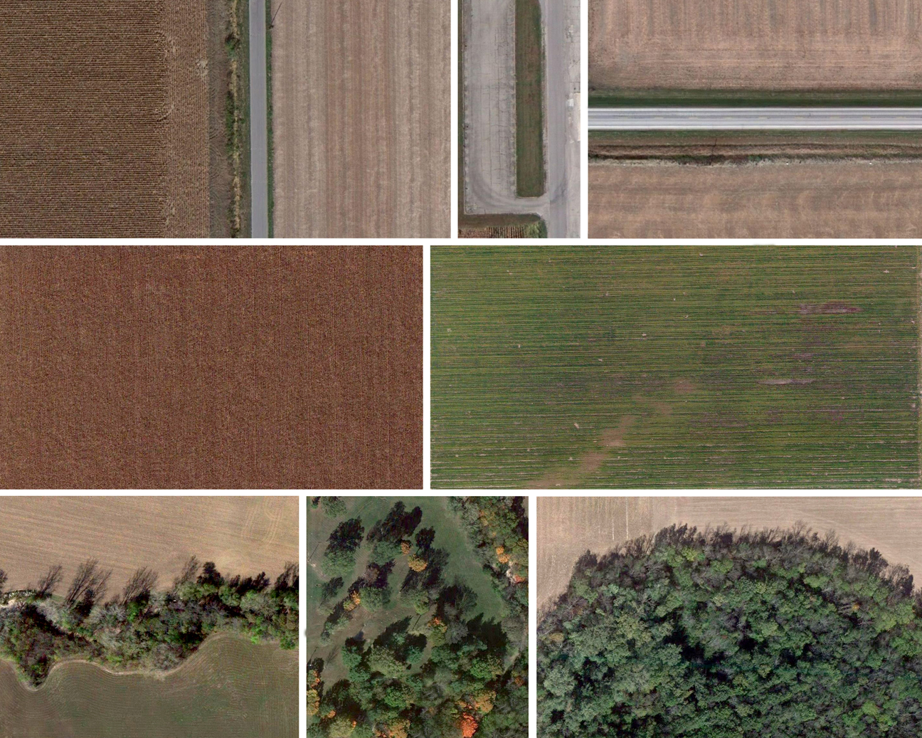
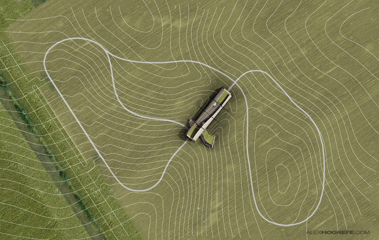
I needed some textures and trees and the easiest way for me to find these was to take screen shots of satellite maps. In a matter of minutes, I had a good collection going. Above are the textures that I used in the final composition.
As mentioned above, I began with a PDF of the AutoCAD exported line work. I also used the rendered roof plan from the previous page for the visitor center building.
I next started to overlay field textures. The satellite images had lots of brown and red tones. I fixed this by adjusting the Hue and “colorizing” the images. I also inverted the topo lines to give them more contrast with the ground.
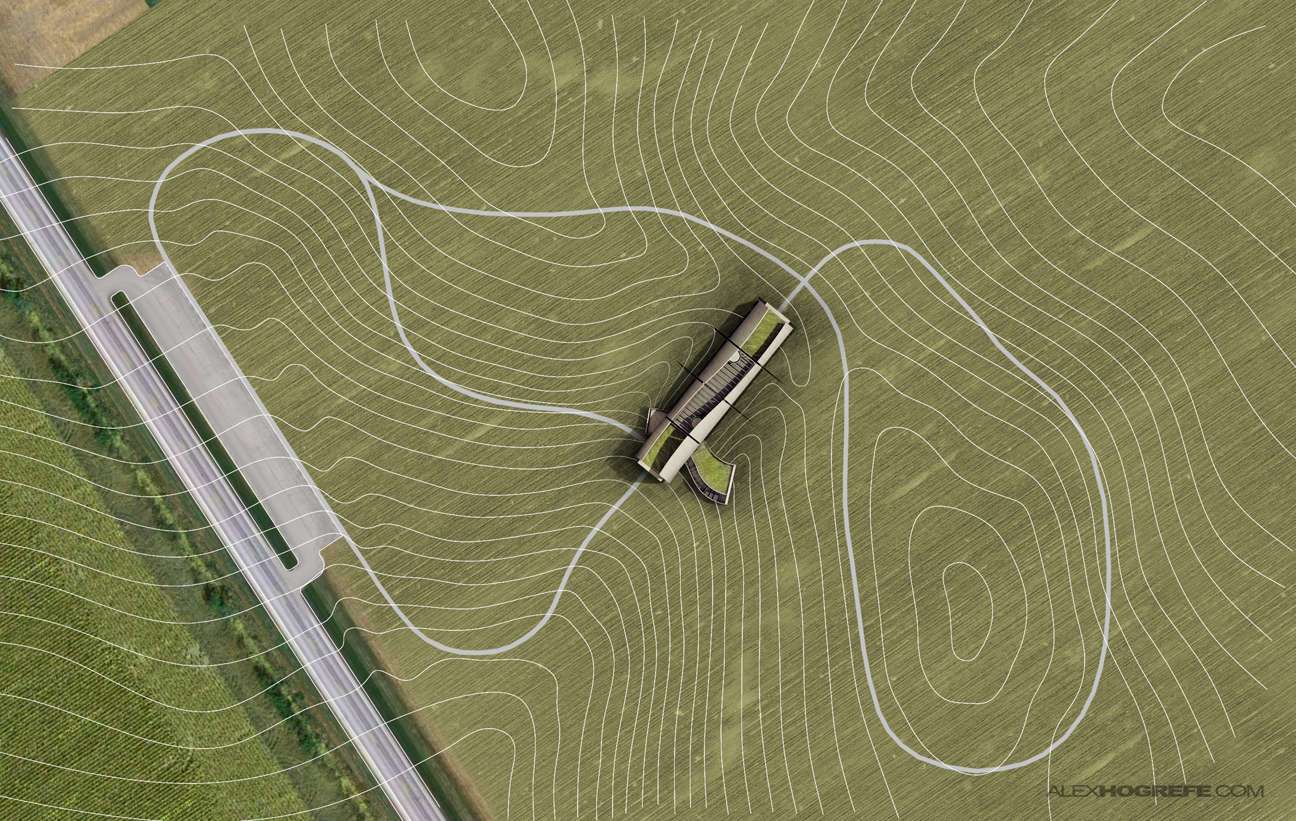
The roads came next.
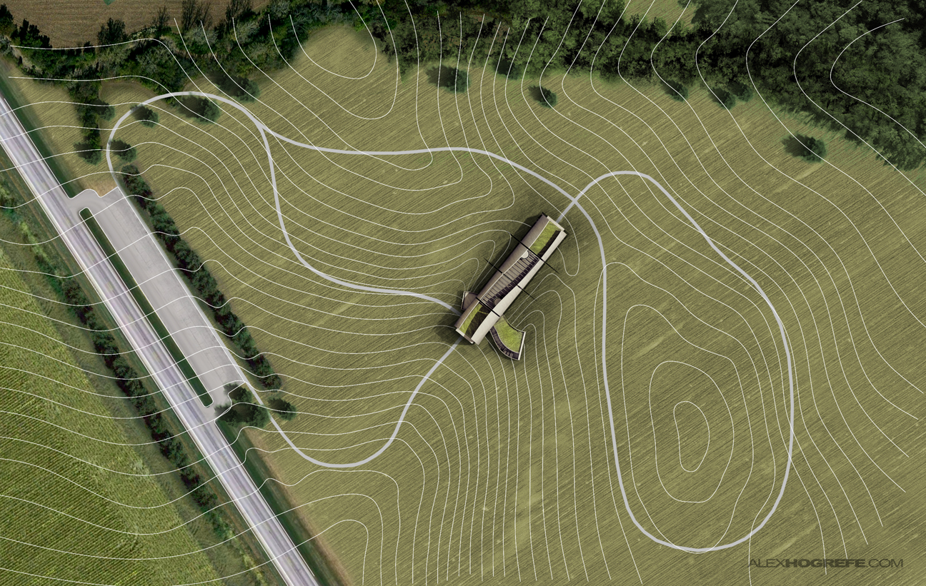
Then came the trees. I spent very little time actually cutting them out. Since the trees are typically darker than the ground, I just set the layer blend mode to “darken”.
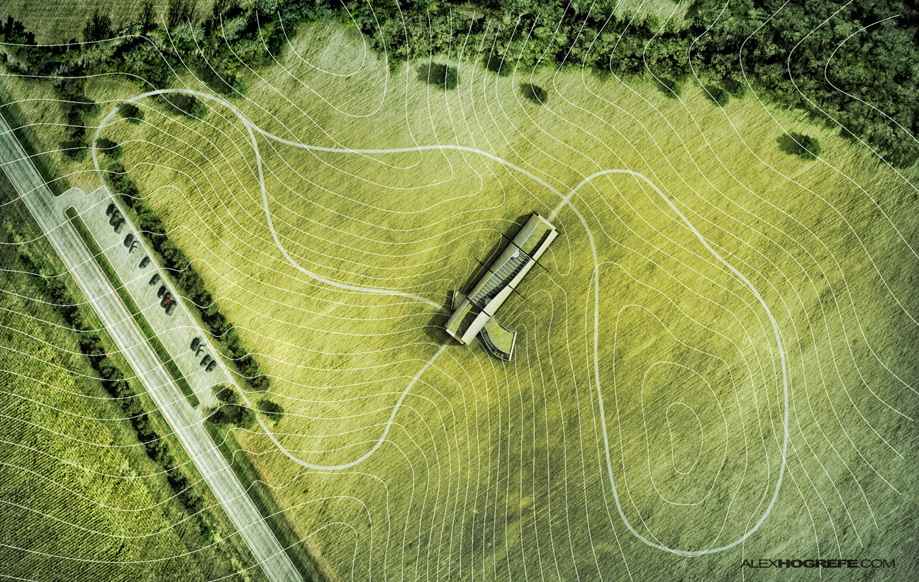
Finally, I did some color correcting and added shadows to play up the topography.
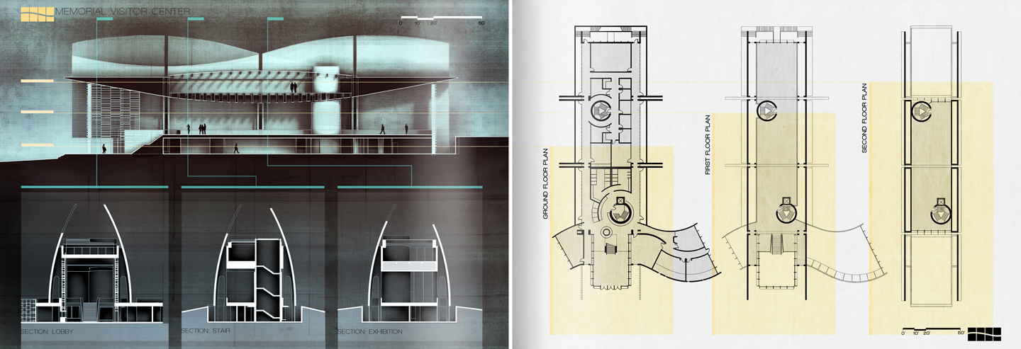
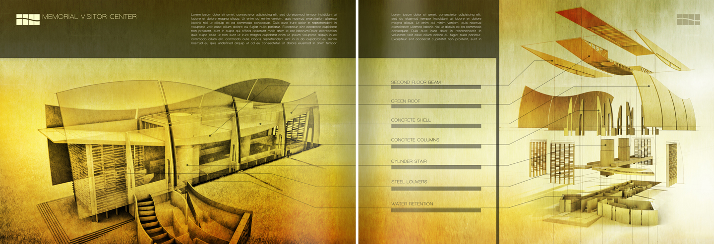
Below are where things stand at this point. I have three pages started which all still need some tweaking. I am planning two more spreads. One for diagrams and the other for interior/exterior illustrations. More on this later.


Interesting! Thank you for sharing!
You rendering style is very impressive! What I like the most is the fact that somehow you achieve kinda "sketchy" effect on the end which personally I really like! How do you achieve that?
Thanks!
Your awesome bro i hope i can reach this level in school i can really use these techniques.
Nice work and congrats for the blog!
great work, big ideas! keep on doing this!
These spreads are quite nice. I Hope you continue to post examples as you update the rest.
The construction details are shown in a direct and simple. This mode of presentation is very good.
Inspiring as always. Especially since I'm in a packed week doing my portfolio for final year here in my architecture school. Like always, thank you, I love every pieces of it 🙂
Brilliantly executed all around!
Very nice work.
Thank you for sharing.
I know your blog for a long time but I've never commented. Tomorrow I have to deliver my final master project and with your tutorial I've made the best master plan in my life!! Thank you!! By the way, have a look at Kew Gardens in London in Google Maps! Threes are amazing there! Thank you again for brilliant idea:)
beautiful work!
Your concept of the building is really interesting! Thanks for sharing
Very impressive landscape. Would you mind sharing with us exactly what ‘ color correcting’ you carried out to get the final effect? As there is a big jump between the second to last and the last image. Thanks.
Hay, I say thanks God that I can meet this blog. I am so happy. Thanks very much for your knowledge. 🙂
Hi,Alex!
I am confused about the last step, the color correcting. How did you do to make the photo like that result?
<3
bau
Dear Alex,
For years I have tried to research on how to create the perfect portfolio. Never have I come across the steps to achieve this, but only found the end results of the pages. You have spent a lot of time figuring things out. I truly respect your dedication to create this blog to help me and various others to make the perfect portfolio. Thank you
your images are amazing!!! I was just wondering if you ever do urban renderings that require more city and crowded situations. I would love to see how you would render within a city block
https://www.themaayaa.com – TheMaayaa is a
creative, branding and digital design agency
based in Jaipur, Rajasthan.We offer specialized services in logo design, graphic design,
web design, web development and hence we are one of the leading web design company.
Graphic design