Below is a quick overview of my thoughts and opinions on Architectural portfolio development. I won’t go into the more tactile possibilities of origami portfolios, lasercut plexiglass covers, etc. These are sure-fire ways to make your work stand out. However, I want to be identified by my graphics and therefore need the imagery and layouts to do the talking. Besides, we are in the digital age, and therefore it is important to have a portfolio that looks good being viewed digitally.
Software
Both portfolios (Undergraduate and Graduate) were created in Photoshop with a little help from Illustrator.
Many people use InDesign as a way to manage the pages. If you know the program, go for it. I did not use it and instead used Adobe acrobat to combine the PDF pages to send to the printer.
(UPDATE) I have since created THIS POST on InDesign and how I have implemented it into my workflow for the creation my PORTFOLIO VOL. 3. It has really streamlined my process and plays well with both Photoshop and Illustrator.
Photoshop vs. Illustrator
First off, I think every architecture student should learn both Photoshop and Illustrator. With that said, I don’t think Illustrator should be main software used to create an architecture portfolio. Here’s why:
1)Photoshop is more expressive, Illustrator is diagrammatic. I think of it as sketching vs. CAD.
2)Almost everything that I WANT to do for my portfolio can be accomplished in Photoshop. This isn’t saying that Photoshop can do everything that Illustrator can do. In fact, I still used Illustrator to develop the parti diagram icons on every page of my graduate portfolio as well as some of the map diagrams.
3)Photoshop has some basic layout features as well as decent text manipulation tools. Along with text manipulation, you can rasterize the text and really get creative with blurring and erasing.
Above, the final saved size of each portfolio page ready to be printed
Initial Setup
Generally speaking, there is no a standard size for a portfolio. Depending on what you are using the portfolio for, some schools may require a size, but I won’t go there. Here are some things that I thought about when setting up my portfolios:
Shape
Square vs. rectangular. I have always gone with rectangular only because it is much easier to layout images and text. Try laying out the same images and text on a square page and then a rectangular page, and you will see what I’m talking about.
Size
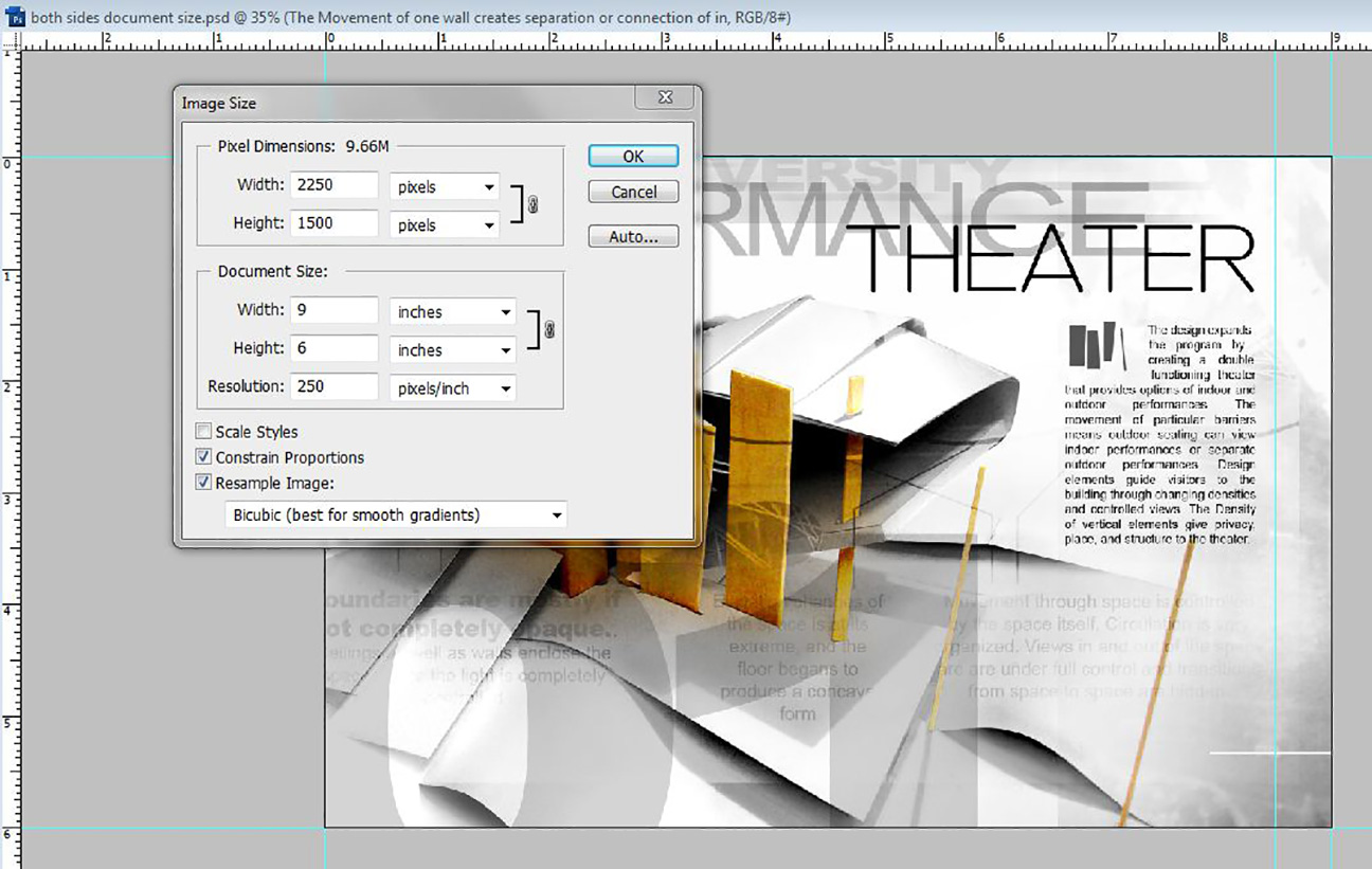
My portfolio is 6” x 9” landscape. I used this size for a couple of reasons.
1) 6″x9″ will fit on an 8.5” x 11” sheet of paper. This is good if you’re printing it yourself. Anything bigger than an 8.5” x 11” and you have to move up to 11” x 17” which most personal printers cannot print. Not only that, but then the portfolio becomes “too” big.
2) It is a common ratio and easy to divide the page into thirds.
3) I just like the size. It’s not too big or too small. Like I said, there are no rules to the size you choose, it’s about personal expression.
Note: be aware of where you are printing and if the printer can print the specified size. Many local print shops can work with custom sizes, but many online printers can only print limited sizes. I go into more depth with printing online HERE.
Resolution
(AKA DPI, AKA Dots per inch). My portfolio was set at 250 DPI (I hate large file sizes). There are some people that are really serious about this issue and will set the DPI to something like 400. All this does is triple or quadruple the file size. Since a portfolio is small and people will be up close looking at it, it’s important to have a high DPI. I would say anywhere between 250 and 300 is fine.
(UPDATE) I have made it a standard to create my portfolios using a 300 DPI canvas. This is an industry standard and most online printers that I use ask for 300 DPI.
RGB vs. CYMK (Update)
If you plan on physically printing your portfolio which most people do, use CYMK since this is the mode that printers use. Printers use cyan, yellow, magenta, and black colored inks to create color on paper. However, there is a limit to the colors that most printers can reproduce. Therefore, it is important to use the CYMK color model because programs like Photoshop and InDesign will tell you if you are using colors that the printer cannot produce.
A lot of what I create stays digital such as website images, digital portfolio, etc. If you images are only going to be viewed digitally on a screen, then use the RGB color mode. RGB allows for a higher range of colors to be used.
Full Bleed
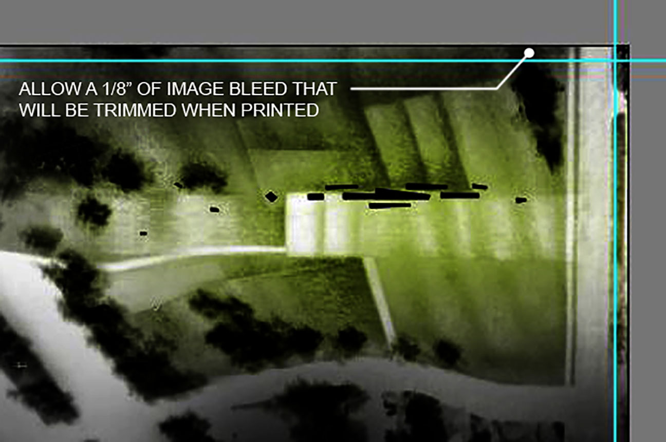
Portfolios should always be full bleed. Bleeding your images means that the images and graphics extend past the page edge. This allows for a little margin of error when printing and trimming the printed images. You will see that when I set up my pages, I gave a 1/8” extra on all sides. So instead of a 6” x 9”, it is a 6-1/4” x 9-1/4”. Most professional printers ask for this amount of bleed. It’s also a good number to use if you’re printing and trimming yourself.
Binding
Always account for the binding in the page layouts. I almost made this mistake myself. I was ready to print my portfolio and forgot that the binding would cut a ¼” into my pages intersecting a lot of images and text. I then had to go through and adjust every page accordingly. I don’t think there is a set number for how much you should allow, but I typically leave a ½” although you can probably get away with a ¼.” It depends a lot on the type of binding. When I say “leave a ½”, I mean do not have text or important images run into this area. Continue to bleed colors into this area so that you get the full bleed look.
Single vs. Double Sided
Double sided pages seem more complete and flow better. It sets up opportunities to connect pages together graphically. I would avoid single sided if you can.
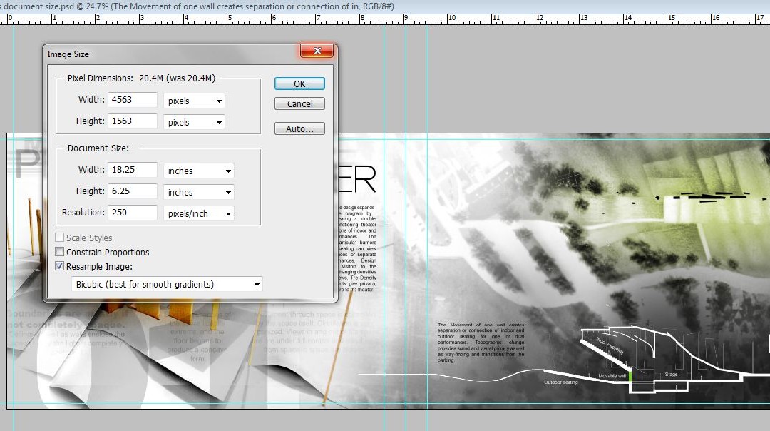
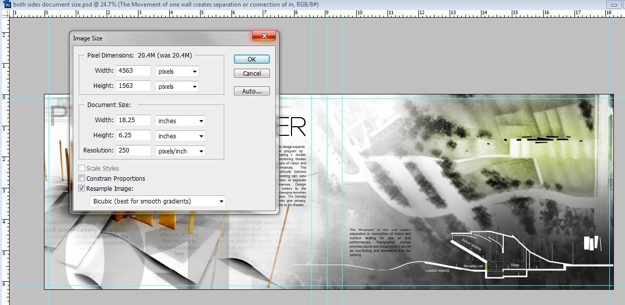
Since my portfolio was double sided, I set up the Photoshop files in such a way that the pages facing each other were always the same project, and thus one Photoshop document. To clarify, instead of having a bunch of 6-1/4” x 9-1/4” pages, I instead used 6-1/4”x18-1/4” size pages which I later divided into two pages when it was ready to be printed. Again, this allowed for a better relationship between pages of the same project. When I was ready to divide the pages, I simply cropped the full image down to one page, then the other, and saved the individual pages. Double check the image size after cropping to be sure the page is still the correct size.
Above: An example of a Photoshop file used for double sided printed.


very helpful page for portfolios. RIght in time, because I'm starting one now.
Thanks
But I wanted to know wich software you used (and possibly how) to make your portfolios files (grad and undergrad…) where you can switch pages as a real book…
For both the digital and physical final portfolio books, I used the individual Photoshop files to create PDF pages. From there, I combined all the PDF pages in adobe acrobat, into one document. From there, you can send them to a printer, or upload to issue.com and they do the rest. Issue will automatically take all the pages and make a front and back page document
great work! loving this site so much. your work has challenged me to get better and put more effort in what i do. One question… do u work in RGB or CMYK in photoshop?
If you plan on physically printing your portfolio which most people do, use CYMK since this is the mode that printers use. A lot of what I create stays digital such as website images, digital portfolio, etc. Therefore, I typically use RGB. RGB allows for a higher color range. Thanks for the question. I will make sure to add this to the document above.
tnx for ur reply, as well u made mention of splitting your pages after working with the double sided setup, how do you split it? or can it just be handed in for printing with the double sides. tnx
Darek,
I split the pages simply by cropping the image to one side or the other, then saving each individual page. Just make sure to double check the image size that all pages are the correct size after cropping. Again, thanks for the question.
How would you divide a portfolio into two units/chapters?
is there a chance that you can put a dummy psd file online with the guidelines? mby? that would be nice
another question alex, why do you use 8bit files? and not 16 / 24 bit?
Christoph,
I only have so much allowable download bandwidth. I will see what I can do.
I use 8bit files because I safe a lot of jpegs when I work for easy previewing (can't safe 16bit jpeg). 16bit will give you better color, but the difference between 8bit and 16bit is minimal, at least for me.
May i ask why you don't use indesign for lay-out work? you should really give that a try! also a great piece of software for poster layouts. the text function is better and it allows master pages.you can simply import photoshop files and if you make changes the illustration will be updated.
I love your blog very much, more more info, I will concern it again! ojnajn ojnajn – red bottom.
A lot of people tend not to share these kind of experiences, I'd say much appreciated for your generous sharing. Thank you.
Congratulations for this job!
I like so much your work in this blog!
This site is exactly what me and so many others have been looking for. For some reason people keep all this info to themselves. But your above that and should be commended. This is great and hope to see it for years to come.
this is good work! keep it up! also i would like to suggest using InDesign. it is a far more effective software for book publishing. photoshop is a tool merely for photo editing. it also resolves a lot of the issues you were facing with photoshop, such as printing double sided and what not. websites such as blurb.com provide indesign plugins so you can publish your own book/portfolio professional like!
Good work in their portfolios. Wanted to know where to get images like I'm on the cover of its latest portfolio. I want a picture like a cloak.
Thank you.
Alex, thanks your website is very helpful.
What is a good printing/publishing company that can print and bind a portfolio 6"x9"?
Thanks.
Alex,
Really great work with the site and with all your tutorials, especially this one. I have been using your website and youtube channel quite a bit this past year as I finish up my first year studying architecture and I just want to say how impressed and grateful I am for them! Thanks.
what kind of binding is the most suitable for portfolio when you bring for interview?
I love your website. Currently making my portfolio for grad school. Since I just moved to Chicago my top choice is IIT. Any suggestions? Also, I was wondering if you recommend making the portfolio in photoshop as you have listed but then placing them into indesign to print?
Thank you
What Font do you use in your presentations?
Thanks
@ Barry,
For this portfolio, I used Arial for much of it. I have a lot from dafont.com that I like to use for my new stuff. Cicle is a good font to check out.
Concerning Photoshop vs illustrator: I heard ps makes the files way to big, is this true? Can't check myself as I didn't learn illustrator yet
Thank you so much for your Youtube. I seen some videos on making a section rendering in photoshop. It inspired me to make my work better and people really love what they see me do. I say " I just look at the best out there to see what they're doing, then do something innovative to make mine special too." Again, thank you and have a continued Happy New Year.
Classically Modern,
Phil Bailey of Modern Masterpiece
I love this site, it's helping me a lot. Thank you for everything Alex, you're the best !! (from France 😉 )
This is a really helpful resource for me! Thank you for sharing. The advice I've been given is that electronic and online is the way to go now, so bleed and binding room wouldn't be needed. I was wondering, what would be your advice for online/electronic portfolio pages?
So amazing! im sorry i have nothing to ask just had to commend you on this incredible work!
Alex,
Great work, and very helpful. I've been learning over the past months on how to make a great portfolio thanks to your tutorials and other portfolios I've come across on the web. One question I've been meaning to ask is… when setting up your layout, you used 6×9. When it comes time to print, will your layout completely fill an 81/2×11 sheet? Or will you have an excess of white space on your sheet? Why not make the layout 81/2×11 and print to that size? When you can, please let me know.
Thank You. And most certainly thank you for all the hard work in showing us great ideas, tips and suggestions.
– Enny
@Alyson,
I would still suggest going with bleed and binding space. This forces you to leave a little breathing room around the edges which is always a good thing. If you end up needing to print, your golden, but if not, then the portfolio will still look good. Also, I like to bring a physical copy with me to interviews. You never know when you will need to print so it is a good idea to design for it.
@Enny,
I printed my portfolio as a 6×9 at a custom print shop. 8.5×11 seems a little large in my opinion however some schools may require it or it just may be your personal taste. Either way, a 6×9 is not a required size or even an industry standard. In the states, any size and proportion is usually acceptable. 6×9 just seemed like a good size to me.
Hi Alex, this setup intro is really helping me out with my portfolio. Clarifies a lot of questions I had about Photoshop and Illustrator. Would you recommend a student getting a graphics tablet to work on? I still have 2 more years of undergrad left.
Alex, this is a great post about getting started on one's portfolio. I, however, have doubt on the dimension sizes because it is quite uncommon for local or internet printing services to have on their option. Is there any websites that you know that have this dimension in their default option?
Dear Alex It is too Much helpful for all.
Alex i have no idea about elevation in psd so would you like to help me by sharing somethin or any links by which may get ..
Thanks
You should definitely use InDesign for layout purposes. It's easy once you have all your pages setup.
@Jay,
I still prefer layout via Photoshop, book like InDesign for organizing all of the files and organizing text. I discuss this process with my latest portfolio here: http://www.alexhogrefe.com/blog/2013/12/30/architectural-portfolio-workflow.html
which is the ideal size
a3 or a4 to work on architecture portfolio
Please help! I followed your setup guidelines and made my CV and portfolio on a canvas size of 18.25 x 6.25 inches, but when i upload on issue.com it doesn't show up as two separate pages. How do i divide up the pages exactly?
Heyy Alex!
Went through the previous comments and found the answer to my question 😀
Your work is great man! Thanks a lot for sharing it. You've been a real life saver 🙂
Hey it is very rare to see such generosity and sharing concerning these type of tools and skills. I usually never comment or post but I really think you should be appreciated and thanked!
Really, you're doing something that really counts, thank you!!
I hope everything works out for you!
🙂
This is very helpful Portfolio Introduction. I am trying to make this kind of portfolio but i’m fail. Next time i wil be try for my best.
Alex, thanks for these great tutorials!
What is the final size of the portfolio file? And how do you compress the final portfolio? if you need to send it by e-mail or to publish on web?
Hi Alex Thanks for your generosity in offering your tips. I wanted to let you know that if you use InDesign, you can set your document up to have 2 facing pages by checking that box in the Document Properties. Then after you are finished, go back and uncheck that box and you now are back to single pages for printing. I do this so I can see the 2 facing pages when working with the layout but once I print to PDF for the printer I have single pages. You may have figured this out in Portfolio 3, but just to let you and other people know. Saves alot of cropping time, as you mentioned that was your method.
really appreciate the fact that you share your knowledge 🙂 ! question here : for the binding page layout, if I have an image, crossing those 2 pages, and I want to be continuous the best as possible, what’s the best way to do that ?
Hi Alex, great tutorial- thank you! What kind of binding did you use for this portfolio?
Great information provided. I appreciate your work.
Great article! in 6 by 9 portfolio, what font size would be perfect for headings, body text and captions?
kindly can someone be any help on this ?
Nice tutorial.
Great information. I appreciate your work.
Great work! Thankyou for all the help. You’re a star!
is there away to change the mode of images which have been created in rgb to cmyk without changing the colour of the image in ps, or is there any other software to do that purpose
I am amazed by the way you have explained things in this article. This article is quite interesting and I am looking forward to reading more of your posts.
Thanks for sharing this article with us.
I am no doubt going to be here and this extraordinary article.
I have found here piles of beguiling data for my understanding I require.
every single one purpose for the interest you oblige us,
it was especially basic and fulfilling, a dedication of gratefulness is all around to share this stunning post.