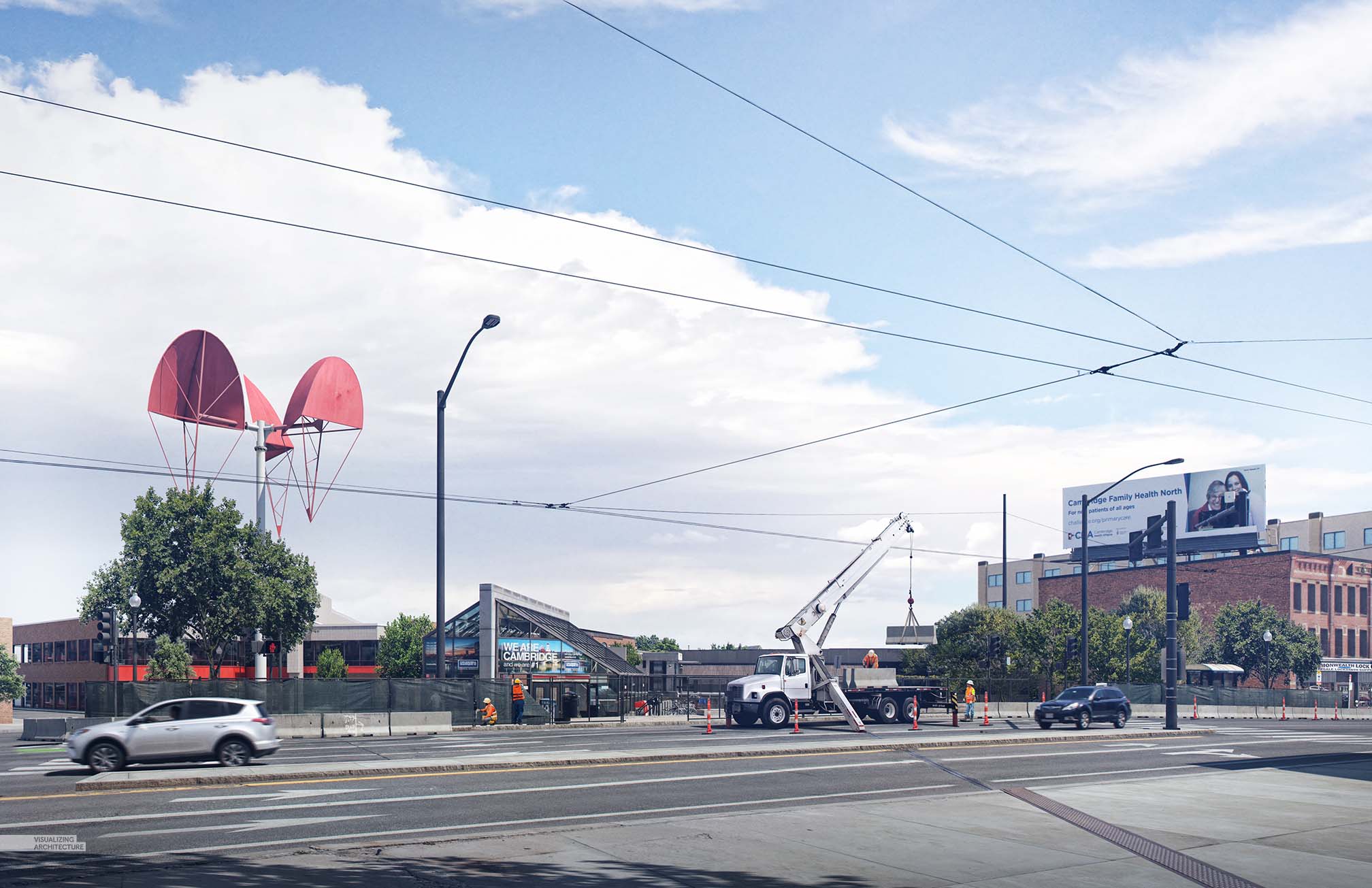
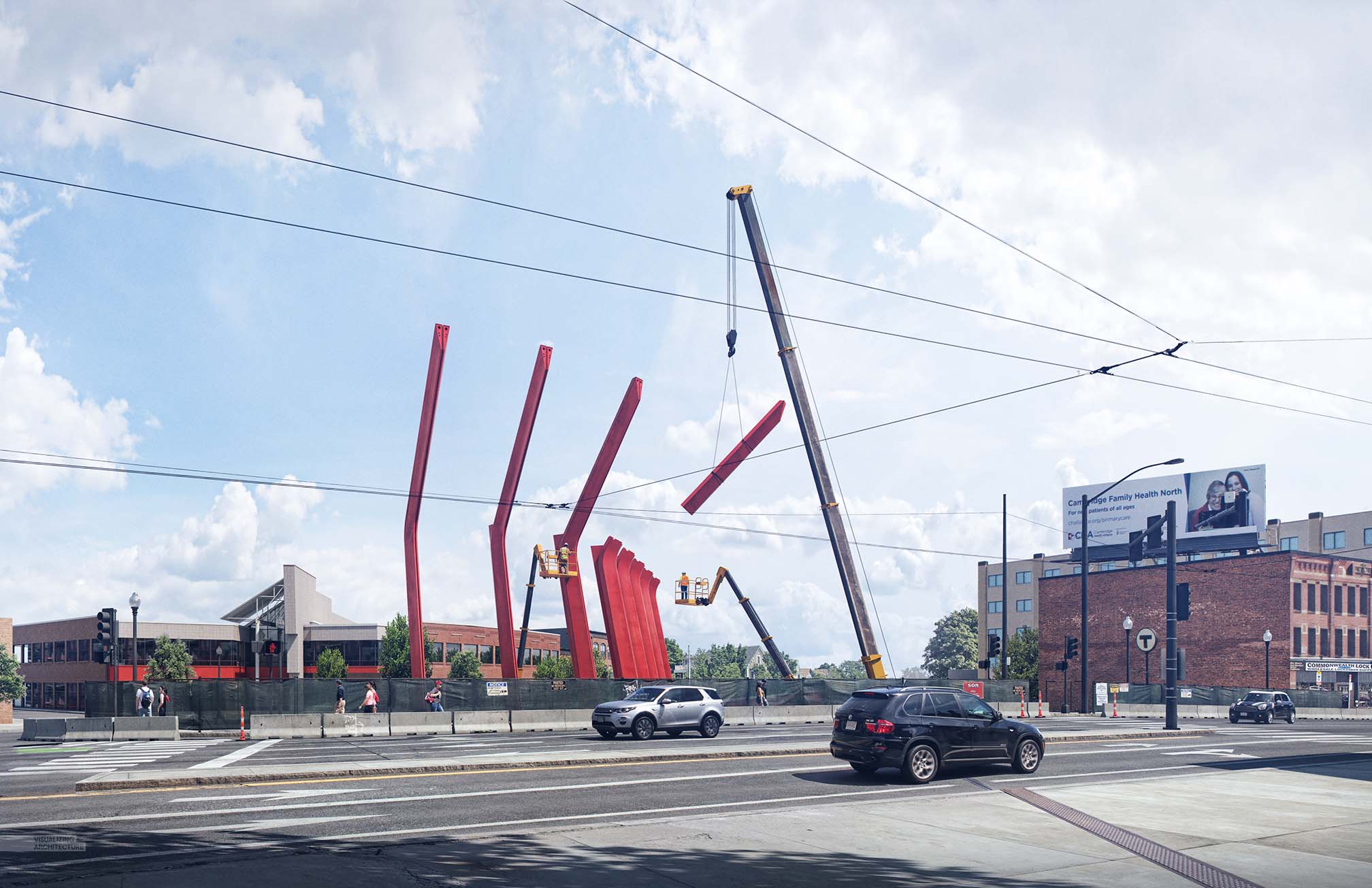
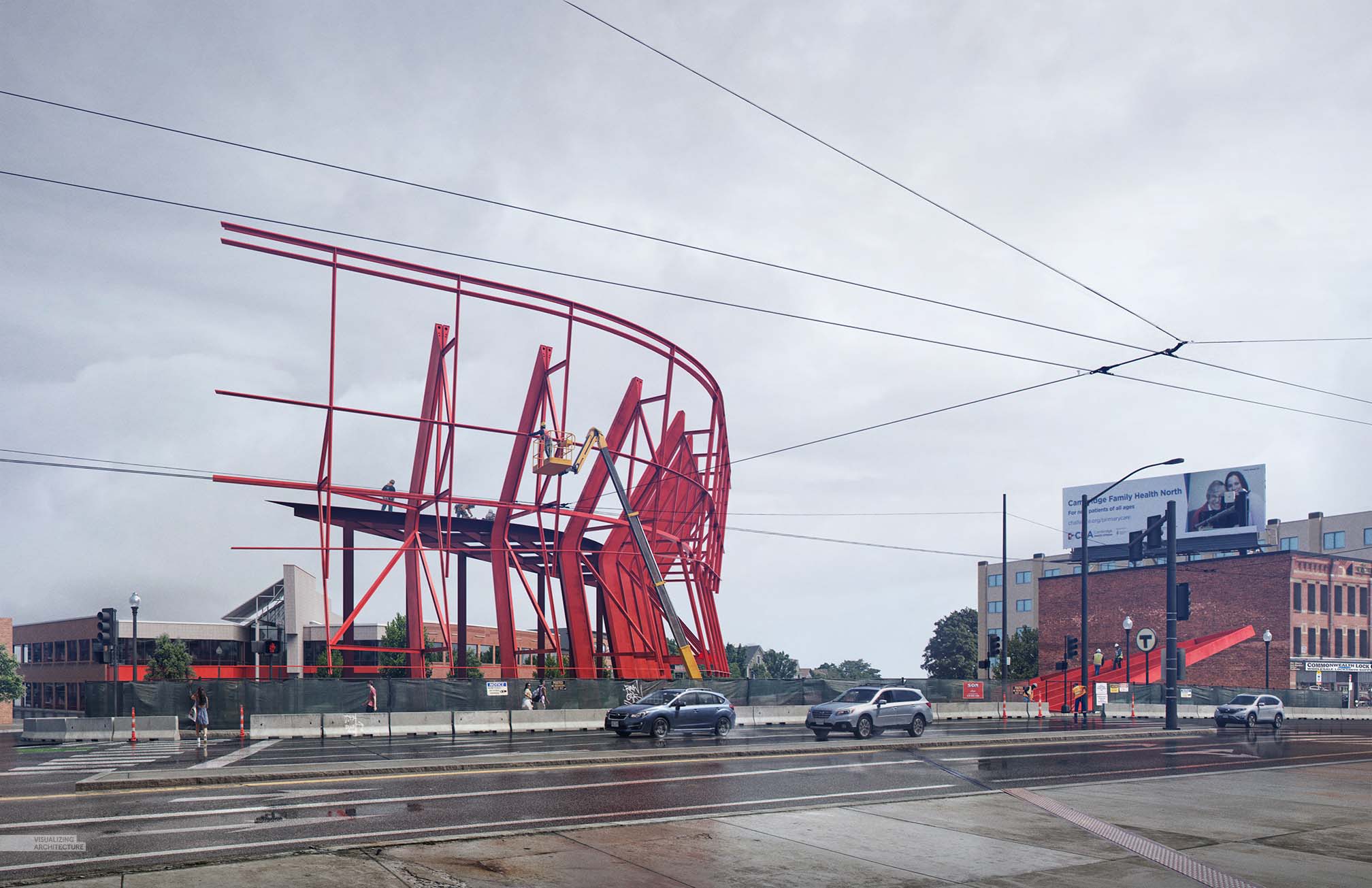
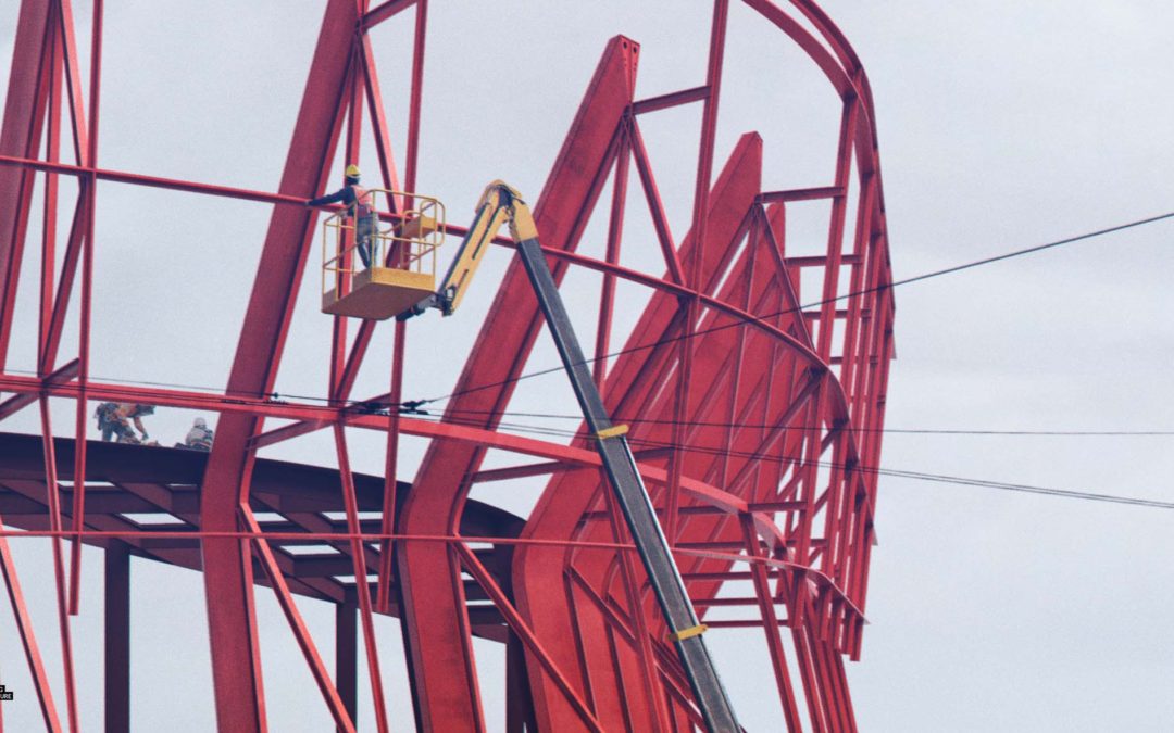
I know, it has been a while. However, I have been doing a lot of work behind the scenes and I traveled to Vienna, Austria for the infamous D2 Conference. The Porter Square Project is taking longer than normal to design, partly because the site is so complex, and partly because I am trying to give the design a little more resolution than I normally do. In other words, things are still in flux, but the big moves and structural elements are in place. Therefore, I thought I would have some fun and develop some construction images. A series of three images were created showing different phases of construction. I plan to possibly add one or two more images to this series showing the final design at a later date.
I approached these images with a slightly different mentality than other images. Because the site is so close to my office, I have access to the area whenever I need to study spaces, take photographs, and think about the images. I am taking more time with these images and really trying to nail textures and dial in lighting. Details that I might have ignored before I am focusing on now. Even though the view is the same for all three images, I used different light settings, weather conditions, and all new entourage and cars. It was time consuming, but I am excited about the final result.
Below are some screenshots of the model and textures I used to give a better sense of what was 3D and what was Photoshop.
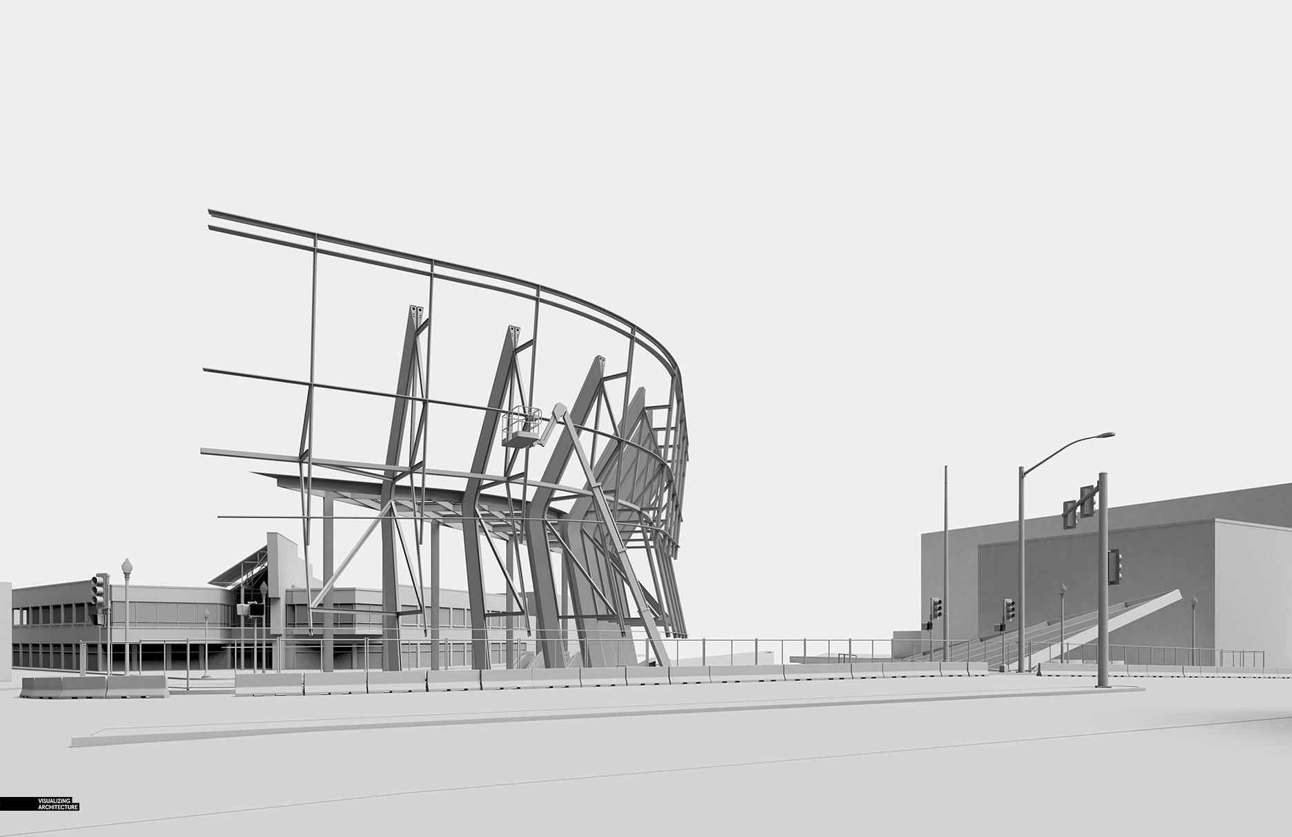
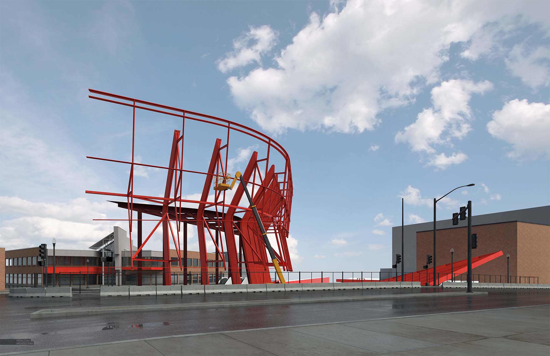
Texture was important, so I not only spent more time with textures in Photoshop, but also in V-Ray. I tried to study the site the best I could and then build textures around that.
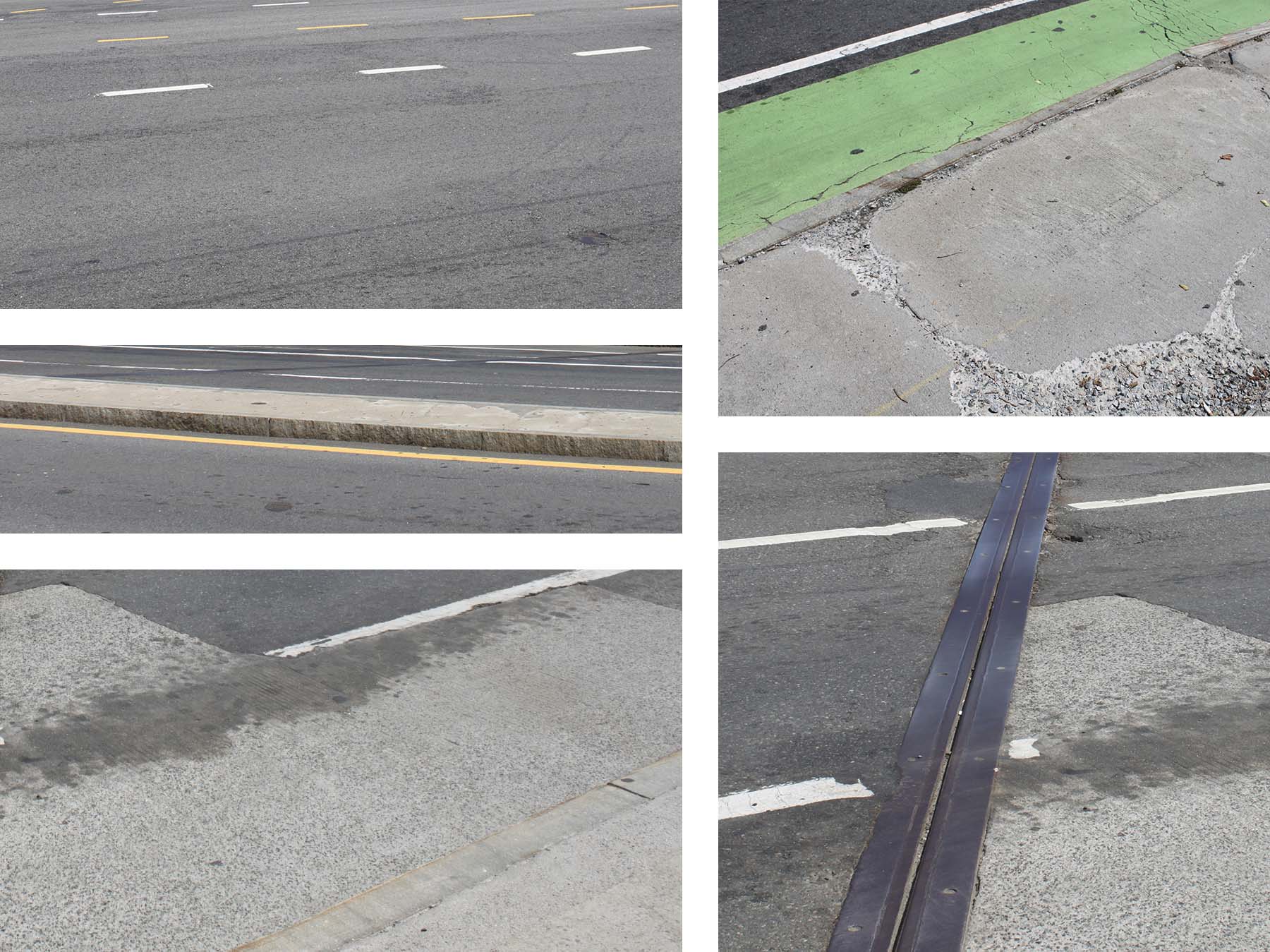
A ton of photos were taken at the site documenting conditions and the “age” of materials. These would give me the proper and accurate textures to use in Photoshop.
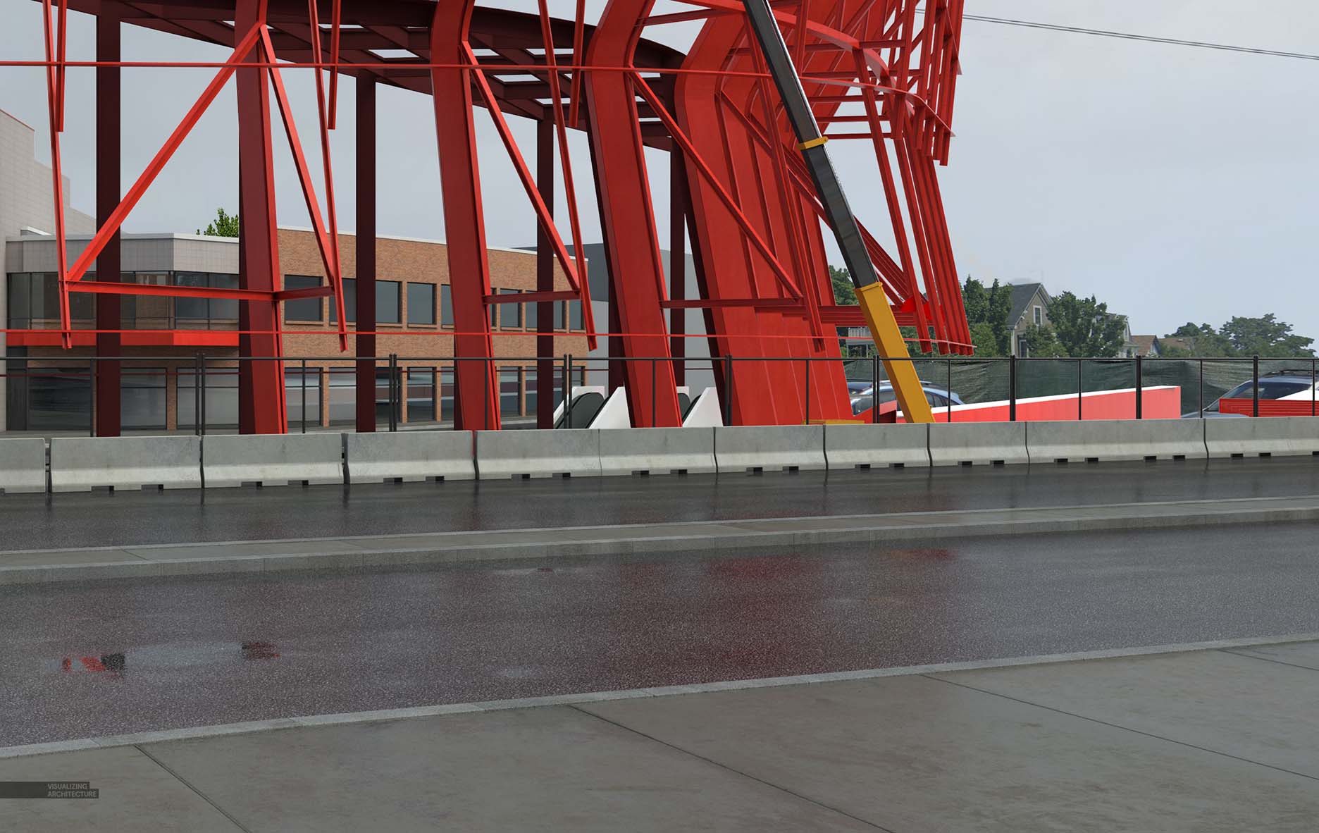
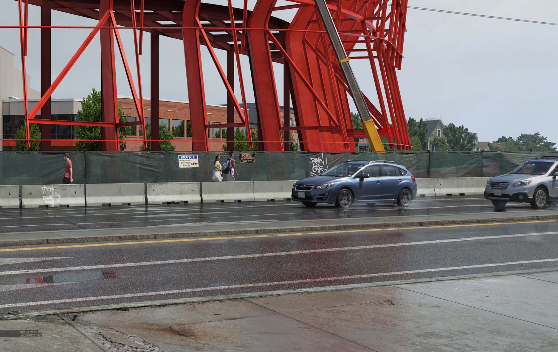
The secret to these images are all of the Photoshopped textures that I layered on giving the illustrations imperfection, grunge, and age. Most of the textures were stolen from the site photos I took and nearly every surface has been aged in someway.
Final Images
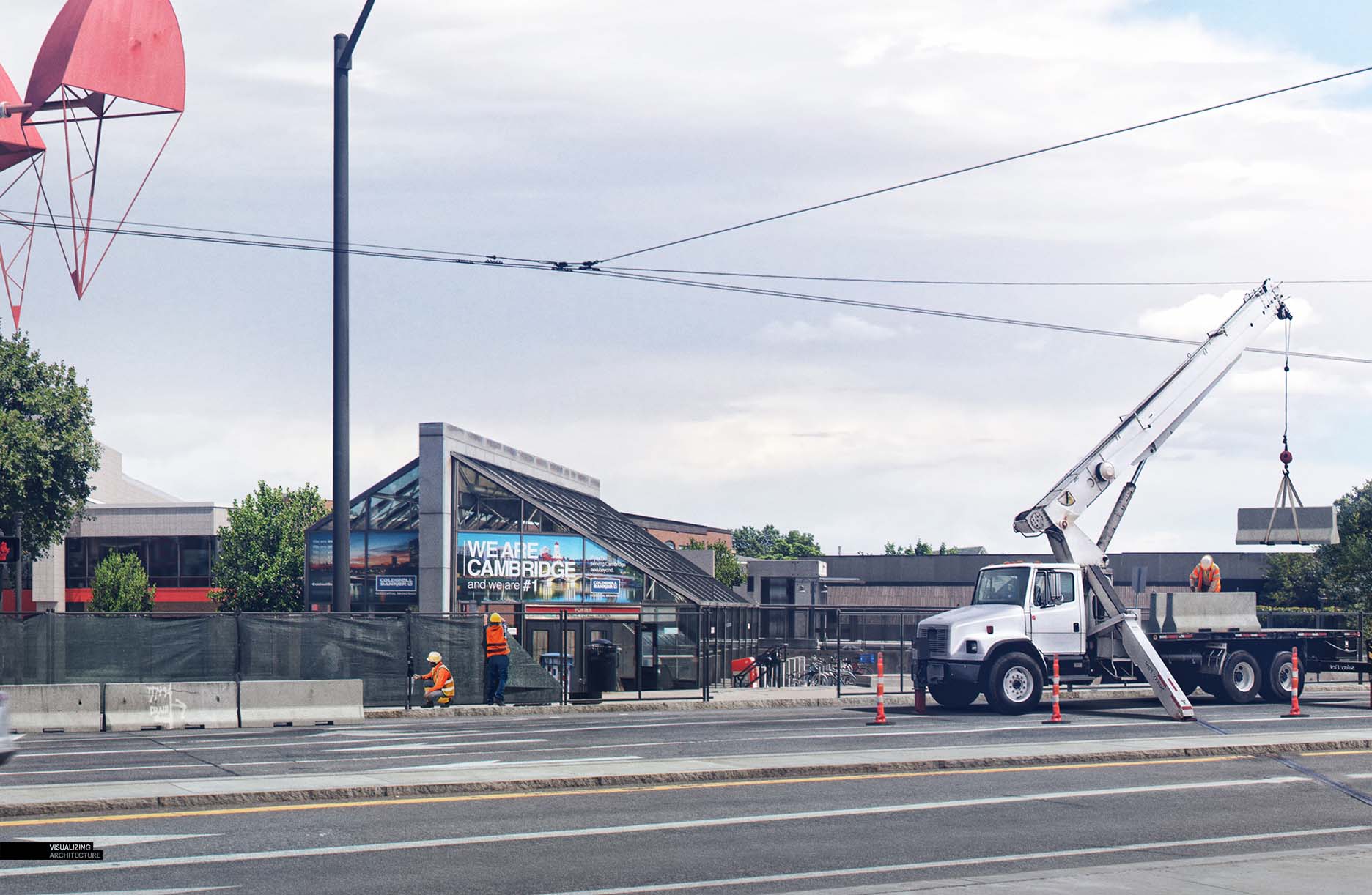
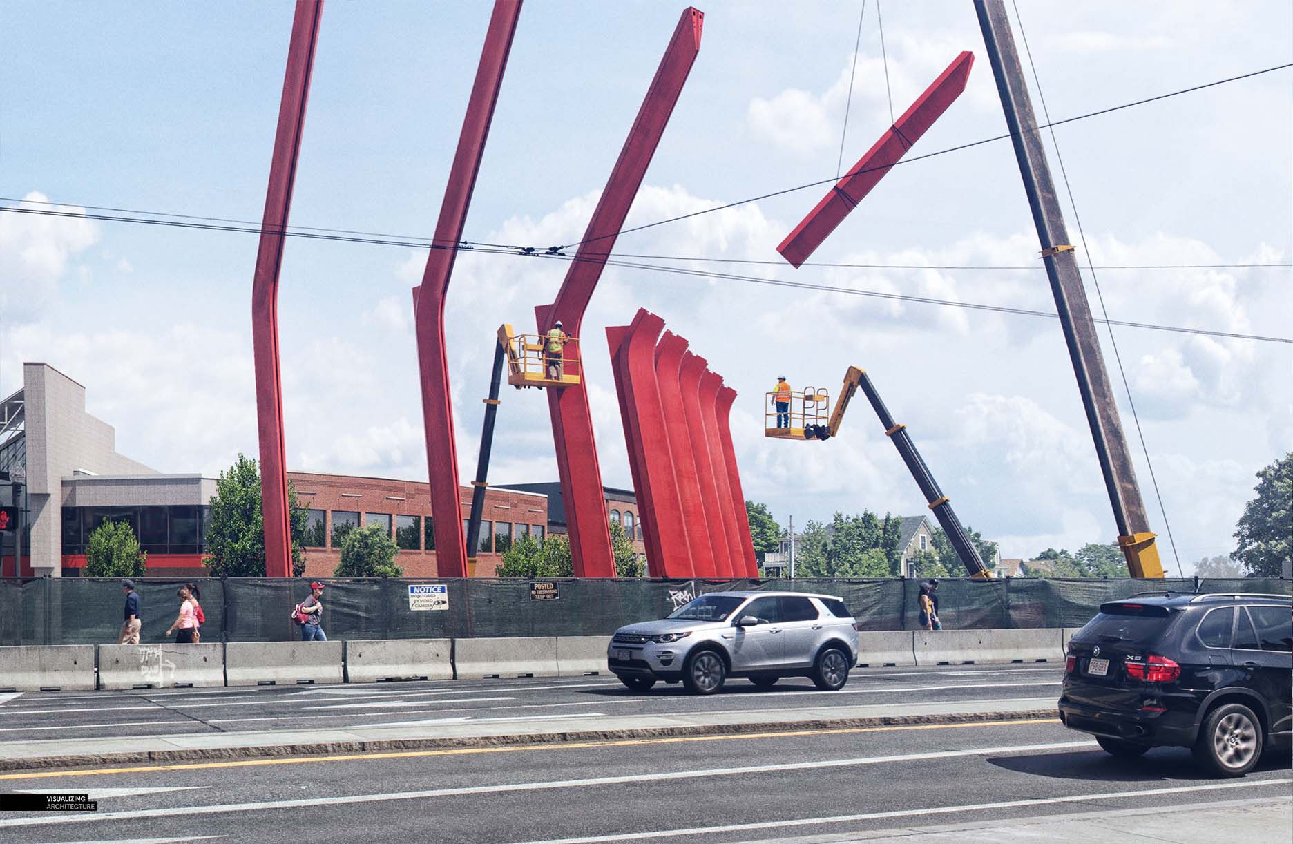
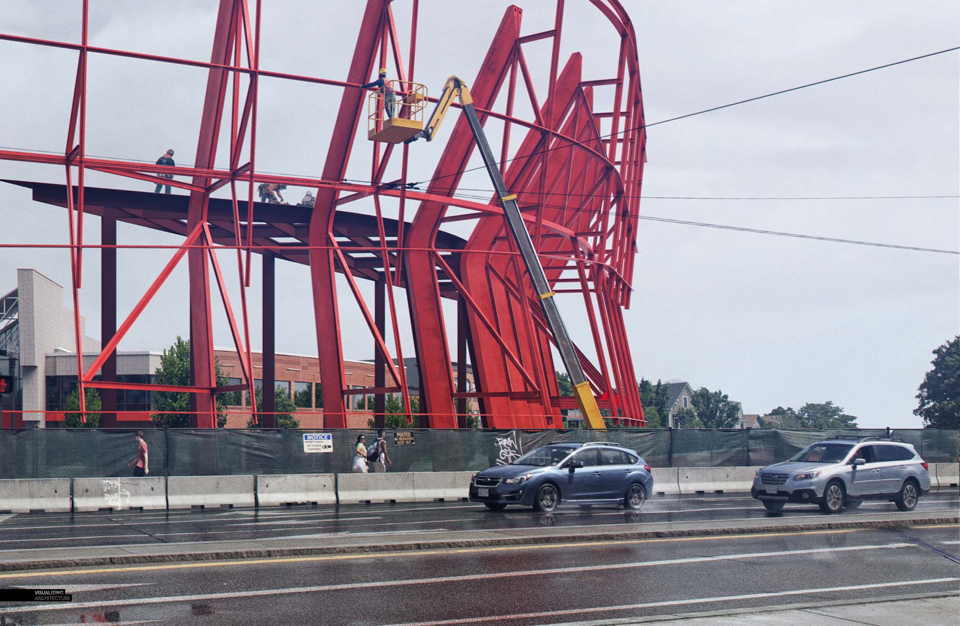


What a brilliant idea! And executed so well as always. Well done Alex!
@Daniel, Thanks!
Very creative and nice idea! Your renderings are scaring me more every time, because they really look photorealistic. Will Porter Sq. be the first project for Portfolio #6?
Thank you for doing, what you do!
@Johannes, yes this will be the first project of Portfolio Vol 6, if there ever is a Portfolio Vol 06…..
Nice work as always Alex, did you photo-match a base plate image of the site for the camera view?
@Dave, No, I started with a V-Ray base rendering. From there, I layered in textures from Photos I took of the site. This gave me the flexibility to change the lighting, wet ground, and general feel of each image.
How did you make that red material?
@Fauzan, It started off as a red metal I built in V-Ray. I then roughed it up and aged it in Photoshop for the final look.
Sharptech is the best digital marketing company & agency in India providing complete internet marketing services like SEO, Social Media, PPC, SEM, ORM, CRM, App Promotion & Branding
Hi Alex!
Thanks a lot for sharing your work !
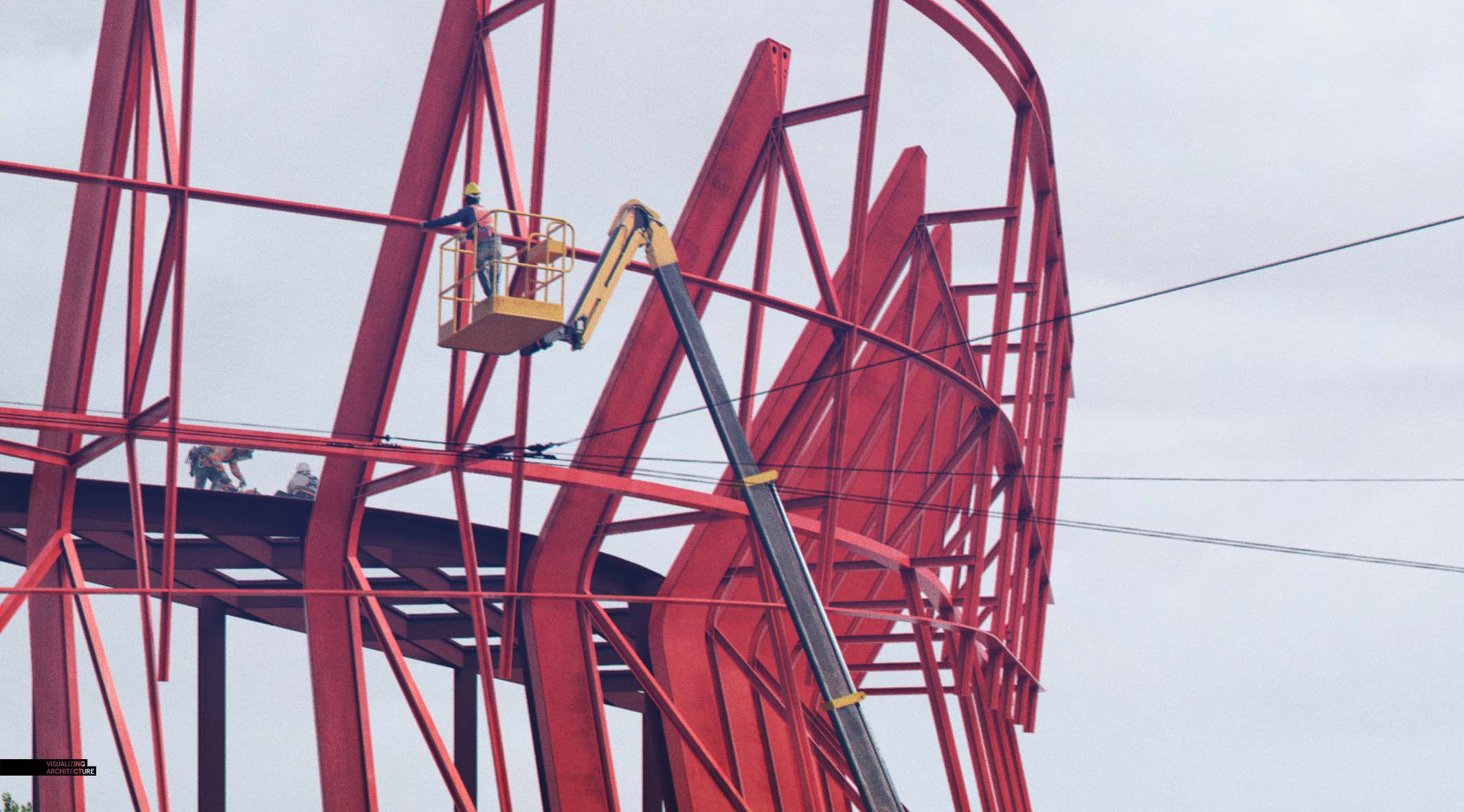
A specific question about details: In the zoomed picturre we can see that the “grain” of the image, instead of being too sharp or pixelized have a slight “painted” style, like if it was made out of aquarel. can you explain how to have that uniformization ? I always try to blur a bit and put some grain over the image at the end but it never looks as great !
thanks
Jérémy
Your new entourage…. (the Subarus?) Models or 2D PNGs?
And I agree with Johannes Blum on the scary realism of your images.
@Joshua, They were cut from photographs that I took at the site with the correct lighting.
Nice work. Where did you get the cars from?
@Ramone, They were cut from photographs that I took at the site with the correct lighting.
impressive!Alex, How did you make electric cables on the air?
@Jean, I started out modeling them, but ended up cutting them out of a photo and adding them via pshop which gave me a little more flexibility with positioning them.
Nice work as always Alex, did you photo-match a base plate image of the site for the camera view?
Plumbytes Anti-malware is the best anti-malware software, read most related reviews and get ideas of the contact details.
Hi Alex!
Thanks a lot for sharing your work !
A specific question about details: In the zoomed picturre we can see that the “grain” of the image, instead of being too sharp or pixelized have a slight “painted” style, like if it was made out of aquarel. can you explain how to have that uniformization ? I always try to blur a bit and put some grain over the image at the end but it never looks as great !
thanks
Jérémy
I have got the same question please answer
“Nice work as always Alex, did you photo-match a base plate image of the site for the camera view?”
Thanks Alex for sharing your work. Your design renderings looks real. Great work.
Hi Alex, Thanks for sharing your valuable blog for us. i’ts so useful and helpful.