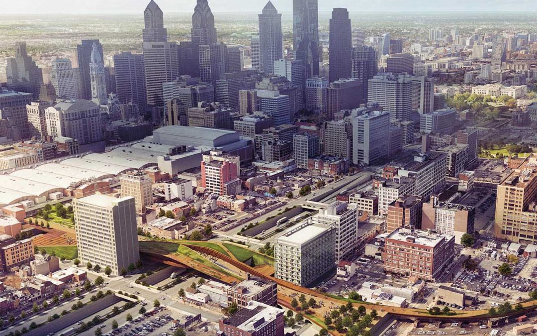
Aerial architectural renderings in a city environment are some of the toughest images to create. For one, you are dealing with a ton of texture, geometry, and complexity when it comes to the context. The ideal way to manage this is to hire a photographer to take photos with a drone at the precise view angle. Another option is to build (or purchase) an elaborate model of the city. However for this personal project of mine, I don’t have either the time or the money for either of these options. Other difficulties with city aerials include creating proper hierarchy and focal points. With all of the texture and complexity of a city, everything is competing for attention and it can become difficult to draw the eye to the places you want it to go. Below is a break down of the Philly Bridge aerial illustration with an attempt at tackling some of these issues.
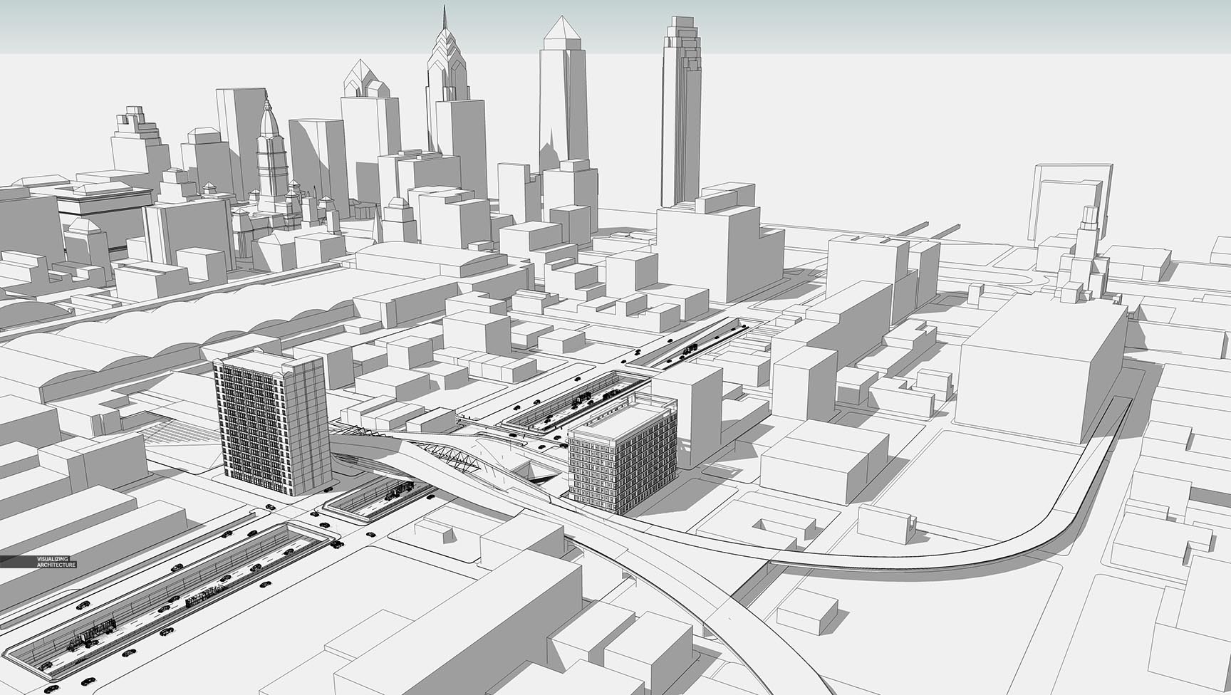
1. 3D Model
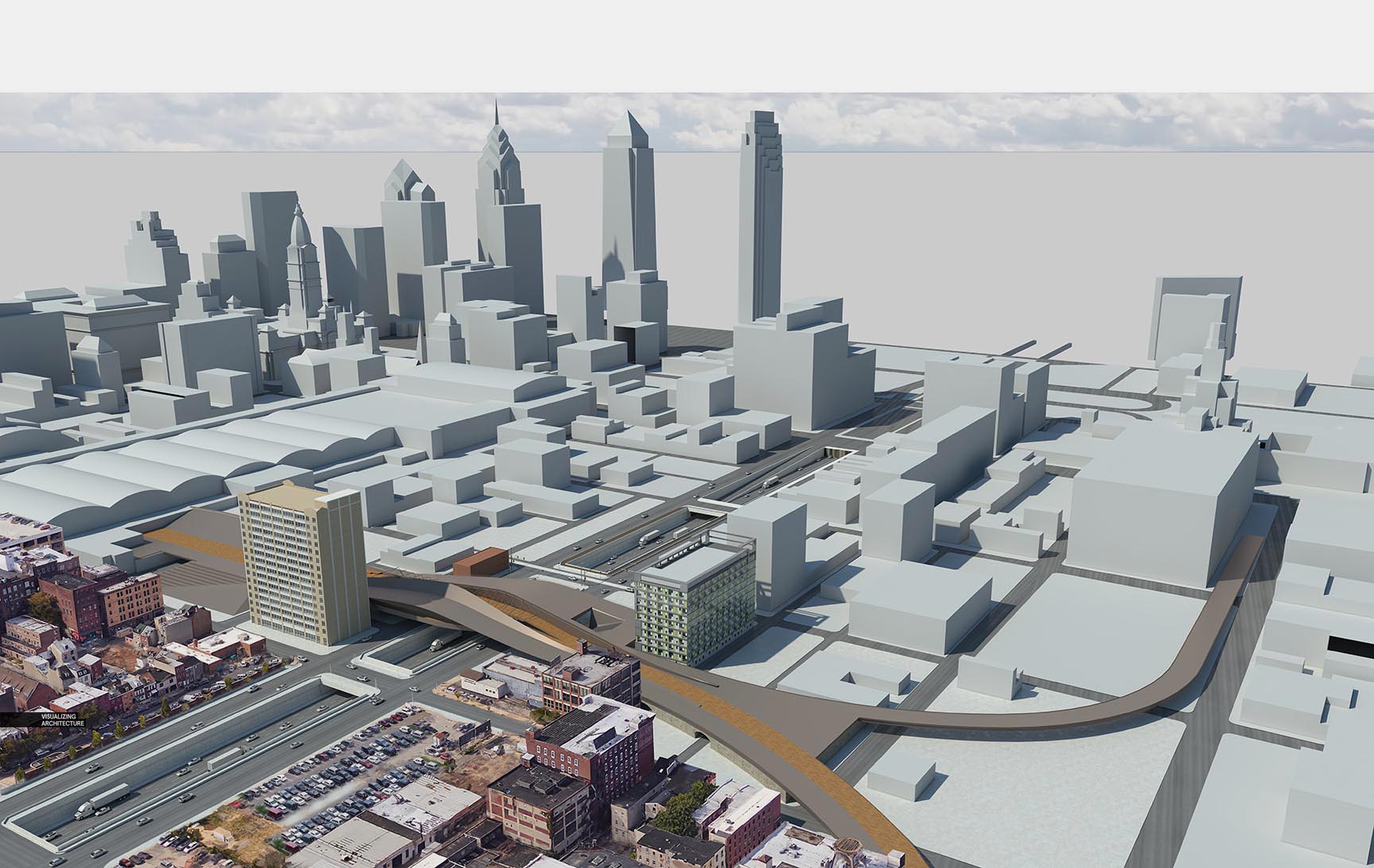
The Sketchup model had the basic massing of the city inserted so that I could properly line up the context imagery in Photoshop. Obviously, you don’t need to have the entire context and can get away with just a few buildings in the distance. However, having as much massing as possible makes it easier to setup the view and composition. Because the view is pulled so far out, not much time was needed to cleanup the bridge design area of the model. Essentially, some materials were adjusted and proxy cars dropped in.
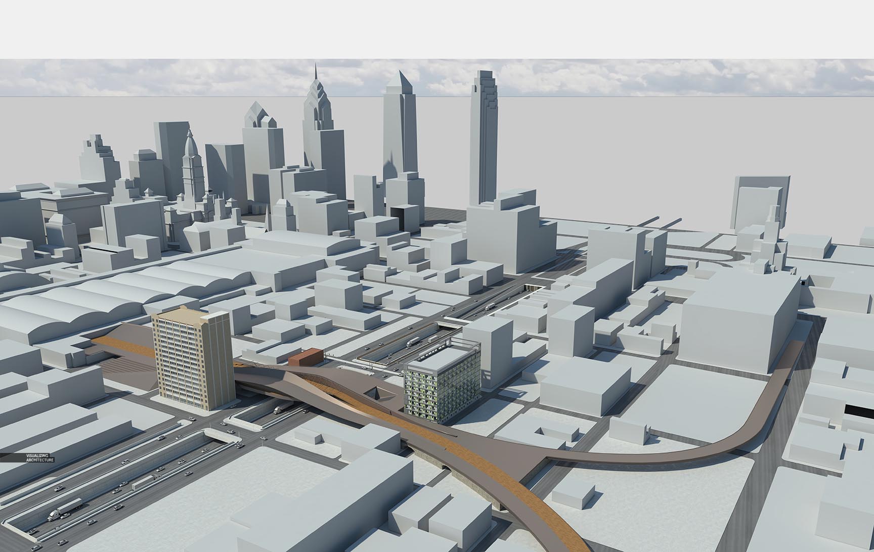
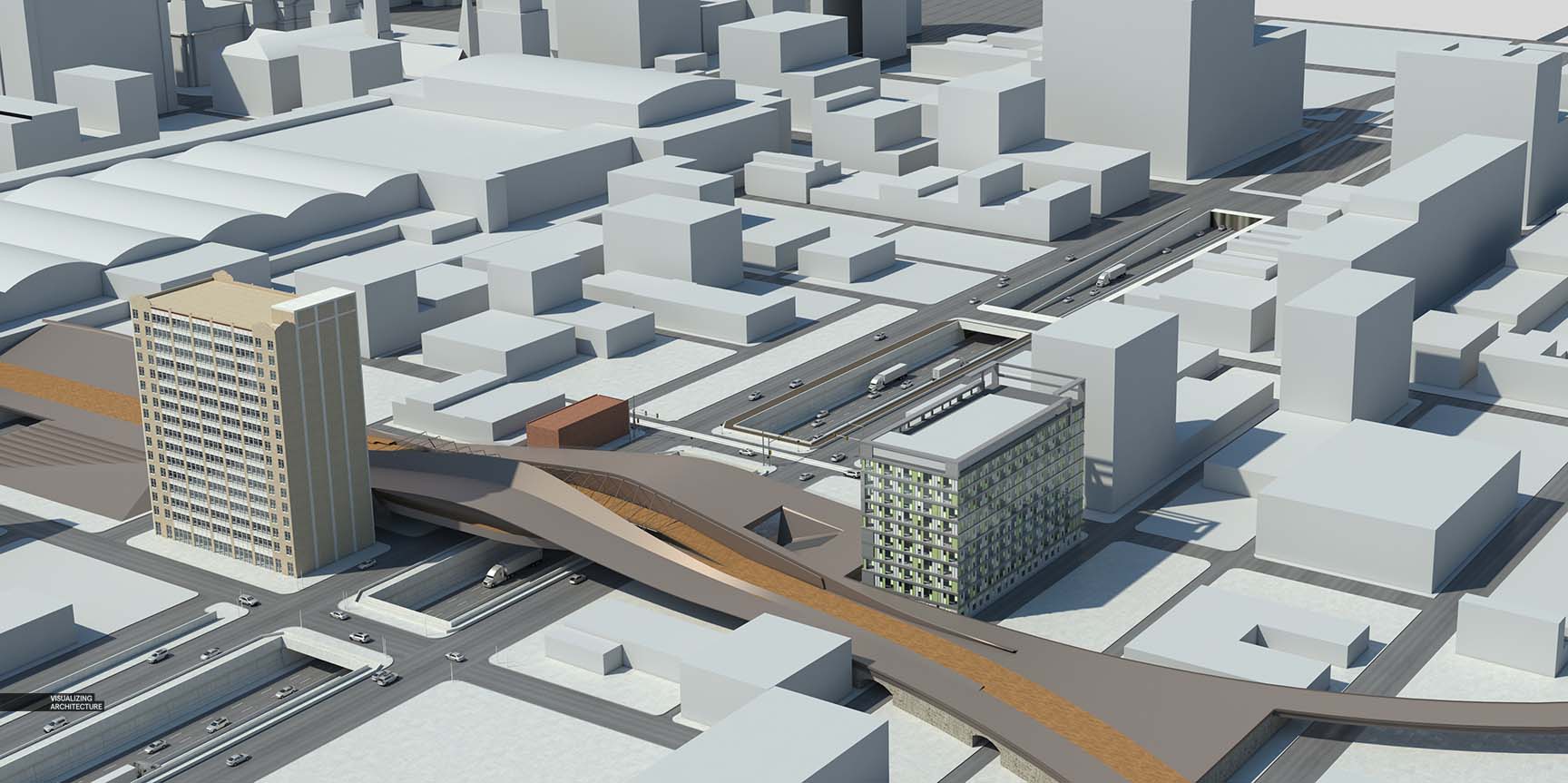
2. V-Ray Base Rendering
The base images were rendered in V-Ray at a slightly higher resolution than normal, 7000 px wide. People tend to zoom in closer on aerials so going with a higher resolution keeps the image looking sharp even up close. Also, the higher resolution allows for more accuracy when Photoshopping in details and creating masks.
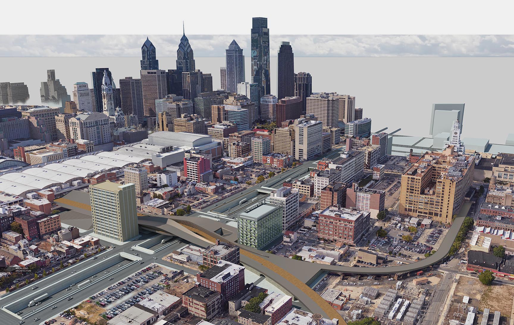
3. Context
Like I mentioned at the beginning, I don’t have any aerial photography or detailed models of the city at this exact view angle. Therefore I looked to one of the many free mapping websites for help. Most of these websites provide 3D navigation where really any angle is available of the city. The problem is the quality and resolution of these images is so low. The 3D imagery is generated from the aerial photography itself, so some cities are better quality than others. While the quality isn’t great, I still prefer this over the coldness of grey massing with half the city missing.
For this image, I patched in the imagery into three groups: foreground, mid-ground, and background. This gives me a little more control when matching the context images to the 3D model, but also for masking in atmosphere and effects later on.
It is important to ensure shadows match up when combing 3D with context imagery like this. The combination of high res 3D with low quality context imagery is already harsh enough, but not matching shadows just makes it that much harder to blend the two.
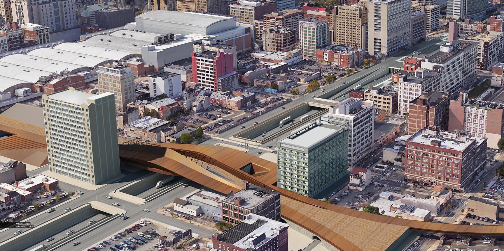
4. 3D Cleanup in Photoshop
I toned parts of the 3D base rendering to better match the context that was Photoshopped in and to dial in the colors of the materials on the bridge.
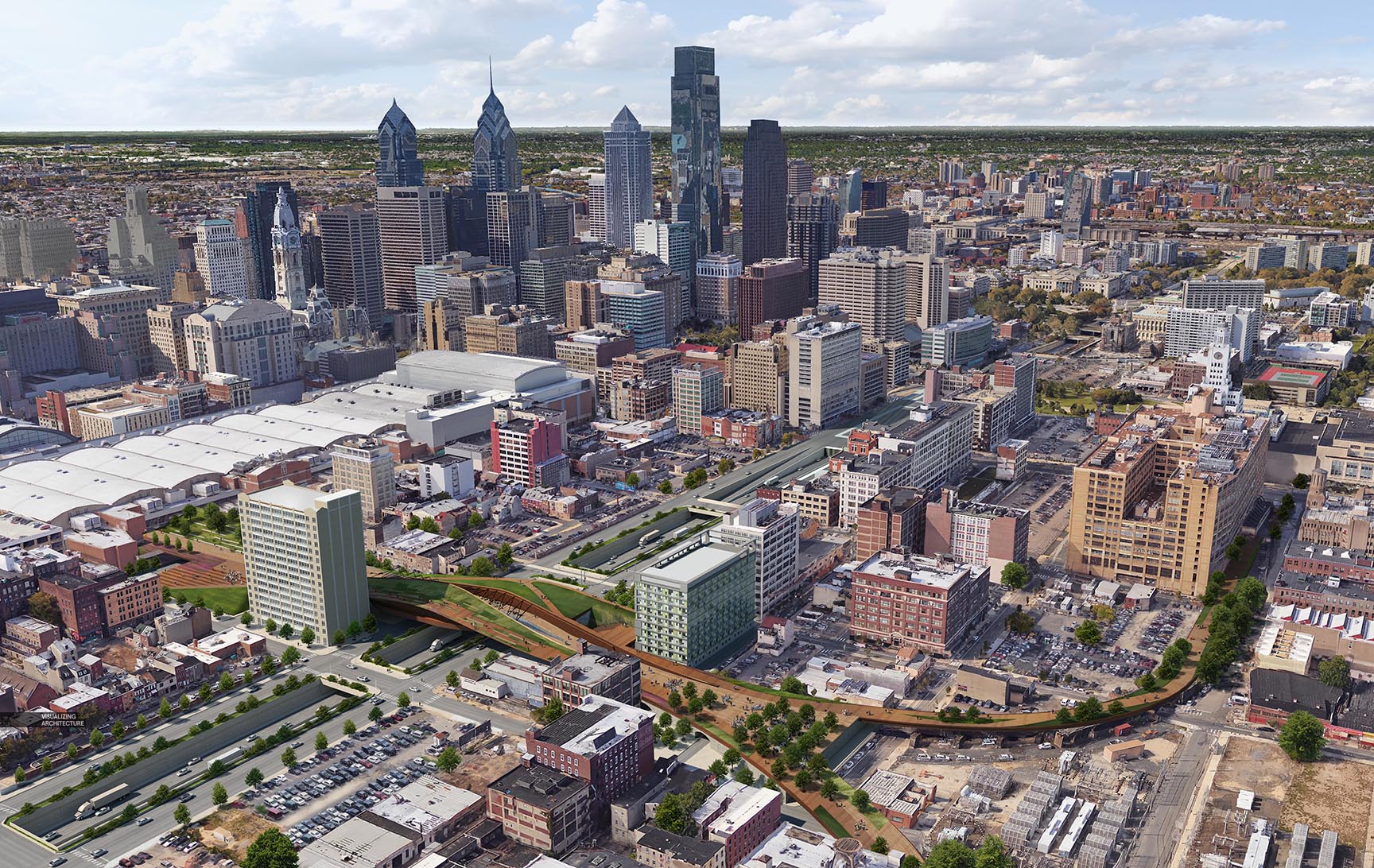
5. Vegetation and Entourage
Next came people and entourage. The people are so small that they are essentially acting as another layer of texture to the image. However, the vegetation was a way to draw attention to the project. I played up the strong green tones to connect the different parts of the design and to contrast the intense texture of the city context. All trees were added in Photoshop vs baking them into 3D because I wasn’t quite set on the design and layout of them.
6. Shadows
One way to insert hierarchy in the composition is to play with shadows. In this case, shadows created by clouds. I, therefore, placed the skyline in shadow, shifting the viewer’s attention to the bridge design in the foreground. By dividing the context imagery into the different groups earlier, I was able to quickly select the skyline to put into shadow while keeping the distant context in light. The cloud shadows were created by simply brushing in a dark blue paint and setting the blend mode to multiply.
7. Color Tweaks
Finally, I tweaked the tones using the Topaz plugin, and punched up points of interest with bright color overlays such as around the bridge and green space throughout the image.
While drone photos or even detailed city models are ideal, a decent aerial illustration can still be achieved without these elements through a mixture of online maps, patience, and some Photoshop magic. Now that I have this aerial out of the way, it is time to take a break from all of these perspectives and get back to some diagrams or possibly a new project. Stay tuned!


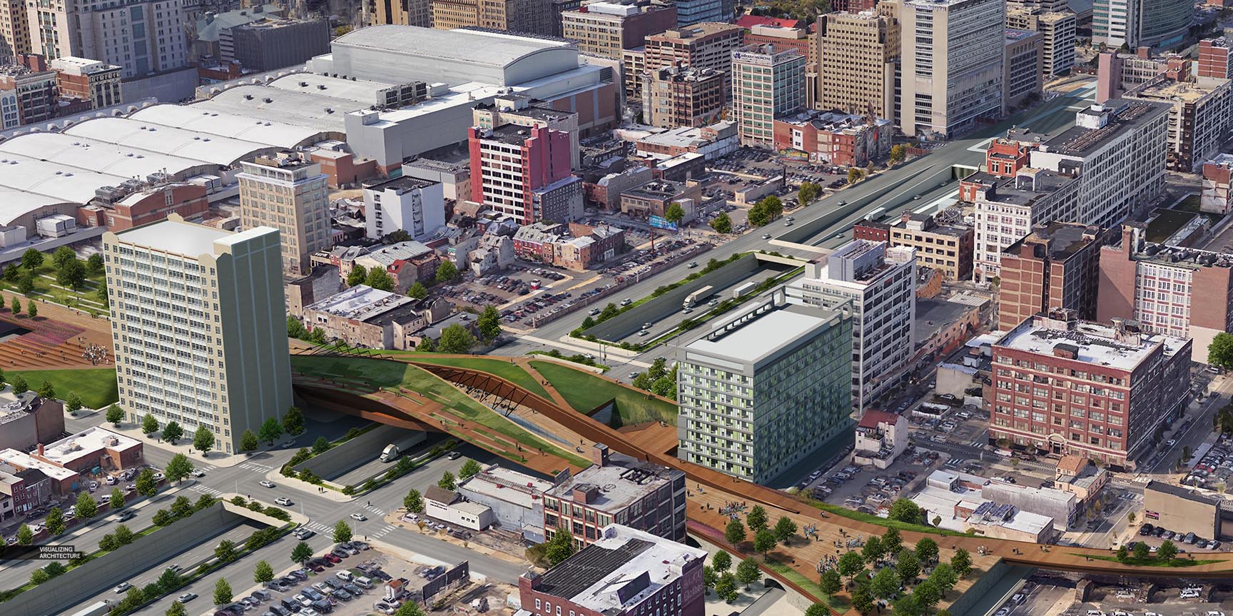
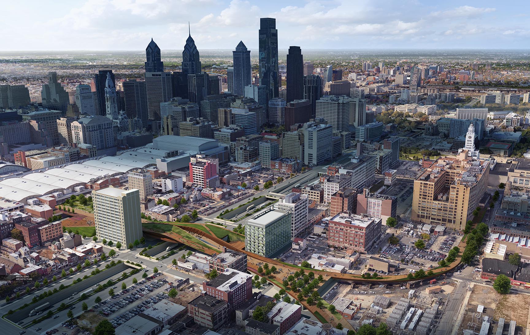

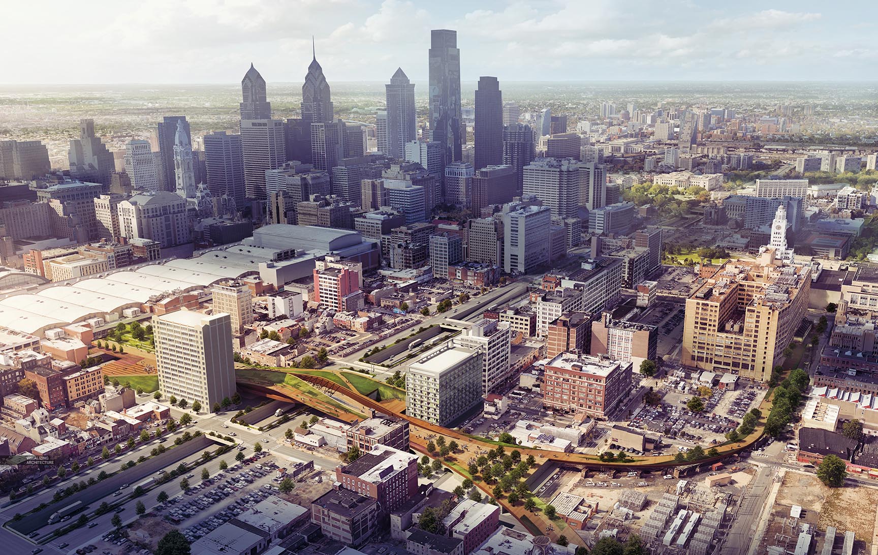

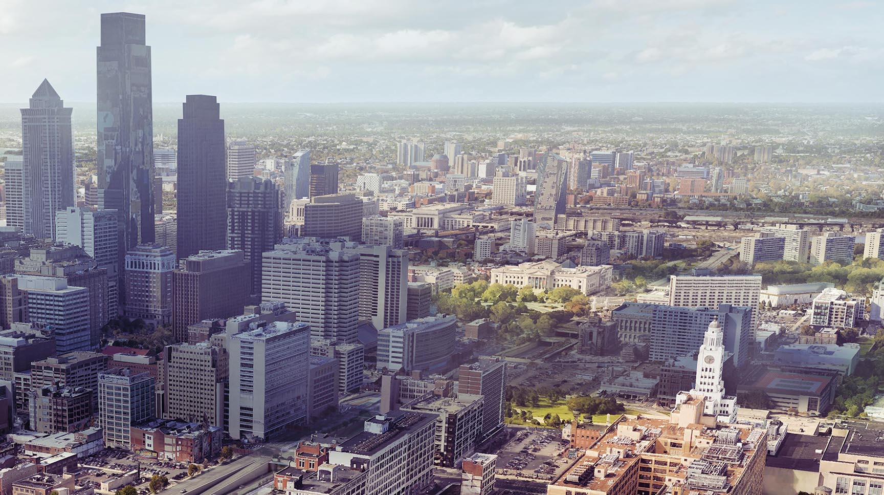


like always, impressive work.
Hi Alex,
I sat in at your presentation at ASAI and your breakdown is remarkable!
Was the 3D imagery generated from Google / Apple Maps Flyover?
Incredible work goes to show that a little extra thought and smart decisions, can produce work as good if not better than the big budget visualisation companies.
Would love a more in-depth on how the context mapping was done!
Great work!
Your work is getting better same supere your tutos us getting worser. How did you time that city textures. Any Photoshop layers screenshot?
Hi Luis, as I mentioned, this was just a quick break down, not a tutorial. Tutorials take quite bit more time to make which has been difficult lately. I hope to find some time soon so that I can describe this process a little more. Thanks
Great workflow break down again, man! Your work and openness to share is inspirational. Keep it up!
hii… another amazing work again… was just wondering how did you manage to get the bird eye view of the city at such exact point….
I’ve got the exact same question as karan
High-res Google Earth images will often do the trick!
I have the same question as Karan, songxisto and also Ralph.
.-How do you find that 3d high resolution images from a point of perspective that you want.
2.-How do you set the exact point of view (photomatch?, maybe skew the textures to fix?
Nice images, but not so good tut.
@All, this was less a tutorial and more just a quick breakdown, so sorry for the brevity. There are several ways to get the high res imagery from different online map software. One way is to download google earth pro which allows you to export 4k images. There are also many ways to align, though none are perfect. If you export the aerial first, then you can “overlay” the image in sketchup using the watermark feature and then adjust the model until you match it. I did it the other way which was set the view in sketchup first, then tweaked the aerial until I got the angle close. Lots of testing before I was able to get it to match close enough. Hope this helps.
thank you for your answer !
A tutorial of this process would be invaluable to younger students. It’s kind of a tedious process that isn’t talked about much.
Hi Alex, great work acomplished, again.
I´m really on the expectation of the tutorials, ´cause these vegetation and people inserted in this scale, and the background imagery matching, really deserves a tuto.
Wish you the best in your further works.
Alex but the google earth pro aerial images are “distorsionated” and kind of useless, like fluidify. Do you get the example aerial images from google earth???
Definitely I am making something wrong. My google earth pro reference city images are not as good and clean and with the same resolution as yours.
Make sure you use the highest resolution possible from Google to export it. This is usually 4k. Depending on what city you pick it may not work well for you as very few have good maps. They aren’t great images either way, but you can somewhat clean them up in PS.
Amazing work as usual! But I’m confused about step 3. Did you finished this step in rendering or Photoshop? It seems really a big work in anyway
I’ve got the exact same question with Li
@Li and Aaron, This step was done in photoshop using map screenshots. It really doesn’t take as long as you might think.
Good one Alex, and nice to see a further development on something i mentioned in the earlier top view sketch of this project. There is a lot of ways to achieve this based on this approach and available data, and have used similar techniques before with more than decent results.
Looking further to new posts.
Thank you!
Great work Alex. I have shared this post with my 3d modeler team and they can learn lot of things..
including all the modeling, how much time did it take to create this image?
Hie Alex, has been learning from your tutorials since 4 years ago and now more or less a decent ‘photoshop’ renderer haha. Keep it up! Still impressed with this aerial view rendering as for me this is the toughest. Hope to see the more detailed tutorial soon!
So awesome coach
Can you show me this steps in a video coach,thank you.
Awesome… this is very useful….https://bit.ly/2sL4gIf
Good Work…………!https://goo.gl/VsfmCc
Nice Post!
Hi Alex, thank you for this amazing tutorial! The breakdowns make the process super easy to follow!
I am having trouble understanding why it was necessary to model the city – as you are downloading an image from Google Earth Pro, could you not have simply collaged your bridge design into the image? What is the purpose of overlaying it and matching a render model?