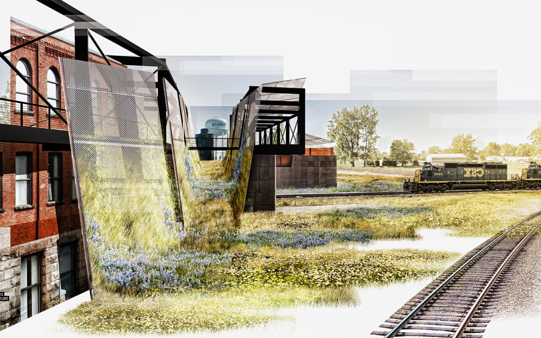
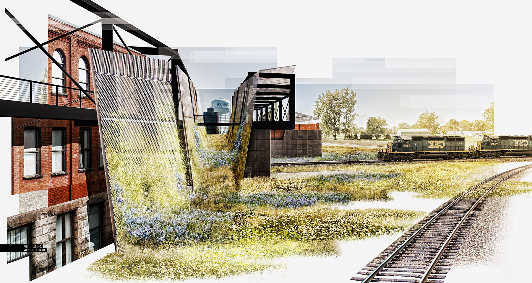
I was in need of some purely right brain thinking so I decided to skip modeling and V-Ray altogether and see what I could turn out with a half baked Sketchup model and some Photoshop. This meant generating a collage style illustration. These types of illustrations are great for speed but also for informal presentations where broad ideas and atmosphere are the focus and less about the details. Post processing is typically much looser and maintaining proper perspective is unnecessary. Instead, compositions are more playful and there are almost no rules. For this image, I saw it as a way to flesh out some ideas that I had about landscape and building materials. I didn’t have time to refine the 3d model so a collage allowed me to quickly throw some ideas around and see what worked. You will notice that in the end, very little of the original Sketchup model base image was still showing.
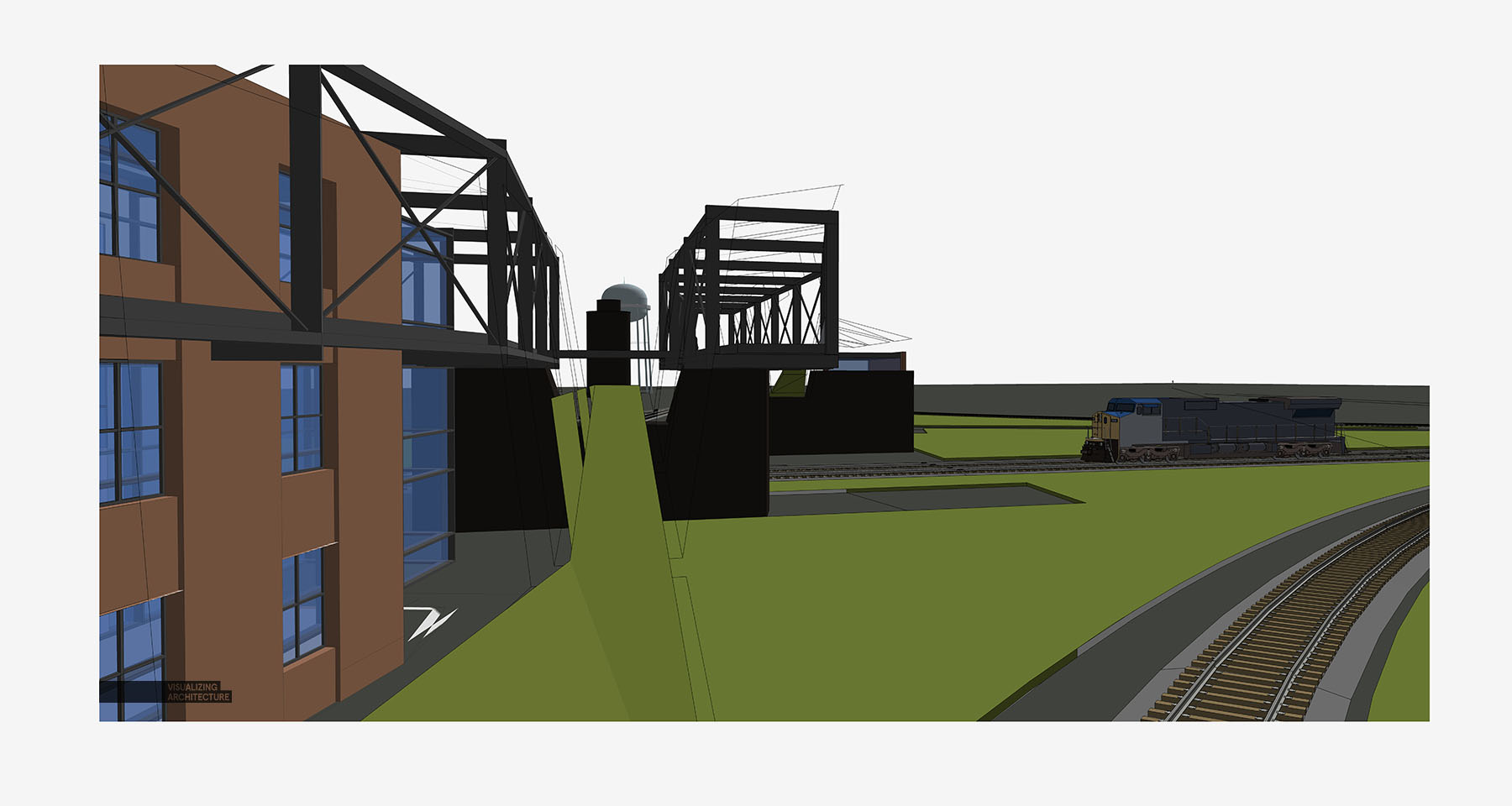
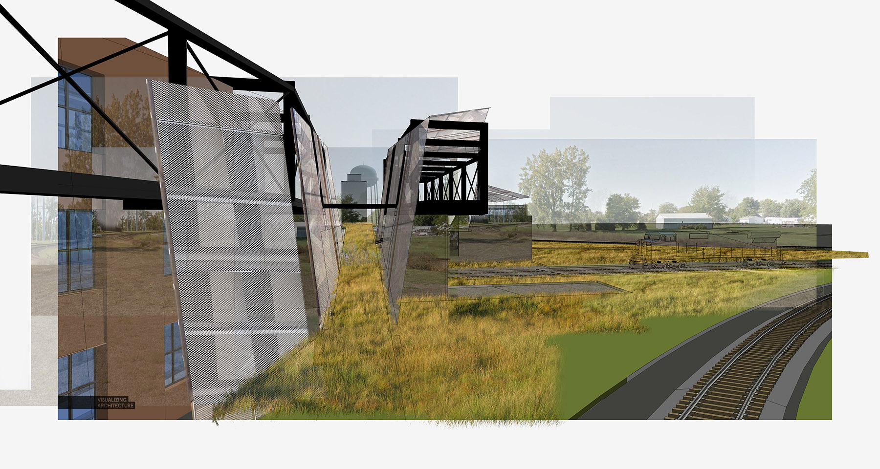
1. Base Image
The model was looking pretty rough but in this case, it doesn’t matter. I am more or less going to use this image as a guide for laying down other textures and materials in Photoshop.
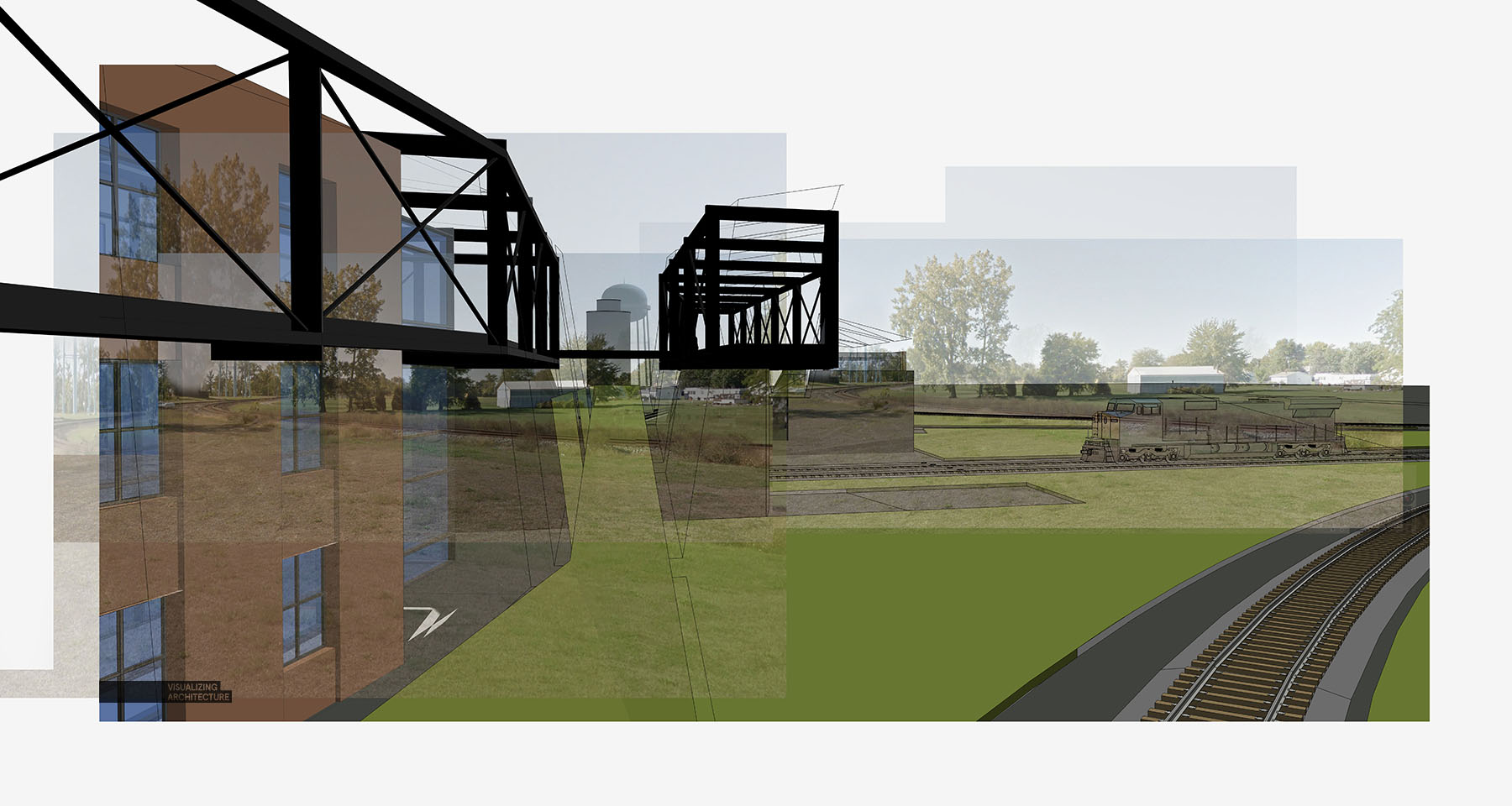
2. Background
Here, I threw in a quick background which I didn’t bother cutting out. I also extracted the steel structure of the Sketchup base image and placed it on its own layer. Since it wasn’t rendered, I darkened the Steel to give it an abstract look.
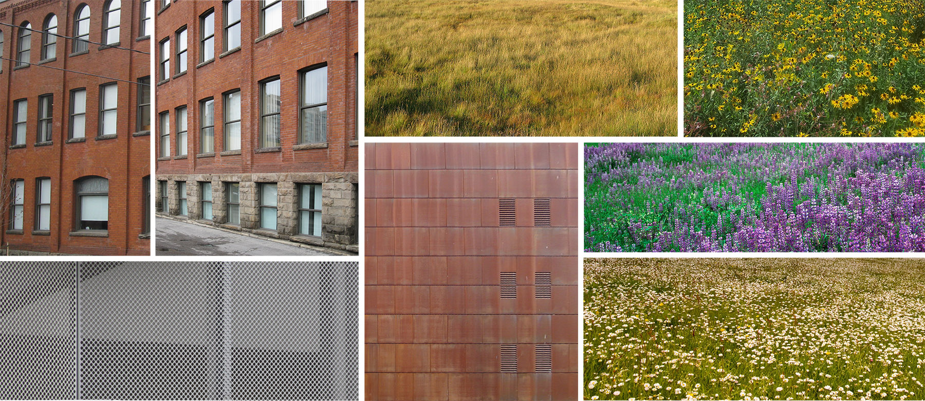
3. Textures
I scoured the internet looking for textures and placed them in a folder so that I could grab them quickly once in Photoshop. These are some of the ones I used though I found many other materials that I tested out but didn’t end up working for the design.
4. Screens and Landscape
I was going back and forth between metal mesh screens and wood slats, but ended up going with the metal because of its industrial look. I also placed a base layer of wild grass to help define the ground plane.
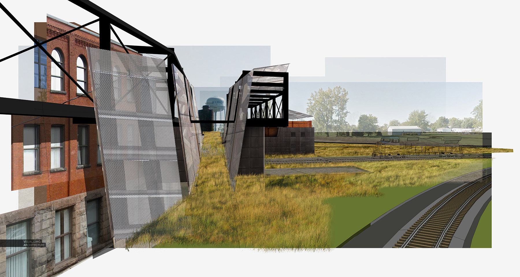
5. Brick Architecture
The existing main street consists of many historical brick buildings and I wanted to bring that language into the new design. Speed was the priority here so I didn’t spend a lot of time meticulously adding the brick architecture. I did however add a shadow to help separate the brick facade from the screen and give the image some extra depth.
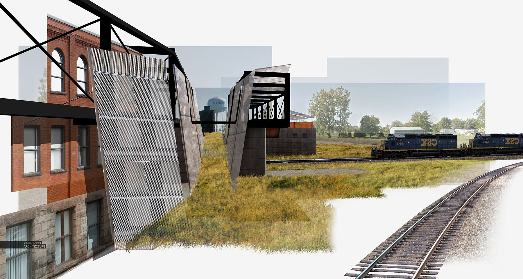
6. Tracks
Not only did I insert the railroad tracks, but I began carving out more white space to free up the different zones of the image.
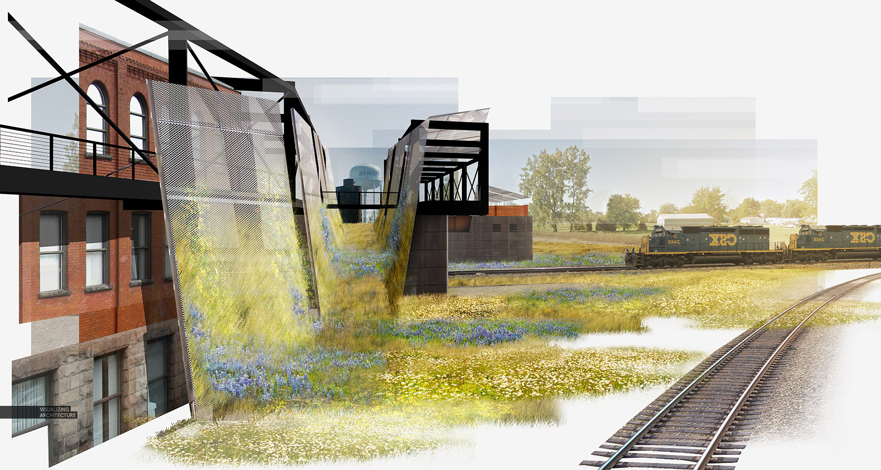
7. More Vegetation
An important part of this design is to introduce local wild grasses and flowers to the site as well as use it as a tool to connect the site with the architecture. I therefore played this aspect up in the image by really saturating the colors and using many different textures in the landscape.
8. Detail
Using the Topaz Labs PS Plugin, I increased the detail and sharpened the image which gives much more clarity to the vegetation. The final result actually ended up much less “collagy” than I expected but still served its purpose as a design tool. It also makes the point that you can get decent imagery fast without complicated models or rendering engines.
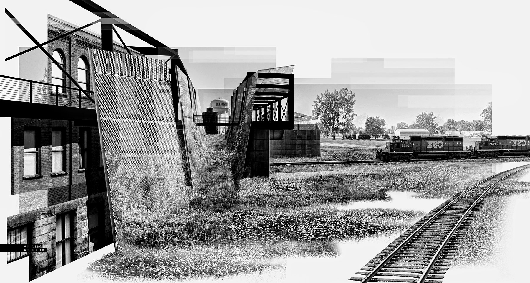
At the last second, I also tried out the image in black and white which brings with it a whole new set of readings and hierarchies. The steel structures are much more dominant and takes on the industrial feel that I was looking for.


Very nice with great detail!! As good as always =D hello Alex, can I ask you, what rendering programs have you tried so far? and what can you recommend for us? Thanks as always
I used to follw this guy back in 2010, back then he used some low level program called Kerkythea (waste of time), now him and I use V-Ray. Cannot go wrong with that, simply soo powerfull on a complete another scale. Amazing what a stuff the guys at MIT can create.
Very interesting technique!!! Thanks for sharing! Have learnt a lot from your blogs.
Thank you for sharing! This is a great technique to express atmosphere and the feeling of an architectural concept. I just want to say a big thank you for your blog – it’s an awesome source of inspiration for my work!
Wow! Very interesting approach… Great job!
Beautifully done! Thanks for sharing.
Hi, I’m just wondering how do you change the railway tracks and the train. do you render it or did you find a completely new image and place it there, or do you just played around with the image adjustments.
That is actually very impressive!
Oh,This is so impressive!
Can I ask you a question? About those picture resources. Where did you get so many good pictures? I mean , the railway ,the train , they are in the perfect same view of the sketchup model.
Can you show us how to find a good picture that is in a proper view? Thank you so much .
By the way, this is a comment from china. It’s a pity that we cannot get a good resource picture easily these days( a lot of foreign websites blocked ). That’s why I’m so curious about how to get a good texture.
I’d be appreciate if you can share the way how you search for pictures!
There was a post where Alex shared with us picture/texture resources that he uses.
your the best i know man, great work as always… #inspirational
Hi, Alex. I’ve always admired your works. Just a question though, I’ve been wondering how you get the edges of your sketchup files to appear really smooth on jpeg. I’ve been having a difficult time with post processing because my sketchup 2D Graphic always ends up looking rough around the edges. Thanks! Here’s a photo for reference. (Tried out your technique on sketchup to photoshop rendering)
When you export your JPG from SketchUp you need to tick anti-aliasing under the options. That should remedy your problem.
you are always the biggest inspiration. keep on the good work. Thank you for all you do.
Hi Alex! Amazing work as always. Your images simultaneously aspire me to push my own renders farther and depress me into thinking they’ll never be as amazing as yours haha. One major question I always have, though, is what canvas size and resolution to make my Photoshop file. Could you give any tips on the best sizes to work at? Thanks!!
I love this. I’m curious how long this took and where you pulled the textures from.
why aren’t you sharing videos anymore?
so beautifull, love it
would love to see the video, to see the applying of textures
非常有创意的做法,谢谢分享
Informative Article:)
nice job
Looks amazing, I’d love to see a video of you applying the textures
Amazing work as always 😉 I have a question though. How do you achieve such an amazing results when adding more vegetation at step 7? It really looks like it it scrimbling up that metal mesh screen.