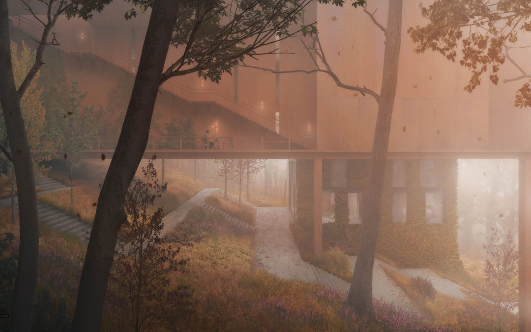
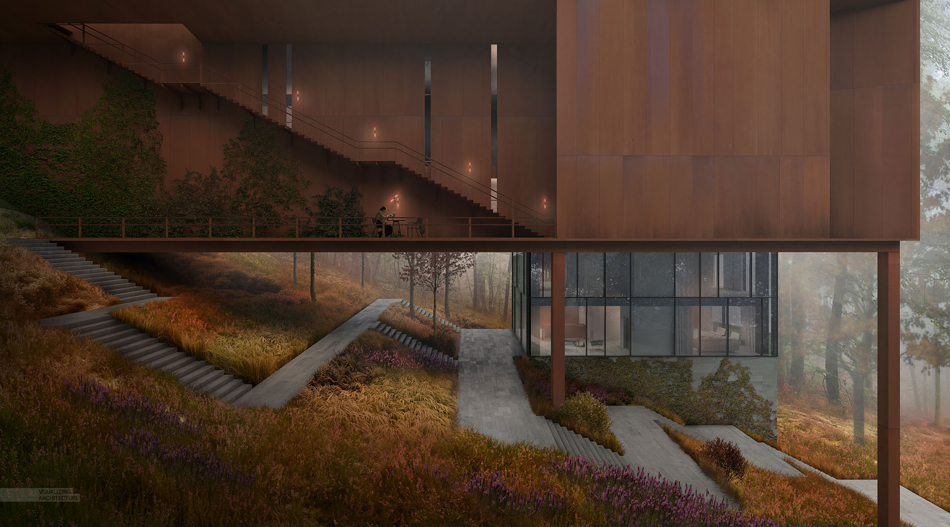
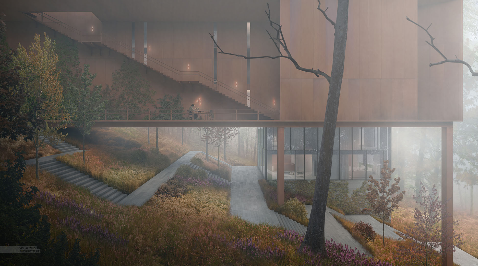
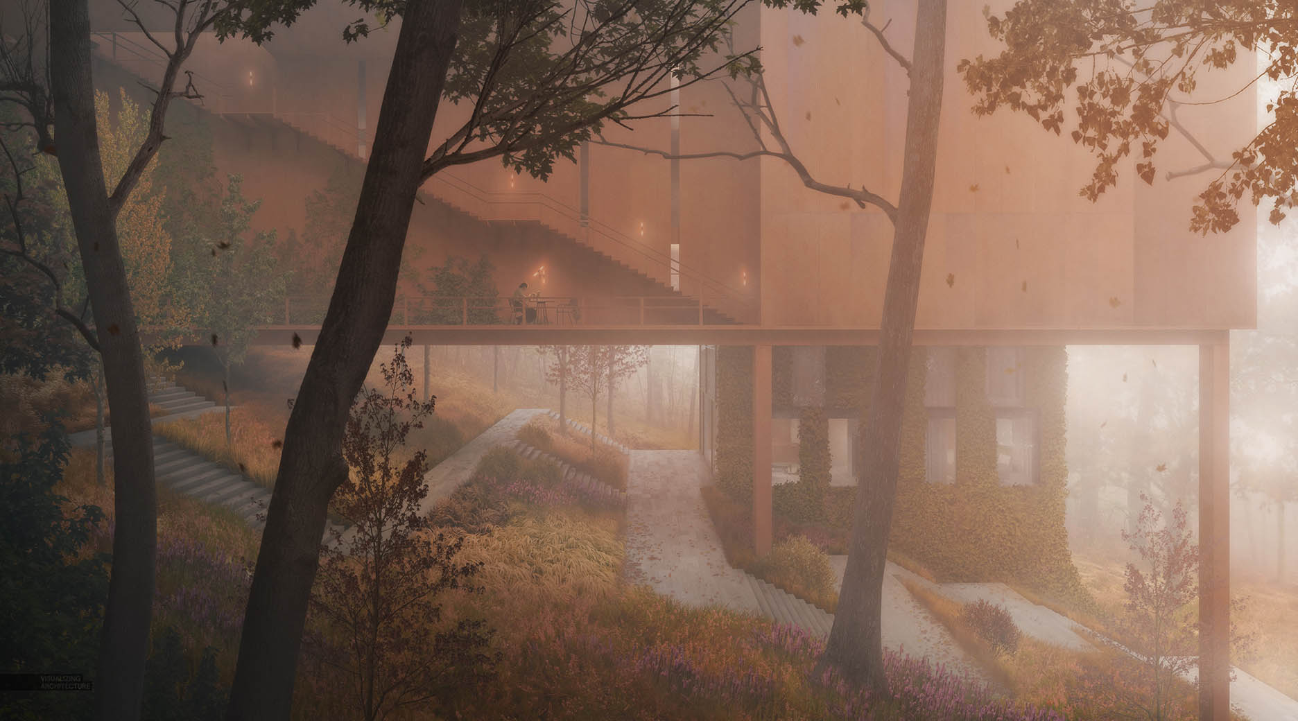
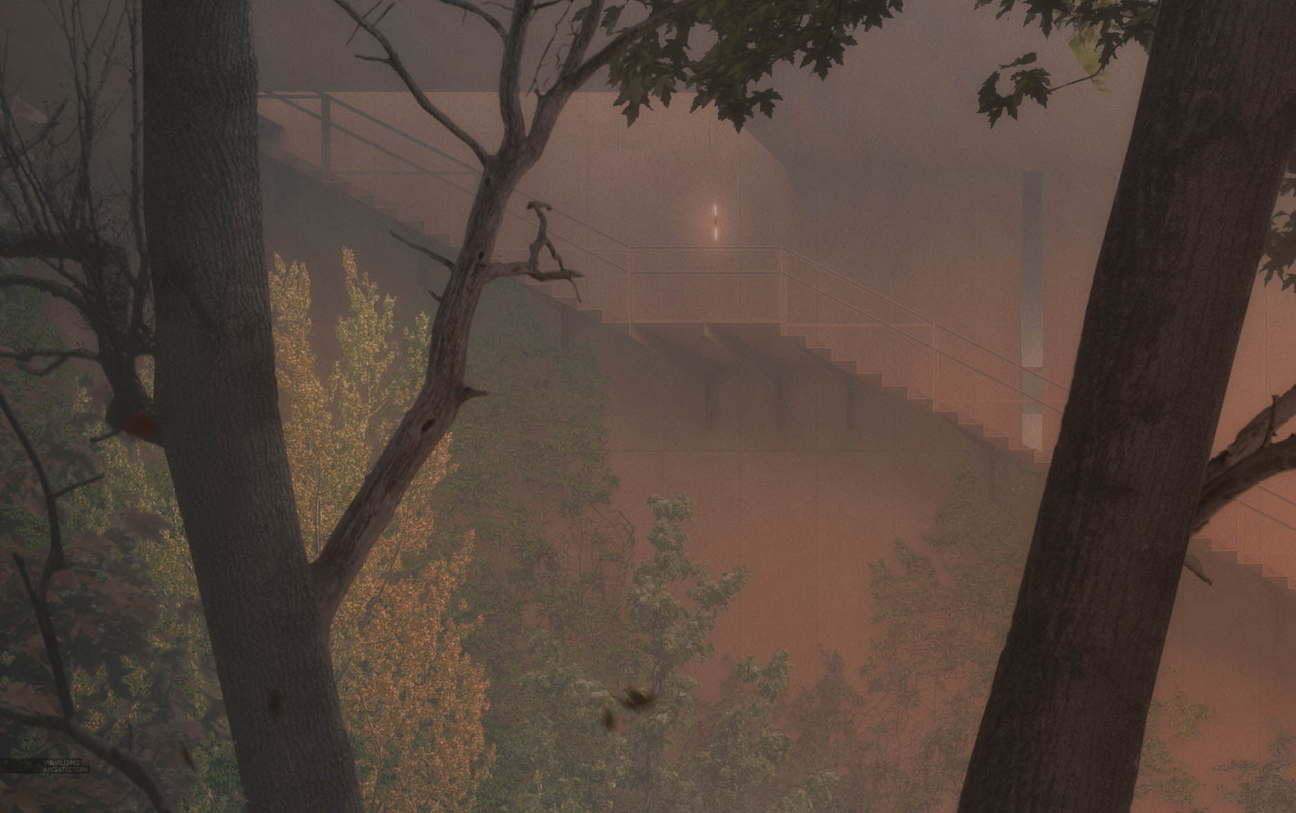
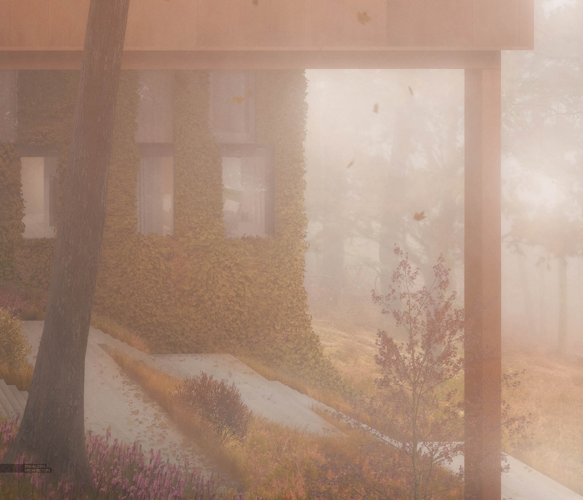
This will be a quick post, but I wanted to show another image that I have been working on. This illustration was put together to study the ground around the base of the tower. I wanted to iterate on some ideas I had for the landscape/hardscape relationship as well as what some of the details are for the back side of the bridge. Below is a really fast breakdown of the image. You will see that I layered in the fog on several steps. I didn’t set out to make this image a fog scene, but it ended up going in that direction as the image developed.
1. Roughing Up the Base Rendering
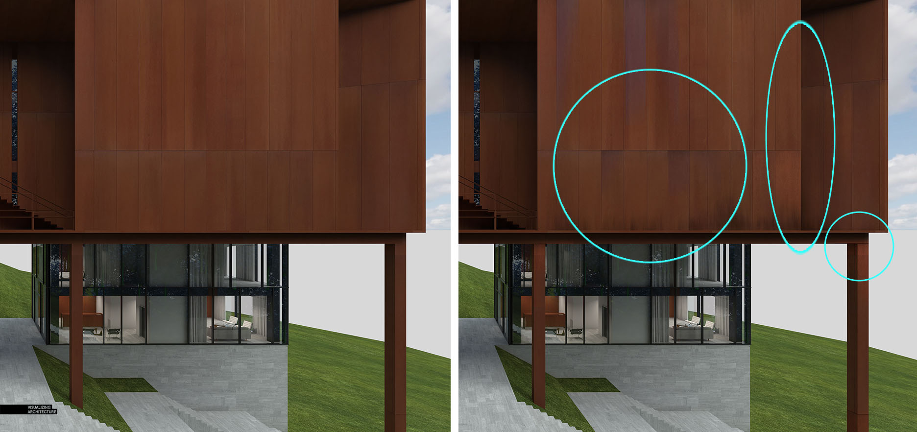
One of the first things that I did was rough up the Corten steel texture a little more in Photoshop. I spent a lot of time building a texture that would render out half way decent in V-Ray without showing tiling. However, the material was still a little too perfect so I darkened up some panels and added dirt overlays.
2. Ground
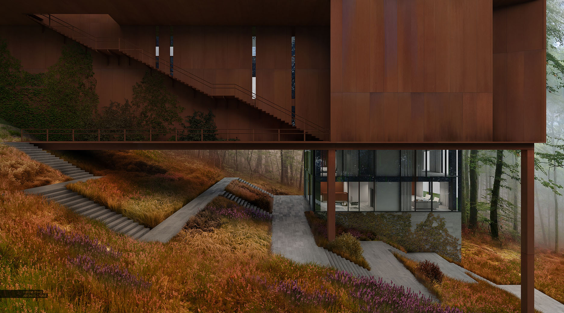
The ground needed a lot of texturing. I wanted the stone paths to feel as if they were meandering through wild grasses. The image shifted to a fall scene about midway through the process, so I added warm overlays to the grass. The overlays are a bit strong and unnatural, but once the fog is added, things calm down a bit.
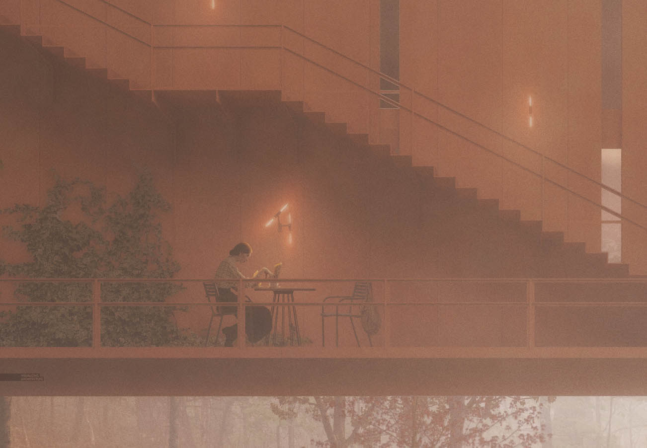
3. Interiors and Entourage
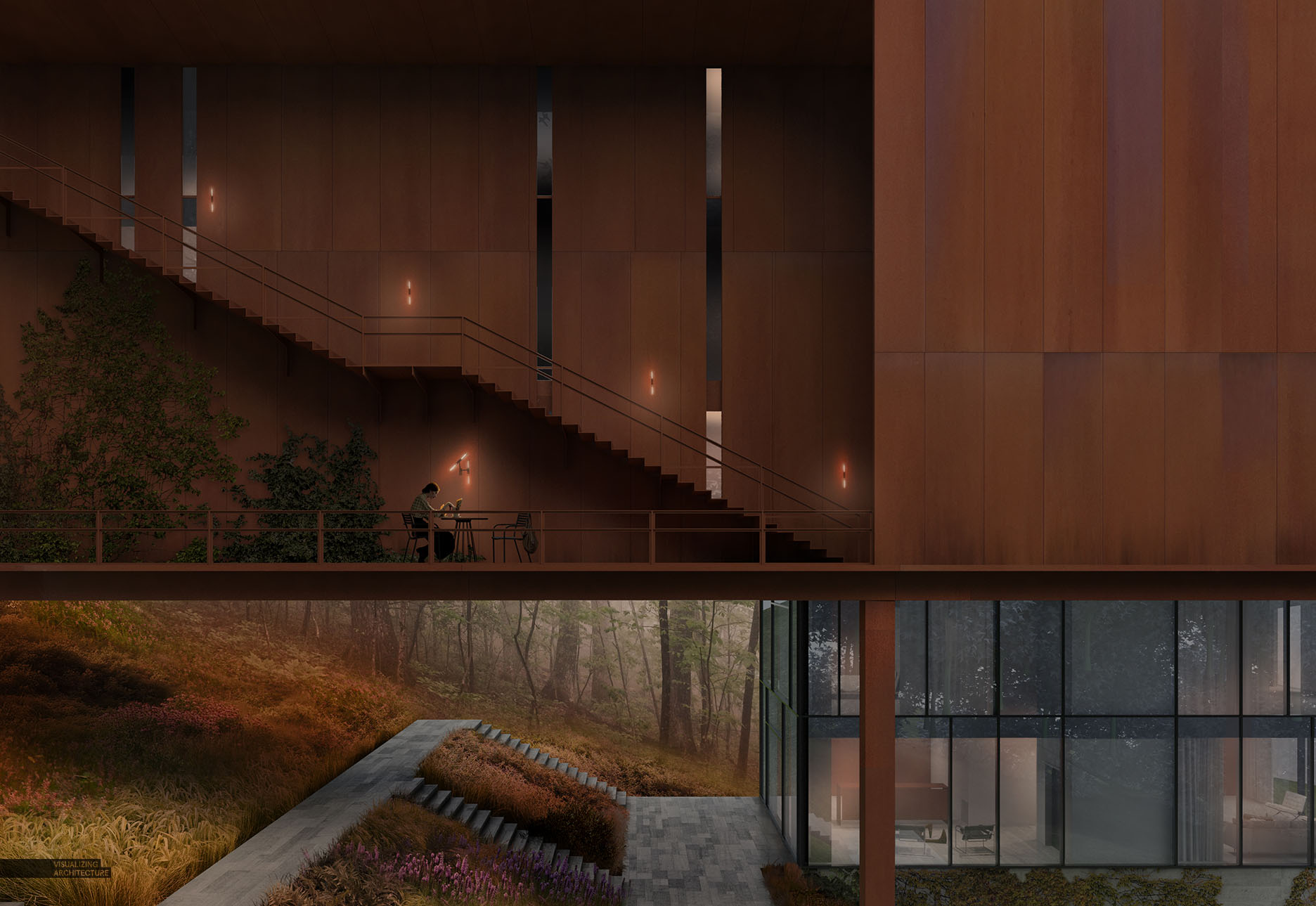
Similar to the last illustration that I posted, I wanted the feeling of this image to be quiet and contemplative. Therefore I minimized the amount of entourage. I added a person reading a newspaper, some sconces on the wall, and hints of activity in the interior.
4. Fog and FX’s Round 1
The first round of fog that I added was to setup the overall gradient of the image with the right side being brighter, and the left getting some vignetting.
5. Fog and FX’s Round 2
For round 2, I added some foreground trees, and layered in a bit more fog and haze.
6. Fog and FX’s Round 3
Finally, for the last round, I added several more foreground trees and branches and added in another layer of fog. The Corten steel was getting a little washed out so I painted in some warm overlays to bring back the orange tones of the steel as well as to brighten up the landscape. You may also have noticed that I added more ivy growing at the base of the tower and some other finishing details. Like I said at the beginning, I am still testing out ideas with the design so things may still change.


Wow great mountain lodge pic…. Thanks for sharing.
Hi Alex!
I was wondering if you could explain how you do the ivy? several times ive tried to implement it in my renders, and i’m never satisfied.
As always, great work, I love it!
Ermin
I guess its ivy photo masked off with ivy / leaf shaped brush.
This is mind blowing!
You are such a talented architect and artist!
Thanks for sharing always your techniques with all of us!
Wow, this place is beautiful, this is an ideal summer destination. thank you for sharing.
Thanks for amazing picture.
Lovely pictures.
But the green vray grass that can be seen through the glass in the interior is killing me… 😉
Could you do an updated Tutorial on how to add grass/ivy etc.
I know the older videos, but somehow your current process seems a lot more refined.
Thanks so much for all you are doing!
this is amazing post . thank you for sharing this awsomwe post .this is very helpfull.
Very helpful advice in this particular post! It’s the little changes that make the largest changes. Thanks for sharing!
Thanks for sharing! Your work is so inspiring.
I wonder whether you could make a tutorial about creating this beautiful meadow. That would be really great.
Stunning scene! May I ask where you get all those high quality trees, leaves and shrubbery? Simply google searches or do you have some certain websites?
Wow. Awesome post and photographs. It sounds quite informative and interesting to read this post.
Thanks a lot for sharing your knowledge.
Very helpful advice in this particular post! Thanks for sharing!
hi alex, thanks for the wonderful image , i have two doubts, first about the ivy , did u create it from the ivy generator and second how did u add the autumn bushes and grass , a small breakdown on that part will be nice
Nice photo shoot.Awesome post
Hi Alex. Thank you for your images and your posts. You don’t know how you helped me and inspired me to create my own channel on YouTube for architecture called (surviving architecture). Could you please check it out and give me your feedback. I also did a video about you hehehehe.
Helpful article. I found interesting information for me
you are really talented, making use of the technology around really helps a lot!
Are the trees in the foreground 3D rendered, or are they cut-out images?
Great blog man …………thanks keep it up all the time. am very happy to see your pics quality.