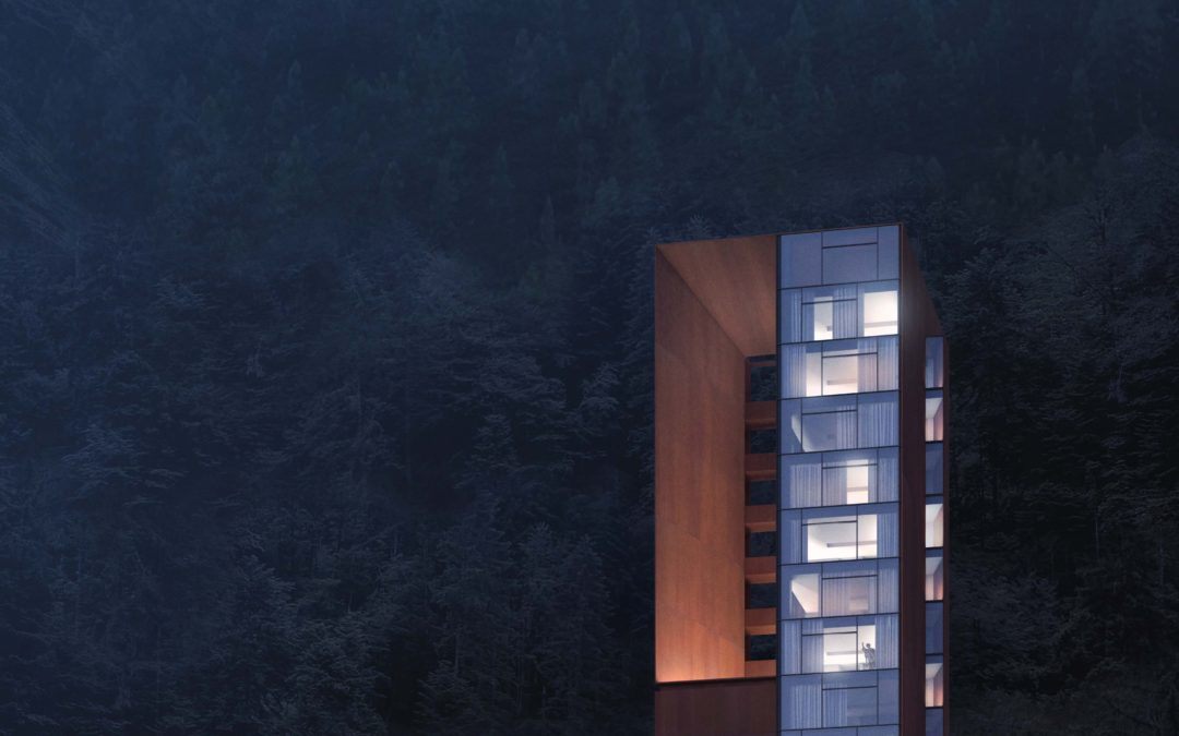
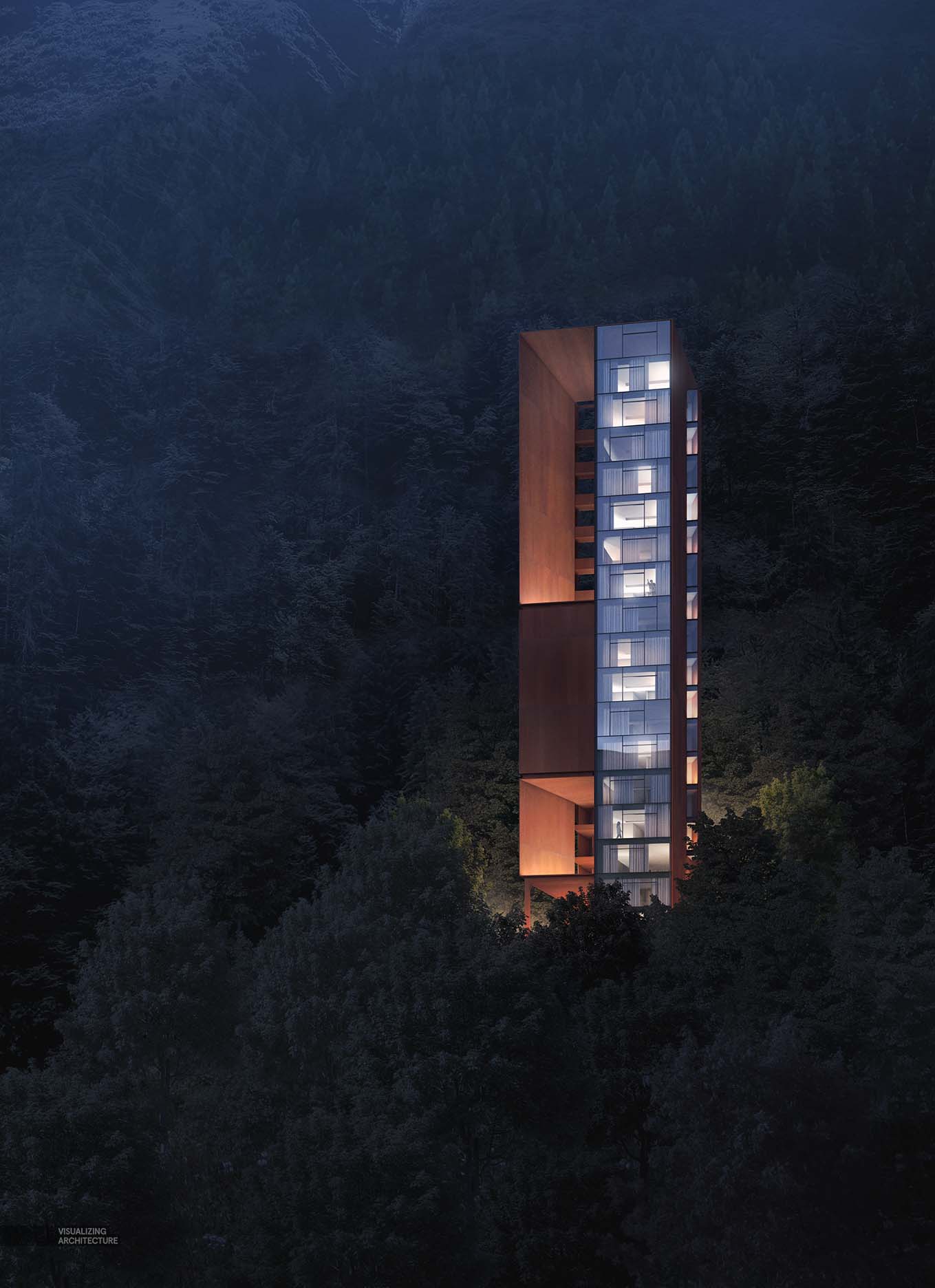
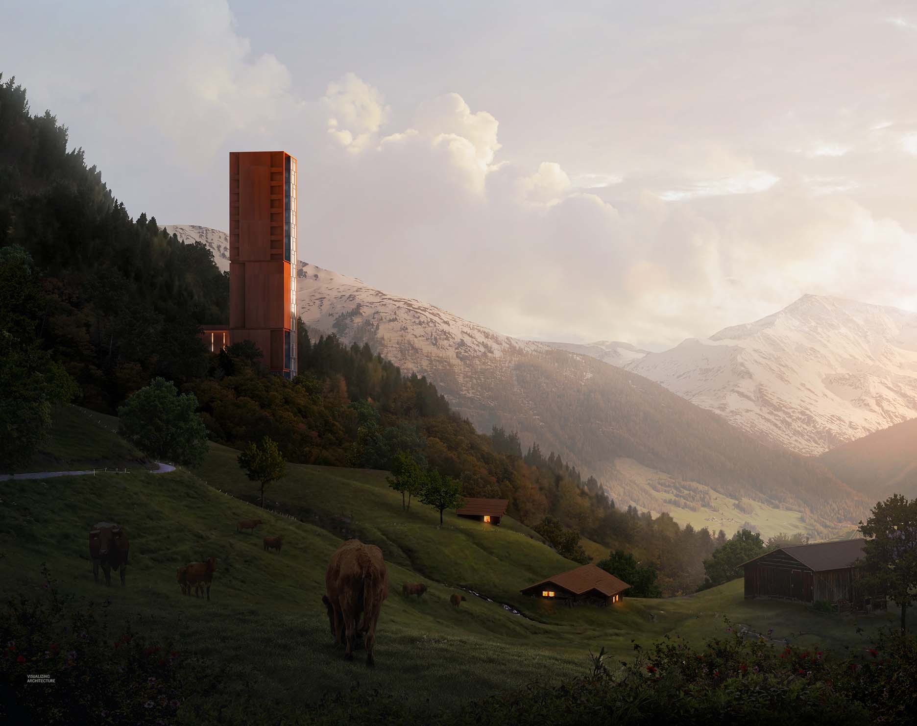
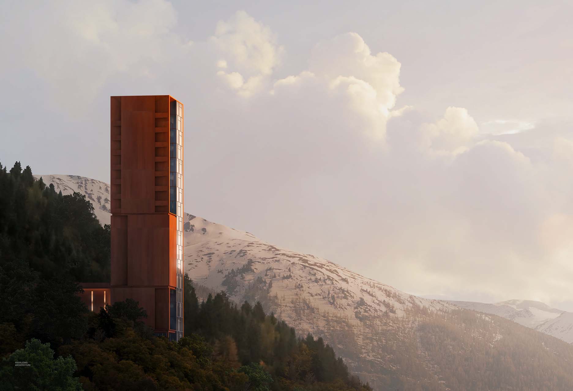
It’s been way too long since my last post. It has been a busy month traveling and moving Design Distill to a new office. However, I was finally able to find some time this weekend to put together two new images for the Mountain Lodge Project. For these images, all I had was a few ideas in my head of what I wanted, but not necessarily sure about how I would execute them. For both images, I ended just quickly picking some views, rendering them out, and then building in the surrounding context around the architecture. I knew I wanted to tell two stories, one of how the lodge is perched on the side of a mountain and the other showing how the two large portals become major beacons when lit at night. I also wanted to convey an idea of quietness and contemplation, an idea I have been pushing in previous images.
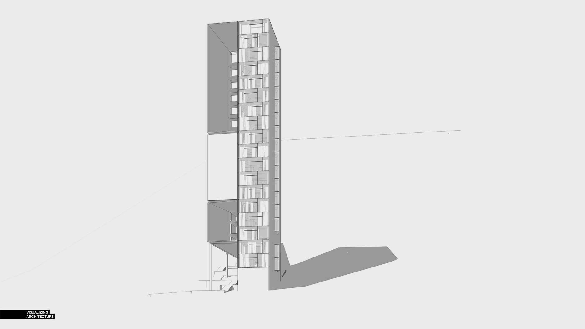
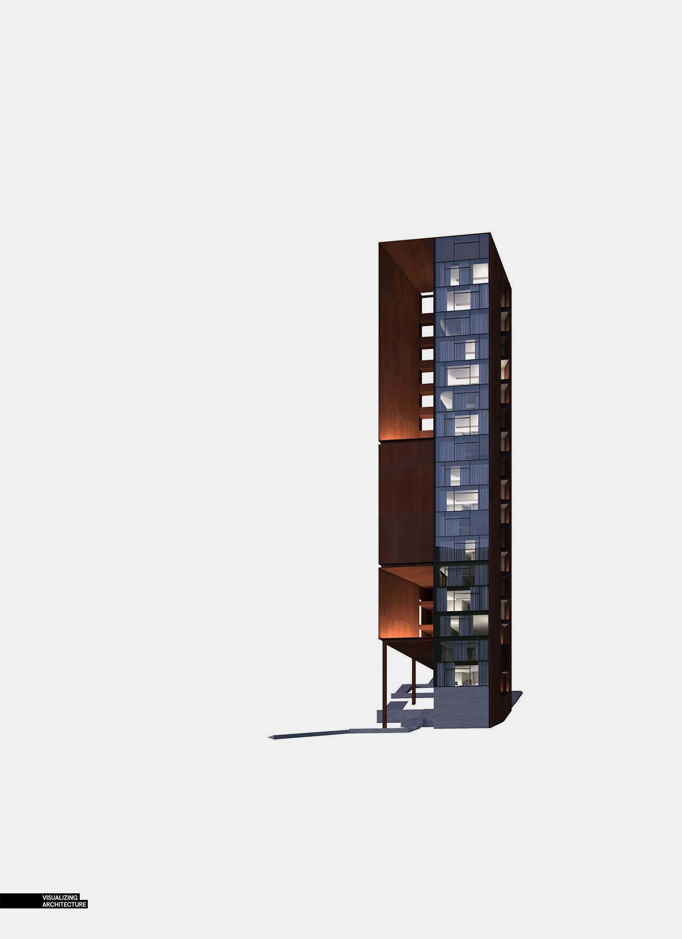
Due to time, I only had a chance to roughly explain how the closeup night shot came together. It ended up being a quick image to create, about 4 hours start to finish including lighting up the interiors in 3D.
1. View Setup
I knew I wanted to capture the entire height of the building and the front of the building which meant the view was easy to determine. I did end up changing the proportions of the canvas in Photoshop and set this image up as a vertical layout.
2. The Trees
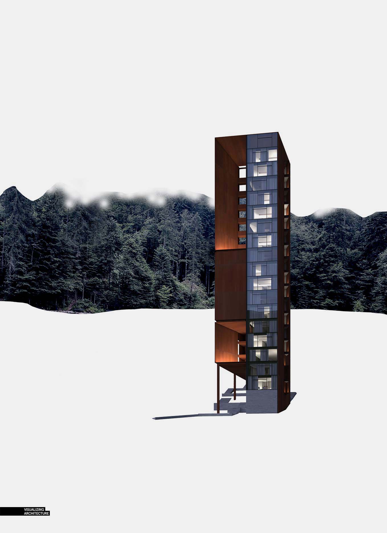
For some reason, I had a difficult time finding trees at the correct angle. I ended up finding a not-so-great texture of trees and then just copied it several times. I was able to get away with the bad quality texture because the images was going to get significantly darkened.
3. Darken, a Lot
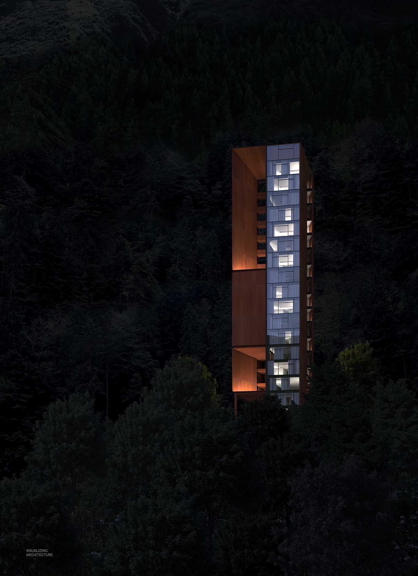
Once all the background textures were in, I darken everything to nearly black. I wanted the focus of the image to be the portals, and not the background. I just about went completely black, but at the last second, pulled it back so that some texture of the trees remained.
4. Add Some Gradient
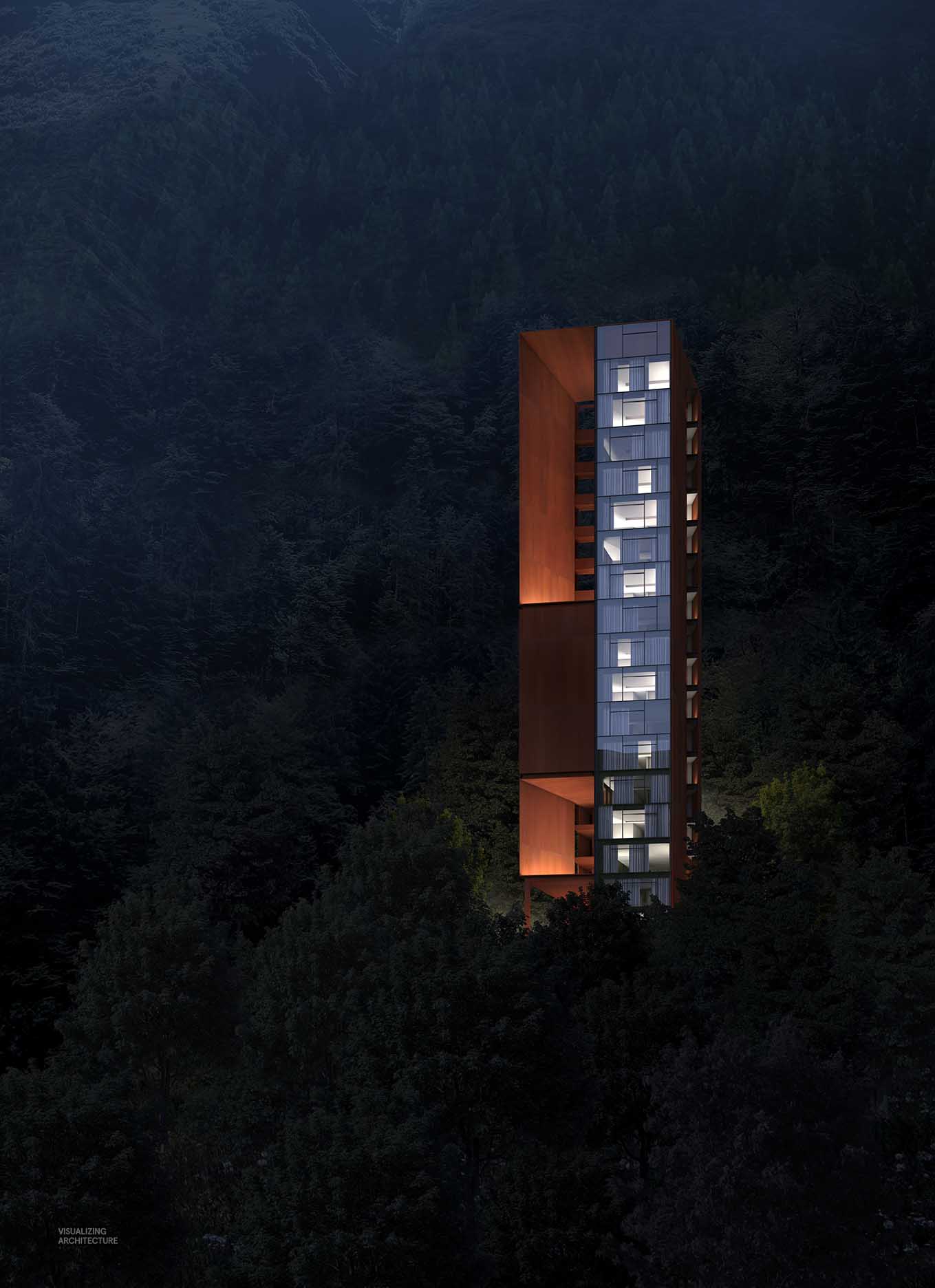
I added just a hint of fog at the top left corner to give the image a little bit of a gradient and to imply that the hill was receding into the distance.
5. Enhance the Light
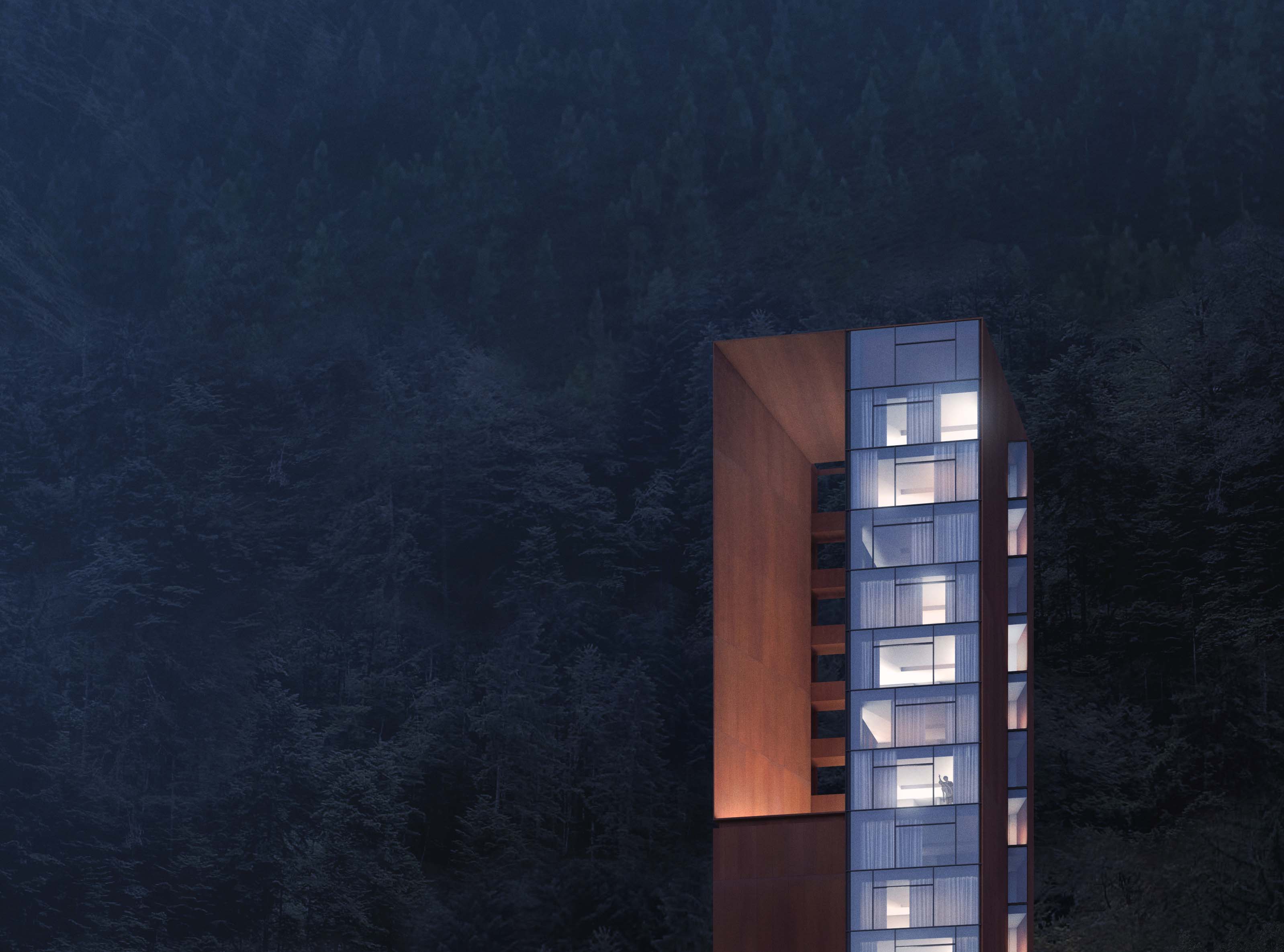
Finally, I reworked some of the lighting on the building. I increased the light in the portals and softened some of the interior lighting. I also shifted the entire illustration just a little more blue. This image came together really quick. Even so, it is probably my favorite image so far. Sometimes keeping it simple wins out.
I also built this image which ended up coming off very “painterly”. Its made up of many different images stiched together to form the mountains, trees, and foreground hills. More images to come soon.


Hi Alex – love these renderings! Hope you’re doing well!
stunning as always
Thank you for sharing.
eyetechsol
I am a little disappointing in the quality of postings lately… The images as always are excellent, however they lack the educational aspect that they once held…
hey alex, i agree with ryan. great work, but can you break it down more precisely, so we can learn how to do it.
I hate to say it but I agree with Ryan Lee’s comment as well. For the last four years, I’ve learnt SO much from you. I hope we get to see some of the great breakdowns you used to do. Nothing against the images though, fantastic as always.
Hello Alex. First of all , congratulations for your work. Your work is always perfect. I am an architecture student and I use Skp-Vray for my projects. I wanna ask you how can I render in totally white mode as you (I have tried with material override but I understood that it is not the right way). Thank you in advance.
To be honest, this image is stunning. I ve been working lately with man made landscape and have tried render a whole view with loads of assets. The end rusult just came out far worse than I could ever imagine. I am really inspired by your work with sheer photoshop which turns out to be really outstanding!
Like your work! Thumbs up for you.
Hi Alex. Thank you for your images and your posts. You don’t know how you helped me and inspired me to create my own channel on YouTube for architecture called (surviving architecture). Could you please check it out and give me your feedback. I also did a video about you hehehehe.
Nice post. Thanks for sharing.
You have raised very valid points in your post. It really happened some person do not have the right idea. But with your awesome tips, one can easily identify it.
I think the final picture looks great, considering its has to be done within 4 hours. I appreciate the step by step guide shared here, thumbs up!
This is fascinating. Please do more article with step by step like this.
Hi Alex,
love the images and have learned so much from your site. I was wondering how you did the lighting and interior of the building?
The way you do your lighting for the building is amazing! Thanks for sharing, hope to see more of your projects here!
trees or objects on stage to give the same effect as in this work?