I posted a landscape video tutorial a few weeks back, however the video did not cover some final post processing steps used for the final look. I received some comments asking for an explanation so I thought I would put something together quickly. The steps are basic and better explanations can be found under the quick tips section of the TUTORIALS PAGE.
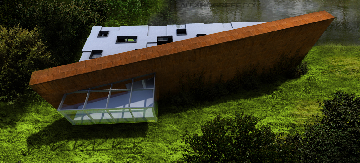
At the end of the landscape video tutorial, the image was looking good (Below), however there were a few subtle details that I still wanted to adjust.
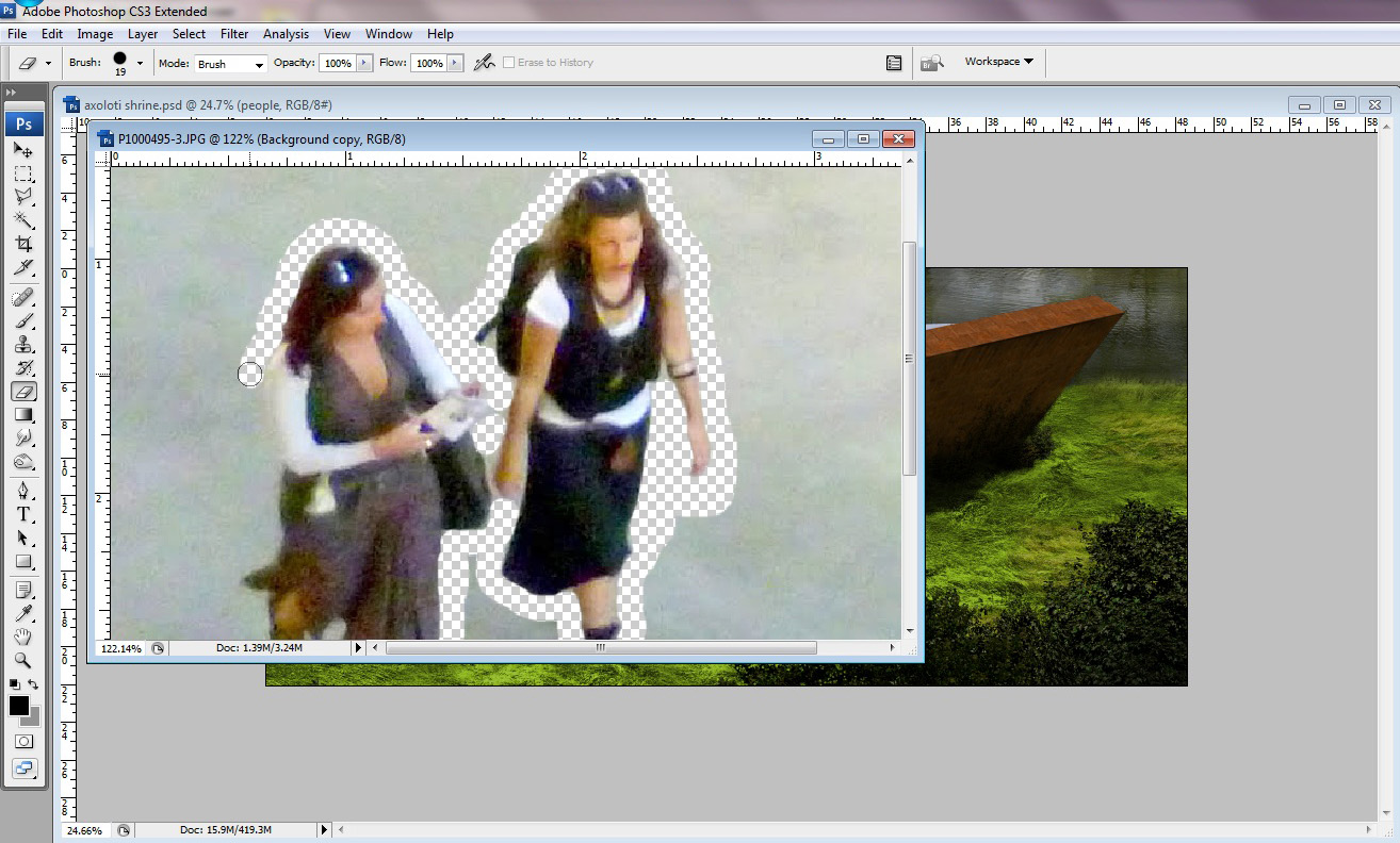
1) First, I found an image of people at the correct camera angle. I quickly cut them out by erasing the background with the eraser tool.
2) The cutouts were dragged into the illustration and scaled to the correct size. I also painted in a soft shadow to set them into the image. Another tip is to desaturate the people about 50% so that bright color clothing doesn’t become too distracting. It also allows people taken from different images to look better next to one another.
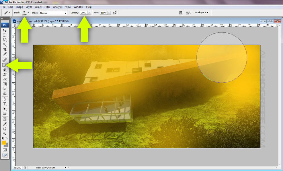
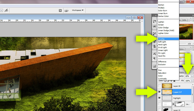
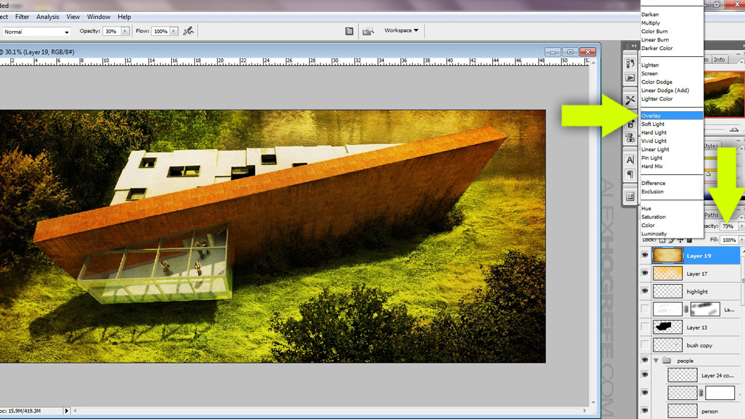
4) Double check that the orange layer is at the top, and set the blend mode to “Overlay”. I like to give my illustrations color overlays because it helps to tie all of the different Photoshopped elements together, especially in an illustration like this with different trees and grasses. A more detailed description of color overlays can be found HERE.
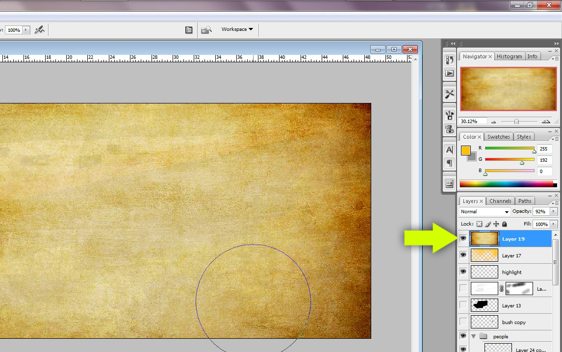
5) Finally, I want to add just a little grunge effect. Find a good grunge texture and move it to the top of the layers pallet. The one I used has an orange hue to it which will strengthen the orange in the previous step which Im fine with. If I wanted, I could desaturate the texture to avoid the added orange color and just utilize the texture.
6) Set the new grunge layer to “Overlay” and lower the opacity. A more detailed explanation of the step can be found HERE.
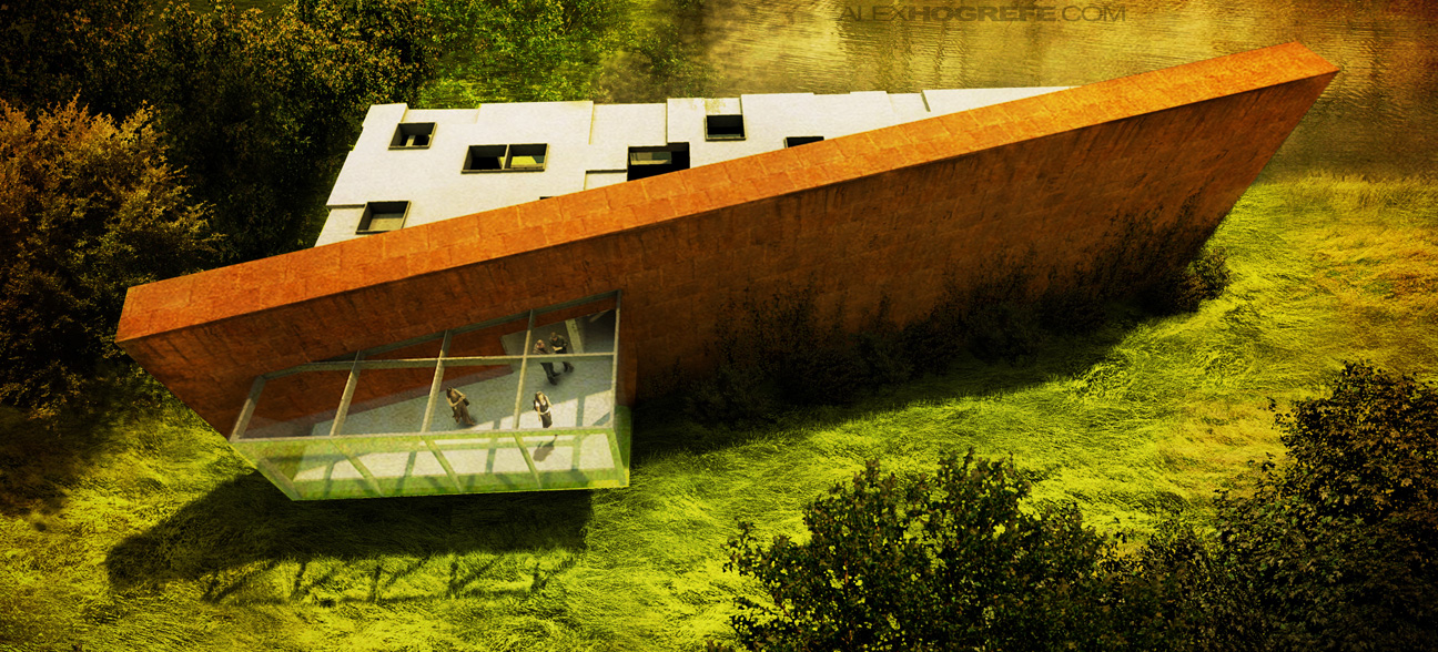
I’ve realized that some of the biggest moves I make with architectural illustrations happen in the last few seconds of post processing. The mood can be completely flipped with just a few color overlays. A have saved a lot of weak renderings with these simple steps.


Hi Alex, found all your tutorials very helpful. I am however having a reccuring problem when i export my scene from sketchup into kerkythea. When i open up the exported file in kerkythea sometimes it does not 'sit' within the render 'window'. Obviously you can pan/orbit within kerkythea to get the whole building in, but this changes the perspective etc meaning its very difficult to overlay your 'lines' from sketchup model in photoshop later. Any ideas? Its killing me!!!
Cheers,
Mark.
Hi Mark,
I have run into this problem before. Sometimes, it has to do with if your scene is in parallel projection and not perspective. Other times, the problem for me has been using sketchup 8. If I opened the model in 7 and then re-exported the model, the problem would be fixed. hopefully that works for you
Hi,
I wanted to share a thank you and a link with Alex and the online community.
This is a link to a competition that my team and I have participated in.
It is a proposal for a recycling center in Nosara, Costa Rica.
I am posting it to Alex's blog because I would have not been able to complete our proposal without this tutorials, tips and inspiration.
This is a link to the facebook page, if anyone would like to vote.
http://www.facebook.com/NosaraDesignBuildStudioNYIT
Our project is called 'Poroso'. please show your support for young architects.
On the facebook page, click the questions tab to the left and please choose 'Poroso'
Thank you Alex and everyone who shows support!
thanks for clearing that up it seems to be working now!!
thanks for shared
I really had a great time with your post! I am looking forward to read more blog post regarding this!
this is really an awesome post that you share.
Thanks for sharing the post