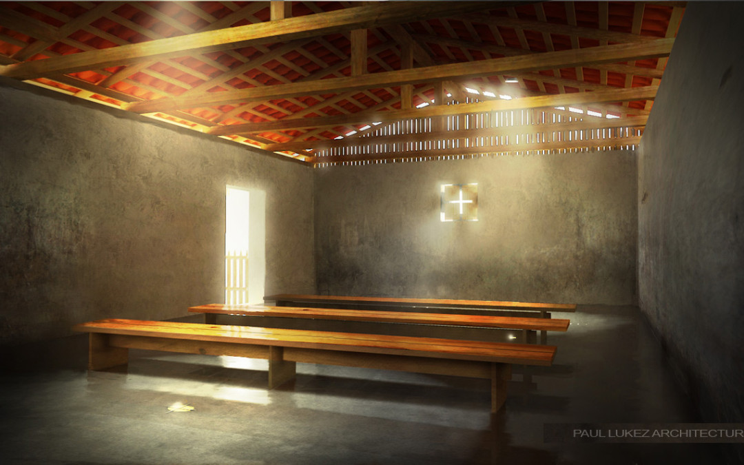
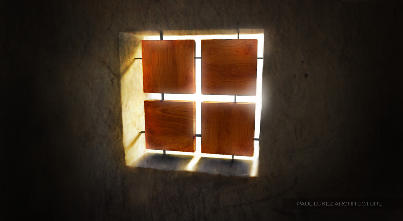
I realized that I never posted these images that I created a while back when I posted the Honduras Church illustrations. In this case, the design is relatively simple composed of 5 elements added to the untouched shell of a house in Honduras. The space is meant to be a meditative place as well as a memorial to certain events that happened inside. Therefore, I wanted the renderings to take on a painterly look with light being the focal point. Textures where key to these illustrations and luckily I had access to high res images of the local architecture which allowed me to overlay images of plaster and wood surfaces.
The building is old, so having clean lined illustrations wouldn’t work here. To avoid this, I used the Smudge tool with a strength of 90% to distort edges and straight lines in the plaster. It might be a good tutorial for later on.
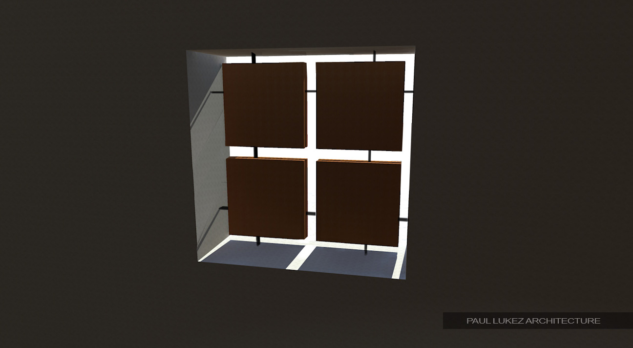
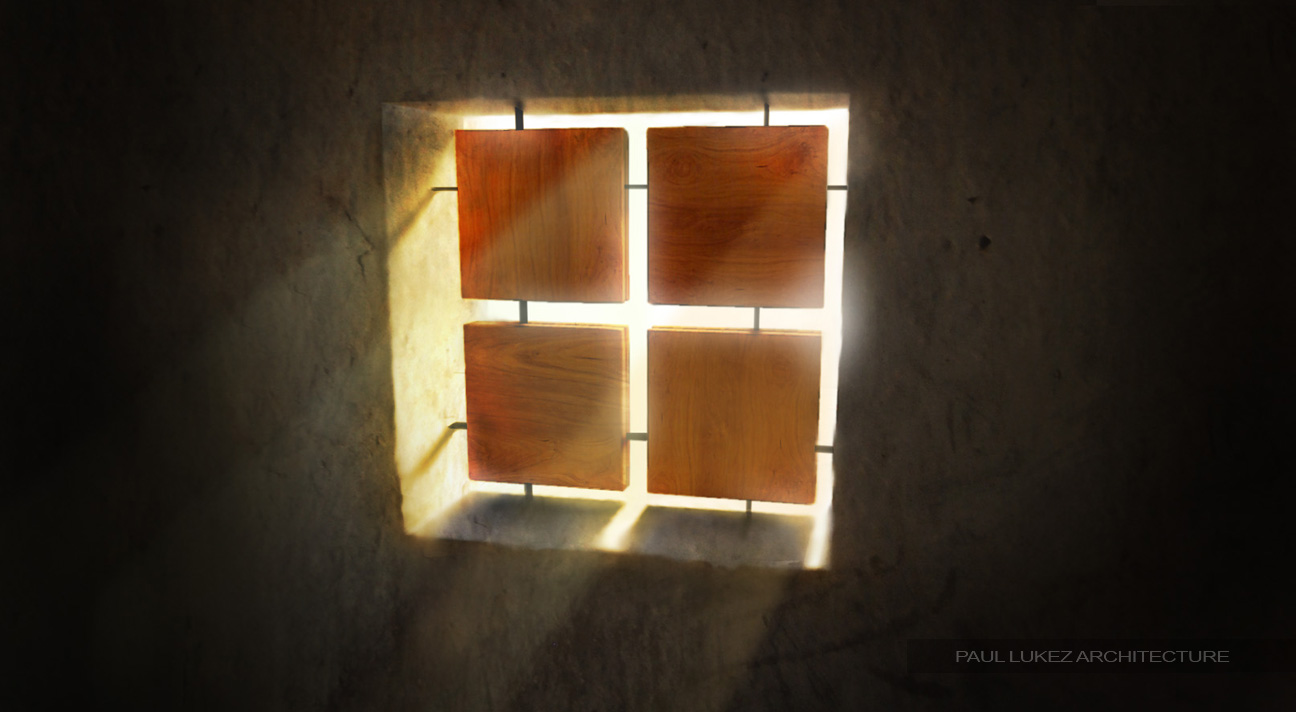
I thought it would be good to show the process of creating the second illustration of the window
It begins with a horrible Kerkythea base rendering.
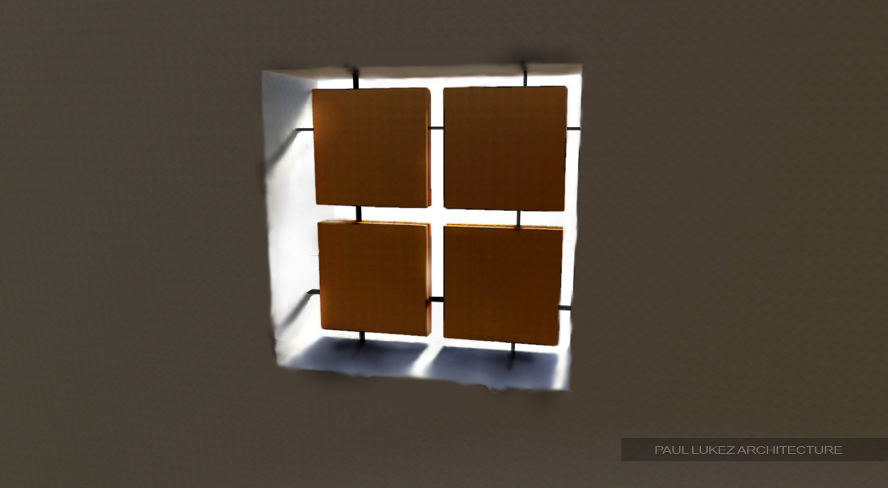
I then used the smudge tool to soften the edges and get rid of straight lines in the plaster.
Next, I overlaid textures that I cut from images of the local architecture in Honduras
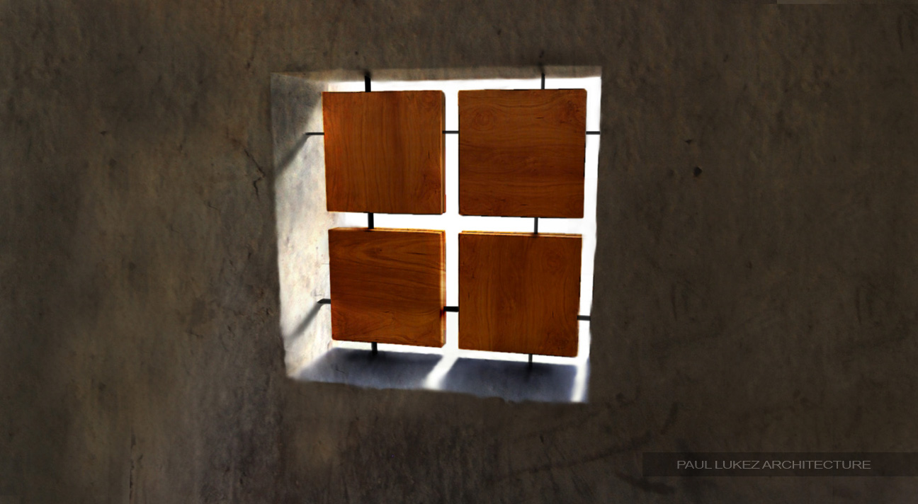
Above, I added some color overlays, glow in the window, and vignetting around the perimeter.
Finally, I added some sun rays for dramatic effect.


you´re a great artist with the atmosphere. so have you any idea for to get a outside render with sunlight ?
Alex,
In the future, would you be able to do a tutorial about how to make the glow and light rays? I think many of your loyal followers would love it!
Thanks.
Wilber
Thank's Alex for this new tutorial.
I'm sharing Wilber opinion and i already voted for you in Boston's most valuable blogger.
Thank's again.
Thanks Alex!
I also have voted for you . Enjoy reading your blog for a year, and some techniques and tips really help me in my arch. studies. (clay rendering tutorials, depth of field tut etc.)
Could you do in future some more tutorials about portfolio creation? Or even making of those big sheets for a project presentation ? Would be very useful.
Hi Alex.
Great blog – love it!
Just wondering how you do your textures so perfectly, fx in the Honduras one. ?? Mine always look like som shitty collage…
any chance you can post something on that?
Thanks 🙂 //Louise.
PS: congrats on the wedding!
@Louise
Really play around with the layer blend modes. I use overlay a lot, but not all of the time. Darken, multiply, lighten, hard light, etc will sometimes look better and get you away from the "collage" look.
Check out the pool rendering videos http://alexhogrefe.squarespace.com/pool-rendering-part-1/ . I used a lot of texture in those.