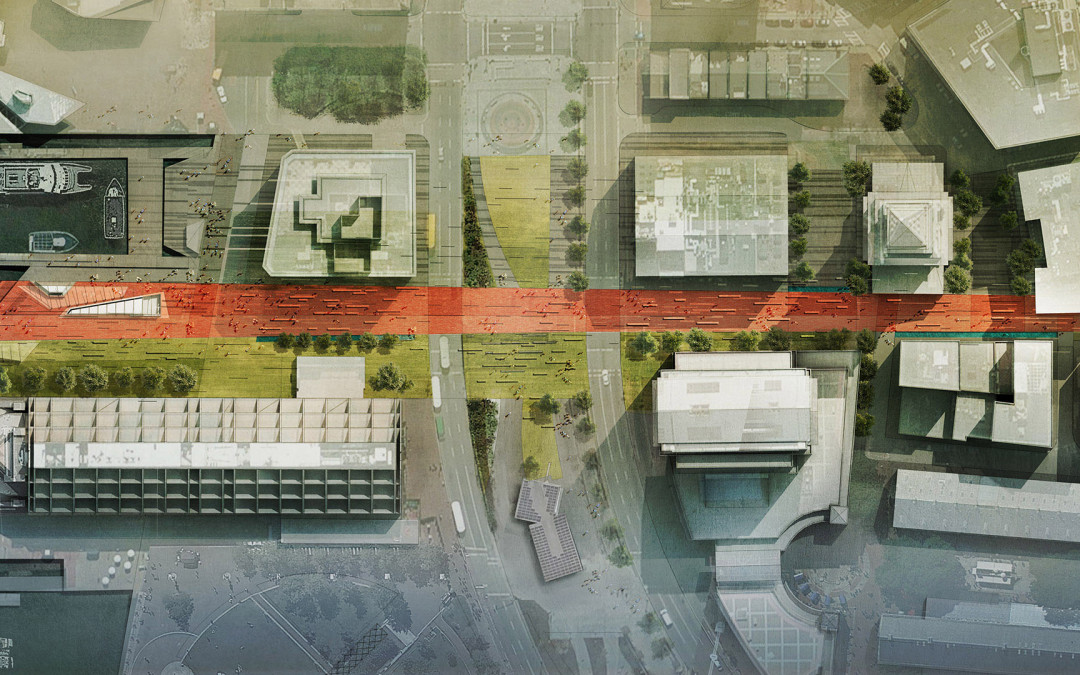
In the previous wharf post, I discussed black and white texture studies that focused on pattern and ground plane elements throughout the wharf. The above image builds off of those studies introducing color and material. Site plans are extremely useful in the design process and I wanted this one to be somewhat malleable as I tweak things.
The wharf is on a strong axis with Boston’s Old State House. I wanted to be able to study this connection as well as the wharf’s relationship to the dense city fabric. The site plan was therefore setup to include this information which meant creating one of the highest resolution images I have ever done. The above image tops out at 10,000 pixels tall. Typical illustrations for me are around 4,000 to 5,000 pixels on the longest edge. The high resolution was needed to be able to study different spaces and textures up close. However, this will also allow me to crop out several close-up images for presentations allowing me to get lots of mileage out of this one site plan.
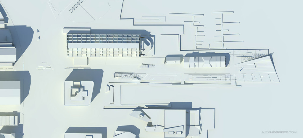
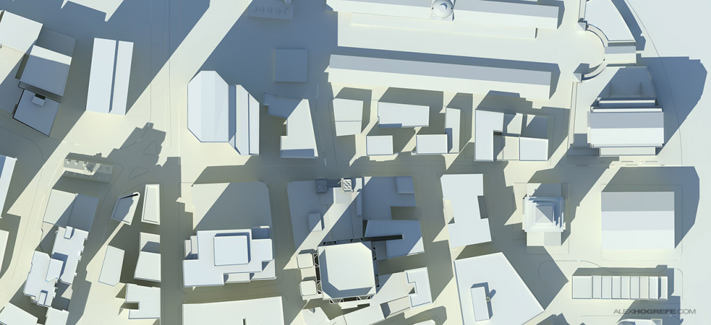
To manage the high resolution, I rendered out two 5000×2300 images seen below. To speed things up, I didn’t worry about adding texture or material in the Kerkythea rendering. I knew I would be experimenting with textures in PS and didn’t want to have to worry about baked in materials. I only needed the shade and shadow so I rendered some clay models and stitched them together in Photoshop.
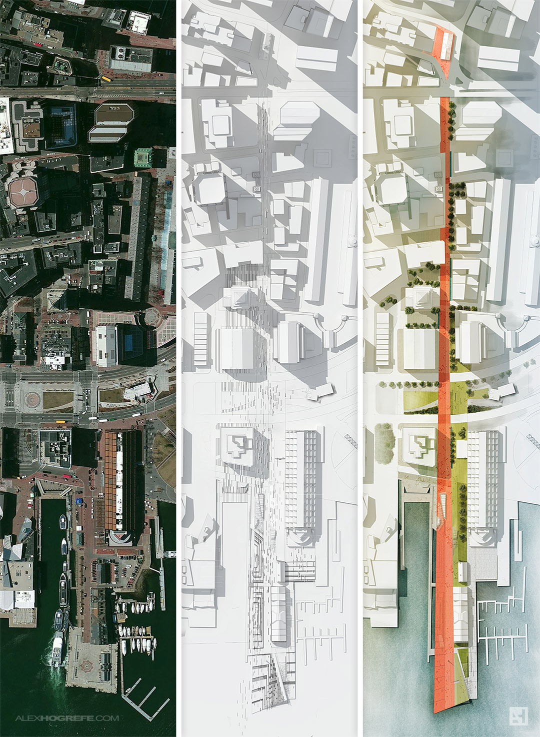
The final PSD file can be broken down into three main sections. I used an aerial image to get much of the existing texture information of the roads, buildings, etc. The aerial was overlayed on top of the clay model with a lowered opacity. I then took the black and white texture studies from the previous post and worked that information into the new site plan. Since all of the line work elements were separated and grouped in the previous PSD file, it was easy to make adjustments and extend the ground plane elements to the Old State House. Finally, I added texture, color, and vegetation on top of everything.
With the site plan far along, I’m ready to start diving into some perspectives. I hope to get going with those in the upcoming posts along with some portfolio spreads. I’m thinking about setting up a vertically oriented portfolio layout as this is a more common layout with the online printers. More to come on this later.


great!
I'm still wondering how you made such a precise model of your site. If you could give me some insight on that, I'd really appreciate it.
a masterpiece, as usual.
Thanks again for sharing.
I agree with Aaron, I have tried many times to produce an accurate model so that i can overlay the aerial image, but most of the times there the precision is not acceptable. I wish you could enlighten us on this. Keep up the good work!
@Aaron & Kat, you are correct that the aerials almost never overlay perfectly. The problem isn't the model but the aerial images. Both google and Bing satellite images are never straight down but are taken at a slight angle. So the tops of the buildings, especially tall buildings, are not in the correct location. What I ended up doing was copying just the tops of the buildings of the aerial overlay and shifting them one by one to the correct location of the model rendering. The site surrounding context model, by the way, came from the BRA which provides downloads of 3ds files of many sections of the city of Boston.
Hey Alex,
Thank you very much for your absolutely useful tutorials!
I'm currently working on a project and I'd like to do the same thing for my presentation 🙂
My problem is that I can't find my town already made in 3D. Do you have any tips to do model it easily so that I can render it with Kerkythea ?
Thank you!
SImon
Oh and where did you find High Res aerial image btw? 🙂
Can't wait for the tutorial on this one!
Hi Alex! I really like your tutorials but I would like to see more videos instead of pictures of every step you take.
Thank you!
Hi Alex, what you do is great, but it would be greater if you do detailed videos of all your posts, anyway your work is AWESOME! thanks
Dang! That's the site plan that keeps on going!
Simply amazing.
Hey this one is really awesome, have you ever though print it, frame it and put it on wall..that would be a great room decor
@Simon, The best way for me to quickly model a large site such as this is to trace a scaled aerial image in AutoCAD. Then import into Sketchup and extrude into massings. The aerial images a made up of several Google and Bing map images stitched together in Photoshop to get a higher resolution.
@Seno,
No I haven't thought about printing this or any of my images in large format haha. I do have many of my Thesis models hanging on the walls though.
Hello All,
Alex, as always wonderful work and we really appreciate everything you are doing! cant thank you enough!!
As for modeling city sites, I am not sure if many of you use Rhino and Grasshopper but there is a very useful Grasshopper plug-in called “Elk” ( found here: http://www.food4rhino.com/project/elk?ufh ) which produces 2D drawings of any selected city and then you would be able to extrude them in Rhino (or export to Sketchup).
Also, I just came across a really good website that actually produces a 3d model of a city!!
Found here: cadmapper.com
They do offer it for free, but there is a size restriction of the selected area, [you can always pay as well :), and get a bigger area ]. Now, some of the cities have the exact building heights and you would be able to download a 3d model with already extruded heights accurately, but most of the cities dont have exact building heights, so you can set a generic “building height” for the buildings(data) that do not have a known height. I would recommend exploring the site and see their options.
Good Luck All, hope that helps!!
Ramzi A.
I just found out that you can actually get a high resolution of google maps by using google earth, but apparently to have the highest resolution, you need the pro version of the google earth
Where did you get the heights of the buildings from? Did you make rough estimates? Great website by the way!
by the way you need to submit this project to the BRA. the public space and public life in that area would greatly benefit from this project.
Hi Alex, thanks for sharing these useful tutorials. I’m trying to use kerkythea now, but it seems that it cannot recognize a parallel projection view. Can you tell me how to render those top view clay models in kerkythea?
Dear Alex
Thank you so much for doing this, you website has completely revolutionised my work.
I am currently trying to use the methods you’ve gone through here to make my own site plan, but i am not sure what difference overlaying to the images on the site model makes that you couldn’t do by using effects on the base image. I am looking at my own version and i am not sure that having the model underneath looks any better, perhaps i am doing something wrong.
Liam I
This tutorial is very helpful for my site diagram. Thank you for sharing.
Great, thank you for sharing the article. I think the site should be upgraded to be more usable