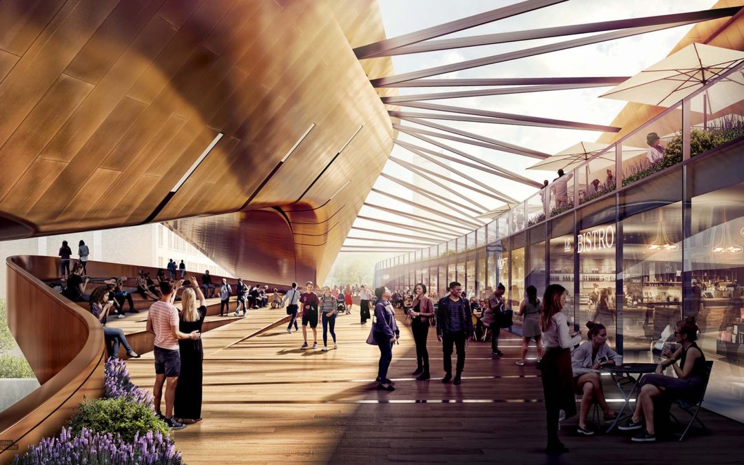
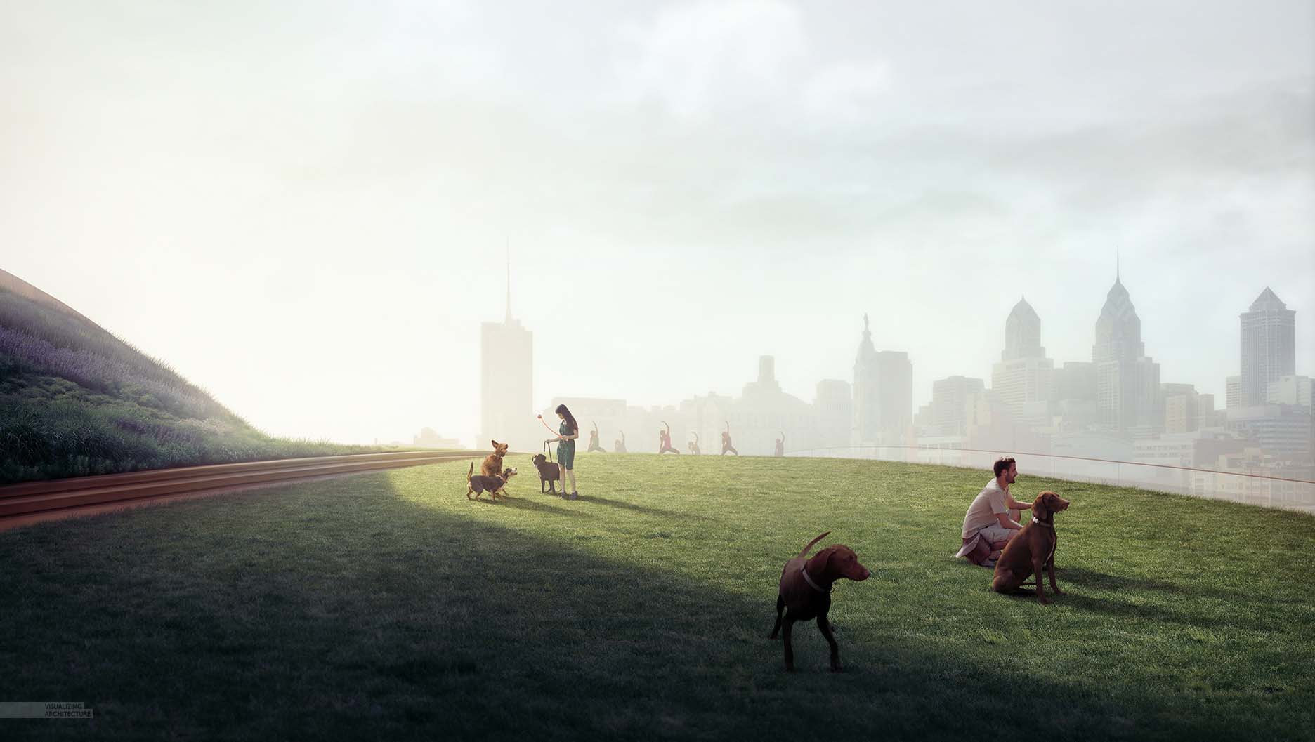
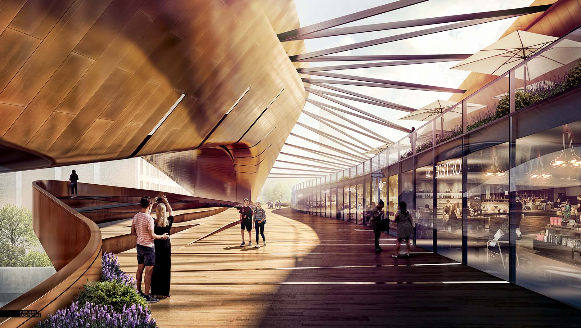
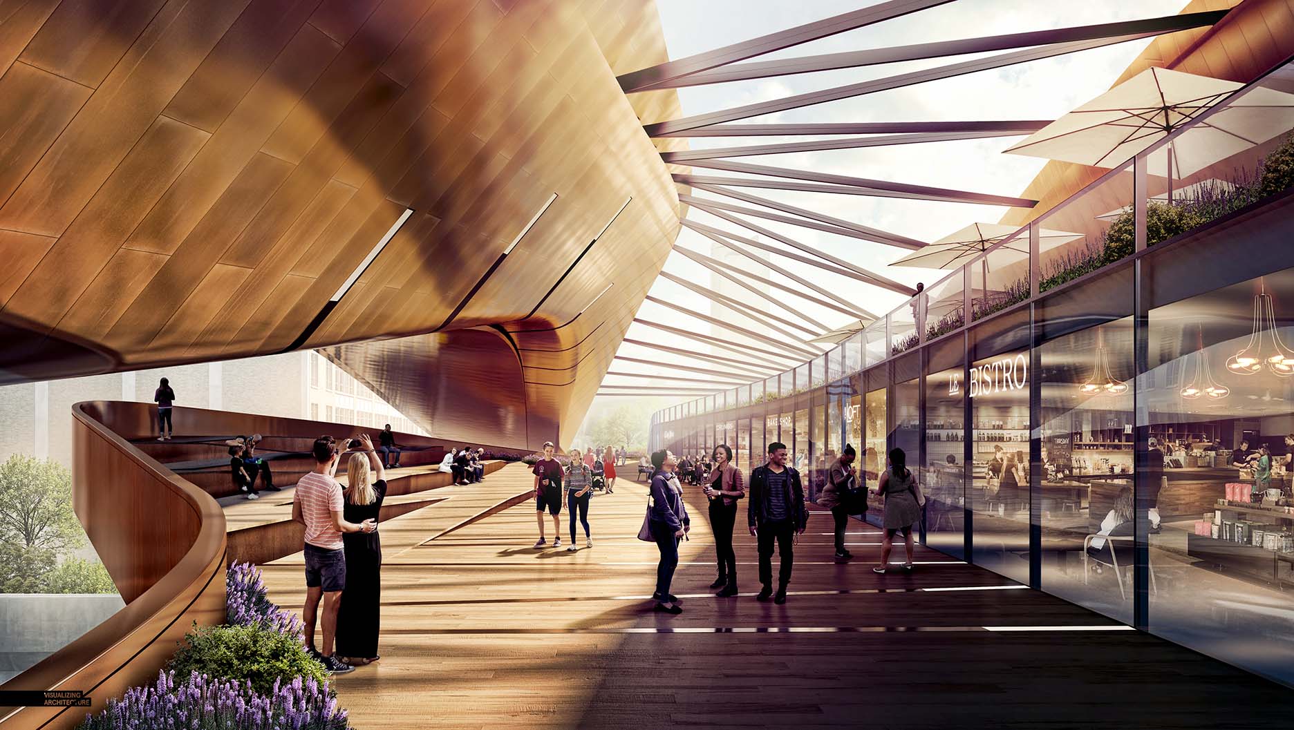
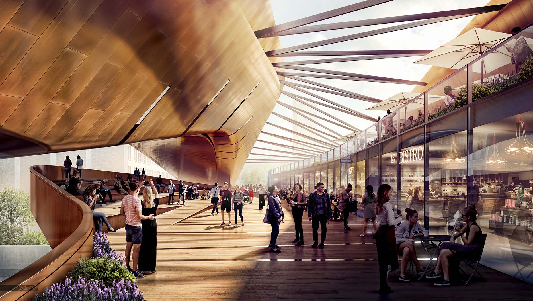
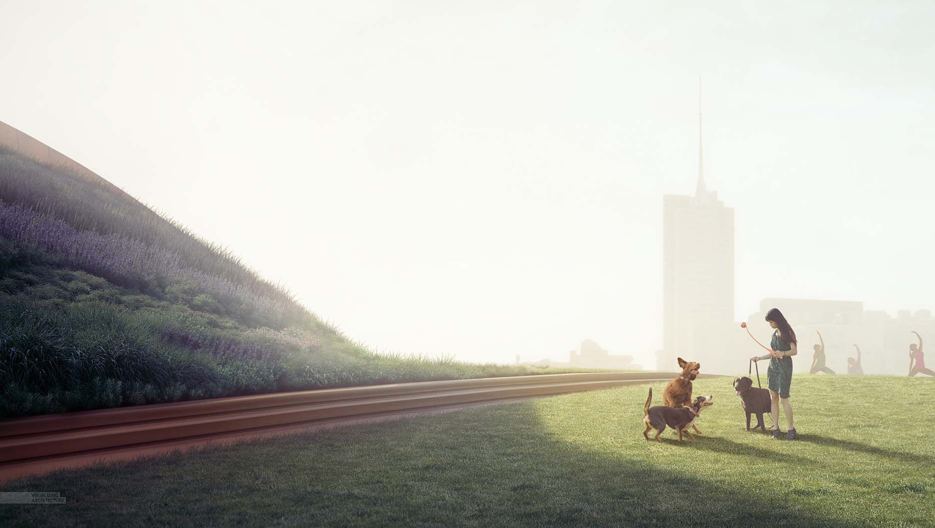
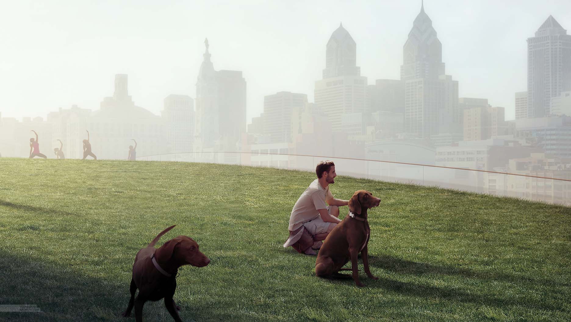
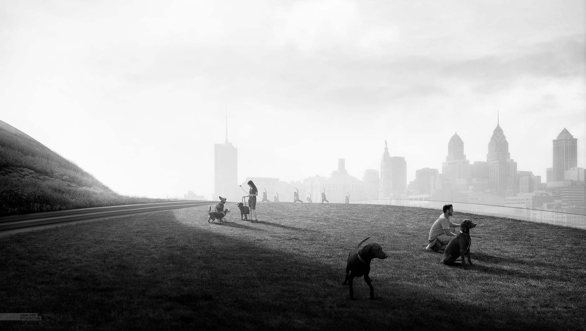
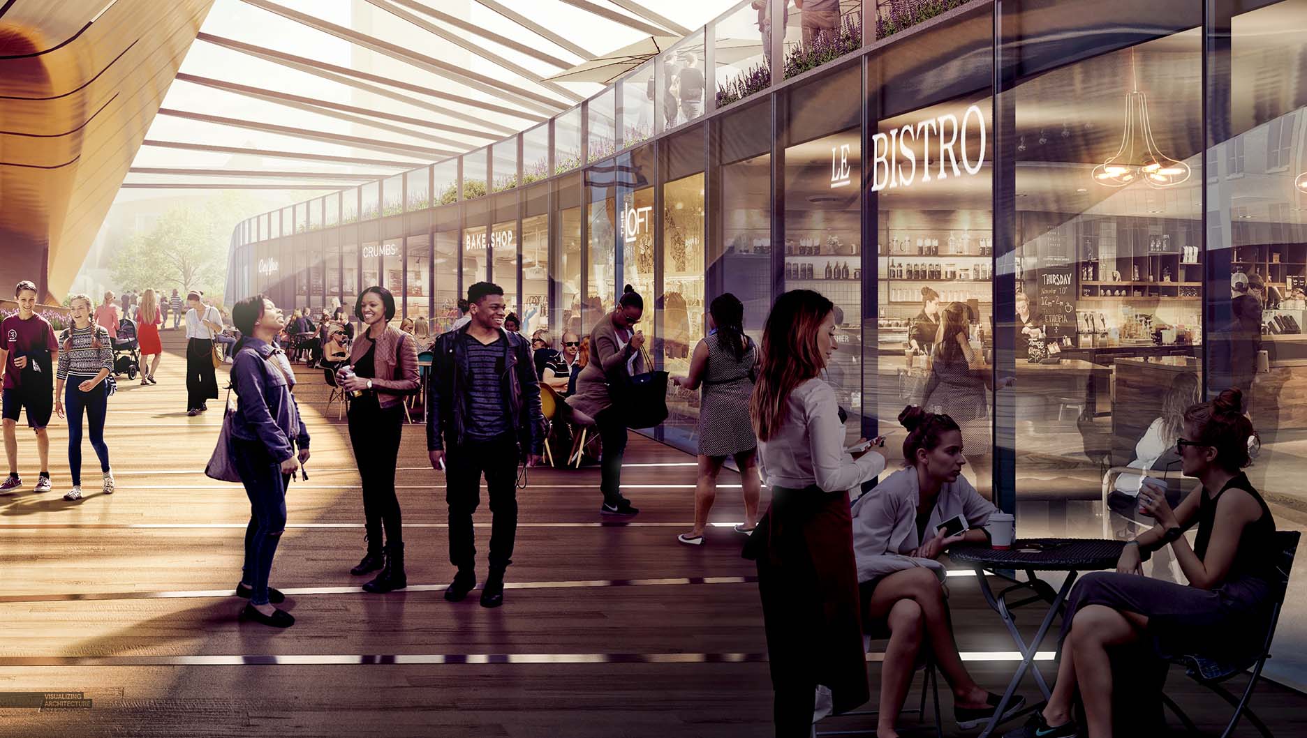
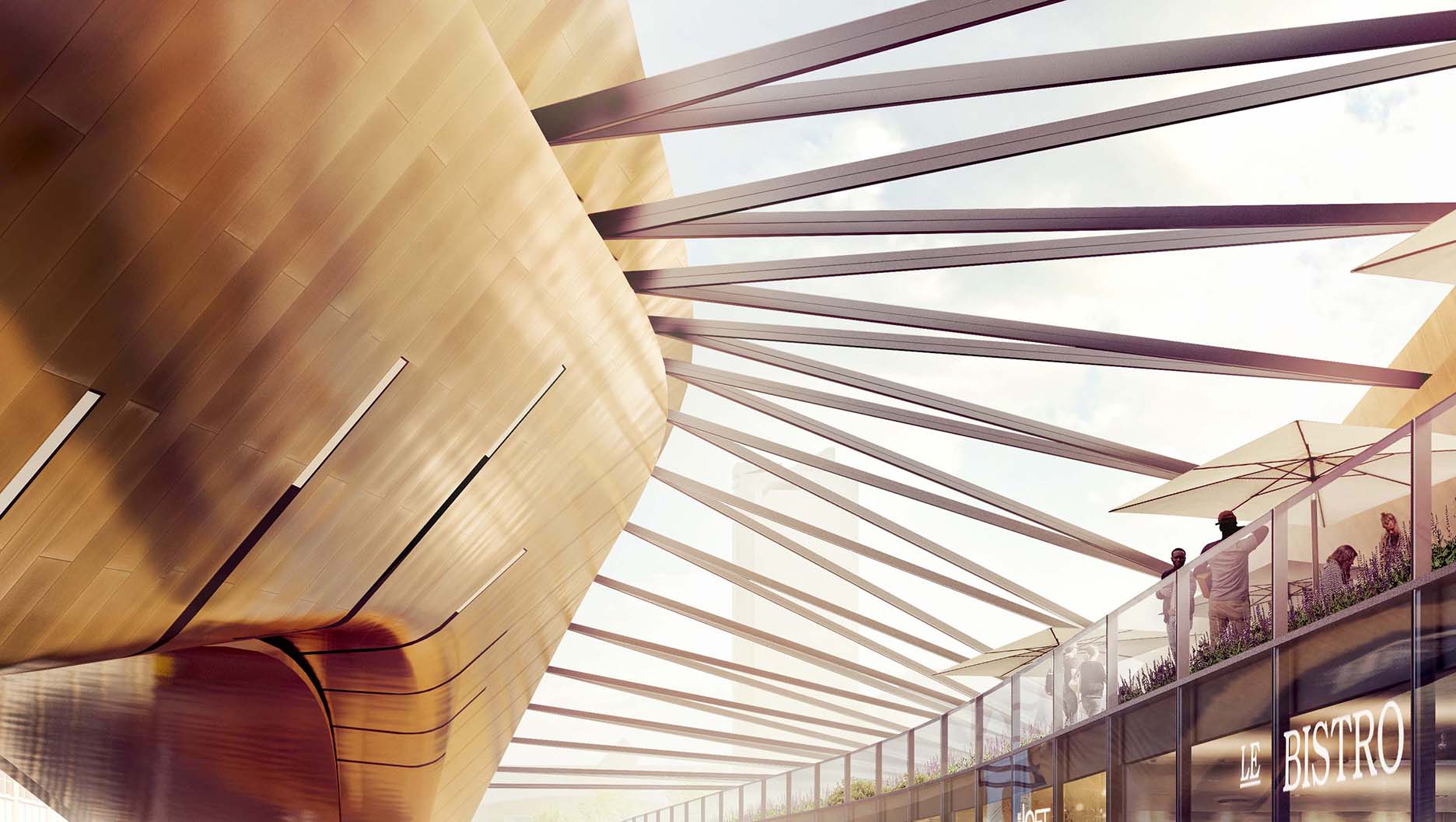
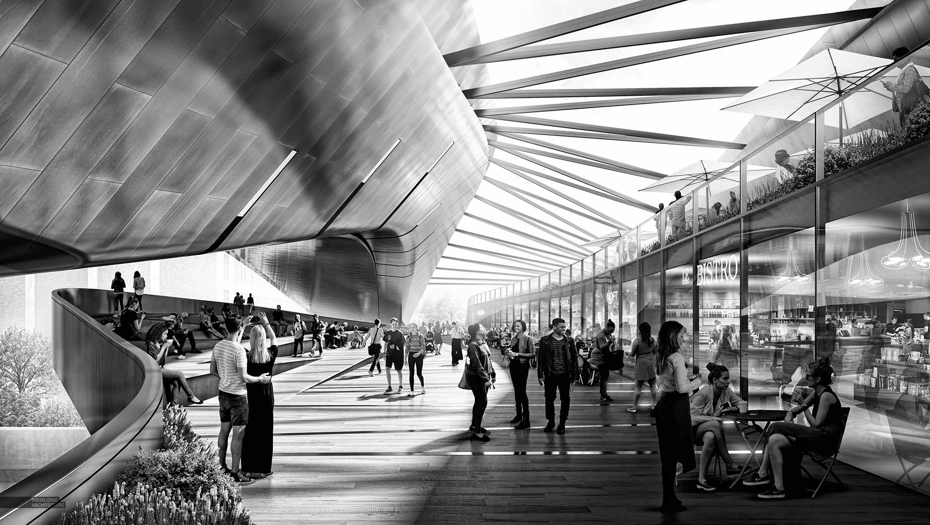
The next two illustrations that I have generated for the Philly Bridge explore the procession across the bridge. The design incorporates different types of program and landscape depending on the path you choose and the activities users plan to partake in. Therefore, I wanted each image to show the range of experiences from very public, active spaces to quieter and more contemplative moments. Entourage became the driving force for both image narratives and was where a lot of my time was spent. At Design Distill, many of our clients spend much of their time tweaking the entourage we placed and honing in on the perfect balance and amount. It is often the case that we are adding more people to an illustration versus taking them out. A common theme I see in most architectural images is erring on the side of less people instead of more. Placing in entourage can be quite laborious so it makes sense that images lean towards fewer scalies. It is also the case that many see architectural illustrations as more poetic and artistic when less people are in the images. However, the default should not always be less is more. In both images below, the amount of people played a crucial role in setting the tone for each image. In the case of the retail scene, a large amount of people were required to create an active and lively environment. Further down the post, I showed three versions of the image with different amounts of people to better show how the image changes with just the adjustment of this one variable.
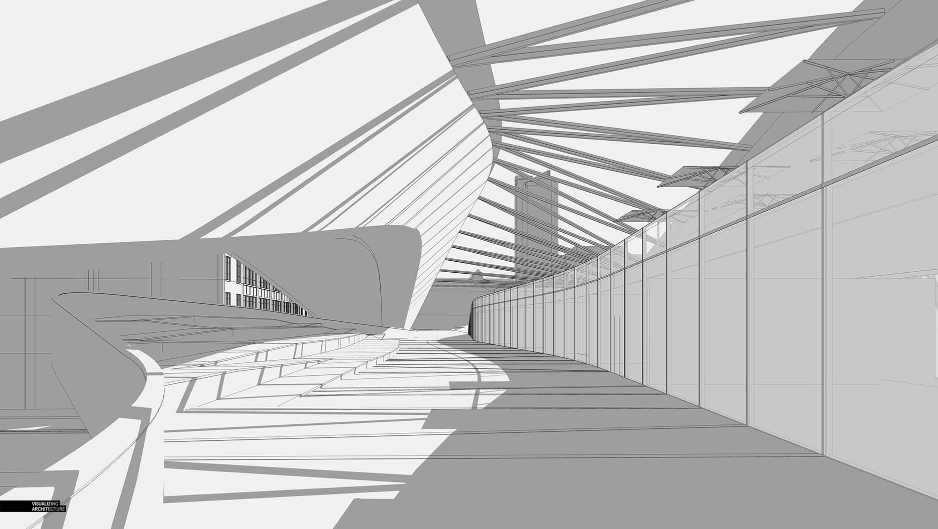
1. Sketchup Model
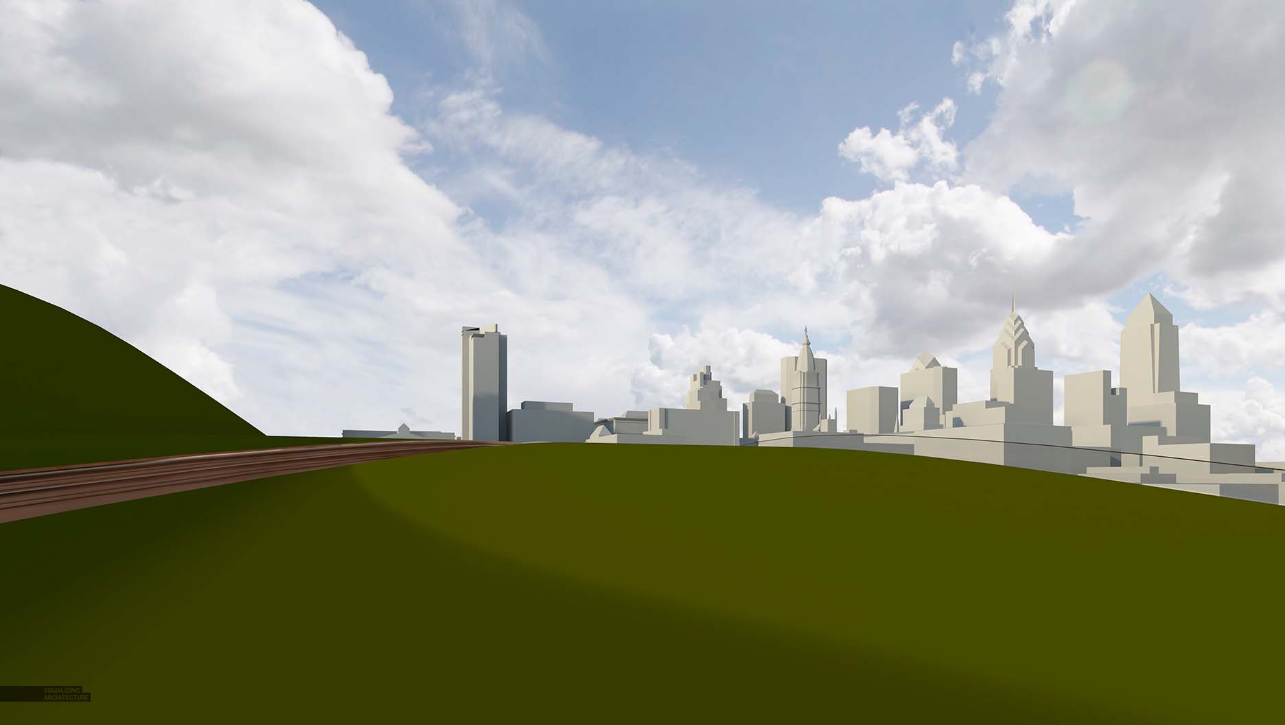
For the park view, the model was as basic as you could get. I knew that image would largely be created in Photoshop, so I focused on basic massing information to guide me once in Pshop. The retail corridor view was simple as well, but a little more time was spent setting up the glass storefront system and adding small details to the tiered seating on the left.
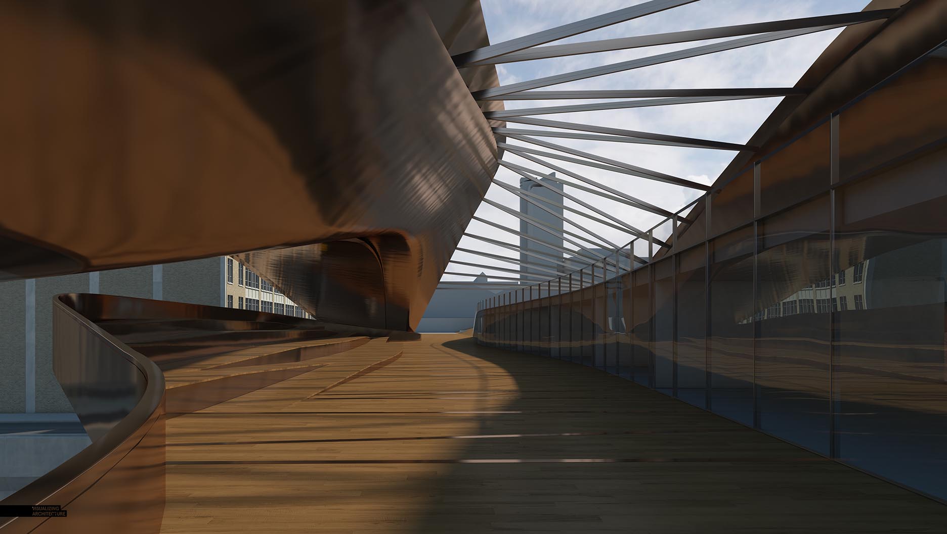
2. V-Ray Base Rendering
The retail corridor view relied more on texturing than the park view. I wanted to make sure I had some good reflections to work off of for the retail corridor view. The park view was essentially all vegetation, so I spent much less time texturing that view.
3. Photoshop Texturing
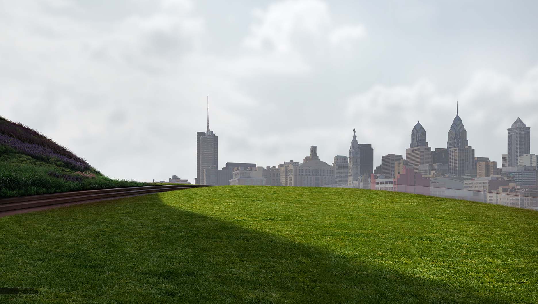
In the park view, I first switched out the city 3D massing with a Google Earth screenshot. Yes, I said Google Earth. The quality of the screenshot was pretty low, but if you take some time to cut out/cleanup the profile of the skyline and then cover up with fog, it ends up being a simple but effective solution. I was able to match a difficult view that wouldn’t exist unless someone took a drone photo at that exact position.
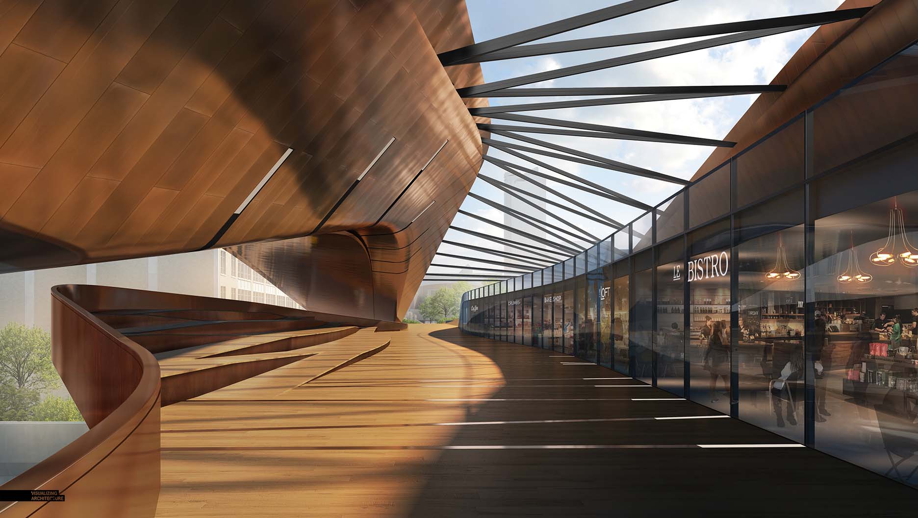
For the retail corridor, most of my time was spent stitching in the interior retail spaces. Each store is made up of several layers including a base photo of the store found online, light fixtures and additional ambient spot lighting.
4. Light and Color
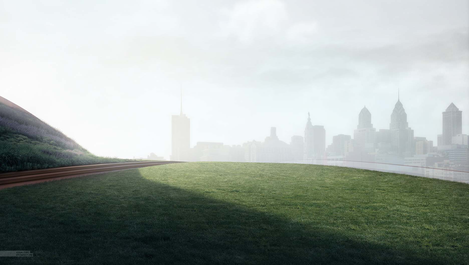
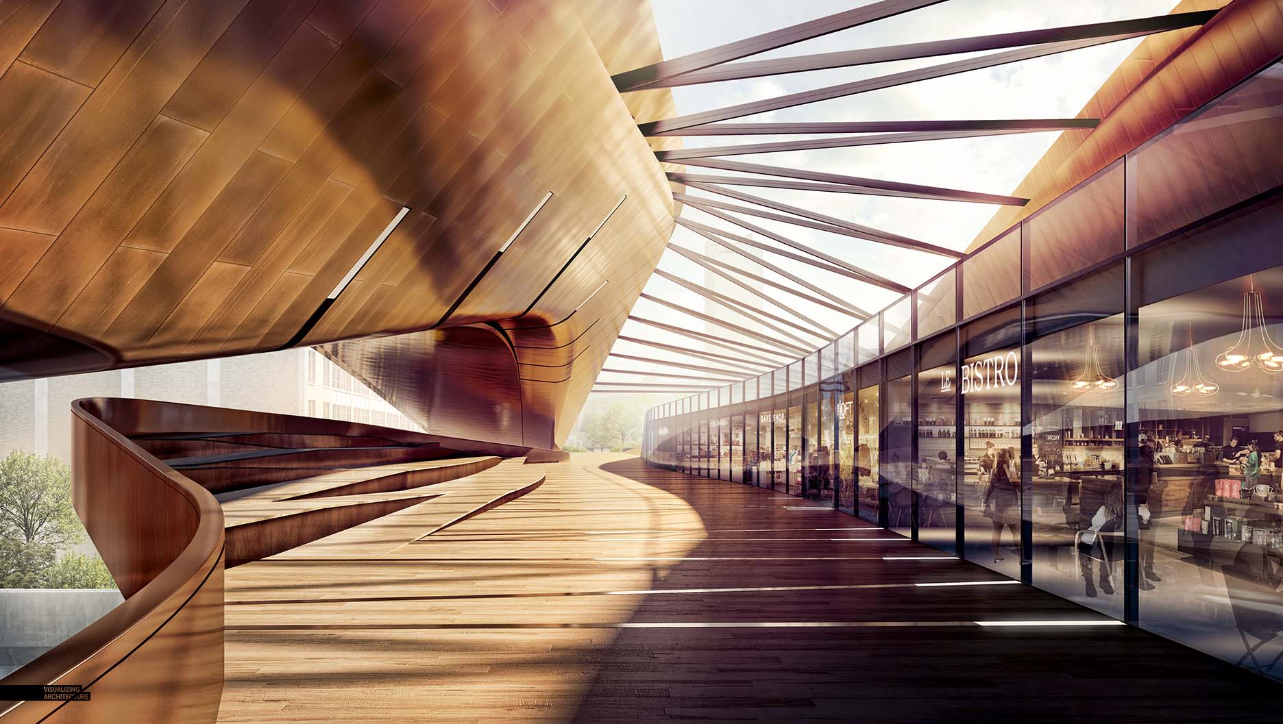
For both images, I used this step to define the hierarchy of the images. In the case of the park view, fog was inserted to push back the skyline and really play up the foreground grass. Soft blue tones helped push the narrative of early morning and calmness. Conversely, I washed the retail corridor view with lots of warm light to push a more active middle of the afternoon atmosphere.
5. Entourage
As I mentioned in the intro, I spent much of my time with these images setting up entourage. People were used to create the contrast between the active and less active zones of the project. I uploaded a couple of different versions of the retail corridor view to better illustrate how the energy of the images change as more people are placed in. In the past, I would have stopped at step one or two. Instead, I opted for more density and used that density to acknowledge the zones in the view such as formal dining, informal dining, lounging, etc.
As I continue to create new images, I still hope to break down some concepts within the views such as adding interior information behind glass, texturing, and possibly some 3D stuff, assuming I can find time. Stay tuned.



Impressive Stuff coming from Mr Hogrefe as always. I am intrigued by the way of how you did the grass part. How did you make the whole grass scene blend in with the whole color scheme in photoshop? could use some tips. thank you
Hi Mr Hogrefe,
Thanks for sharing but could you give a few pointers on how you manage to incorporate shops so accurately into that space. and could you please advice on how could i create a curved window on sketchup. I’ve been having trouble with that and couldn’t seem to find a solution. thank you
In this case, the model, it seem to be using lineal windows , and by the scale you get the curved view, you can modify your segments on circles arcs or semicircles on the options tab in Sketchup.
i LOVE your work
its amazing
but idk why the second photo looks like something wrong with it ?!
i think – this is my opinion only – its the waitress + table with two girls and the black guy , they do not quite fit in the photo
too much space between the first table and the other tables plus the black guy is blocking the other tables ( so its look like that the first table is .. hhh well.. “photoshoped” there 😀 ) seriously there is no connection between the first table and others
and of course the black guy is looking at… mm.. what ? where ?
the position is just unnatural
and one last thing, sorry this is being too long
but the light effects looks so unrealistic
this is just my opinion nothing else
i would give this work A+
thank you
That figure sticks out to me as well. He seems stretched a little wide?
I think it’s because he’s so prominently placed that the distortion makes it look off.
Alex how many figures do you have in there!?!?!
Great tips …
I swear I can never thank you enough!
Love the work
My question is how did you get the paneling done? More specifically the brighter shines along the edges of the panels.
thanks in advance!
You are amazing,
thank you for all the great tips.
Precedent setting work ! Thank you!
Hey Alex,
I am very curious with your technique for rendering the bistro.
You did that all in photoshop? Could you please show some tips on your process?
I’m curious as to how you blend the interior photos so seamlessly into your rendering. It’s something I always struggle with and end up modeling my interiors which can be extremely time consuming. Is it just about spending time on Google to find the perfect image at just the right angle? Or is there more to it? You always make it look so easy lol.
Hi I am an architect student. I have a special responsibility. mail? brksrl@hotmail.com .thank you 🙂
its really good ….. Thanks for sharing this articles….https://bit.ly/2sL4gIf
Nice Work….! https://goo.gl/VsfmCc
Quick question on the lighting of the people. I saw a video of yours from years ago where you showed how to add shadow/highlight to cutout people in evening renderings. In this situation with areas of bright, reflective sunlight would you instead do the opposite? Picking the edges where light reflections would hit and upping the highlight tones and painting around their figures? A quick and simple tutorial of how to make your entourage (objects, people, etc.) read with the proper lighting and overall tone of the image would be great. Thanks!
Very informative blog post.Really thank you! Really Great.