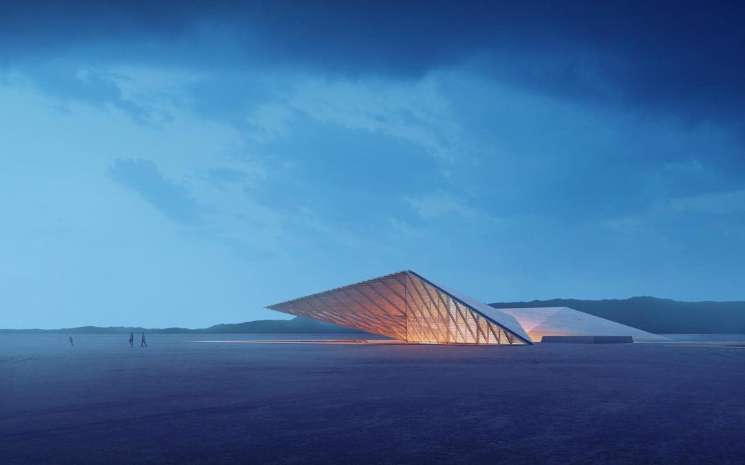
Part 2 of this tutorial will break down the Photoshop side of this illustration. In terms of Photoshop complexity, this image is relatively simple and minimal in layers. However, I think it is a good example of how a compelling image can be generated with just a few basic moves. This part of the tutorial is quite long and fully breaks down every aspect of the Photoshop file. It is probably one of the most detailed tutorials that I have ever written in terms of covering the entire process. My hope is that it will give a more complete picture of my entire workflow from start to finish and better show where I choose to emphasize color and texture compared to where I try to tone things down. In case you missed it, Part 1, which discusses modeling and V-Ray settings can be found here.
1. Setting Up Base Files
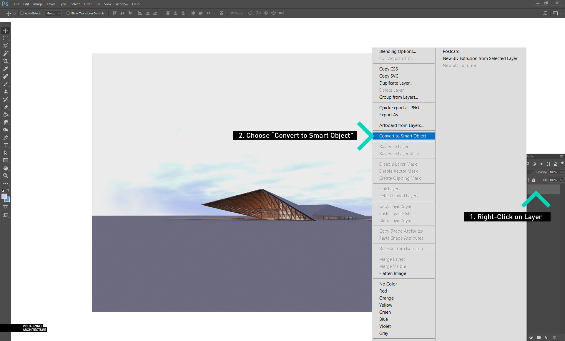
1A. The first thing I want to do is setup the base rendering. When I open the V-Ray RGB rendering, I convert it to a smart object. I do this by right-clicking on the layer and choosing “Convert to Smart Object”. This ensures that I will not cause destruction to the layer if I adjust the tone or levels. It also will allows me to replace the rendering with an updated rendering later if I need to. I also wrote a post a while ago about the advantages of smart objects HERE.
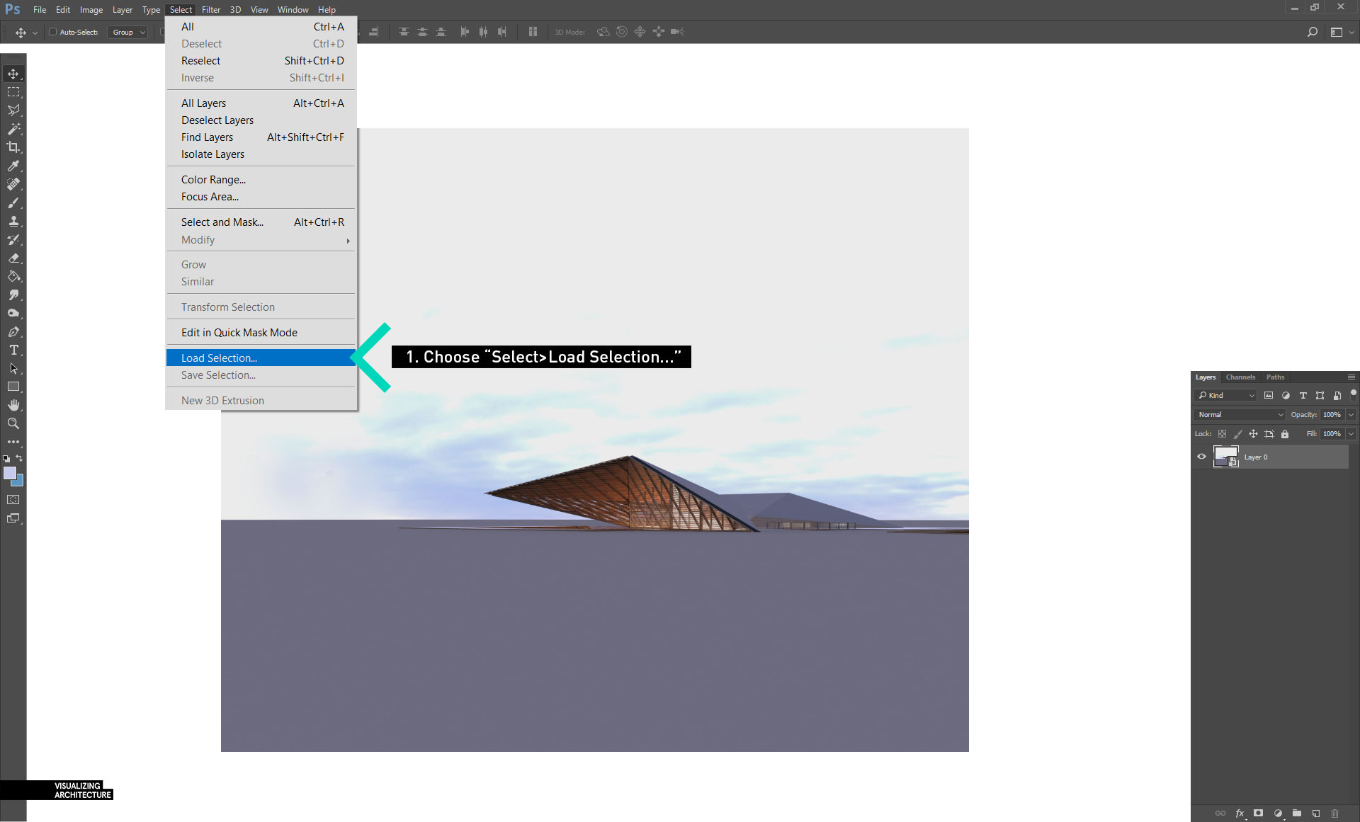
1B. Next, I want to remove the background. To do this, I choose “Select>Load Selection” which will bring up a “Load Selection” dialogue box.
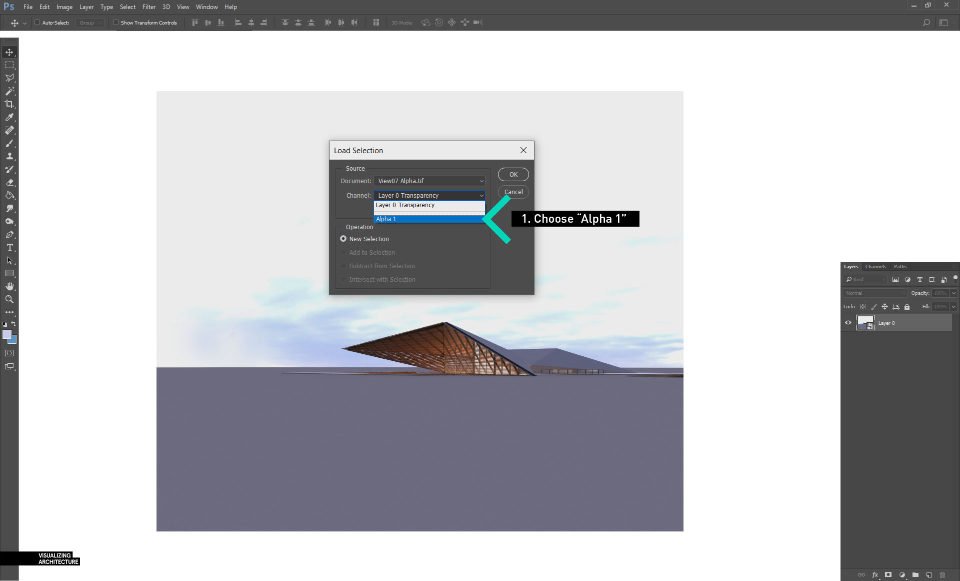
1C. Choose the “Alpha 1” in the Channel drop down menu and then choose “OK”.
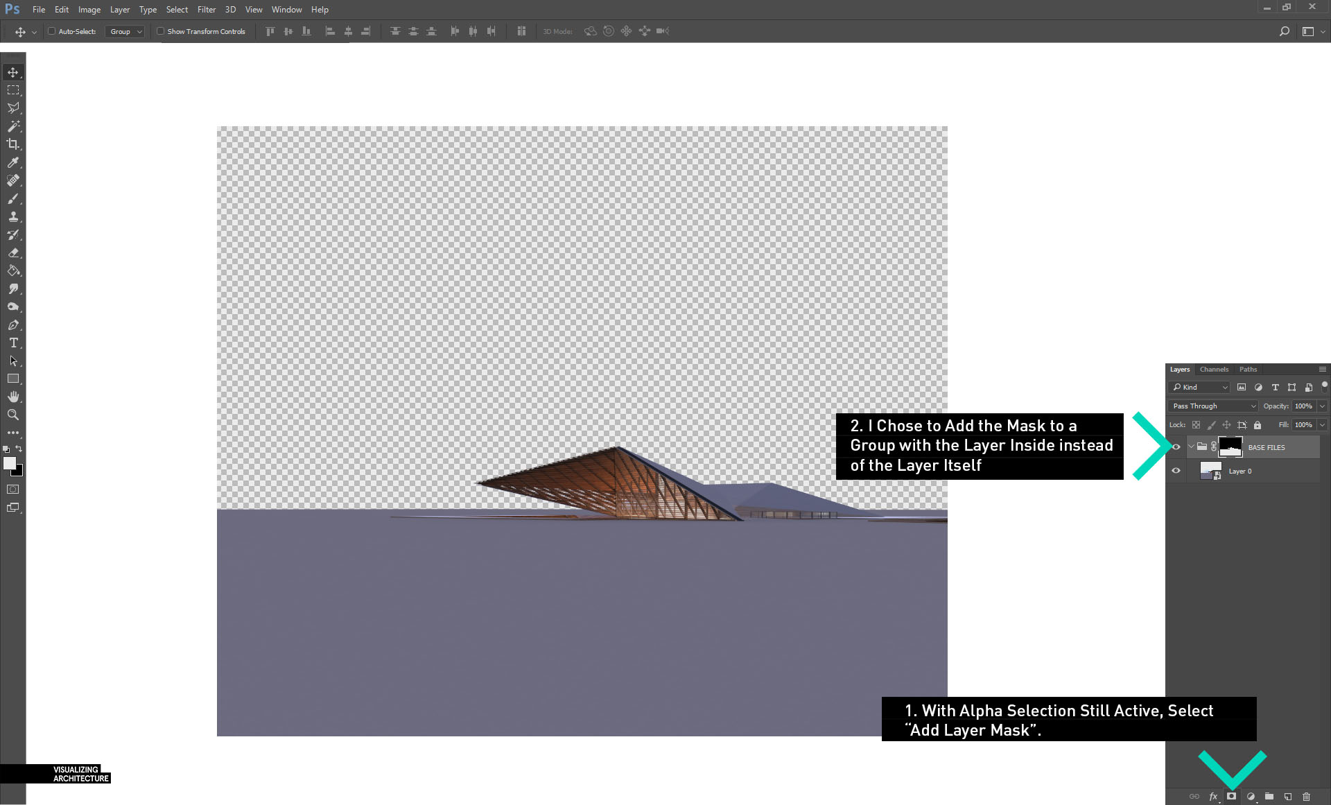
1D. When the Alpha is loaded, it will give a selection of the background. Once this selection is active, create a new group in the Layers Palette and then choose “Add Layer Mask”. When I drag my V-Ray RGB rendering layer inside of the group, the sky will be removed. Any other render elements that I drag into this group will also have the sky removed such as the Reflection, Refraction, and Raw Light elements. This avoids the need to create new masks for each element.
2. Adding the Sky
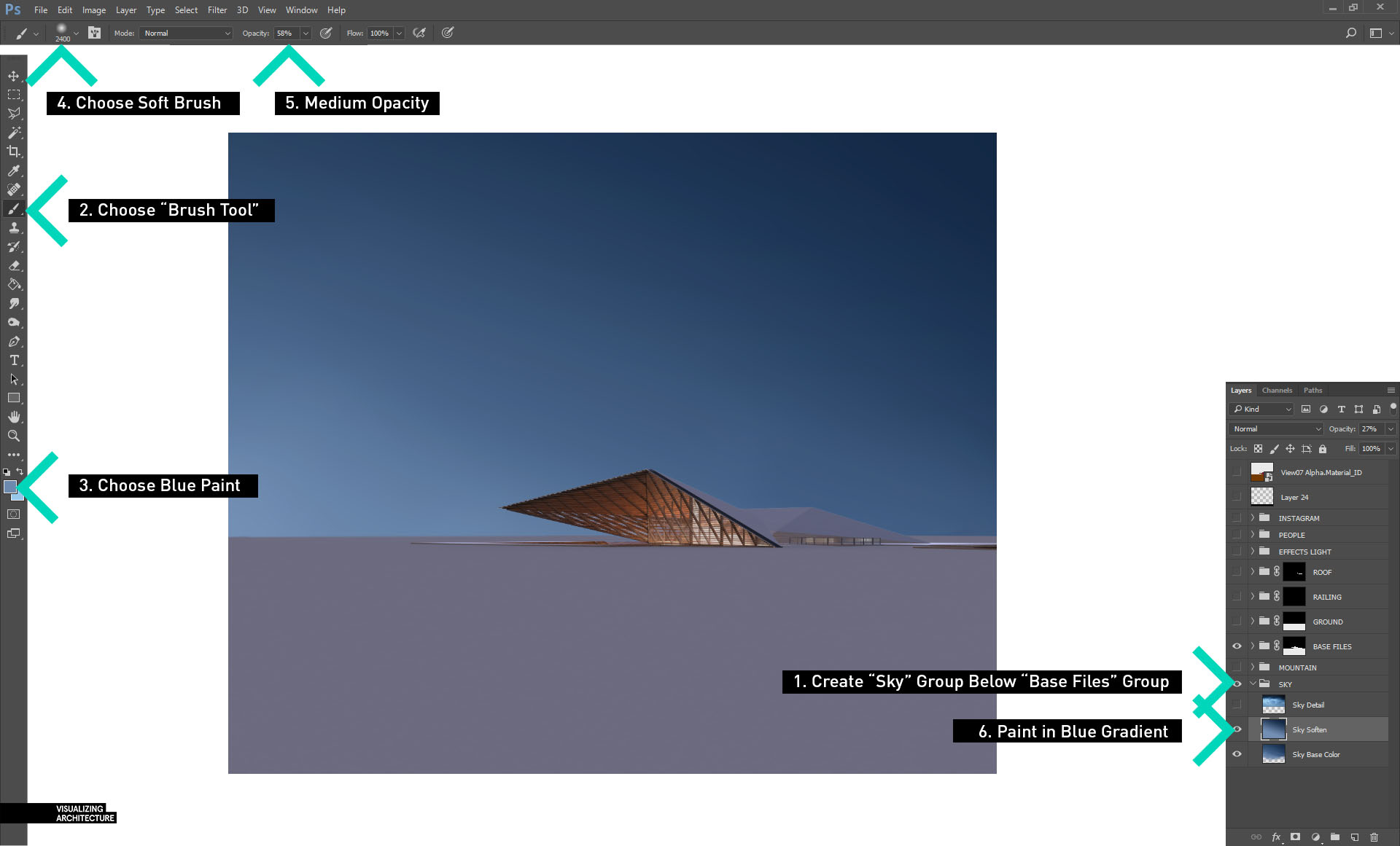
2A. I start the sky by first creating a new group under the “Base Files” group called “SKY”. Within this group, I create a new layer called “Sky Soften”. Using the “Brush Tool” with a soft tip and medium opacity, I slowly paint in a gradient from light to dark blue. The goal of this is to set the main color tones of the sky.
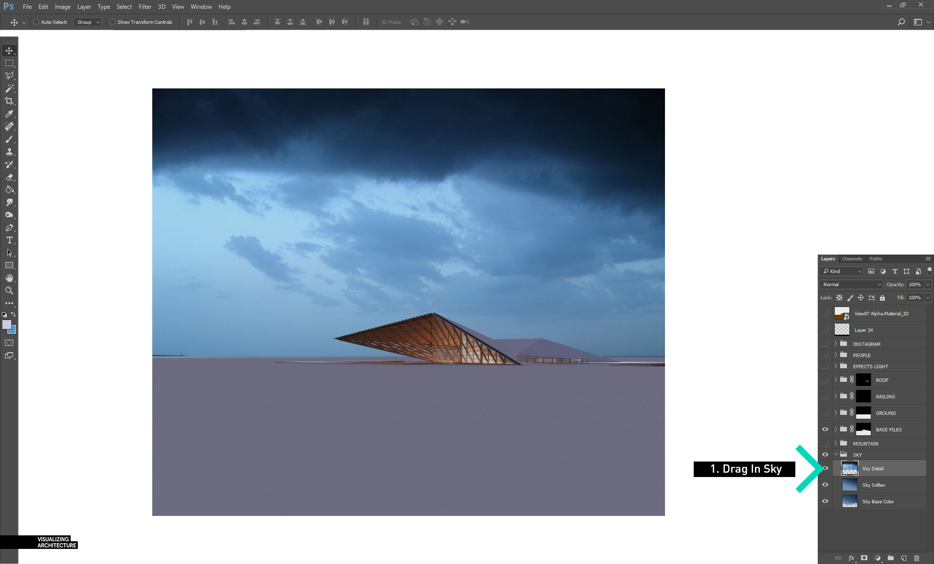
2B. Next I drag in my sky texture and place it above the “Sky Soften” layer.
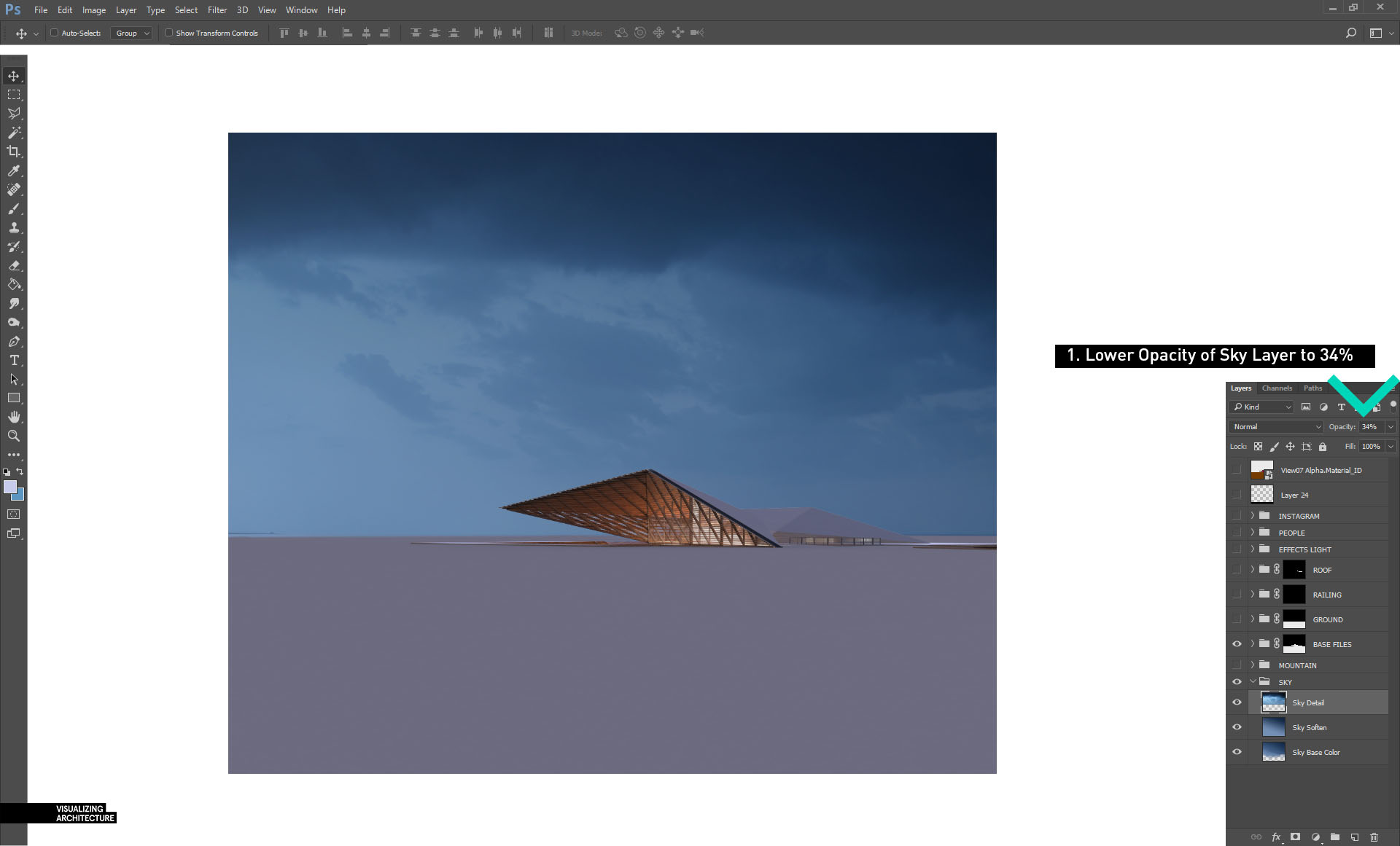
2C. The sky texture is too strong so I lower the opacity of the layer to 34% so that the detail is subtle and not grabbing too much attention.
3. Background Mountains
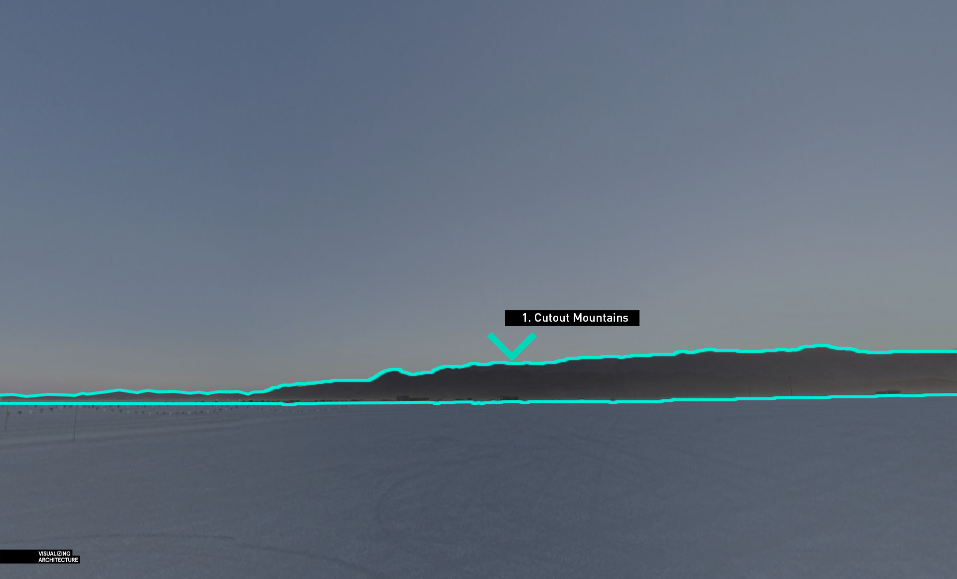
3A. Using Google Earth, I was able to go to “Street View” at the location of the Desert House and save out a few screenshots. I then cut out the mountains to place into the illustration.
3B. Once the mountains are cutout, I can drag them into the illustration. I darkened and colorized them to give them a slight blue tone. I also made sure the “Mountain” group was below my “Base Files” group to take advantage of the alpha mask.
4. Ground
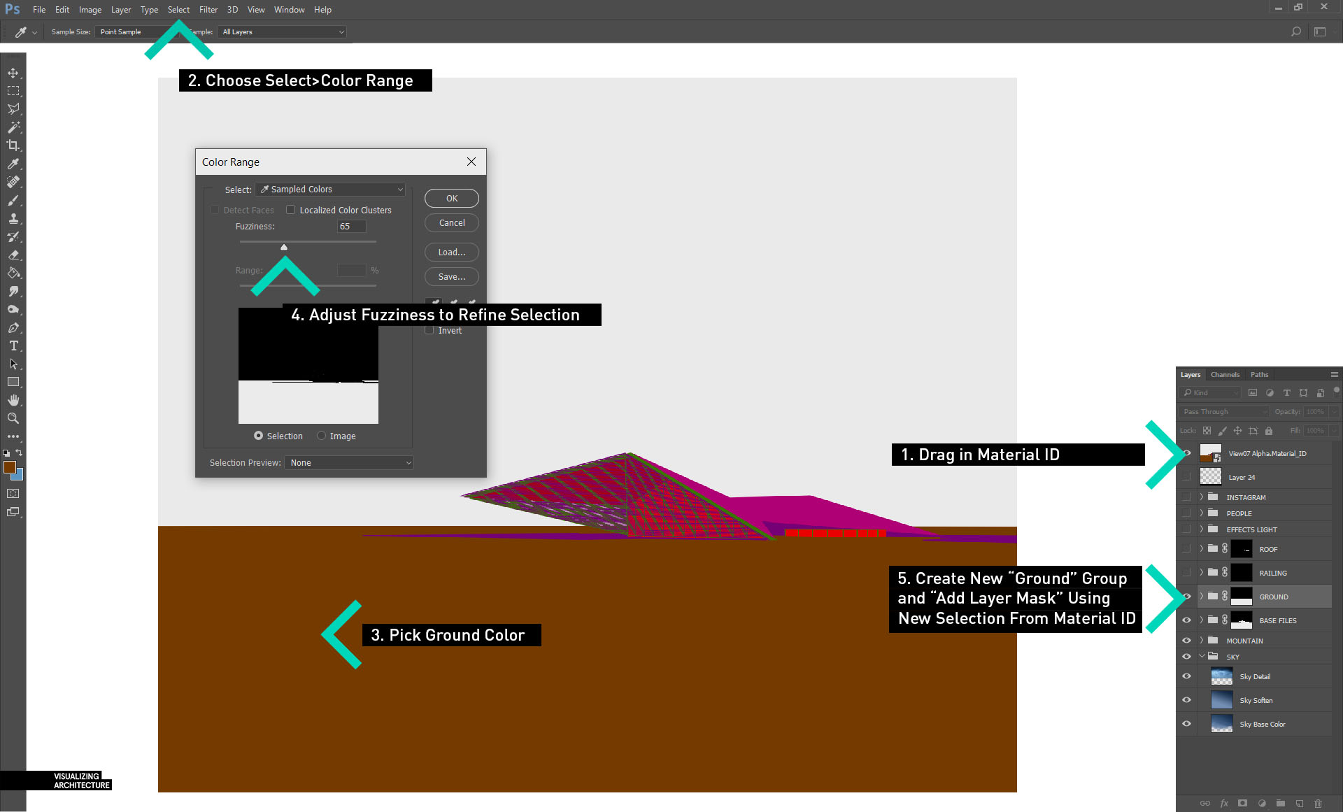
4A. To start editing the ground, I first need to create a selection of the ground. I did this by dragging in the “Material ID” V-Ray element (discussed in part 1) and placing it at the top of the Layers Palette. Next, choose “Select>Color Range” to bring up the “Color Range” dialogue box. Pick the color of the ground, in this case, the brown color. This will highlight the ground in the “Color Range” dialogue box. Adjust the “Fuzziness” slider to refine the selection as needed. Then click “OK” to load the selection. With the ground selection active, create a new group called “GROUND” and choose “Add Layer Mask” at the bottom of the Layers Palette. I now have a container to add in many textures without needing to create new masks for each texture.
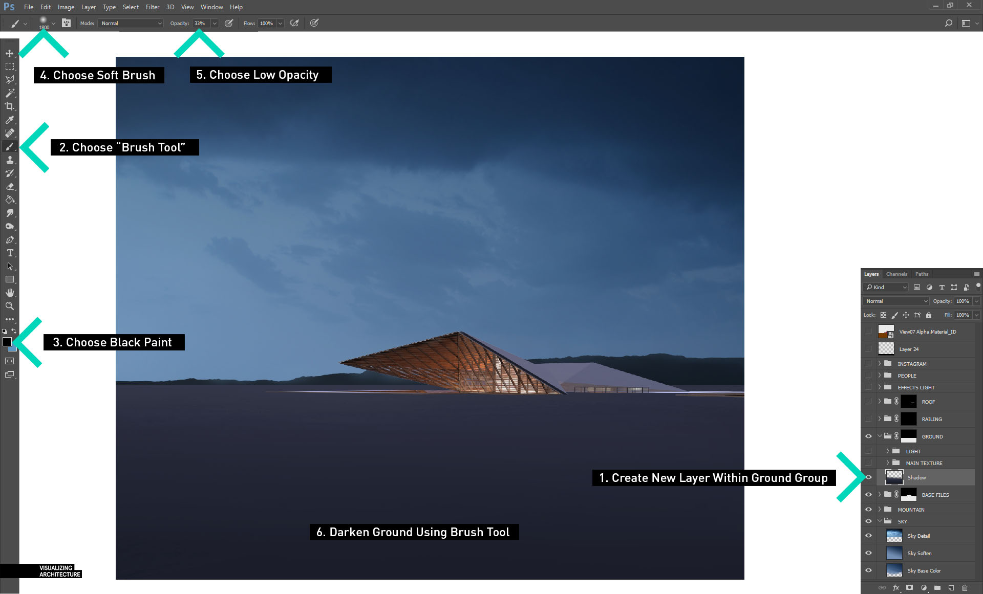
4B. In the “GROUND” group, create a new layer called “Shadow”. In this layer, I use the “Brush Tool” with black paint, a soft tip, and medium opacity to darken the ground which better matches the lighting of the scene.
4C. Next, drag in some ground textures. I am using about five different images to make up the foreground, mid-ground, and background textures.
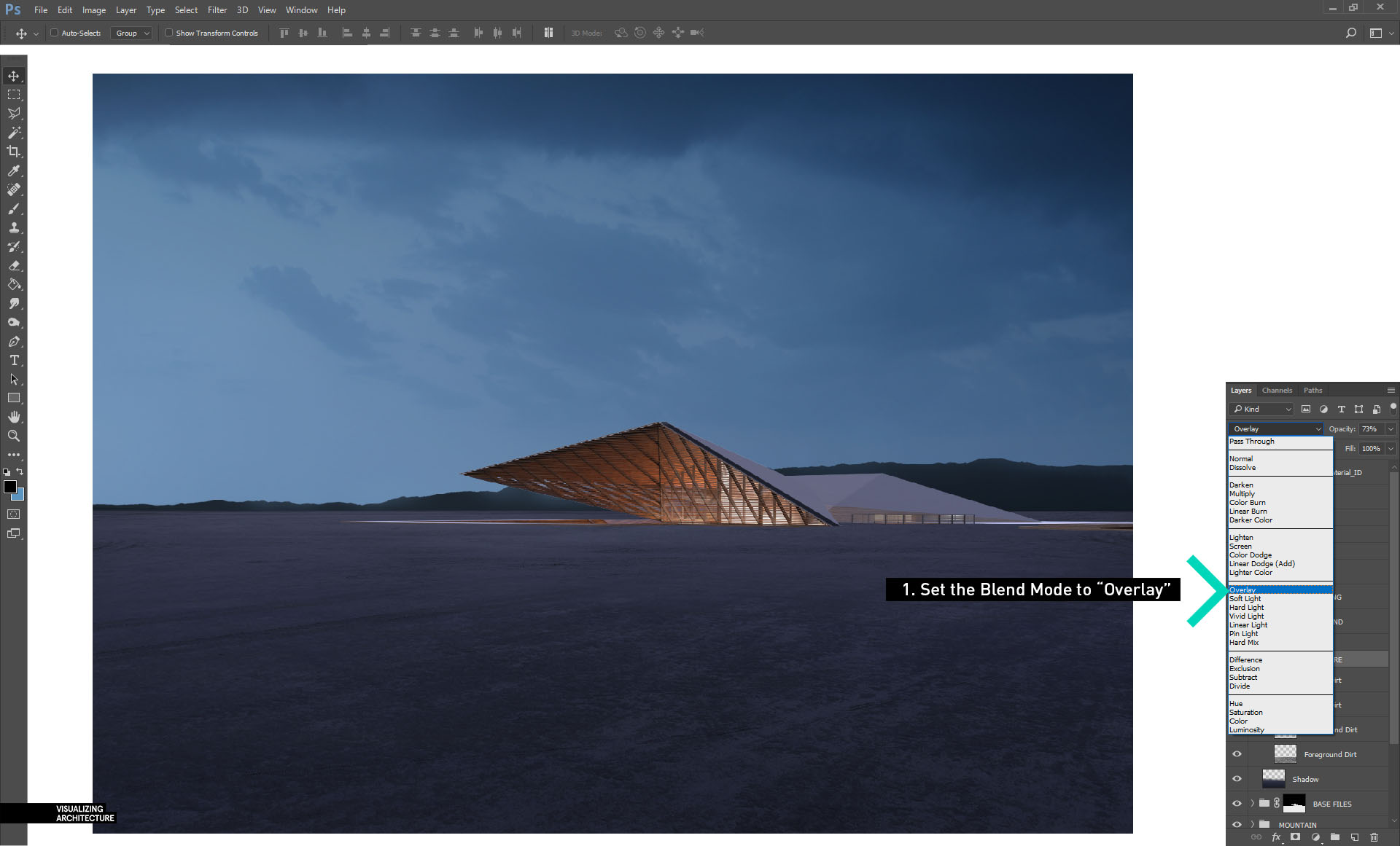
4D. Once all of the textures are in place, I set the “Blend Mode” of the entire “GROUND” group to “Overlay”. This sets the textures into the image and picks up the shadows and colors of the ground.
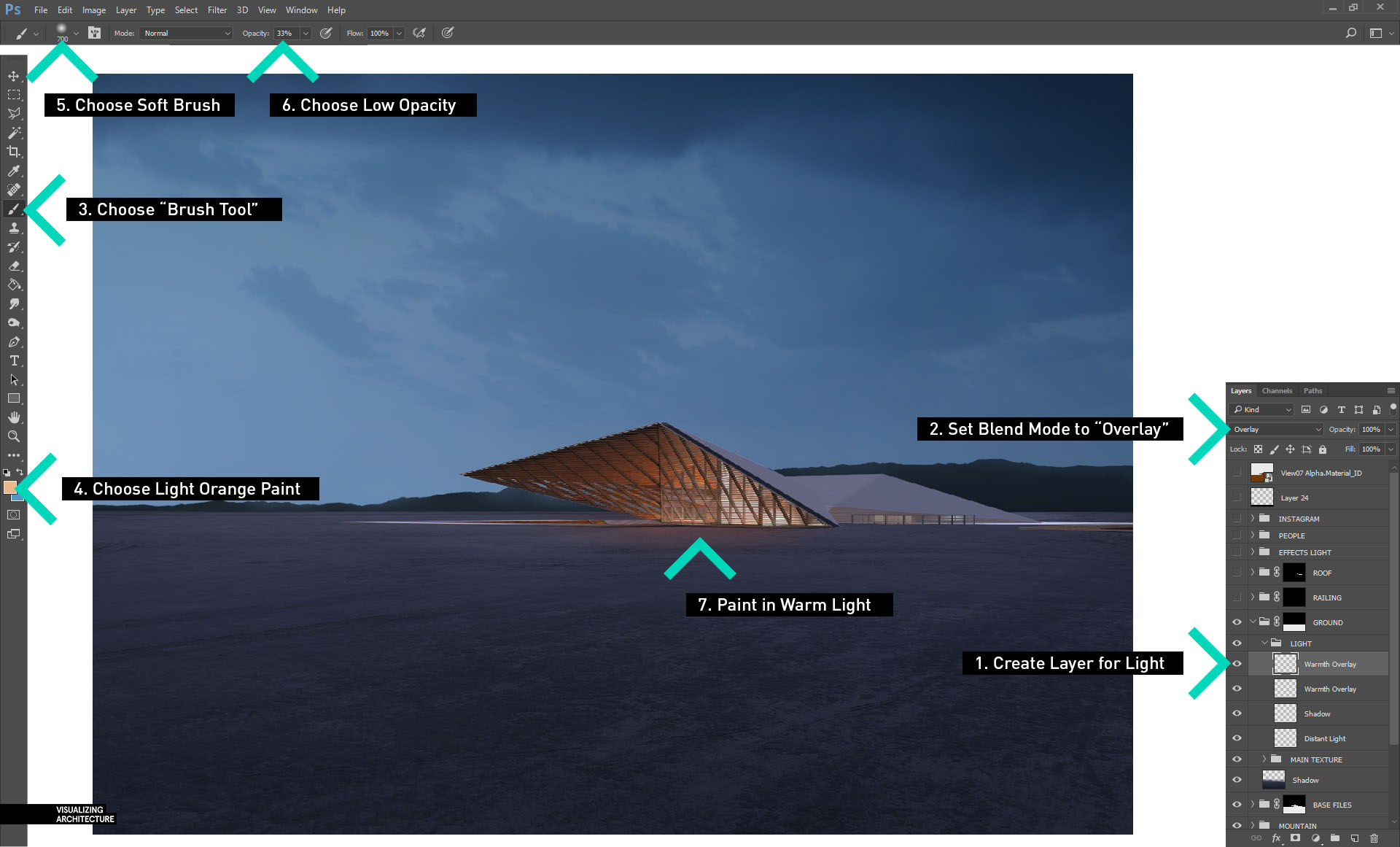
4E. Finally, I want some of the glow of the interior to wash across the ground. To do this, create a new group called “LIGHT” inside of the “GROUND” group. Inside the “LIGHT” group, create a new layer. Then select the “Brush Tool” with a light orange paint, a soft brush tip, and low opacity and start painting in the warm colors. Finally, set the “Blend Mode” to “Overlay” to blend the warmth into the ground.
5. Roof Textures
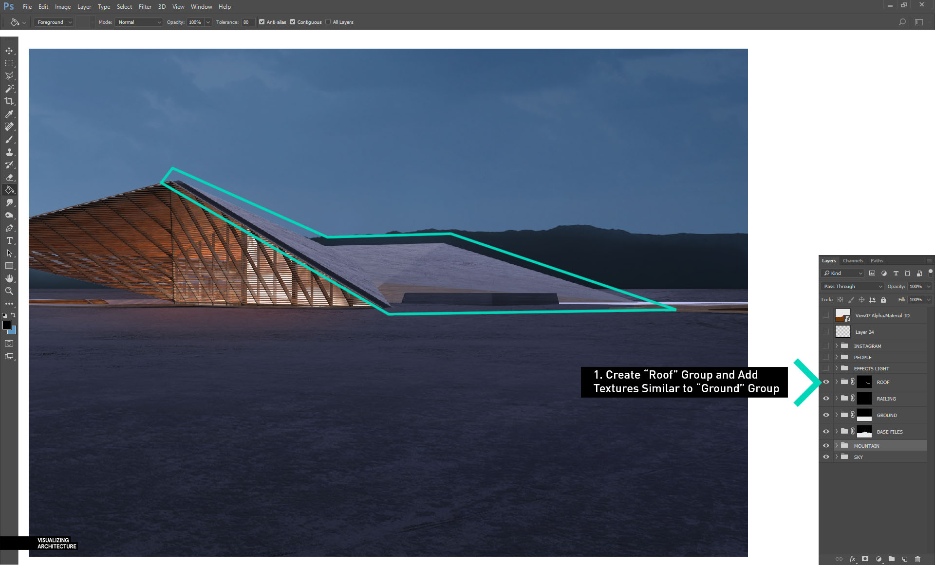
5A. For the roof textures, the process is the same as the ground textures. I create a group called “ROOF” with a mask applied. In it, I add textures and set the “Blend Mode” of the group to “Overlay”.
6. Interior Light
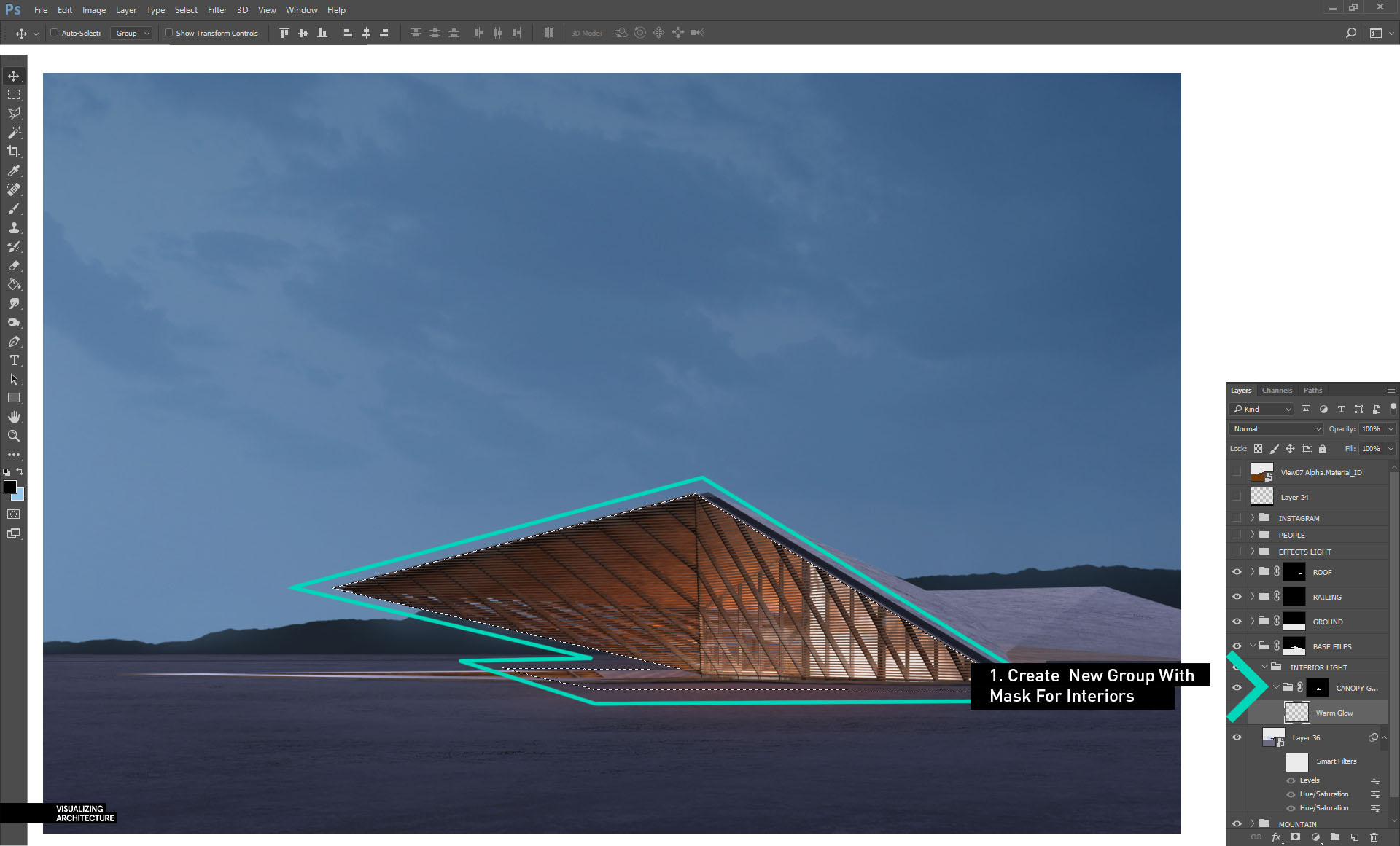
6A. For the interior lights, I again create a new group and call it “INTERIOR LIGHTS”. I place this group into my “Base Files” group so that I can take advantage of the Alpha selection. Inside the “INTERIOR LIGHT” group, create another group called “CANOPY GLOW” with a mask of the area highlighted in green.
6B. Within the “CANOPY GLOW” group, create another new layer called “Warm Glow”. Then select the “Brush Tool” with a light orange paint, a soft tip, and low opacity. From there, slowly add in the light orange paint. Finally, set the “Blend Mode” to “Overlay” to blend the warmth into the image.
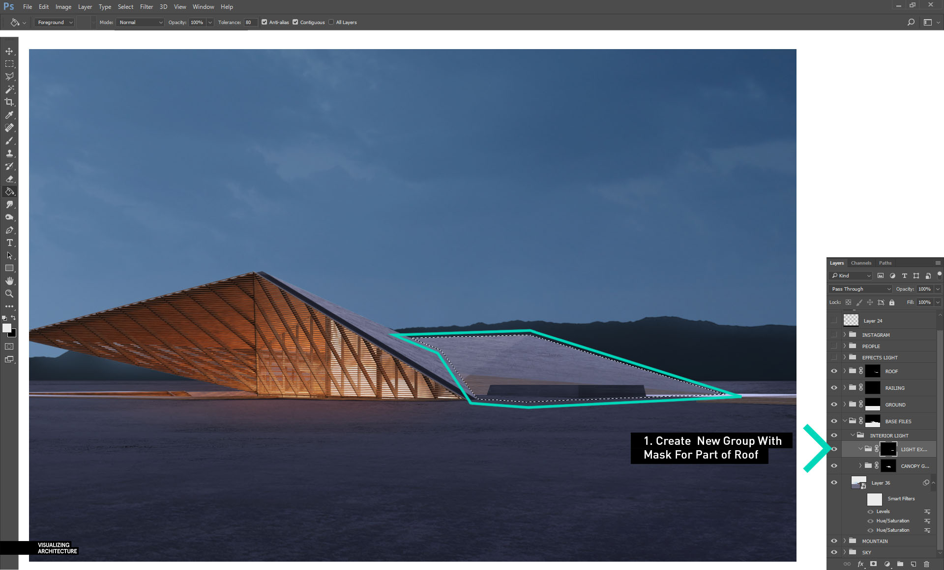
6C. There is also glass on the back side that will be adding warmth to some of the roof. Create a new group with a mask revealing just this section.
6D. Again, use a soft brush with a light orange paint, soft tip, and low opacity to paint in warmth in this area. Finally, set the “Blend Mode” to “Overlay”.
7. Fog
7A. Some fog is added to give just a hint of depth to the image. I usually do this in a group called “EFFECTS”. To add in fog, create a new layer, select the “Brush Tool” with a light blue paint, a soft tip, and very low opacity. Slowly paint in the haze focusing most of it near the horizon. I have several fog layers to better manage the density of the fog and to better control opacity in different areas.
7B. This image shows just the fog layer on a black background. You can see it is very subtle and focuses mainly near the horizon.
8. People
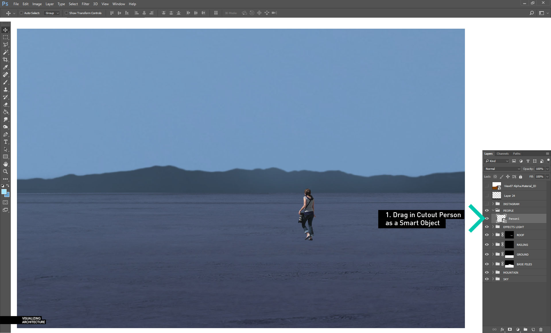
8A. Normally I like to place people behind the fog layers. However, in this case the “PEOPLE” group is placed on top of the “EFFECTS” group for more control with their toning. To get started, I first drag in one of the cutout people and convert the layer to a “Smart Object”.
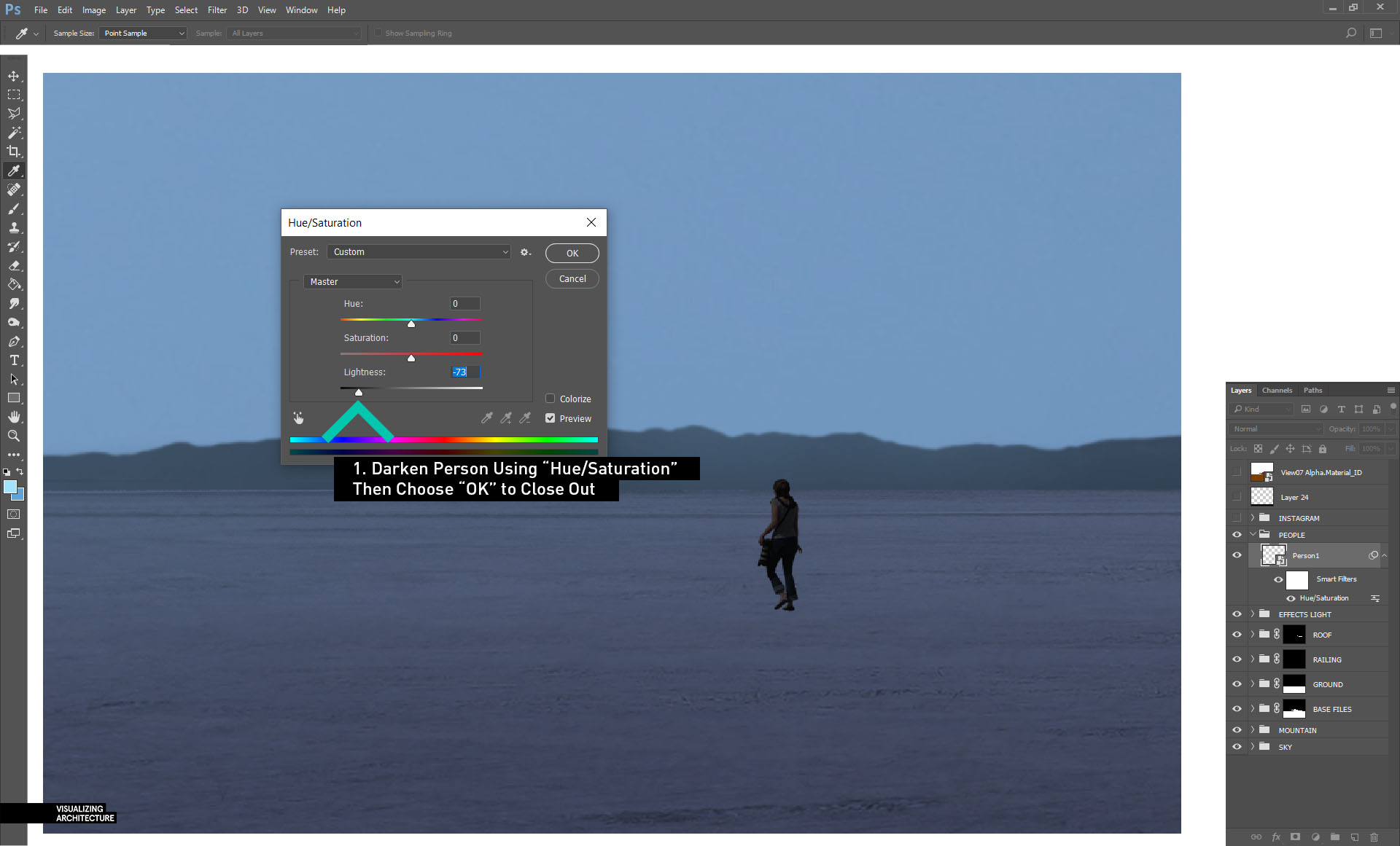
8B. Next, the person needs to be darkened to match the scene. Choose “Image>Adjustments>Hue/Saturation”. In the “Hue/Saturation” dialogue box, move the “Lightness” slider left to darken the person. Then choose “OK” to close out of the box.
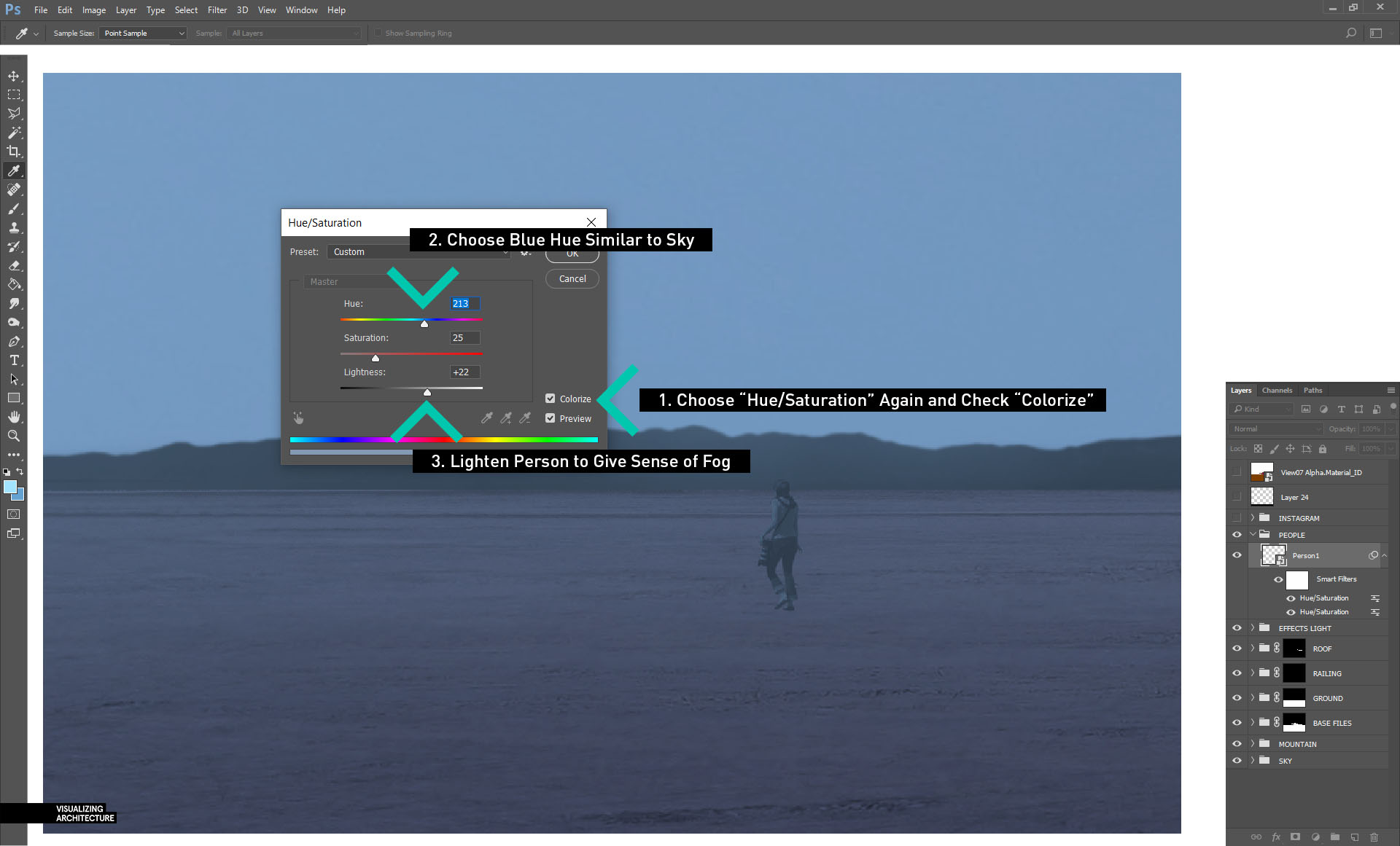
8C. Next, again choose “Image>Adjustments>Hue/Saturation”. This time, check the “Colorize” box in the lower right, then slide the “Hue” slider to a blue tone that matches the sky and atmosphere. Finally, slide the “Lightness” slider to the right to lighten the cutout and account for some of the haze in the image.
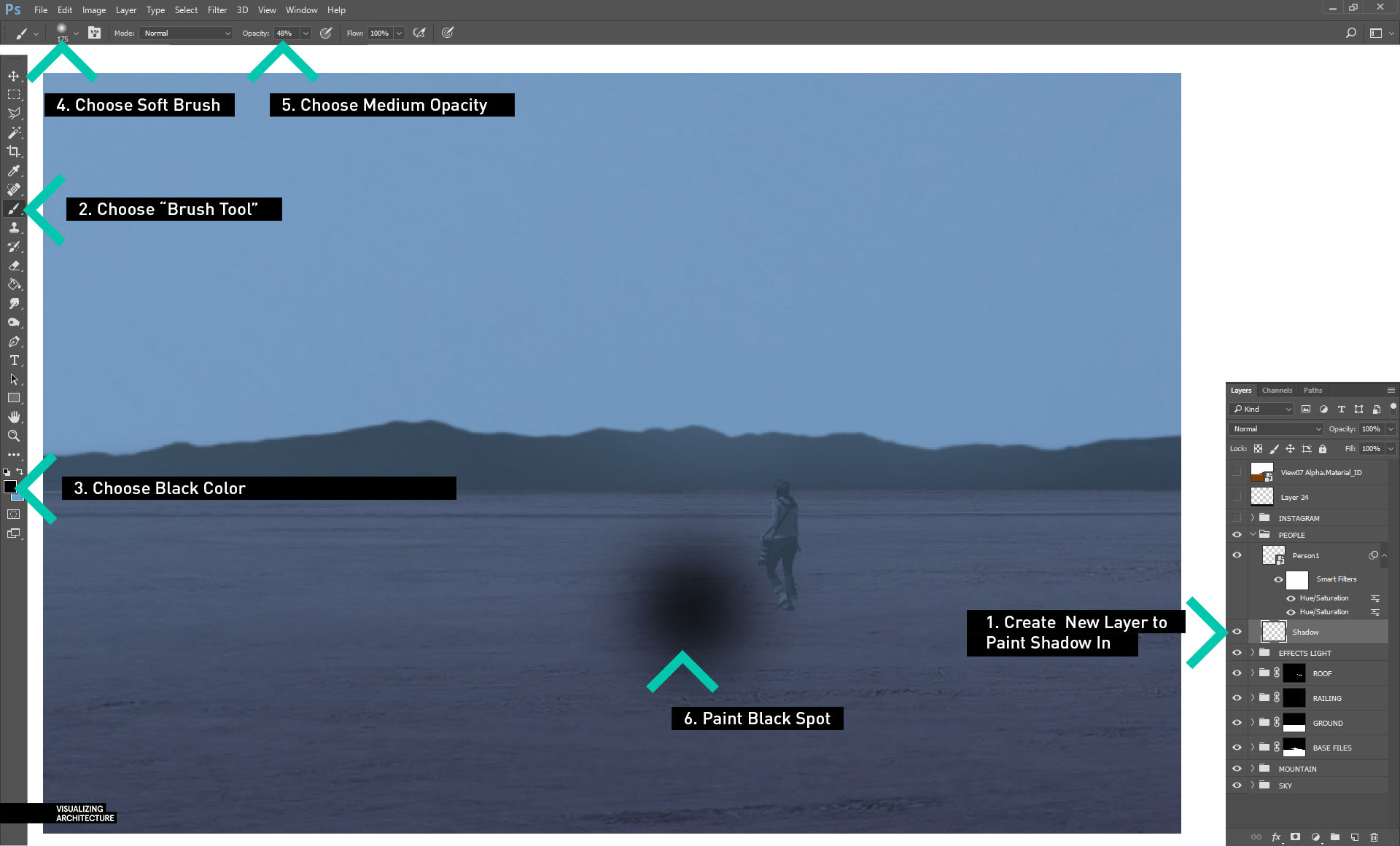
8D. To help ground the person, a shadow can be added. Create a new layer, then choose the “Brush Tool” with black paint, a soft tip, and medium opacity. Then paint a spot in the middle of the canvas.
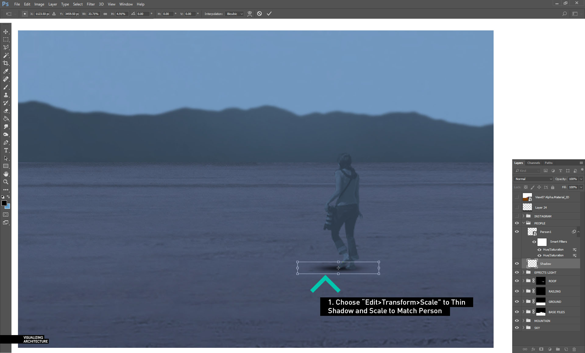
8E. Choose “Edit>Transform>Scale” to thin the shadow and scale to match the person. The opacity may need to be lowered as well.
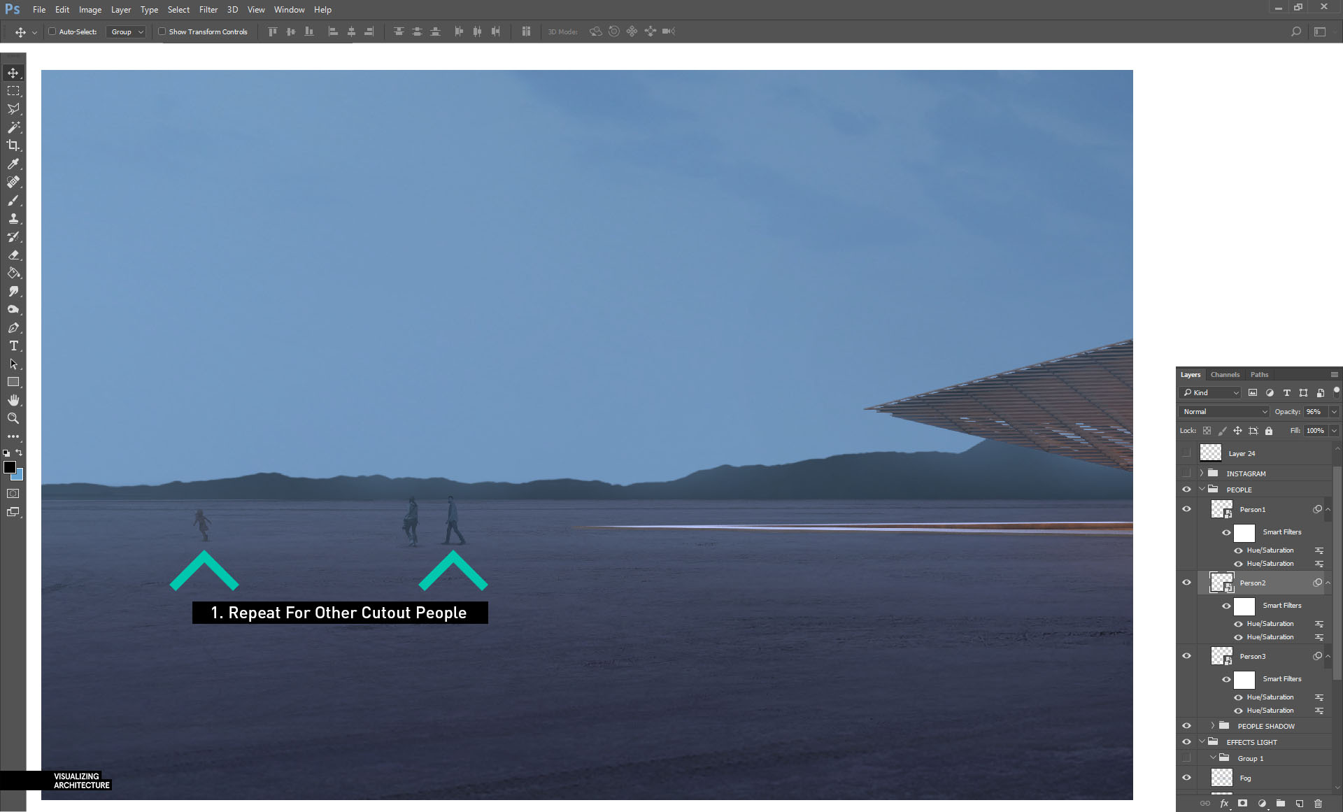
8F. Finally, repeat these steps for the rest of the entourage.
9. That “Instagram” Look
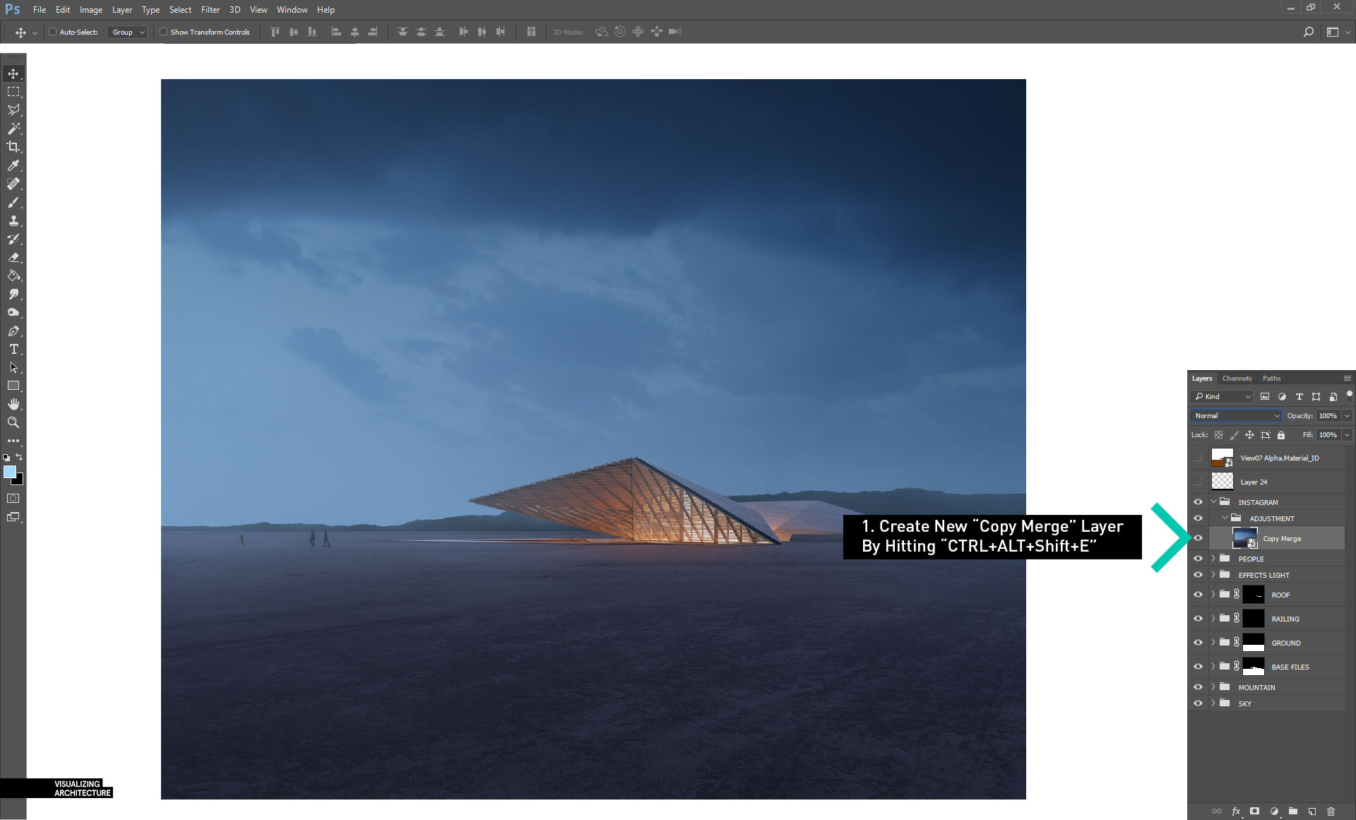
9A. I ended up posting this image on my Instagram page with a little extra color tweak. To create this extra bit of color, first create a copy-merge of all of the layers. This is done by creating a new layer, then typing “ctrl+alt+shift+E”. Then convert it to a smart object by right-clicking on the layer and choosing “Convert to Smart Object”.
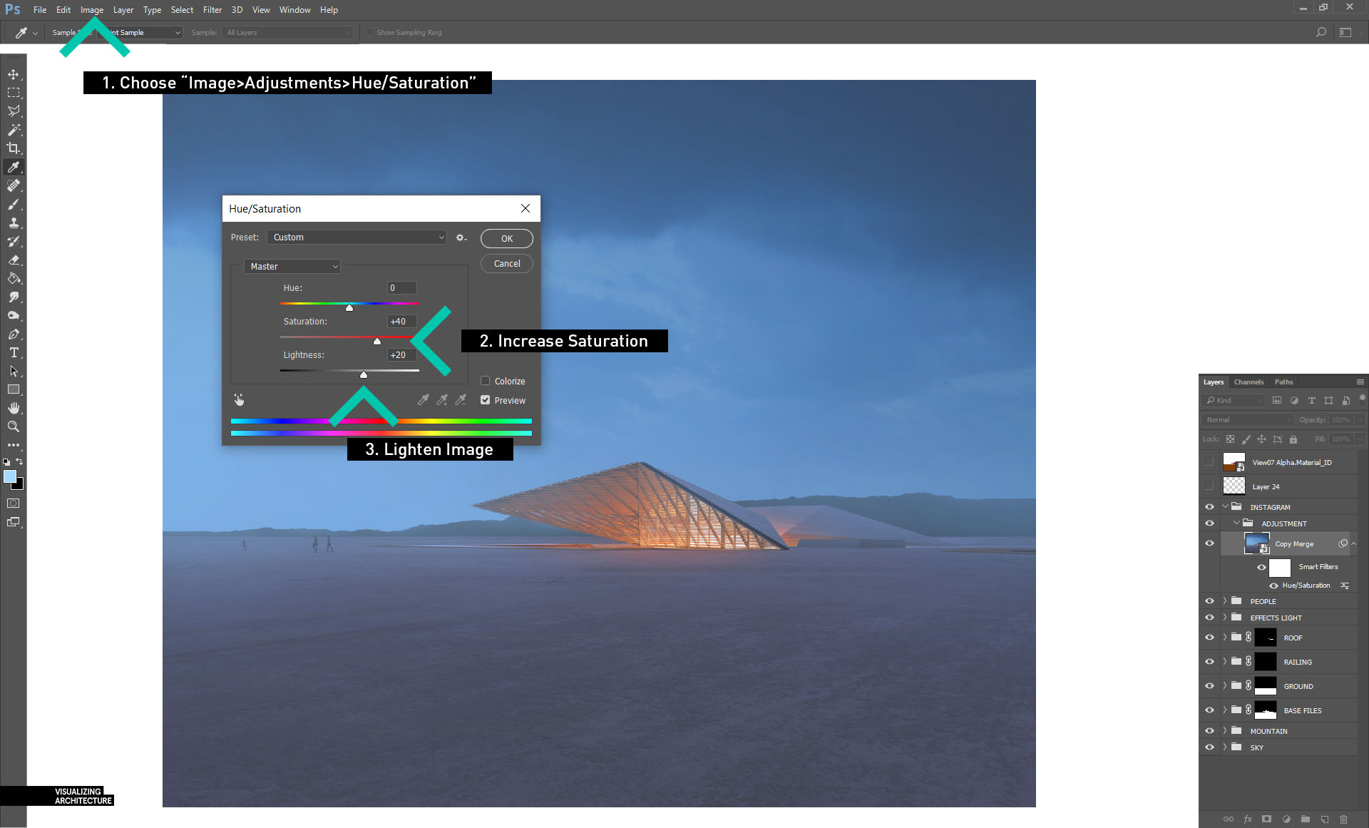
9B. Next, choose “Image>Adjustments>Hue/Saturation” to bring up the dialogue box. Then increase both the Saturation and Lightness.
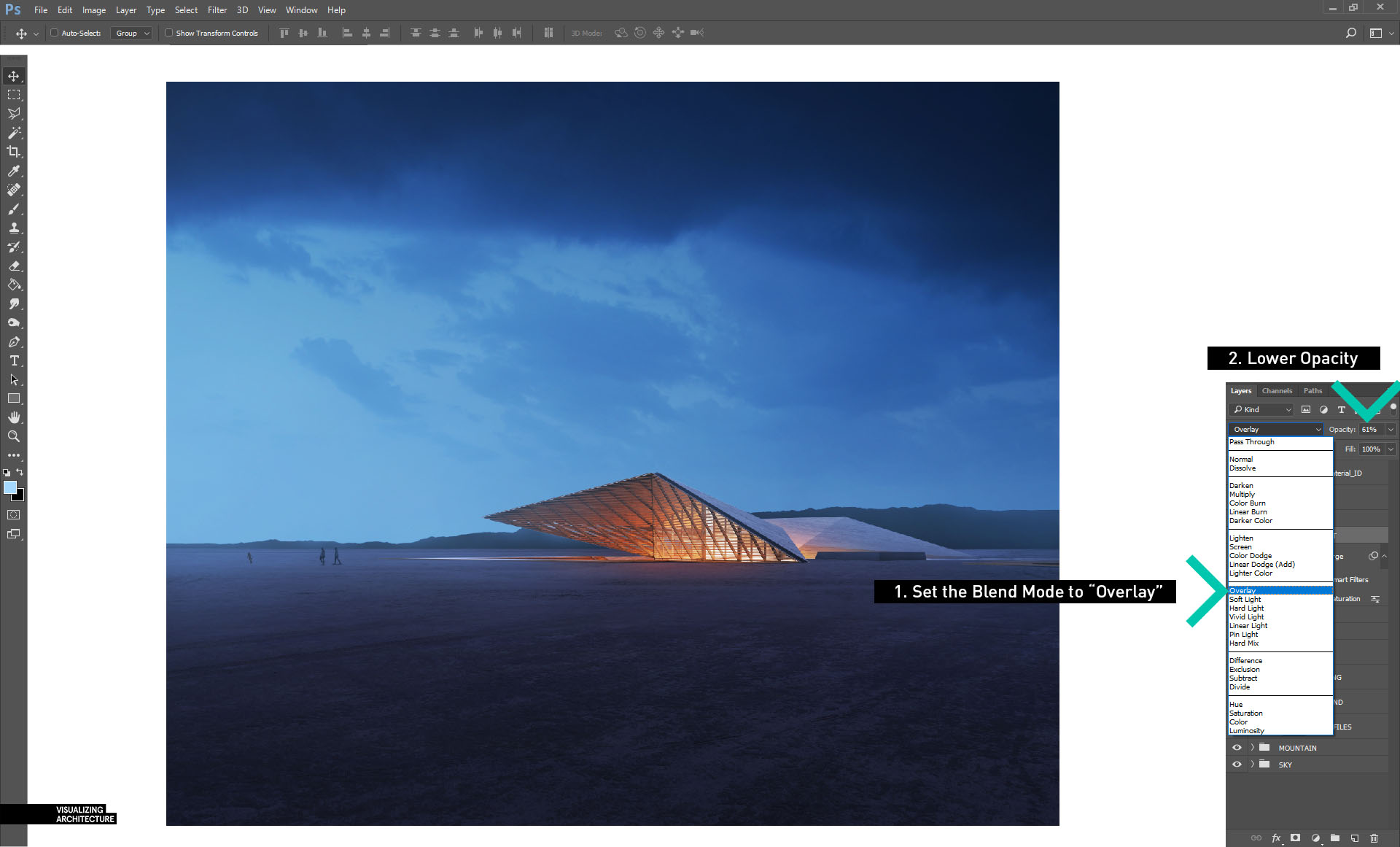
9C. Now, set the “Blend Mode” to “Overlay” . This should significantly enhance the colors of the image. I lowered the opacity to tone down the strength just a little bit.
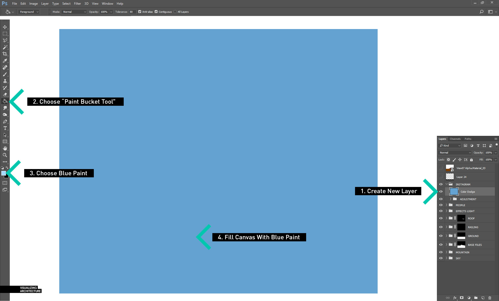
9D. Next, create a new layer and fill the new layer with a blue paint using the “Paint Bucket Tool”.
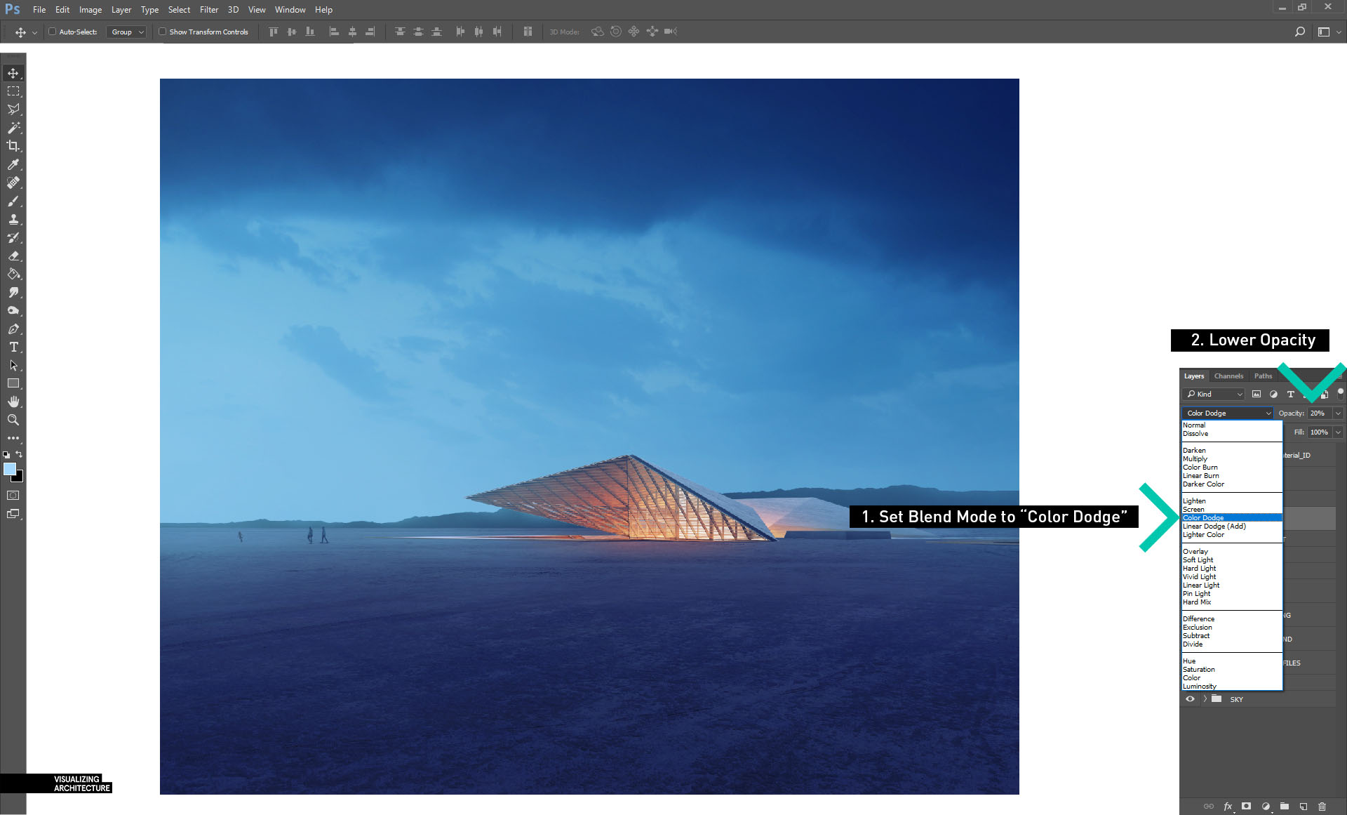
9E. Set the “Blend Mode” of the blue color layer to “Color Dodge” and then lower the opacity to about 20%.
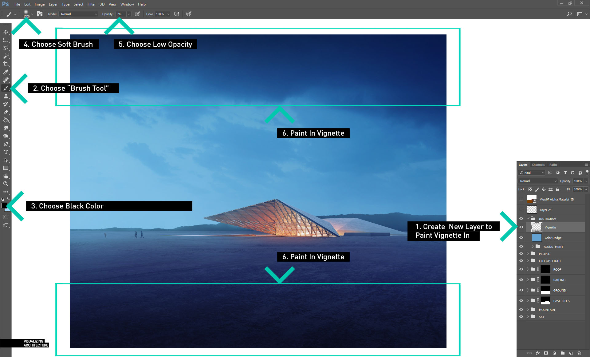
9F. Finally, with the “Brush Tool” set at a low opacity, create a new layer, select a black paint, and darken both the bottom and top to create a vignette effect.
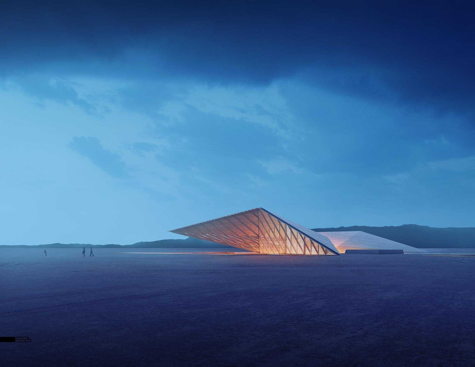
Final Image
I have never done such a comprehensive tutorial on my site like this before. I tried to cover every aspect of the making of this image. However, if I forgot something or didn’t explain it well, leave a comment or send me a message and I will do my best to correct/add to this post as needed.







detailed, comprehensive, well explained steps and yet easy to be understood. Thank you for beginners like me
That is exactly what I was hoping to hear. Thank you for the comment
I really loved the videos you used to do. So chilled and genuinely relaxing to watch. Would you consider returning to those?
You’ve always been my inspiration while I was in architecture school. And even until now, you never cease to amaze me with your talent. Cheers!
I have been following your blog since I graduated design school. You have always been a great inspiration of mine, and I have learned so much from your blog (Honestly, 70% of what I know about creating visualizations is from your blog). Thanks for sharing your knowledge. Looking forward to your future posts.
Your willingness and patience to make your tutorials so comprehensive is very much appreciated Alex! You’re talent for designing this great architecture, visualising it and teaching us all is truly amazing. Big fan from Belgium for over 8 year now! Grts
You crushed it. Glad to see your detailed breakdown and know that I’ve been on the same page! Beautiful work.
Awesome! You’re one of my motivation, so everyday I work hard to get your level
I ought to acknowledge that it really is 1 of the most worthwhile content I have actually study. It actually is also professionally created. I am an french instructor so I see what I suggest.
Again, giving us these great and entertaining tutorials. Thank you Alex.
Mcafee is one of the most reliable antivirus providers in the market. Mcafee is delivering top rated protection from mobile devices and computers. http://mcafeecomactivatenow.xyz
Alex this is pure gold, what an amazing way to display such a complex process. The numbering system in the diagrams are brilliant and easy to follow. You deserve an award for this. Thank you for your time and love to the craft.
Useful Info! I would like to thank for the efforts you have made in writing this post in simple way. Great work.
Amazing write-up! You have such informative, eye-opening information. Keep it up!
In comparison to other blogs. This blog contains a relevant article which is informative. Thanks a lot for an awesome post.
Appreciate it.
Thank you for giving us these great and entertaining tutorials especialy this one of desert night !
Thank you Alex.
Just want to say your article is as astounding. The clearness to your publish is simply excellent and that i can think you’re an expert on this subject.
Fine together with your permission allow me to grab your feed to stay up to date with approaching post.
Thanks one million and please keep up the gratifying work.
this is my first time to this site…nice blogs