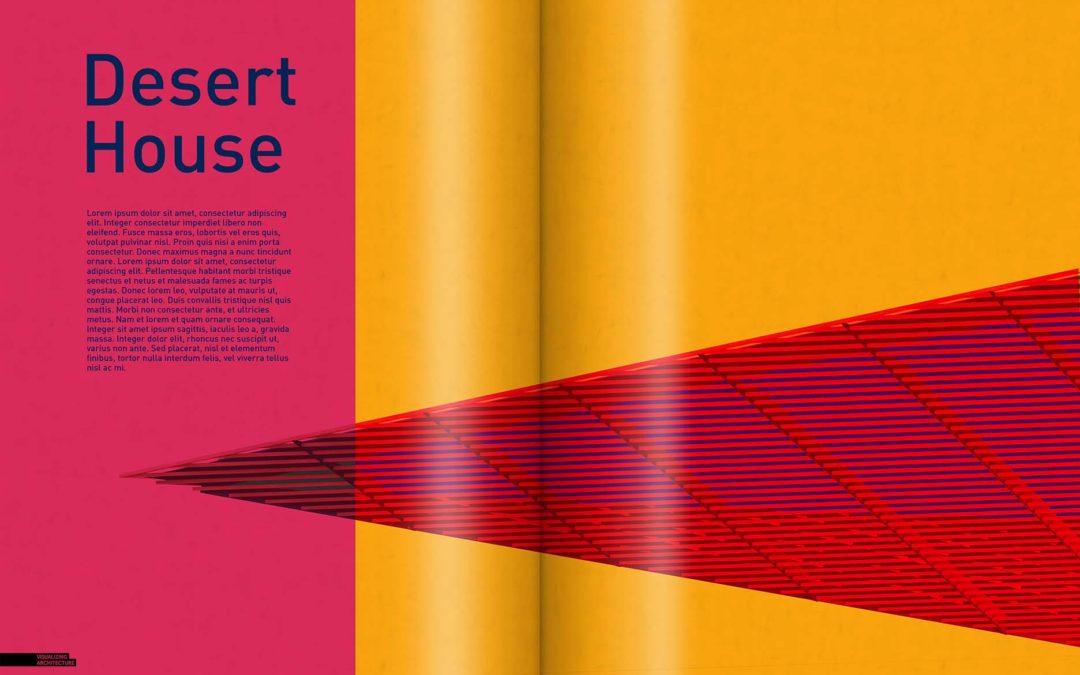
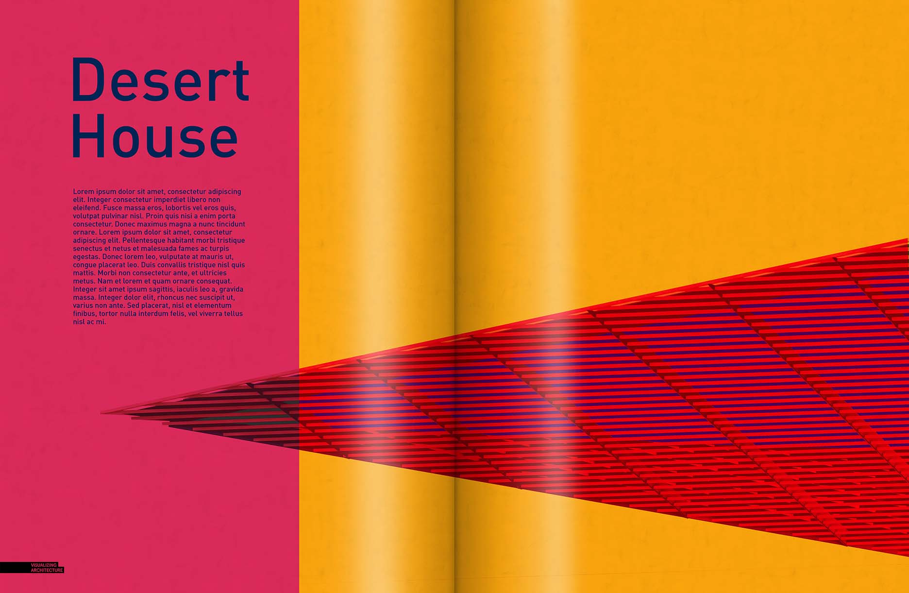
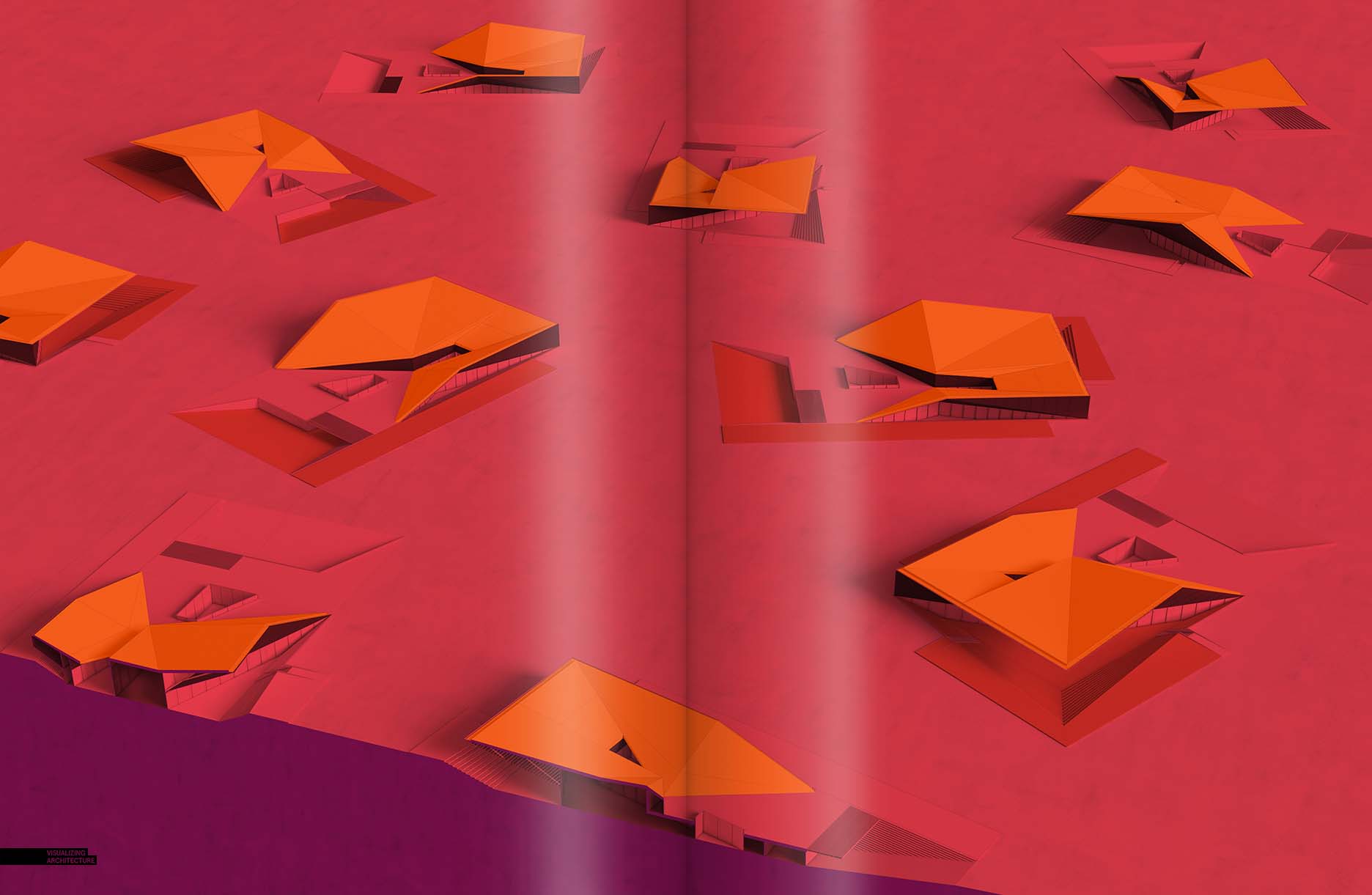
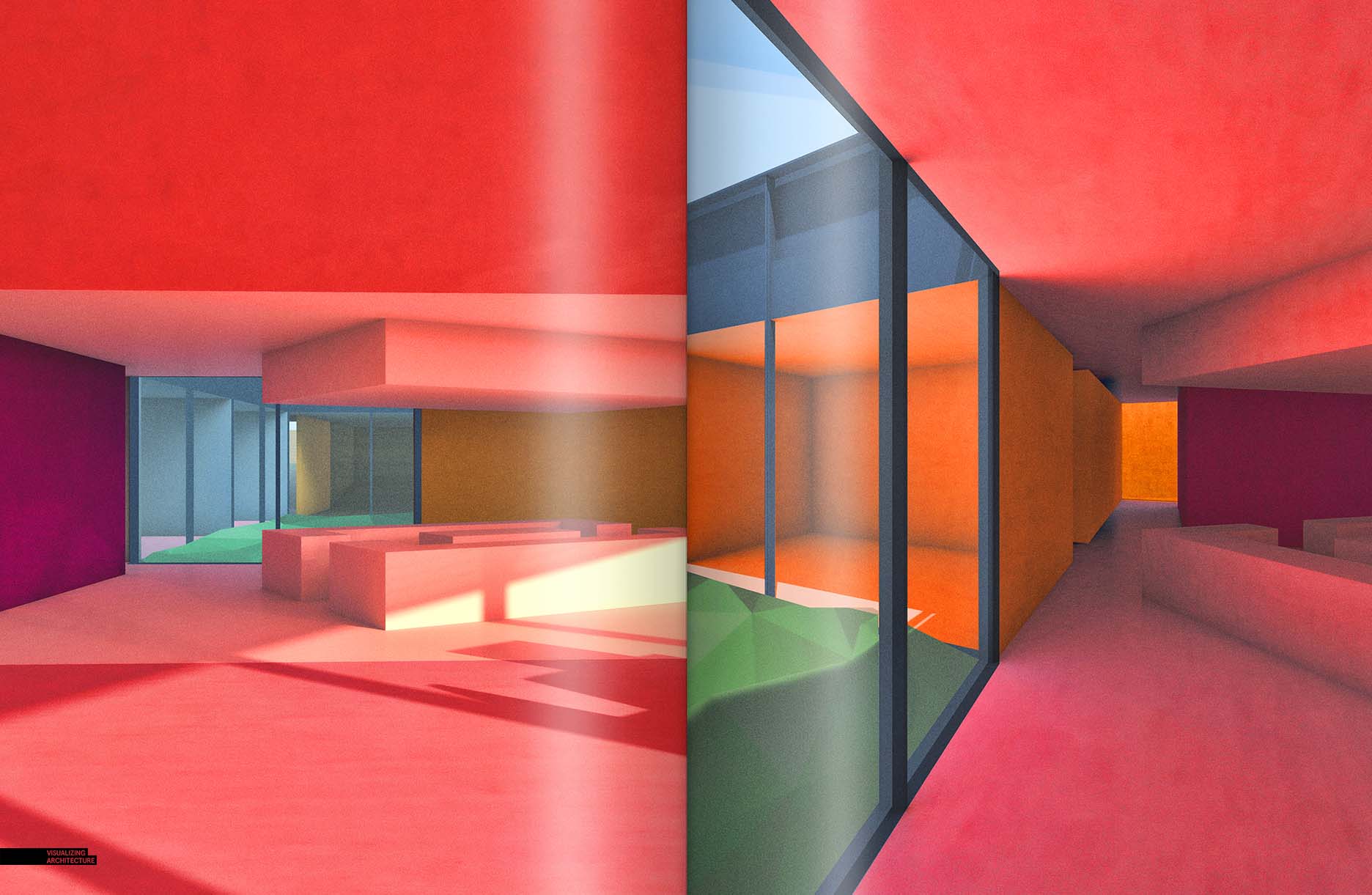
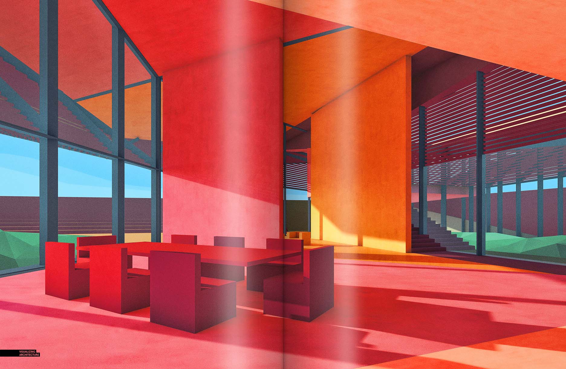
The Desert House Project is nearing completion and I have begun looking at how I can piece together the different images into portfolio spreads. Setting up these spreads help me to clarify what images still need to be generated to fill in the narrative gaps. They also get me thinking about the branding strategy of the project and what tone the pages will take on. In the case of the Desert House Project, I drew inspiration from the Abstract Interior Renderings that I created in my last post. Those images used an aggressive color palette and could be interesting when applied to the entire project. The colors are weighted on the warmer side and are extremely saturated. Once I had the color palette, I began adjusting some of the past illustrations to take on the more vibrant colors.
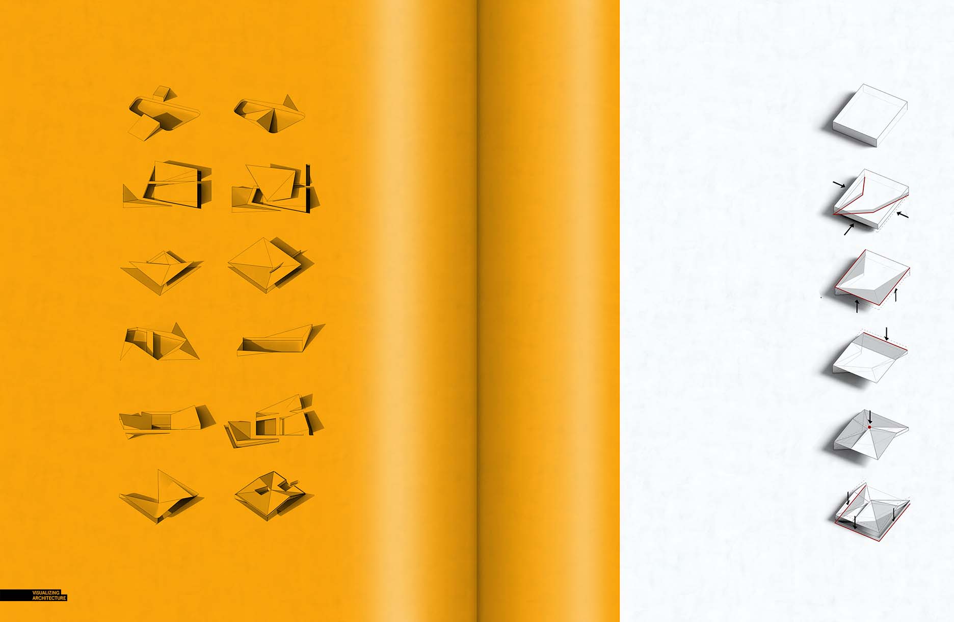
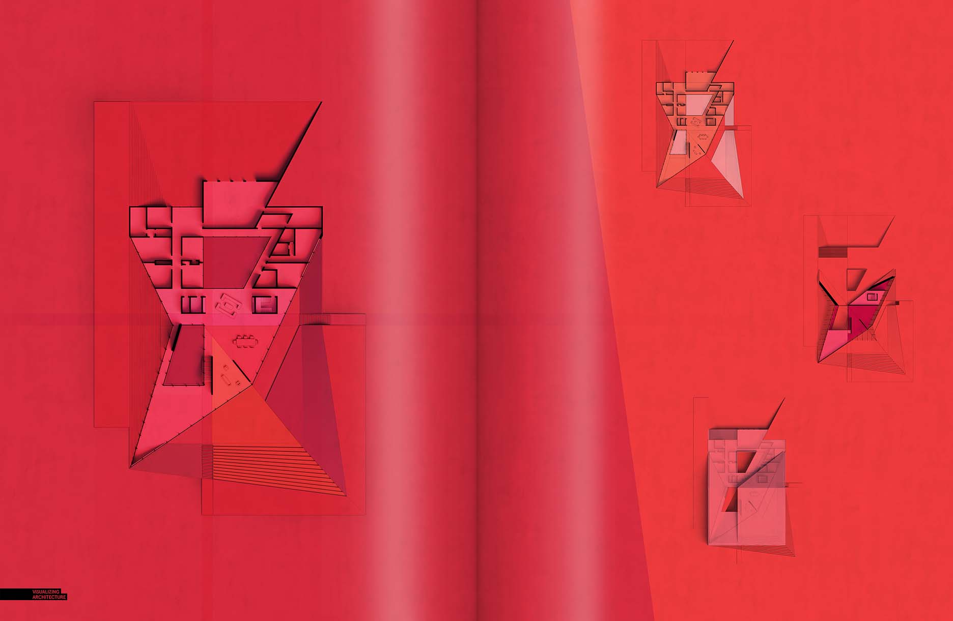
Below are some drafts of the spreads. I still need to obviously add text and annotations, however the spreads are starting to take shape and I can now study how the colors and layouts flow from one spread to the other. There are also a lot of images and spreads for this project that are not included in this post but that will be included in the final portfolio. For the new portfolio, I will be giving each project more pages to express the design so that each spread can have a little more breathing room and less pressure to cram as much information as possible into them.
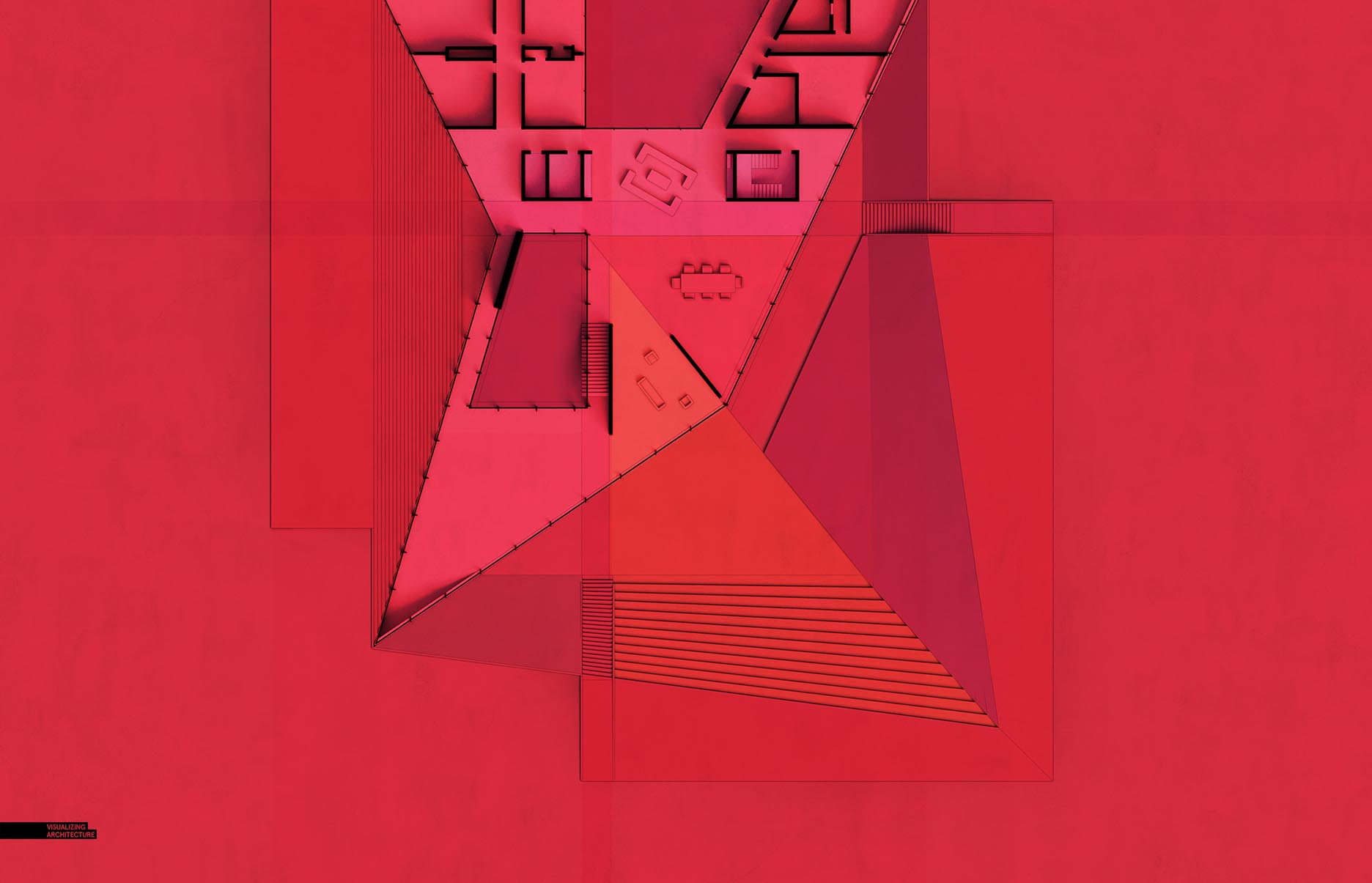
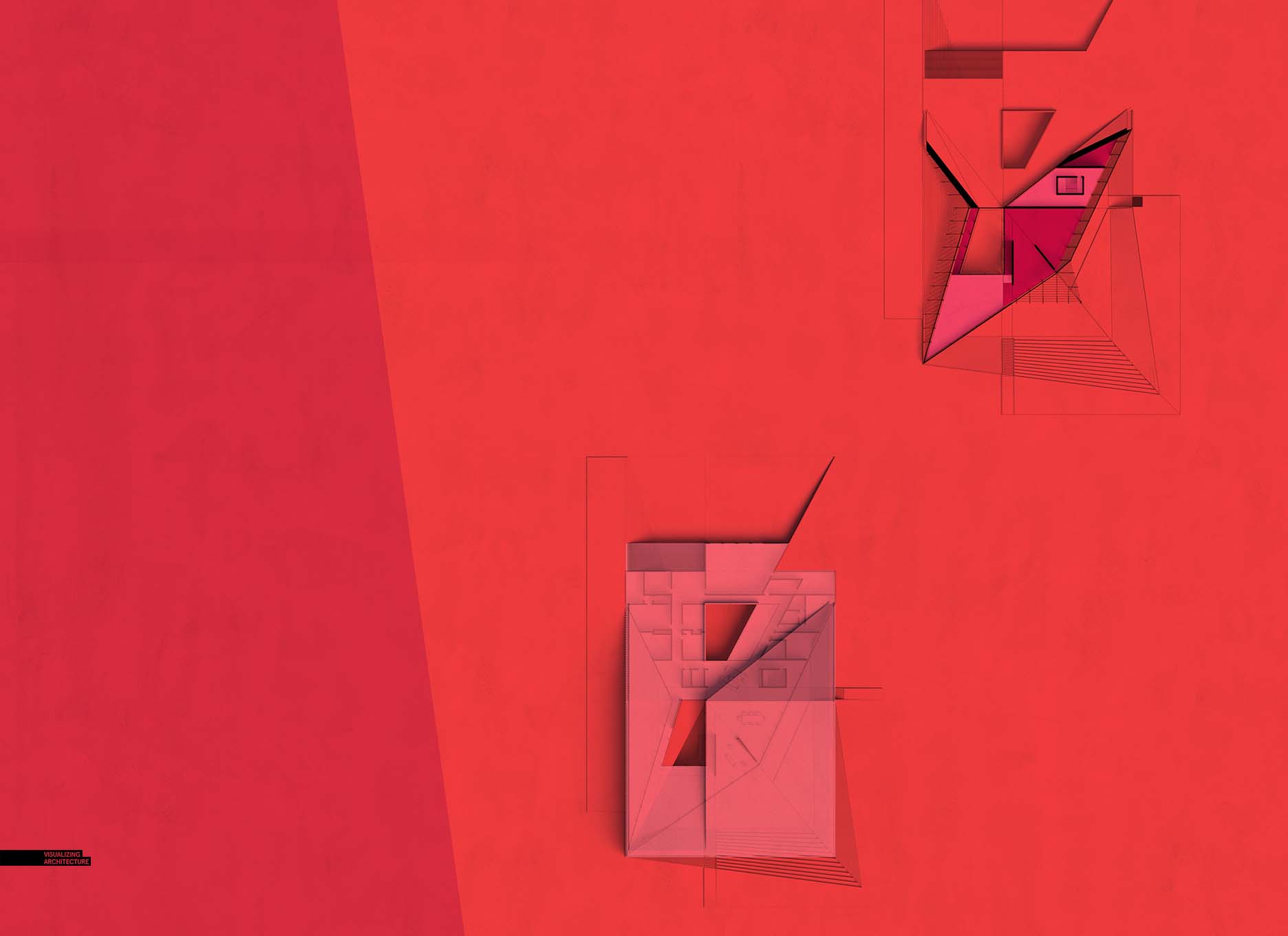
One of the spreads I put together included some new floor plans of the house. Again, I still need to layer in some text and annotations, but the framework is there. I experimented with lots of different material and color options before settling on a more simplified final image. Floor plans contain a lot of information that viewers are trying to digest quickly. Layering in lots of textures and colors can sometimes overload the plans with too much information and ends up hurting the hierarchy and reading of the diagram. I almost always end up going the more simple route with my floor plans.
I will hopefully have a new project underway by my next post. I have yet to do a project in a mountainous terrain. I think I will give that a go and see what I come up with….


Congratulations on yet another fine project, Alex!
Looking forward to what you do next.
please Alex. could you show us how to do the paper shadow. it looks like a printed book.
Alex,
Love the work as always, how do you get the reflections on the page on the above images, is this just a simple photoshop gradient or an indesign feature? I really like it.
Thanks,
William
Hi Tarik and William,
Yes, I have been asked this several times. It is really simple. The reflections are made in Photoshop using white paint at an opacity of about 15%, and then painted in a straight line using the Brush tool. The shadow in the crease of the spread is made using black paint instead of white paint.
Hello Alex,
quick question, as I see this spread and previous ones, I concluded that you don’t like the white pace in our portfolio. I understand that you keep you images clean, minimal and crisp but is there a specific reason why you avoid going more simple in your representation like white space around your images so they can breath ? (The abstract interior studies for example.)
Best regards,
Odair
Hi Odair,
I would argue that I leave quite a bit of breathing room around my images. I do like each spread to use the page differently, thus some having full bleed images, while others containing small diagrams floating on the pages. Similarly, I use color to connect projects and narratives. Its not that I don’t like leaving pages white, its that I just see it as one style of many styles to go with. With that said, I do love just simple white backgrounds and minimal images which I used several times in my Portfolio Vol. 3. Thanks for the comment!
Hello everyone! It’s very appealing document. I really am amazed that you are so good. I failed to respect you!
Looks colorful and colorful, thanks for sharing
Interesting…..
Thanks,for sharing a proper blog i like it. this blog very interesting blog also writing style is very good.
Its really good ….Thanks for sharing articles…https://bit.ly/2sL4gIf
Good Work…..! Thanks for sharing this Articles…..https://goo.gl/VsfmCc
Hi There! It sounds quite interesting and awesome to read this relevant article.
Appreciate it for sharing this post.