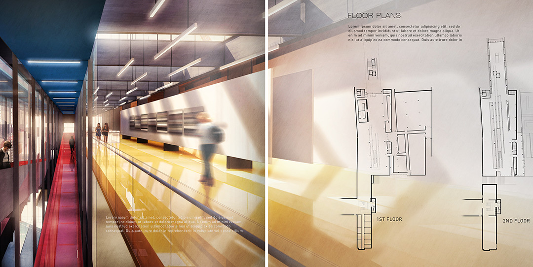
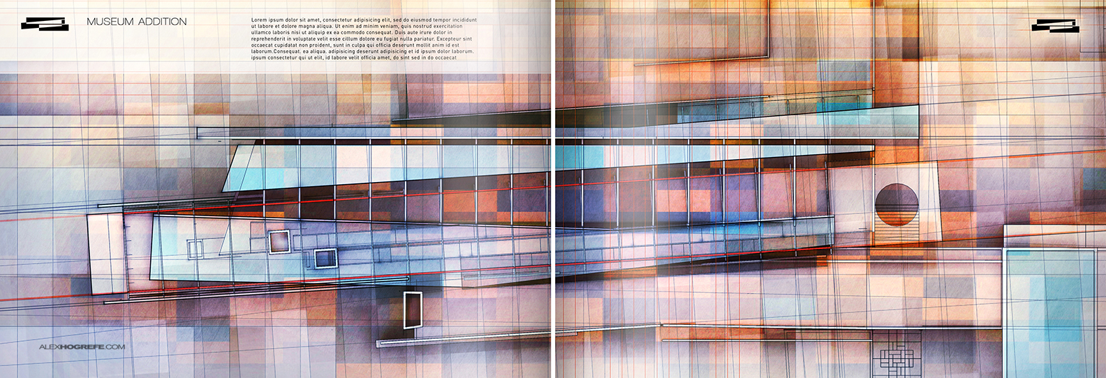
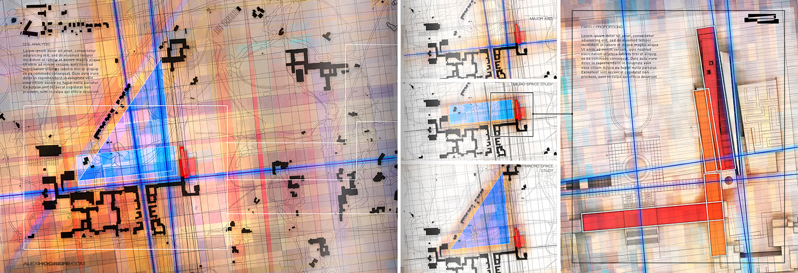
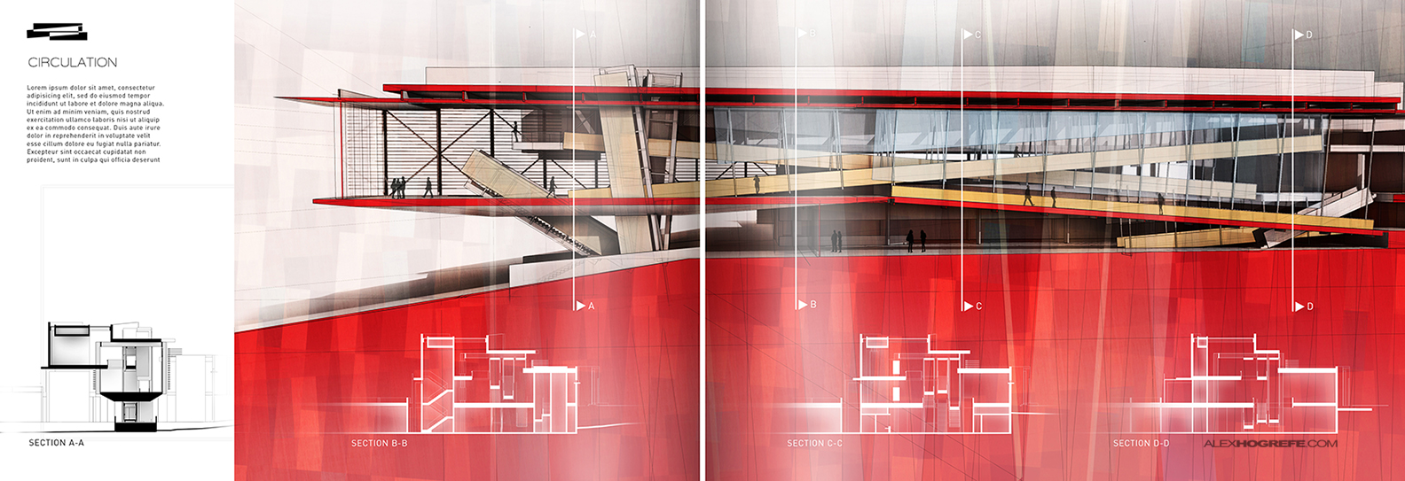
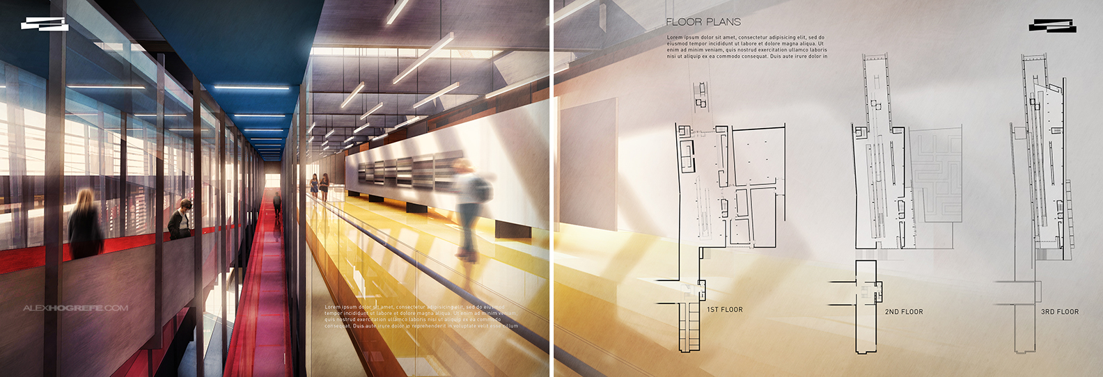
The Cranbrook project spreads are starting to come together. I spent some time composing the section and floor plan spreads which meant moving away from the abstract diagrams and into more traditional architectural drawings. I also developed an interior rendering of the space in an attempt to better explain the ramp systems inside and what I was envisioning for colors/material. I decided to go bold with the colors since that seems to be the theme for this project.
Below are the spreads up to this point:
I am struggling with the last spread in relation to the others. It still seems a little foreign in my opinion and lacking the graphic language set up in the others. It could be the lack of the grided texture or simply the color tones of the page, or both. As I develop the final illustrations of exterior/interior shots, I may try inserting other graphics into this spread to see if they transition better.
This will have to be a short post this week since most of my time went into the actual making of these pages. However, I will see if I can find time to break down the interior image so check back soon.


Please show a video how to do all the textures and most important … the process you follow
Hi Alex, been following your website for a while now.
My opinion on the relationship of the last spread to the others is that, I think you've followed your graphic language with all the colors that are in present with the previous ones. I think it's just the spread before it that has too much redness or too heavy of a dominating color that contrast these two too much. If you block that red section spread and have a look at the rest, I don't think these is any lack of colors in the last one.
I've just realized that maybe, if you tone down the 2nd spread (esp. blue lines on the left and black blocks, somewhat appear to be needing more organization maybe? looks like bread crumbs falling on a plate atm :D), the 1st, 2nd and last are perfect fit.
Just some of my thoughts.. still great work!
these are amazing alex!
Excellent work as always and if you could find the time to do a break down of the top image that would be brilliant.
As for your comment on the last spread, on first look I wouldn't say that it is particularly alien to the others but it might be worth doing as you suggest and try a faint grid but without the colours tinge on the right page. Good luck with it though looking forward to seeing the results.
Thanks for sharing your work Alex, you should be proud you inspire so many people.
no comment! i wonder how does it feel to get better every week! haha, great job SIR ALEX!
Hi Alex,
Have you tried on the final spread putting the checkerboard overlay on the white portion, fading it out with the image gradient so it doesn't feature on the left panel?
I can't wait to see the tutorial's video *____*
@Ryan/Lauren,
Thanks for the comments. I plan to rework the pages soon and will post if I can figure something out.
@Bryn,
Yes I did, but the grid overlay was competing with the plans to the point that the plans weren't ready well. As mentioned above, I am going to revisit these pages in the future once I finish up the other final renderings
@Gennaro,
I am currently putting together a breakdown of the top image, but not as a video tutorial. I will get back into the videos once I am able to free up a little more time. Thanks for the comment.
Hi, Alex, you have a amazing and inspiring work! And I would like to know how you achieve the mosaic hand-drawing feeling grid? Do you have some tutorial for this?