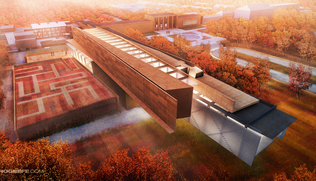
I have taken several trips up to Maine over the past month and experienced some beautiful landscapes with stunning fall foliage. This has inspired the latest illustration for my Cranbrook project. Autumn scenes are not that much different from your standard landscape scene except for the warmer color tones of the trees and overall warmth of the image.
On the other hand, bird’s eye views are, in my opinion, some of the toughest views to illustrate. It is difficult to find Google images at the proper view angle of landscape elements, cars, buildings, etc. On top of that, this view reveals much more of the background requiring more modeling of surrounding buildings and landscape. In my case, it means more time Photoshopping these elements in. However, the extra effort can be well worth it because this view angle can provide a clear understanding of the relationship between the design and its surrounding context which was my main objective. The design sits adjacent to, and is heavily influenced by the Saarinen Museum. I, therefore, wanted to illustrate this relationship as clearly and dramatically as possible, but still keeping the focus on my design. The bird’s eye view met this criteria.
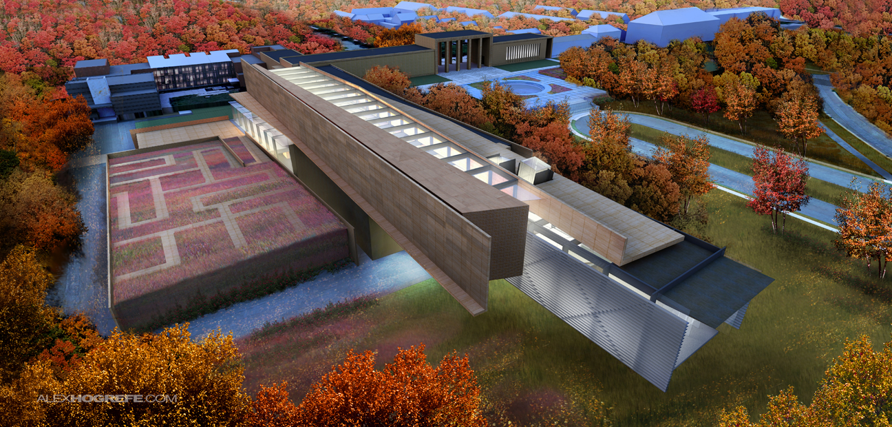
There was a heavy amount of Photoshop work that went into this illustration due to the amount of trees as well as the underdeveloped Kerkythea rendering. Below are the steps I used to layer in all of the key elements. I should note that although the steps seem clear and straight forward, there was actually a lot of back and forth between adding trees, grass, fog, textures, etc. While I used the overall structure of the steps below to piece together this illustration, it was very much an iterative process.
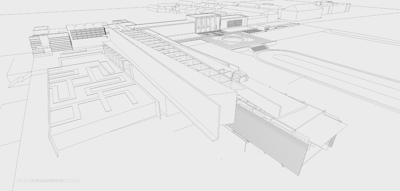
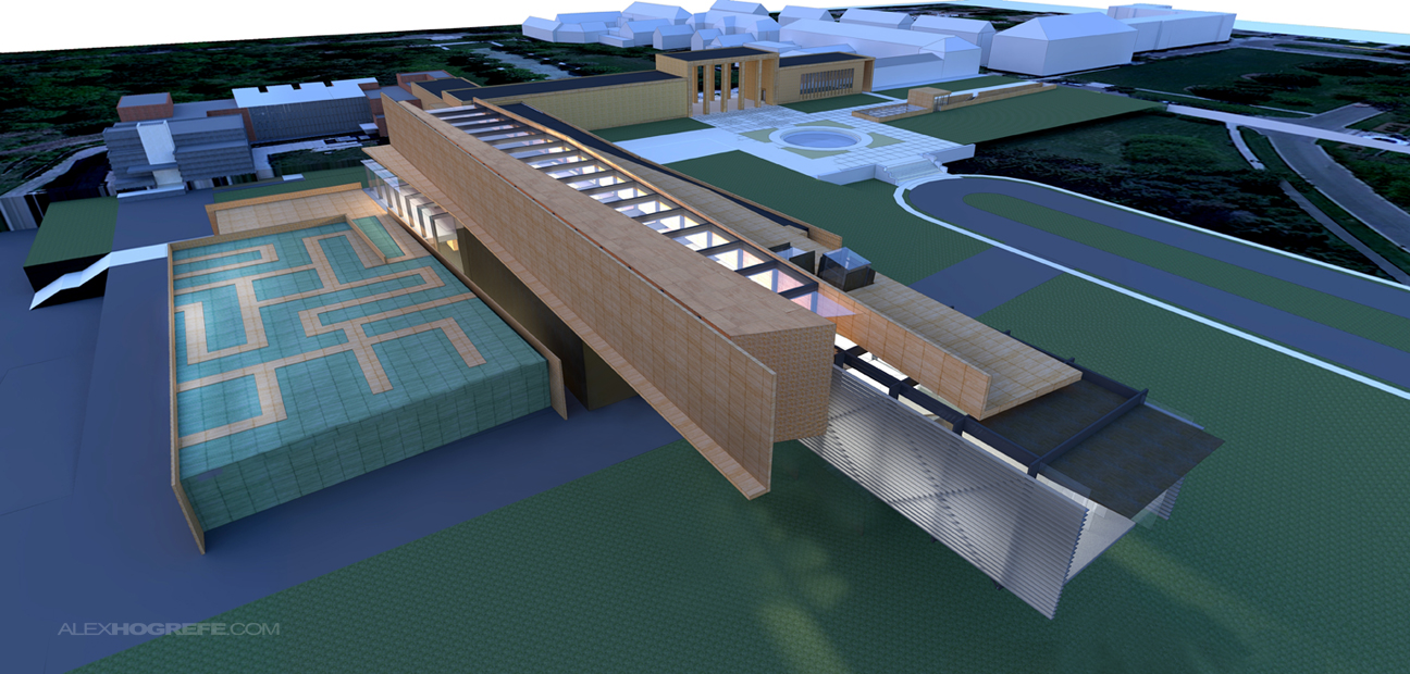
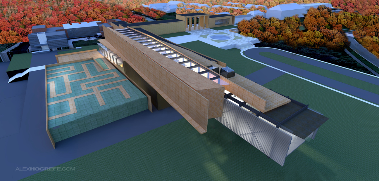
1. SKETCHUP TO KERKYTHEA: I spent most of my time on the design of the addition which left much of the context looking barren. I made the decision to not spend time modeling in more detail into the surrounding buildings and landscape but instead use that time in Photoshop. All that extra modeling would not show up in any other illustration views and I could Photoshop these elements in much faster.
Above: Sketchup Model
Below: Kerkythea Base Rendering
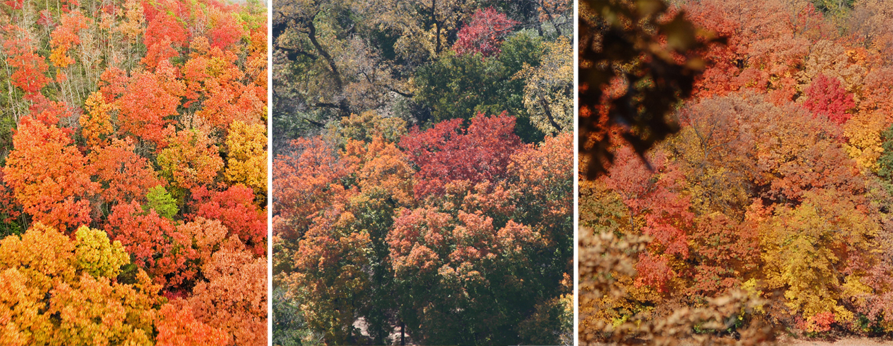
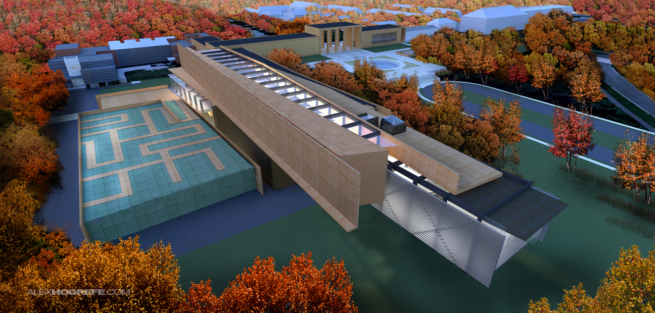
2. BACKGROUND AND FOREGROUND TREES: The landscaping was going to make or break this illustration. I Photoshopped in the trees starting in the distance and working my way towards the camera. I used several images to cut from so that I would have a good amount of diversity in color and avoid too much repetition.
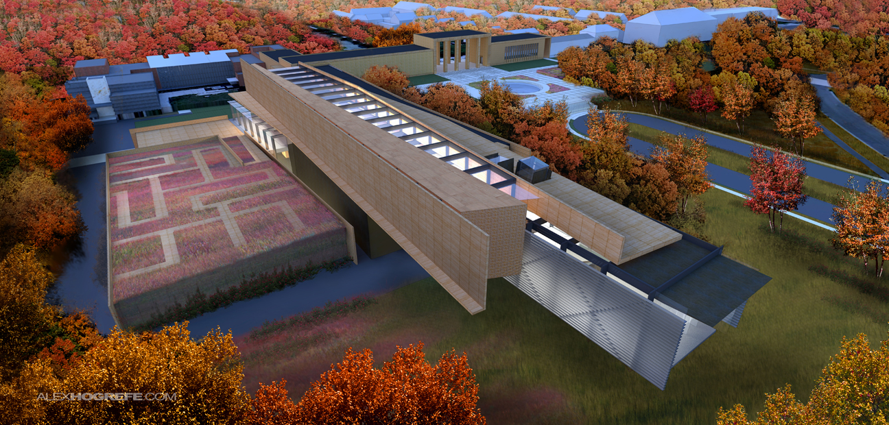
3. GROUND COVER: It is surprisingly difficult to find grass images at this angle. I tried to bleed as much color into the grass as I could because I was going for warm tones and didn’t want to see too much green. I created a video tutorial a while ago showing the steps I use to add grass seen HERE.
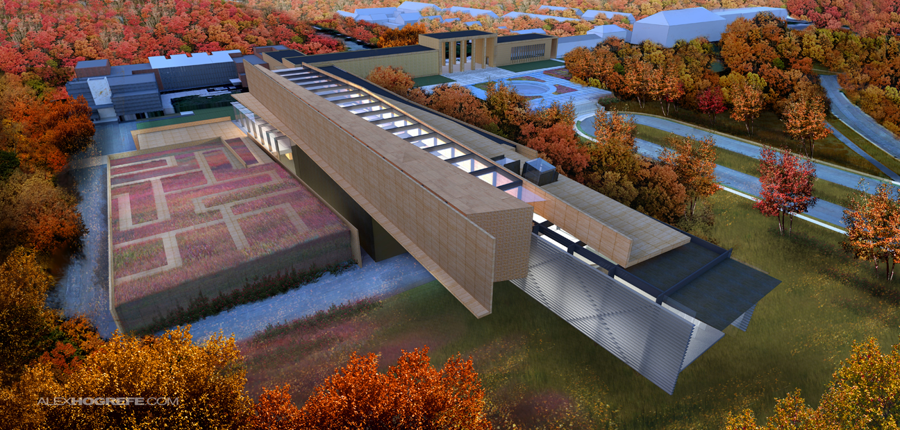
4. ROAD TEXTURE: The only surface I haven’t touched yet was the road. It’s one of those subtle moves that you don’t think will make a big difference. However, I have realized over the years that these are the details that bump illustrations to the next level. So spend an extra ten minutes and add a quick overlay onto the surface. I also added a few leaves on the ground to get that autumn feel.
5. BUILDING LIGHT AND SHADOW: With much of the landscape in, the buildings needed to be punched up. I adjusted the levels and used the burn tool to give more contrast to the architecture. I also increased the intensity of the interior lights. This process is similar to one I used in THIS POST.
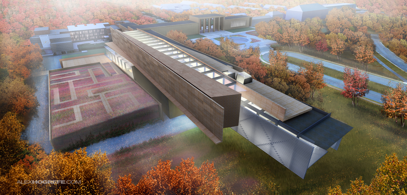
6. DEPTH VIA FOG: Now come the big moves. Fog seems to be the most under utilized adjustment in arch illustrations. I even use it in interior illustrations. In this case, I really wanted to play up the depth between the background and foreground trees. It’s a 30 second process but completely changes the mood of the scene. I give a more detailed description of adding in fog in THIS POST.
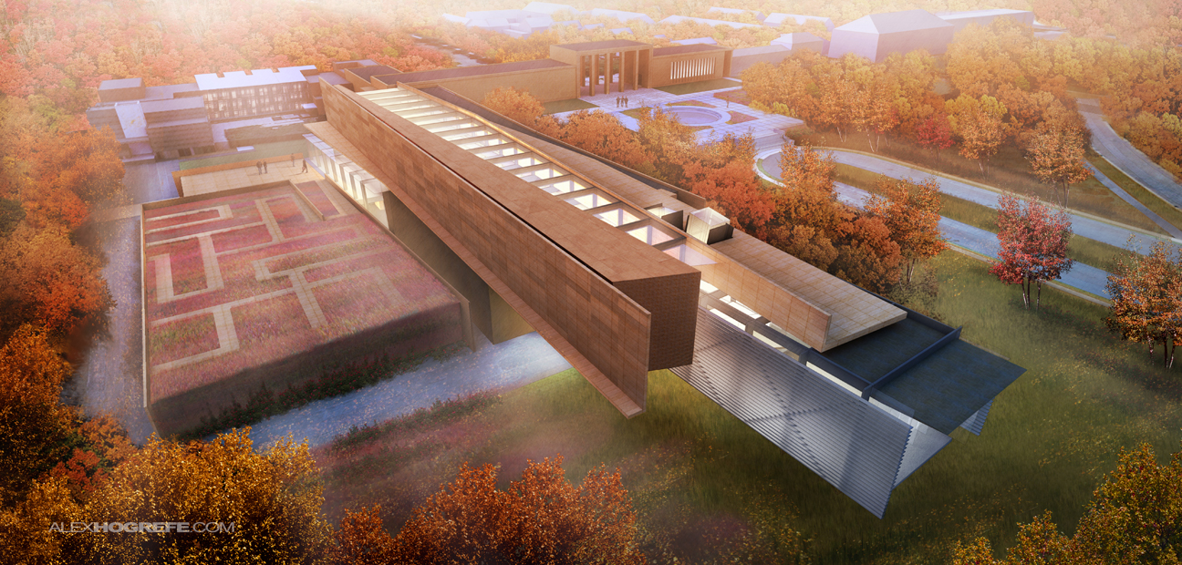
7. COLOR OVERLAY: While the fog is dramatic, it is also washing out the image. To fix this and bring all of the colors of the image into a similar range, I applied a color overlay. Since this is an autumn rendering, I went with bold reds and oranges. A tutorial on color overlays can be found HERE.
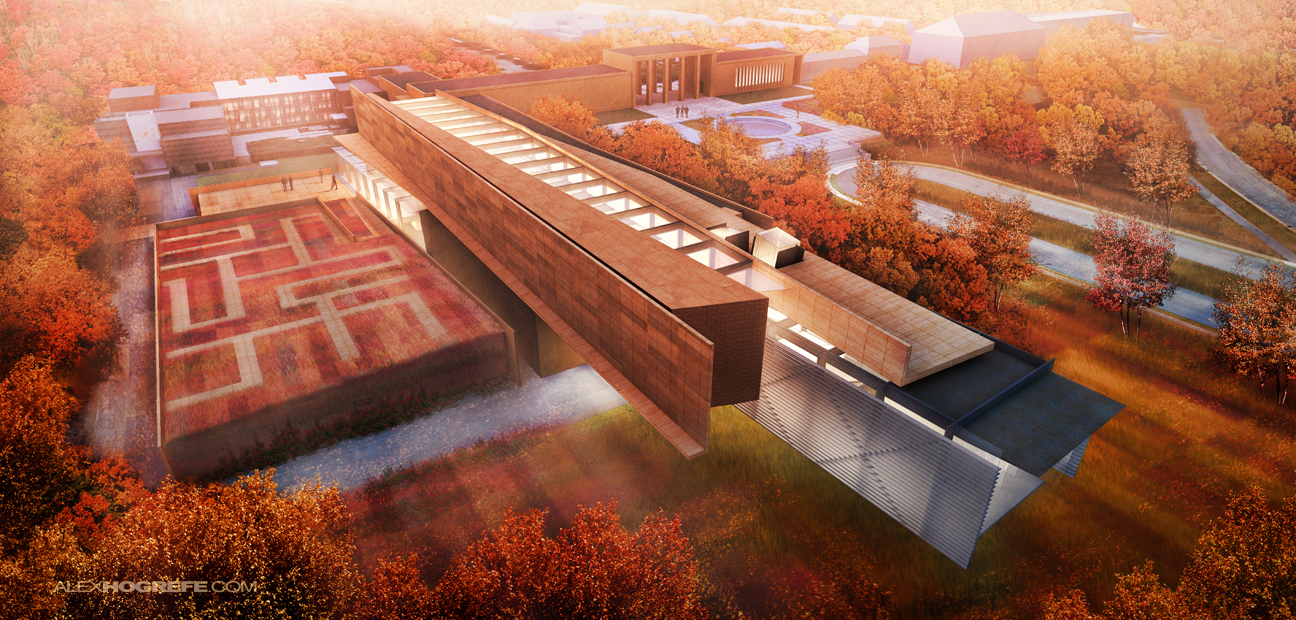
8. MORE LANDSCAPE COLOR DIVERSITY: The grass was looking a little too even in tone and I wanted to take on more complexity and color. I took the same grid texture that I have been using in the other illustrations for this project, adjusted the perspective to match the illustration, and overlayed it on top of the grass. I then applied a slight guassian blur which gave me the look I was going for.
9. DETAIL AND COLOR ADJUSTMENT: I tend to favor images with higher contrast and color saturation, so I jumped into the Photoshop plugin TOPAZ LAB ADJUST to increase the detail of the image and tweak the colors. I also duplicated the image and set the layer blend mode to “Overlay” for a little bit more contrast as shown in THIS TUTORIAL.
The Final Illustration




Looks awesome as always helping us a lot! I know it's your passion and wouldn't want to bother but would be possible to see how your portfolio looks like? Or how do you deliver it because for some of us which just ended school would be nice to see a good way of presenting it… Or what are your recommendations for this?
as always, thank you very much for sharing your techniques.
But a detail escapes me: could you be more precise about the road texture? You painted it or what?
Thanks in advance
amaizing workk az usual , i cant thank u enough sir , @Miguel Ambriz heres Mr.hogrefe's ISSUU account
you can check both his portfolio's there , i am there everyday so x) ,, http://issuu.com/hogrefal
Hi Alex,
Thanks heaps for all of your tutorials….
I have noticed in this image like many others of yours, once you applied the colour overlay in step 7, the whole look of the image became much more textural and it almost looks more like a hand render with a fine texture diagonal to the page like someone coloured it in.
I really like this effect as it does take it back into that more 'realistic' (not in a photo-realism way) architectural render- the old-fashioned images that left more to the viewers imagination.
Would you mind letting me in on how that was created please?
Cheers, really appreciate it.
Dion
very inspirfull as always!thank you alex
Awesome as always. Thanks for your tutorials Alex.
It's more useful than ever cuz I'm working on a site design program which requires a bird view. This tutorial's just in time for me, really appreciated.
Hi Alex,
That's a great image just like all of them!
On thing I pick up on in all your images is the realism of forests / vegetation. I have to create an aerial image for school of a large site plan that is essentially a forest. Would you recommend simply using any generic aerial view from google of a forest and photoshoping it in? Also, similar to how you blend several types of grasses together, is blending different forest images something that can even be done? You seemed to have done it on this image, but I'm not sure how that process works – it's a looong jump from the three images of trees to the completed forest you created!
Thanks a ton Alex, keep posting your work!
@Armondo,
Its a little more difficult to blend the forest images together than with grass. The trees have more definition and can't simply be "cloned" or else you will start to see either a lot of repetition or the texture of the trees will start to get diluted. Its hard to explain in few words so I will have to see if I can put a tutorial together.
great art !!! im just a noob drafter
the first question
what software do you use?? , its the same technique like in Martha Calderon's portofolio ??( see http://www.artchitect.com
and how we can make realistic ground texture in sketchup
Thanks for answer
THANKs a lot for yor sharing, Alex!! its very helpfull. Thanks. God bless))
very awesome , really its supper great work alex but i wish if there was a video
Great work! I love it!