by Alex Hogrefe | Jun 22, 2014 | Fundamentals |
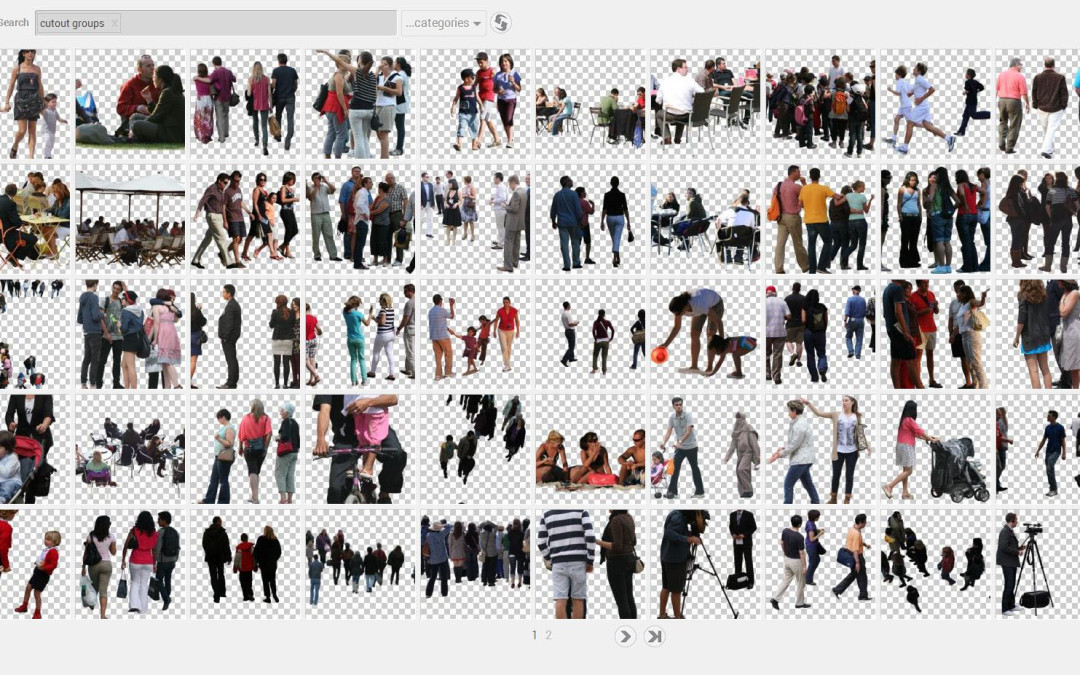
Architecture visualization can consume a lot of resources and time if you’re not careful. With the tediousness of Photoshop and renderings calculating through the night, spending more that 20 minutes searching Google images for a specific texture or image...

by Alex Hogrefe | Jun 8, 2014 | Portfolio Vol. 4, Project 01 Long Wharf, Uncategorized |
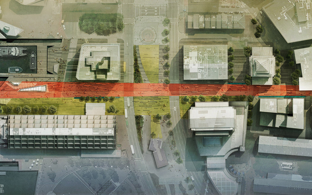
In the previous wharf post, I discussed black and white texture studies that focused on pattern and ground plane elements throughout the wharf. The above image builds off of those studies introducing color and material. Site plans are...

by Alex Hogrefe | May 18, 2014 | Uncategorized |
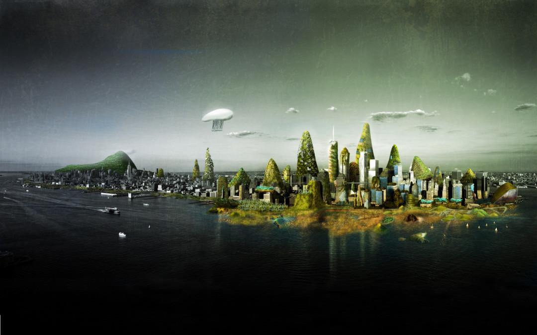
It was a little over a year ago that I started a visitor gallery tumblr page in an attempt to generate a another place on the internet for architecture visualization inspiration. It has been exciting to see so many unique styles and methods submitted week after...

by Alex Hogrefe | May 4, 2014 | Portfolio Vol. 4, Project 01 Long Wharf, Uncategorized |
The last few posts have been focused on diagramming the existing conditions of the site. In this latest post, I have shifted to studies for the new design. The overall concept and form of the Sketchup model is established, but now I am interested in exploring...

by Alex Hogrefe | Apr 14, 2014 | Over Time, Portfolio Vol. 4, Project 01 Long Wharf |
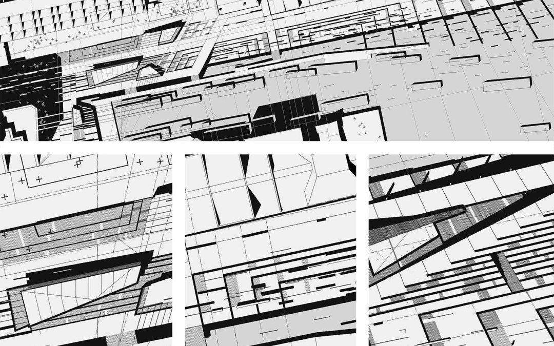
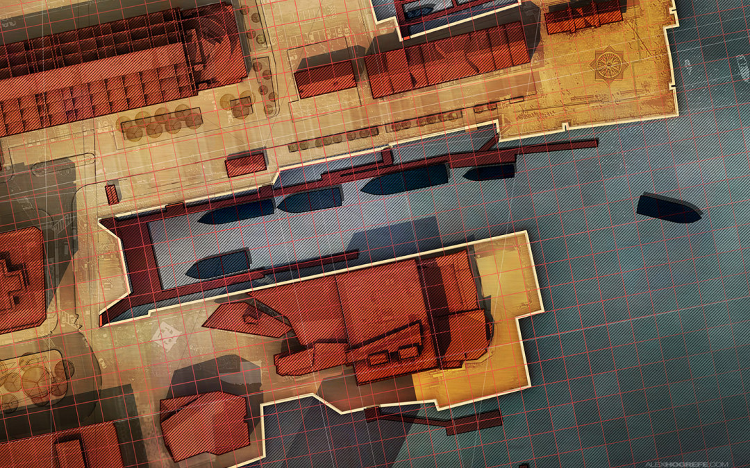
This post is also a follow up from many emails asking me to explain the diagonal line hatching used the site analysis diagrams. There are two methods in Photoshop that I know of that can create the diagonal line hatch seen in the image above. Both options use a...
