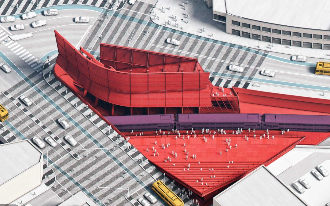
I started off this image as a much more simplified version with very little texture and detail. Originally, it was going to be used for diagrammatic purposes with some text overlays. However, over time, it evolved into an image with more detail and texture, partly because of the ground plane design. Porter Square currently has a striped concrete pattern designed by artist Toshihiro Katayama (seen in the top left area of the final illustration). I experimented with bringing a similar stripe texture down and around the station as well as on the streets themselves visualizing connecting the the different shopping areas and public transit.
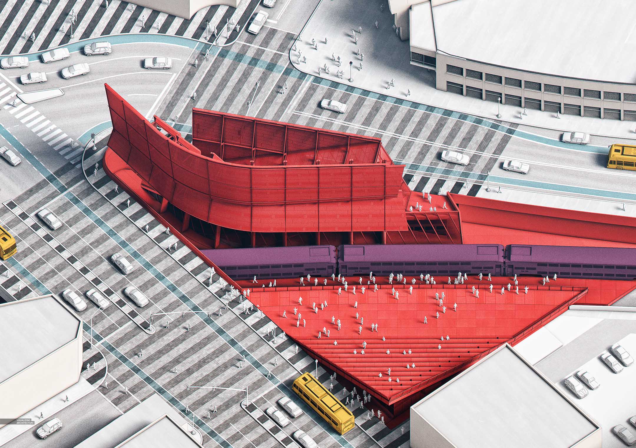
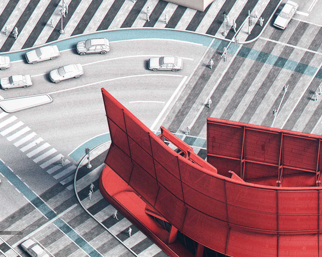
For an image like this, most of my time went into prepping the 3D model. I downloaded a bunch of low poly cars and people and copied them all over the site. I also made sure to add in all of the street infrastructure such as street poles and traffic lights. Once I had the 3D model in a good place, I moved into Photoshop where I added the color, texture, and street markings. What I like about an image like this is that it reads well from both a distance and up close partly because it is still diagrammatic in nature while also containing lots of details. I can see this image being presented as a full image in a portfolio with additional zoomed in shots on corresponding pages allowing for detailed explanations of the different areas.
1. Base Images
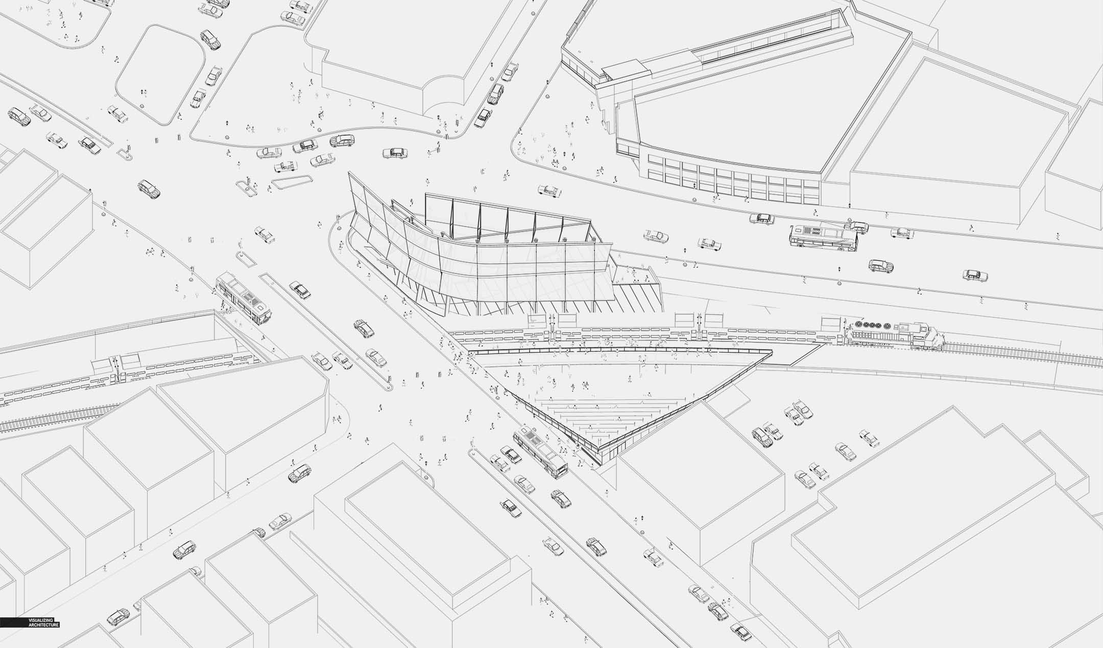
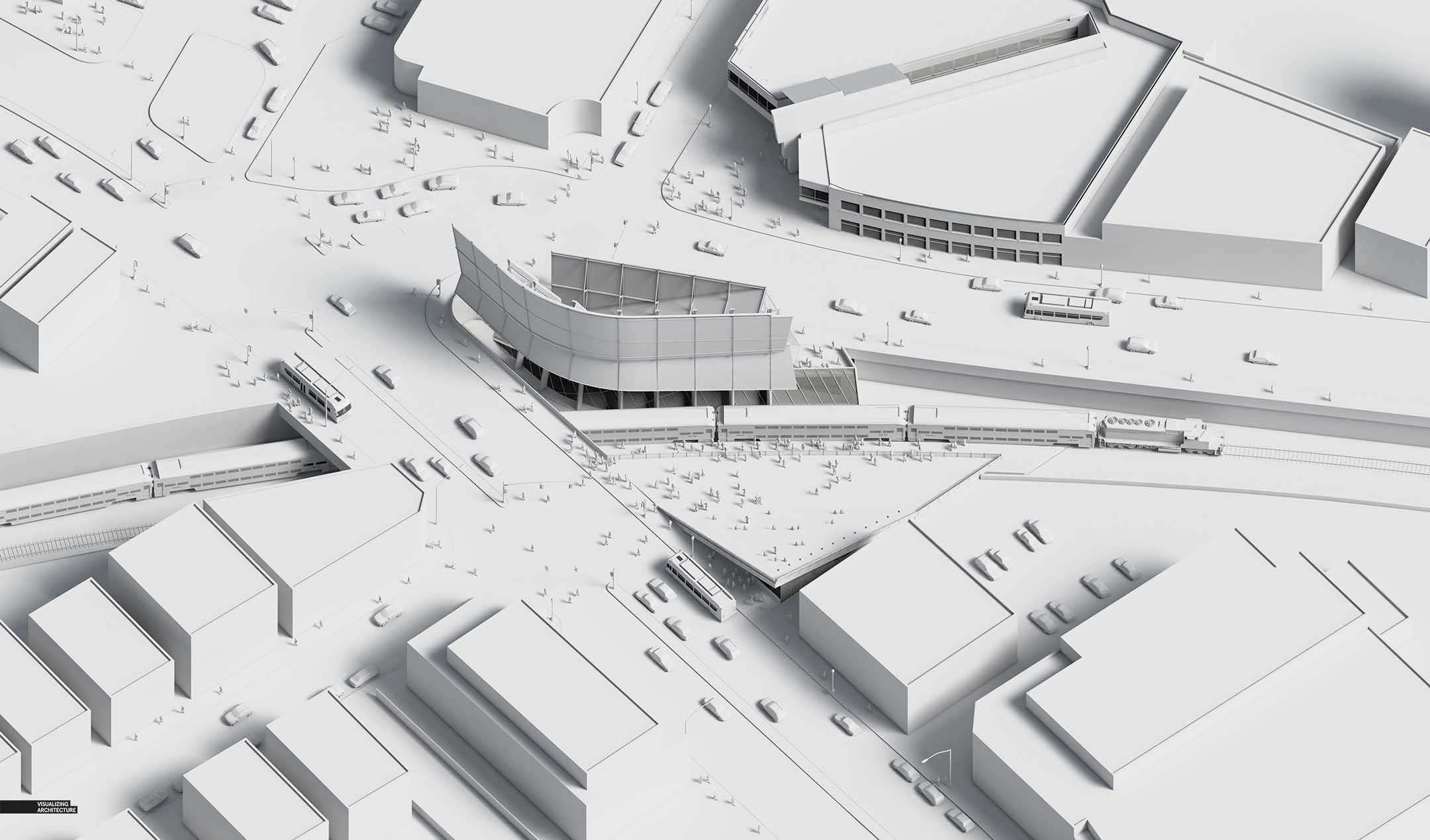
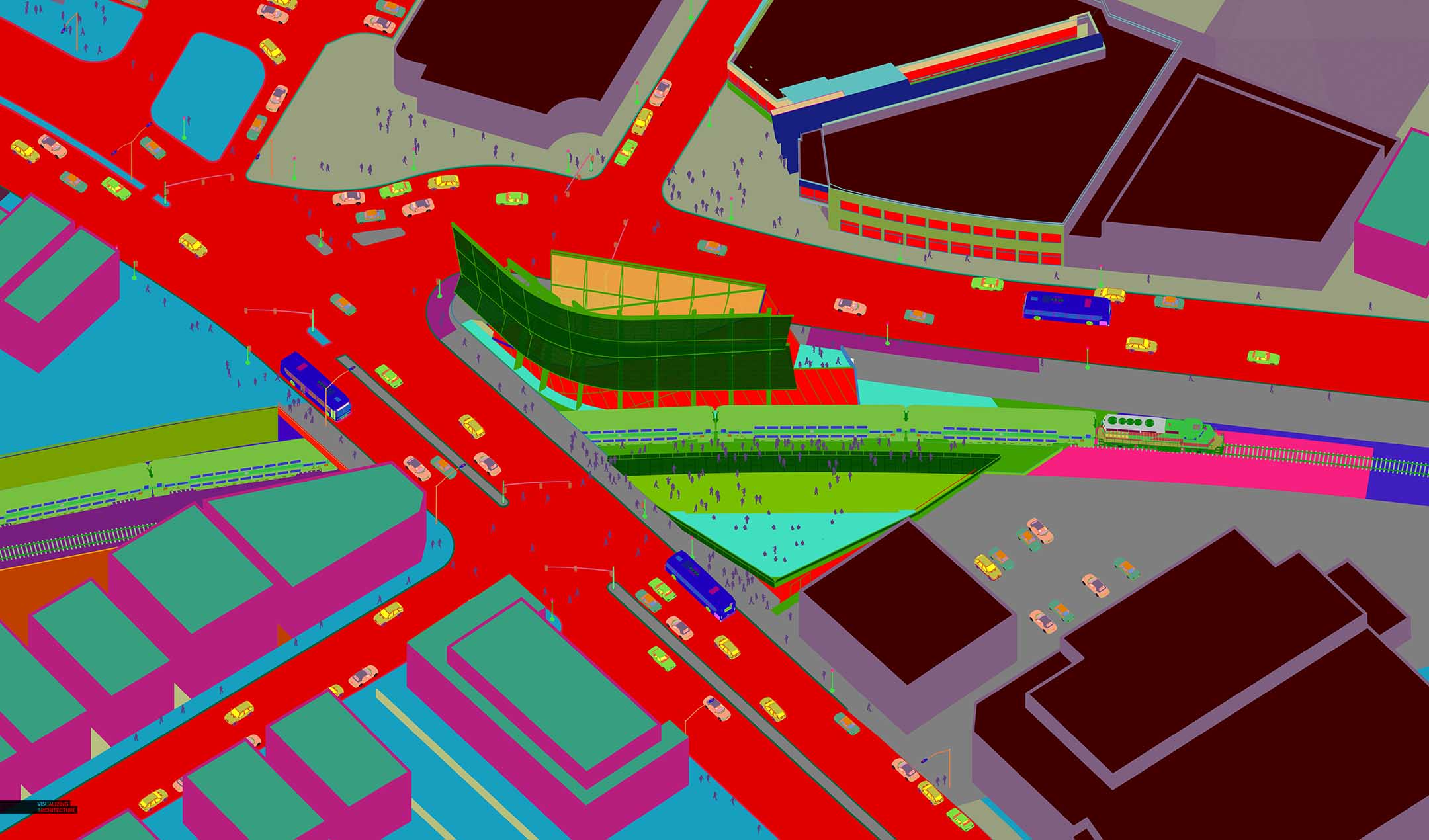
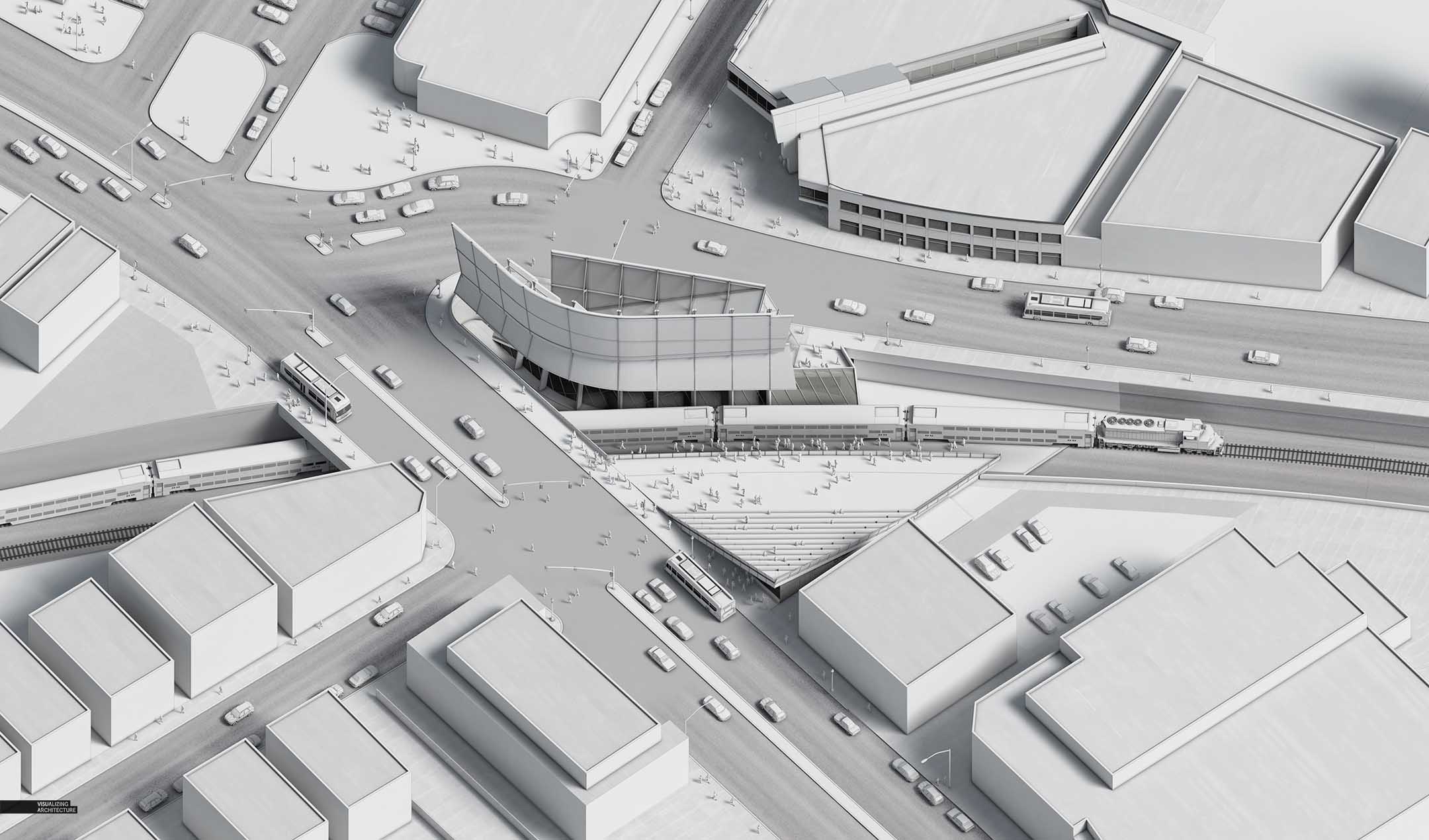
Above are some of the base images rendered in V-Ray and exported from SketchUp. You can see in the model that a lot was done in 3D including the people and cars. As I mentioned above, these were really low poly models because I wanted to keep things diagrammatic and not draw too much attention. I am also showing the Material ID pass from V-Ray as this was really important to setting up this image. The Material ID allowed me to quickly and accurately make selections of different parts of the image in Photoshop to add color and texture.
2. Texture
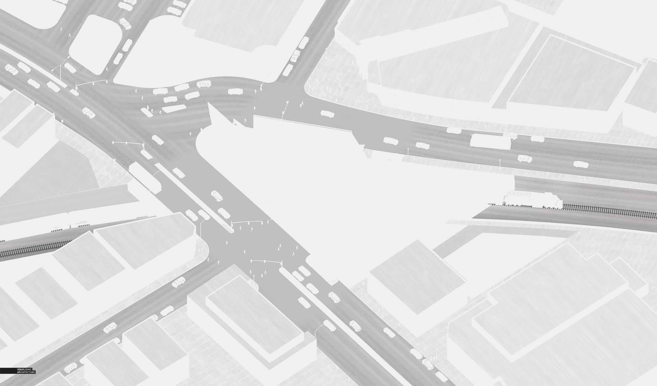
Lots of textures were added in Photoshop such as street, sidewalk, and roof grain. This texture also started to setup some hierarchy in the image with the streets being the strongest element.
3. Ground Plane Detail
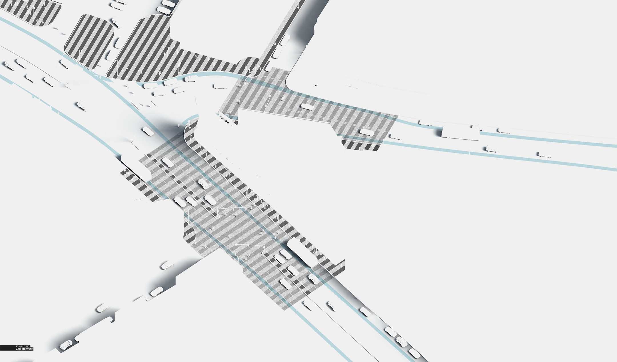
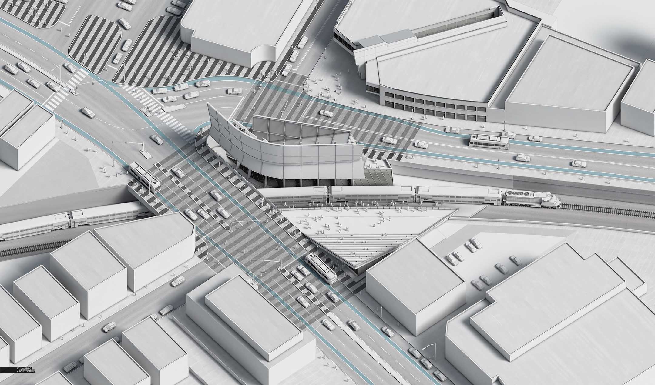
All of the striping and street markings were also added in Photoshop. There was a lot of experimenting with how I wanted this to look which is why so much of it happened in Photoshop vs texturing in 3D. However, because everything was organized carefully using groups and masks, the striping and road markings are all still very editable in the off chance that I want to explore other ideas down the road.
4. Color
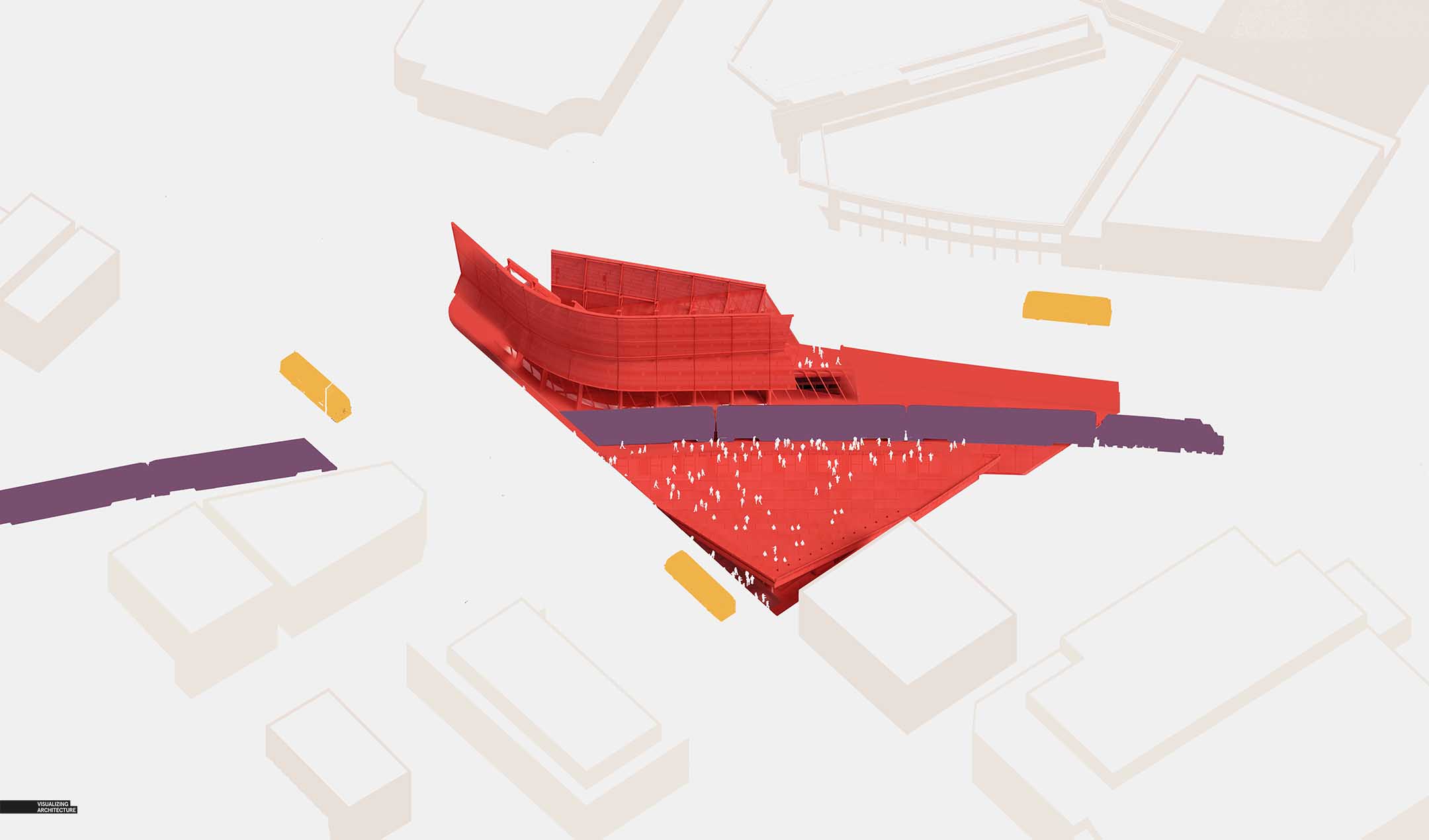
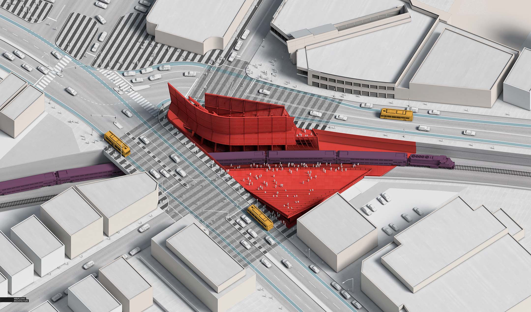
As much as I love black and white images, I knew I needed to add color to define the project and better setup the reading of the axon. With that said, I kept color to a minimum and focused primarily around the site and not so much on the context.
5. Final
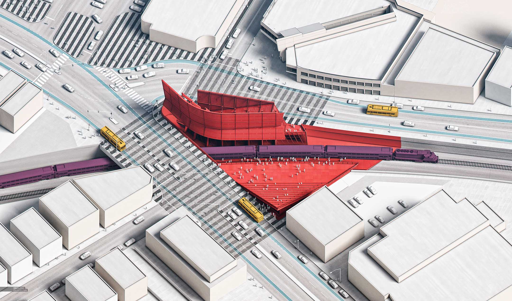
Finally, I used the Photoshop plugin “Topaz” to help punch up the textures and warm the image just a bit.


Amazing as always! Thanks for sharing!
Beautiful illustration, Alex!
I am having trouble finding the right display/laptop for accurate colorwork. Because every single thing is about the graphics and the right color. What do you use?
@Maira, I use Dell Ultrasharps both at home and at the office. I really love these monitors.
Beautiful illustration! I’ve always loved the texture and stylizing of your renderings. Is this truly an axonometric though? Or is it an isometric drawing because the angles of the plan are not 90 degrees?
@Jake, I think your right. I should be more careful with my terminology haha.
These designs are just awesome. Your information is deep and accurate.
Very Nice blog post, thanks for sharing
Thanks for sharing such a informative and valuable blog post.
Thank you very much for sharing this informative blog with us, it was really amazing and I’m really grateful to you.
I am really enjoying reading your well written articles. I think you spend numerous effort and time updating your blog.
I am really enjoying reading your well written articles. I think you spend numerous effort and time updating your blog.
Amazing render. It’s simple and effective.
I was wondering where you get your 3D entourage models from?
@Kevin, I literally just downloaded a bunch of low-poly models from sketchup warehouse and removed all of the textures. Super easy
Hello Alex
Great post as always. I have been following your blog for years. Is there a way you can share your textures, especially the ones you use for the sketchy and shading lines in your B&W renders. I never seem to find the right ones.
Cheers
Wow, Such a nice post. I really enjoyed this article. Thanks for sharing.
Could you share the VRAY settings you used to render the clay based model?
Also, if i do not have topaz, do you have other alternatives?