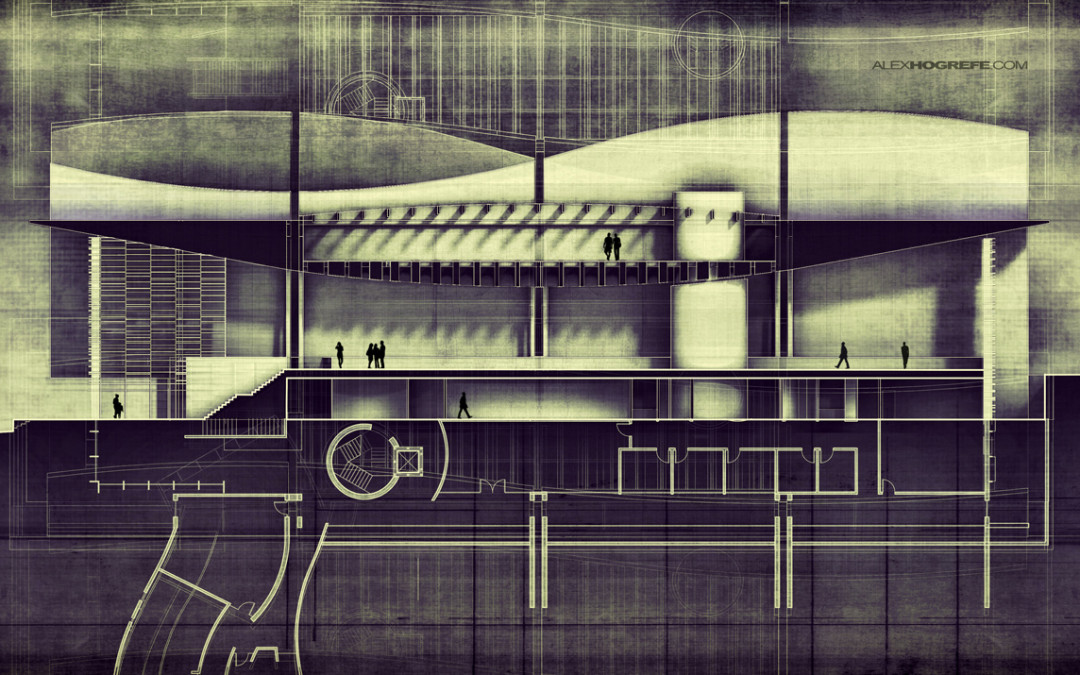
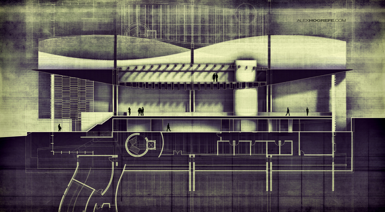
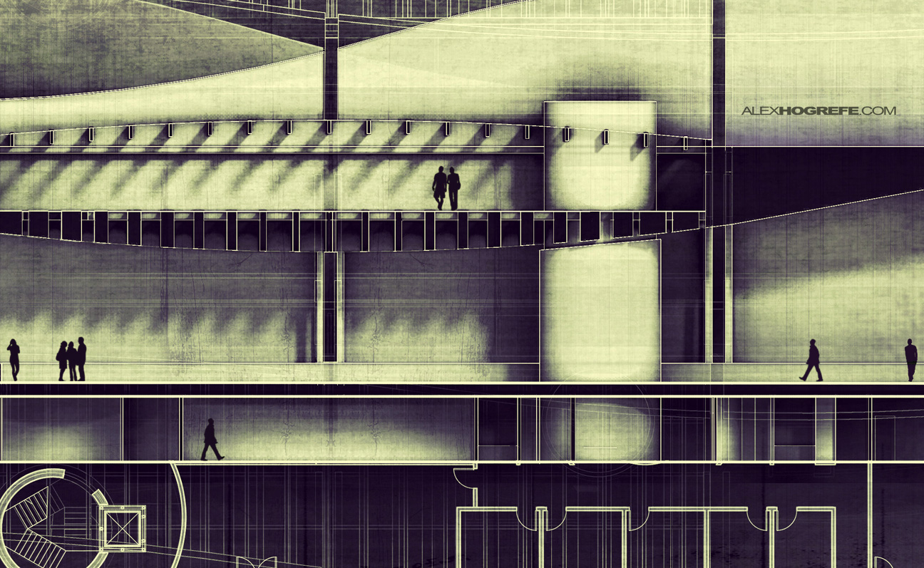
I randomly decided this weekend that I wanted to go all out on a building section. I have been spending a little of my free time detailing an old studio project just to have some new geometry to illustrate and present on the site. I really liked some of the interior spaces and thought it would make for an interesting building section illustration. I was also debating whether or not to keep the illustration abstract or to keep things clean and legible. In the end, I took the legible route but threw in some twists. I also applied some HDR effects to bump up the drama of the image. One thing I want to emphasize is that there wasn’t a clear linear path in terms of workflow. I went through many different iterations before I arrived to this final result.
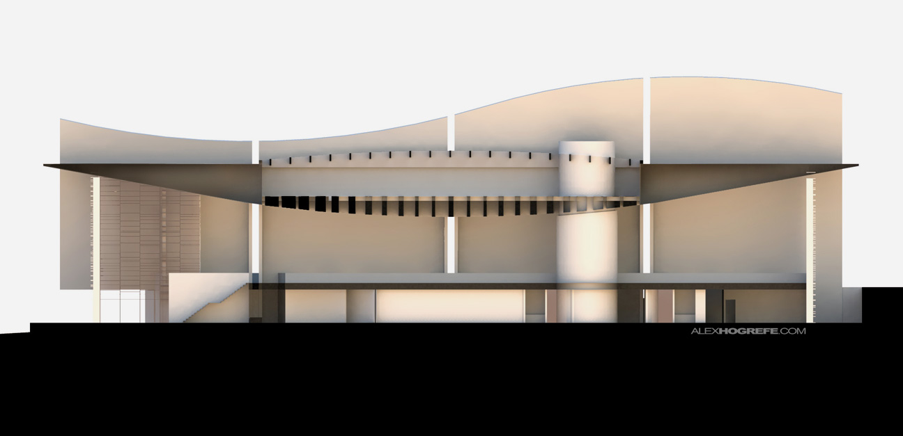
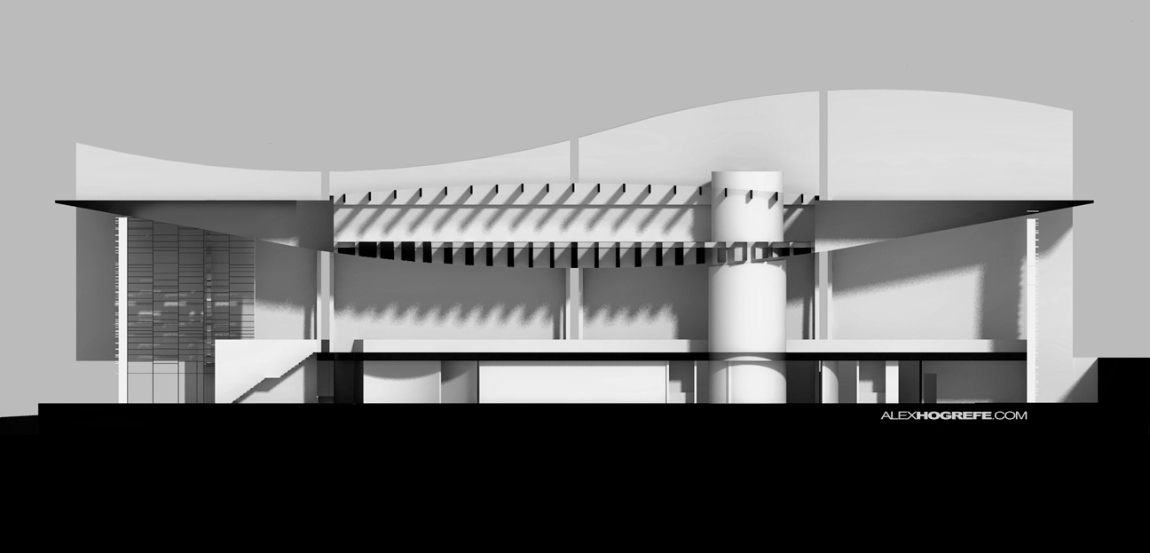
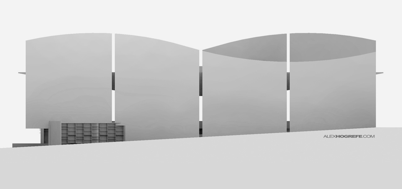
To generate the above illustrations, I rendered multiple views in Kerkythea using different shadow settings and section cuts (each took about 10 minutes to render). I did this partly because I wasn’t sure what the final look would be but also so that I would have multiple styles at my disposal to test different ideas. I ultimately used all of them layering them together which added depth to the image while still maintaining clarity in the overall composition.
Above, Kerkythea rendering with soft shadows.
Above, Kerkythea rendering with strong shadows.
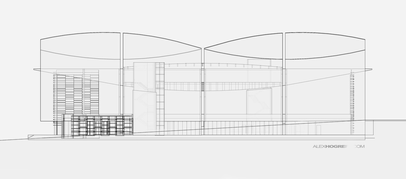
Above, Kerkythea rendering of the exterior elevation.
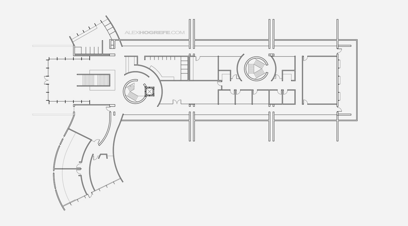
I exported a CAD floor plan and used it to inhabit the blank space below the building section. This is a technique we use a lot in the office because it not only adds interest below the ground plane but also explains where the section is cut and how it relates to the floor plan.
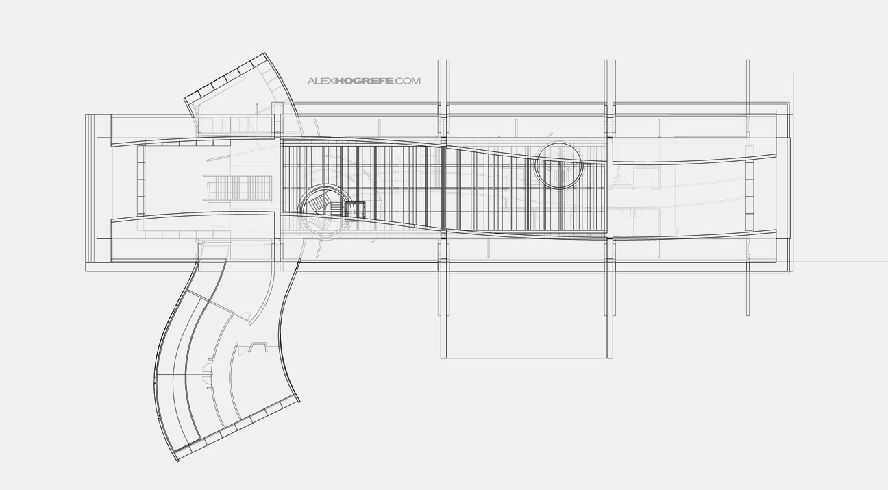
Above, Sketchup export of the roof plan in x-ray mode.
Above, Sketchup export again in x-ray mode. I like to use these types of abstract images subtly to give another layer of information and texture.
Final Illustrations


Hey Alex, we need a video about this!!! please!!! Hahaha, GREAT WORK MEN!!! THANKS FOR ALL.
Stunning
nice. like always
This is amazing! I would love a tutorial to get this 50's monster-movie look. The texture is unbelievable.
Great Job!!!! Thanks for sharing
simply amazing work as always man! keep up the great work!
thanks alex
spectacular technique and the result, serious power chevere
see everything in a step by step video tutorial
wow~ I don't know what to say~! It's just awesome~!!!
may I know how do you render the elevation in kerkythea?
because when i export the SU file to XML file with a parallel projection view, it can't see any thing in kerkythea….
thanks =D
Simply.. that's GREAT!! O_O
Amazing!!! Thanks Alex!!
@Kira,
When you bring a model into Kerkythea in Parallel projection, the model is zoomed in extremely close. If you you zoom out really far, the model will come back into view. Hope that helps.
amazing work man. i just wanted to know what programs do you use to create/ model your 3D buildings.
SIMPLE but GREAT!! Hope the more detailed tutorials! Thanks for your show!!!
it looks like a big weapon!! just kidding great job as always alex!
Amazing job. Simply amazing.
I would love to see a detail post between the X-ray export and the final illustrations so we can learn how to get that awesome texture. Could it be possible? (Maybe a youtube video, as you did before)
@Sakhi,
Everything for this model was built in Sketchup.
hey, ur work are amazing! Please do a tutorial video with this section. It's very useful.
hey alex! awesome work 🙂 if u have time, could u please do a tutorial on elevations? its seems like you've already covered many types of drawings, but not elevations. just a suggestion 🙂 cheers!
Alex,
Work is always great. Always referring to your blog for great production styles. If i may ask which rendering settings did you end up using to get the soft shadows & hard shadows. Thank you sir
@Jose,
Check out my Kerkythea tutorials. Both types of shadows are covered in those videos: http://www.alexhogrefe.com/kerkythea-tutorial-part-2/
All rave reviews and well deserved! And to that I add my own (rave review).
Beautiful work, but more appreciated is the desire to and skill at sharing with your peers.
As someone who teaches drawing (studio arts and design foundations), I would say that in your final rendering it would read better if you separated the floor plan from the section elevation just a bit (even many inches). This little crisp graphic standard would make the final touch. As is, it took me a minute to understand that you were showing a partial floor plan, and not some kind of strange foundation…
thanks for all of your great and generous work
Hey Alex,
Great job as usual, but this time i have a question: How do you get these flat section images from SU? Everytime i try to get a section its on a perspective and its never flat as i CAD drawing. Hope you can help me.
Cheers!
riesci a strabiliarmi ogni volta che guardo un tuo lavoro…eccezionale.
Hey Alex,
Awesome work. Great site. Just wondering about how you created the CAD floor plan in this tutorial? Did you export Sketchup to AutoCAD, and if so, I'm curious about your workflow.
Pete.
Hey Alex! Love your works, you're a hero to me. Could you make a detailed tutorial to apply this texture that successfully?
Thank you for everything!
Hi Alex, how do you export section in kerkythea?
thanks for all!!!
Hi Alex your work is absolutely amazing.
I tried exporting the sectional slice from sketchup in to Kerkythea but I cant stop Kerkythea from exporting the whole model no matter what I do !!
I would be grateful if you could let me know how to do it.
Thank you
Hi, how can i render section in kerkythea? cause skp never exports sections to kerky, just the scenes. is there any special command in kerkythea? thanks
I cannot render a section on kerkythea though :/