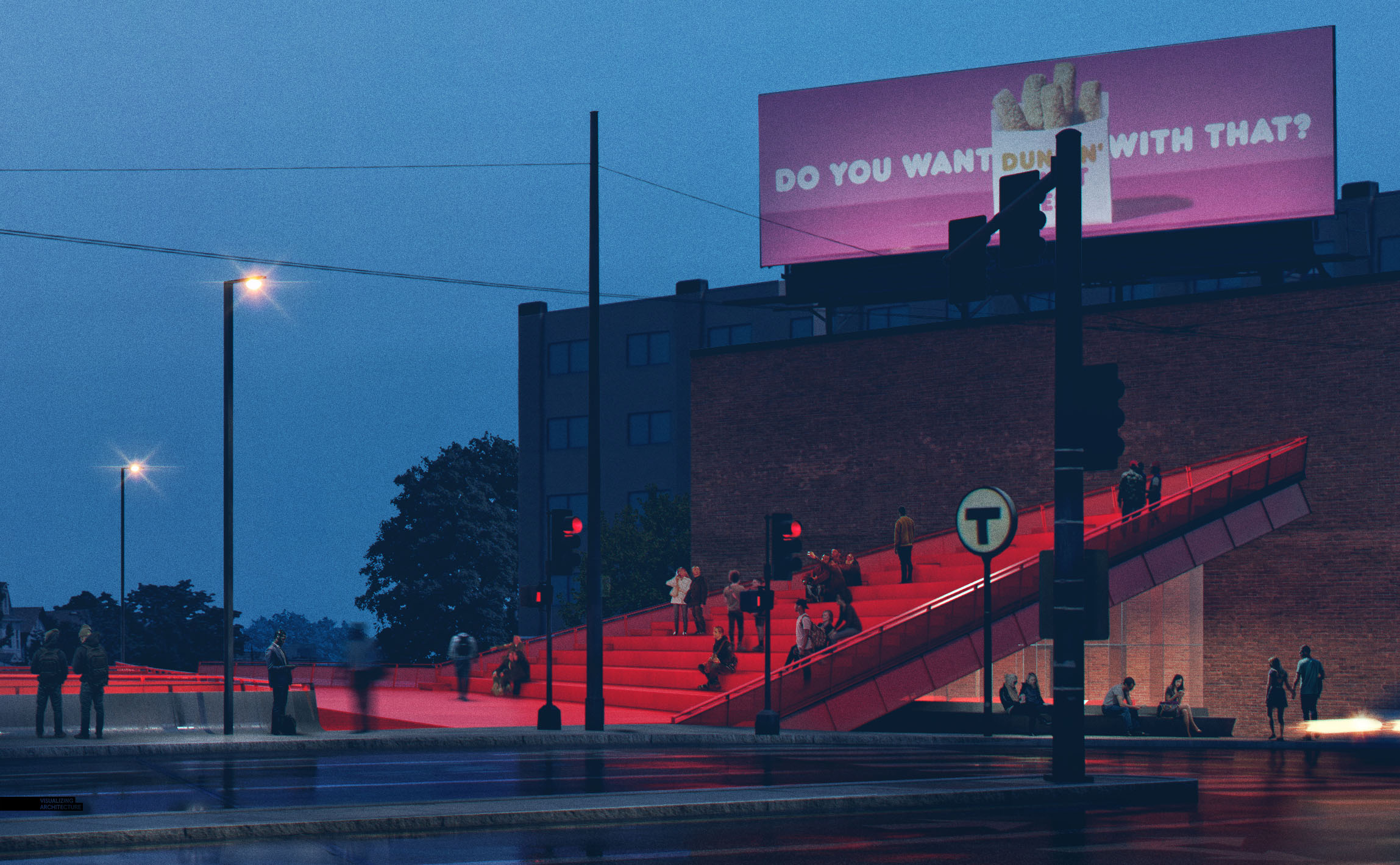
Alright, I finally was able to finish up my design of Porter Square Station and therefore create a rendering revealing the new design. I kept the same view angle as the “Under Construction” renderings to finish off the series. This also meant I was able to reuse a lot of the Photoshop textures saving me a bunch of time.
I used quite a few more V-Ray lights than I normally do because the complexity of the structure and metal mesh makes it very difficult to properly mask and add lights in Photoshop. Other than that, the image didn’t move too much in Photoshop in terms of color grading. Most of my time came from detailing people, context, car light streaks, and creating the LED looking text on the metal mesh. Once again, this will be a quick and simple breakdown. I hope to take a deeper dive into some of this stuff later on.
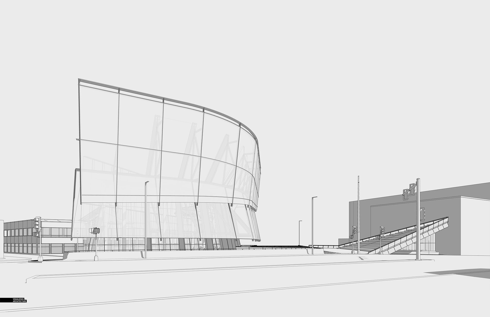
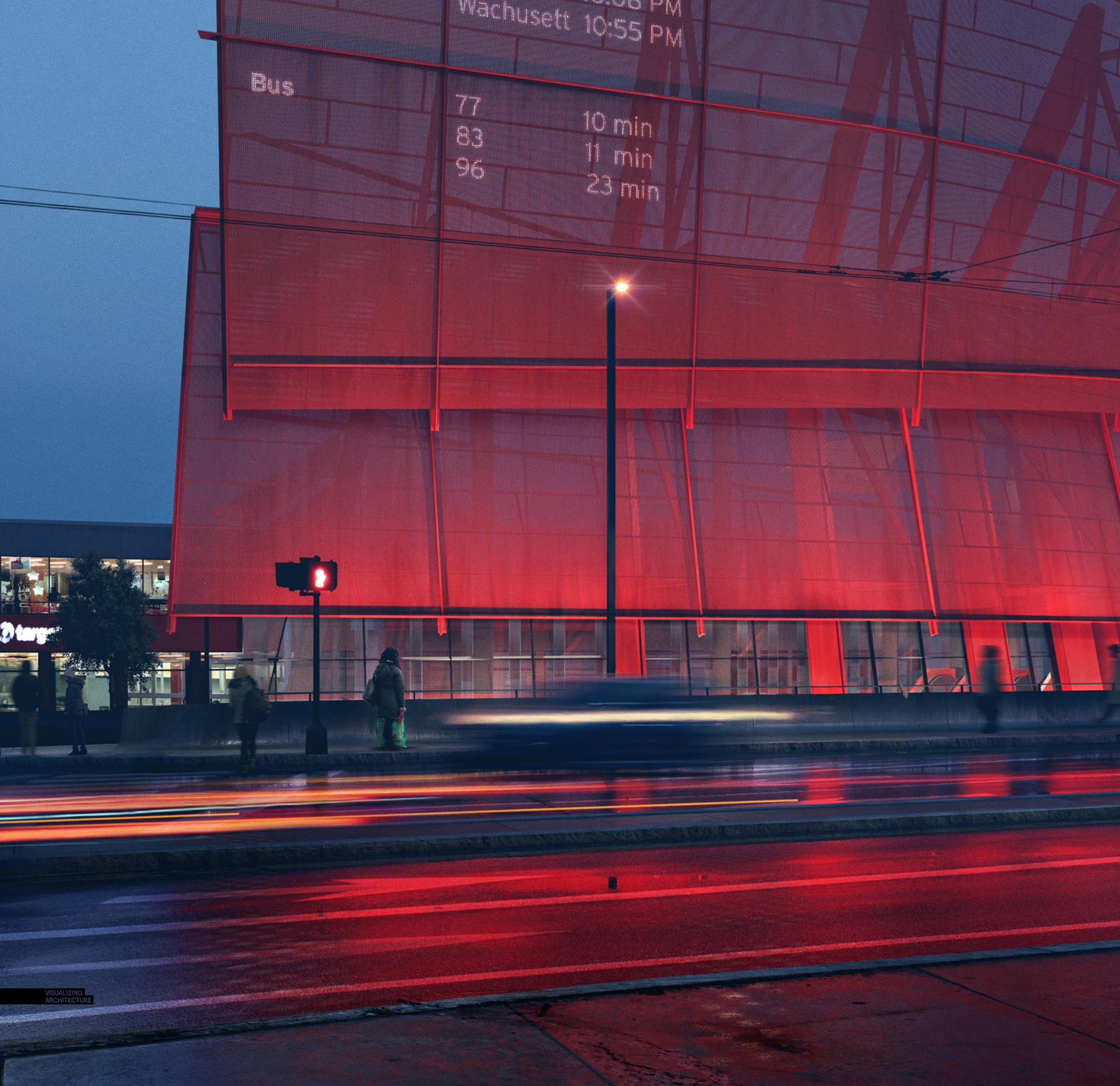
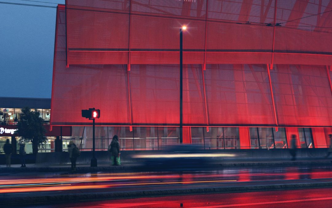
The final design consists of a large metal mesh screen acting as a digital billboard that will display data and other graphics. Getting this to read properly was my biggest concern because of its prominence in the design. I ended up building a mesh texture and tested out many levels of transparencies until it was dialed in just right.
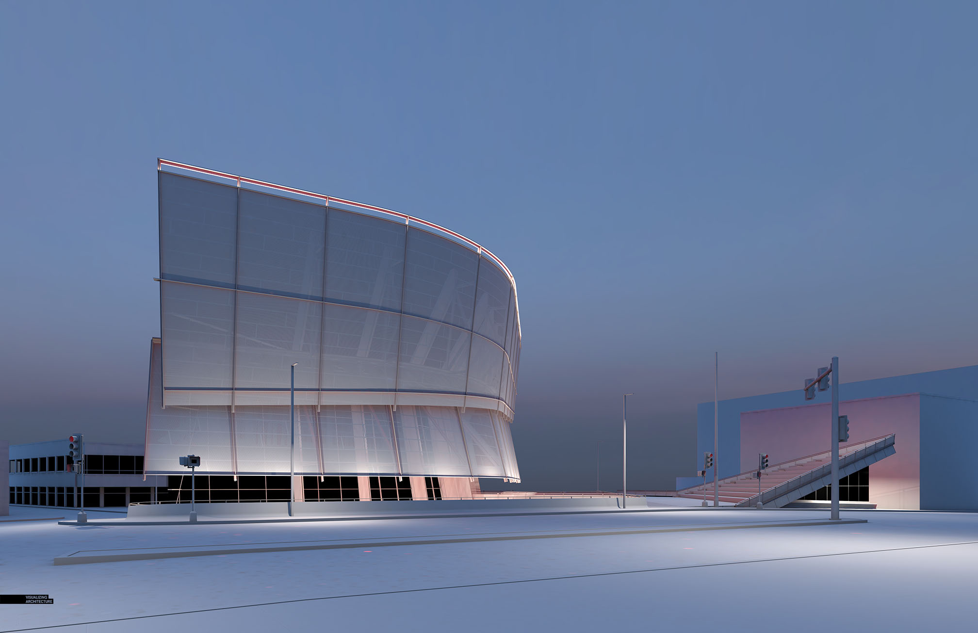
The clay rendering best shows how I lit the model. I tried out several lighting scenarios looking at back lighting the screen or lighting the screen from the top. However, lighting the screen from the bottom just seemed to feel the best so I went that route and flooded the bottom edge with lights.
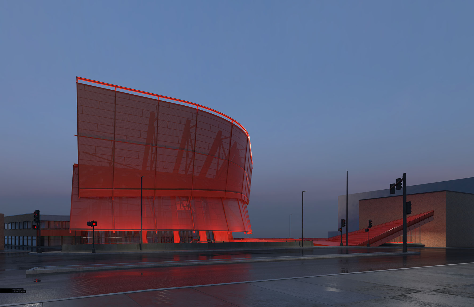
I carried over the wet street and sidewalk textures from the “under construction” post so that I could play up the red tones of the steel in the reflections and add quite a bit of drama to the image. The tones and environmental lighting ended up being close to what I was looking for, so I didn’t need to push the color too much in Photoshop.
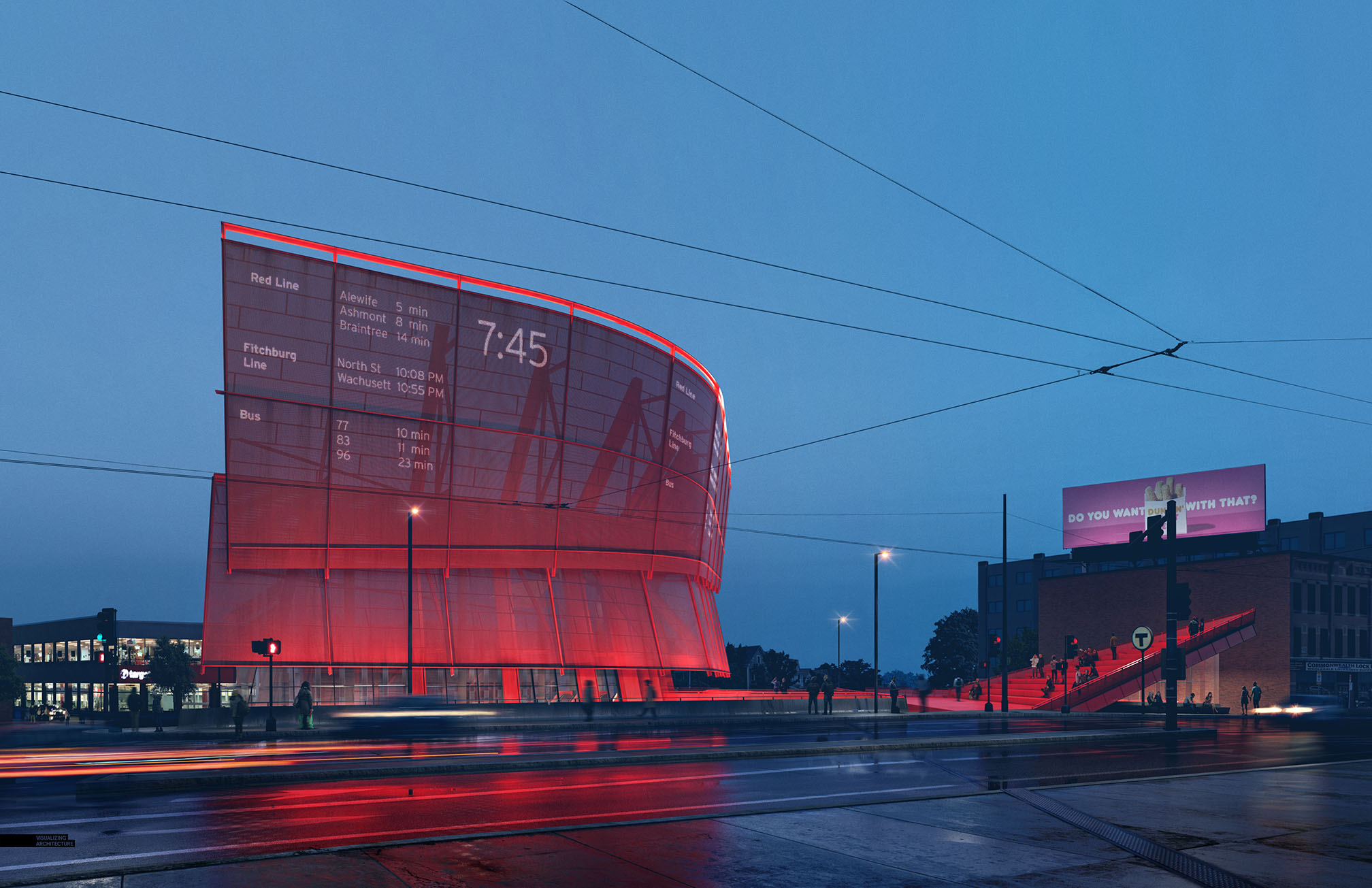
I am imagining that the metal mesh screen will be covered in LED’s giving the option to display colorful graphics across the entire surface. For this image, I kept it minimal with simple data describing the different transit routes. I will test out some different and more colorful graphics in upcoming posts. Stay tuned….


This looks fantastic! I wonder how do you get the base render has the “wet” feeling and water? I remember you had a wet street tutorial but that was through Photoshop.
Dear Alex Hoggrave
I like your tutorial, This station is also a project I’ve been looking forward to for a long time, but I’m in a little trouble now. Can you help me out? That’s the permutation mapping mode of the Vray renderer(3.6). Maybe I’m using 2014For3Dmax. Can you give me a detailed tutorial?
A fan from China
Which Topaz Labs Plugins are you using these days? Adjust? Sharpen?
Hi Alex, that’s an amazing final render. How did you get the red light on the screen and the metal mesh on V-Ray in the Base render? I see that the Clay model is already lit, so is the red the colour of the steel, or a different addition?
This is fantastic. I would actually enjoy taking the train more if a design like this were to be developed on site. A refreshing look at how to use wasted space at Porter.
Hello,
Getting excited about studying more. Wonderful blog. Truly eager to go through more. I cherished the post. Very much obliged. This really is one particular amazing blog site article. Seriously thank you
StudentBackr: The first crowdfunding platform just for students.