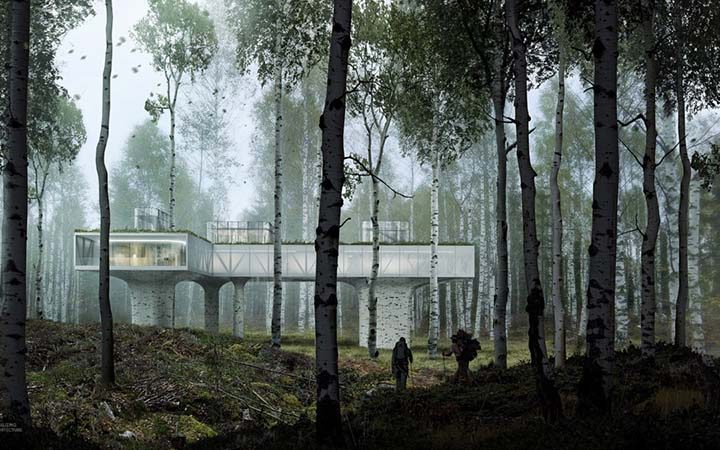
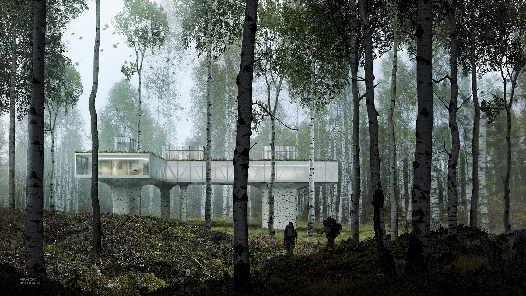
I had been going back and forth on building materials and realized that I needed to create an illustration that would allow me to visually compare options within the contextual setting. The form is more or less finalized, but I have had trouble envisioning exactly what the site looks like in my head. Therefore, this illustration is pulled out away from the architecture to capture more of the surrounding landscape and allow me to better study this relationship of architecture and landscape. I can then use this illustration as a reference as the design of the project progresses.
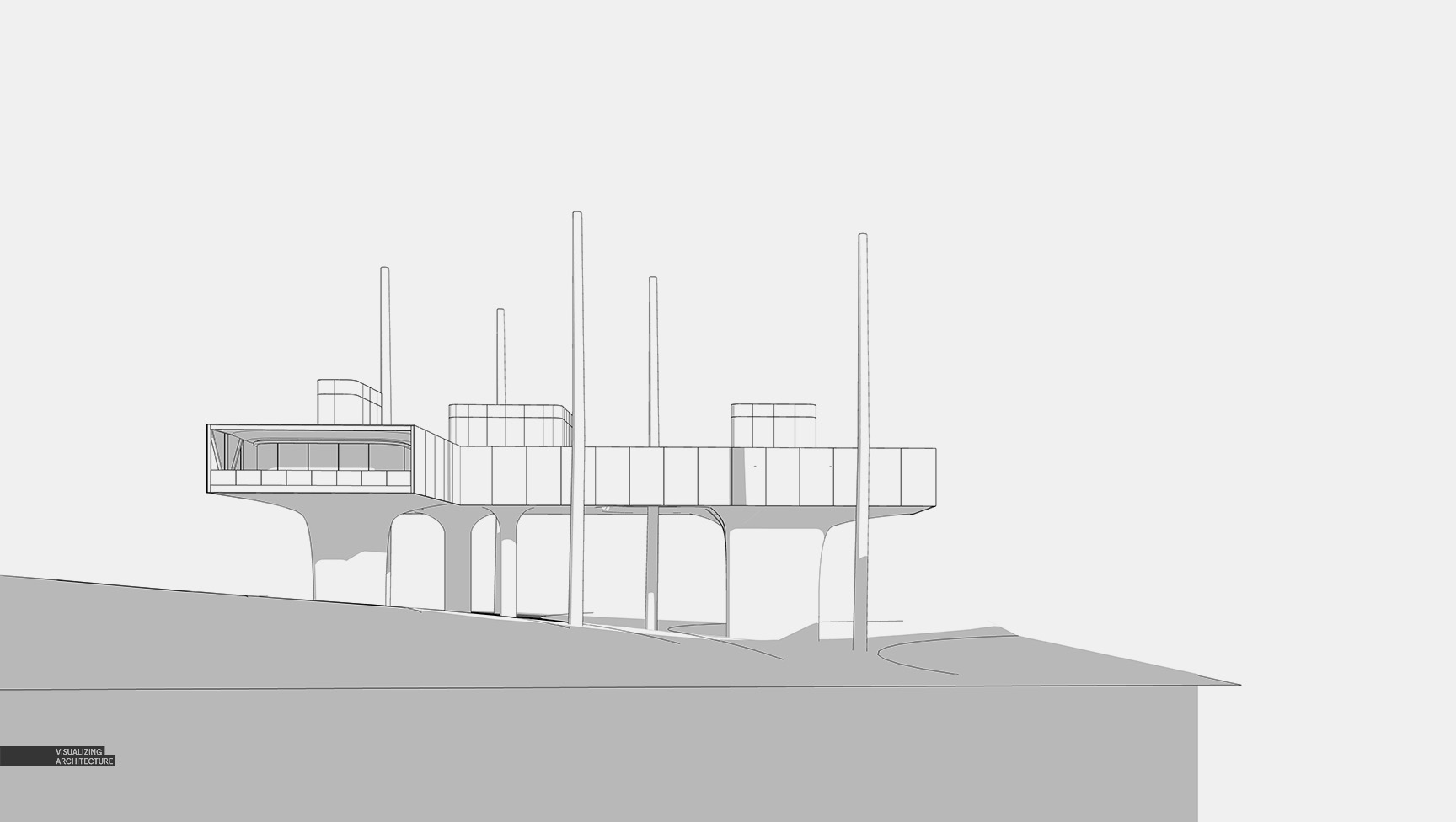
1. Sketchup Model
Above is the Sketchup at its current state. Like I said earlier, I still need to study material options but the form is more or less finalized. The model looks relatively simple from this far out but I have taken the time to model in better details which will be more visible in later illustrations.
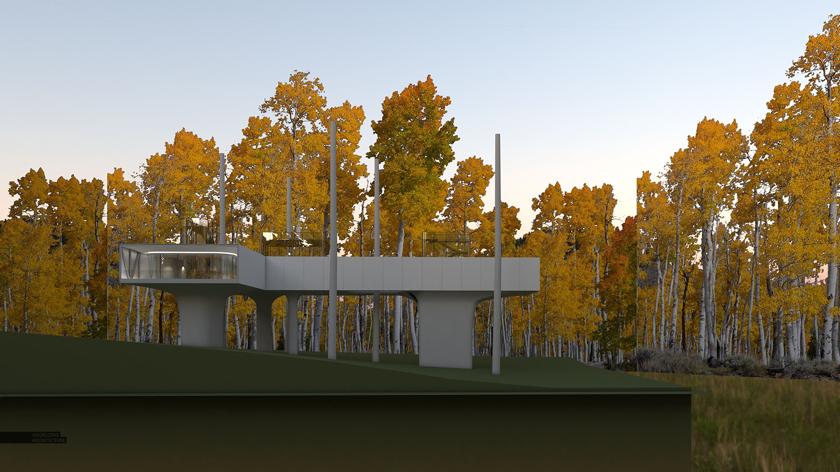
2. V-Ray Base Rendering
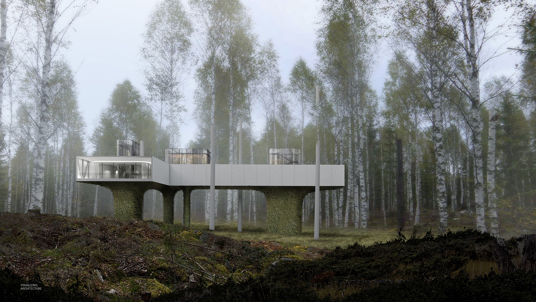
This image actually started off as a fall scene, hence the extremely yellow foliage. I ended up switching to a spring scene in Photoshop, but was able to still use the initial base renderings. I also ran a second rendering with the white side panels turned off so that I could play with the transparency of the side panels in Photoshop.
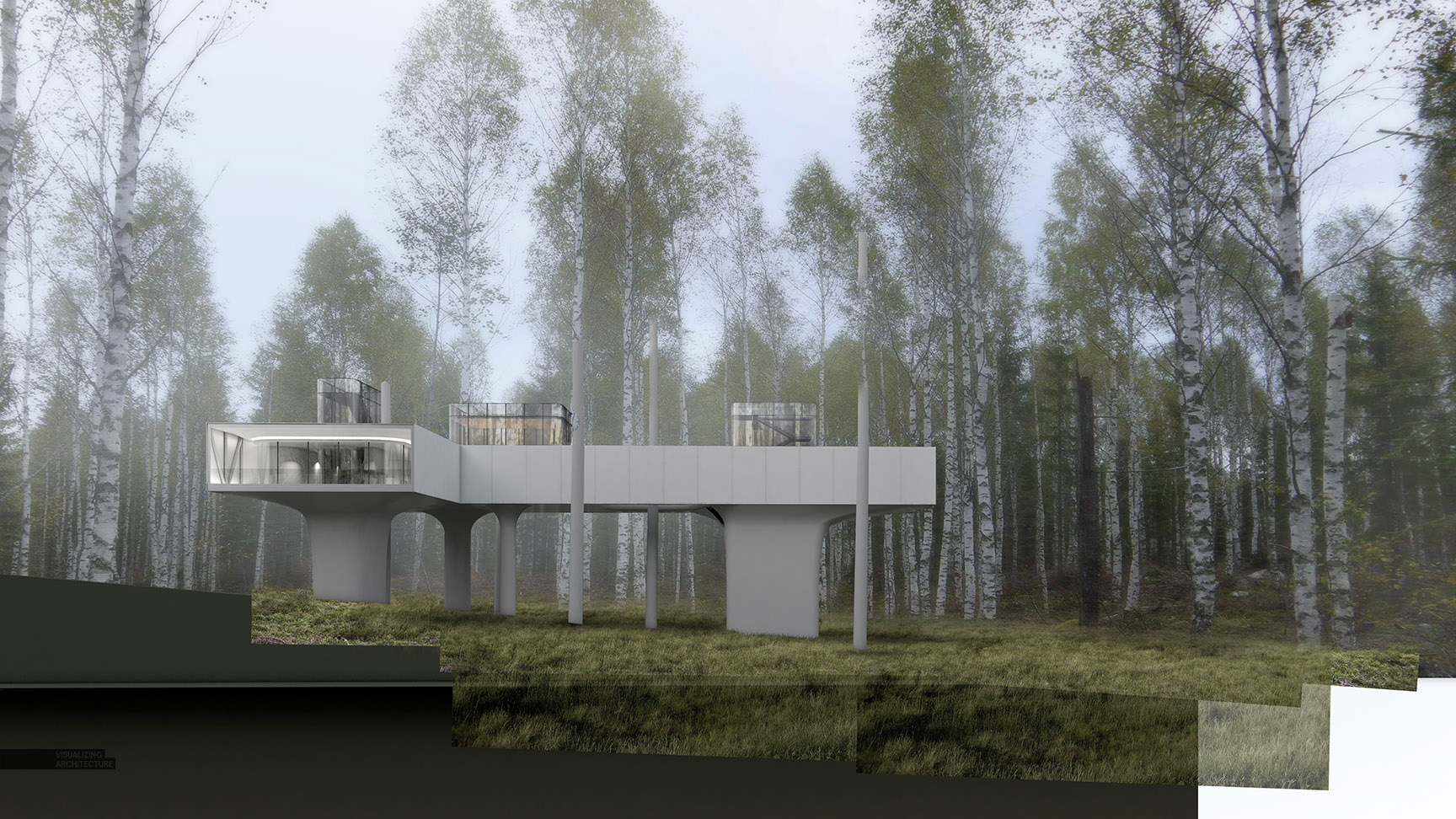
3. Background
Once I removed the baked-in yellow foliage and replaced it with spring colors, the mood of the image changed completely. I tweaked the colors and lighting of both the new spring background image and the rendered architecture so that both had a slightly cooler feel and meshed better together. I also added some grass at the base of the building and spent some time blending it into the background image.
4. Foreground Vegetation and Vertical Garden
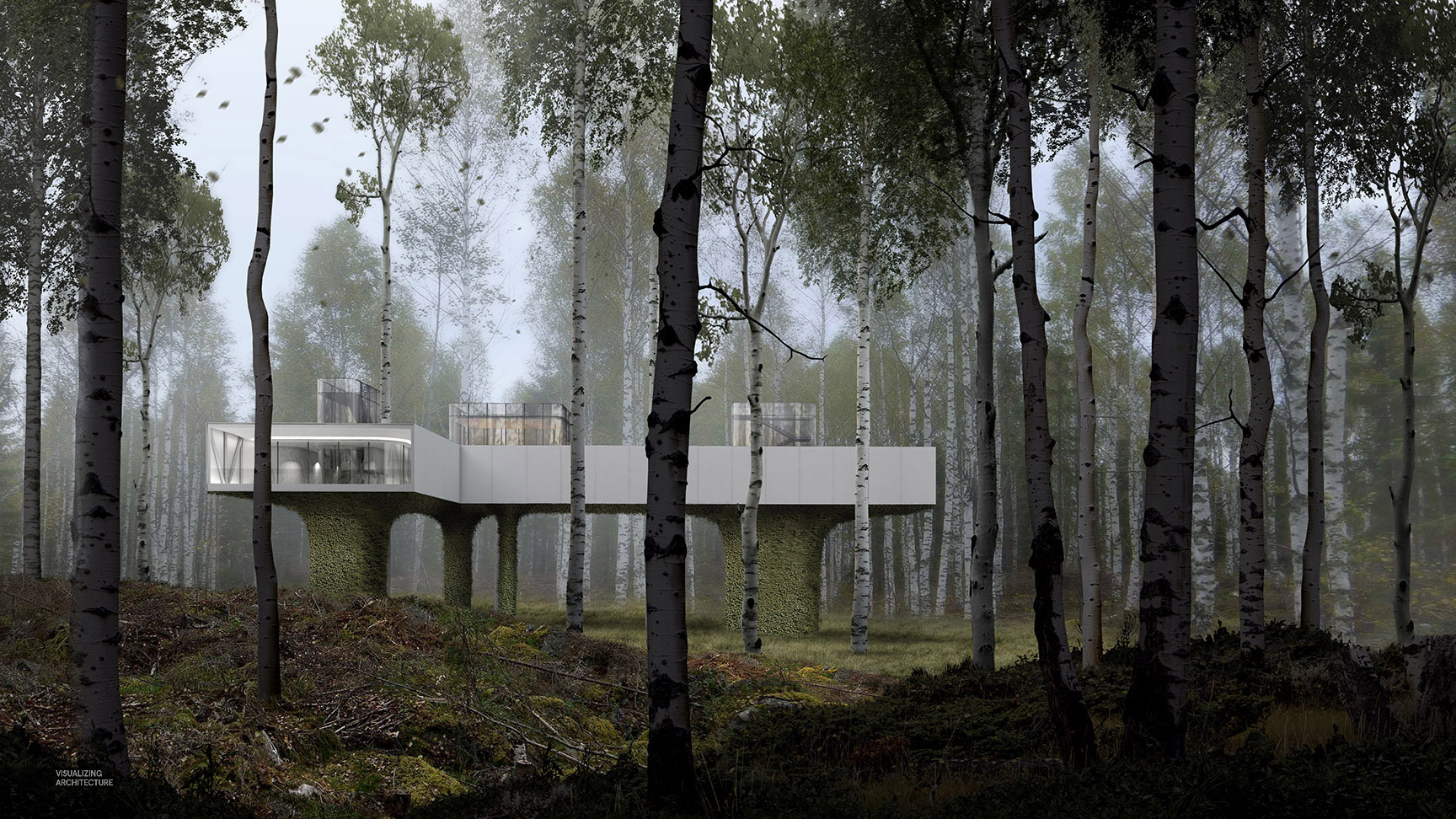
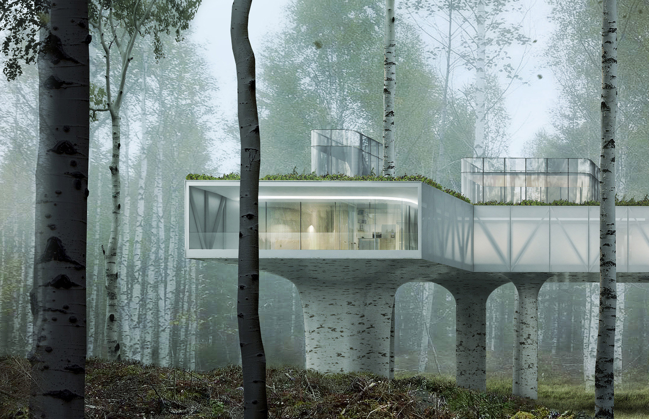
Next, I introduced the vegetation in the foreground which plays up the hilly features of the site, but also gives me an opportunity to play with the light and drama of the composition. Creating such a strong dark shadow in the foreground amps up the contrast of the overall illustration and really draws the eye through the trees to the lighter and brighter architecture beyond. Also, ivy was added to the base of the architecture. This was one of the areas that I wanted to study and the main reason for this illustration.
5. TREES
Next, trees were carefully placed in the foreground and mid-ground to help frame the architecture. Nothing too difficult here except to gradually lighten the trees as they thin out near the clearing.
6. Entourage and Details.
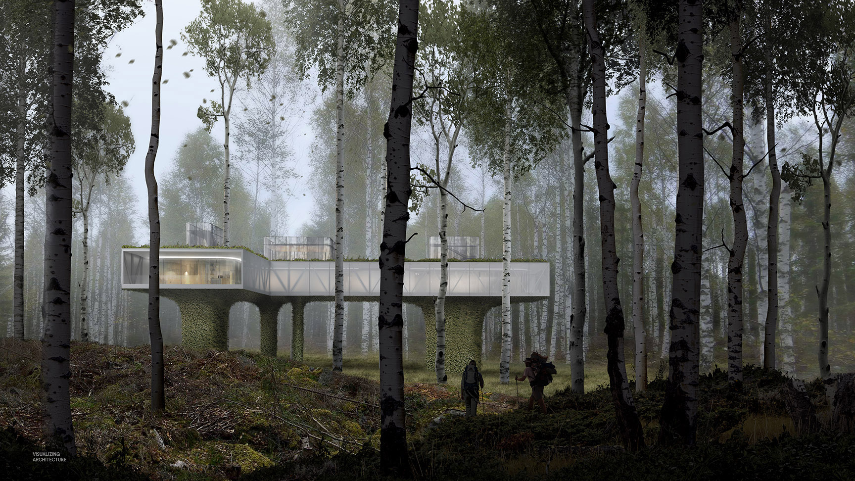
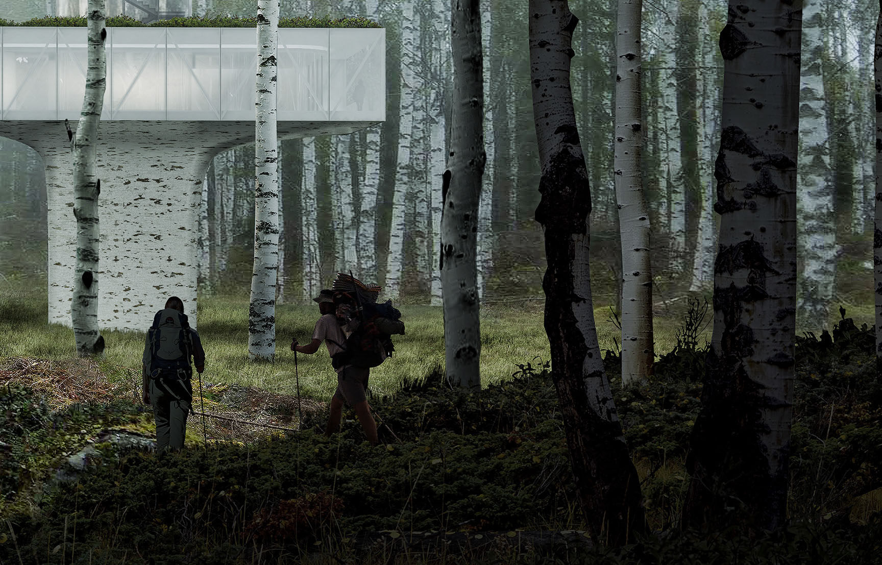
Entourage is minimal but selective. The project is of a research lab, so to reinforce this concept, a small narrative is introduced of scientists returning from a long day of research out in the field. Other elements were adjusted such as the transparency of the side screens and the interior warmth. I used a second rendering of the architecture with the translucent panels turned off to allow me to make selections of the interior in Photoshop and precisely control the opacity and softness of the panels.
7. Color Adjustments and Material Options
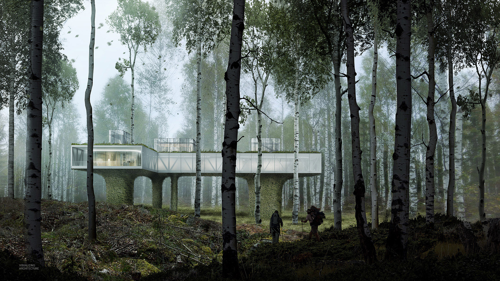
Finally, I jumped in to Topaz and pushed the image slightly cooler in tone. I now have a completed image that clearly shows the relationship of the architecture to the landscape and that would now allow me to better compare material options. The biggest decision was whether to draw the vegetation up the base of the building or leave it as a hard, but textured surface.


The overall mood is great and the composition is truly magnificent. I assume that the photographic qualities you have given to your latest works is what put you amongst the great contemporary arch. visual artists. However,in the closeups some details are off scale. I do understand that this render is to help you better comprehend your design decisions but it makes me wonder if it’d be better to setup a scene and environment in 3DS for your final imagery so as to give it a true life like feeling.
Alex, incredible work as usual. I absolutely love the mood you achieved.
Could you add the resources you used on the post? Mainly the background and foregrond images.
Thank you and keep up the amazing work!
Absolutely amazing photographic piece Alex But I have to agree with Kostas: the model and the people look a little out of scale, lost in the grandness of the forest.
Other than that, your atmospheric work in Photoshop is among the best I’ve seen…
Dear Alex. Great stuff. Really appreciate your imagination and effort producing such work.
Working as a small part-time illustrator and teaching 2D/3D in architecture, your work/website/you tube has been one of my main resources of teaching and learning about ‘digital architecture’ to future generation of ‘digital’ architects/artists – to them and me (too)! Students like your work; they tell me that your work works like a magician – conjuring reality out of computer screens.
One of my research interest is in digital fabrication and how digital 3D models can be turned into construction methods. Do you think in your future planning you might include the idea to see your visions into built forms? It would be an awesome project 🙂
Thank you for sharing your work/talent/art to all of us here!
Bring life to your amazing renders with these people cutout collections https://sellfy.com/cutout
Hi! Thanks for another great walkthrough.
I have a technical question about how you changed the lighting between the fall (yellow) and spring (blue/green) scenes. Is this all done in photoshop? Or do you tweak your render settings also?
Hey! Great stuff, and thanks for all your walk throughs. They’re very helpful as a student.
For your renders, what is your process for sourcing your images? Do you just google search for backgrounds or do you have a membership with a stock photo website? I feel that is one of the hardest elements in making a good render- finding a good background and foreground elements.
I’ve become pretty good at adjusting temperature of the images as well as lighting/shadows and finding texture elements. Just need a better process for sourcing main background and foreground images. Thanks again!
Wow, I have never seen such an idea, I thought at first it was a photoshopped one, but hopefully no. Really fantabulous!
This is absolutely stunning! I have seen lots of renderings and I have to say, hands down to you. Color, proportions, light, mood… just everything really, all show such a fine sence for beauty. Bravo!
The out of scale people comments are nonsence.
I find this very inspirational. Very admirable you are sharing how you do it! I need to study the territorials.
Dear Alex.
I was attracted by your beautiful picture.Your idea and technology is great,no doubt.
And i want to look your psd file of this picture. Thanks very much anyhow.
I’m very much reminded of the design of the BlueShore Financial Environmental Learning Centre except you’ve incorporated no base structures other than the supports. I’m sure this would very much make people nostalgic for childhood tree houses.
thanks a lot for sharing this study.
its an amazing post that have lot of information.
Check This Out