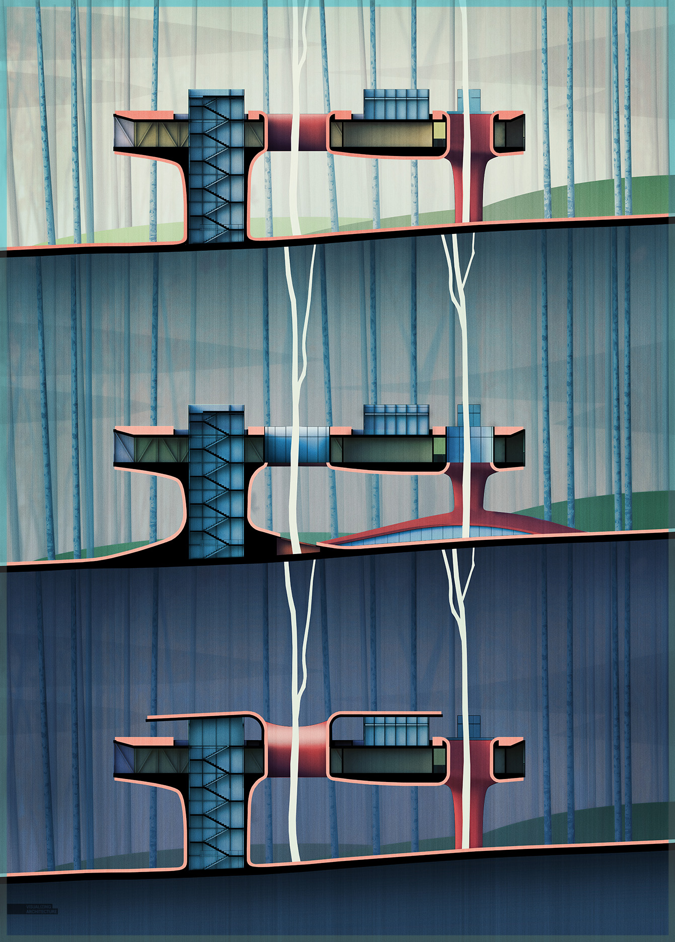
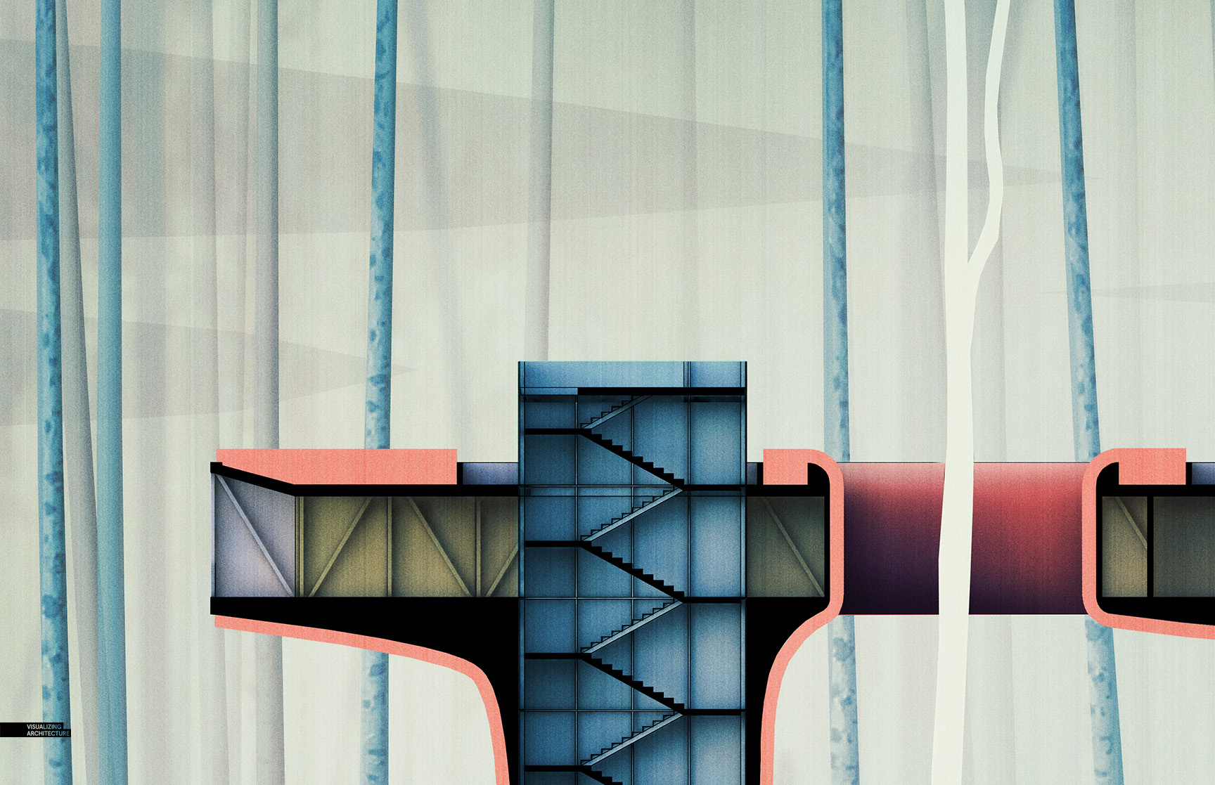
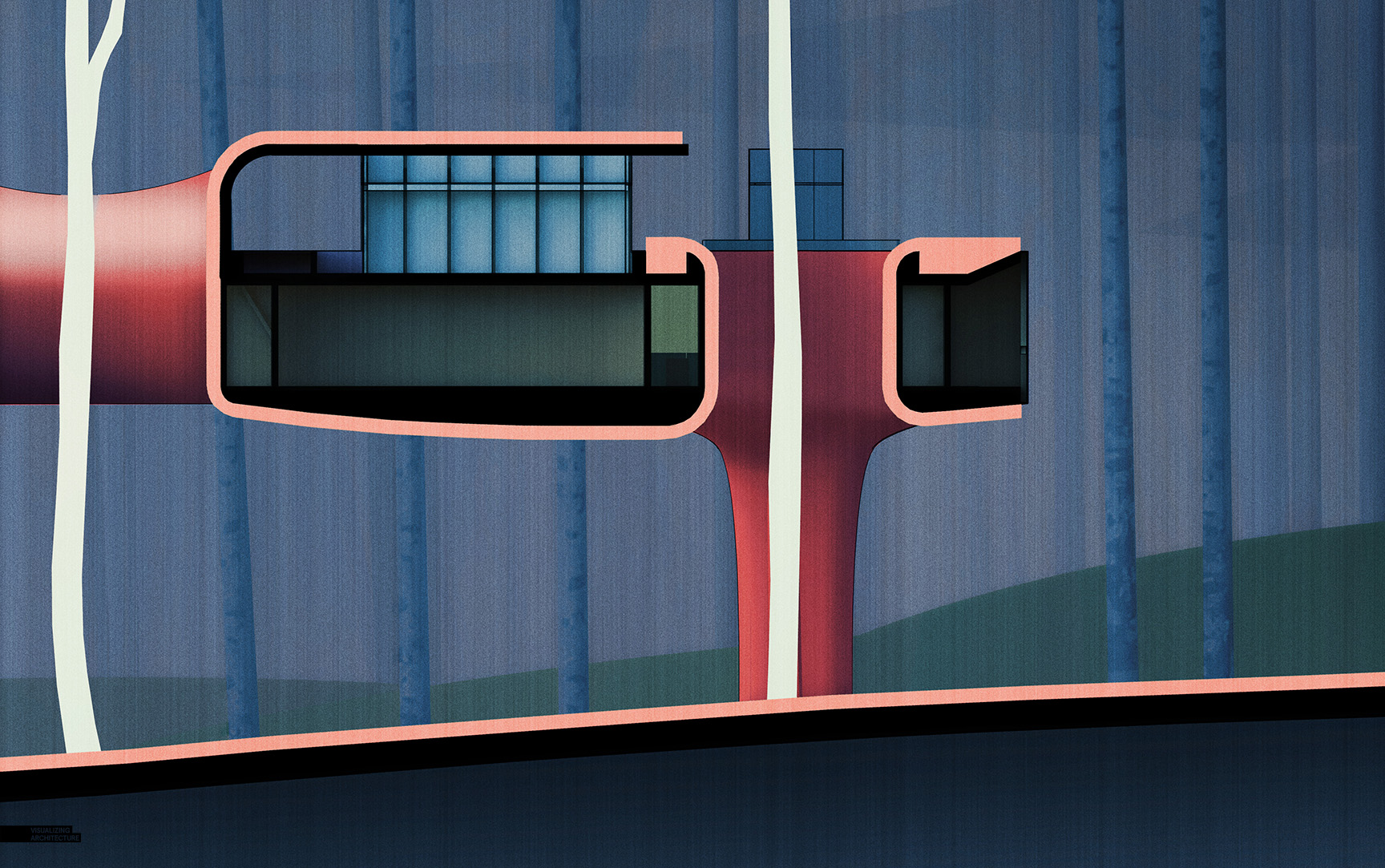
I have been continuing to develop my research lab concept and specifically I have been focusing on some sectional qualities of the design. Since time is limited these days, I don’t always build elaborate models of each idea. In this case, I cut a section through my master model and worked it over in Photoshop to test out some ideas. This method doesn’t necessarily always yield the cleanest images in terms of sharp line work and shading, but it is more than enough to get the idea across and show some of my process work at the same time.
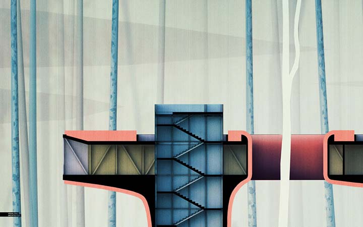
This style of illustration is building off of my “Culture Center Intro Illustration” which took on a minimal/vintage type look. Again, landscape elements are abstracted and shading is simplified. Colors are also diagrammatic to broadly represent basic elements of glass, vegetation, interior, etc. You can get away with a lot more going with a style like this. A fully detailed model isn’t necessary and mistakes can be concealed through paint and poche.
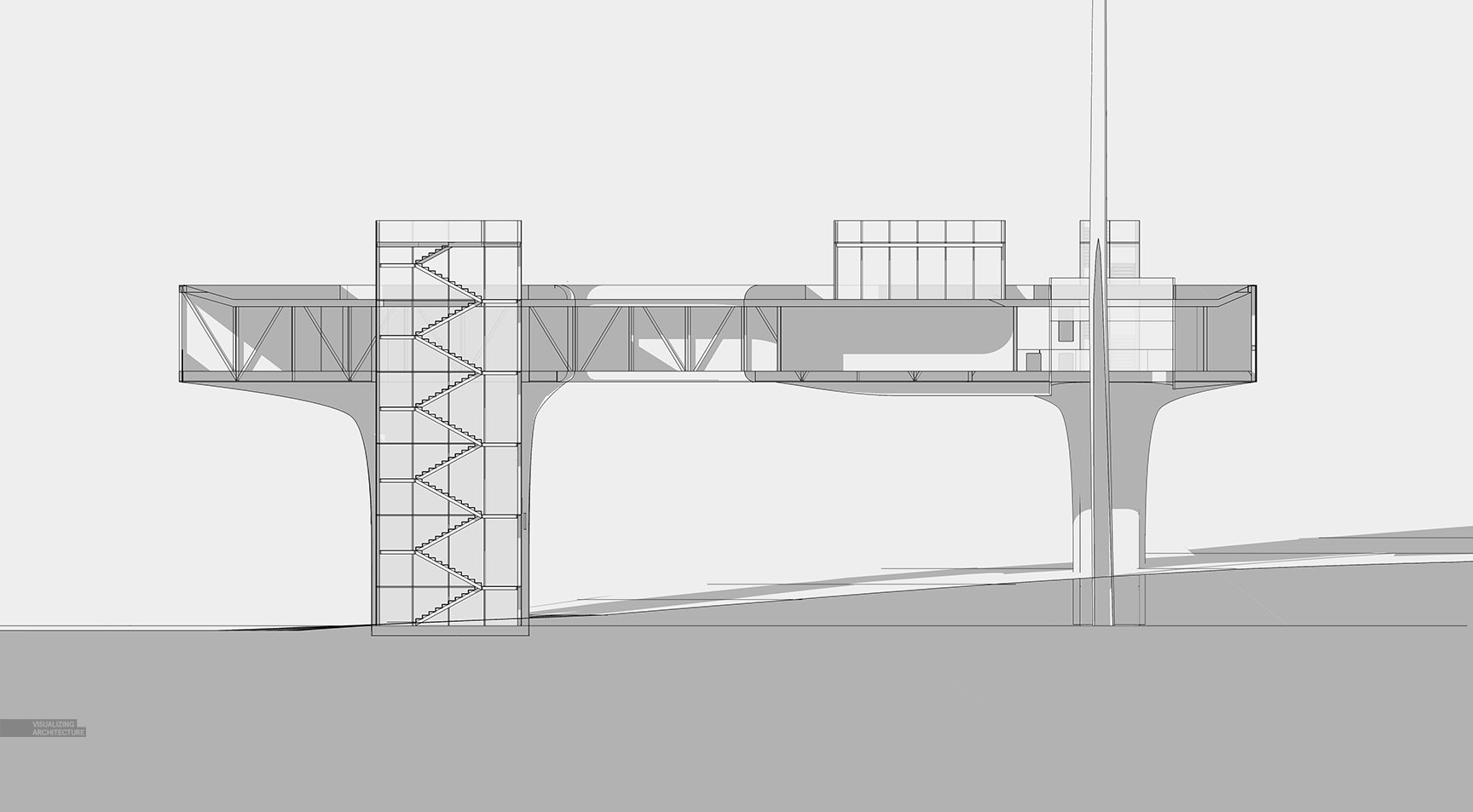
1. Sketchup Model
Like I said, I didn’t want to spend the time modeling each idea. Therefore, I used just one model, then copied it 3 times in Photoshop.
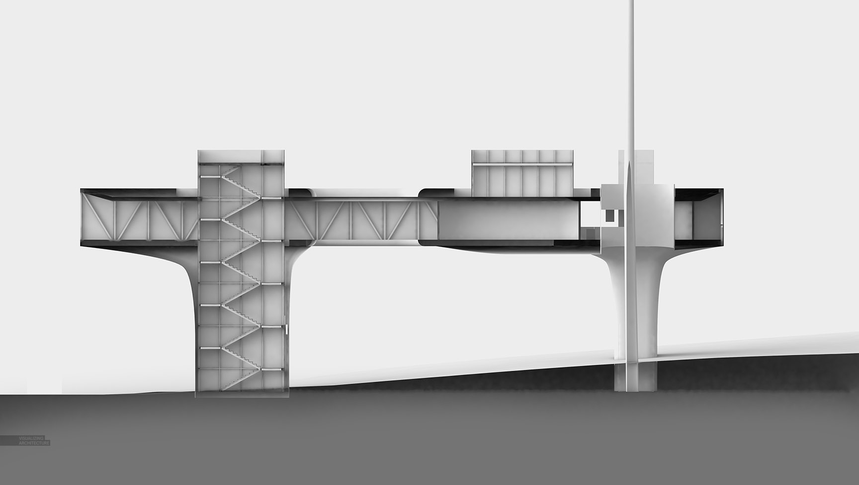
2. V-Ray Rendering
I used the material override in V-Ray to generate a simple clay model rendering, standard stuff here on this website.
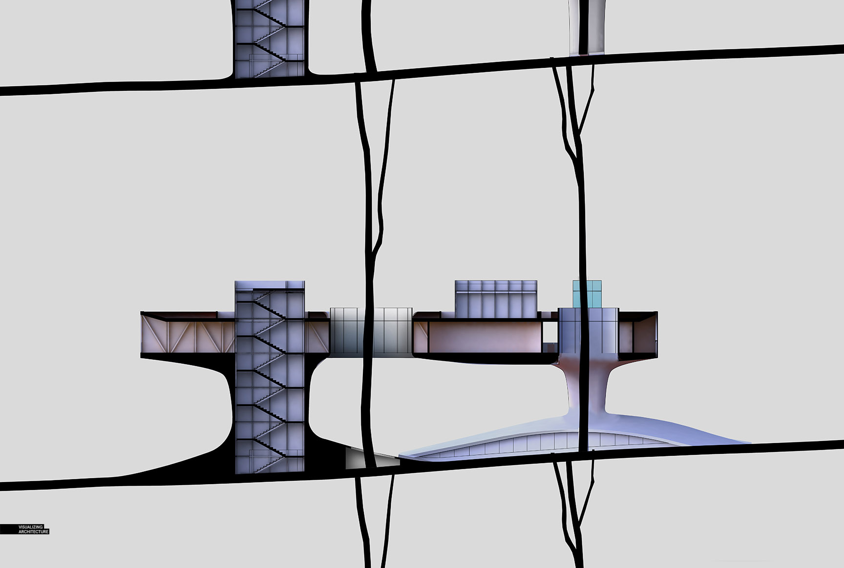
3. Poche
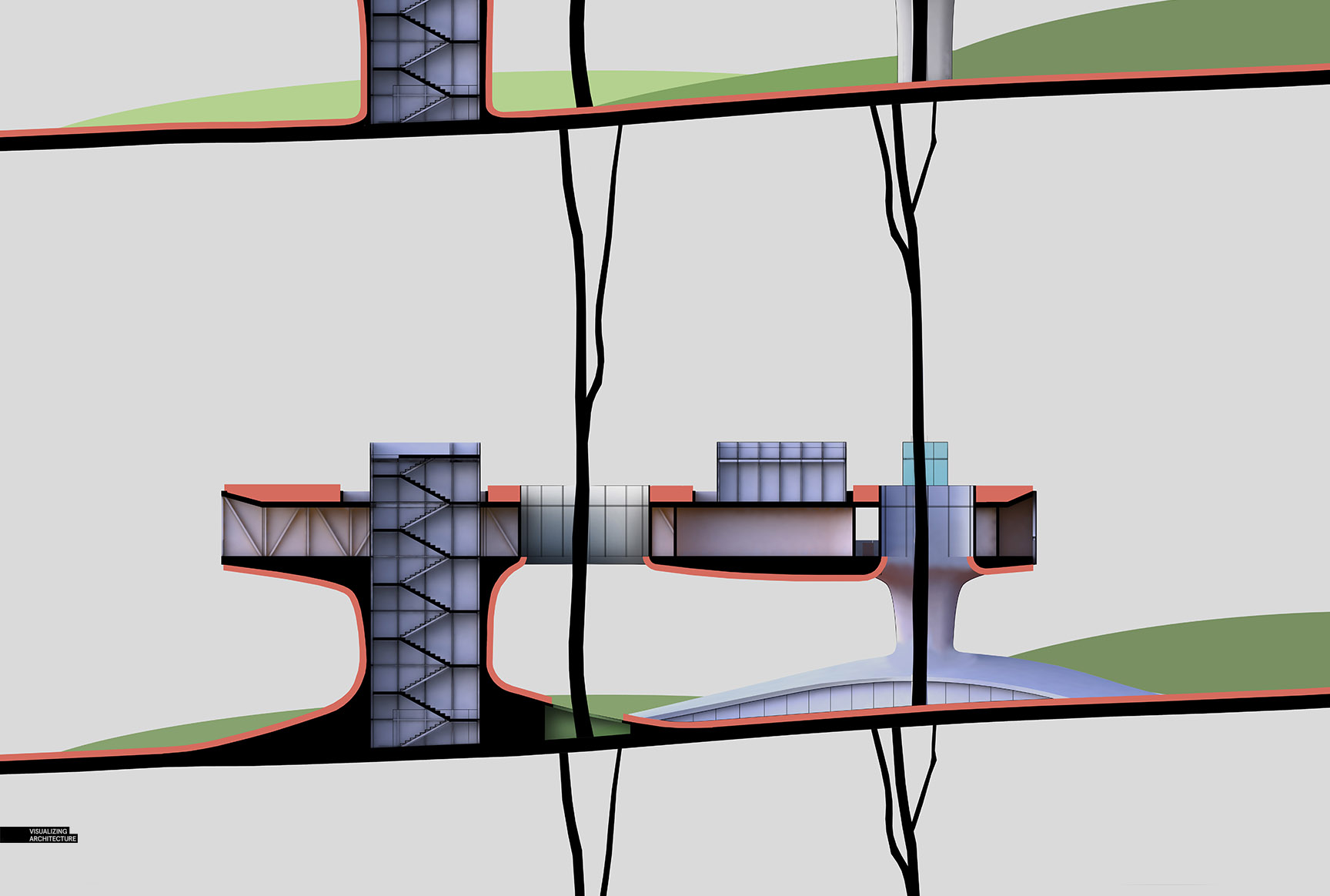
The first thing that I did in Photoshop was poche or fill in the cut areas of the model with black paint. This helps clarify the reading of the section and hides mistakes in the model. I also edited the base rendering in Photoshop to test out some of the other sectional ideas that I had. In this case, I sculpted the ground around the support columns as well as some other minor changes.
4. Landscape Highlight
The section diagrams are meant to show two levels of information in the cut. The black poche represents the cut through structure and red represents vegetation. These three studies are looking at how the vegetation flows in and around the architecture. I will probably create a key or annotate these ideas later on down the road.
5. Color
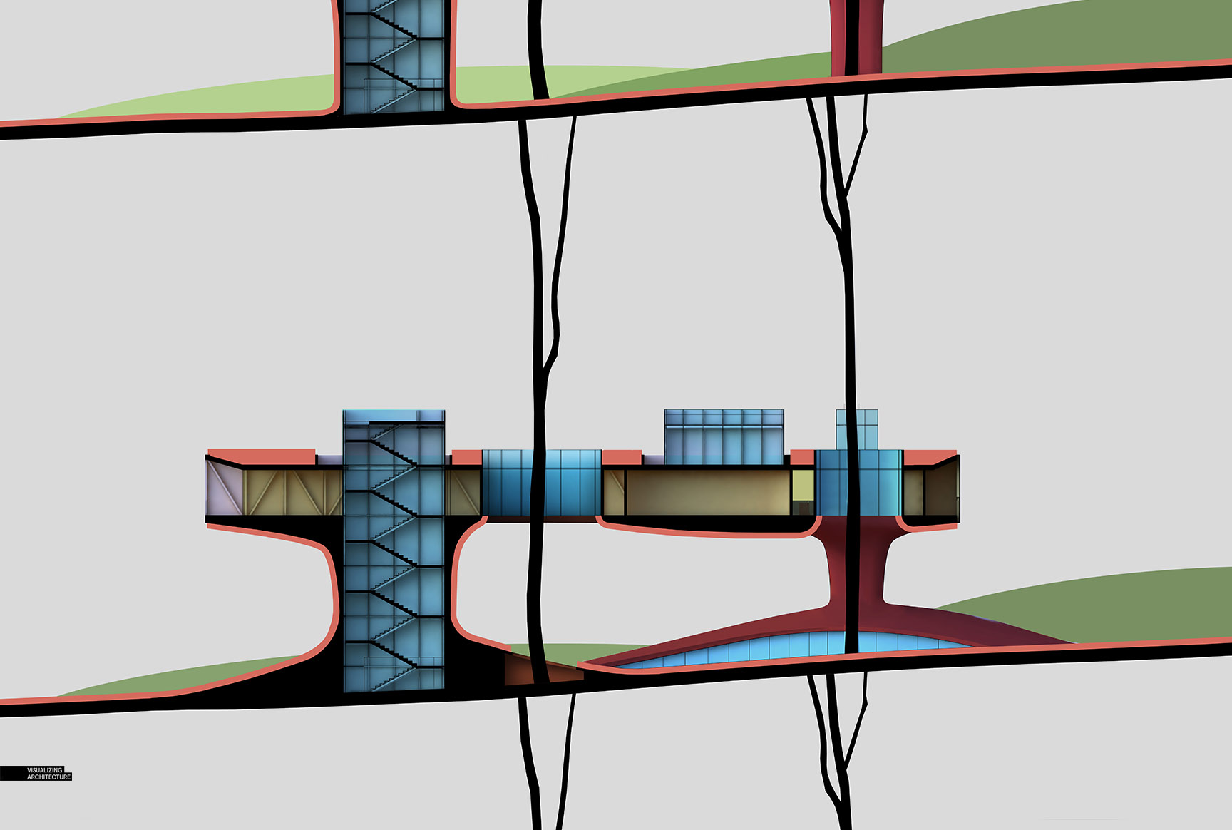
At this point, color is introduced to help define material and further clarify the reading of the diagram. I am not too concerned with how the colors are reading. I just need to get the layers setup knowing that I most likely will tweak them later. I Also know that I will make sweeping color adjustments towards the end with topaz.
6. Background
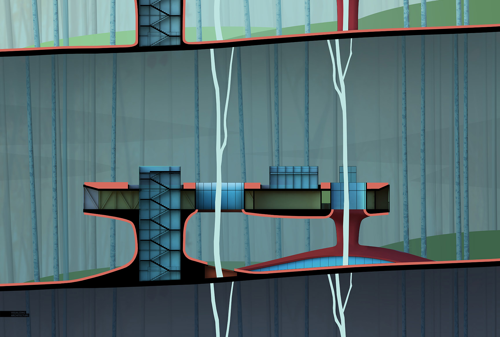
A simple background was inserted which abstracts the trees into long linear elements. I wanted to avoid the background getting too busy with branches and distracting from the section.
7. Topaz and Texture
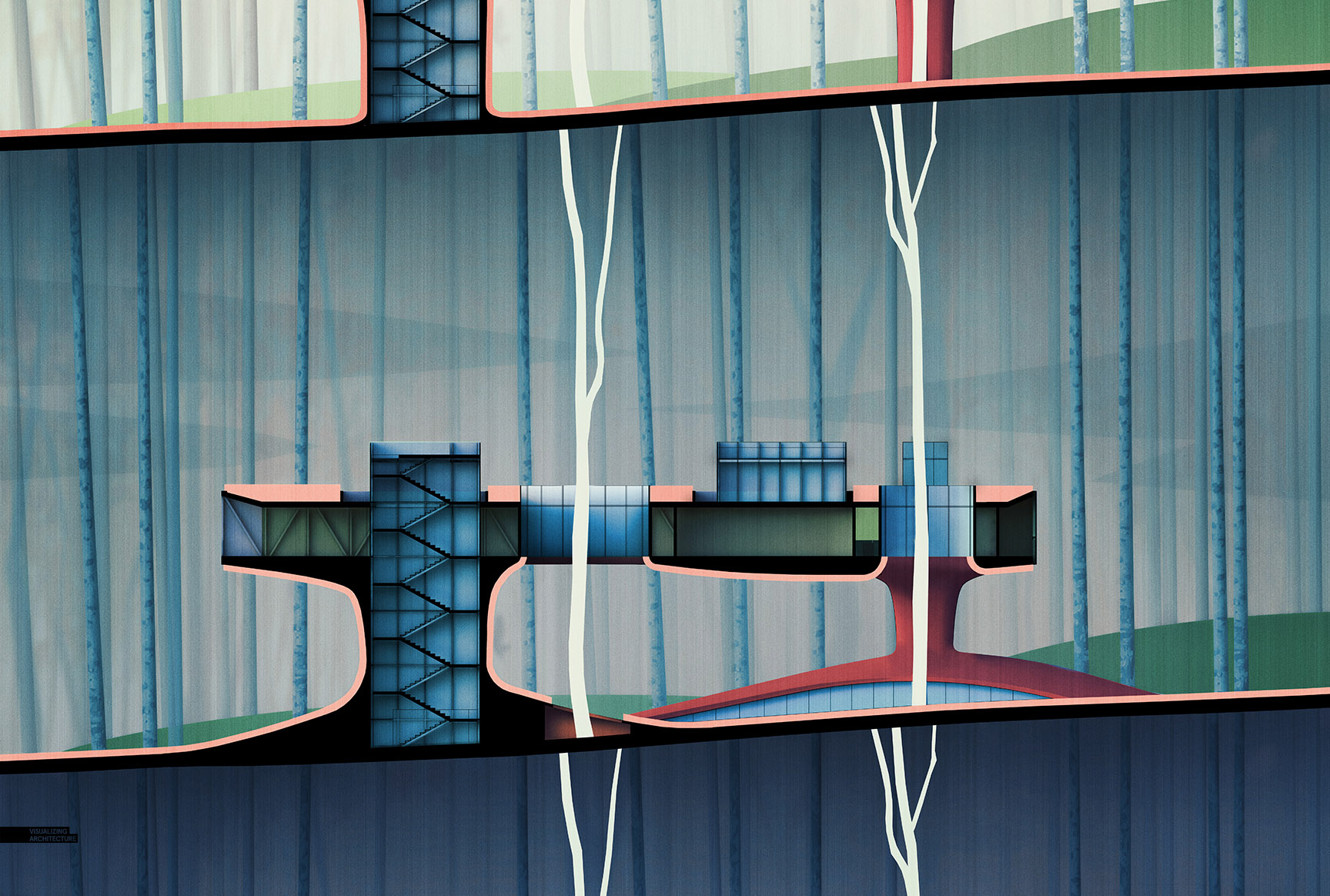
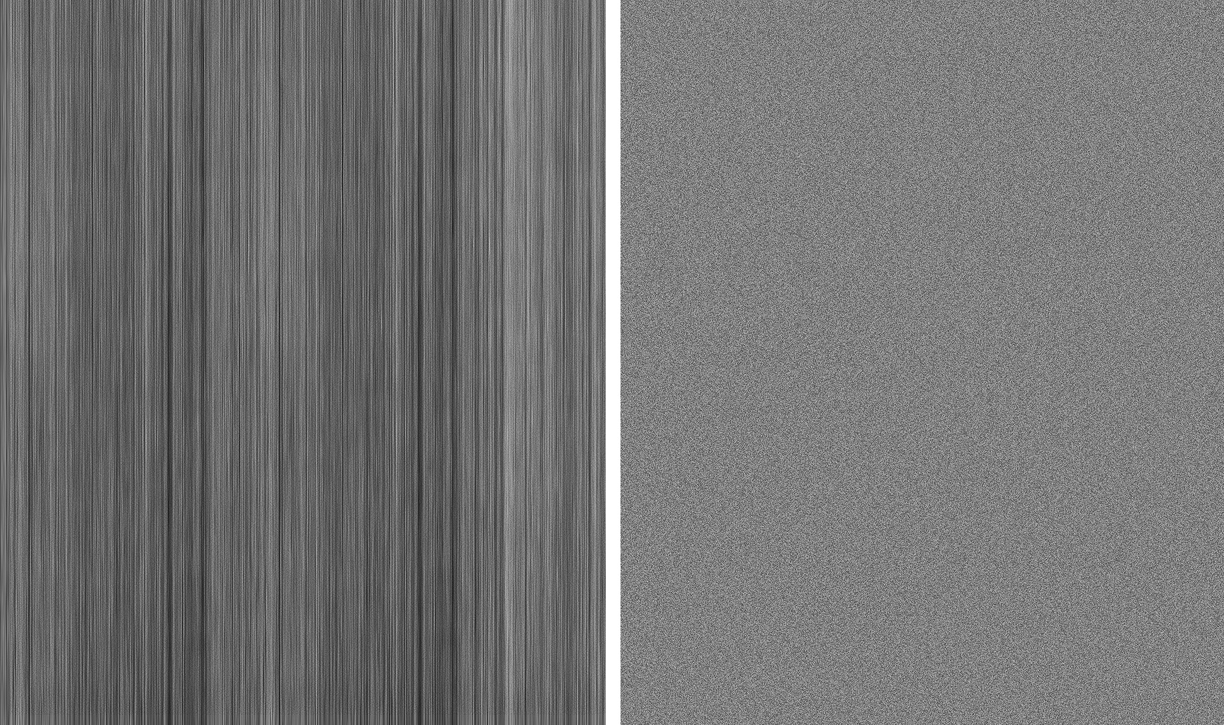
Finally, I adjusted the tones using Topaz and overlaid some textures. Since so many edits were made in Photoshop, the textures help hide some of the imperfections and tie a lot of the different elements together. Above, I used a sketch texture that I stretched vertically and a noise texture generated by a Photoshop filter.
The Final Images
Finally, a big thank you to everyone who has purchased a copy of my Portfolio Volume 04. I am amazed at how well it has been received and the interest people have shown in it. If you did purchase a copy, please take some time to leave a review on Amazon or Barnes and Noble depending on where you purchased it. I am always looking for your feedback!


As always, very nice work. I really like the colors and the atmosphere of these sections.
awesomeeeee!!! 🙂
how do you render a section with in sketchup with Vray ?
He used Zorro 2 plugin to generate the sections, and then he did a simple clay render in Vray
what’s the best way to do organic modeling in sketchup, do you use a specific plug in
I relly want to buy a copy of your Portfolio, but I found that it’s unable to buy it in Amazon china. what a pity ! I hope Amazon will sell your portfolio in china someday, and I will definitely buy one ! Love your works , amazing!
Big fan in china!
A very helpful tutorial. Thanks Alex!
Really great work bruv!
very very conceptual and poetic work more tutorial plz thanks
Thank you so much. Keep posting
i am very impress with your work.