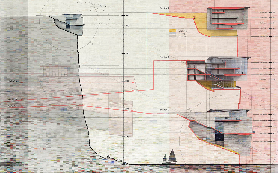
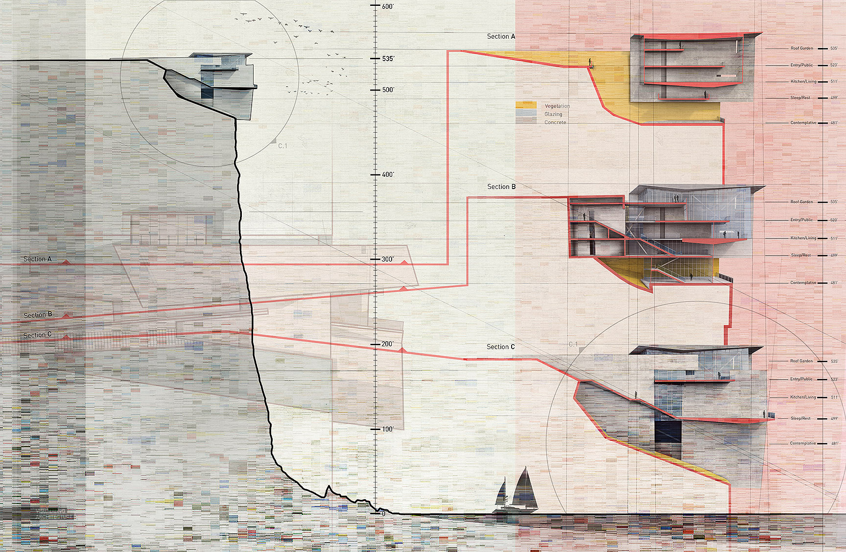
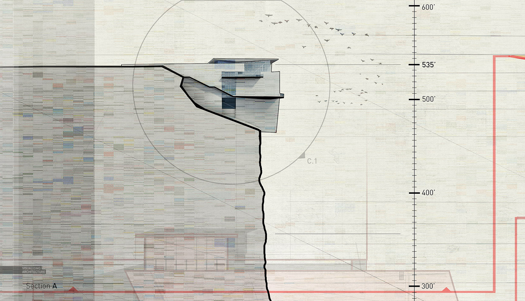
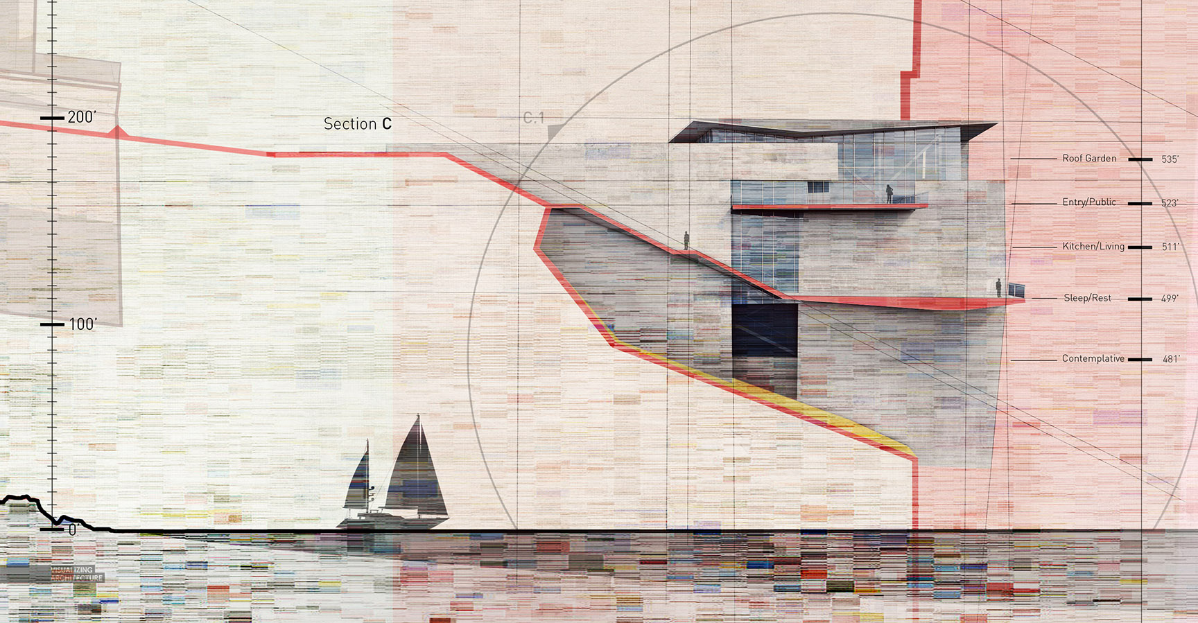
For the past few weeks, I have been producing section illustrations of my cliff retreat design. As is often the case, the final result took a complete detour from what I originally set out to produce. I began the spreads rendering out two large detail perspectives with the intention of placing one on each side of the spread. However, as the work progressed, I realized more emphasis needed to be placed on the scale of the cliff. Once I started going in this direction, the building sections themselves scaled down and more real estate was given to the site cliff section. The aesthetics of the spreads also shifted from clean and detailed image to a loose and sketchy style. At a certain point, I just started experimenting and iterating like crazy to arrive at the final design. Below is a very quick breakdown of the image.
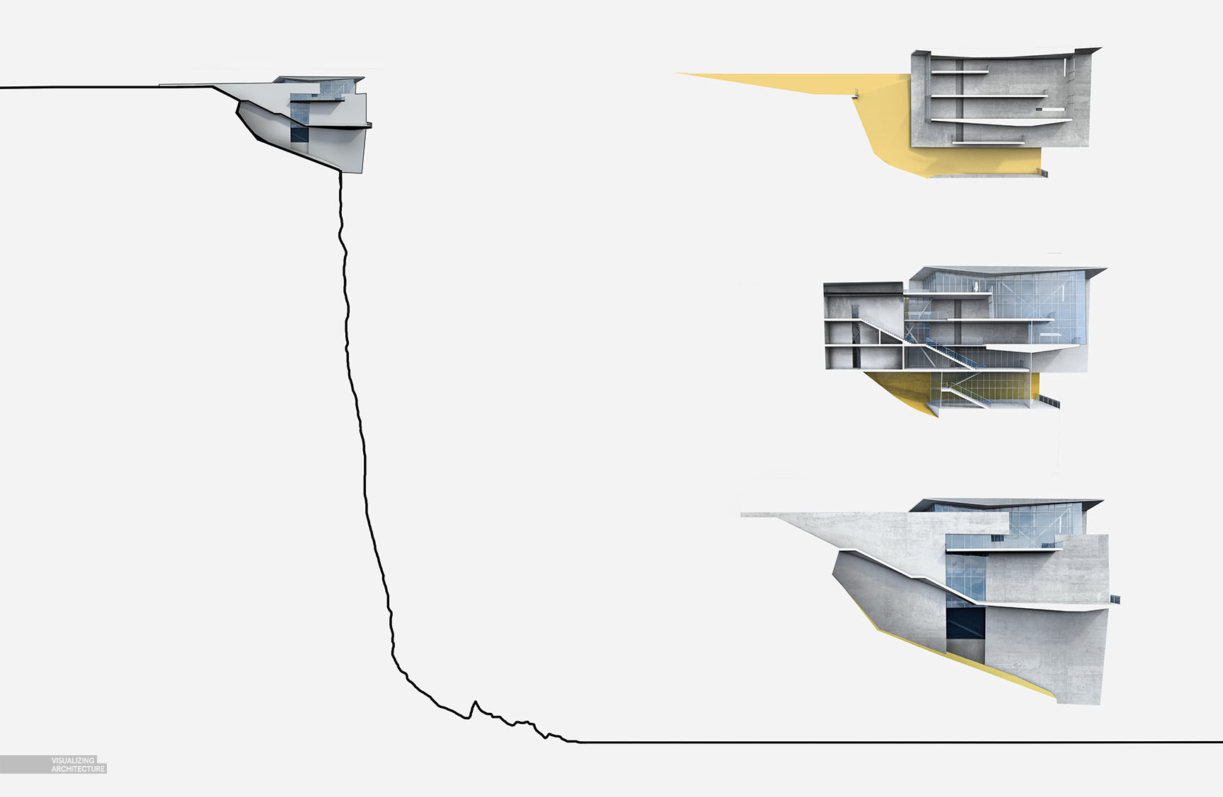
1. Base Renderings
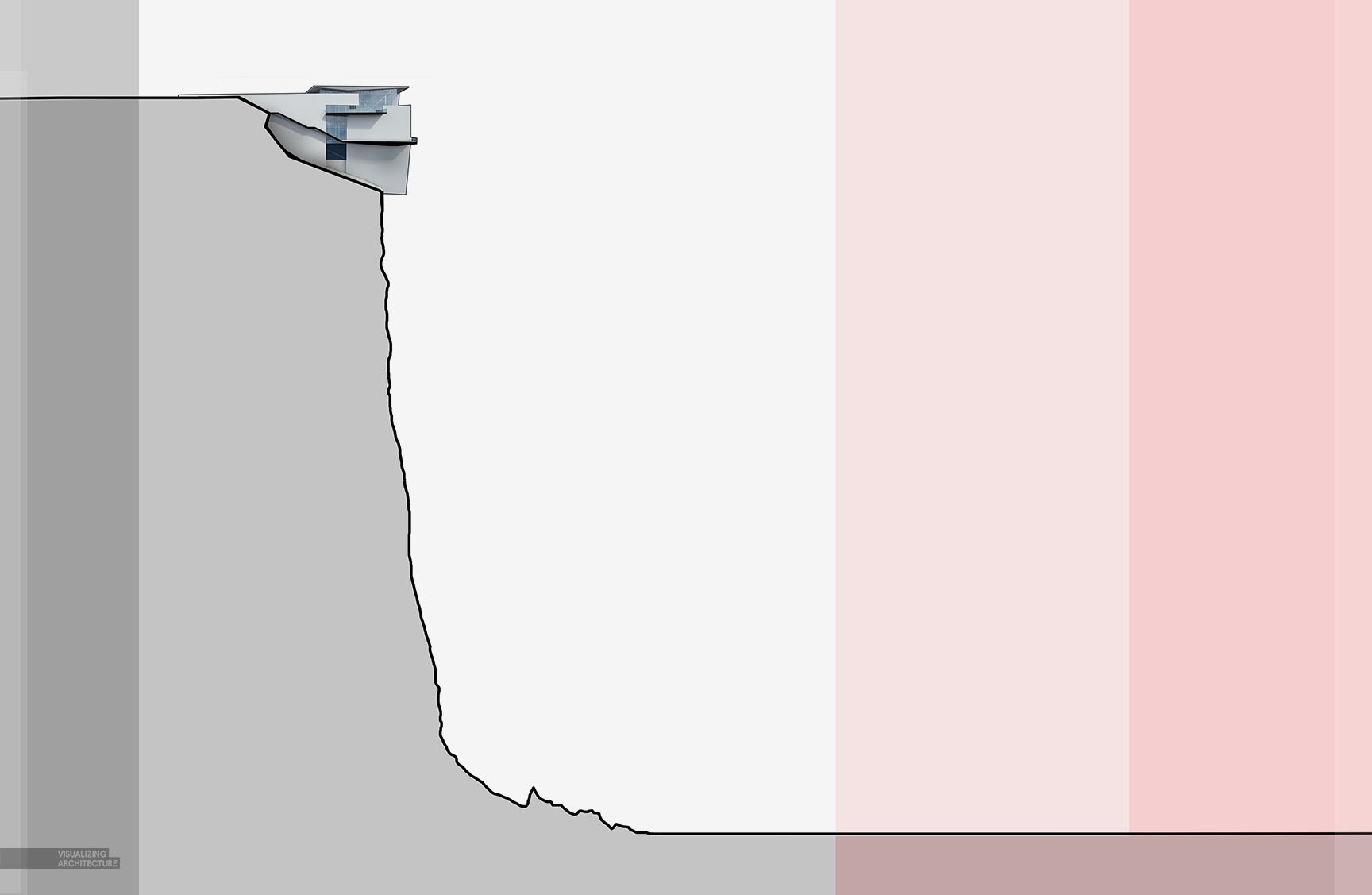
I started out by cutting sections in my Sketchup model and then rendering in V-Ray. The V-Ray renderings required quite a bit of cleanup in Photoshop to hide mistakes in the model. I also added some concrete textures and colors to designate materiality.
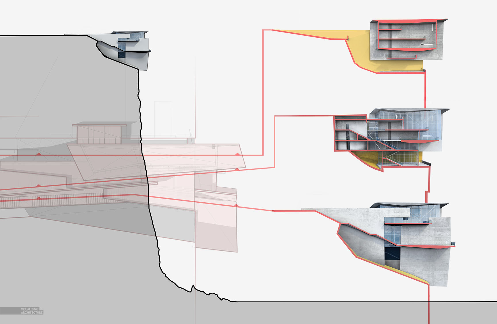
2. Poche and Site Plans
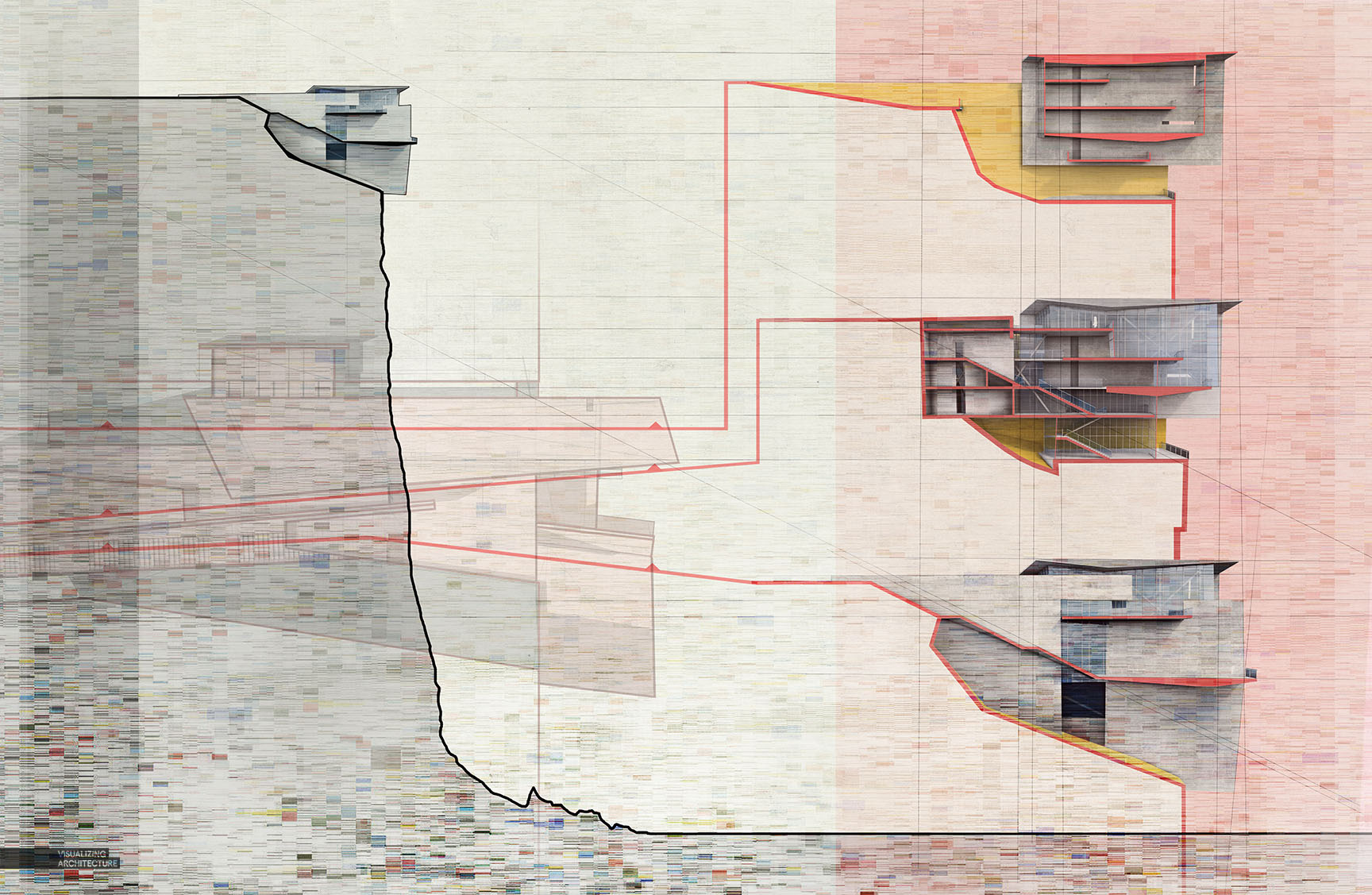
One thing I like to do with my sections is poche the cut with a bold color to help clarify the reading. The red also becomes a graphical move that encourages eye movement around the page and make connections to more information. In this case, I added a site plan of the design to inform where the cuts are taking place. All of this is kept somewhat abstract to help fade into the background and not draw attention away from the main site section.
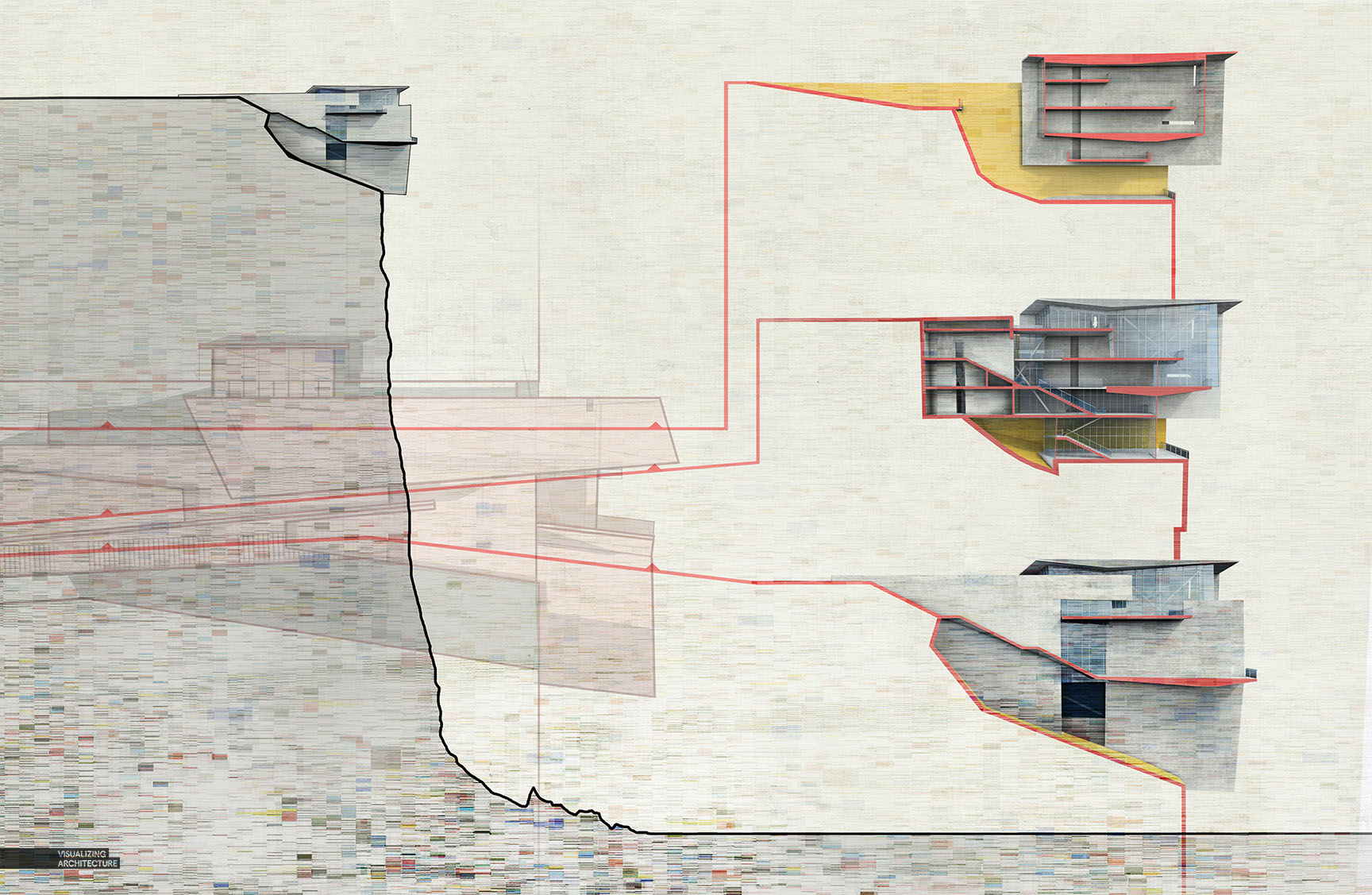
3. Textures
At a certain point, I quite methodically planning every move, relaxed a little, and let my right brain take over. I started exploring with texture and color to give this image some grit. While the step-by-step breakdown of this image is very linear, in actuality, I iterated and tested out a lot of different layout designs, colors, and textures before arriving to the final image style.
4. Background Color
I added background tones to clarify the hierarchy of the spread and help organize the information. The red on the right was used to better define the sky from the cliff as well as visually separate the building sections from the site section on the left.
5. Annotation
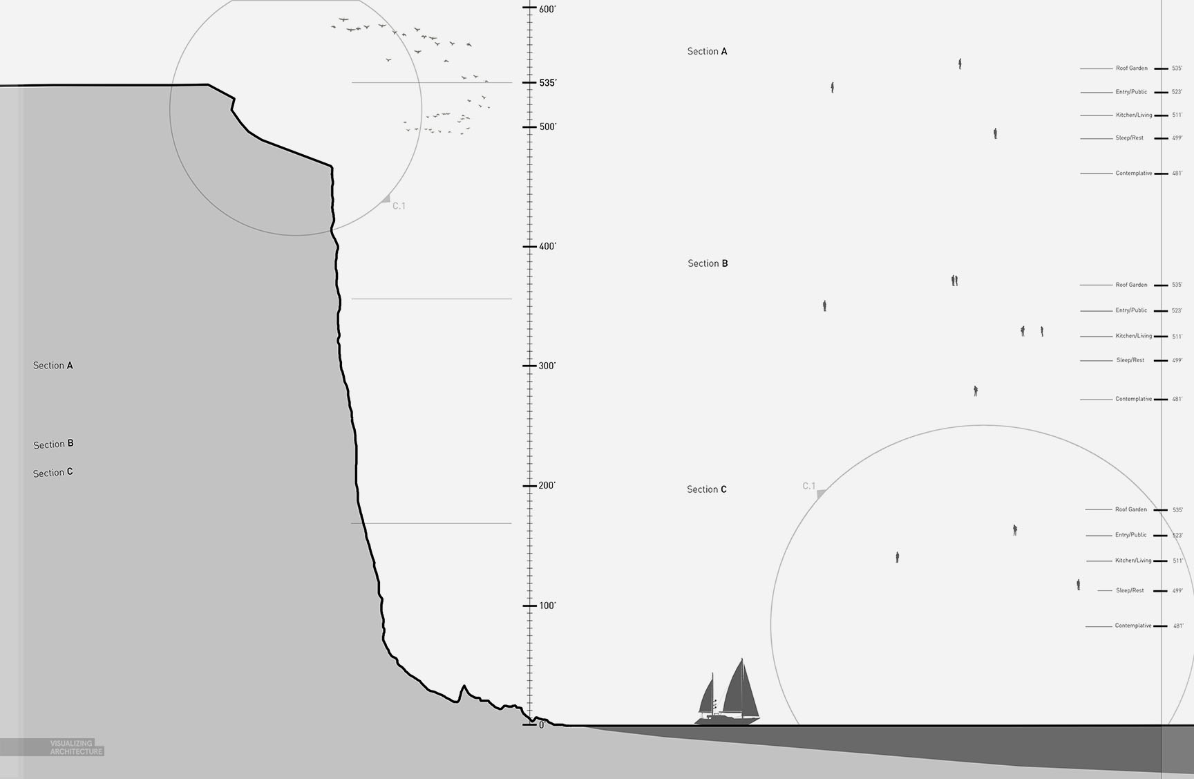
Finally, annotations and scale figures were added. I always try to put just as much time into the design of the text and annotations as with any other graphical information. Often, I see this stuff added at the very end in a way that disrupts the flow of the spread and distracts from the illustrations. However, I typically work this stuff in as I am developing the spread which can add another layer of texture to the composition and be used to strengthen the hierarchy of the spread. With that said, it is a fine balance between maintaining readability and not stealing too much attention.



Hey Alex,
Great post as always, very clear and helpful. It seems like you are enjoying your posts a lot more nowadays (just an observation).
I am curious though as to where you find your textures for under/overlays during your post processing? Are there a set few sources that consistently have good quality textures, or is it more a process of browsing the web?
Thanks Jason. My textures are found all over the internet and is an ever evolving library. There isn’t really one place I find them. Most of them, I stumble onto.
Hi alex I love you
Hi Alex,I’m also curious about your textures,can you recommend some web about that?thanks very much^_^
wonderful! i especially like the annotations and the feel they offer the composition. just beautiful work, thank you for sharing!
Thanks Dave
How do you do your sections in sketchup? Is there a particular extension that you’d recommend for cutting up the model?
Roi,
I used the zorro plugin for sketchup to physically cut the model.
hello Alex
A fine job, as always
I have a question. What font are you using?
I use din for most of it.
Hi Alex,
I’m a student at Ohio State’s landscape architecture program and I have recently been researching how to branch into the architectural illustrations field. I just stumbled upon your site and my mind was blown. I love the work you’re doing and would really like to talk to you about how you got started in the field.
P.S.
Understanding the landscape to be the most crucial aspect of the piece and using it to create a compelling layout was very nicely done.
I have the same question about how to make the illustrations shows better
i am a student from China.as i see the proceed of your work,it can amazing me and abstract me a lot。there are lots of details i need to notice and learn。so,i am willing to be your friend or student。thanks for the sharing。谢谢。
Thanks alot for sharing.. I liked the lines idea between sections and plan
Dear Alex, you have been my role model and sort of virtual mentor for the past couple of years.
I graduate recently, finished my portfolio with a great help from your blog and scored my first job almost instantly. You are a true inspiration!
I hope you never stop posting your amazing work.
All the best,
Olivia
Hi Alex,
I was always confusing where did you get those awesome texture pictures? Did you photoed them by yourself or you just download them from the internet?
I have noticed that the texture is an important part of your diagrams.
Thx a lot
Hello Alex , I hate you ( positive) , follow you for a long time , and are always impressed by the variety , complexity and originality of your work . it is difficult to create always different ways to view the architecture . I wanted to ask what precisely the third texture I can not see it clearly .
good example,someway i have to analysis the color changed in the end ,but thk ur ideas and shows
this website really needs to be on innstagram
constant inspiration for me
Hi Alex, like everyone else who knows your work, I admire you very much, and I’ve learned a lot from you. But 🙂 this tutorial seems like one of your best and most brilliant students work. I will try to explain why.
Aside from the tiniest little details and tricks you bring to life, I was always impressed how you create the atmosphere and the tension into the scenery, and completely adjust the way of the presentation with the project concept&context. Whoever sees the projects is immediately there, completely flushed with the whole idea of it.
This is ofc a problem for everyone who uses your tutorials, bcs doesn’t matter how far you go with the details, our projects are always “borrowing” your interpretation style. Like borrowing the clothes from the older bro. Sometimes it fits sometimes not….
In this tutorial, I simply felt the lack of this atmosphere and drama that is present in each one of the cliff series. What catches my attention the most is this mosaic texture, that has no narrative role (or I couldn’t see it) Presentation and the final outcome is still awesome, but I wouldn’t really use it for THE Cliff, but for sth else. What also disturbs me is this sailing boat that also takes the drama out of the scene.
This is just my impression.Could also be I am completely wrong.
In any case, you are the ultimate best!!!
xoxo
Can I simply say: “WOW” ?! I was talking with a friend a couple of days ago about the fact that I have to start working on my portifolio and how I didn’t know where to start, and he suggested me some people and websites for me to search for over the internet, and let me say that I’m completely amazed with your work, and more so with the give away vibe you have, how you share your knowledge with the internet and of course your incledible work! You got a new fan over here, that’s for sure! Congrats!
Hi Alex . I am curious about your textures and i just wanted to ask you that you use vector textures? because i tried to find thsese kinda textures alot but i couldnt find it and even if i find they all gets pixelated when i try to use them on bigger scale. prolly because od small size of images, and i am really not able to find proper textures.
Wow
All of those are very creative . Thank you so much .
Hi Alex ,
I really like the layout of the section spread. In my opinion the ” texture-patterns ” are distracting my focus away from the plan view which you use to view the sections . It is really a creative way to show this. but i just think the patterns can be more suttle or better yet just remove it and it will be great already because of the way you lay it out.
Alright Alex,
sorry for bringing up an old thread but I’m feeling desperate. How were you able to render section cuts in v-ray??? every time I render my sections it completely ignores the cut I made in sketchup. Im trying to get the shadows cast from the invisible walls so I want to avoid separating the components and render the section as it is. this will be particularly effective for my floor plans too.
Hoping this gets a response…
P.S. i keep coming back to this page as this is just “effing” brilliant mate! keep up the good work and keep on inspiring!
i love u so much alex……………………….
Hi Alex,
Thank you for sharing, this is all incredibly insightful. I am interesting in knowing more about your process of bringing in the annotations that add a lot more technical information to the spread. Did you do those in InDesign / import them from AutoCad as a PDF? If you could explain a little more it would be of great help.
Thank you