It’s been a while, but I am finally back. I have spent the last several months traveling, giving workshops, settling into a new home, and spending time with family. Needless to say, priorities shifted as they often do and this website unfortunately had to be put on hold. However, I am ready to get back into things and am excited about what is to come.
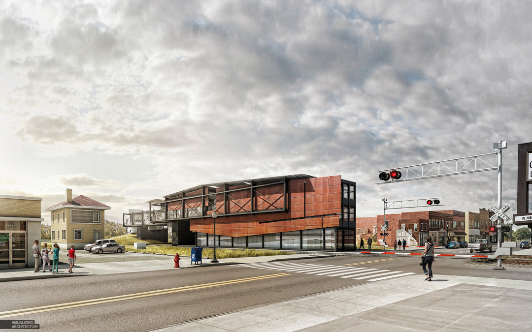
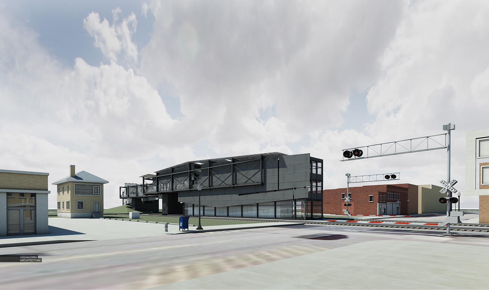
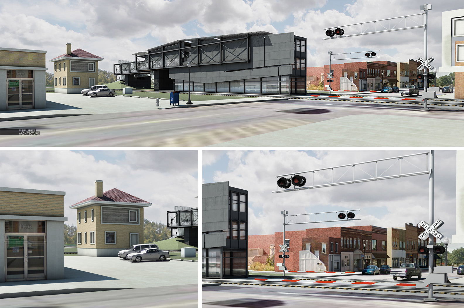
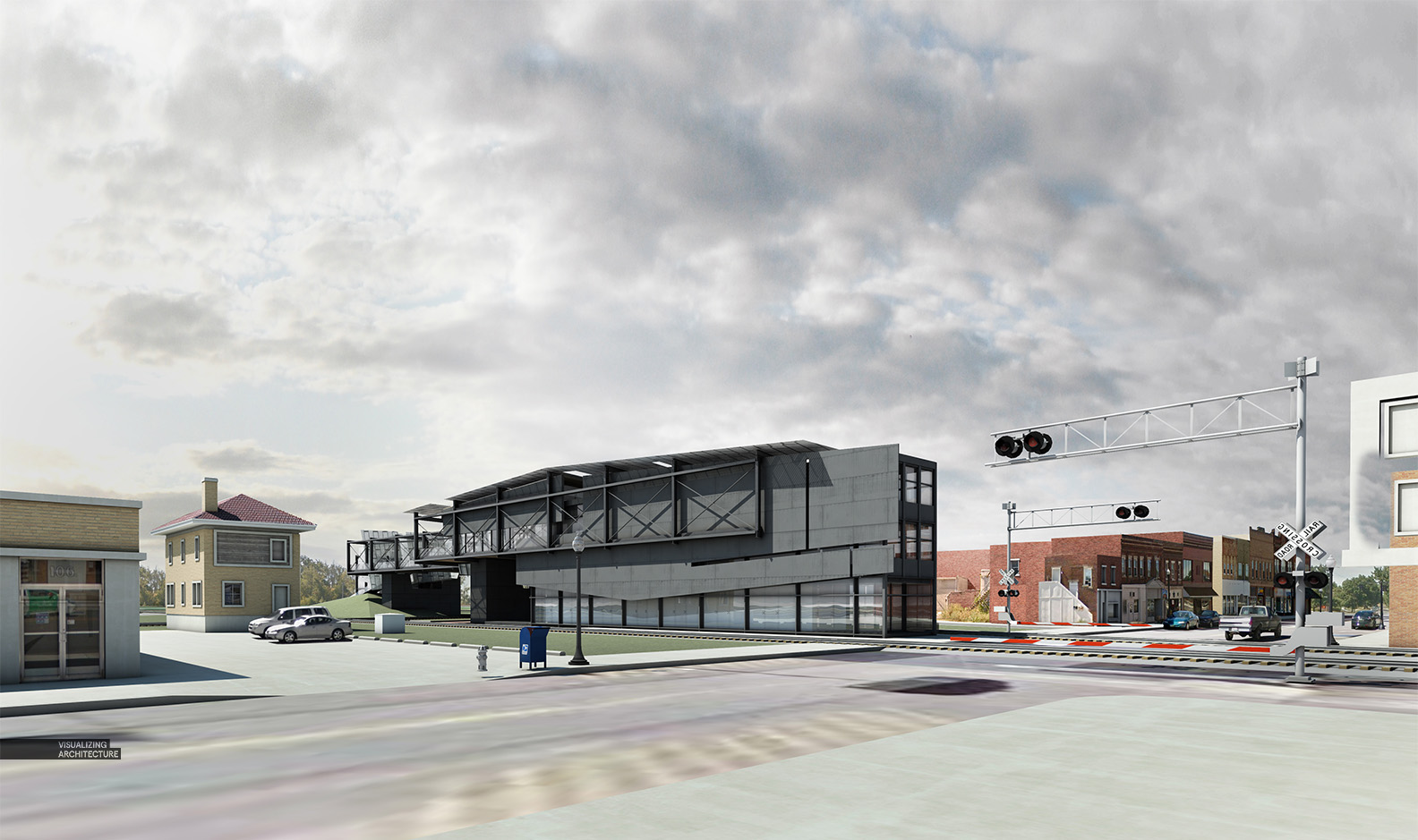
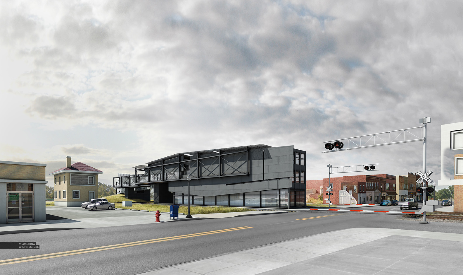
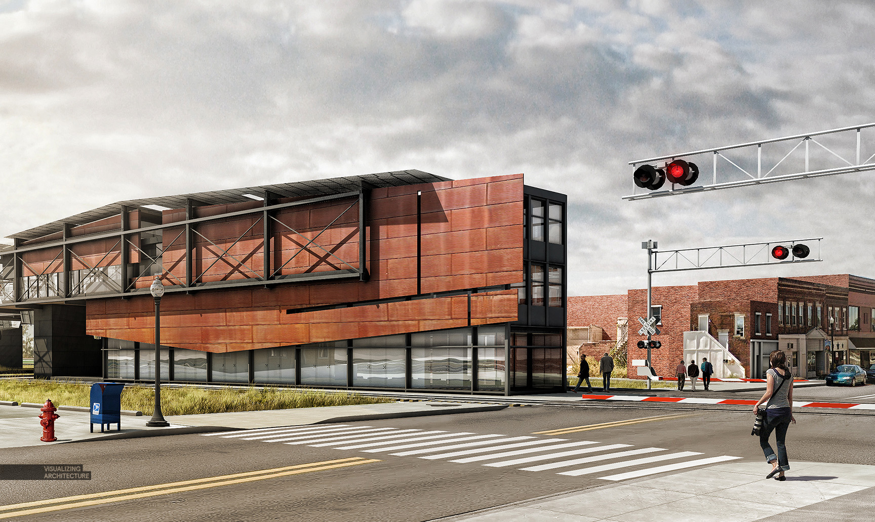
To start things off, I have continued development on the train museum design and wanted to generate an image that will allow me to study the new design within the main street context. As the design continues to evolve, I can re-insert new renderings into this Photoshop file to better visualize and understand the contextual relationships.
Below is a quick breakdown of the illustration.
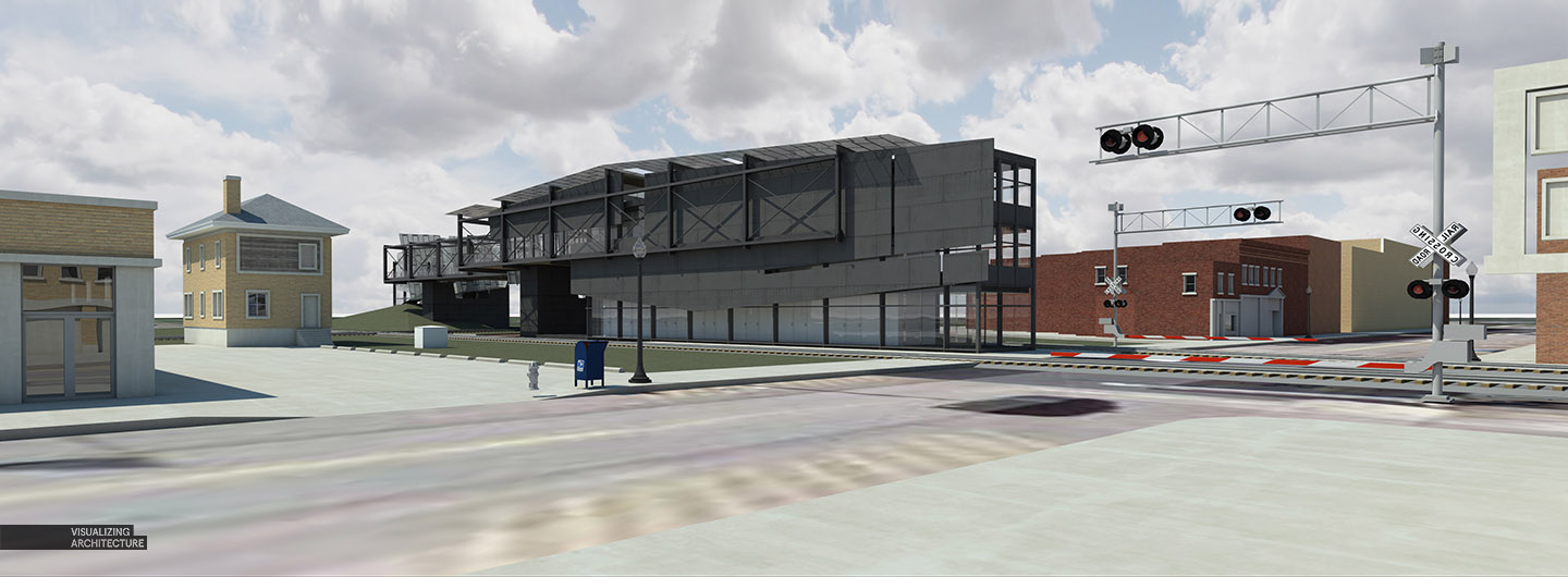
1. Base Renderings
Base Rendering out of V-Ray
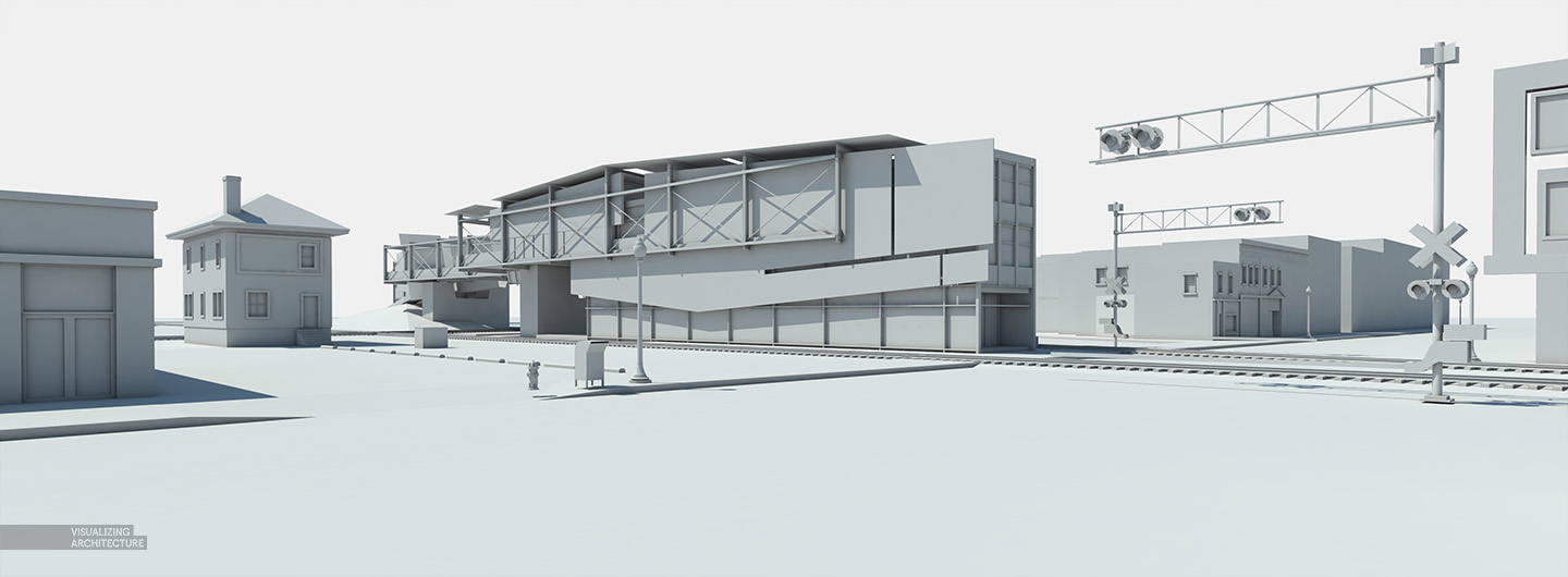
Clay Model Rendering out of V-Ray used to amp up highlights and shadows by setting the blend mode to “Overlay”. Also allows me to add shadows to Photoshopped textures.
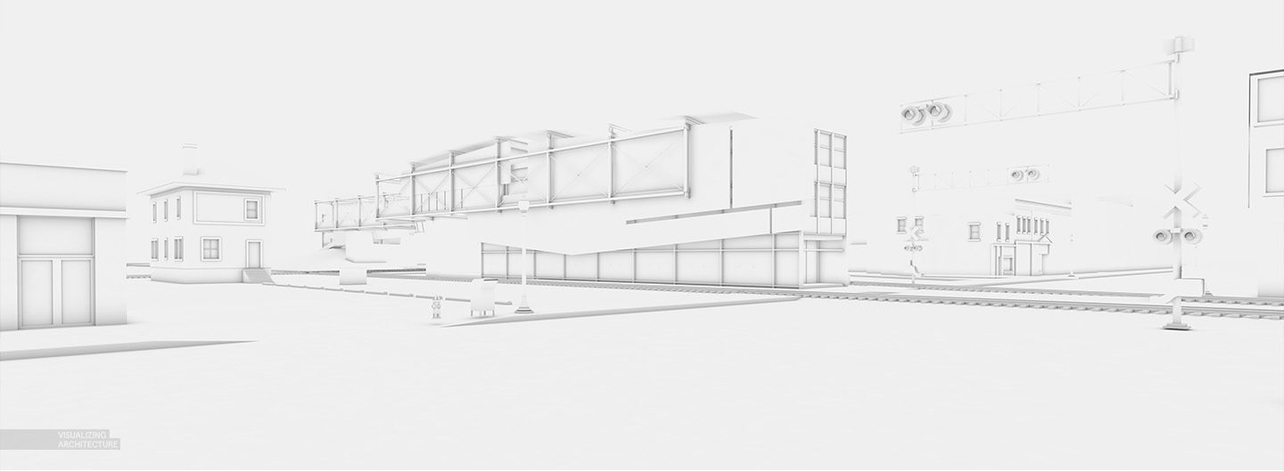
Ambient Occlusion Pass out of V-Ray. This pass allows me to increase detail in the base rendering by setting the layer blend mode to “Multiply”.
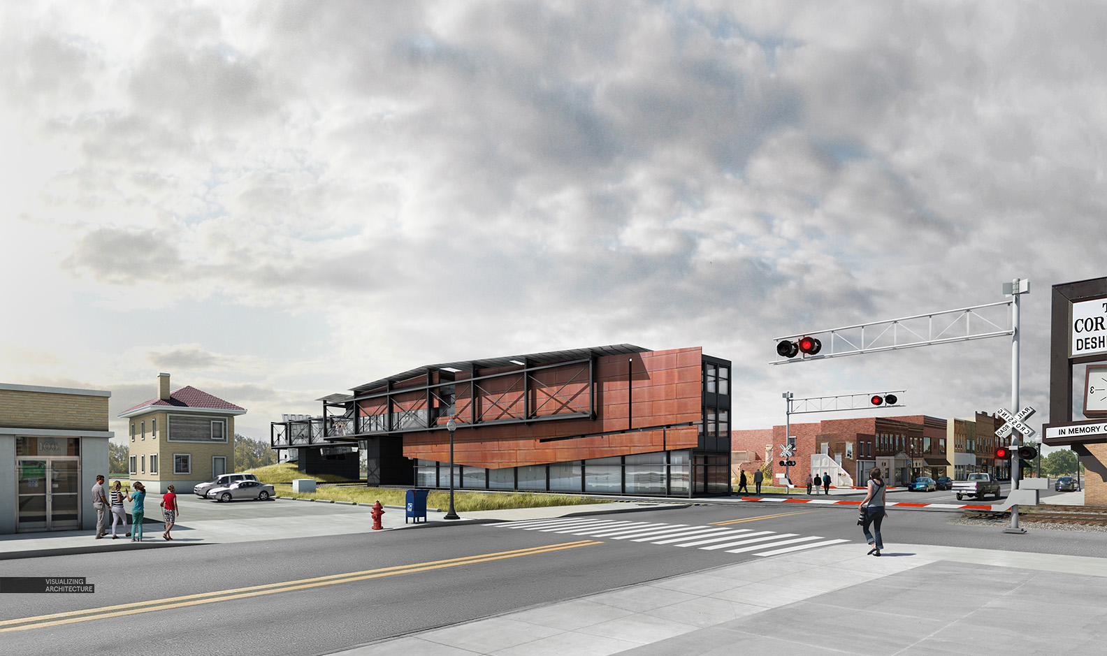
The base rendering after compiling all of the passes together. What I am looking for are nice highlights and shadows while still maintaining the detail in the really dark and light areas of the image.
2. Context
I used online imagery from certain street view maps to fill in the missing context. It would have taken me way too long to model all of this detail up so I opted to carefully stitch in this information. Since a lot of context buildings are in the distance, the low resolution images are fine to use.
3. Sky
I have said this many times, but the sky sets the tone of the image. I found a good one that works well with the mood and lighting of the image. It has a subtle texture but doesn’t overpower the composition or draw too much attention. I often spend a lot of time searching online for the right sky to use in my illustrations because they play such a big role in the final reading of the rendering. I may put together a more in-depth post on the subject later.
4. Ground Plane
There is not a lot of vegetation in the foreground so I spent a little extra time inserting road and sidewalk textures. I almost always insert these textures via Photoshop now since rendering these materials come out looking too “perfect”.
5. Final Details
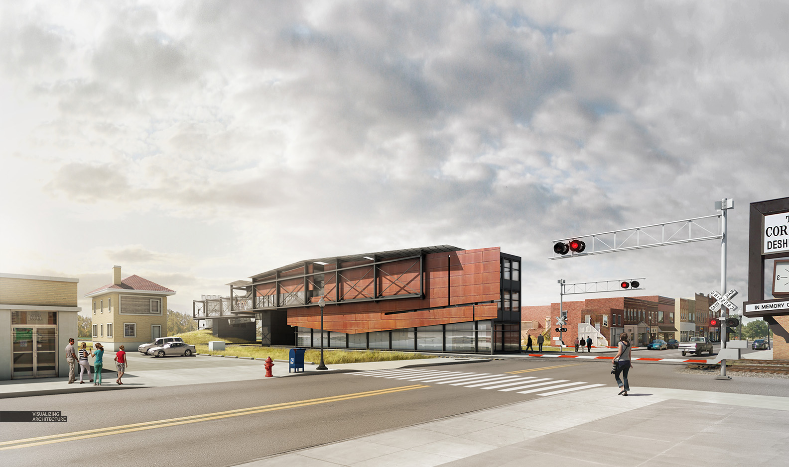
The last few steps included tweaking the facade material on my building design as well as dropping in entourage and lighting up the railroad crossing signals. This step of the illustration seems like it could go on forever as there is always an endless amount of things to tweak and adjust. However, a big part of this step is knowing when to stop and when you’re not getting a return on the time being invested.
6. Lighting
Here, I added some quick color overlays and some glare to the left. This step only took a few seconds but amps up the atmosphere of the image and brings in a little warmth.
7. HDR and Enhanced Detail
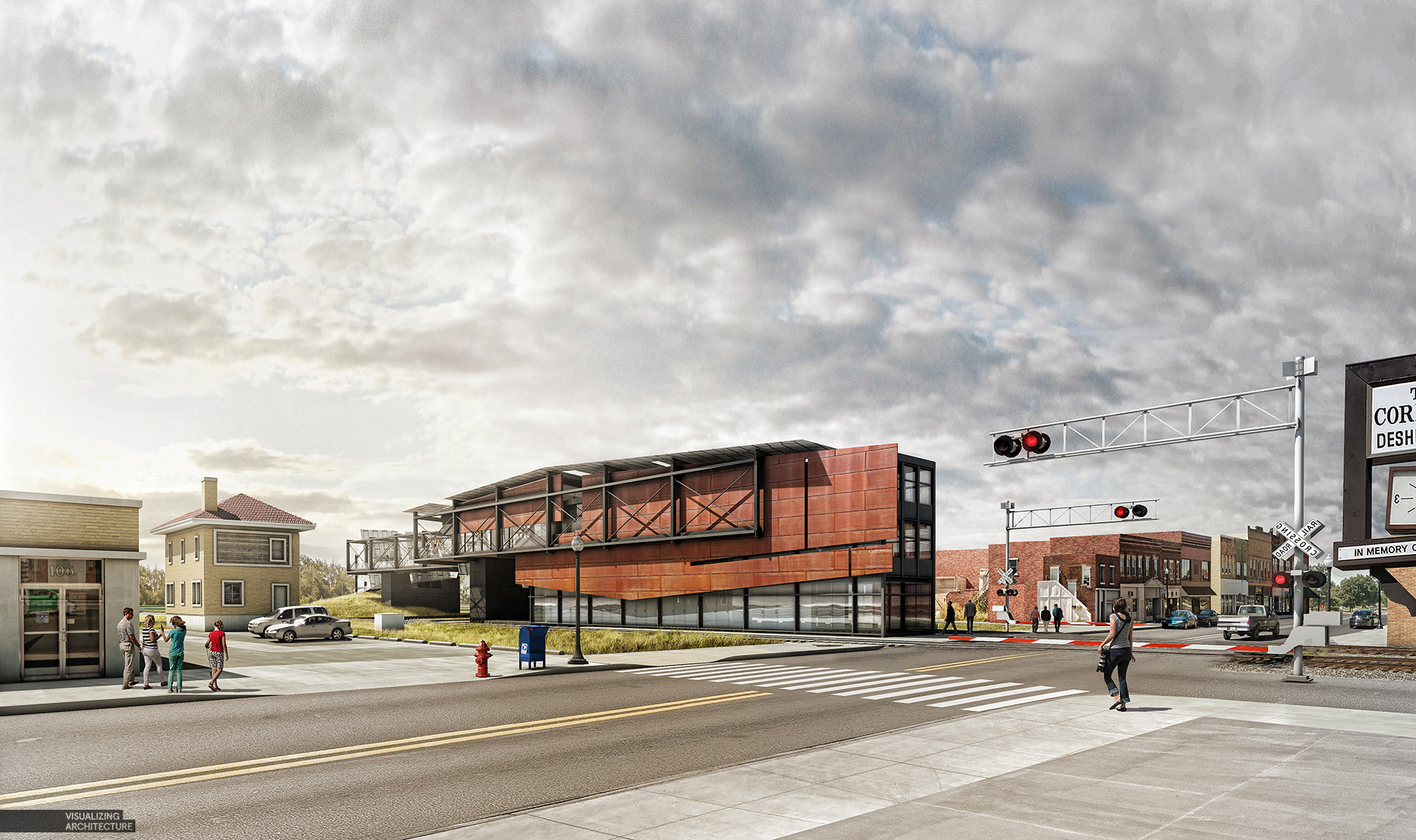
Finally, I like to jump into the Topaz Photoshop Plugin to help sharpen the image and give it a slight HDR effect.
Image Stats:
Resolution: 4500p x 2700p
Software: Modeled in Sketchup, rendered in Vray, and post processed in Photoshop
Equipment: Macbook Pro Retina


Thanks for your post Alex! Once again you achieved a great work! Sharing your skill with us amateurs is really great of you. Keep them coming!
Thanks Diego
I really enjoy the layering technique of multiple renders! I’ll have to tackle this workflow for a current project.
On another note, do you tweak v-ray’s settings for each render? Or do you have a preset render setting? Either one or the other, i’m sure your followers would enjoy your take and/or process tutorial!
I am starting to use presets. Especially for things like AO passes. I will be getting to vray settings this summer. Its pretty dry stuff to talk about but many people have been requesting it.
Hi Alex! will you share your vray settings in the future?
Nice result!
Do you recall how long the whole thing took you?
Rendering from V-Ray took less than an hour. Photoshop was probably about 4 hours.
V-ray settings, please.
Alex, always superb works! I have one question regarding your road texture. Did you separately render it or did you get some flat out road textures on the internet and distorted it in photoshop?
I found a good texture online. This one in particular came from a google street view image. Google street view is actually a great way to find road and side walk textures and I use it often.
Good to see you again, Alex!!
I’m your big fan:)
Thanks Chen
Hi Alex,
I think the most important effects you get in your image is the perfect balance between all elements and the atmosphere you can create.
In this image, for example, I would like to be inside… the picture tell us a story.
Another good work, Alex.
Thanks Umberto
He’s back. He came back. Phew. Was beginning to panic…….
How do you render your clay and AO passes?
I´m not sure but the clay would be a standard vray mat + lights. Probably as a override material. The AO is a vrayextratex render element where you place a vraydirt as texture. That is what I do in Max, but i´m not sure how vray for Sketchup works or if it´s a different workflow.
Alex, we all really apreciate you lose your time explaining your workflow. thanks a lot… your work is very inspiring.
Hi Alex. First of all I want to thank you for inspiring all of us with each of your ports.
I would like to know how do you put lights in road signals or streetlights. Thank you very much
I found a photo online of railroad crossing lights at night. I photo shopped those lights into this scene and added a little red glow
Thank you Alex!
Alex, always enjoy looking at the site for inspiration. I see you mentioned street view for textures. Have you been pinning locations of where you get your textures? I have used Google Earth Pro for similar purposes (cars mainly), but I had never thought to pin good locations…
I have mostly been using building textures specific to each site so I don’t have much need to save the locations. However, if I find a good road texture, I will save a screenshot to my texture library.
Hi Alex, I really enjoy your work. Can you share your camera and vray setting. Very inspiring!
Hey alex, just a quick question. I thought Clay renders and Ambient Occlusion was the same thing according to all of your past tutorials ? but now that you ditched Kerkytha and went for V-Ray, you started calling it “AO”, but now you used both in this one. I am confused a little.
Clay renderings and Ambient Occlusion are two different things. Clay renderings have dark and light faces and bounce light similar to a normal rendering but without textures. AO calculates shadow in corners , doesn’t take into account sunlight or artificial light, and is used to amplify detail. Kerkythea couldn’t create AO passes but Vray does. Before Vray, I would manipulate Kerkythea clay renderings to get something similar to an AO pass. The AO options were a big reason why I moved to VRay.
Oh yeah, I get it now. The way you pay attention to all the details and know how to bring out the best in each render is quite inspiring. Thanks a lot for the clarification.
I had read your post to improve my skill, here comes a problem with the clay mode rendering and AO rendering, how you set your blend mode in vray?
Hi Alex,
I’ve been following your work and as always, your renderings and style is absolutely great! Is there a way you can can post a video on how you added those street elements in Photoshop and how it all seems to blend so well together? I always have a hard time “stitching” things together to create a seamless look.
Thanks, Alex!!
You keep blowing my mind.
Hi Alex. Glad that you are back again. Thanks for your tutorials
how you make the clay render in vray ?
hai Moustafa ,
clay renders in vray are made by clicking the override material option in vray , you can enable it by , going to ,
vray output (an O button in vray toolbar) ->global switches ->override material.
Hello Alex, thanks for your post, it’s a very nice job. I was wondering how you managed the subtle “wavy” distortion in your glass reflections ? The effect is very nice. Thanks again for sharing your tips
Hi Alex
Great job
wanted to ask you about what you do after inserting your people in renders, They look great and in harmony with color of your render..
Hei Alex, can you please tell me the steps how you rendered the road? did you add context in photoshop? Moreover, did you add all contexts via Photoshop?
Hi Alex, your work is very inspiring 🙂
is there v-ray for mac ?