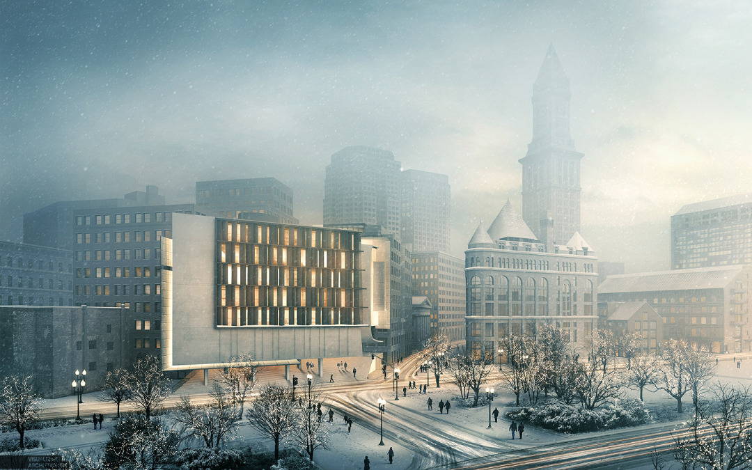
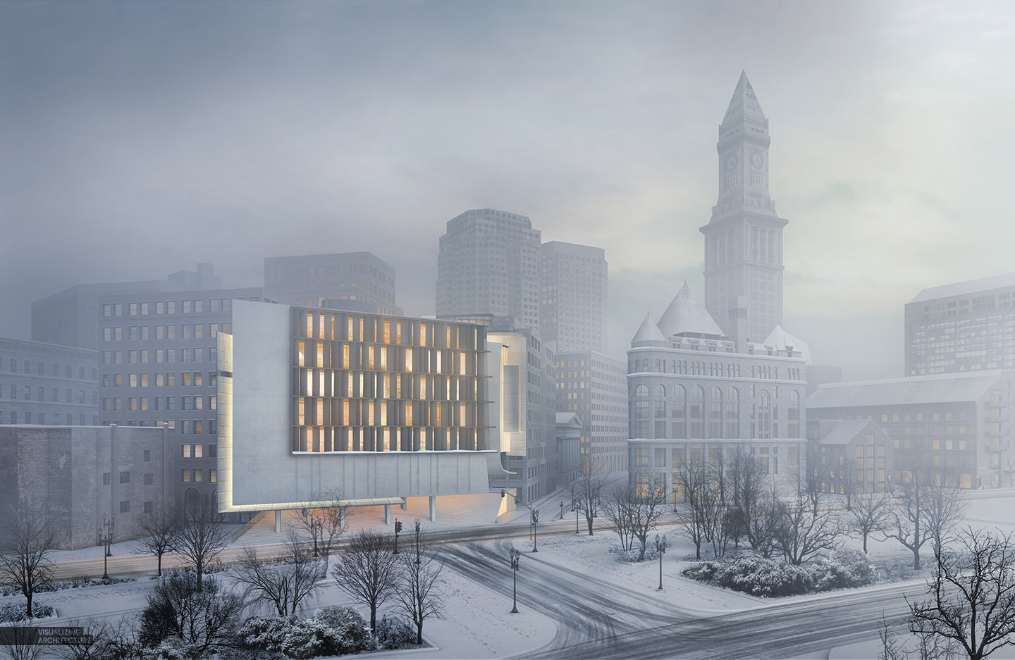
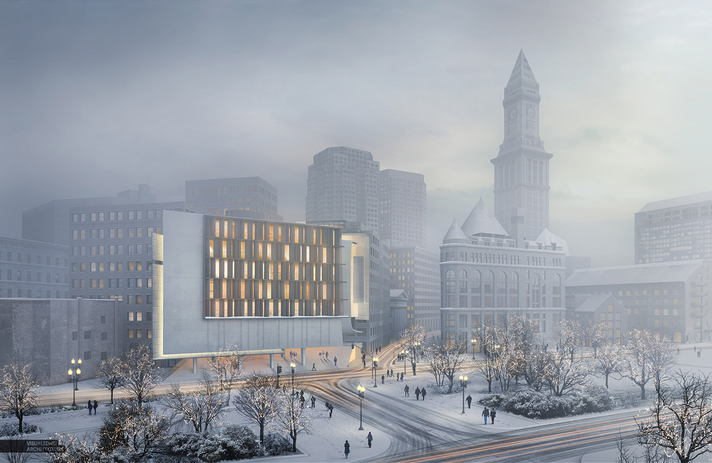
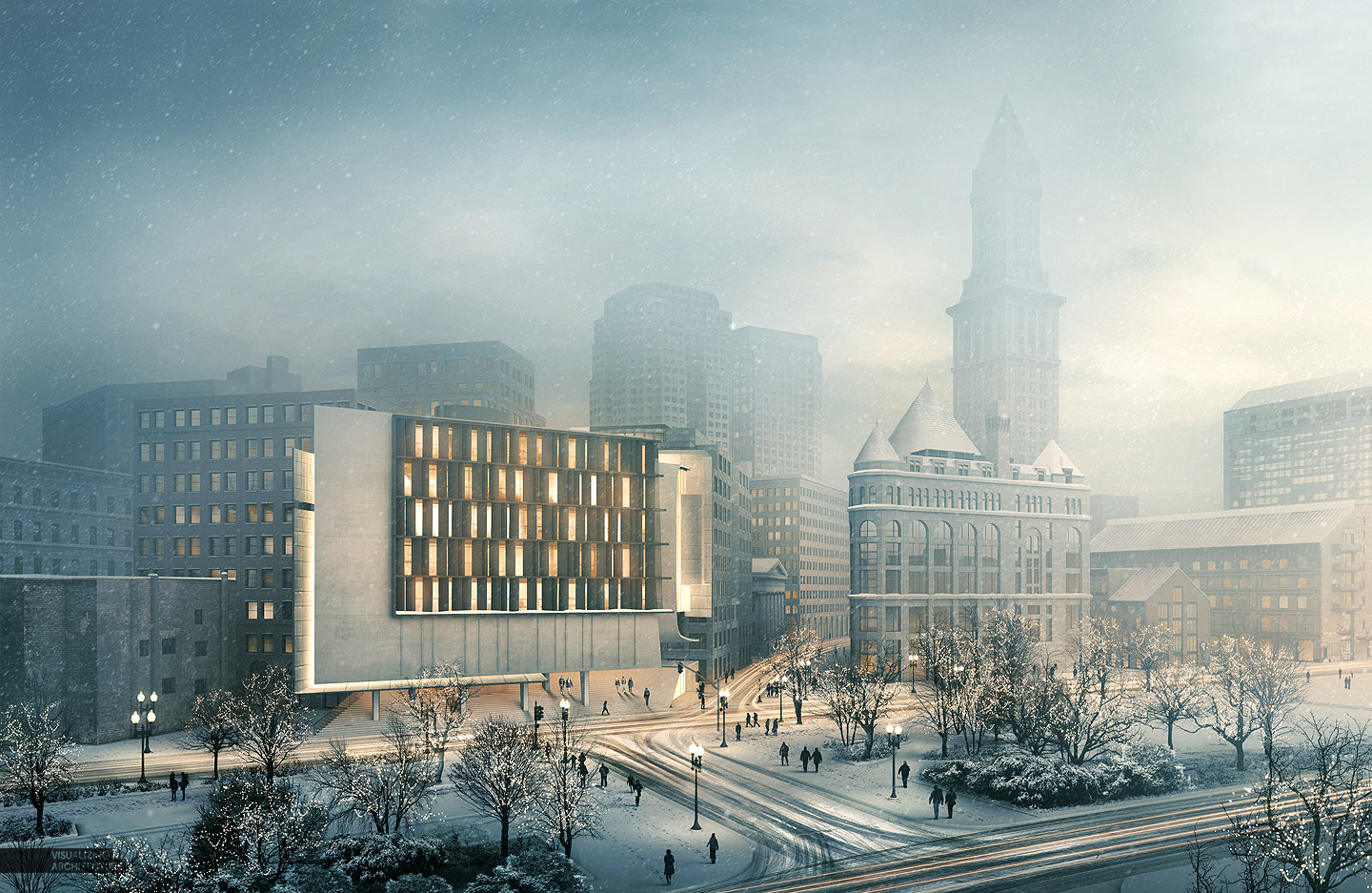
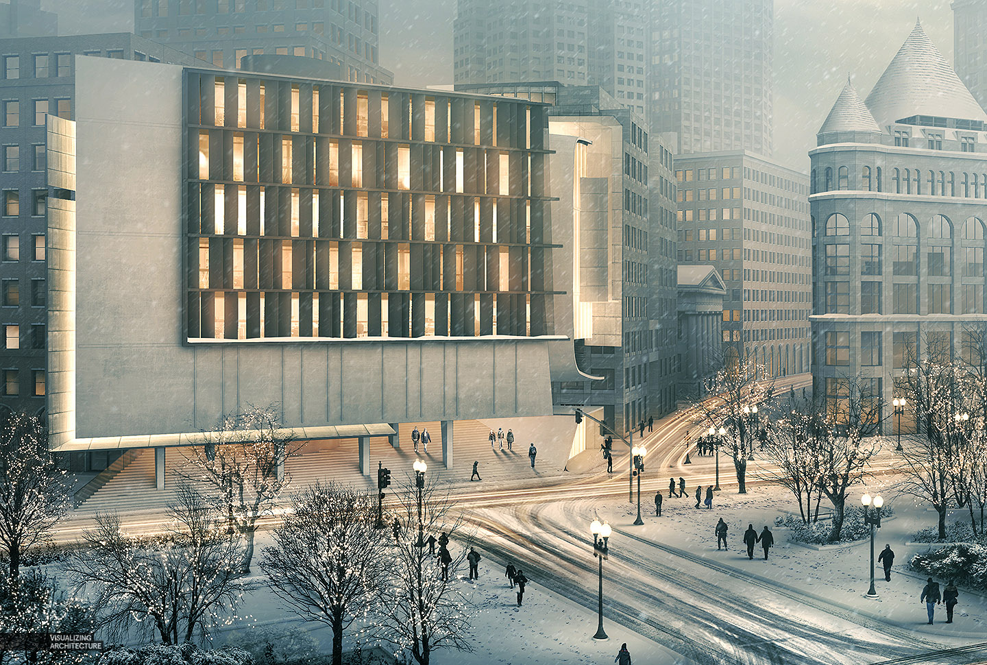
For this winter special #4, it was all about the lighting and atmosphere. Going into this, I knew the illustration was going to be heavily post processed so I spent little time preparing the 3d model and just kicked out a quick V-ray base rendering with no lights. This has been my most ambitious winter scene yet as compared to the last three seen here because of the detail and view angle. The transformation from the base rendering to the final illustration was extreme, which is outlined below.
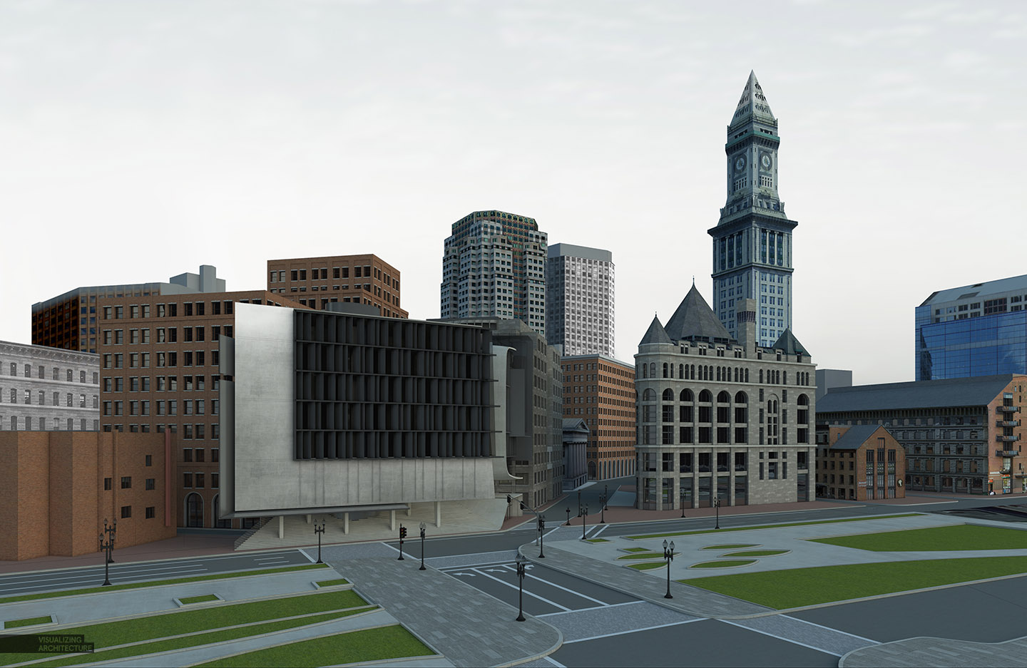
1. Base Rendering
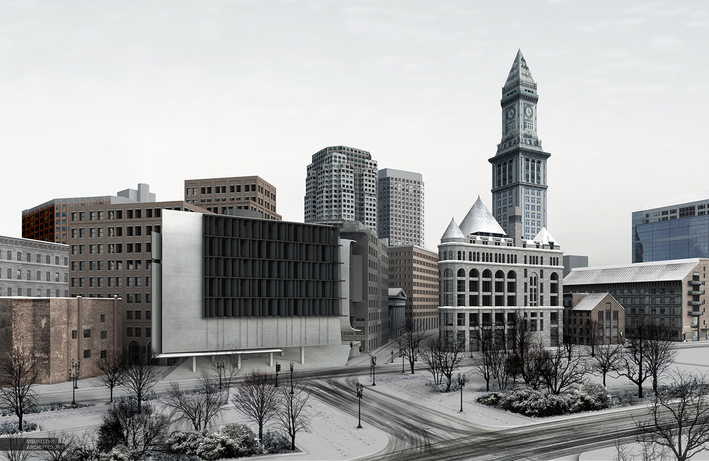
The base rendering was pretty brutal. However, I was just looking for a rendering with soft shadows and some basic texture information.
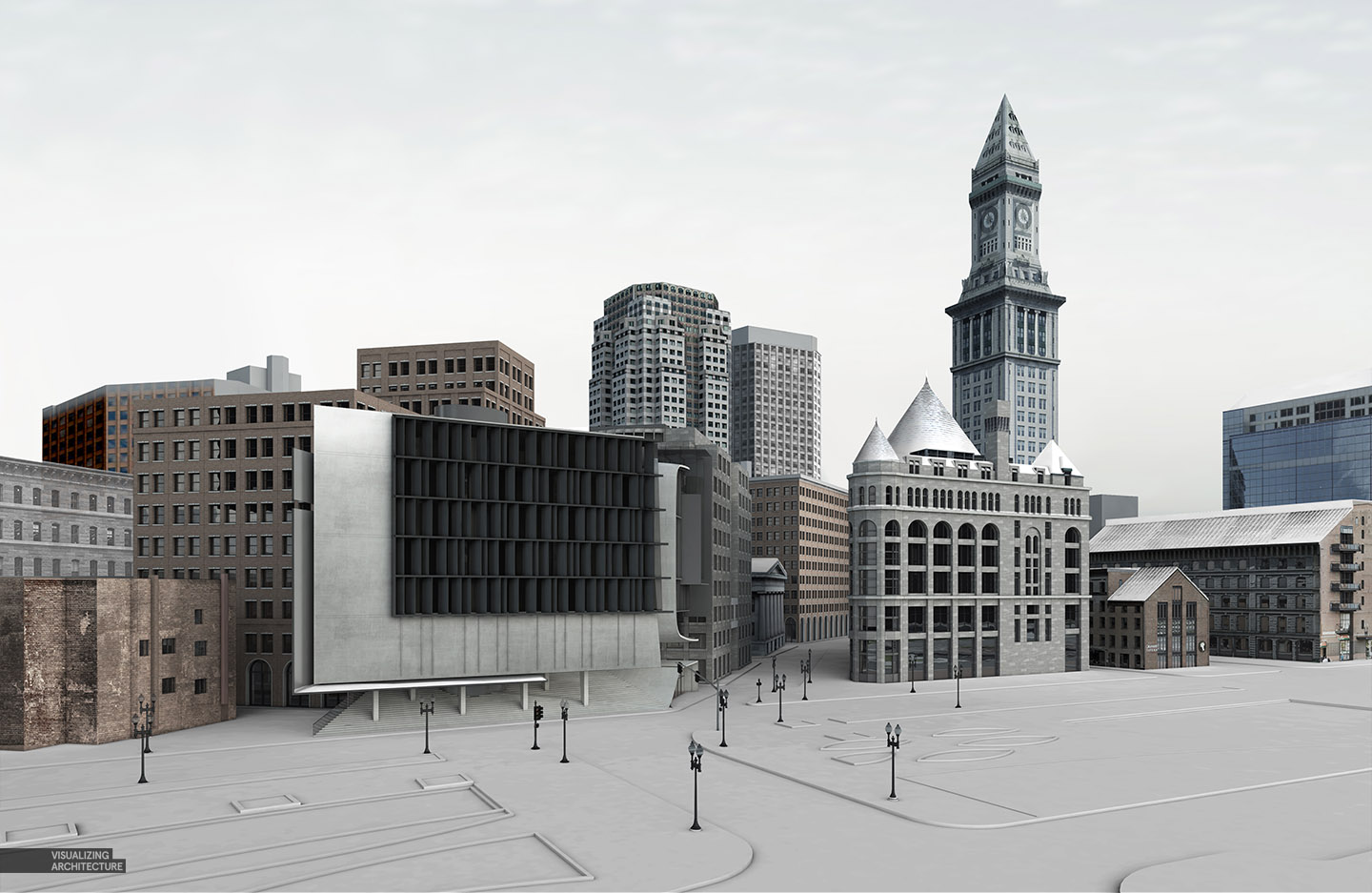
2. Clay Rendering
To get the image closer to a winter scene, I desaturated the colors and added a clay rendering to the ground plane. This scene will have snow on the ground so using a clay rendering acts as a good base to Photoshop snowy textures on top of. A clay rendering is the same as a typical rendering except that all materials in the scene are replaced by a simple matte gray texture. I have a tutorial explaining how to create a clay rendering using Kerkythea, seen HERE.
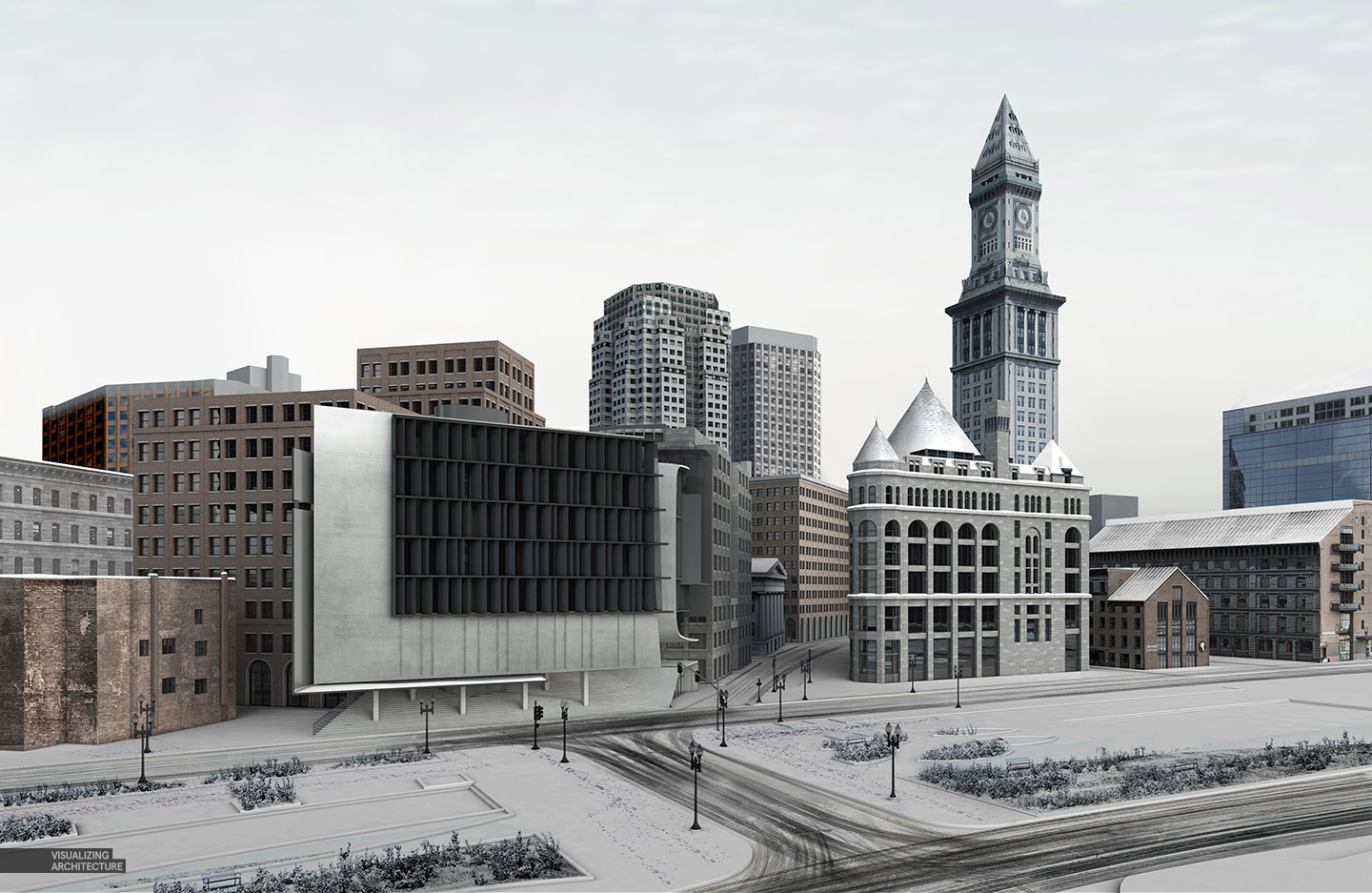
3. Texturing the Ground Plane
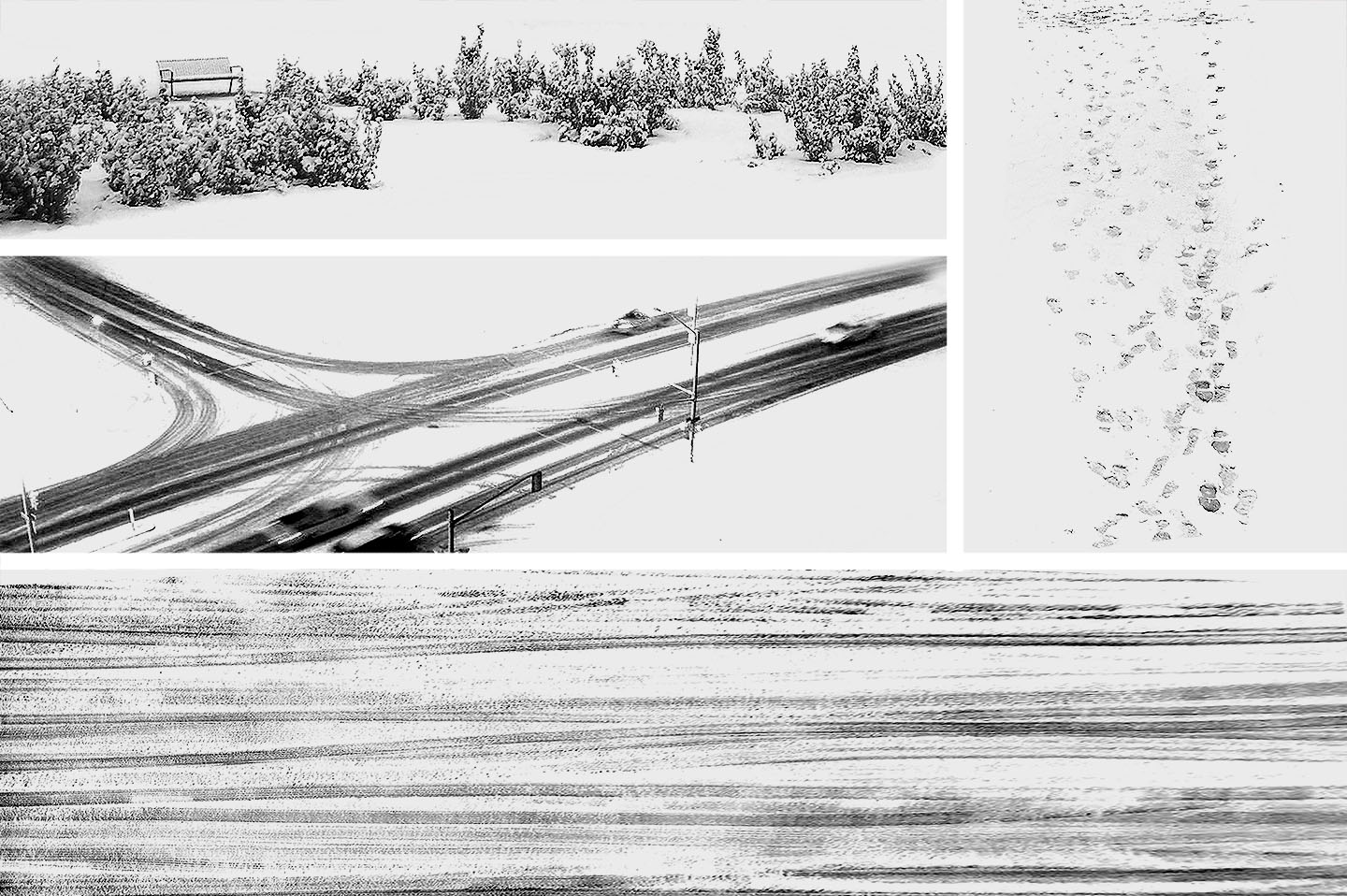
As discussed in my last post, it’s all about the textures and that is what I focused on for this step. I combed through the internet looking for textures of tire tracks, foot prints in snow, and snow covered plants. I then slowly layered them on top of the clay rendered ground plane. Because they are black and white snow scenes, I didn’t need to cut anything out. I only needed the dark part of the textures so I just set the layer blend modes to “Multiply”.
4. Trees
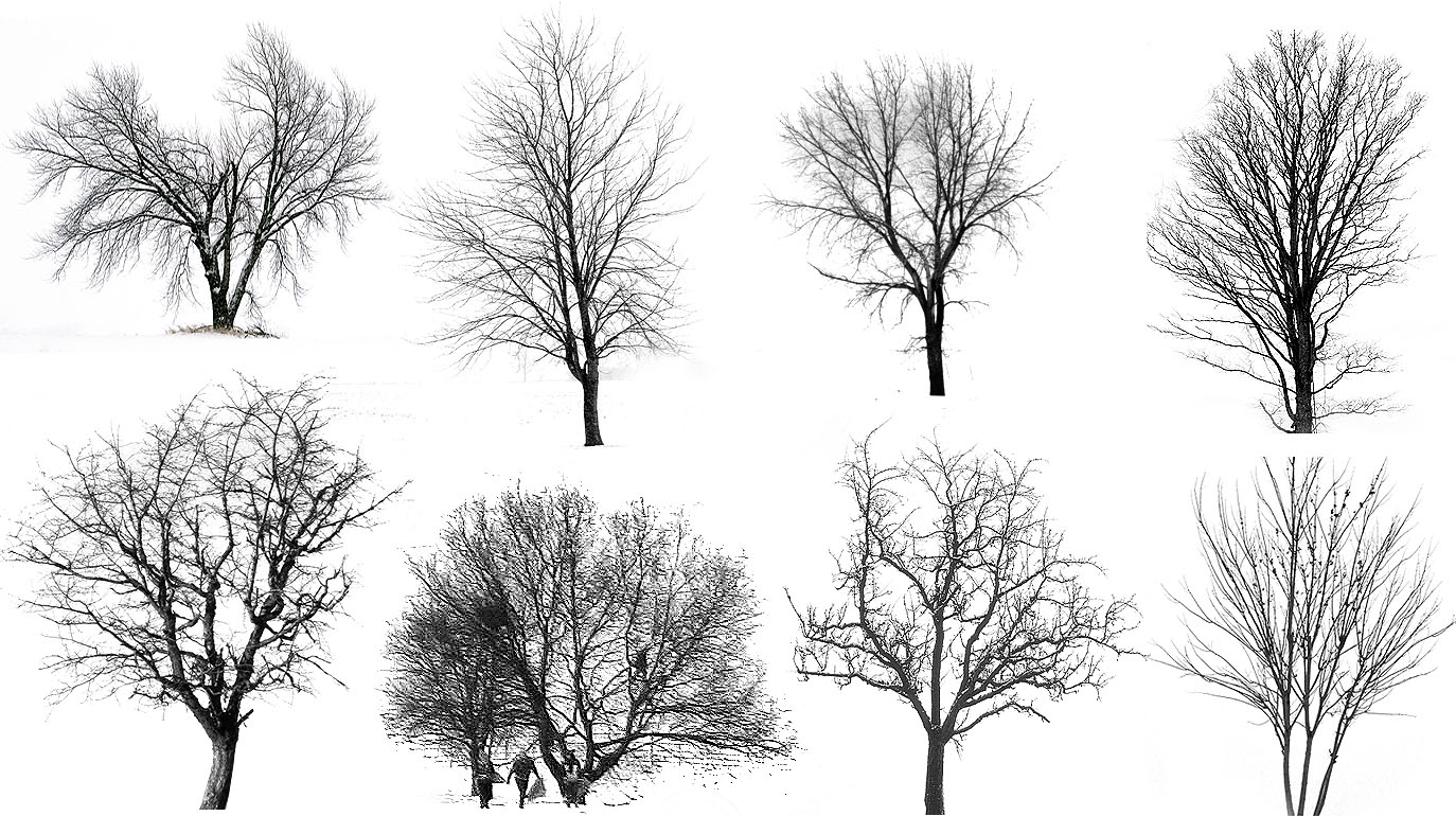
Oddly enough, this step went fast. It is very easy to find winter trees with snowy white backgrounds. As with the above step, no cutting was needed. I only need the dark parts of the tree images so I set the layer blend mode to “Multiply” which gave me trees without the backgrounds. Nailed it.
5. Fog
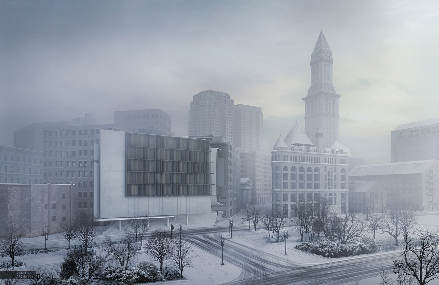
This step is where the image makes a huge mood shift. The more I create visualization, the more I realize the power of fog/haze/atmosphere. It’s something that has taken lots of practice and not the easiest thing to explain in a tutorial because everything is so subtle. I have attempted a tutorial in the past found HERE though I am probably due for an update soon. I also added a blue color overlay over the entire image.
6. Building Lights
Lighting up the architecture provided an opportunity to bring the focus of the image to my design. I therefore lit my design much brighter than the surrounding context bringing hierarchy and drama to the illustration. A tutorial for manually lighting a building can be found here.
7. Ground Plane Lights and Details
I needed to activate the ground plane so I inserted some people, car light streaks, and because this is the winter special, some tree lights. I was careful not to overdo it because I didn’t want to draw too much attention away from the architecture.
8. Color Editing
The illustration was coming off too gray for my taste so I tweaked the colors to be more saturated and blue. I also added a little snow falling just to bring home the winter scene feel.


Gorgeous.
And yes, you totally have to create a new fog post, because that fog looks perfect and change the whole render.
Now to just move some place that it snows…….
Great as always, base render is with hrdi setup?
Correct, so that I could get some soft shadows
Mr. Alex, I’m a really big fan of yours. You got me into arch viz. Do you by any chance know about the vray Material IDs? They’re these selection masks you can assign to materials. I think they’d go great with your workflow of painting lights and textures. Anyway, really great work. Always inspiring!
Yes, we use them all the time in the office and for images like this. They are especially helpful for making easy selections of all the glass in the scene for painting in light as you mentioned.
Very very nice!
I don’t know.. I think the rendering before the final colour saturation and tweaks looks better. More true to winter, more calm. The final one is nice too, but just seems overly punchy.
I agree, one is more calm and the other more aggressive. I debated for a while about the color editing but ultimately went the aggressive route.
Alex, I want to know you modeled the whole in Sketchup or just the main building. From the very first rendering, it seems you rendered the whole scene.
thank you
All of the context was modeled in Sketchup. In some cases, I overlayed some textures of buildings to add more detail.
I just couldn’t resist and needed to ask how you did the Christmas lights on the trees? It makes the atmosphere really nice.
Really easy actually. I found an image of lights on a tree with a really dark background. Then I set the layer to “Screen” to keep the lights and remove the background. It took just a few minutes to do.
amazing, but do you think you could make video tutorials as before??
hello,alex,great work!BUT i am wondering what changes did you make from step 7 to 8 color edit,can you tell me more details cause i really love this effect!!
That step happened in a Photoshop plugin that I use often called Topaz Adjust. They have tools that make color adjustments easier to control and refine then through photoshop itself.
thanks for your apply,i have downloaded the plugin and it’s amazing the it has lots of wonderful effects but i did not make the same effect just like youXD can you make a tutorial of this effect and of course the light streak ,i love it !
Incredibly beautiful. I have always struggled to create convincing car light streaks. What method did you use to achieve this?
I went online and found some images of car light streaks. The secret is to find images with really dark backgrounds so that you can set the layer blend mode to Screen which will remove the dark background. I then stretch and morph the image to work with my scene.
Is Kerkythea still being used? I teach in academia and VRAY seems to be the weapon of choice for all the students. Whenever I mention Kerkythea, I get blank stares as if I’m speaking a foreign language from another dimension.
I downloaded it years ago, but the materials library was suspect at best. Have things improved?
Love the blog btw.
PS… Does it work with Rhino?
I have recently switched to V-Ray. Kerkythea is great because it is free and easily accessible to anyone. However, V-ray works inside of Sketchup smoothing out the workflow and has a few other features that I need that kerkythea doesn’t offer. Kerkythea is a good “getting started” program that has all of the basic elements of a render engine. V-ray is more capable but also costs money.
Great!!!
happy holidays 🙂
Hi Alex, big fan great blog! I just wanted to know how you insert the building surroundings into the model without slowing it down too much! Can this be done in post processing?
The surrounding context is very light massing. Most of the buildings in the distance just uses images as textures. The context in the foreground shows the windows and doors modeled to get accurate shadows and detail. I use lots of groups and components which helps with the speed. You can absolutely add this in post processing as well.
Hi Alex! Once again you’ve produced a rendering that I want to hang in my living room. I just had a few questions about your modeling process. I feel that creating site context (as far as surrounding buildings go) through modeling rather than post-processing gives a huge edge to renders in making them seem more realistic, but sometimes finding all the necessary info can be tricky! Any tips on how to go about taking/finding measurements to accurately model your surrounding buildings? Thanks so much! I’m always aspiring to make my renders as beautiful as yours.
For Boston, there is an entire massing model of the city available for download. This doesn’t show windows or doors but does give heights and basic info. In the past, I have traced aerial maps for foot prints, then extruded based on the shadows of the aerial map. If you can match the sun angle in sketchup to that of the aerial map, you can get heights close by matching the shadows. I also use google street view a lot to count bricks, windows, floor heights, etc. I essentially use many methods to figure out this info.
this shows only your genius 😉 I love your work Alex, really great !
thanks for the reply! I’ve never even thought of the shadow trick before. As far as building footprints, it’s a bit of a lengthy process but I recently started using the Elk plugin for grasshopper that uses free downloadable OSM data from the ‘open street map’ project- you can choose the area you want and it will generate a file you can use in Elk to show 2D site context.
Would you be willing to do tutorial on car light streaks? I’ve always admired how much that effect enhances an image. Thanks.
This… is amazing! Awesome work!
Hi Alex,
how do you create the snow effect on the roof?
Is it the same procedure than the ground (clay render)?
Thanks and Marry Christmas!
In this case, I found some images online of snowy roofs and photoshopped them in. Because they were so far away, I could get away with this method.
Hi Alex!
I love your work! I feel like one of the reasons why your renders look so amazing is because of the modelled details of the context. Are the surrounding buildings modelled with as much detail as they appear to have in the base render? Are there any tips you have to quickly model these?
Thanks!
I started with a basic model found online of the massing. Then with the buildings next to my design, I modeled details like windows and facade texture. For the stuff in the distance, I found images of the entire buildings and pasted it on the massing. There were also a few buildings in Google warehouse that I was able to utilize. So to answer your question, it was several different methods all in an attempt to minimize time and energy of developing the context.
I enjoy any step of your workflow…but how much do you spend on average on photoshop?
It ranges from image to image. For this shot, it was probably 8 to 10 hours of Photoshop and looking for images online. About half of the 10 hours is spent looking for images and textures online which is why I am spending more and more time building up my own library to minimize this in the future.
The research of images and textures is really important but often daunting for me…however if you tell that 5 hours are spent for it, you give me courage. Naturally I’m not a master of Ps….I manage fairly but my time greatly increases. Anyway thanks for your sharing 🙂
thousands of students looking forward to see your work, well done!
hi alex,
i admire your work especially the cleverness of your workflow!
your artwork above is inspiring me again..
i noticed that in almost every visualization the detailed background is of great importance to you and the quality of the final outcome. i have already seen a lot of small individual tutorials about it in your blog but what i am interested in is a kind of clever workflow to do the whole thing. What to model in detail what to model in rough volumes and just texture it ( and especially how).. what is clever to render and what is better to do in postproduction.. well all in all a kind of good workflow or a fast one.. because what i noticed is its always about the SPEED..
So i kindly ask you if its possible for you to make a tutorial about it..
thank you very much and hope to see a lot of future post in your blog
bro how to make car light streaks? can u help me? and do u have any tutorial for it?
Great Job! Wonderful Work! Thank you very much. In a different matter Can I also ask, for your website do you use WordPress? If so what Theme are you useing?
hi im new to this, just wondering is there a post on how to do step 3? applying ground texture
Hey Alex, what programs did you use for this?
hi Alex
Can I ask about you software ? are you working with 3ds max or sketchup ?
thank you.
Great Job! Wonderful Work! Thank you very much
Hi Alex, I am always been wondering how did you detailed the windows of your building? In the first rendering I saw it’s just a plain black box inside each windows, then you apply some brushes to light it up – but suddenly there are also details (furniture, activities inside) appeared there. Are they just some JPEGs online you put there and set is to a certain blending mode? Thanks before!
Hi! I love your renders! You’re an artist!
One question about the model. Do you import the background buildings or do you model them?
If you need professional 3d architectural rendering design service, explore it …! – 3dpraxisstudio.com
Hi. We are just entering our 4th year on the road and I think I agree with just about everything above. It’s always changing, we find new, better ways, or what we want from this lifestyle changes, so for a few months we’ll be regular backpackers, then we’ll chill and rest for a while in a city apartment rental. Whatever, we love this life. Your picture of that little stove on the Everest trail brought back happy memories, we took the kids up there a few months ago, great times. Cheers!