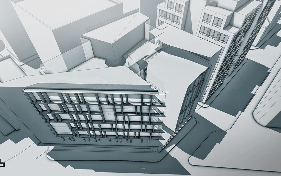
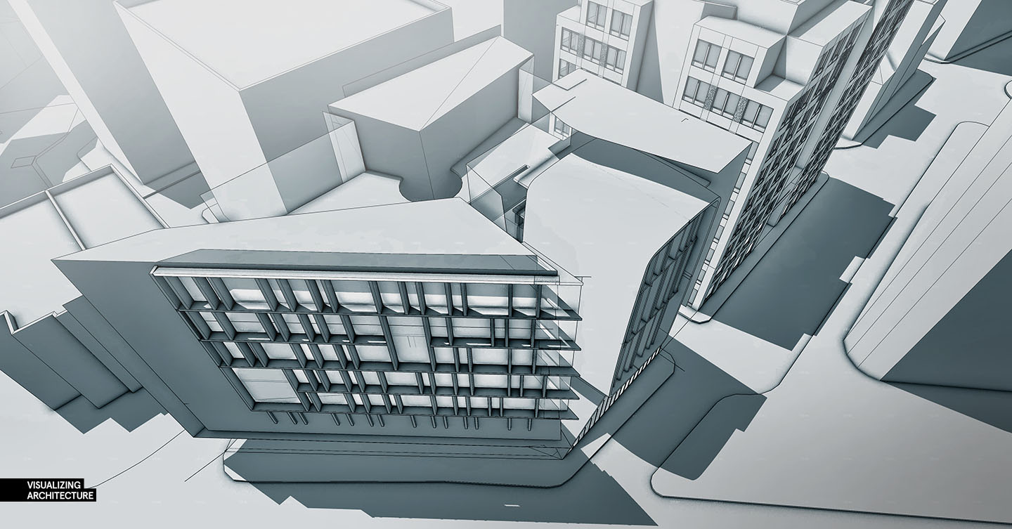
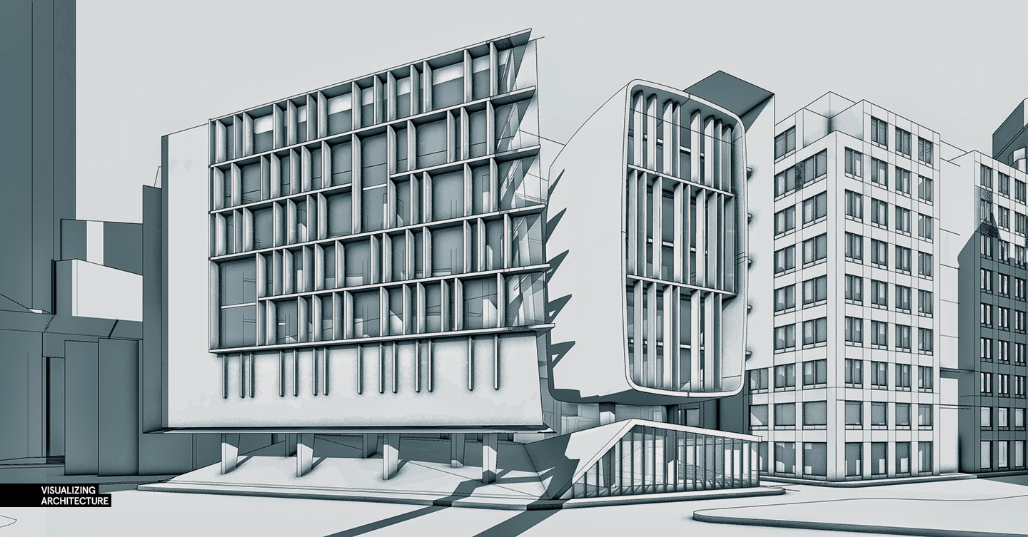
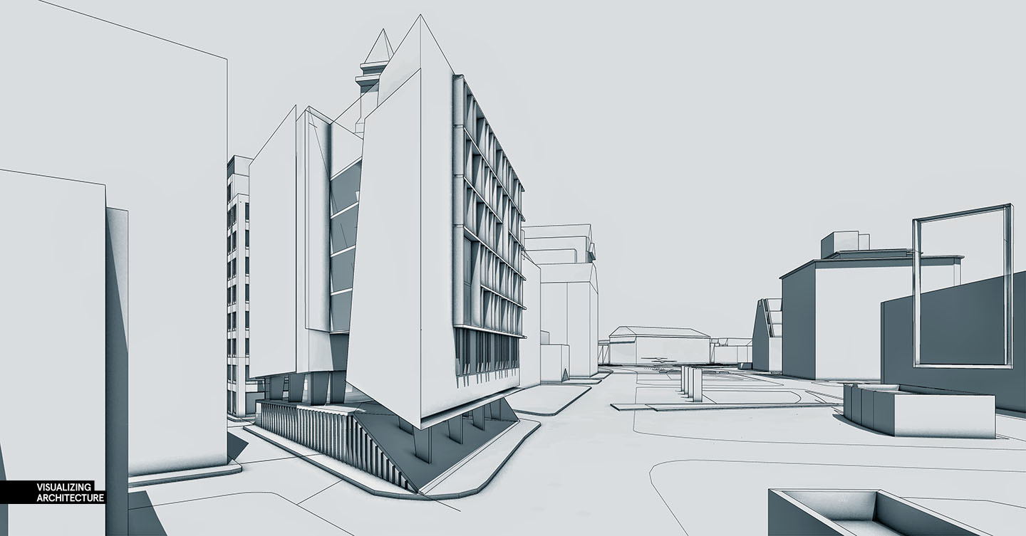
These past two weeks have been crazy and if any of you follow my Facebook page, you know what I am talking about. However, with all of the change, I figured it would also be a good time to start a new project as well. The wharf design was a fun project to conceptualize but I am starting to crave full-on architecture. I have started a new project/sketchup model that will be the focus of the next several posts. This model will be used to study interior visualization, something I haven’t covered much on this site, as well as the other typical exterior views, plans, sections, and aerials. I may also jump into some abstract and diagramatic illustrations.
Below are some images of the new design. The model is still in its early stages with several iterations to come. I am recycling some of the surrounding context massing of the wharf model for the context of this new design. The site is only a few blocks from the boston long wharf over a parking lot next to the green way. This seemed like an ideal place to test out a few ideas that I couldn’t do with the wharf project. This location will set me up for several environmental conditions since one side of the building faces a dense urban fabric and the other side faces a park. Overall, this new model will be very flexible when it comes to visualization possibilities.
I hope to get some new tutorials going soon. There are a lot of areas of the arch viz that I haven’t covered that I really want to get too. I expect this new model to be a good gateway into some of those topics. Stay tuned.


Very nice building design. Is this your creation? Can you give us more details în terms of architecture? Also, it will be great to hold a contest on such a project and let us make some renders. 😀
I know the visualizations will prove to be mesmerizing as always, but I hope you can also take a little time and explain some of the thought behind such an intriguing piece of architecture!
Totally agree with that, not only he is good at visualizations but his projects are awesome too. Maybe do a design memory showing off step by step how he aproached that design and why he took those decisions
I love all your work and you are one of the reasons I aspire to be a visualizer! I do have one question, as I am struggling for projects to show my work. Are your projects all fictional in the sense that you design the building purely as a fun project for yourself to show off certain techniques? or are these real projects you have done visualizing work with? Thanks Alex, Keep up the work!
Many of the earlier projects were from school, however, this project and the wharf were fictional and yes these are designed purely for fun to allow myself to experiment with different techniques. I don’t post client projects because many times that work involves sensitive information and its easier if I just focus on my own work for the site.
i agreed with Alex, because some of the real project that has been done contains several sensitive information that could not been expose to public yet until the project finish. here alex check out my works too. i need your comment. thanks ya!
Nice model. Nice touch with the high AO pass. Do you have any tips on clay render settings?
The base reminds me of the new Ryerson University Student Learning Centre
@Radustanescuarg, Chris, Gual,
I hope to reveal more about the design as develop diagrams and illustrations. Since this is a fictional project, I am coming up with the program and ideas on the fly. However, there is an overall concept and reasoning for the form that I will describe in the next few posts. It is still being developed as we speak.
awesome, I cannot express myself enough to show how much I admire you and your work!
Have you ever had a error in kerkythea that says along the lines that the model is to complex. I am trying to do a clay render and when building the meshes the error will come up. Any help? Thank you.
Nice! Looking forward to see more 🙂
How to get that effect on pictures?
Is an instrument for the whole picture? or handle every detail (shadow / line / …)
I like that black-white pictures.
Alex do you have some kind of open discussion so that we can share the knowledge about techniques of visualising using different media type?
the little shadow around the corner of your skp model,can u tell me how do u make it? from the original skp function or with other plug-ins? many THX~~
Very nice model! I am always having problems in 3D model making and layer management. May you give us more tutorials on 3D model making? Or the tricks of modelling efficiently?
Very nice model! Looking forward to see more
you very well play with the lines and make creative things which make pleasing ,.,.,.,.,.,.,and every line make seance in the work ,i love your way of thinking
It is very nice that you share this with us.
Very helpful advice in this particular post! It’s the little changes that make the largest changes. Thanks for sharing!