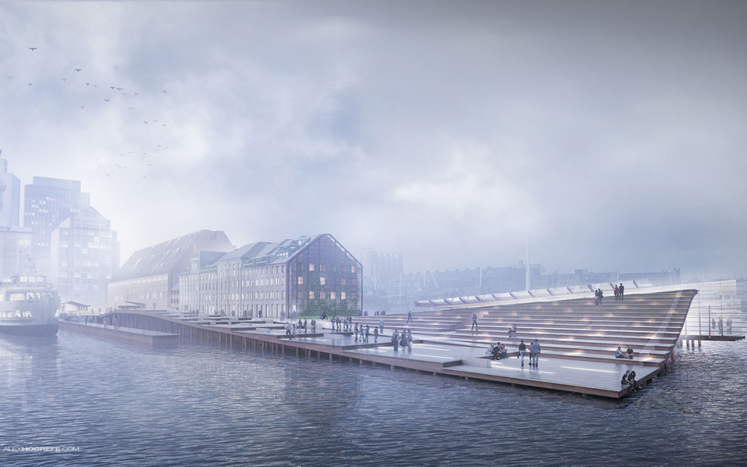
This was a fun image to work on and the breakdown is relatively straight forward. The big poetic moves such as fog and coloring come towards the end which is typically the case with images like this. There was a lot of prep in Photoshop such as refining textures, lighting, and adding entourage. But once those elements were in, some serious experimenting began to generate the final mood of the image. I have continued to tweak the image from the last post, focusing mostly on color. Because of the way this image was set up, the image is very flexible and could easily be manipulated into a dusk shot or even a night shot. However, for this breakdown, I will stay with the morning shot.
1. Composition
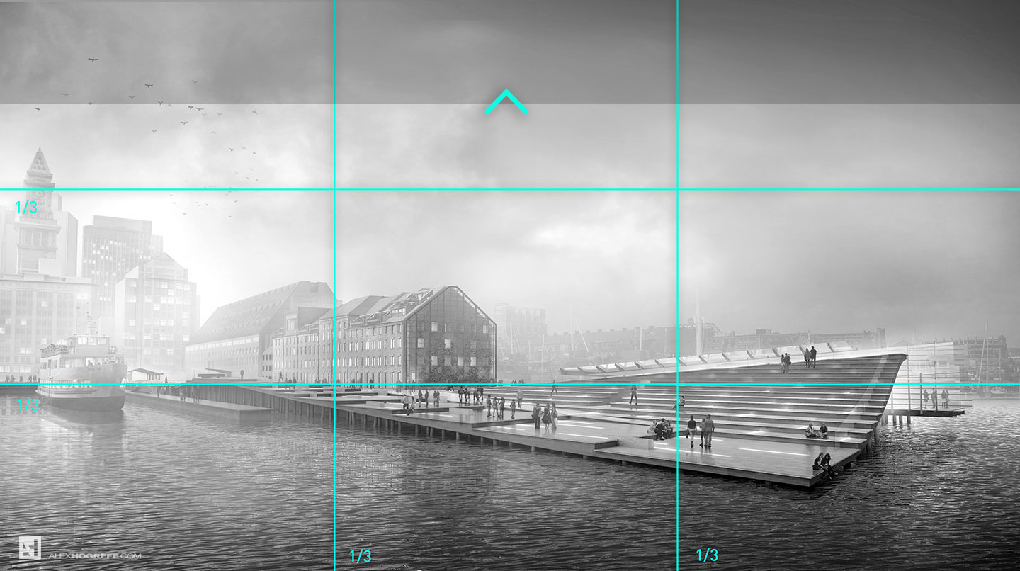
An often overlooked element of an architecture illustration is composition. Going into this image, I wanted to capture the scope of the project as much as I could showing the length of the pier as well as its relationship to the water and city. I also wanted to express the topographical elements of the design so I brought the camera as close to the water as I could while still being able to see the deck lighting. The image is positioned so that the horizon sits right on the lower 1/3 of the image. I knew I would be recreating the sky in Photoshop so I simply added more height to the canvas in Photoshop to shift the horizon to the lower 1/3 of the page. The center of the foreground building’s long facade is placed directly on the left hand 1/3 line of the image. After finishing the image, I realized the real focal point was actually the green wall in shadow. It would have been ideal to place this directly on the left hand 1/3 line instead of the other facade. This could have been accomplished by cropping the shot, but I wanted to keep as much of the docks and city towers as possible, so I left it as is.
2. Base Rendering
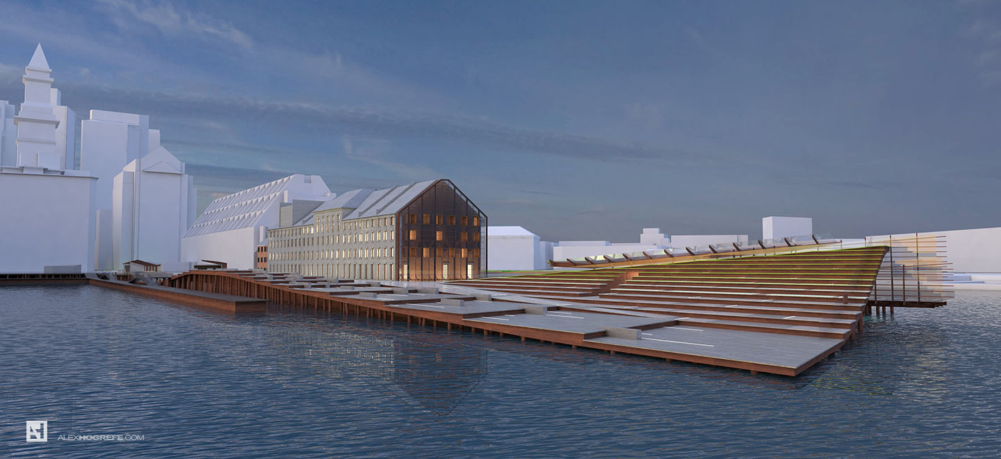
I’m not going to spend too much time here but I thought I would give some basic settings that I used in V-Ray. Before I rendered, I edited the model to help with the reading. For example, little things like adding slight overhangs at each step to create shadow really helped to define the step edge and topography of the wharf. I also added lights embedded into the pier by creating a material in Sketchup, painting that material in each location of the light, and then telling that material to emit light in V-Ray. However, running out of time to tweak the lights to my satisfaction, I abandoned the rendered lights and decided to paint in the lights using Photoshop instead.
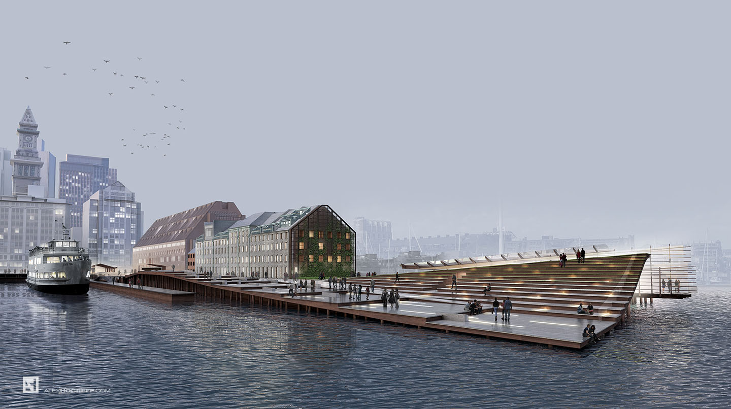
I used an HDRI for the sky and background seen below which was downloaded from viz-people.com. Along with the HDRI sky and background, I also turned back on the V-Ray sky with an intensity lowered to 0.02 to generate stronger light hitting the surfaces. The biggest advantage of V-Ray over Kerkythea for me is the ambient occlusion settings. This really helps pull out the detail and depth in the base rendering. The AO settings used in this scene were: Amount- 1.0, Subdiv- 16, and Radius- 40.
Other than that, I used the physical camera to control the exposure and set the output resolution to 4500px X 2520px.
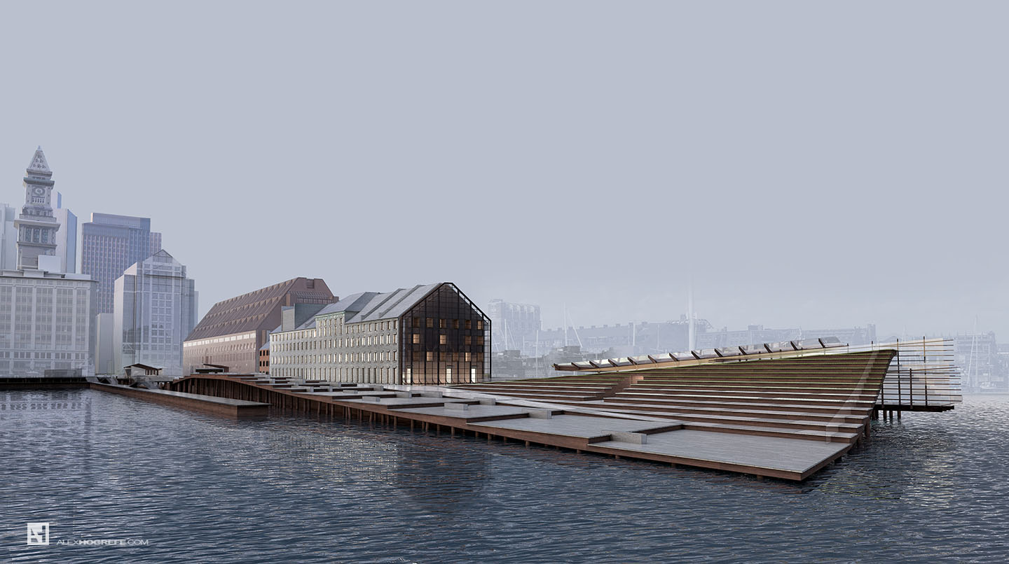
Above, the final base rendering from V-Ray.
3. Alpha
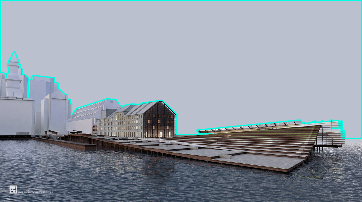
The first step in Photoshop often begins with separating out the background from the base file. Most rendering programs will render an alpha channel making the selection of the background much easier. Removing the background allows for better flexibility when adding the sky and background buildings.
4. Background Texture
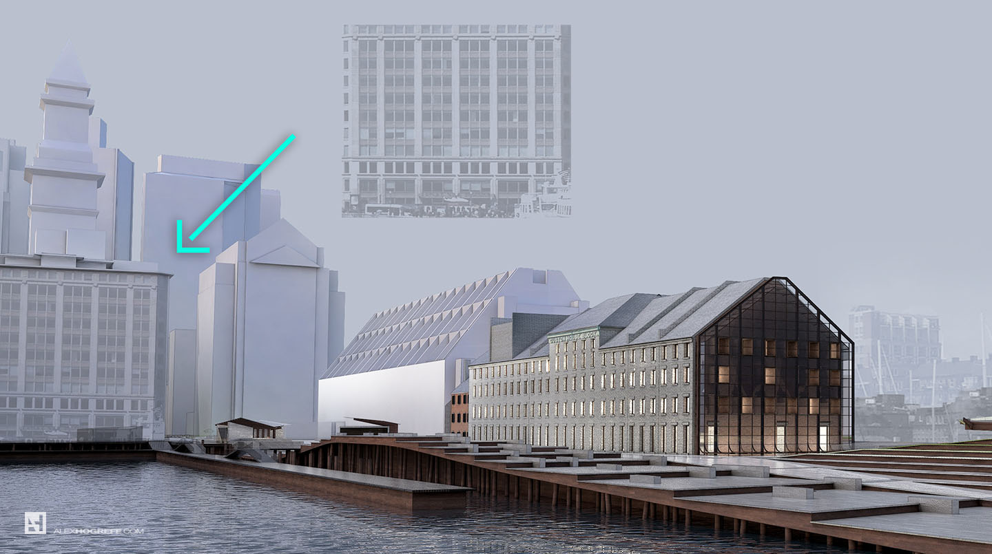
Next, I searched Google for images of the surrounding context. I then begin sampling the buildings, desaturating the texture, and applied them to the base rendering. I used a range of layer blend modes, but “Multiply” seemed to work the best in most cases. I applied the textures one surface at a time allowing me to match perspectives for each facade.
5. Lights
Knowing that thick fog was going to be added later, I like the idea of the lights in the city bleeding through. I spent a little time painting in light and punching up the lights around the design. I go into greater detail explaining the process of painting in light in my PAINTING LIGHT tutorial .
The design calls for lights imbedded in the deck of the wharf. As mentioned above, I had originally rendered the lights in V-Ray, but didn’t have time to refine the settings. I ended up painting in the light which allows me to hone in the look that I am going for. The process is very similar to adding the lights in windows described above. The important thing here is adding that little bit of glow to each one.
6. Entourage
People are important for understanding scale in a design. Therefore, it is crucial that they are shown at the correct size. I often throw in some 2d people in Sketchup at different locations of the site, then export a 2d graphic of the view, and bring that image into Photoshop. This provides a clear reference for proper scaling when I begin to insert high res images of people. Since the scene has low light, I darkened the people to have more of a silouette effect. This minimizes the destraction of bright colored clothing or improper lighting. It’s also important to note the reflections on the ground. To some, this may be a subtle move, but this helps to “ground” the people and set them into the image. Shadows have the same effect in daytime scenes. Without shadows or reflections, the people will appear to float and seem out of place. Awhile ago, I put together a tutorial on adding people which can be seen HERE.
7. Sky
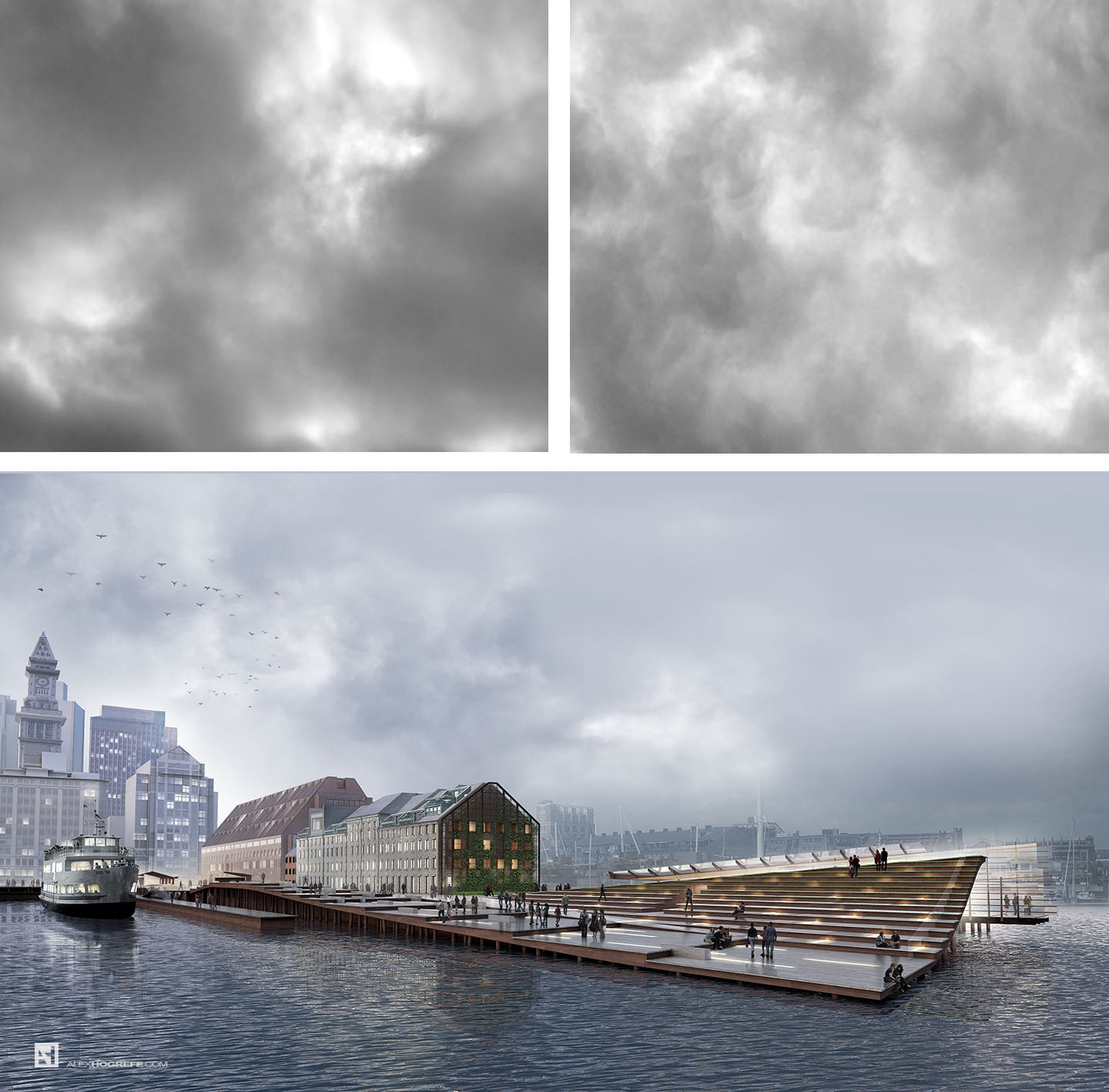
The more time I spend working on architectural illustrations, the more I realize the importance of the sky. This often will make or break the illustration. In this case, I was looking for something that would work well with a foggy scene but not distract from the design. I found some images that gave me the flexibility to experiment with the softness of the reading. I ended up desaturating the sky textures and overlaying them on the background which then picked up the blue tones already in the base rendering. I then feathered out the edges so that the sharper texture of the clouds remained in the center of the image drawing attention back to the design.
8. Bring on the Fog
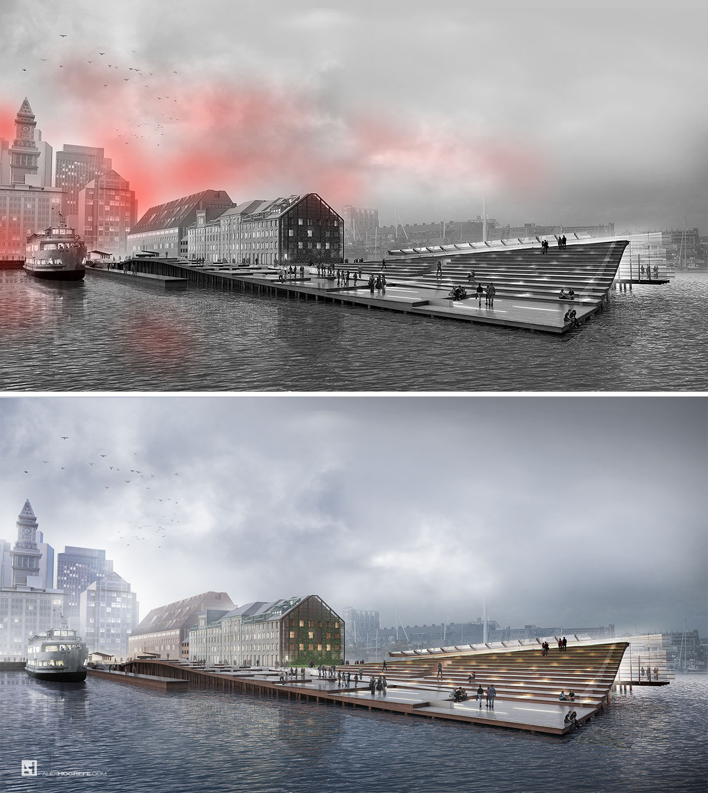
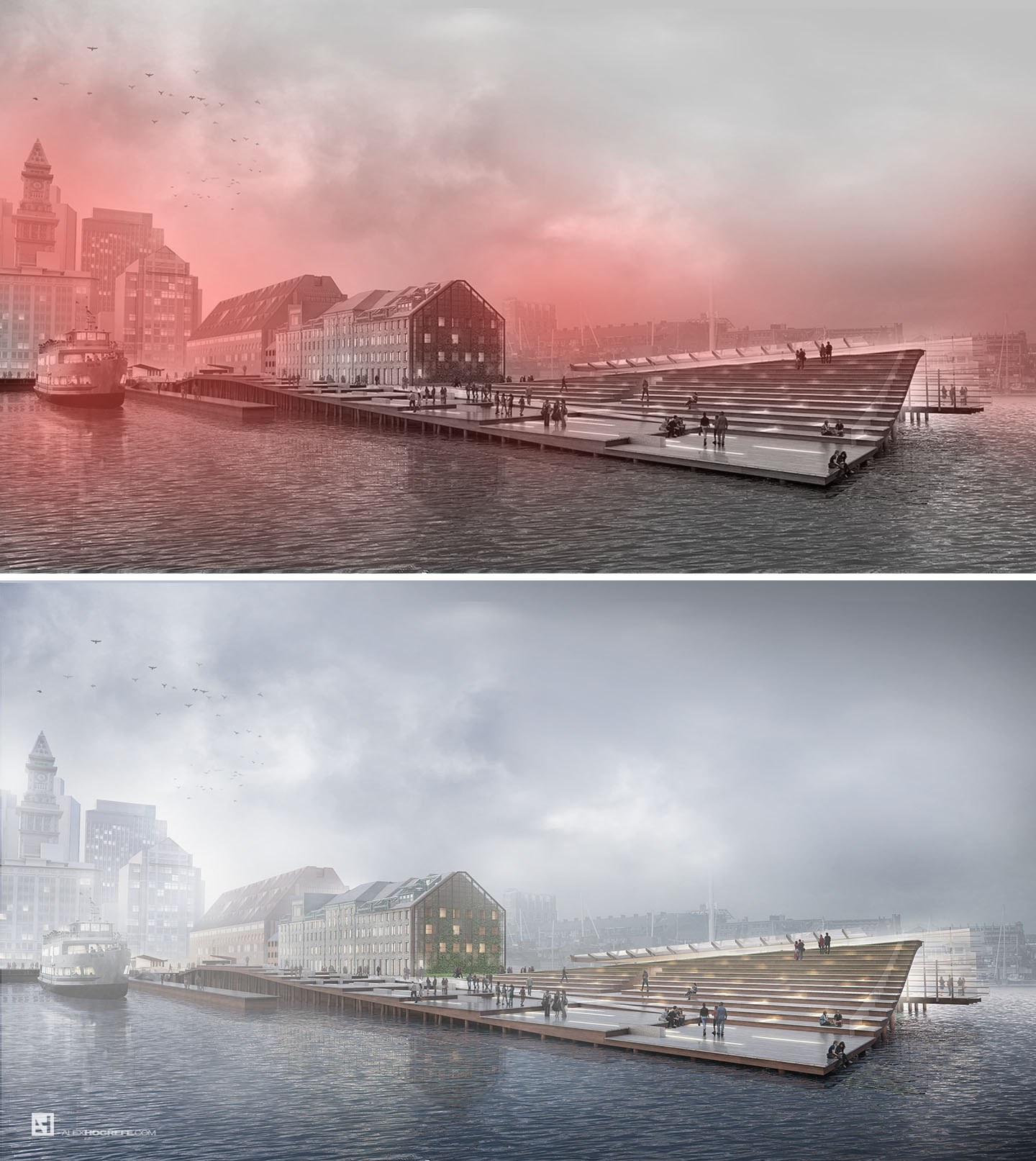
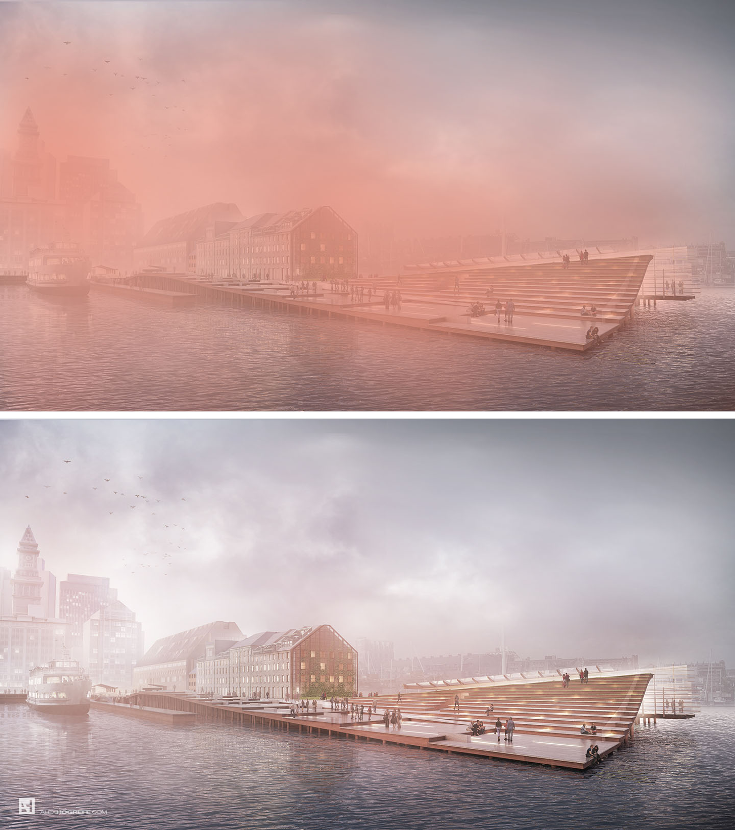
For many people, this part can be intimidating. In reality, there is nothing to it. The most important thing to remember is to slowly layer on the paint. This means setting the brush opacity low, below 10%. Rendering programs like V-Ray can render out a channel called “Z-Depth” which renders a gradient based on how far an object is from the camera. The problem I have with this channel is that it is too perfect. Especially for a foggy scene, the fog is inconsistent in density. I was looking for a loosness and softness that the Z-Depth channel couldn’t provide. I therefore manually painted in the fog. I did two passes shown below. The first pass was to highlight the light coming from behind the city creating a glare look. The second pass represented a denser more encompassing fog. I switched the fog color to red to better explain where it was placed. In this case, the imperfection works to my advantage. You can see a more in-depth explanation at my “Adding Depth Via Fog” tutorial .
9. Color Overlay
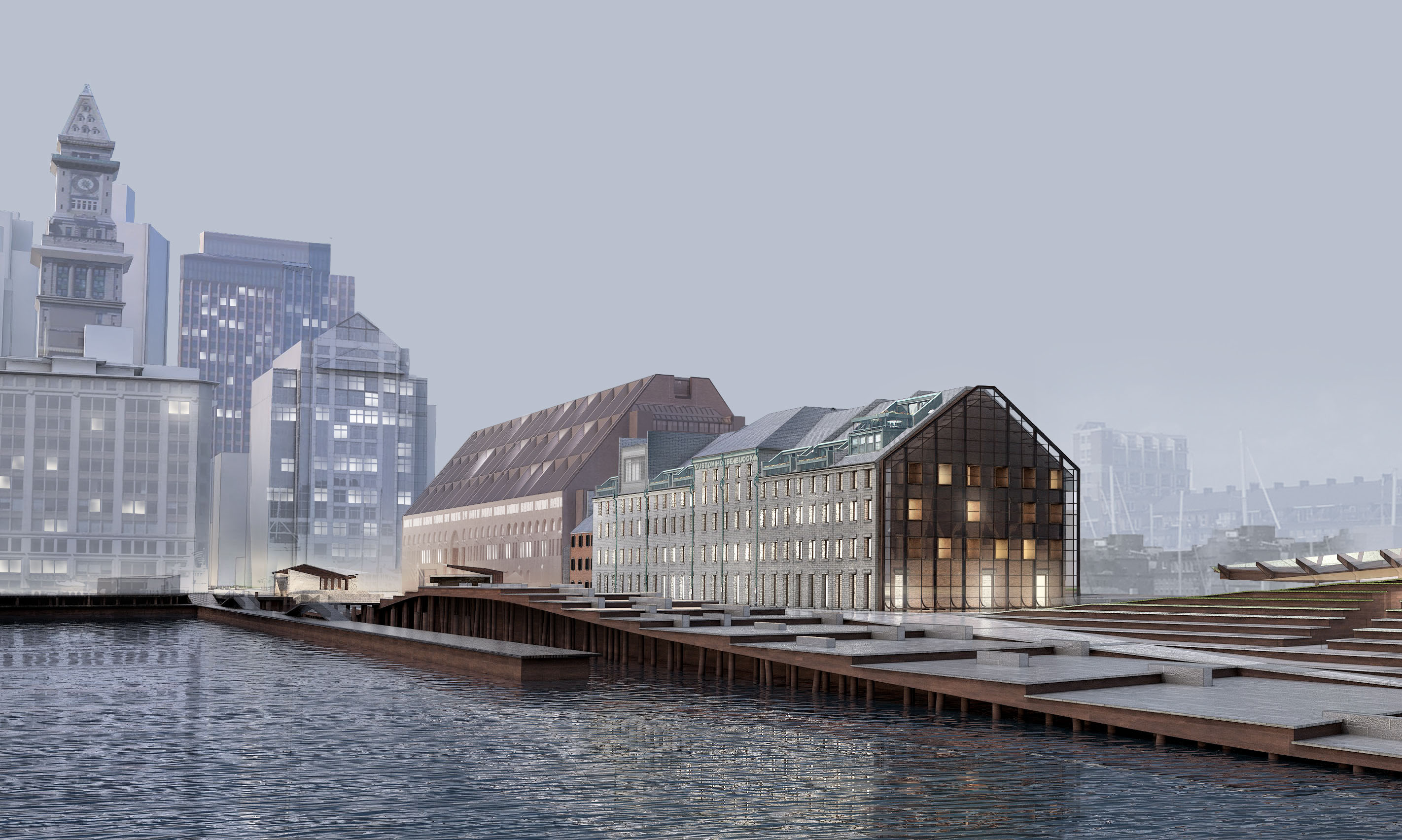
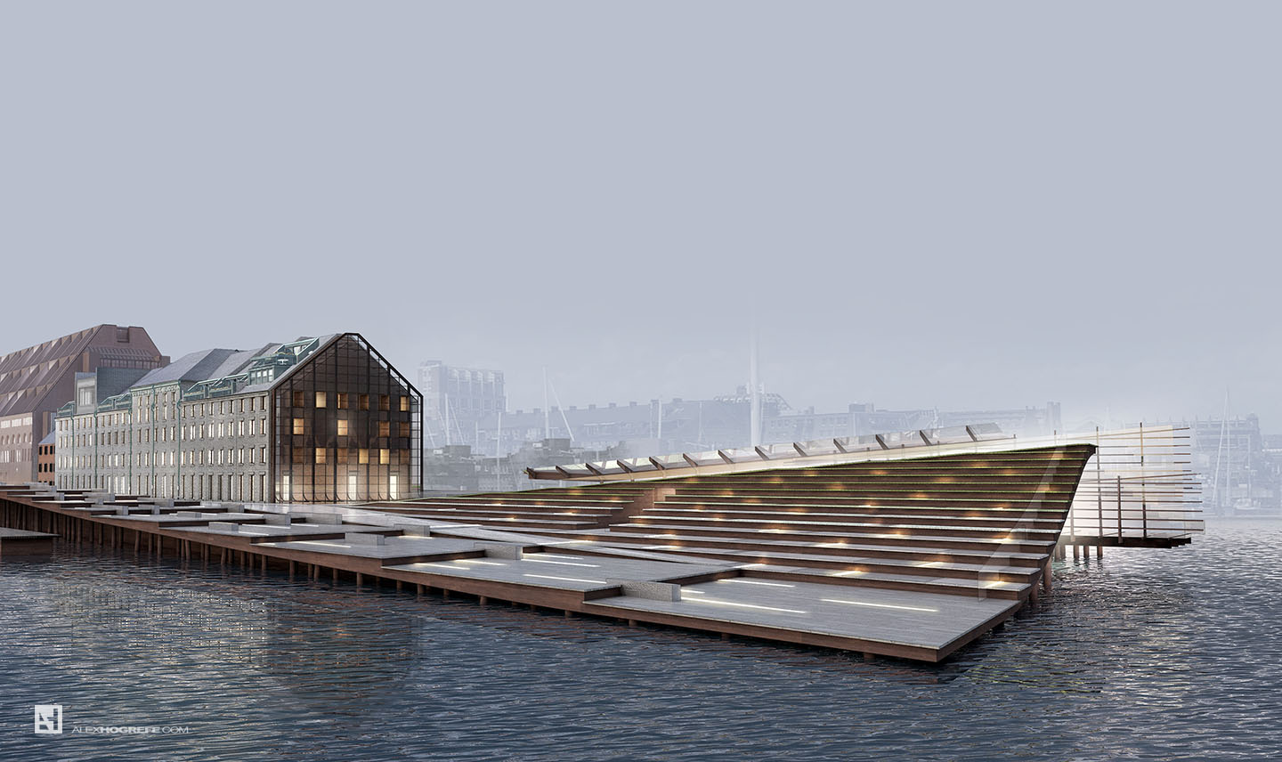
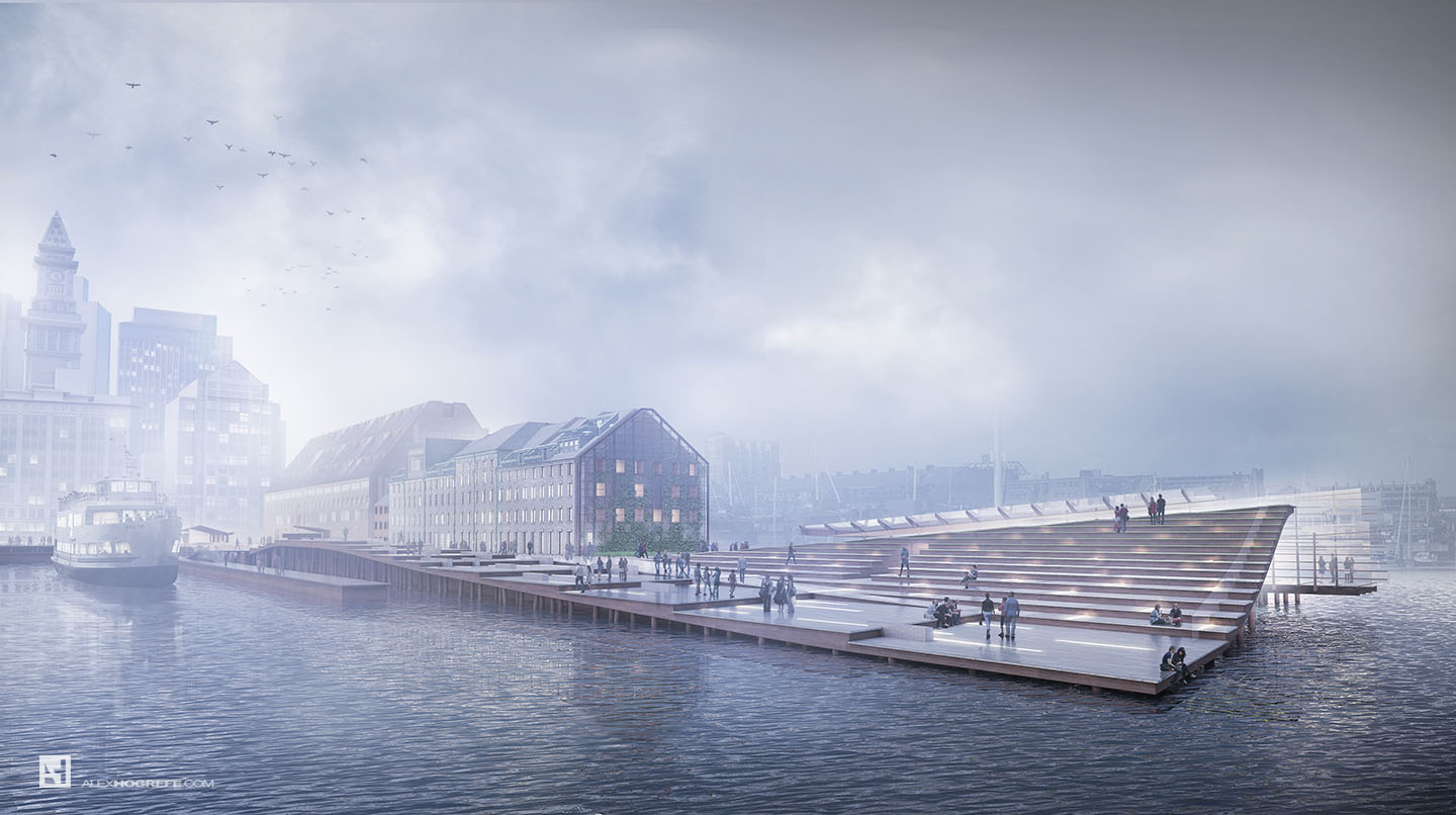
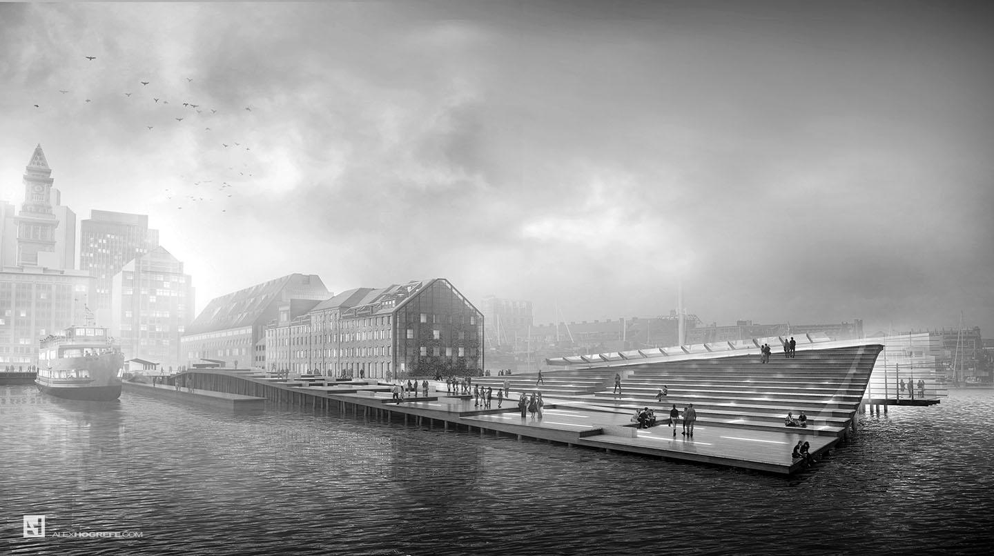
I almost always end with some kind of color overlay. The color overlay does two things. It takes the color range of all the different photoshopped images and brings them together into a more cohesive look. Color overlays also allow me to quickly cool or warm and images changing the entire feel of the illustration in a few seconds. In this case, I was going for an early morning atmosphere, so I looked at several color options. I tested a red overlay at a very low opacity first and then looked at a blue overlay which I ultimately ended up going with. I also really liked the image completely desaturated. The black and white seemed to pull out the texture of the sky and enhance the drama. For more on color overlays, visit THIS POST.
Moving forward, I plan to render out a few more views exploring some different graphical styles not yet addressed on this site. I’m extremely excited about picking apart this design and seeing what kind of new imagery can be extracted. More on this later…



Wow! this is incredibly amazing! Thanks for sharing!
Your posts are always very informative and helpful. Learning new techniques is very fun. I know these posts must take hours and hours to assemble, not to mention all the time the actual images take to put together, so I give many thanks for taking the time to share your knowledge with the design community!
Superb! I really like this a lot. I was wondering if you will be doing a basic rendering set up of tutorials in Vray for sketchup, similar to what you did in Kerkythea? I understand you are keen to keep this an illustration blog but if you wouldn't mind, that's something I would really like to see.
Thanks for posting these tutorials, they are very helpful.
Just out of interest, have you moved on from Kerkythea to Vray? Was this an employers decision, or did you make the move yourself? I wondered if you considered KT's big brother, Thea but determined whether Vray was more suited to you?
Sorry if it sounds like an interrogation, but I was just interested in the switch.
Hello alex ! Great post ! Do you use photoshop textures or vray textures for the rendering ?
@Ellen,
At this time, I plan to still focus on the Photoshop/ post processing side of things and experimentation. Maybe later on down the road, I will dive into more specific V-Ray tutorials. The thing is, there are already many great V-Ray tutorials out there.
@JGA
I wouldn't say I have moved on from Kerkythea to Vray, but I am definitely using it more. Its something we have been exploring in the office. We currently use Mental Ray/3d Studio, and were simply looking for an alternative. Think about it as diversifying my knowledge so that all my eggs aren't in one basket. More importantly though, I really like the interface, its clean integration into Sketchup, and its extremely in-depth library of resources online. I have looked into many other types of software including Thea, but ultimately went with V-Ray because of the reasons stated previously.
@Michael,
The quick answer is that I use both. Depending on the illustration, I may spend more time texturing in PS than in Sketchup/Rendering software. I prefer to still do most of my vegetation/landscape in Photoshop. More and more of my architectural texturing is being done in Sketchup, but again, that depends on the illustration.
Hi Alex! Thanks a lot for your tutorials, You are a great artist. I have to ask, what kind of equipment do you use for your work? i have a really old laptop wich i want to replace, so, can you recommend me a good computer for renders and visualization, i mean, perhaps you can tell me, wich brand of PC do you think is the best purchase for people who wants to do what you do?(yeah right, like i'm that good :P). I use sketchup (advanced) and Vray for sketchup (beginner), and Photoshop as well.
Hi Alex, thanks for the reply.
I appreciate that and all your posts are really helpful.
Do you have any suggested websites then, where I could look up information on vray? I've always struggled with it.
@Pedro,
I am currently running windows on a Macbook Pro. My biggest need is a very accurate color reproduction screen and the ability to Handel large photoshop files which this computer does great. This laptop is handling 2.5GB photoshop files without any problem.
I would suggest looking for something with a great IPS monitor as well as a lot of RAM and SSD harddrive. This however will quickly move you to the higher priced laptops. My top 3 choices were the new Razor Blade, 15" Dell XPS, and the computer I ended up getting which the Macbook Pro Retina.
@Ellen,
I started on the V-Ray website going through their tutorials and then moved to YouTube essentially binge-watching everything I could. There are many good videos by all different people and sites so there isn't really one place I can suggest except for youtube. honestly, Im still learning myself haha.
haha, thanks Alex, maybe I will follow your lead and start binge-watching asap!
Using your final image as my screensaver- really appreciate your tutorials!
Hi Alex I’ve been following your posts for more than 2 years now! They are great and really helpful for my uni work 🙂 Anyways I want to ask about the 3D model you did here for the renderings. I realized the sketchup model you did looks simpler than that in the final visuals. I wonder did you do the roof/skylight bits on another software/using another method instead of sketchup? Cause I always find making nice, detailed 3D model(even on sketchup) is rather difficult which hinders me to produce realistic visuals. Do you have any tips? (Would you considered making tutorials on 3D modeling and/or rendering?) Thanks
you used Google photos for the background texture. but those photos had shadows in them , how did you get rid of those ?
thnak u so much alex
What’s the point of having a huge “Vignette” title on the last page? That’s like writing “Plan” under a floor plan drawing or “Section” underneath a cross section through a building. The person reading the portfolio should be intelligent enough to know what types of drawings they are looking at…