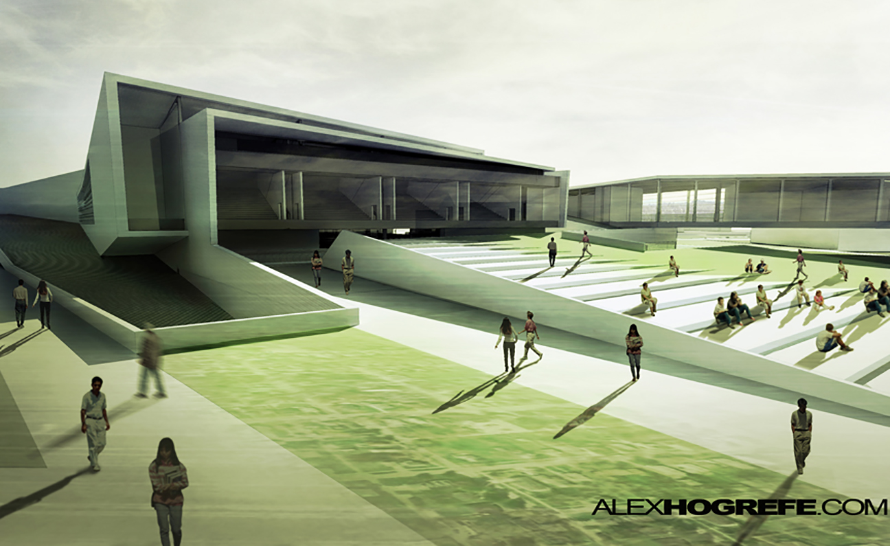
As with many of the other tips in this series, this tutorial adds a last minute “kick” to an architectural illustration. What is nice about this process is that the contrast is increased, but at the same time, the sharpness is decreased providing an interesting final outcome.
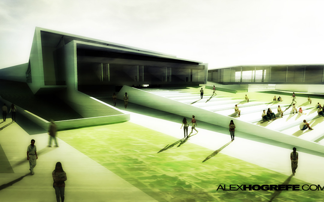
Begin by opening the image in Photoshop. The original image that I will be using is below.
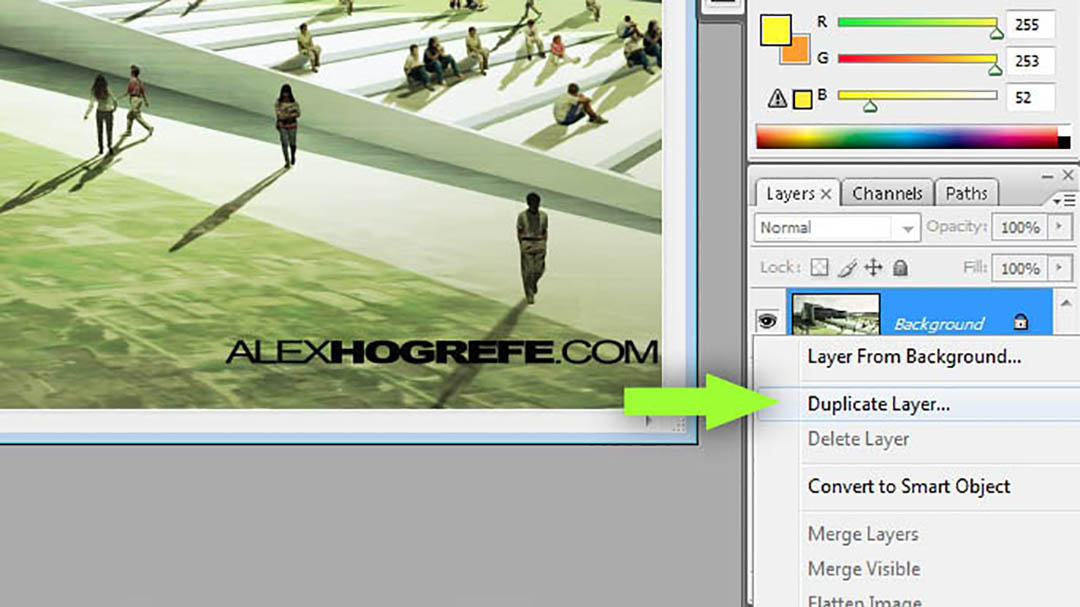
Right click on the image layer and choose “Duplicate.”
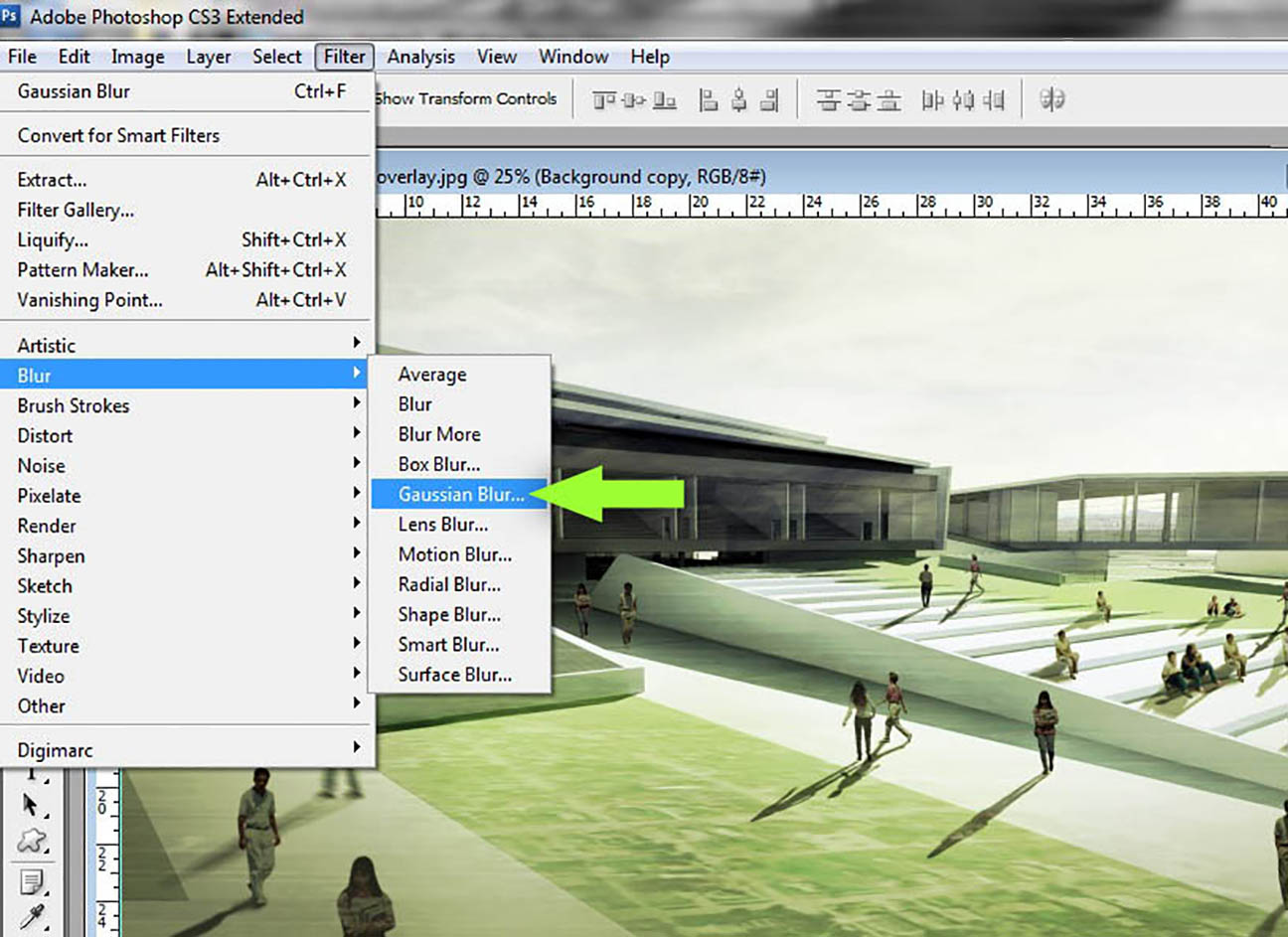
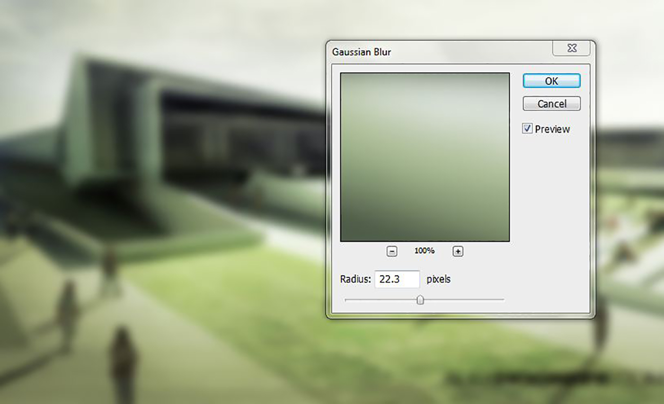
Next, select Filters>Blur>Guassian Blur.
The amount of blur is dependent on the size of the image and your own preference.
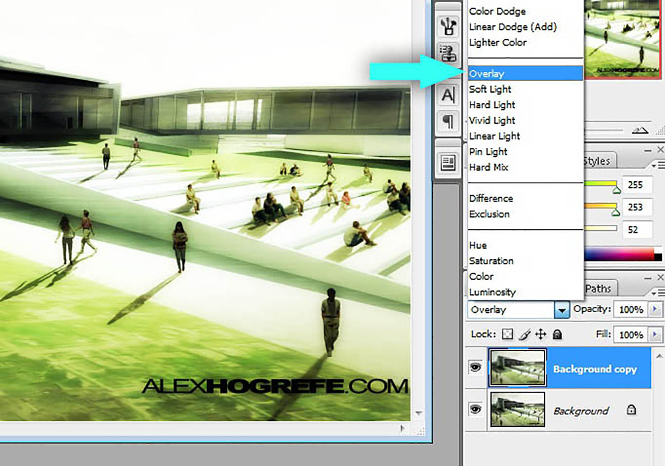
Once the blur is applied, set the layer blend mode to “Overlay.”
Adjust the opacity of the layer if the effect is too strong.


great tip. thanks for the website
Easy do to, strong do show, that's the cat´s jump.
again awesome tips, great help for architectural students like me 🙂
Thanks for your great tutorials Alex. Would you please explain or put a tutorial of how you made the grass in above photos. i severely need it, specially for huge site plans.
wonderfull men…!!!! only the master of the busy students in architecture..!!! sensei miyagi…!!!!:)
THANK YOU !!!!!! LOVE THE TIPS !!!!!
very nice! been wondering how this is done for a while. so easy yet effective 🙂
God ALLMIGHTY THANK YOU!!
Incredible tutorials my friend!!!! love your work!!!! keep on going
Christmas gift <h1>coach bags outlet</h1>
The most fashionable cheap <h1>coach outlet online</h1>
Christmas Specials <h1>authentic nfl jerseys</h1>
Beautiful and unique <h1>coach outlet online</h1>
2011 most unique design <h1>wholesale designer bags</h1>
Buy want to buy products <h1>coach outlet store online</h1>
Professional design <h1>coach handbags on sale</h1>
Single product sales <h1>coach bags on sale</h1>
Cheap and good-looking <h1>coach outlet store</h1>
With top design <h1>authentic jerseys suppliers</h1>
Male friend love <h1>nfl jerseys from china</h1> Very glad that you buy
awesome. .just by simple step. .we got the nice result
How did you get the colors to be like that on the original image?
@jrew,
I used some subtle color overlays and vignetting.
bro your tutorials are so helpful. Would love to see more landscape graphic processing and section cuts and section elevations
You are an awesome person… thanks for your time!!!
thank you Alex
you've made the picture look over contrasted with too much green and even some of the architectural details are lost. this did not help the photo whatsoever.
These are wonderful tips for image softening that will be useful to me. I am learning Photoshop and it is interesting and there is a lot of things to do. It is a wonderful experience and I am trying to implement it. Your tutorial has helped me and thanks for this interesting tip. Keep providing useful tips.
These are amazing Tutorials. Definitely helping me do better in my pin up reviews!! Thanks so much
this site is simply the best you can find
Thanks for sharing your tutorials!!! Effective and easy to follow!
very nice & thank u so much for ur tutorials .u are an awesome person
Great … this trick made my render beautiful ! Thanks a lot !!!!!!!!!!!!!!!!!!!!
little staps make great progress.
Ohh OK! Now I know how to do Image Softening….Thank you for the information!
Thanks for your time mr.Hogrefe.
These tutorials are very usefull
Your F awesome i learned many thing from your website please share tips and tricks with us
Thank You…….!