I have not significantly changed the design of my site or its functionality since its inception, so the time has come to switch things up. The first thing I did was move from Squarespace to WordPress. Squarespace was a great platform but WordPress offers a huge amount of flexibility and customization that Squarespace can’t match. I had never used WordPress before so this meant pouring through every tutorial I could find and researching the best way to build this site.
The first thing you may notice about the new site is how information is organized, something the old site failed at miserably. The home page acts as a summary of the site providing the latest posts along with previews of other pages. The tutorial pages lists out all of the links at the top for quick referencing but also provides a visual search below.
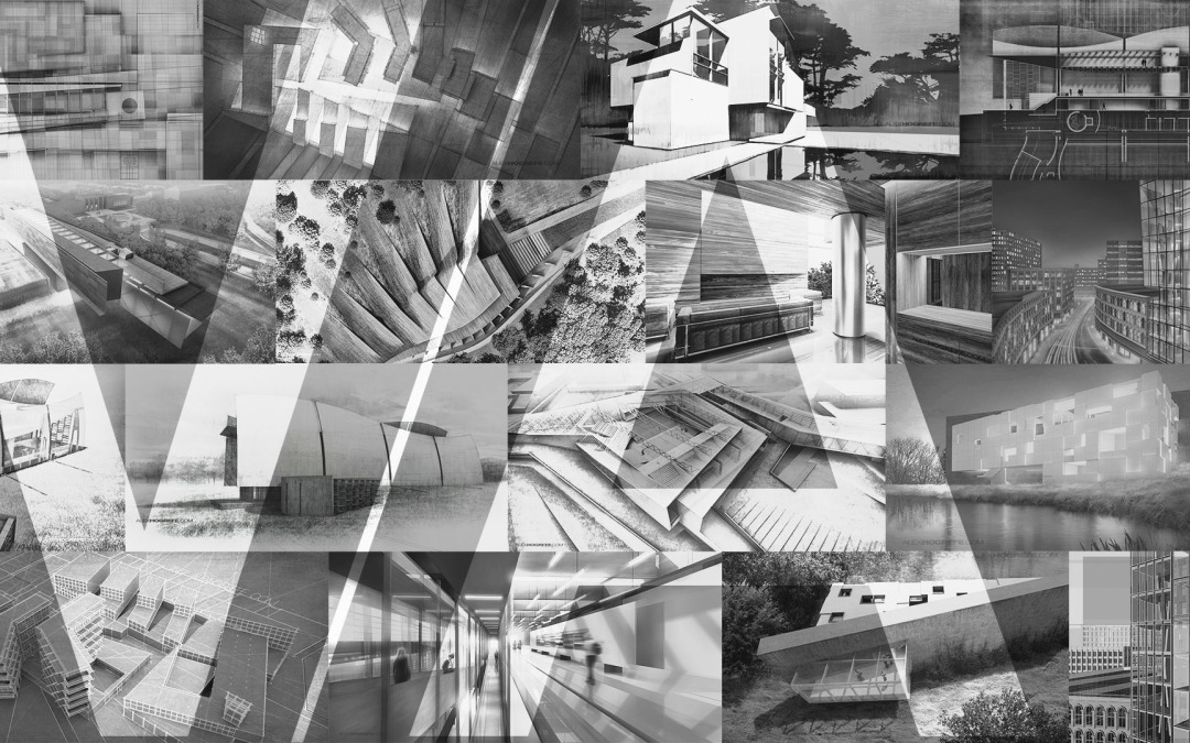
Much of what I do is visual, so I wanted images to be front and center, something the old site did poorly. Large sliders are placed throughout the site and blog posts are wider to accommodate larger images.
A responsive site was high on my priority list. This is not only good for mobile viewing, but it allows me to take advantage of a lot more screen real estate when viewing the site on a large desktop screen.
Probably the biggest change is the site name. This was one of the hardest things for me to do but also the most important. My name is difficult to pronounce and is not very memorable. My site has grown exponentially over the years and it has been largely by word of mouth. I’m hoping this transition to the new name will go smoothly without causing too much confusion.
As hard as I worked on this site, there are still a lot of bugs to work out. I see this site continuing to evolve as I test out more ideas and features later on down the road. However, I wanted to limit the downtime of the information and try to get this thing up and running as soon as possible. If you see any broken links or bugs in the site, please email me using the contact form on my about me page or send me a message on Facebook.
Finally, I want to thank Matt Uminski for helping me work through the many design and coding issues over the past 6 months. This guy is crazy talented and proved to be a great resource when designing this site. Be sure to check out some of his work here.


Thanks Alex you’re very kind to invest months of preparation for your site, for us. I’m very grateful =D
Nice layout, smooth experience and always breath taking rendering =D
Now that it becomes a more commercial project instead of personal portfolio.
Love the new design! Keep it up!
Great!
Really nice, congrats!
Really nice Alex, hope the page keeps as personalized as always.
Great new look for the website – so much cleaner and easier to navigate. I just wanted to thank you for all the tricks and lessons, my skills have improved so much since I started following you =)
nice nice nice nice nice!Extraordinary! wonderful !
I recommend reading it to the end.