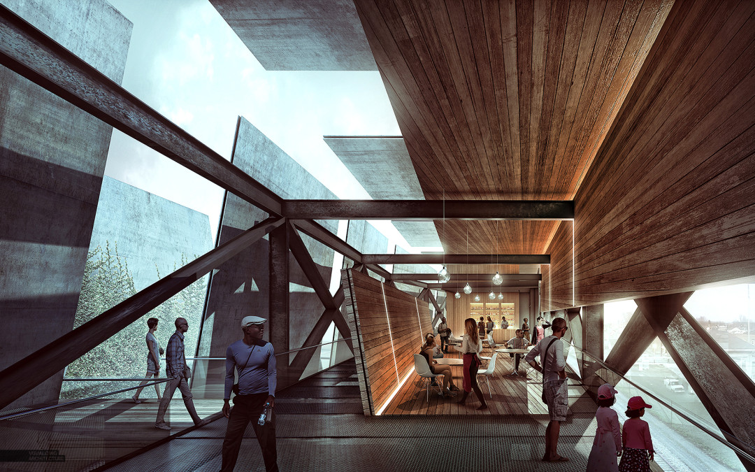
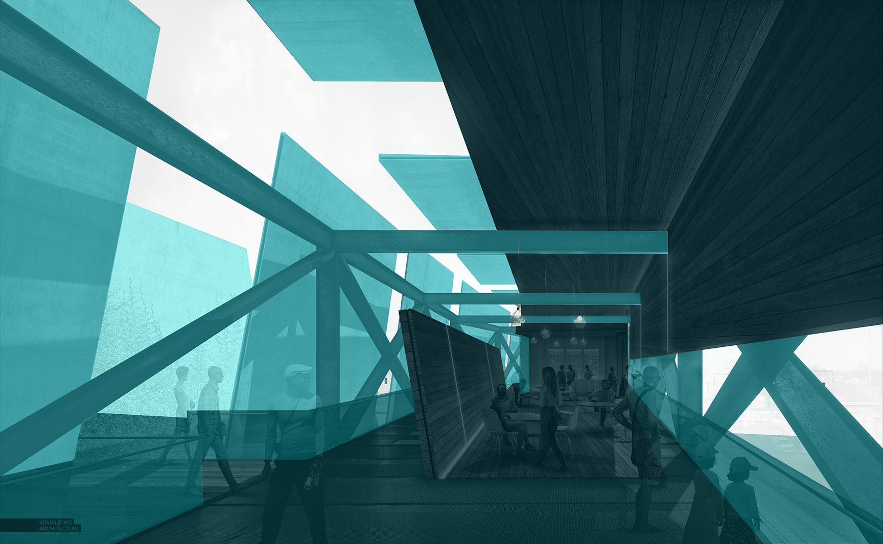
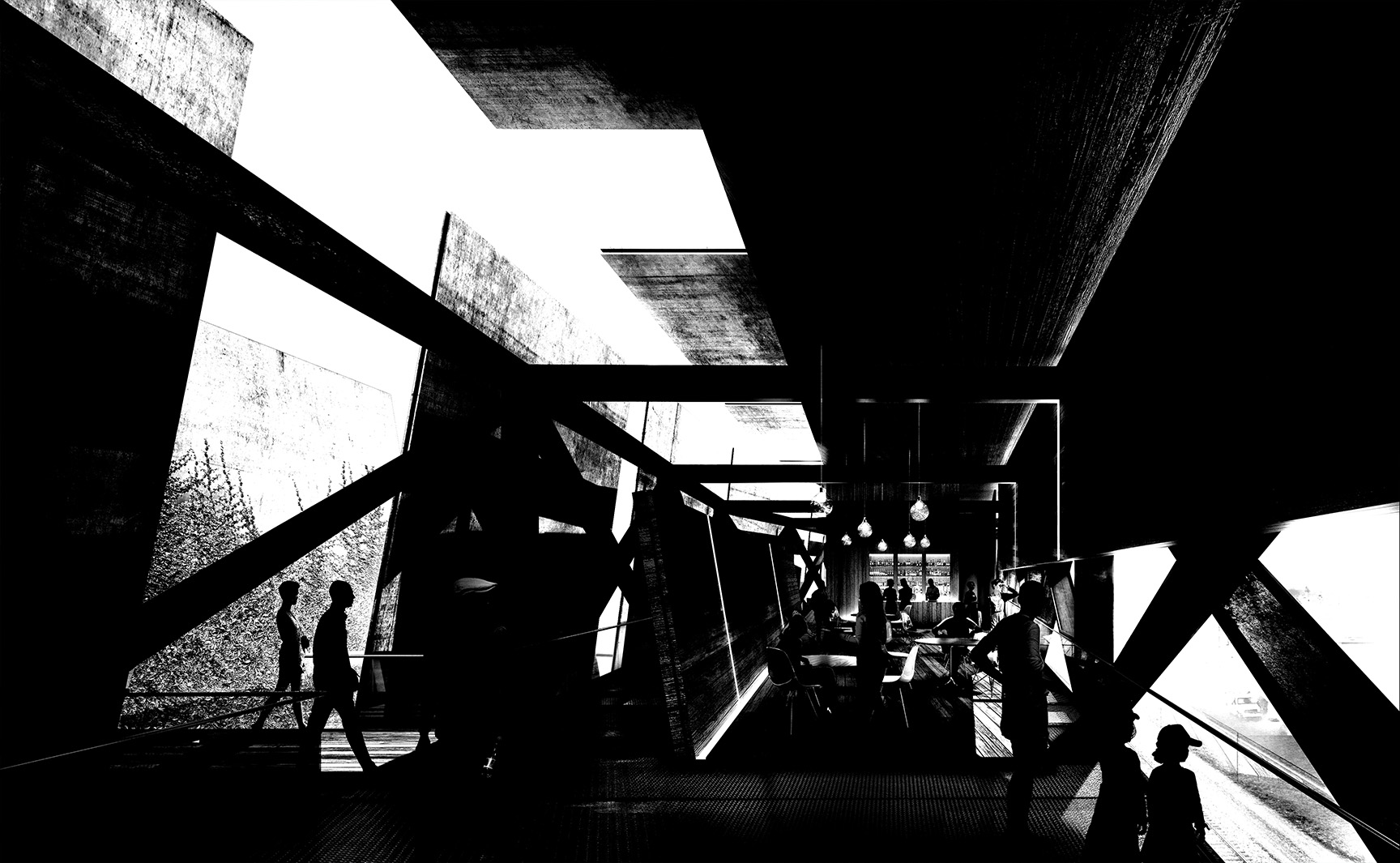
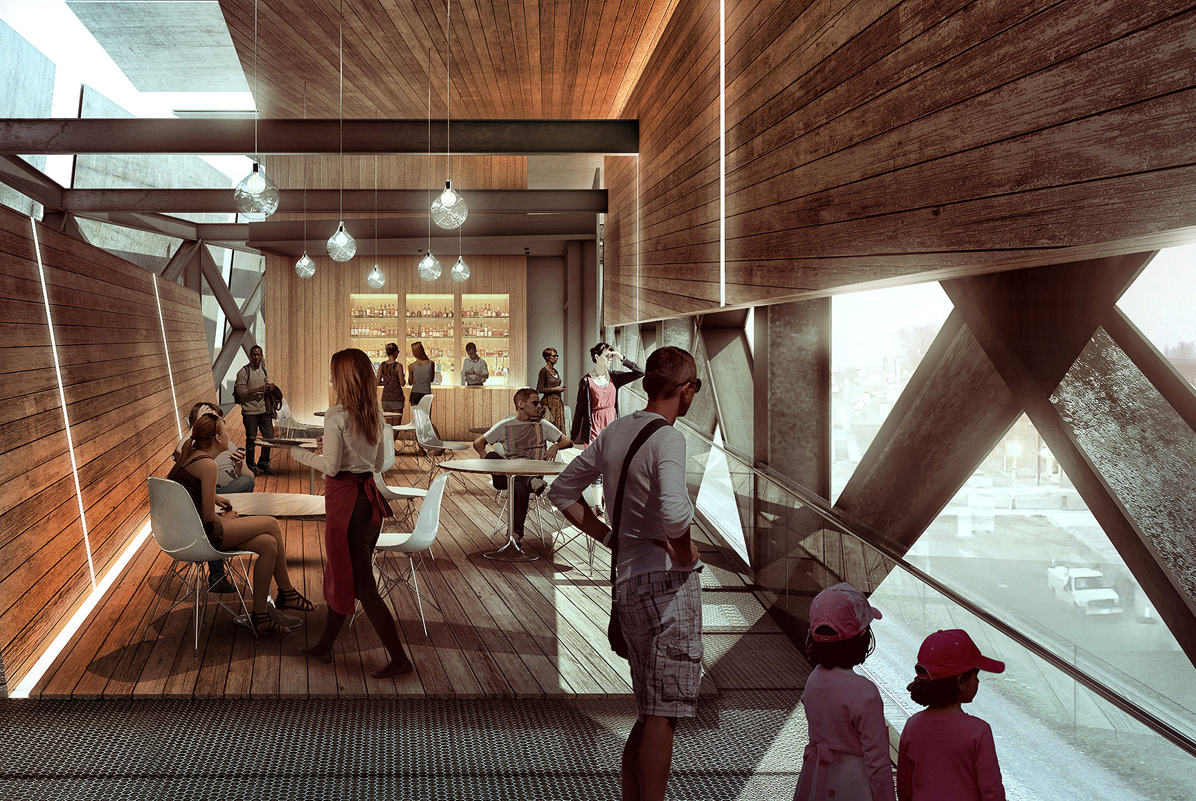
I have been experimenting with some interior illustrations and wanted to post a breakdown of this image. Determining the view for this shot has been difficult because there is so much going on in the design, and I wanted to find a view that properly captured many of the design elements. Ultimately, I will probably need to create several interior shots to tell the full story, but this one seemed to do the job of expressing the layering of the elements.
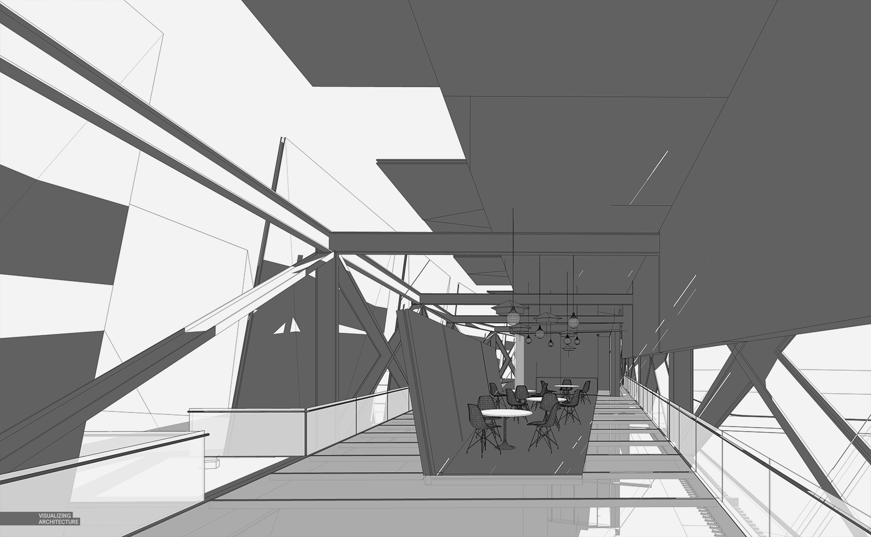
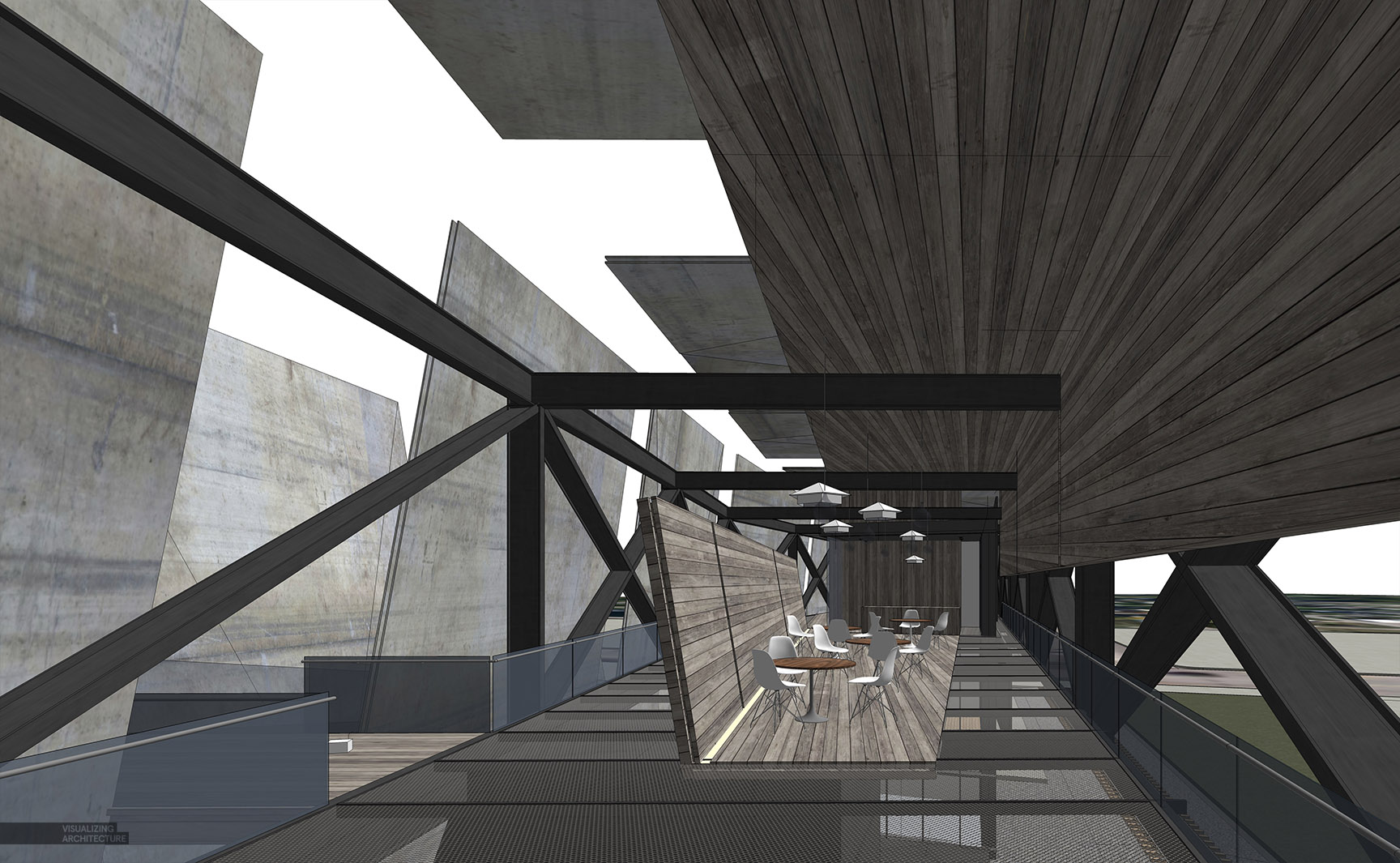
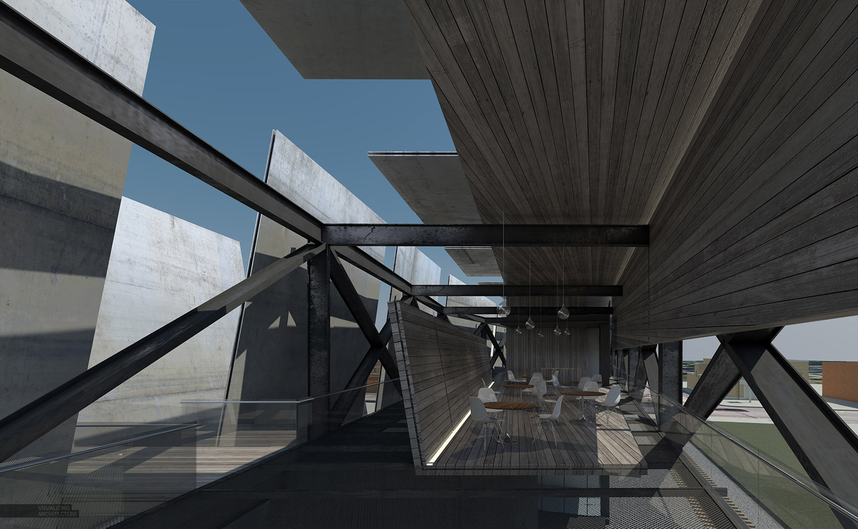
The breakdown of the image is like most of the others that I post. I started with a Sketchup model and created some textures for the metal and wood materials.
Sketchup model with textures off
Sketchup model with textures on
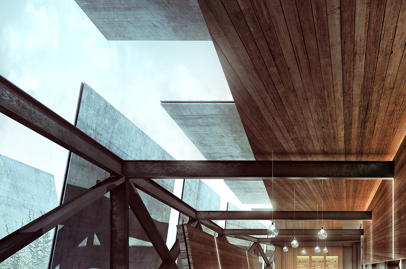
Base rendering directly out of V-Ray
Final image after Photoshop post processing
There are several things that I was juggling in my head when I was deciding on the view. The design contains several layers of structure and sun shading devices. I wanted the view to express these elements and show how these layered on top of one another. This meant shifting the view around quite a bit to avoid certain walls covering up other walls, or letting steel structures block views of the context. The materials themselves also help express the layering by using dark and light tones along with cool and warm tones. Finally, a hint of atmospheric haze was added to give a better sense of depth and further enhance the layering effect.
I also knew that I wanted to play up the contrast of the bright exterior from the shadow generated by the shading canopies. What is nice about this view is that the light areas of the image creates a strong diagonal move across the illustration. This is not only nice compositionally, but it also encourages the viewers’ eyes to move around the page.
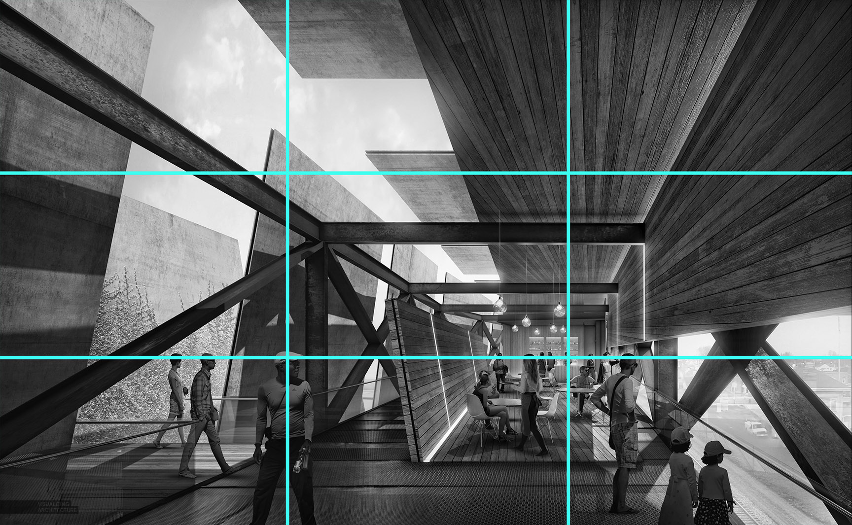
Finally, the view takes into account the rule of thirds. The horizon is placed directly on the bottom third of the page and the converging lines of the perspective fall on the right third of the image. I don’t always follow the rule of thirds, but it is something that I keep in the back of my mind when setting up images.
I rendered the image out at 5000px x 3125px on my Macbook Pro and it took about 2 hours. This isn’t bad considering the resolution that I am working with. I spent quite a bit more time in Photoshop but the point is that you don’t need massive rendering farms to be able to generate high res images. With that said, I am not using displacement maps on any of the textures nor am I loading the scene with a ton of lights which can really increase rendering times. My Photoshop file grew to just over 1.5 gb in size which is typical for my illustrations at 5,000px wide. In my experience, images over 6k or 7k px wide with lots of layers will start to generate PSD files that are difficult to manage unless you have an amazing graphics card.
One final note about this site, I have went through and re-embedded all of the videos so hopefully everything this up and running again. However, if you come across any videos that are still not showing up, send me an email or leave a comment and I will try to fix it as soon as I can.



Amazing. You’re very gifted as a designer, visualizer, and teacher.
I’m just getting back into the field of architecture as a visualizer thanks to you. Could you elaborate on the end use of a rendering of this size (or the larger ones you allude to!!) Are you just making massive prints with them?
This is a minimum size that we use for all client work. Many of our clients print them out on large 24×36 prints, or even larger sometimes. Creating images at this resolution insures that the images still looks sharp at that large of a size. It also allows us to use sharper textures and entourage which ultimately leads to better looking images.
Thanks, Alex.
I recently completed several views of a project for a client each having a resolution roughly the same as what you mention. ~5000w x 2500h for use on a “coming soon” style site sign. I figure the increased viewing distance (& speed as driving by ) should counter any loss in sharpness at the sizes they were looking to print.
Is that 5000px x 3125px size what you use for the 36×24 prints?
Thanks again!
What a super awesome breakdown!
As always, i really enjoied reading your post and learned so many good things
God bless and thanks.
P.s the render is fascinating!!
study
Haha! right!?!?
Fantastic rendering illustration as always! great job!
by the way, it will be interesting to see a elevation render of this project! I hope you can make a elevation render process of this project =)
Do you model in Revit then export to Sketchup?
No, I model everything in Sketchup, although Revit does import well into Sketchup if you need to go that route.
Hi Alex,
Do you use a pc or a mac computer?
What do you prefer, revit or sketch-up?
Thanks.
I use a macbook pro that runs bootcamp/windows. I windows, but like the hardware of macbook pros (retina screen, color reproduction, etc). I also prefer Sketchup as the modeler because it is much more fluid, fast, and abstract. It allows me to iterate and test out ideas much faster than in revit.
So beautiful, as an interior architecture student I would love a breakdown of your photoshop process for interior images like this one!
Looks great Alex.
I’ve used Archicad for years and love it. I’ve also produced images like yours roughly the same way.
Do those fantastic textures come from Sketchup, V-Ray or Photoshop ?
You say that Sketchup is quicker than Revit and I guess you’d say the same in relation to Archicad.
If I was to get into Sketchup what’s the best and quickest way to start ?
What is going on with the ceiling there? Strange taper…
I agree, the wood texture on the ceiling and connected downturned panel looks off. It could be that the edges of the planes are angled but in that view it looks like the texture is skewed.
Hi, what about the bar counter? is not in the base rendering, added with Photoshop?
I really appreciate lights, natural and artificial!
I hope doing a “study” like that… some day.
Hi, Its fantastic… What a Great Work…!!!!!!
PLEASE can you make a video of your entire workflow for a image like this. (obviously sped up by 5X or something).
That would be extremely helpful, at least with the post work in photoshop.
You are one of the finest renderers I have ever come across. Keep up this great work. I wish I had your skills
Fantastic work Alex, it has amazing ambience and feel to the drawing. I hope to see it built one time. Let me know if yo need a BOQ done on the model, I have the perfect Sketchup Plugin for that . 🙂
Looks great, congratulations!
I have some questions, hope you can answer them! What visualization style do you use on sketchup that looks like that? I cant find that style! Do you have Vray on your Mac or you use the Bootcamp to render with Vray?
Thanks! Sorry if my english is not that good, Im from Dominican Republic.
Hi Alex, thank you so much for your amazing tutorials.
Would you make for us a tutorial about WOOD? I always struggle to represent it in a beautiful and realistic way at the same time.. I’m sure you know the best/quickest way to do it!! Hope you’ll consider this,
MV
Can the same output be produced using Rhino for modelling and Rhino vray for rendering?
really nice expression !
非常非常棒!要是翻译成中文就更好了~
你说中文,,别人可能认不得啊,,,,
Nice work! Look at our works at archicgi.com. We provide 3d architectural rendering design services .
HI ,you are just amazing .i wander what does the blue picture used for?thanks!
I like the post-process on this image. Kind of gritty and has nice contrast. But compositionally I reckon the area of strongest contrast is in the top left, so it’s a tad distracting. Nice piece though!
这是什么玩意 我没看懂 艹
You made a good site and giving us such a great information on this topic. it’s very interesting one and very important too. I am very satisfied with your site and your posts they amazing. Thanks for sharing the best posts they very useful to us.
This is the best site and also you gave us such a great information on this topic. You made a such a great site it’s very interesting one. Such a fantastic material that you have on your site only.
thank you
Good article!
Look at our works at 3dpraxisstudio.com. We are one of the largest 3d visualization and 3d modeling services in the world.
We are a progressive studio, we are engaged in 3D modeling and architectural visualization. Look at our work on our website.
Great Article!!!
Really Amazing for Train Pavilion Interior.Thanks for sharing us
It’s nice that you share such information with us, I am grateful to you.
Alex, Whats with the texture map on the roof. looks odd and i cant figure out why and how you did it like that haha.
Great simplified article defining the difference between 2d sketch and 3d rendering! Really great interior design. It would be very helpful if you share an exterior design related article.
Thanks for sharing a very nice blog post amazing for 3d architectural rendering service.different service 3d rendering,3d interior designs,3d artist impression,3d animation, and 3d interior visualization.
Good showcase! Please share more similar projects like this!
Amazing creativity. Keep it up.
Thanks for sharing!