I grabbed some of my favorite diagrams developed for my thesis project from a few years back. They actually have been living in this site under the “about me” section, but you have to dig a little to get to them. I wanted to post them because they were really simple to make but received a lot of good feedback during pinups. It seemed in thesis that I spent 95% of my time thinking and researching, and 5% actually producing. When pinups did roll around, I wanted to avoid having bare or unfinished looking diagrams. One way I avoided this was to always have a digital model in flux (usually Sketchup), especially one with all of the surrounding site buildings massed out. With this, I was able to generate sections, plans, and perspectives to quickly Photoshop over for decent looking diagrams. The other way I found to give diagrams the appearance that more work went into them then actually did was by overlaying aerial maps. In fact, the first thing I did when starting a new project was to piece together high res maps from Google Earth just for this reason and maybe some research haha.
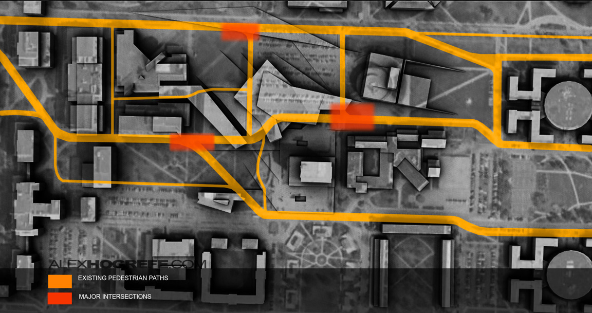
The first diagram takes a basic Sketchup model rendered in Kerkythea as a clay model, and overlays it on top of a desaturated aerial image of the site. Then some color was Photoshopped on top. You can see that the aerial doesn’t line up perfectly but that didn’t really mater to me at the time. I also didn’t take time to remove the parking lot over my design. It took a few minutes to render in Kerkythea, and then an hour or so Photoshopping everything together.
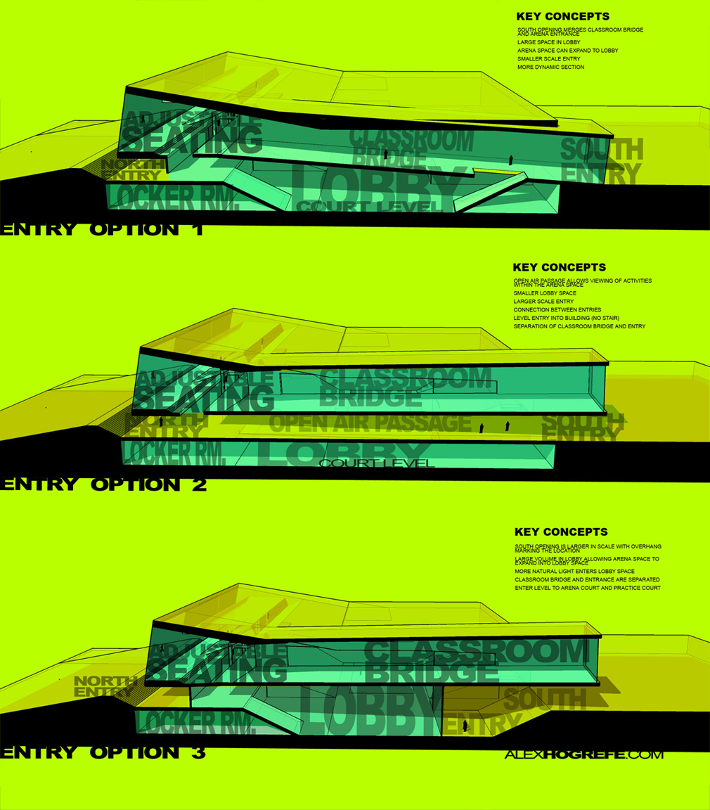
For the next diagram, I quickly massed out some ideas on top of my existing Sketchup model I already had going and exported the sections. In Photoshop, I darkened the section cut and stretched large words over the cut to hide the lack of detail in the model. The color overlays also help to hide the “Sketchup” look.
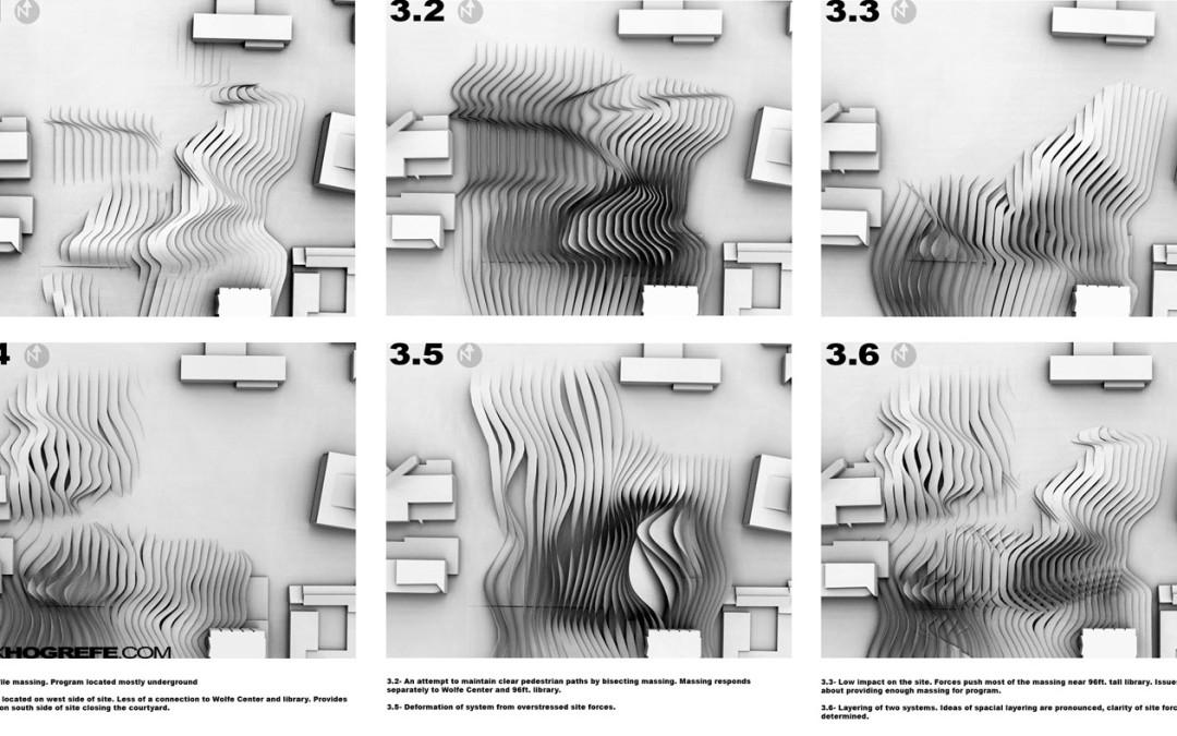
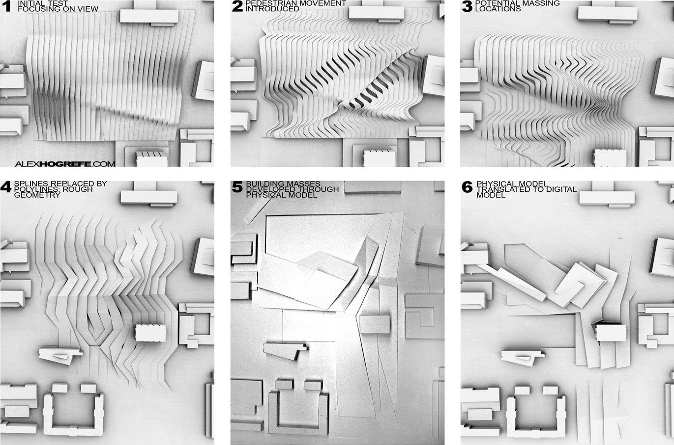
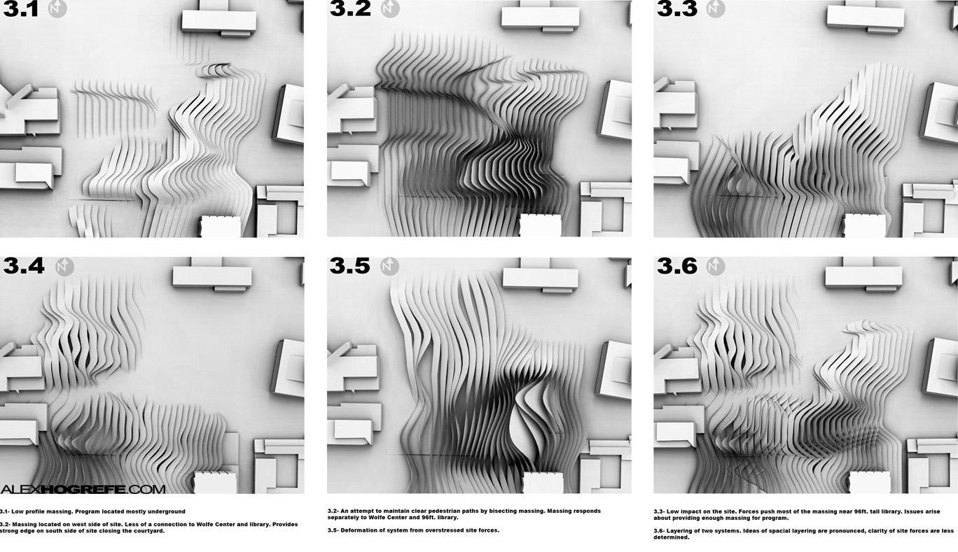
I’m happy with how this last diagram turned out. I had been playing around with Grasshopper and had generated a ton of 3D models while studying site forces. I wanted to create some process diagrams for a pinup, so I took the models and produced some Kerkythea clay renderings. Because of all of the geometry and information in the diagrams, I avoided adding color in hope of simplifying things. Each rendering took a couple of minutes and everything was finished in a few hours. Most of the time was spent opening the different models and exporting.


nice!! good idea wish i'd known this sooner
Excelent approach. Could you by any chance detail the proccess and grasshopper techniques?
Congradulations Alex…Great work…
I like those sections…simple diagrams expressing clear and strong idea…
Hey man,
Do you get all of the images of people from the internet or some other sources?
Please reply!….. 🙁
Hey Habib,
Someone just showed me this website. http://www.immediate-entourage.com/. Also check out Vyonyx.
Very nice diagram. I would like to congratulate you for your amazing job!
Hey Alex, great work by the way.
Could you make a Tutorial showing how do you make those section diagrams over the second image. They look realy simple and clear
these diagrams look really great! thank you for doing these tutorials!
NICE DIAGRAMS! especially the last row, could u show us on a tutorial how did u do it ? plz 😀
Hi alex
Thanks so much all the help on your blog. Here in glasgow in the uk everyone is loving your tutorials.
I was wondering if you could clarify how you got such a good balance with the kerkythea clay render overlay over the aerial imagery. I really like the style but I am getting a very washed out image where the clay model is hardly visible even after tweaking the levels.
Ewan