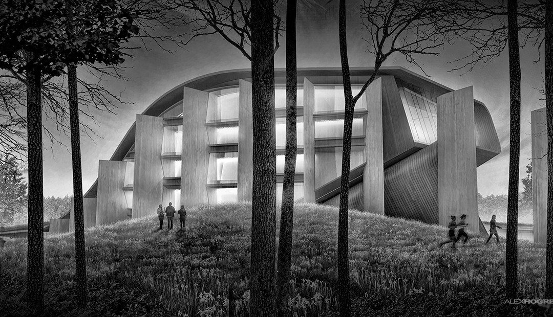
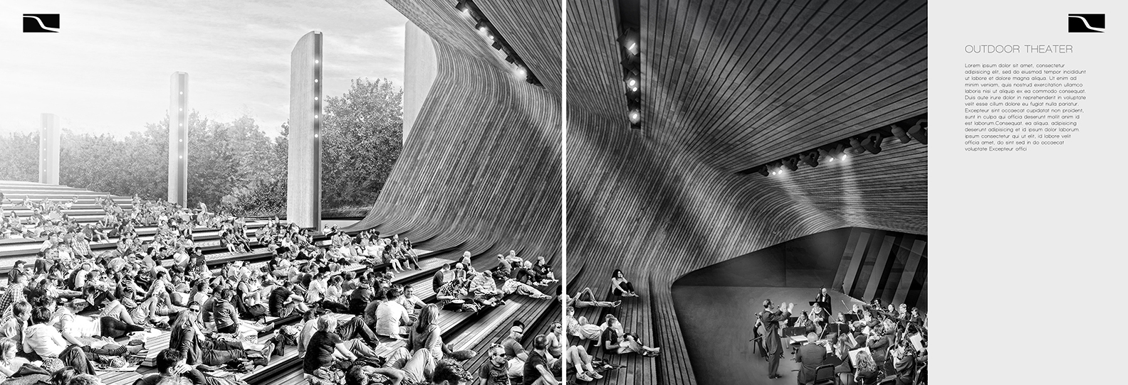
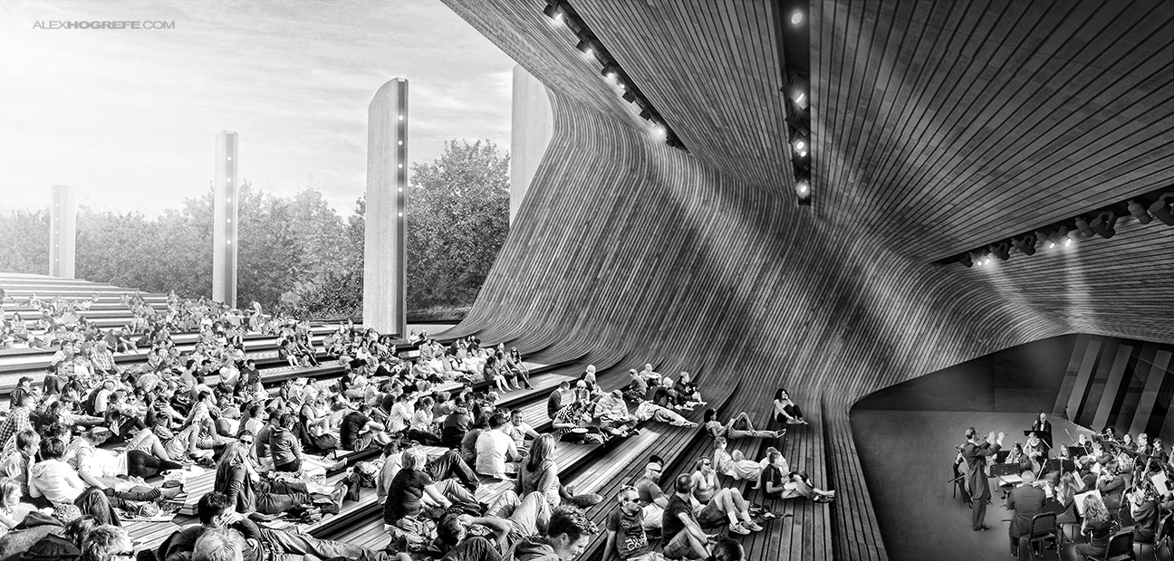
I was able to develop a couple of illustrations this weekend to help illustrate some of the exterior spatial qualities of the theater design. The number of pages for this project are really starting to add up and I don’t want to add any more than where I’m at now. As I mentioned earlier, I wanted this project to focus on process work and there are still some diagrams that need to be added. While I like the full page spreads of these perspective shots, I may end up combining them to a single spread to allow more room for process work.
These illustrations were extremely heavy in post processing. The outdoor theater perspective alone took a ton of Googling before I could find enough source images of crowds to cut from. Even with all of that time spent, you will still notice that the sun direction is off on almost all of the people. In this case, I put a higher priority on getting the right view on the people so that the perspective was correct which meant I had to sacrifice the correct lighting.
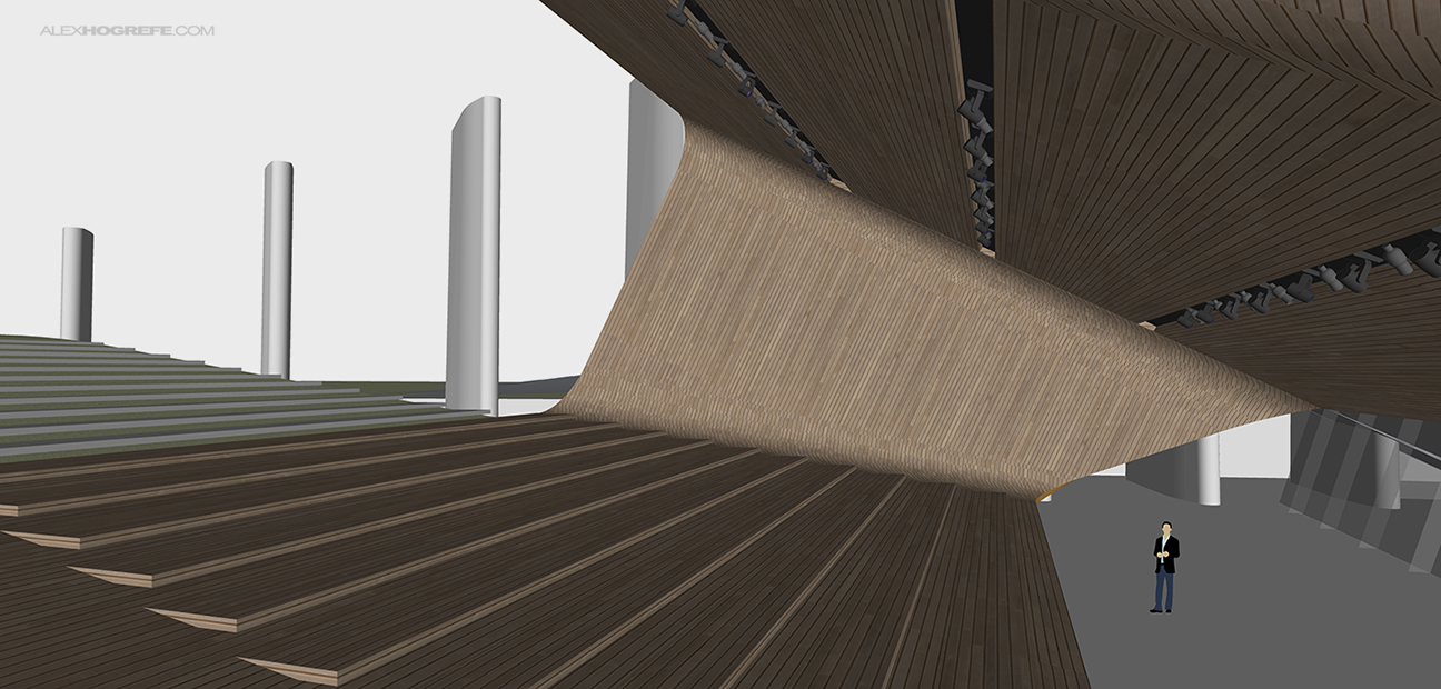
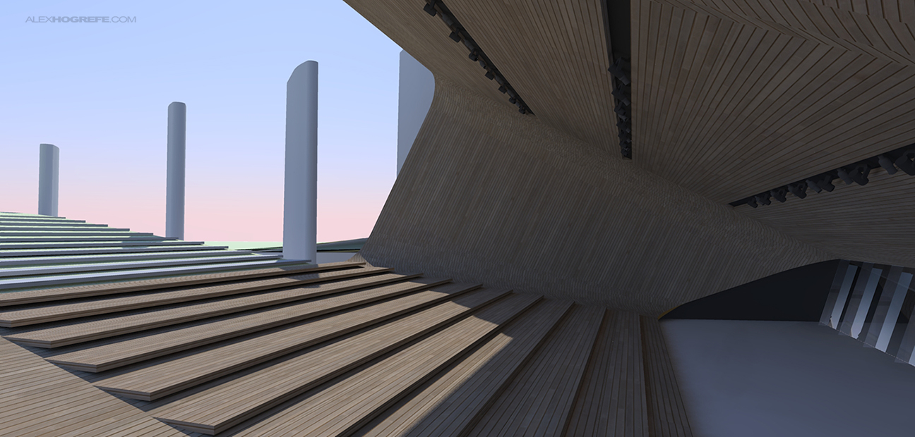
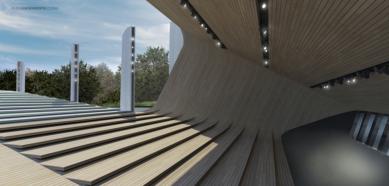
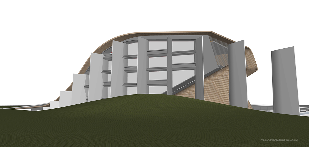
Below are some of the screenshots of images as I worked in Photoshop. The Sketchup model is lacking in detail and textures not properly mapped which meant I had to spend a little extra time in PS to offset this lack of development.
Above, you can see the Sketchup model is not very well developed. However, this is more than enough information to allow me to get the illustration that I am envisioning.
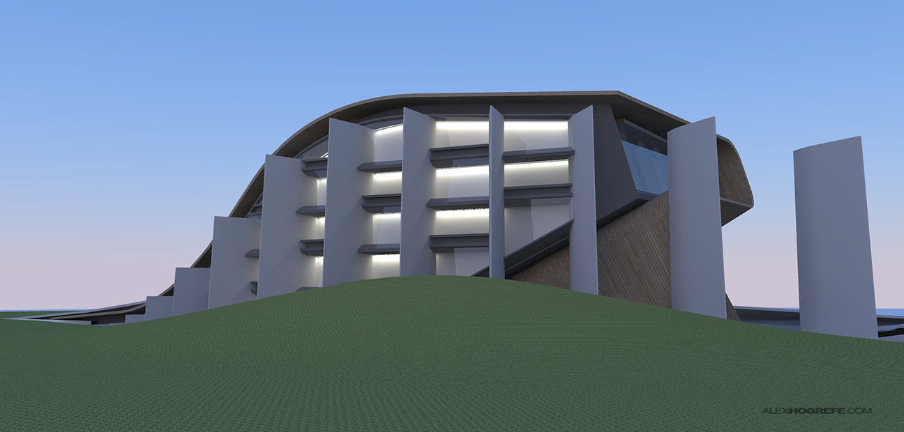
The Kerkythea rendering provides the basic shading information for me to begin building off of in Photoshop. Any rendering program will work for this step. I use Kerkythea because it is free but it is by no means a requirement for this workflow.
I always start off in Photoshop by adding a background which, in this case, includes the sky and vegetation. This step takes little time but adds a layer of completion that allows me to better visualize where I want to take this illustration. Plus, it’s always a good rule of thumb to start with items furthest back in the distance and work your way forward into the foreground. Another one of those things I picked up from all my hours of watching Bob Ross paint on TV.
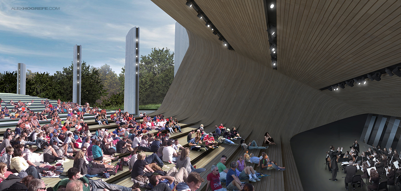
As I said earlier, I spent forever looking for images of people outdoors that I could cut and add to this illustration. It’s really easy finding views of people from the back, but surprisingly difficult finding views from the front. It was also tricky finding the right density. I didn’t want it to look too crowded, but also not too empty either. I ultimately used about 5 or 6 images to get the crowd shown above. Also, the perspective needs to match closely otherwise the whole shot will look off. The lighting for most of the people is coming from the wrong direction, but I wasn’t too worried about that. I had to take what I could get.
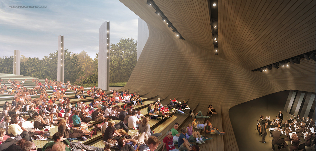
The problem with cutting people from multiple images is that there is a disconnect in color tones between my base rendering and all of the different images used. It’s obvious that the people were cut from different photos and they just don’t blend well into the illustration. A remedy for this is to use color overlays. In this case, I used a brown color overlay to blend all of the images together. Check out this tutorial I put together a while ago if you have no idea what I mean by “color overlay”.
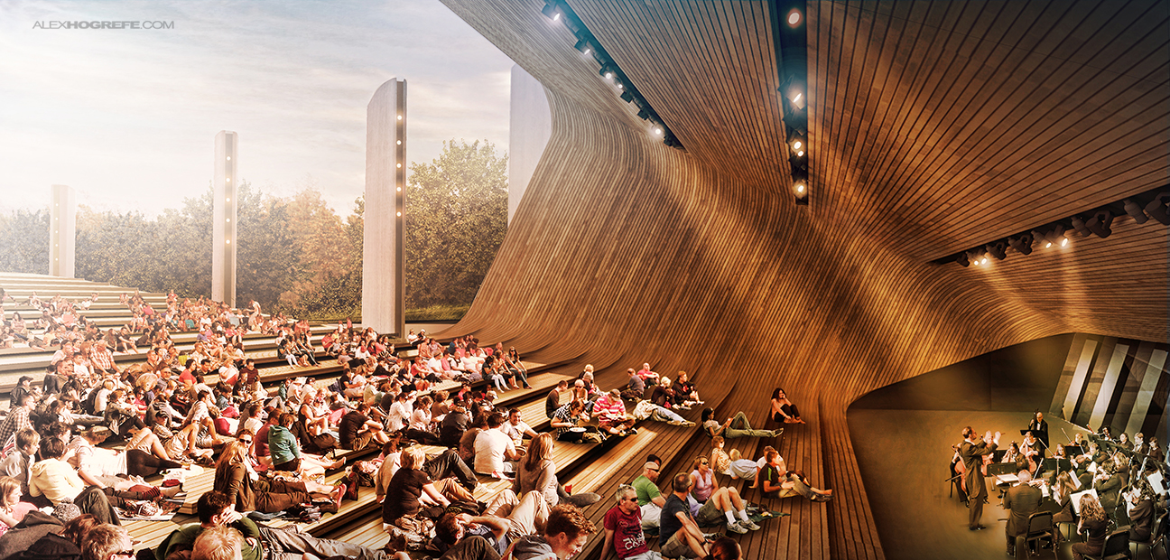
With this image, I did some more color tweaking with software called Topaz labs. I have been experimenting with a program they just came out with called “Topaz Restyle”. It’s primarily photography software but has been great for my arch viz work too. And, it only costs $30. It’s worth checking out.
With all of that color editing, the last step was to turn it into a black and white image. It hurt to do this but the rest of my imagery for this project was black and white too. Besides, I’m a big fan of black and white images and I like the reading of this perspective in grayscale.
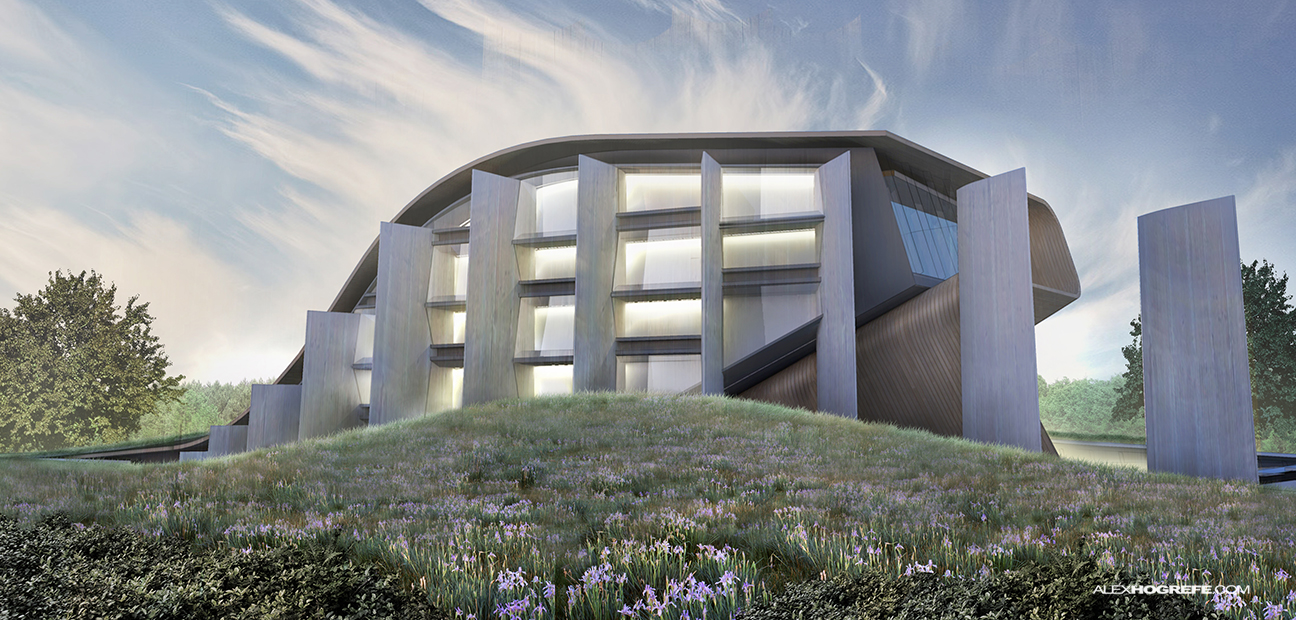
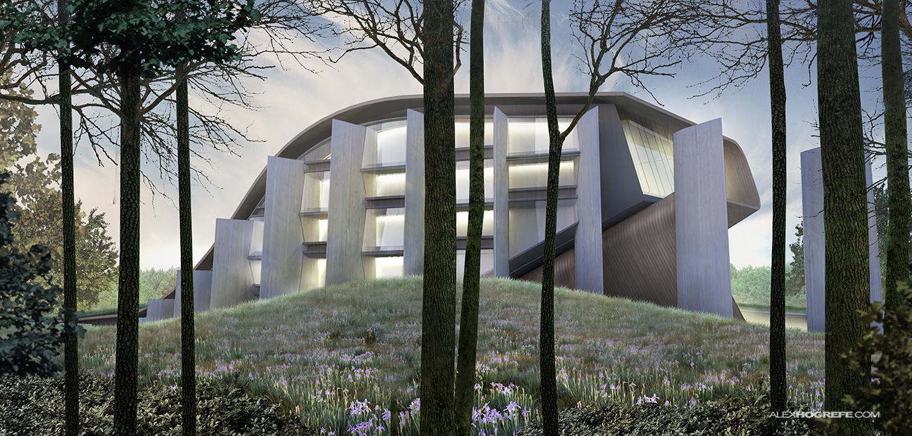
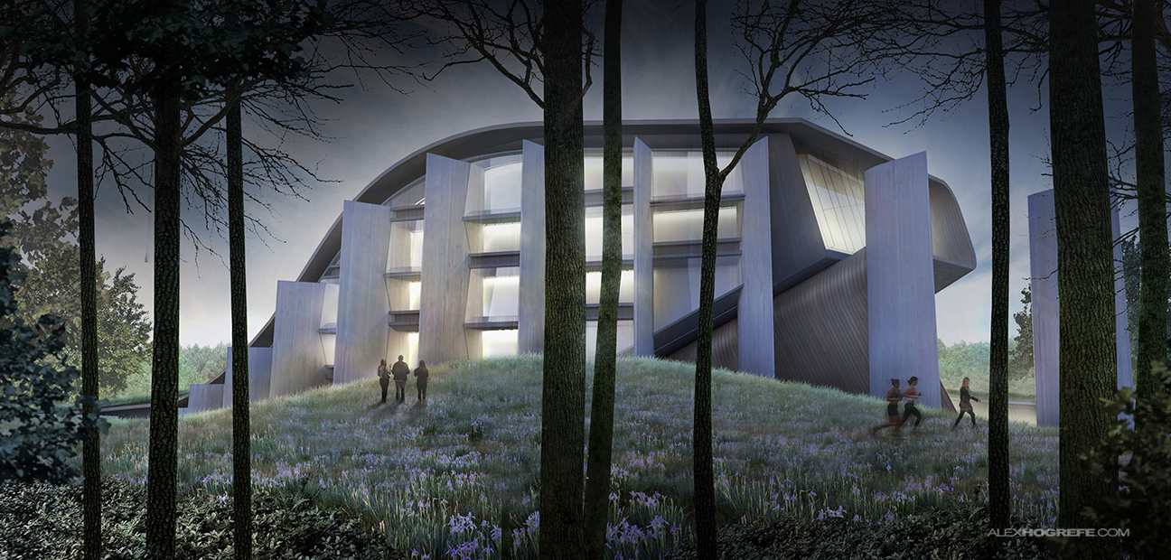
The second illustration was a little all over the place. It started off as a daytime scene but then went to a night scene midway through. The workflow was the same as above but with a completely different final result.
Again, the Sketchup model was not fully developed and some of the textures were not mapped correctly. However, this was overcome in Photoshop.
I rendered the model in Kerkythea as a daytime scene but also added lights to the interior to give detail and life to the design.
In Photoshop, I first added the sky and the trees in the distance. I then moved to the grass in the foreground and combined a couple of different textures to get the “overgrown” look. This is also the stage where I added more texture to the building.
The camera is actually sitting in a heavily wooded area therefore I wanted to throw in some trees to give a better sense of the surrounding environment. Unlike crowds of people, it is very easy to find tree silhouettes. This step went quickly but yielded dramatic results.
At a certain, point, I decided I wanted this to be a dusk scene. To do this, a blue overlay was added and some vignetting around the edges which allowed the interior lights to really pop.
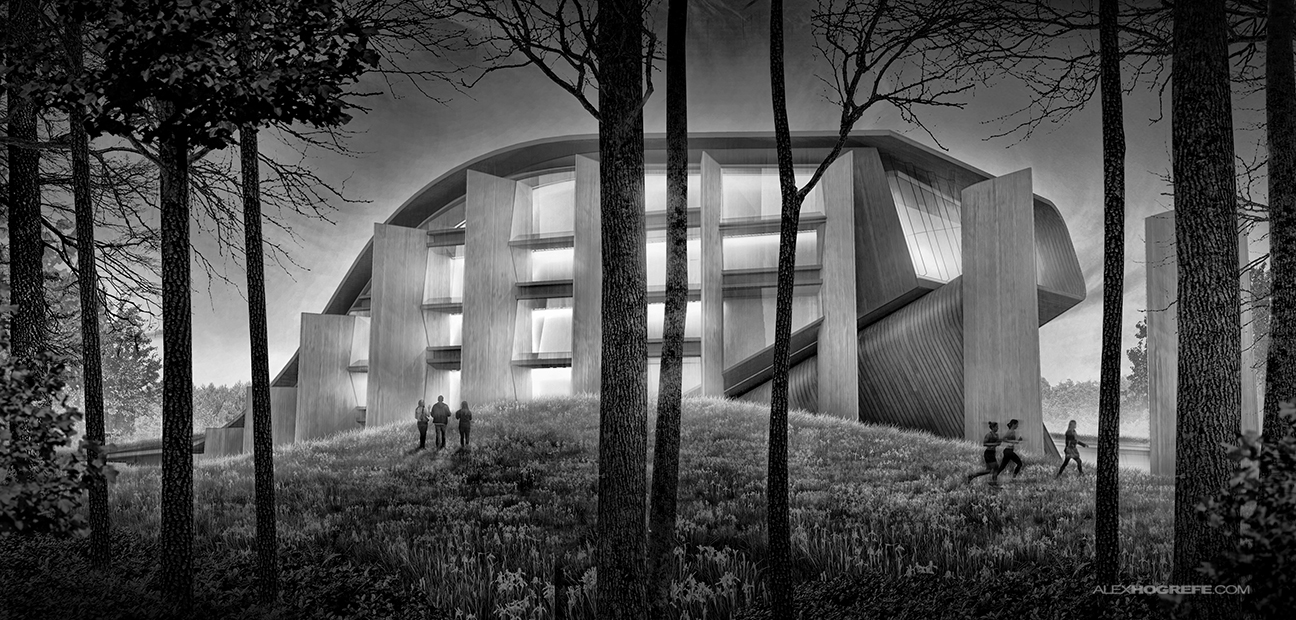
Similar to the other illustration, I turned this into a black and white image. In this case I think the image in grayscale is stronger than in color. The textures read really well and there is a nice contrast between the silhouette of the tress and the building behind them. Depending on time, there are a few more shots that I wanted to illustrate. However, I want to revisit a few other projects for this portfolio before the end of the summer. Much more later.


Amazing as usual Alex! I really like the first pic. Although i would try too keep the colors… I'm waiting for your next post on your projects 🙂
And now, it's time to sell the project! great job
Hey Alex, the final b&w-effect on the images, they are basically a sort of HDR effect, right?
Hi Alex! I chanced upon your blog and absolutely love your work and I've been trying out your tutorials. I have a quick question about rendering and post photoshop work. From your articles it's amazing how you keep your renders so simple and manage to do so much to bring the image to life with photoshop. I've seen plenty of people fitting as much as they can in their external rendering software, trying to add realistic materials, playing with render settings etc and skipping photoshop entirely but their final image is no where as engaging as something like yours.
What are your thoughts on Rendering VS Post Photoshop work? When you use an external render engine what are you looking for in the image that is produced?
Cheers
Grace
@Grace, going through school and now working in an office, I never really had enough time to fully develop a detailed model which would allow me to do Photorealistic renderings. Nor did I have enough computing power or time to render detailed models. Instead, I have always preferred to invest more time in PS experimenting with light and texture. I think this method offers up more opportunity to be creative and test our more iterations of styles in a short amount of time. Not that the other method is bad or wrong, I just preferr the speed and a style with more of a human touch to it vs. the ultra photorealistic.
I just saw this panorama on 360cities, and I immediately remembered about your auditorium… Thought you might find this interesting! 😉
http://www.360cities.net/image/the-wave-1#-727.37,2.98,70.0
Hi, ALex! It is an amazing work! Love it so much! I just installed the Topaz Restyle. There are tons of presets. Do you have any recommendation on the presets?
Thanks a lot!
Cheers!
Qi
@Herman, I wish you would have seen that earlier. Its beautiful and gave me a few ideas of how I could have handled the space differently
@Qi, I have only been using Restyle for a few weeks and I am still experimenting with it. There is a ton of presets to go through so I don't really have any favorites. I sure I will post in the future about it once I have had time to use it a little more. And can say that every image seems to work better with a different preset and I haven't found one that works great with all images.
just wanted to let you know that your a icon n our university , everyone uses your blog even the doctors , thank you very very much , much love and respect from U.A.E – dubai
Alex, do you still use an 1/8" bleed in the center of your full page renders (2 pages would be 1/4")? It doesn't look quite that thick – how does this translate to printing and binding?
please alex show us vedios plzzzz , you have a great talent and skills in both design and digital rendering you are awesome plz let us benefit from your knowledge 🙂
Thanks so much for this site!, I'm an architecture student in Mexico and it's been really, really helpful to me! Regards!
Thanks a lot , ALex! I am experimenting Restyle too. I really like your rendering style and learnt a lot from your blog. Thanks again!
@Aaron,
Typically, you want to give a little more than 1/8" on each side to account for binding. Its probably better to leave 1/4 on both sides. The images I posted are shown without the bleeds just so that they look good graphically on the site.
@ Sebastian and Ashraf, and Qi, Thanks.
Amazing renderings and great work. Must have literally broke your back working and improving everyday. I really like your intention to share your work and explaining in every inch and detail. I wish you all the best !!!!
I hope you receive enough funds for the software too !!!
Honestly it's a great illustration. Plenty amazing and creative activities you granted here. Like most like this types of plenty creation. Nice sharing ever!
Alex,
I have been following your blog for awhile and have used some of your techniques in my past work. I am looking to hone my craft a little better. My question is When rendering from the background to the foreground how do you know which sky and scenery to use?
My difficulty has been trying to add depth to my drawings. All of my renderings have that, for a lack of better words, flat, Photoshop look.
wowwwww….. that's all I can say… wowwwww…..
Great work as always! I'm curious as to which font you are using for this project?
Great Illustration ! Creative work always looking adorn and plenty attractive. It helps to give entertain to people by theater update 3. I amazed to see this too much extraordinary stuffs.
hi alex. nice perspectives btw. i just want to know, how did you make curve building in sketchup.. i always curious and wondering how people can do it. of course im just intermediate in skecthup. will you teach me or give link for tutorial. my design always limited by skecthup if iwant design something curve like this. thanks.
I'm not a huge fan of a tree being directly in the center of the final render. There doesn't seem to be any rationale behind someone say, taking a photograph of the building right behind a big tree. It draws one's eye directly to the tree and distracts from the building.
I've nice feelling after seeing your amazing projects…
good for you…
Hello Alex,
Great workflow, 🙂
I notice in the 1st Tutorial-
At the edge where the wall intersects with the stepped seating.
There is a difference in geometry visible in " Photoshop edited karkethya rendering" and the "original Karketheya rendering".
The wall geometry merges into the steps.
Is that achieved via overlaying the "raw sketchup image" on the "karketheya rendering"….or there is some other technique involved?