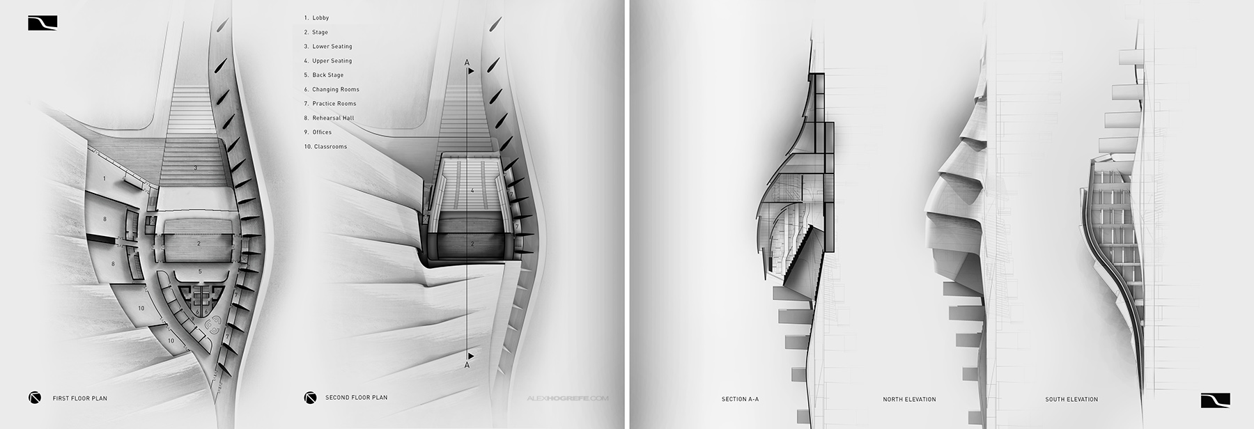
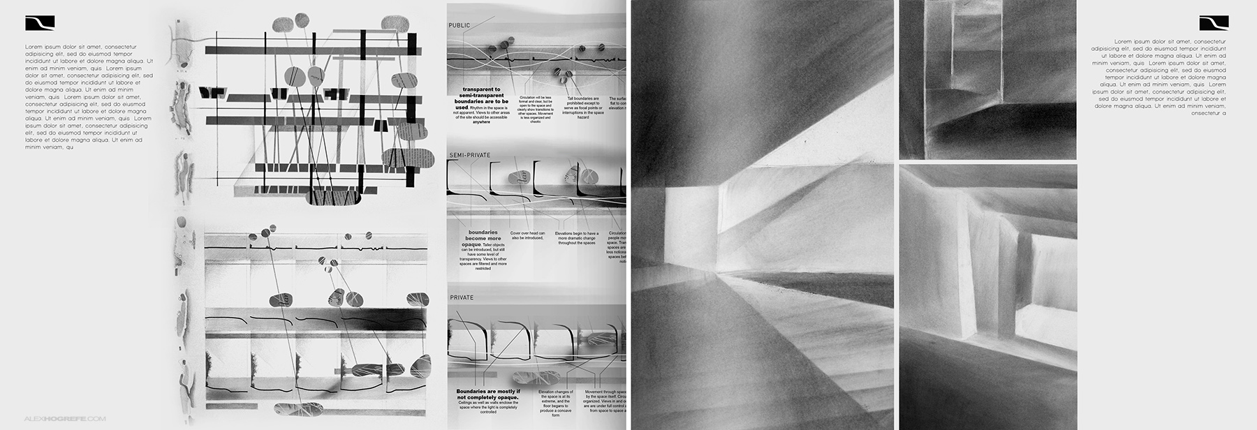
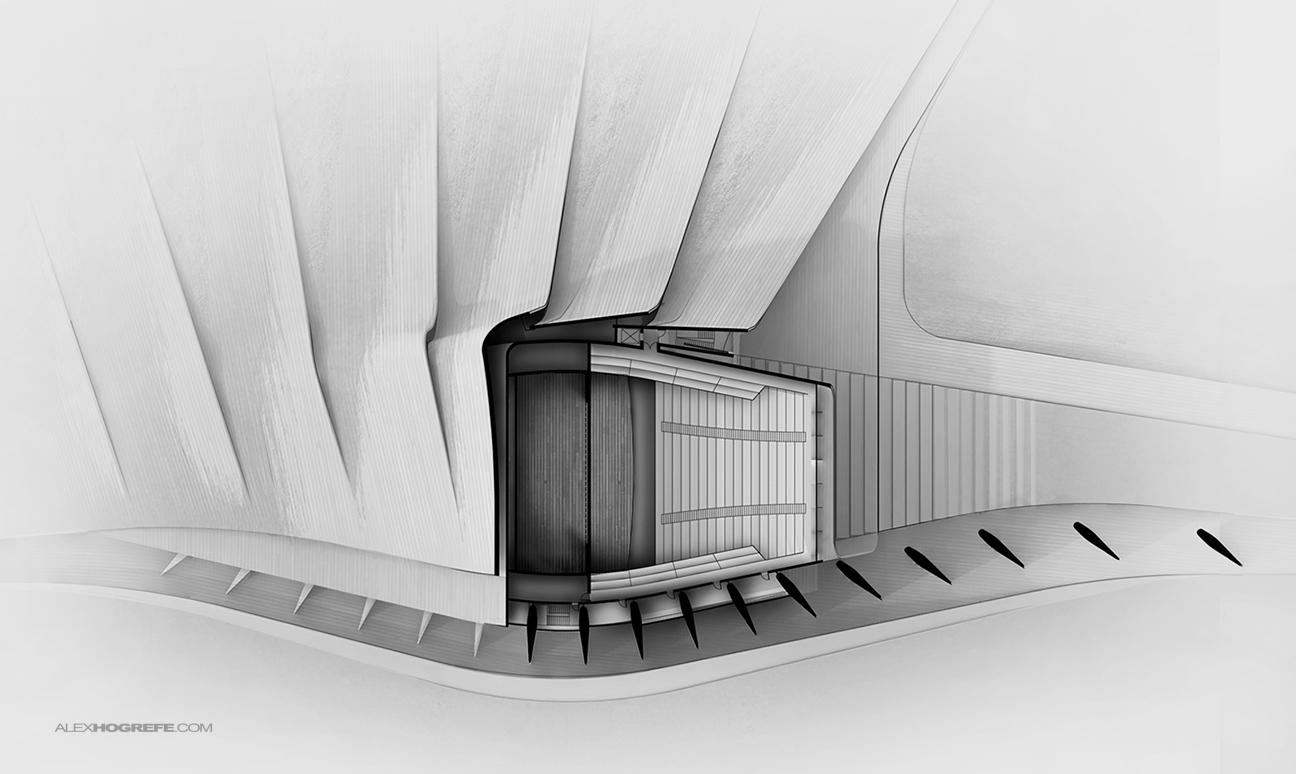
Progress is being made on the theater section of project portfolio upgrade. I put together some floor plans and sections/elevations of the design as well as compiled some of my past process work into another spread. I decided to group the plans, sections, and elevations into one spread because a) I want to leave more pages for process work and b) I like the visual relationship between the drawings. I typically don’t render floor plans mainly because I prefer the clean, diagrammatic look of simple line drawings with poche walls. But, because I wanted to emphasize the geometric relationship of the plans ,sections and elevations, I therefore wanted to illustrate them similarly too.
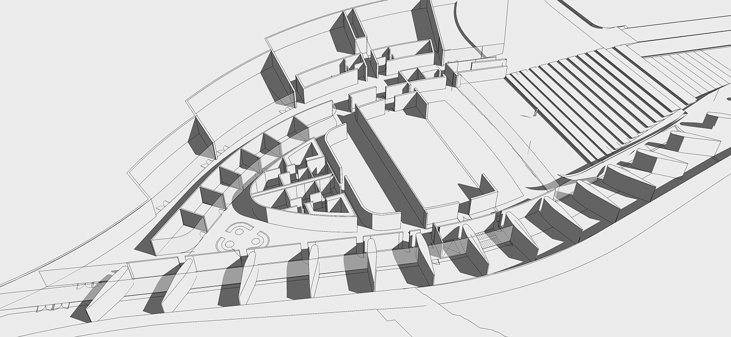
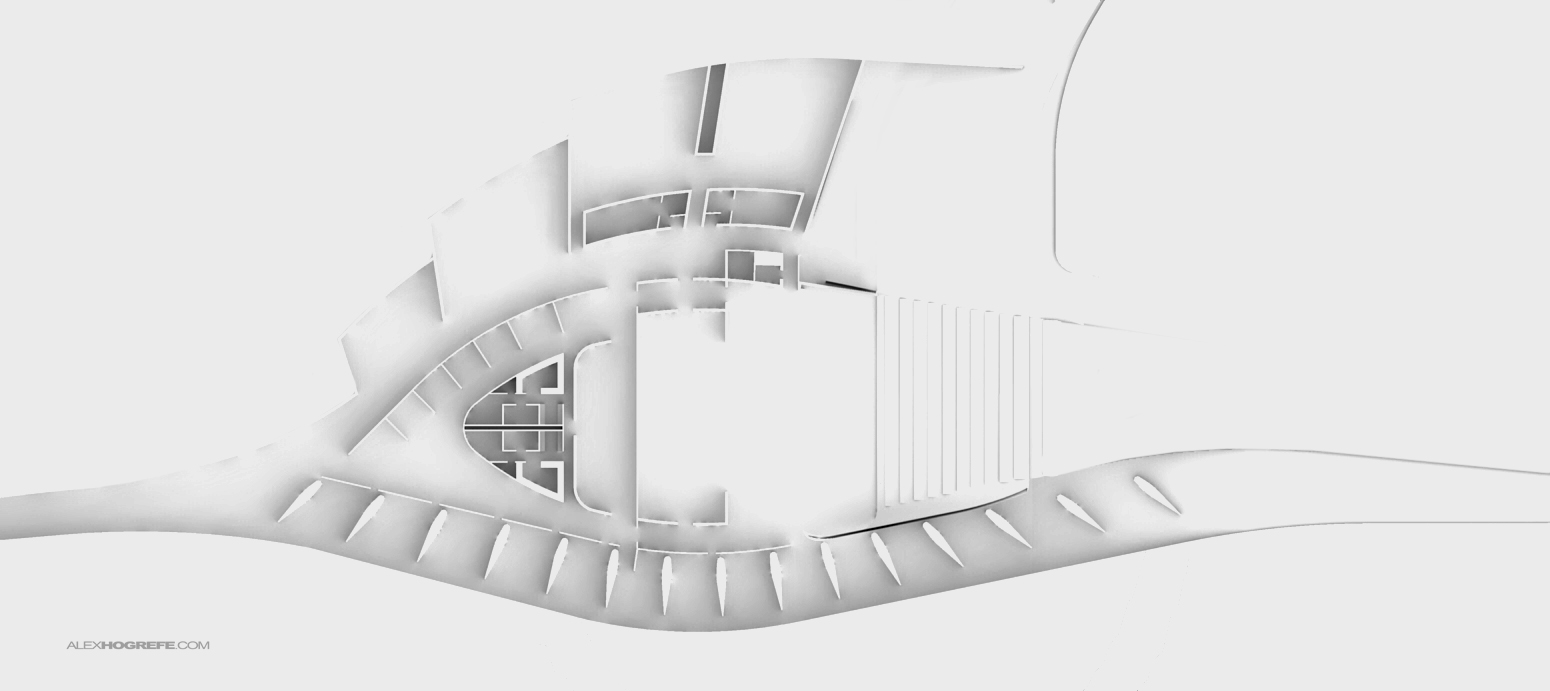
I have been designing and developing the 3D model as I put together this portfolio and I therefore haven’t had time to fully resolve all of the geometry. The 3D model was not in a place where I could cut a section and render the floor plans. Instead, I took the CAD floor plans that I had been developing along side the model and imported those into Sketchup and quickly extruded them. I now had something that I could throw into Kerkythea and render as seen below.
Above, A Sketchup model of just the first floor plan.
Above, A base rendering in Kerkythea of the first floor plan.
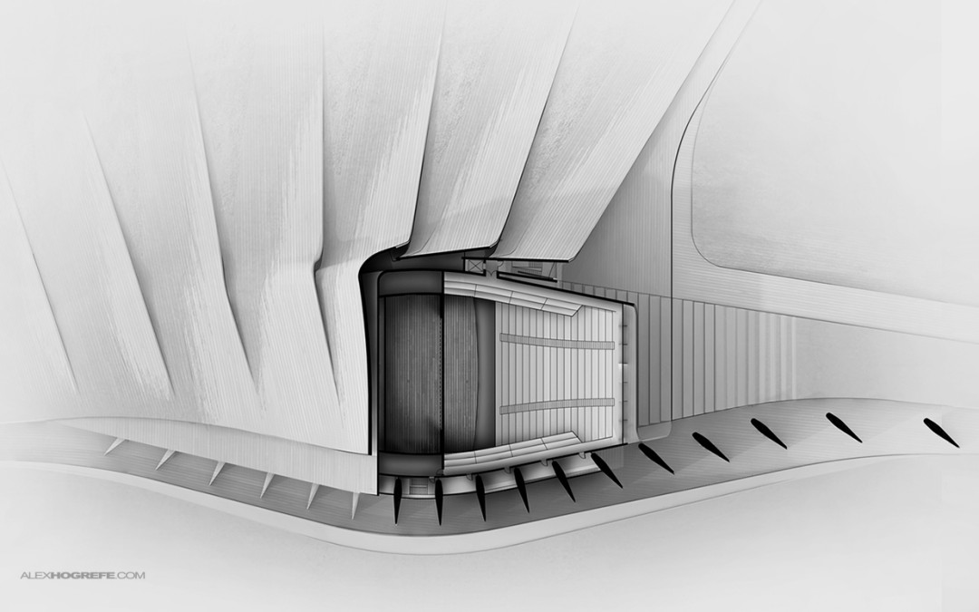
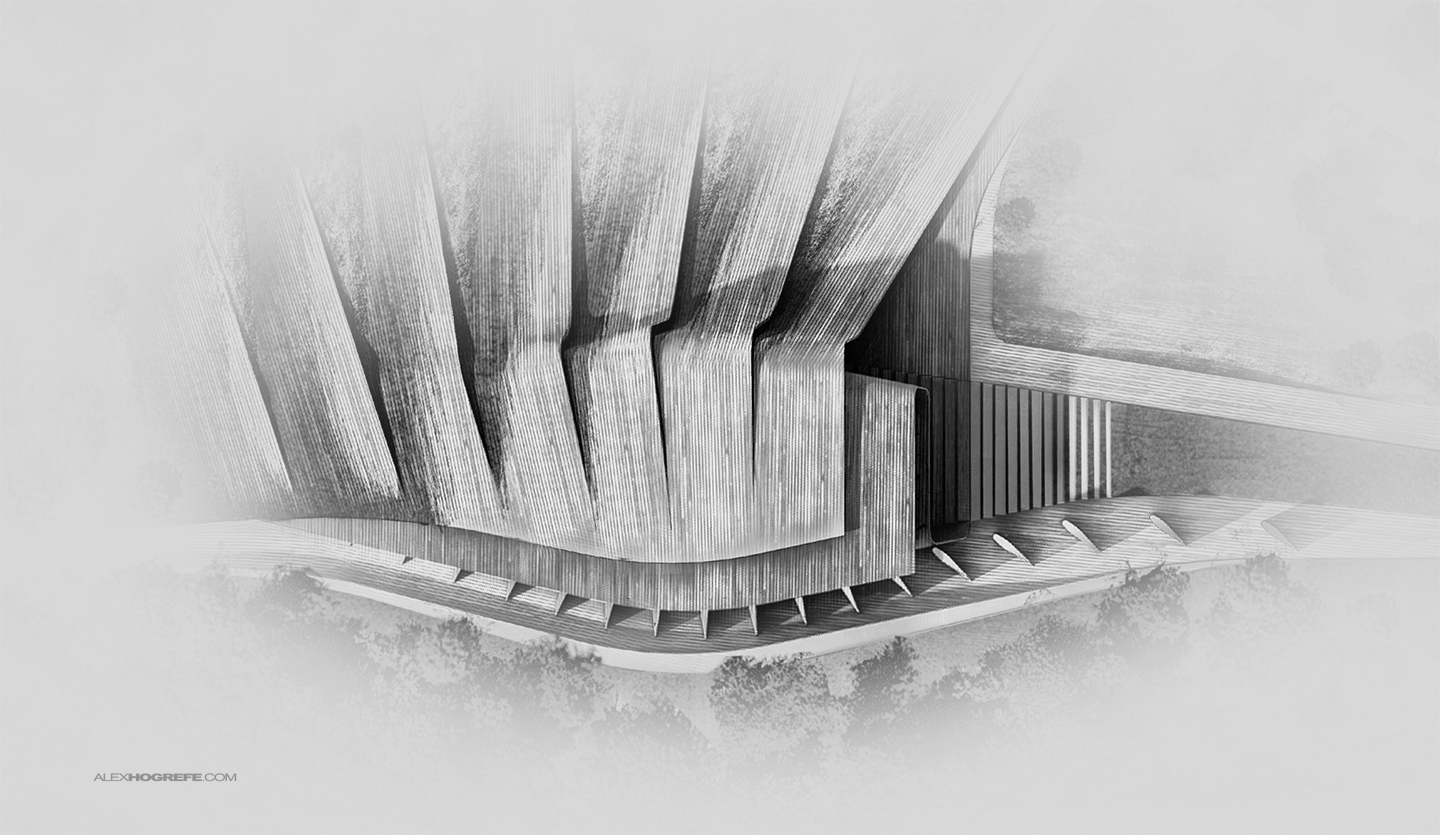
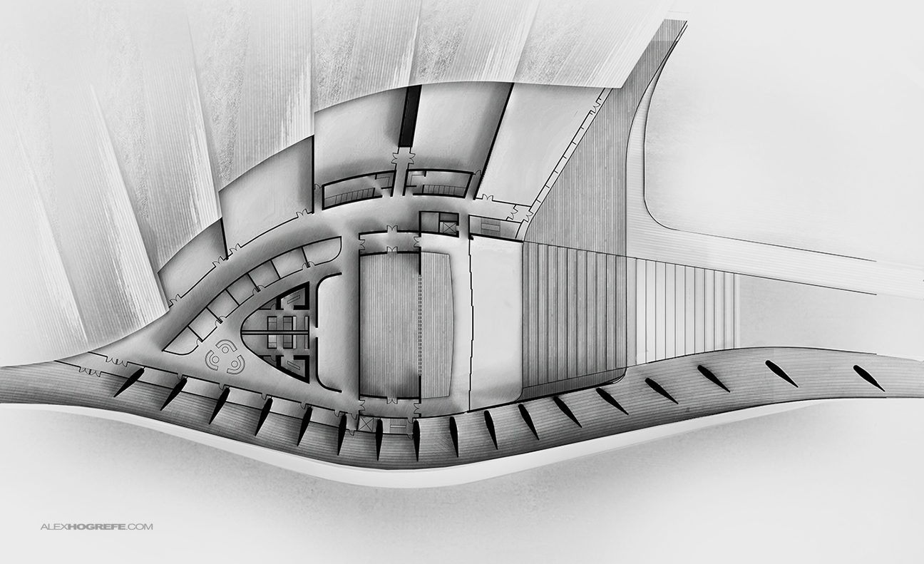
To finish everything off, I took a site plan rendering that I had made previously and blended it with the floor plan rendering to add a some texture and give some context of how certain walls relate to the exterior form. I also took the CAD floor plan and overlayed it on top of the illustration to get neatly poche walls and edges.
This project section of the portfolio is almost complete. I still want to add more site analysis diagrams along with some eye-level perspectives of what one would see when experiencing the different spaces of the design. The spreads are still lacking a sense of scale and place so I want to end with renderings that show people inhabiting the spaces, activities that will take place, and how this design blends with the site to generate a unique and exciting experience.
Below are the series of spreads developed so far for this specific project.
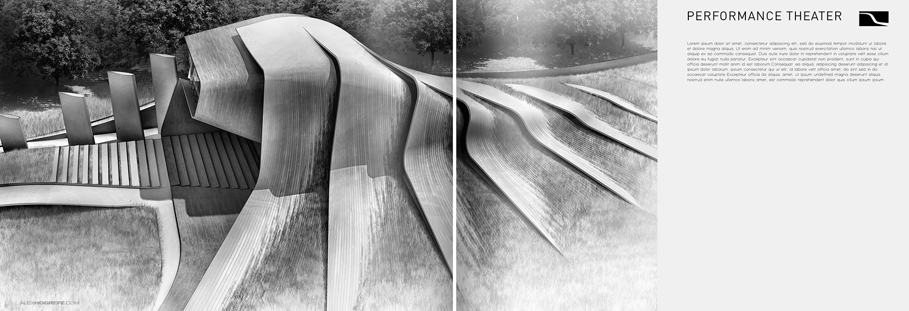
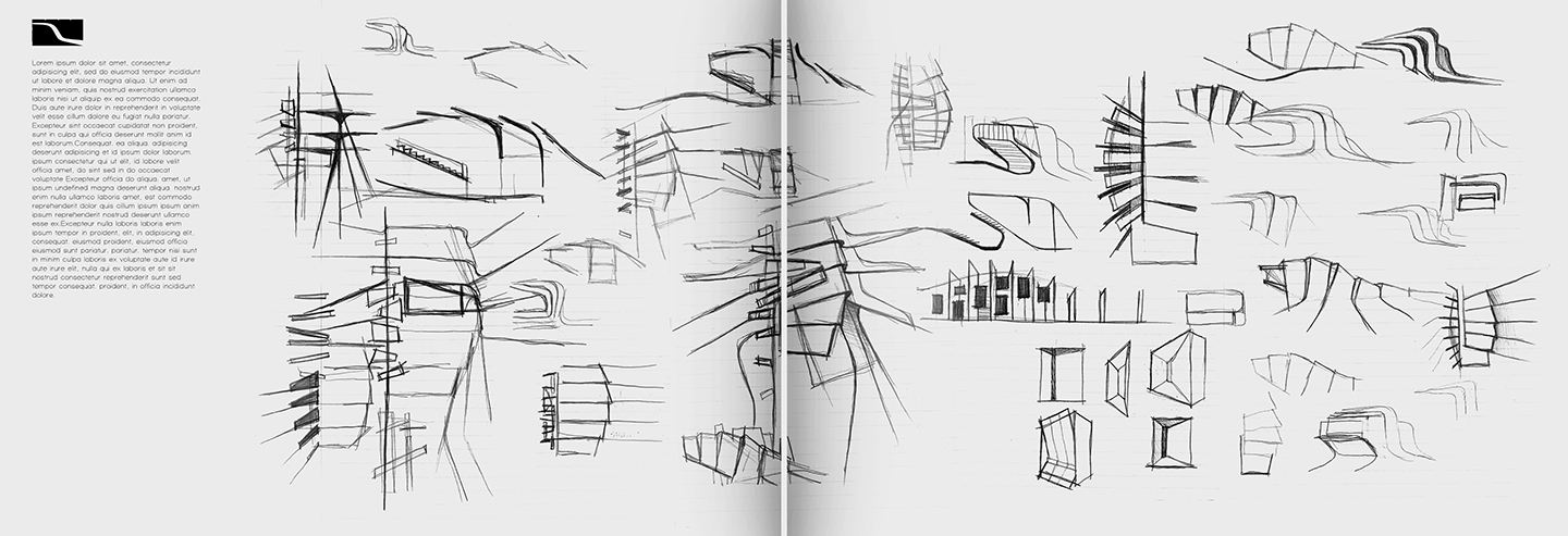
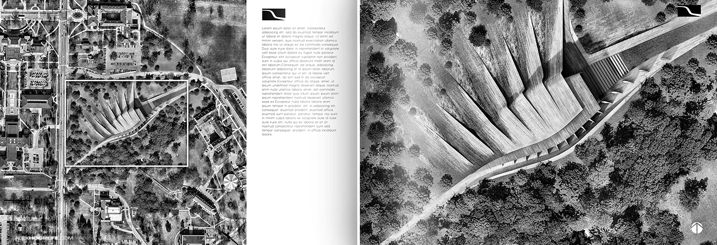


Looks great, man.
Looks Great But i got one question! Why did you do vertical section and elevations? I know they match up with the floor plans but it makes you wanna tilt your head to read them.
@Dan,
More than anything, I liked the visuals of layout and how you can see the relationship of the curves to the plans. I feel like if they laid horizontal, the strength of the repetition would be lost. However, this portfolio is meant for print, and if the viewer really wanted to study them, they could just rotation the book.
Great work again Alex. Always look forward to new posts. Keep it up!
I've been following your posts for a while, I enjoy your approaches. This time I find it a little too 'messy' seeing so much art on the page. I think you've said elsewhere you have trouble with white space. This is a situation where it would be appreciated. The cover image is great, but then if you had larger blowups of subsequent images, and less of them– with more of that fade to white– I think it would match the elegance of the design.
One question– have you tried using Twilight yet? What are your thoughts compared to Kerkythea?
thanks for continuing to share.
Fantastic as always~ But is there a way to change the layout so you have to turn your neck? I bet you did a lot test. i just want bring this up so everybody can share some thought. I suffer from that a lot.
This is wonderful layout work. I think your graphic maturity is showing; the type is clean and the images are clear. I'm not sure if I agree with some of the comments regarding the sections, as I have made similar layout moves in the past. My experience is that if you make such a move designers are quick to reorient themselves and may appreciate the graphic rhythm created by the spread as a whole.
Have you considered how you will bind this portfolio? What will be your final page size?
your work tips set as a kind of confidence for students when they design their project, because everyone know that even if our project are not extraordinary they do look extraodinary when using your tips. THANKS!
@JG,
Its difficult finding the correct balance of white space and information. For the diagrams spread, I literally left out 75% of the diagrams. I am also trying to minimize the number of pages in the portfolio. Too much white space and my portfolio becomes a 100+ page book which I want to avoid. I have not tried twilight, but I will be the first to say that Kerkythea is not the best out there. I focus on it because it (use) to be a free download and accessible to everyone.
@Michael,
Thanks for the comments. Because of the amount of pages, I will probably go with a "perfect" binding. Its a clean look and most print shops can do it. Right now, the page sizes are 6×9" but I am also formatting the pages for an 8×10 so that I can test out printing online through companys like blurb. I plan to do a post on it when it is all said and done.
The stage is at the same level as the lower seats? (I mean without any elevation?) The drawings look very, very good.
Nice work, but I still wanna know more about what is your process to decide how to lay out your pages and what should be presented in the pages,
by the way, can you give us a video about how did you do your model with curves, because i found it pretty difficult to move curves or lines to the exact position.
thank you
very nice~thx
I really enjoy your blog and your works. Your graphic skill is awesome. But I enjoy a lot more of your Photoshop tutorials that I can actually learn it step by step. I know you haven't make videos for a long time and I really hope you can do it again.
Thank you
Great work – really love the creativity that you put into spaces.
Hi. I love your work. Really inspiring. But one question I'm asking myself while I look at your work; Why all the extravaganza? Why is it important to have these stunning renderings? Does it help promote great architecture? I would love to hear your take on this matter some time 🙂
Hi!
What program did you use when making the 3D model of the theatre? I'm trying to make a pretty similar roof for my structure but I really struggle to make it.. Any tips??
@Herman,
I used sketchup with some plugins. I created a post here that explains the process: http://www.alexhogrefe.com/blog/2013/6/23/lofting-basics-process.html
I use a lot of plugins by Fredo. They are the most stable and have great interfaces.