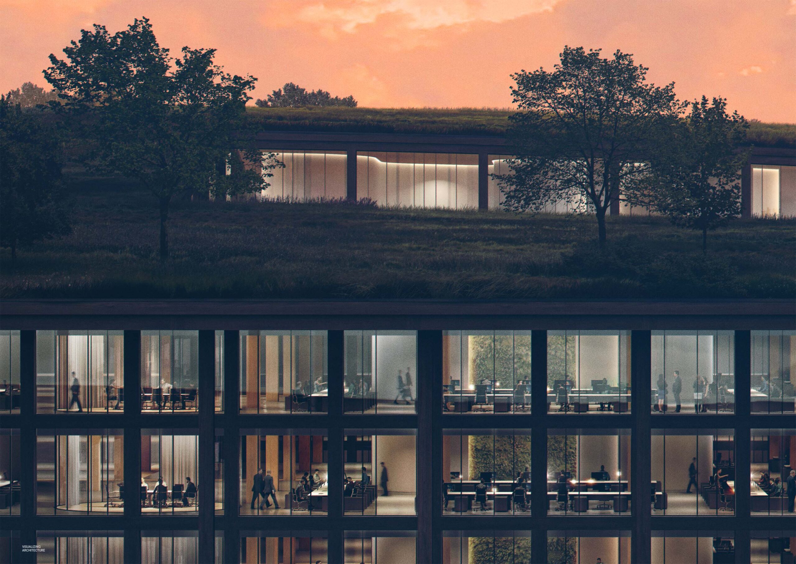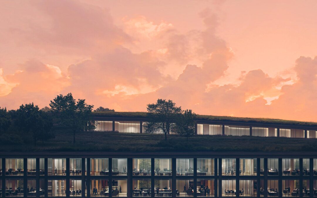
This has been an image that I started a while back and abandoned and then picked back up again. I wasn’t sure how I wanted to approach it because of the amount of detail involved. This view is all about the activation of the interior space and making it feel lively and interesting. However, there is a balance that needs to be struck between the macro and micro reading of the image. Sure, people will be zooming in and looking at the detail of the interior space, but the image still needs to hold up when looking at it as a whole. It is easy for the details and complexities of the interior spaces to look muddy and busy from a distance so I found myself constantly zooming in and out to make sure the image was ready properly at different scales. Below is a quick break down of the image.
1. 3D Model
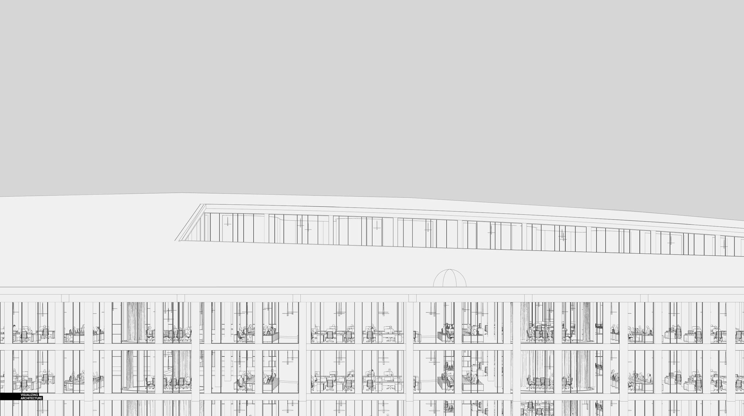
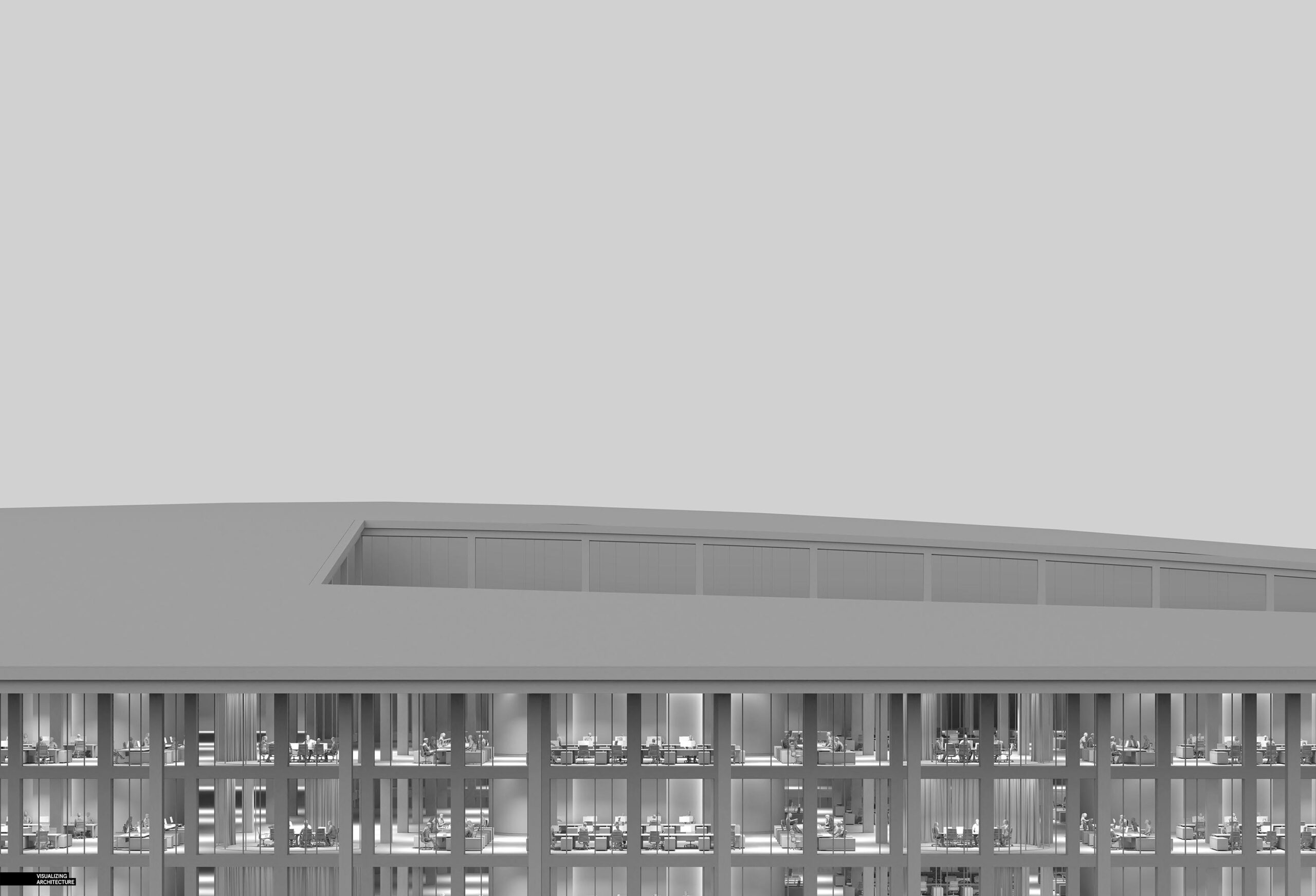
For an image like this, trying to mask so many people around desks would have been a nightmare. On top of that, the lighting for the space is directly overhead, so finding enough cutout people with the proper lighting would have been equally difficult. Therefore, I used mostly 3D people for this scene. At Design Distill, we use 3d people all of the time in the images we make because of the fact that they perfectly pick up the lighting of the scene and the time that it saves not masking in Photoshop. The 3d people do not always look great up close, but are perfect for situations like this where they are seen from a distance.
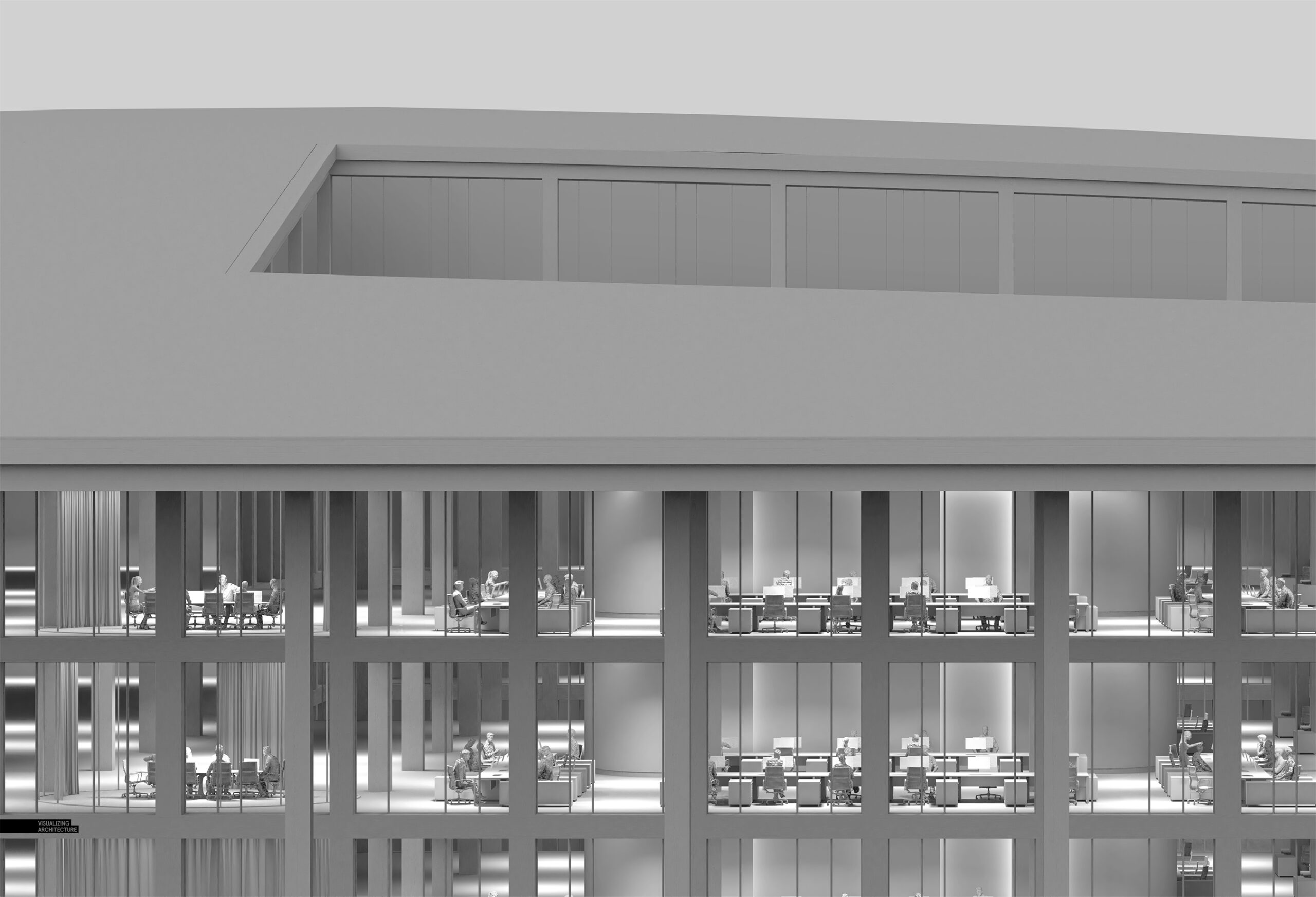
If I had a little more time, I would have liked to add in more details on the desk surfaces and add a few floating lounge spaces in the areas of the floors that are still a little bare. There is simply an endless amount of detail and little narratives that could go into a view like this but the weekend was coming to an end so I had to call it.
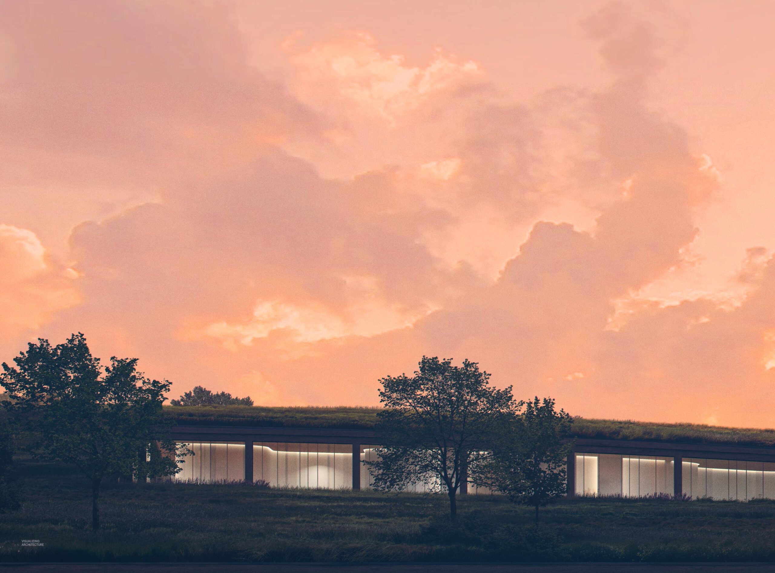
2. Sky
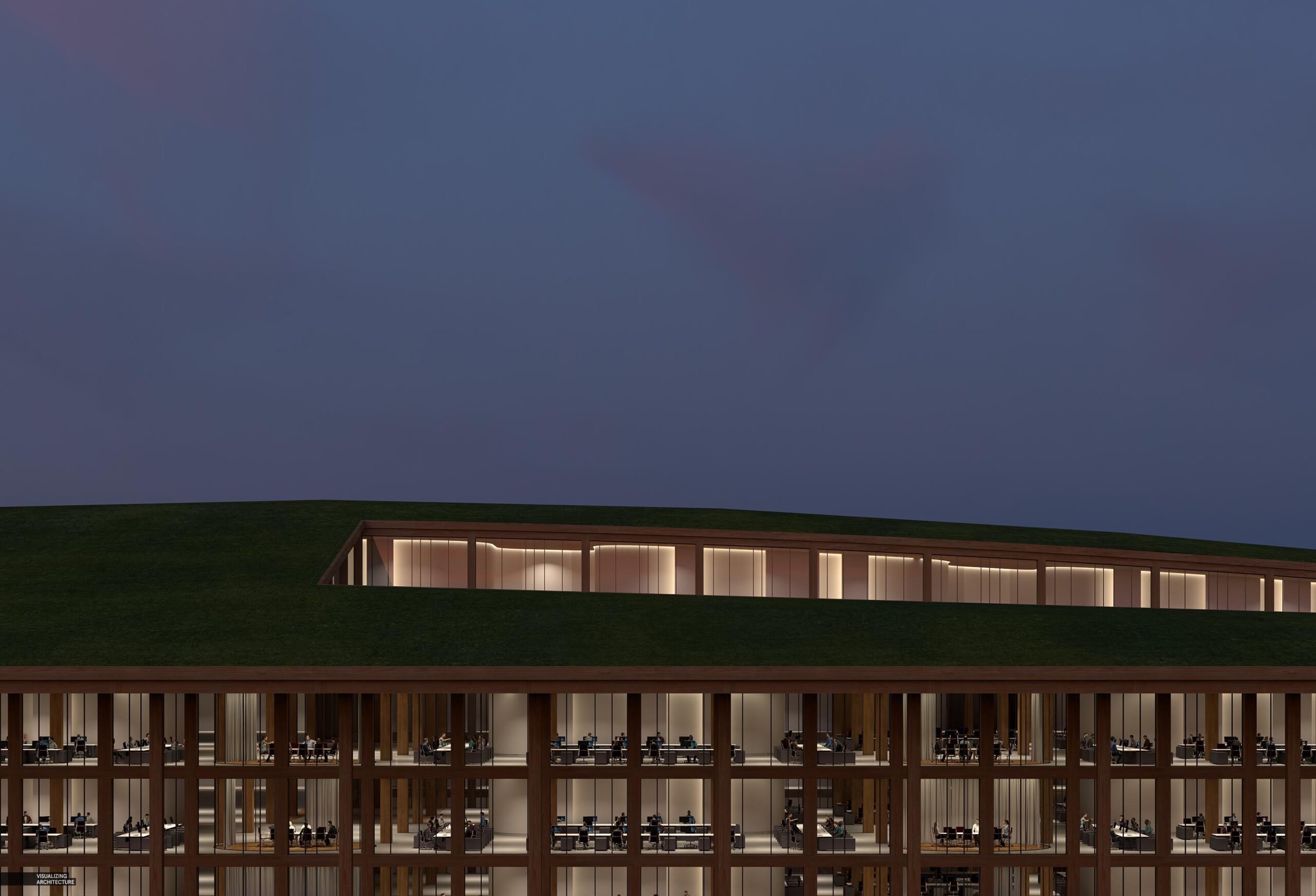
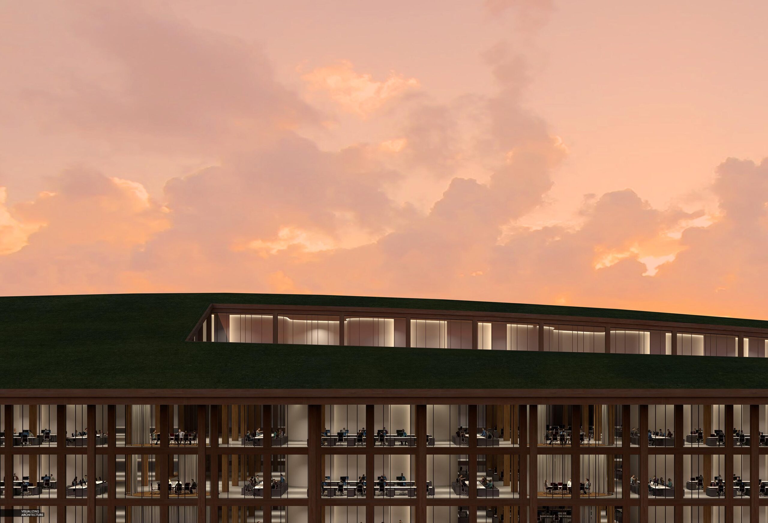
If the sky feels a little unnatural, that was intentional. Working on so many illustrations each week, sometimes I just want to switch it up and go with something a little different. I wanted a punch of color, so I took a sky image that had lots of blues and purples, and dumped a whole lot of orange on top. In the original sky image, the clouds contained lots of contrast and drama, so I muted them a bit so that the sky didn’t feel too busy. I wanted the color to be the focal point, not the cloud texture.
3. Darken
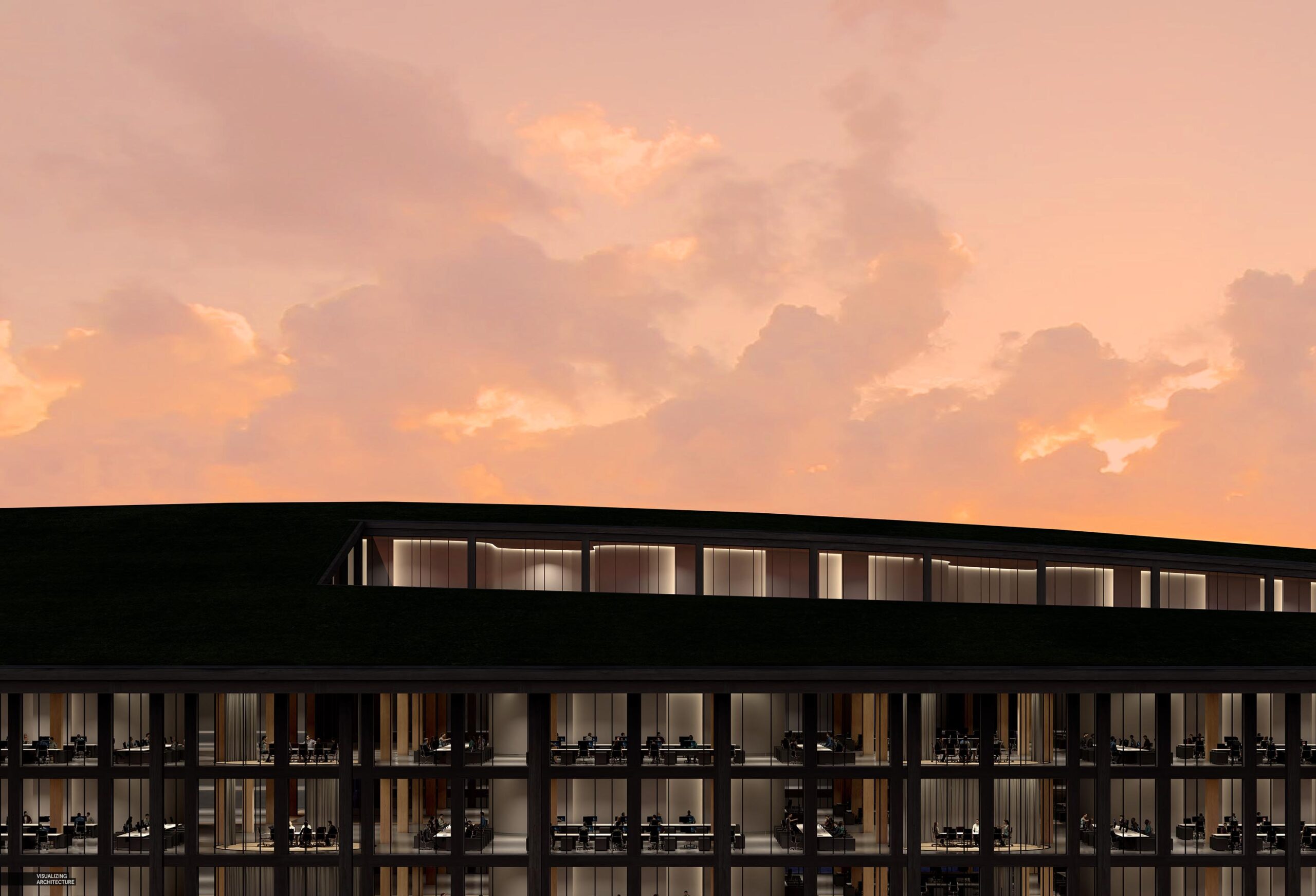
Once the sky was dropped in, I turned my attention back to the architecture. I darkened the exterior columns and rooftop significantly so only a hint of texture and detail was left. this was done by setting up a mask that excluded the interior and adjusting the levels. I didn’t want the exterior textures competing too much with the interior details as this would muddy the hierarchy and flow of the image. I wanted the eye to move past the exterior elements and go directly to the lit spaces inside.
4. Interior Details
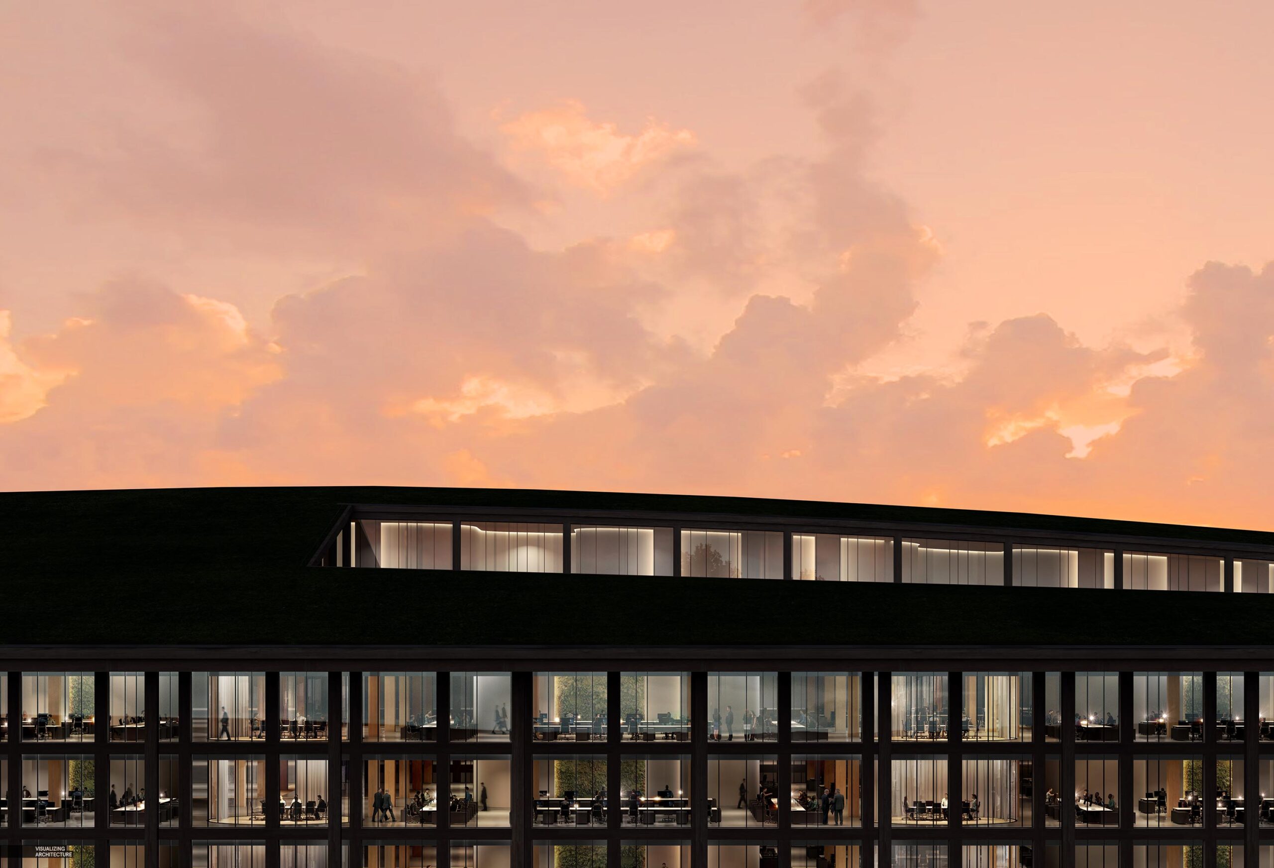
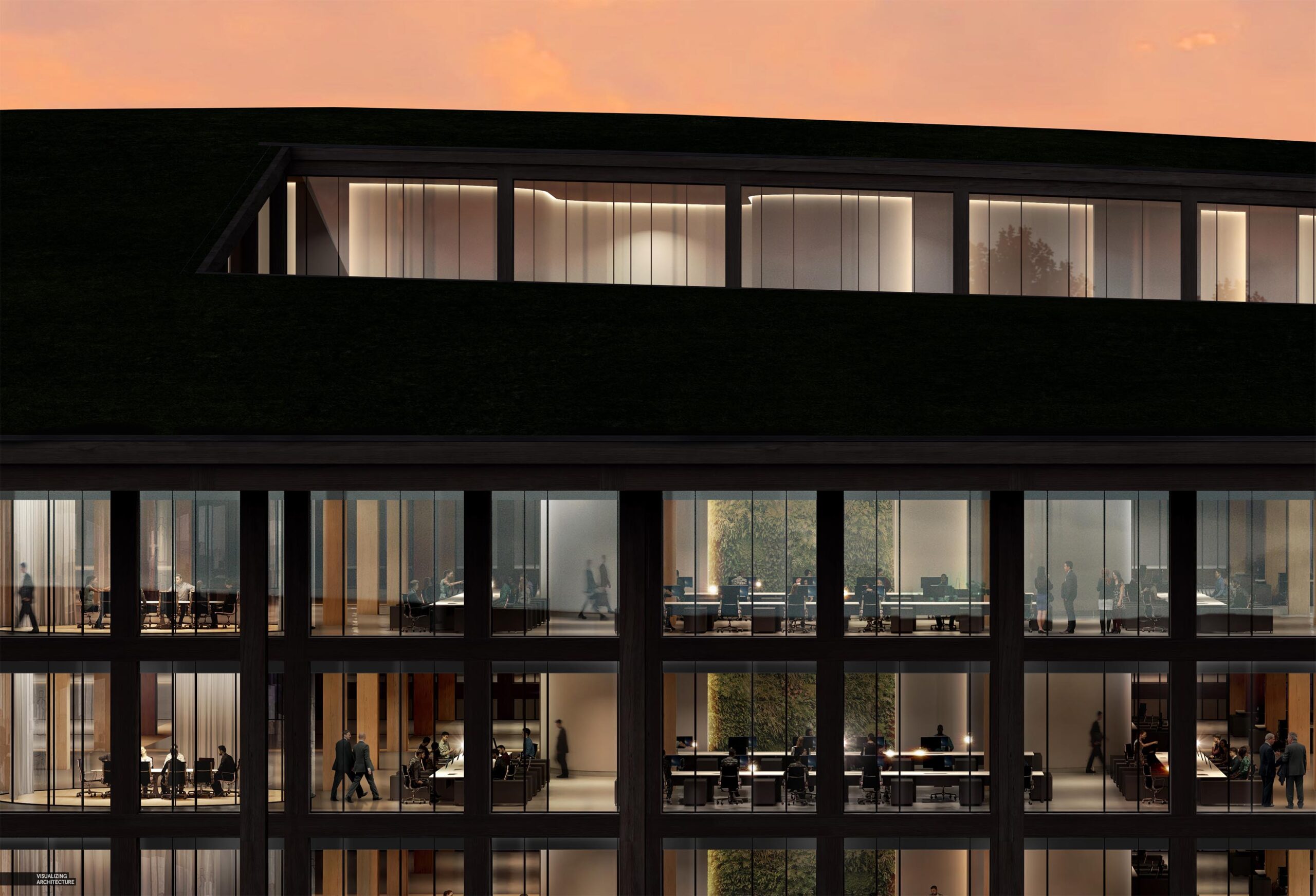
Much of the detail added in Photoshop was subtle. Overall, moments of warmth or coolness was added to break up the monotony of each floor stretching from one side of the image to the other. I punched up the light around the conference spaces and added in some green walls to further visually break up the spaces. A few 2D people were added along with some desk lamps and accent lighting. Finally, a subtle horizon reflection was added to the glass to help define the glass plane.
5. Vegetation
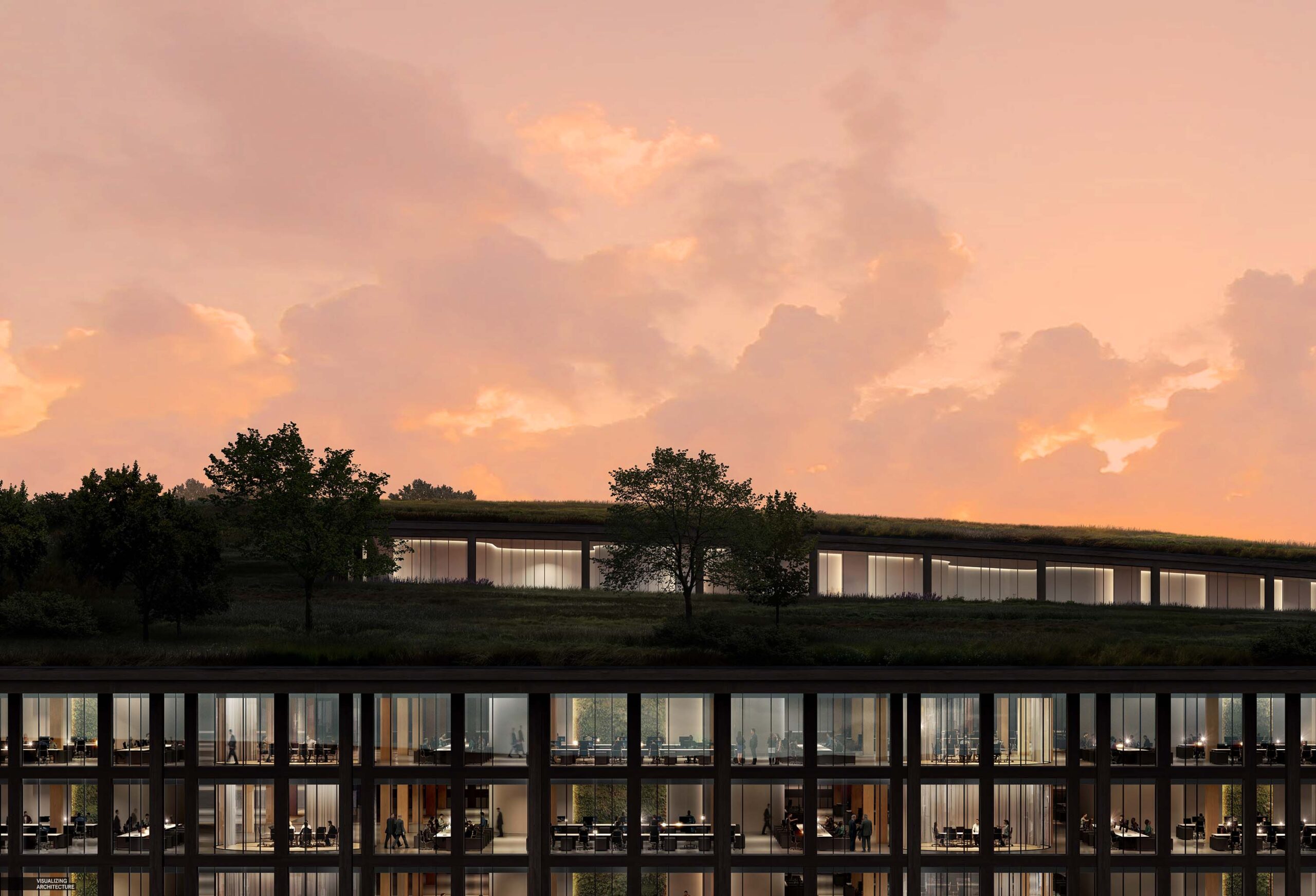
The roof vegetation went relatively quick. The vegetation was not the focal point of the image and was significantly darkened which meant I could be a little more fast and loose with textures and it wouldn’t be noticeable. The most important part was getting the edge shadows to read properly so that the grass felt tall and had depth.
6. Final Image
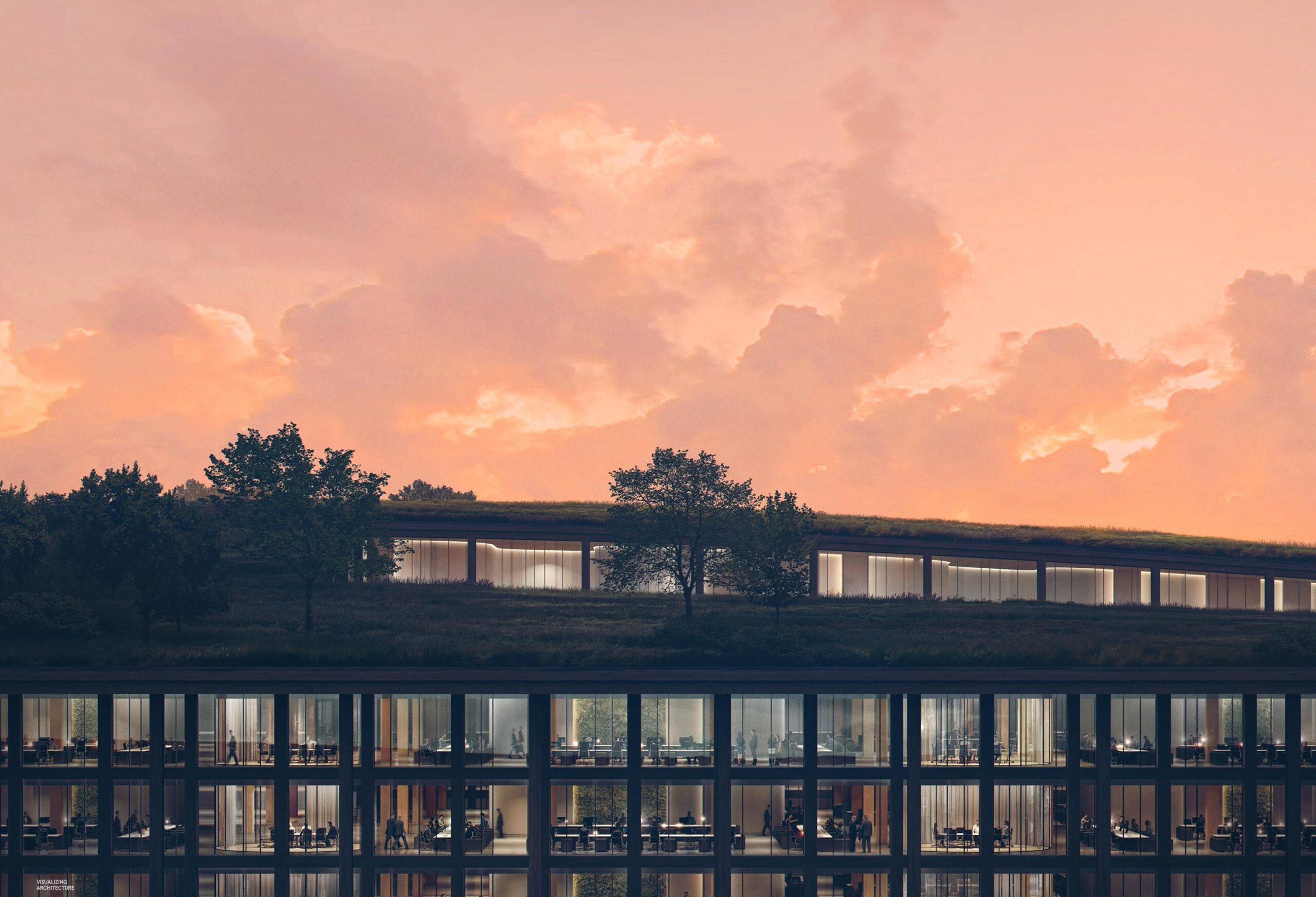
I didn’t do much with the color grading. I softened the shadows a small amount and punched up the sky with more saturation. I rendered this image at 9,000 pixels wide which allowed me to really focus in on the detail and make crisp selections. I am just about to the point where all of my new images on this website will be around the 10k pixel size. I was initially worried about working with such large images sizes but I really haven’t noticed a difference in performance in Photoshop. While renderings take longer (I am still rendering all of these on my single desktop), they benefits of the higher resolution far outweigh the added time for rendering in my opinion.