I don’t often discuss in detail how I tone images because the process ranges so much from image to image. Daytime images use different techniques compared to overcast images or dusky images. On top of that, sometimes I am in the mood to really experiment with color grading while other times I keep things subtle. However, a trend I have been noticing with my work is that my techniques for toning and creating atmospheric effects are becoming less and less complicated. It used to be adjustment layers on top of adjustment layers with many additional layers of fog and Topaz filters. The simplification of my technique is in part because I am realizing that the underlying image prior to toning needs to be setup in such a way to properly accept the toning. For example, in this image, I had to really darken parts of the illustration so that the color grading on top would read properly.
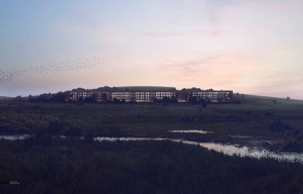
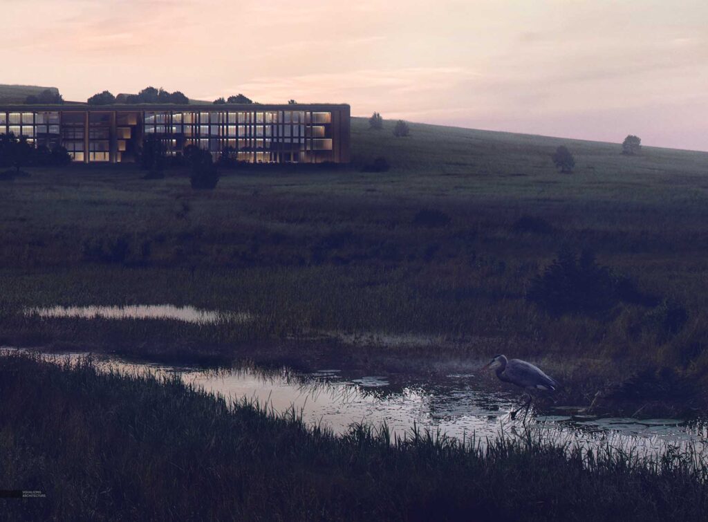
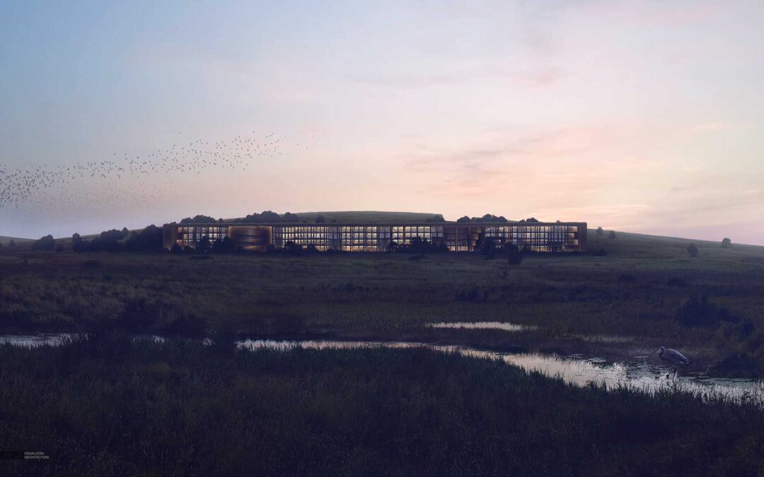
For this latest image, I had an idea in my head of where I wanted it to end up, which meant taking things darker than I normally do. I was going for really deep contrast that silhouetted the building and ground plane against the sky, interior lights, and meandering stream. The final color grading really shifted the tones of the image at the end, but each step was subtle and built off of one another to get the big effect at the end. Below is a break down of this process.
1. Toning the Grass
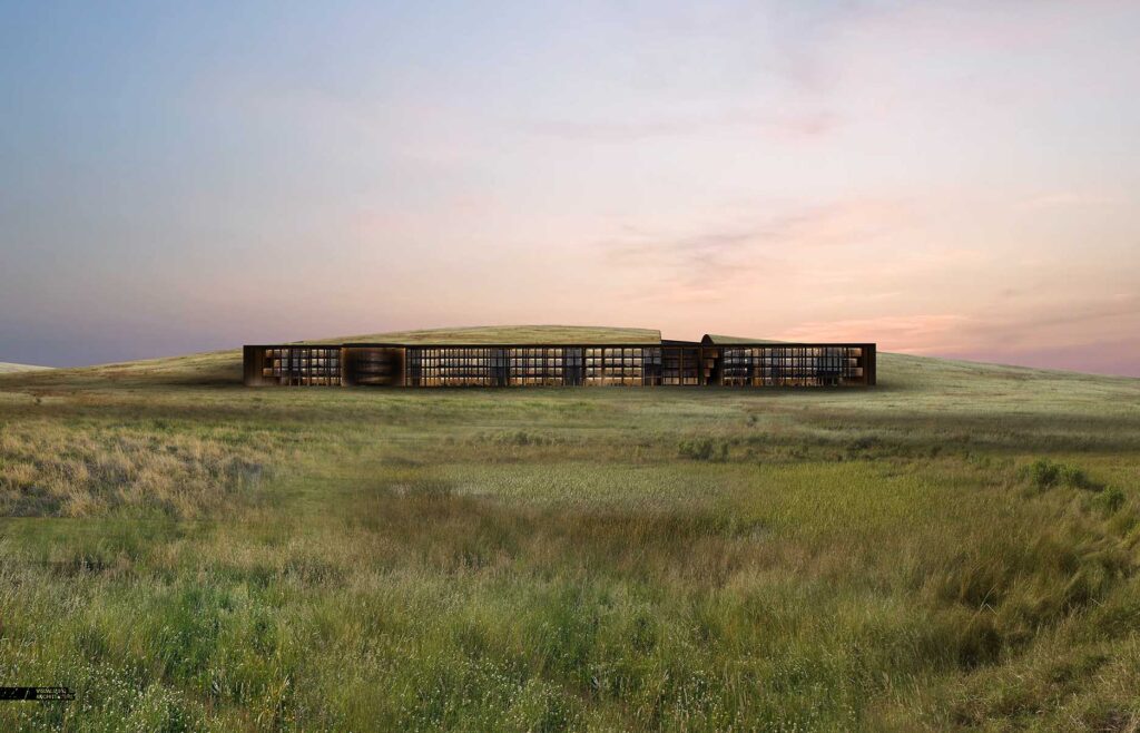
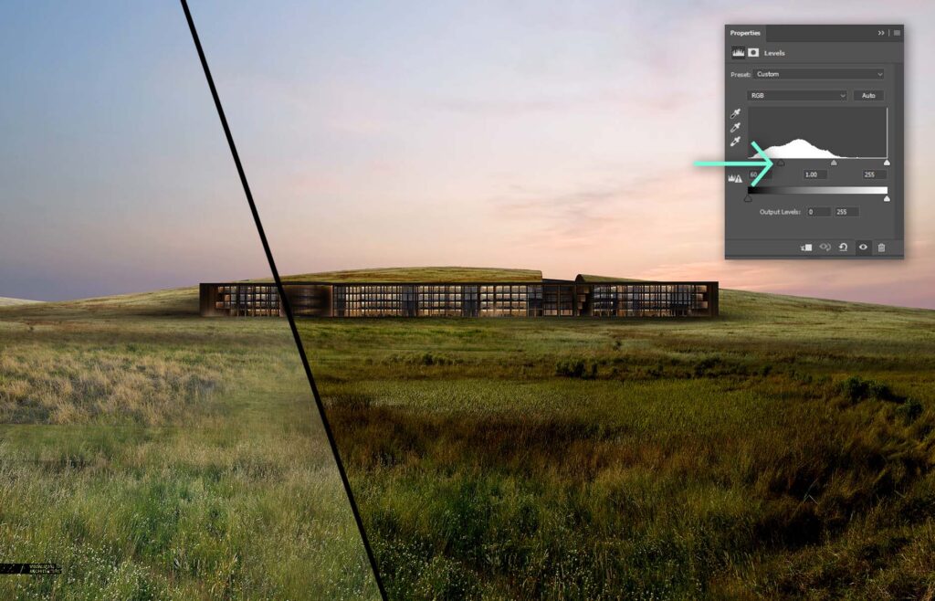
I am first showing the the grass before it was darkened. The grass is made up of four or five different textures and toned to have a similar desaturated grayish green. Once I had the textures stitched together, I needed to darken the grass significantly. I did this in two steps. First, I adjusted the levels to punch up the contrast and to deepen the shadows. In some cases, the darker parts of the grass started to lose some of the detail in the shadows.
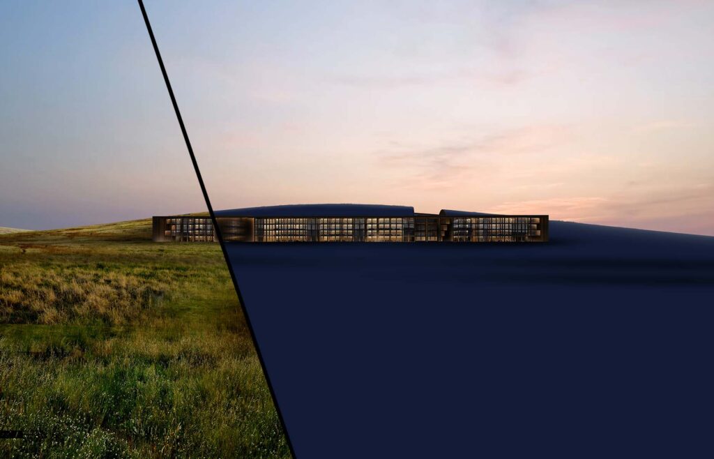
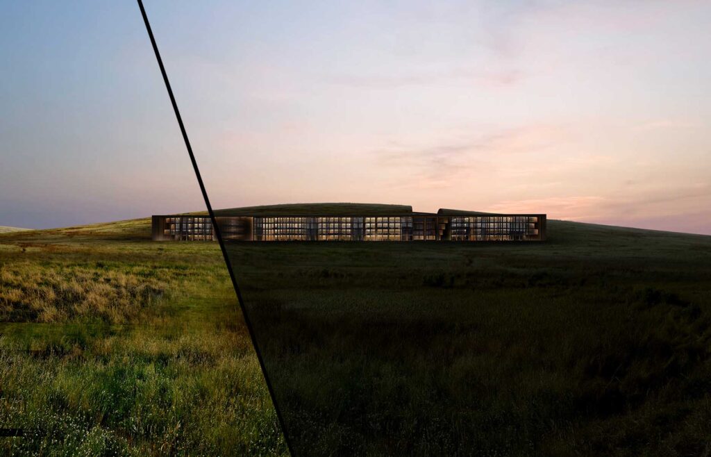
Next, I wanted to evenly darken the grass while giving it a subtle blue tint. My favorite way to do this is by creating a new layer, painting it a dark blue, and setting the Layer Blend Mode to “Multiply”.
2. Additional Details
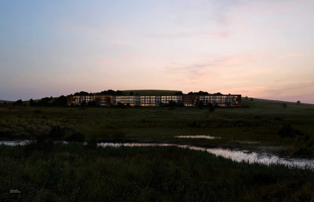
I added in lots of trees and a stream cutting across the image. In both cases, they are either shifting really dark or really light continuing the extreme contrast. For the water, I setup a mask and simply flipped the sky so that the water reflected the exact same tones.
3. Final Adjustments

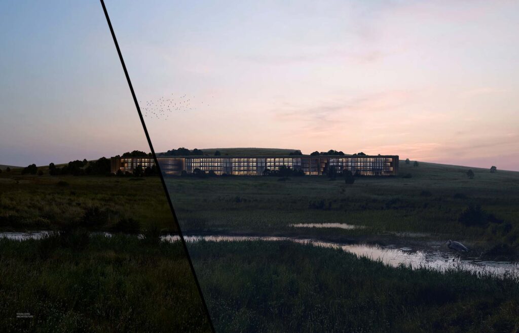
Now that I have the base image where I want it, I can begin setting up the final color adjustments. Up until this point, the toning was happening on an elemental basis meaning I was toning the trees, grass, building, and sky separately. These next round of adjustments will be happening at the top of the layer stack and effecting the entire image.
I first wanted to lightly wash the image and push the pure black shadows to something a little more blue in tone. I did this by creating a layer, painting it a dark blue, and setting the Layer Blend Mode to “Screen”. I then tweaked the opacity of the layer to reduce the strength of the effect.

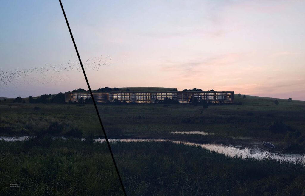
Next, I copied that same blue layer, but this time, set the Layer Blend Mode to “Lighten”. The change is subtle and both “Screen” and “Lighten” are softening the shadows of the image. The difference is “Lighten” effects only the darkest parts of the image whereas “Screen” is effecting both the dark and light parts of the image.
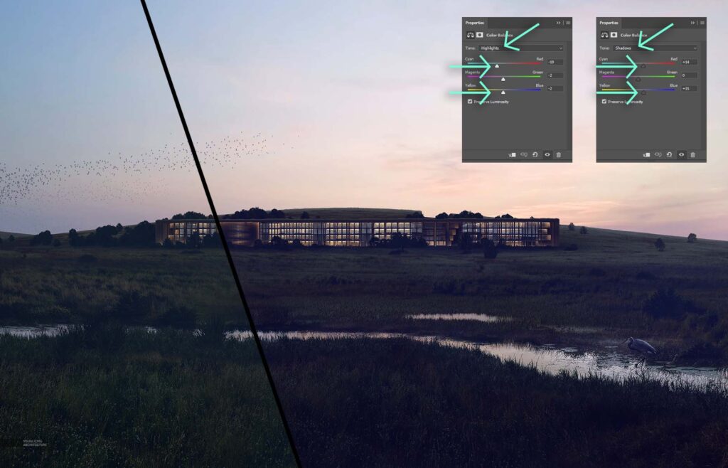
I wanted to move away from the grass feeling too green, so I next adjusted the “Color Balance”. With the “Color Balance” dialogue box open, I first selected the “Highlights” in the “Tone” drop-down menu. I pushed the highlights of the image to a cooler blue tone by moving the “Cyan” slider to the left. I then chose the “Shadows” in the “Tone” drop-down menu. With the shadows, I didn’t want to lose all of the warmth, so I stayed in the purple ranges by pushing the “Cyan” and “Yellow” sliders to the right. I should point out this took some testing and experimenting before arriving at to these final settings.
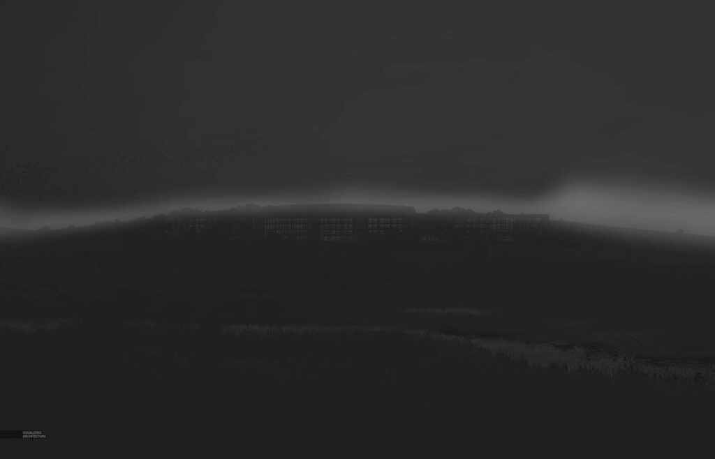
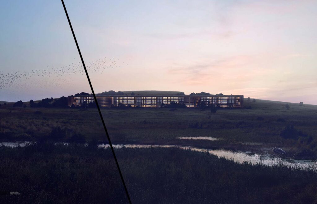
Finally, the transition from the hill to the sky was a little to harsh, so I painted in some haze that focused on the horizon, and softly washing the entire image.
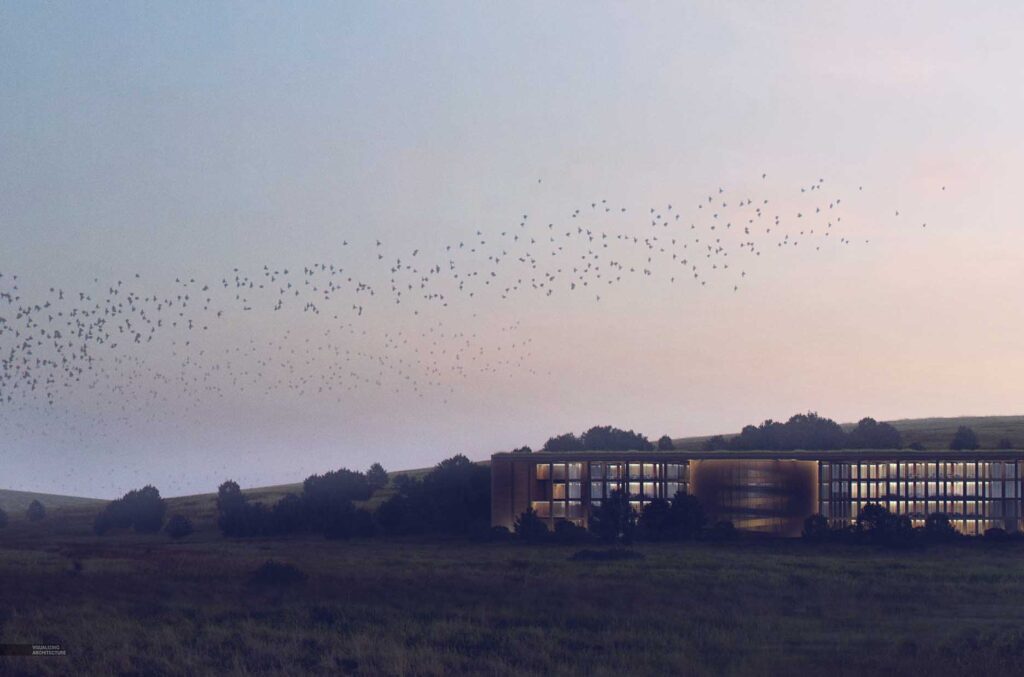
Final Image
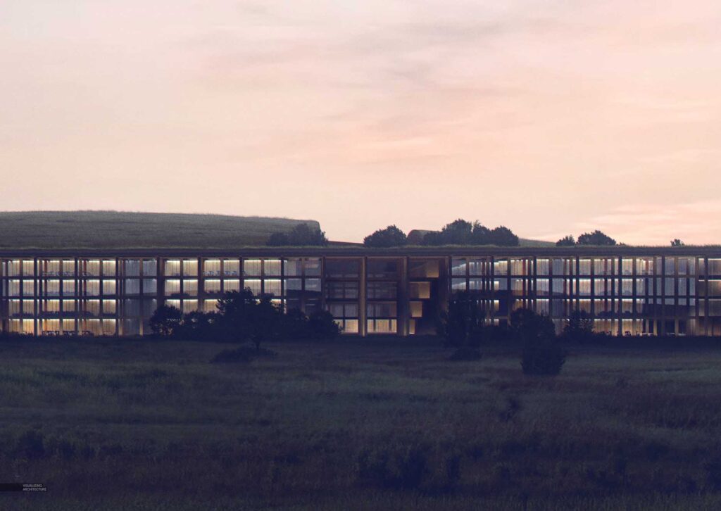


MASTERPIECES!!
Amazing work! This was really helpful, especially how you work with the color balance adjustments. Thanks!
Would it be possible to get a tutorial on how you added the stream? Looks so seamless and grounded in the nature. Really amazing.
I still cannot shake the feeling that this looks a lot like the Flint Hills around K-State. I guess there are some areas between Conroe and Dallas that look like this. Personally feel that the haze is a little strong in the foreground, but the work is, as always, a cut above.
I would love to see how you put the stream into the grass.