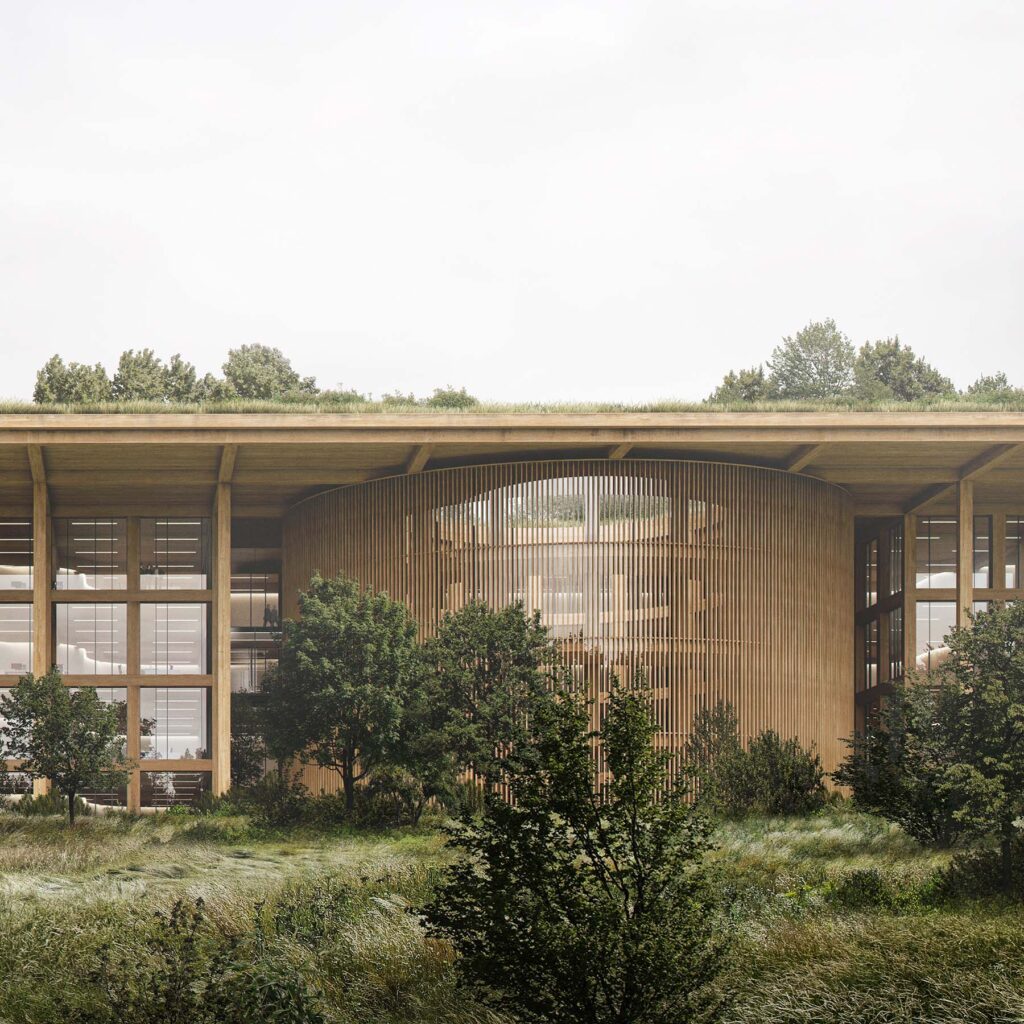
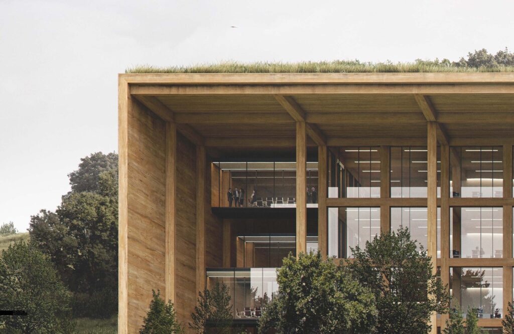
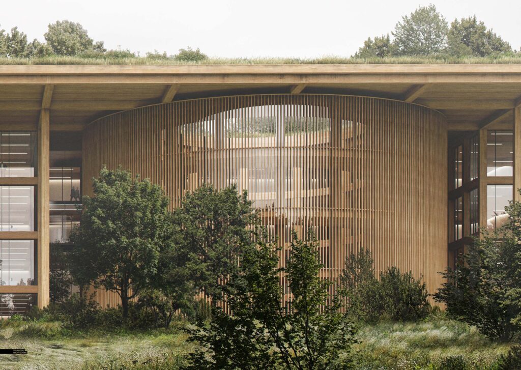
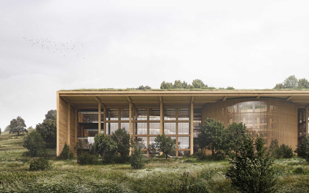
I created this illustration to tease out a few details with this project that I wasn’t too sure about. For one, I had this idea of the meadow and trees flowing in and around the architecture so I wanted to setup an “easy” view angle where I could quickly test out how this would work. I wasn’t sure if I wanted to go all meadow, or if there would be trees throughout, how dense the trees would be, etc. Therefore, this images allowed me to visualize things a little better and hopefully inform other illustrations that will follow.
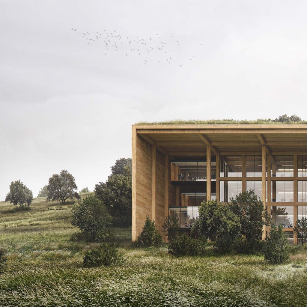
You may also notice that the architecture has already changed from the last post. I am still making big formal changes while at the same time trying to work through some of the details. Illustrations like this elevation where the camera is close up forces me to make some quick decisions and just go in one direction or another, otherwise I would probably never stop tweaking and changing.
Below is a quick breakdown of the image focusing on the vegetation.
1. Model and Base Rendering
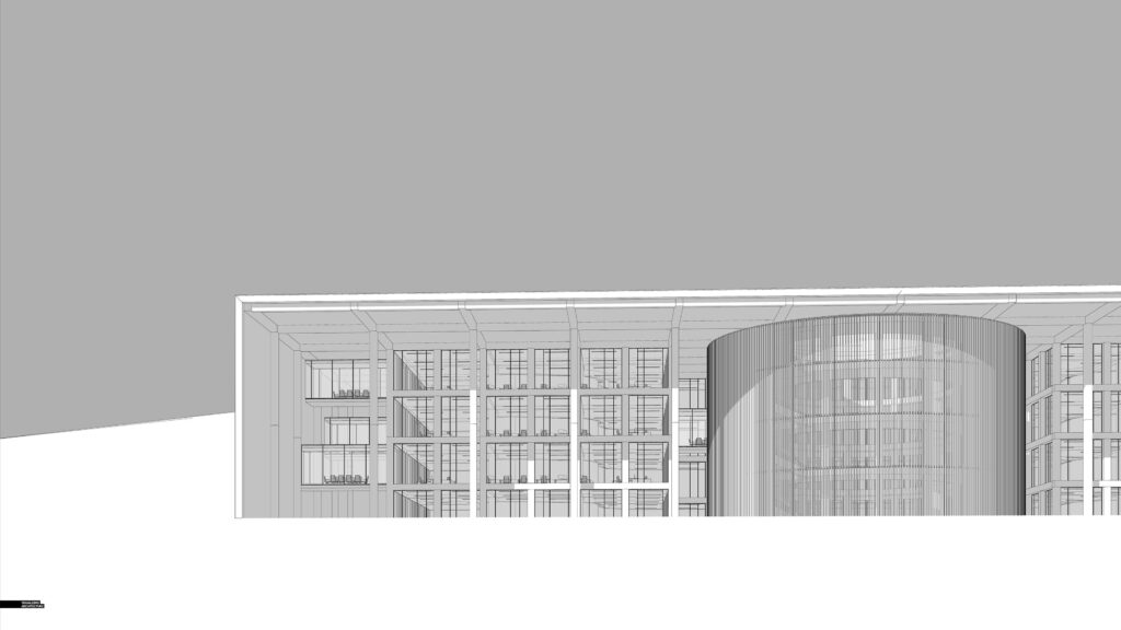
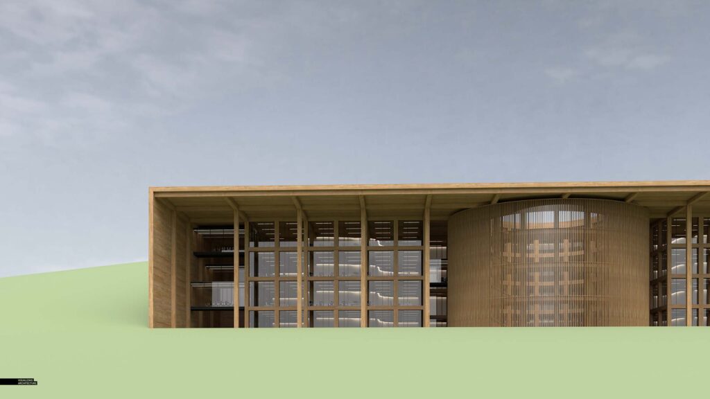
Nothing unique here. I modeled everything in Sketchup, and rendered in V-Ray. I built a new timber material that was relatively large in size so that you would not see tiling. This project will almost be entirely wood, so I knew I needed some textures that read well from a distance as well as up close. Also, since the project is so large in size, I am using as many components as possible and designing in such a way that the same kit of parts can be used throughout the whole project allowing me to easily add detail and make quick changes.
2. Meadow
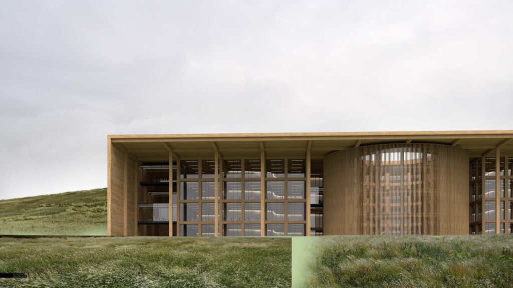
The meadow was probably the most important part of the image, and I had a specific look I was going for. The problem was that this illustration was much higher resolution than I normally do, so I needed to find textures at an equal resolution which was just about impossible to do. Therefore, I combined several textures to get to the quality and detail I needed. I first started with a base that combined 3 or 4 large textures. I significantly darkened and desaturated the textures to get them to fit the overcast scene as well as read more cohesively
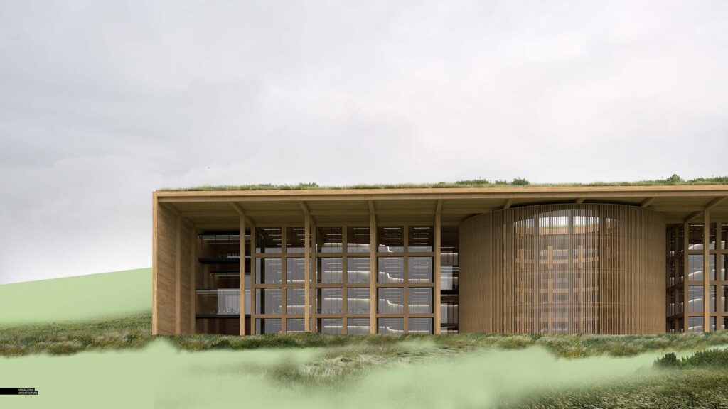
A secondary level of vegetation was added to give moments of detail and breakup the monotony of the large grass textures. These details also help to hide the seams of the larger grass textures and also add resolution to certain areas when zoomed in really close.
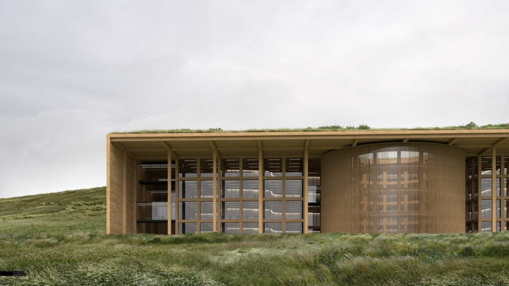
The most important part was toning all of the different grass textures to feel as one. There are lots of different methods to do this and I have found it rarely works to do a series of big adjustments at the end. Instead, I will bring in one texture at a time, and tone and adjust on an individual basis. It is obviously a more time consuming method, but it allows me to really dial in things and keep it looking natural and not-so-Photoshopped.
3. Trees
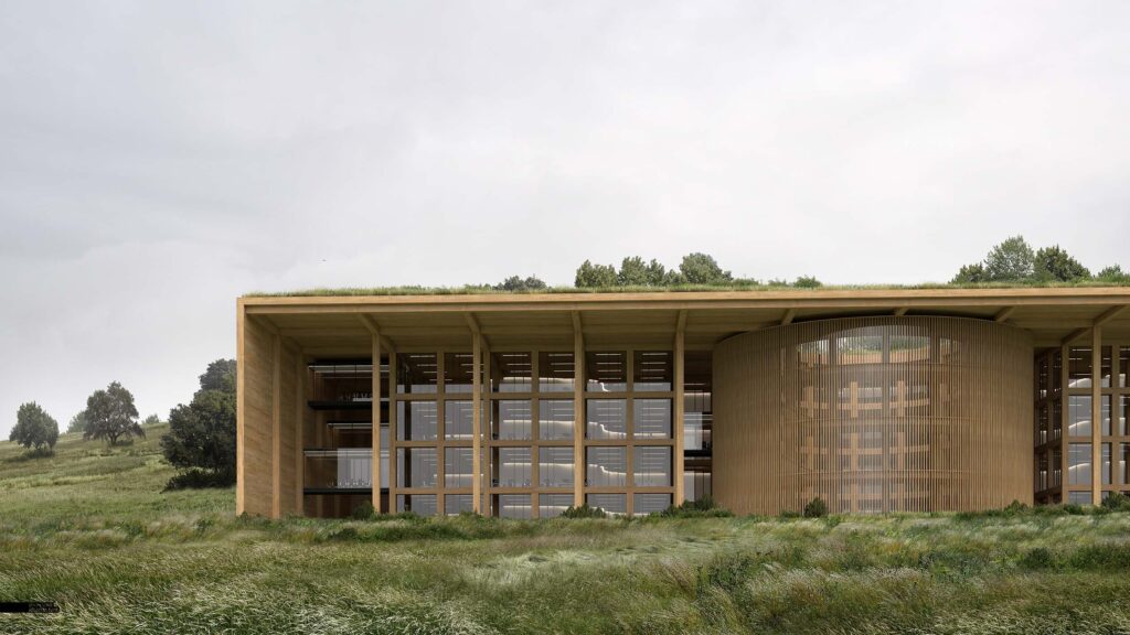
The trees were deployed in different layers as well. I first started with the trees in the distance. These were positioned to frame the architecture and hint at the landscape moving up and on top of the project.
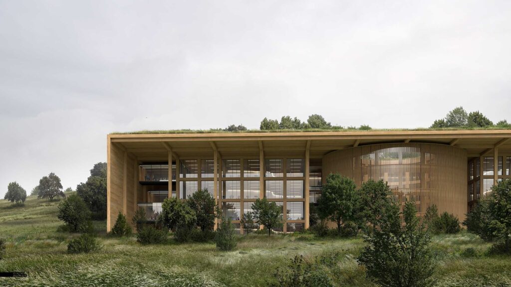
Next came the foreground trees and understory vegetation. One trend with many of the landscape architecture offices we work with is that when they want to play up the natural/wild landscapes, they spec lots of understory plantings which helps blend the low ground cover with the mature taller trees. The problem is that it is hard to blend the understory shrubs with the grasses without it looking too edited. It takes a lot of careful masking and soft shadows to get it to feel right.
As with the grass, there was a lot of toning with the trees and understory. Primarily, darkening and desaturating. Again, this was all done on an individual basis instead of large adjustments at the end to the entire group.
4. Glass

I didn’t do too much to the glass/interiors because this image was really about the landscape. However, because the sky is so bright, I needed to amplify the reflections and add in the reflections of the trees. I also added some people and a hint of warmth to the glass conference rooms on the left.
5. Age
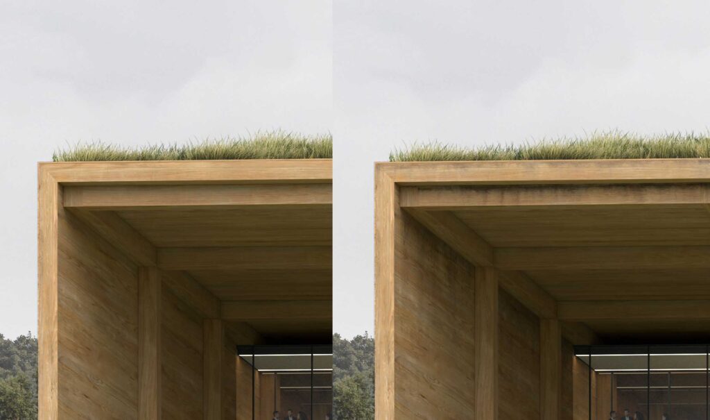
I am trying to be more consistent with showing slight aging and weathering in my projects. It goes a long way in making an image feel more human but is also a way to connect the architecture back to nature. There are a ton of dirt or leaky textures you can find online. I didn’t go too crazy with them, but instead focused them in a few areas at the overhang and on the wood beams.
6. The Mistake
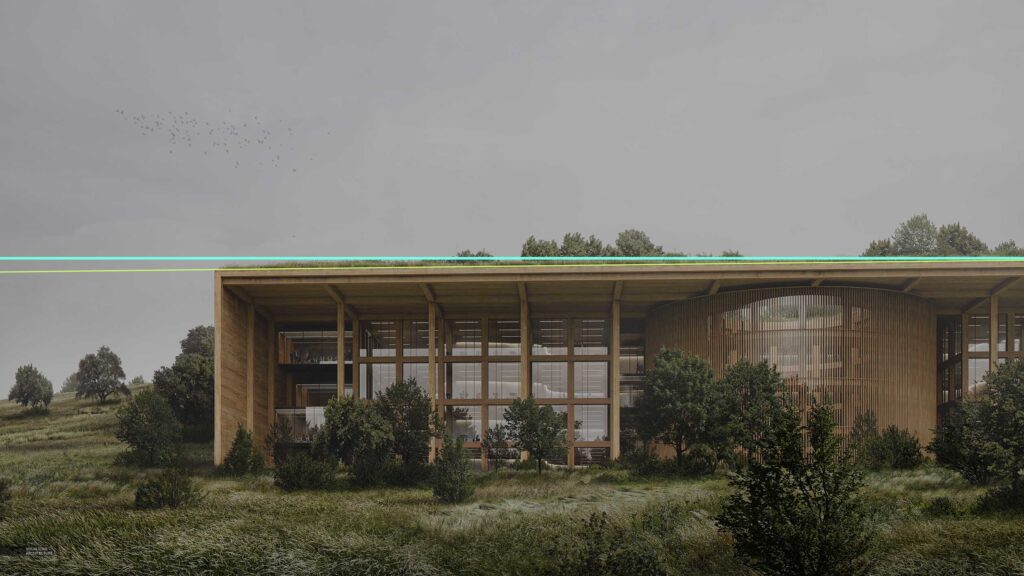
I was more or less done with the image when something just didn’t feel right. It turns out, the horizontals were not perfectly horizontal. I normally check and double check this in the 3D model but somehow, I let it slip this time. I don’t like to make these kinds of major adjustments at the end, but I also did not want to re-render and re-mask everything again. It was Sunday night and I had work the next morning haha. So, I copy-merged the layers at the top of the layer stack and skewed the image to correct the horizontals.
7. Finals
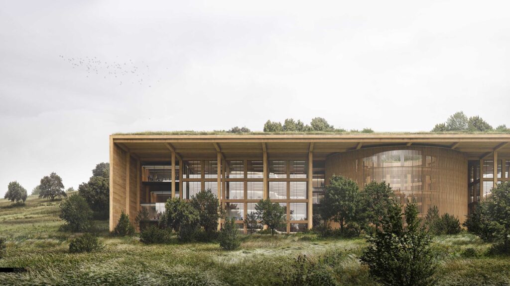
I did very minimal color grading to this image. I was going to do some more extreme effects but backed off and decided to keep things simple. The final image resolution was 10,000 pixels wide. It is much more than I normally do, but makes selections and masking much easier. Once you get past the need to find higher quality textures, the image ends up being much more cleaner and refined.


Amazing work Alex
Have been following your work for years now and it really helped me to decide for visualization as my carer of choice, so thanks for everything you share!
Keep up the amazing work
@Gerardo, that means a lot. Thanks and good luck!
on a 10k pixel wide image, what were the avg resolutions of the grass images that you used?
Awesome! Do you have any tips on how to search for hi-res vegetation textures? Google has unfortunately removed the option in image seatch to look for images “larger than x MP”…
Amazing!
Great project! I really like the weathering detailing. Thank you for the tutorials on your website.
Really like the wood texture!! Just amazing, I’m a beginner in photoshop visualization and learning a tonne from your tutorials. Thank you
as always very compelling. I know that this has been asked a million times but how did you build your wood texture. this is consistently a problem. we are working with SU + Vray but its never right.
Loving the new website format. Makes it much easier to keep track of the projects.
Alex been reading your posts for so many years – you must sleep so well knowing you’ve guided so many of us along a steep learning curve. Thanks
Very good realistic rendering and careful in detail with the aging of wood!
Alex your work is inspirational. It is wonderful you are willing to share your knowledge and skills. Keep it up.