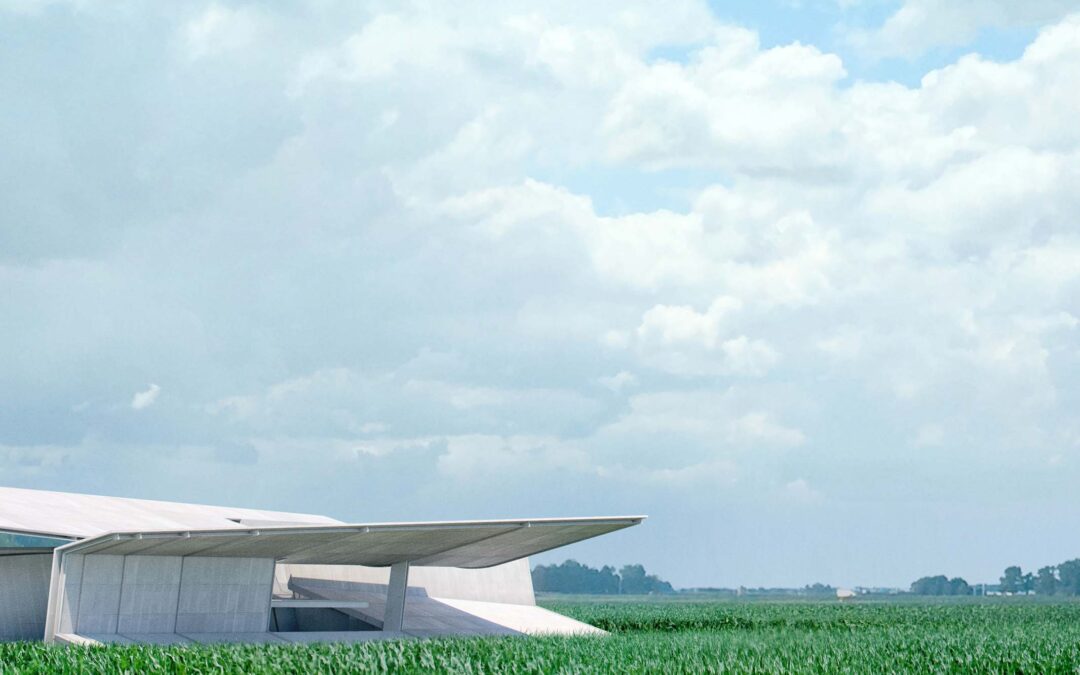
by Alex Hogrefe | Aug 29, 2021 | Portfolio Vol. 6, Project 12 Summerfest |
This series of illustrations were initially meant to be a quick study of the contextual environment. However, I ended up really pouring a lot of time into them, constantly reworking the images, changing views, changing lighting, reworking the images again, etc....

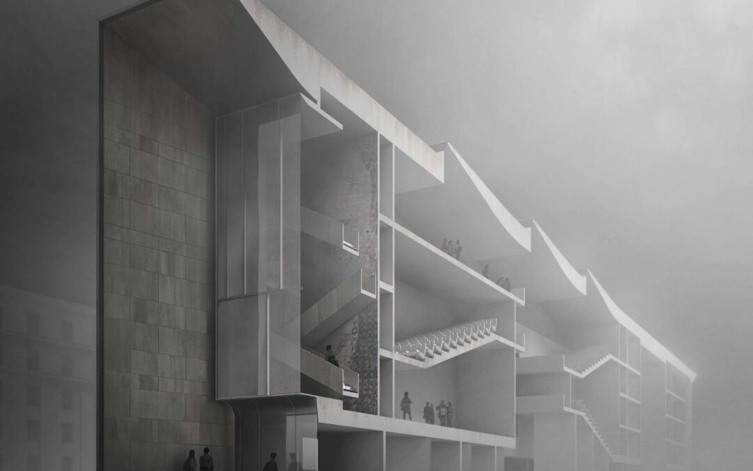
by Alex Hogrefe | Jun 5, 2021 | Break Down, Portfolio Vol. 5, Project 11 MIT Hub |
Sections are some of my favorite types of architecture illustrations to create because of how well they show the relationship of exterior to interior. Traditionally, section drawings are illustrated perpendicular to the cut with minimal perspective and presented in a...

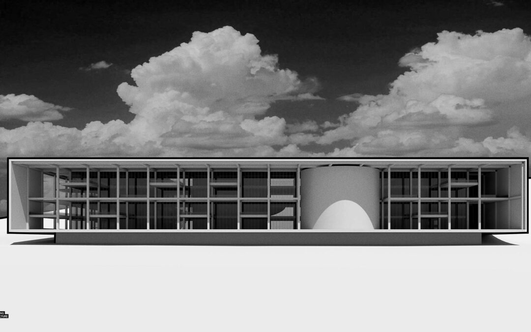
by Alex Hogrefe | Mar 31, 2020 | Portfolio Vol. 6, Project 10 Prairie Office, Uncategorized |
As much as I love working on the Porter Sq Station redesign, I needed to change things up a bit so I started designing my next personal render project. We have been working on a lot of really interesting projects lately at Design Distill, and it has been spurring some...

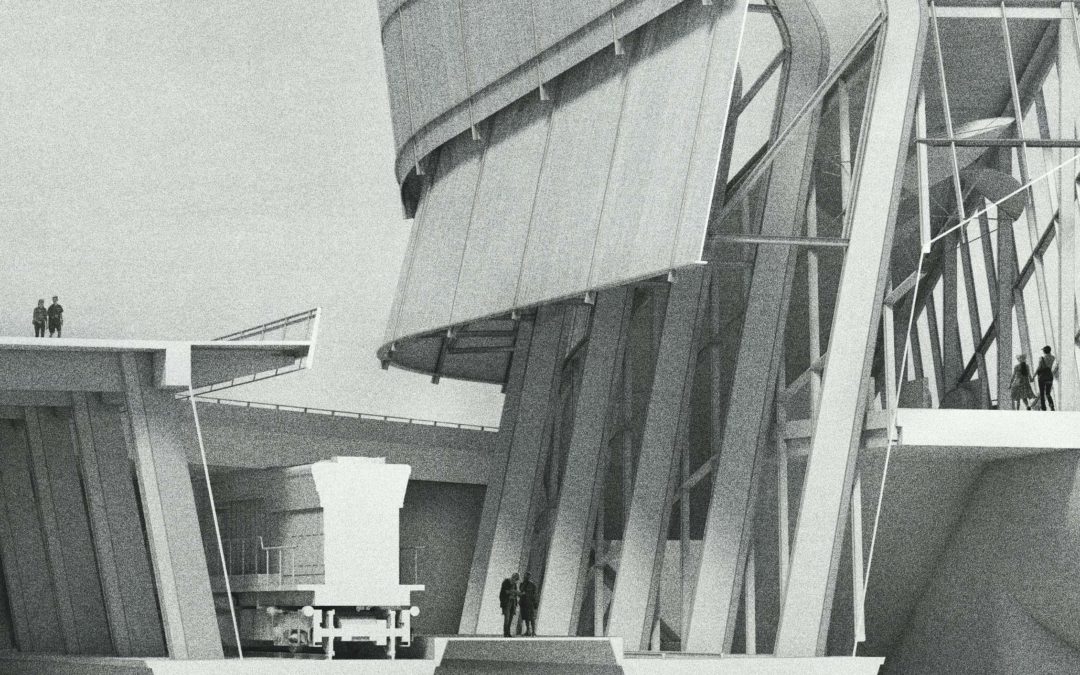
by Alex Hogrefe | Nov 24, 2019 | Break Down, Portfolio Vol. 6, Project 09 Porter Square, Styles / Effects, Uncategorized |
I have been developing several illustrations for the Porter Sq project the past couple of months and have finally finished one of the section diagrams. I decided to go a little old school with this one and keeping things monotone. With this style of illustration I am...

by Alex Hogrefe | Oct 16, 2019 | Break Down, Portfolio Vol. 6, Project 09 Porter Square, Uncategorized |
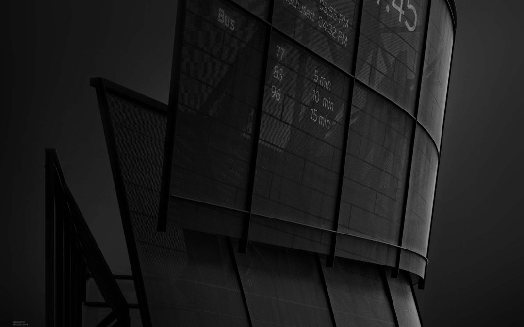
I recently stumbled across an article about an architecture photographer named Sajin Sasidharan and his black and white photos of Dubai. The images are extremely dramatic and he is very strategic about how he uses light to create clear focal points and manage visual...
