It has been a while since my last post, the longest amount of time I have ever taken away from this website actually. As much as I love illustrating architecture, I love doing other things too and sometimes there isn’t enough time to do both. Besides working digitally, I spend quite a bit of time building and doing carpentry work on my house. I use to work in the wood shop when I was at grad school at Miami University and I have carried over those skills into revitalizing our historic 1920’s Dutch colonial house. Anyways, it was getting to the point where the time spent working on the computer vs working with my hands and doing physical work was getting a little too out of balance.
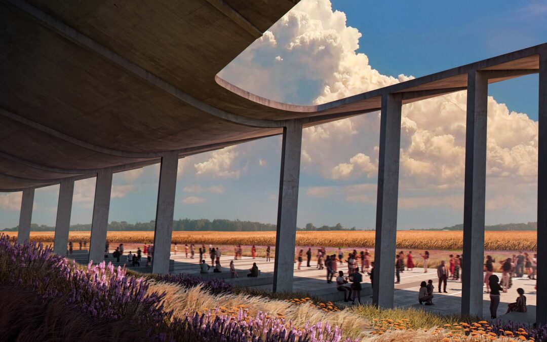
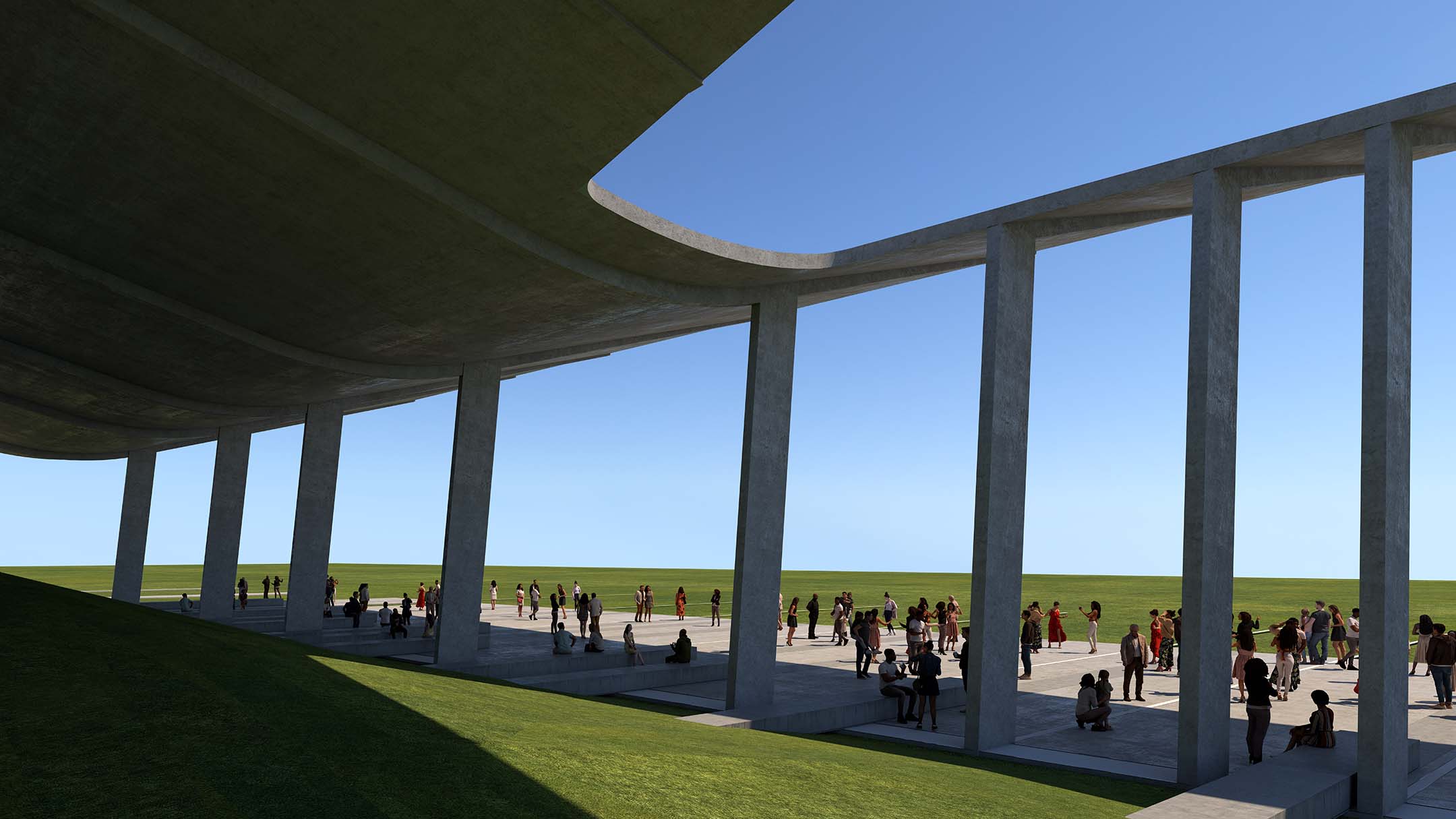
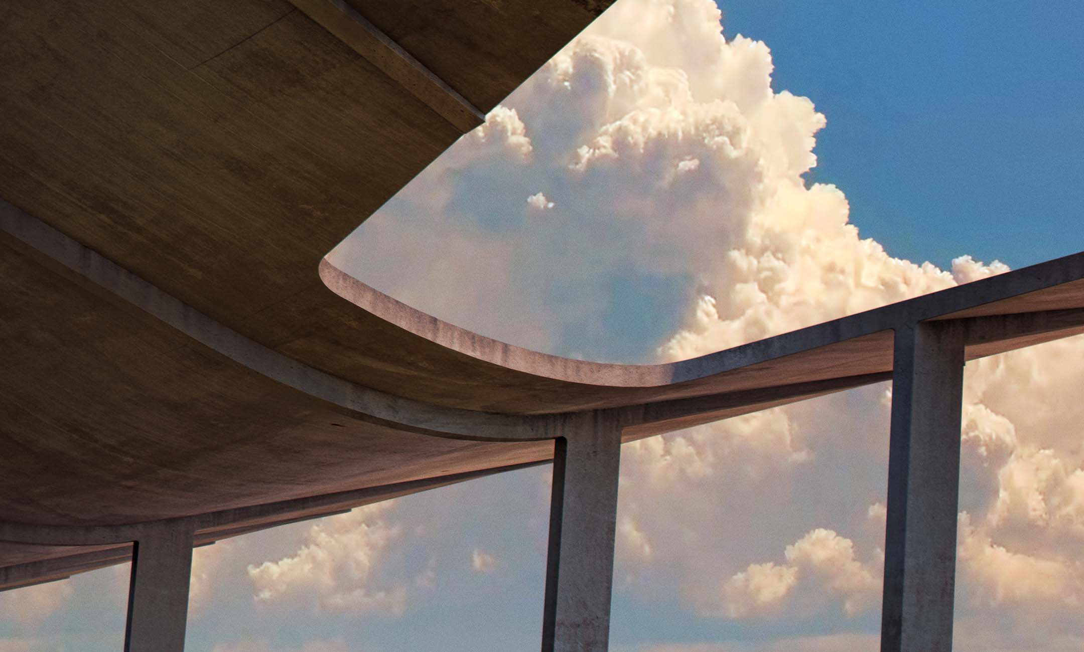
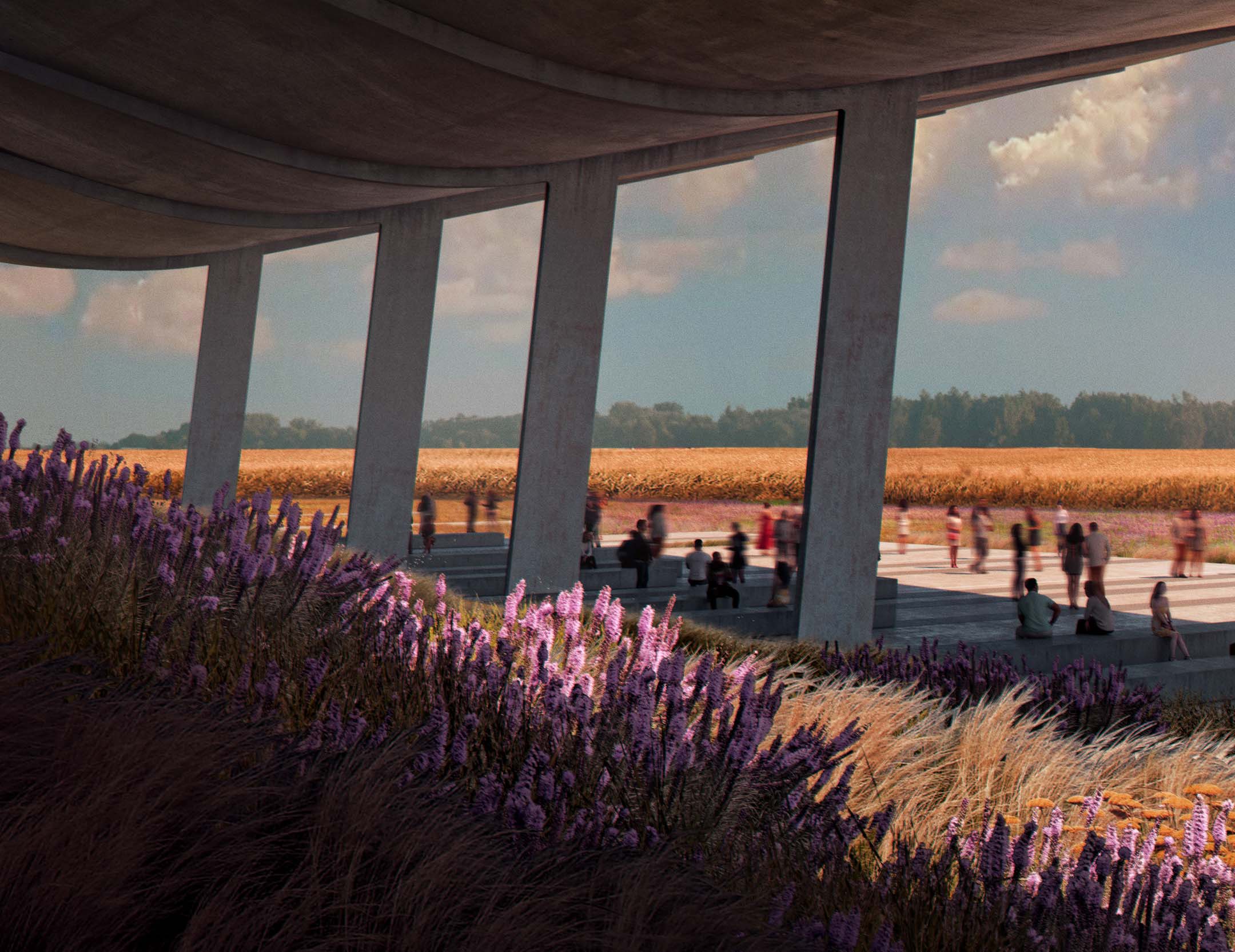
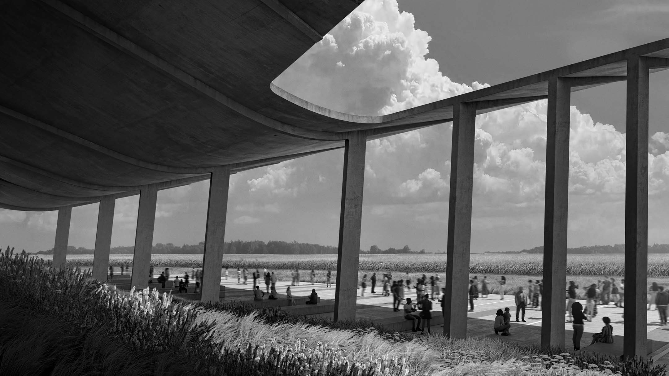
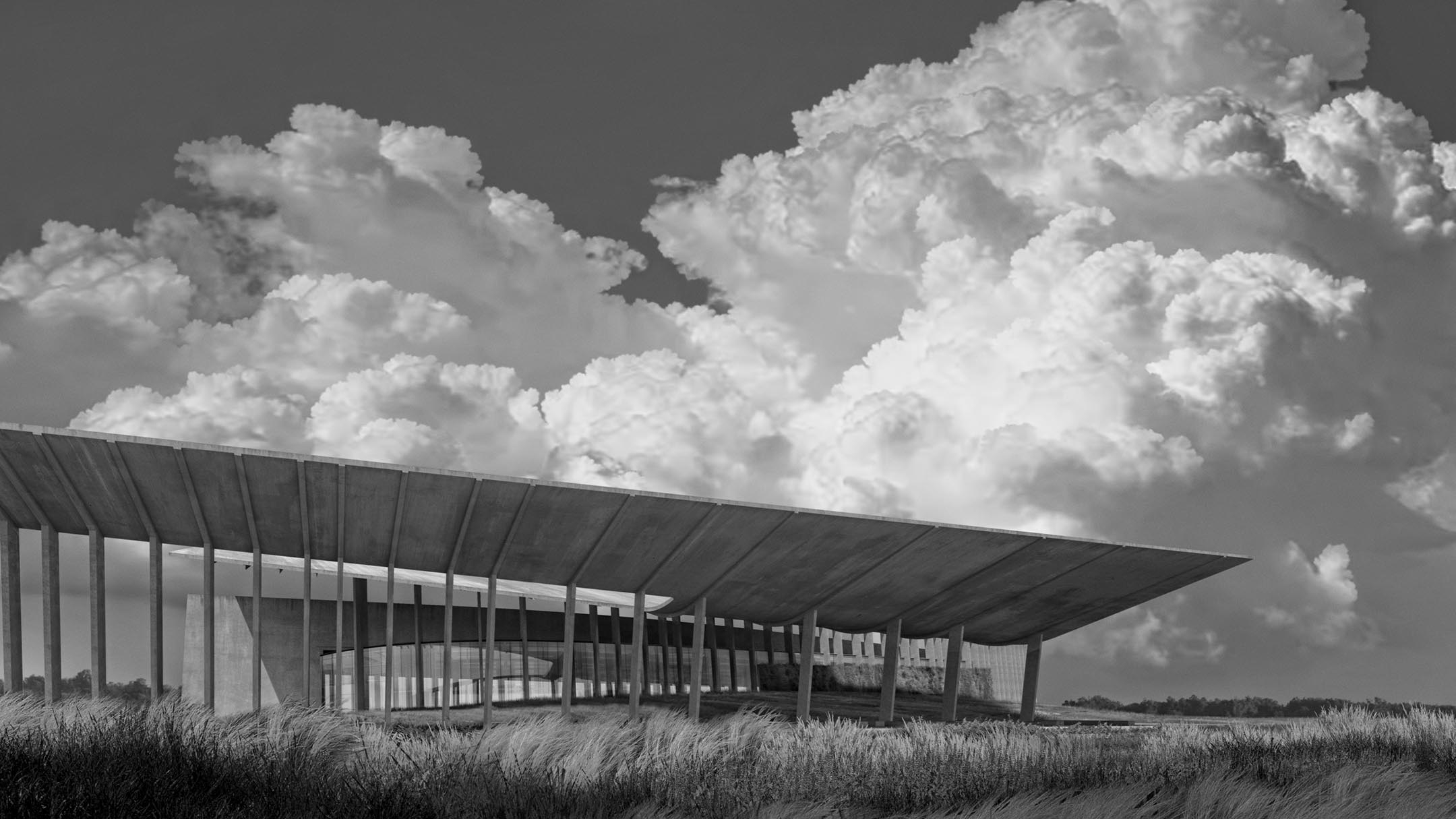
With that said, I still thought a lot about the Summerfest Pavilion and the images I was creating. As soon as I got back into things, I started to rework the design…..again. I can’t seem to get to a place where I am satisfied with how the architecture is articulated. The overall roof form has not changed but how it meets the ground has. The building was feeling too solid so I removed some walls and added columns.
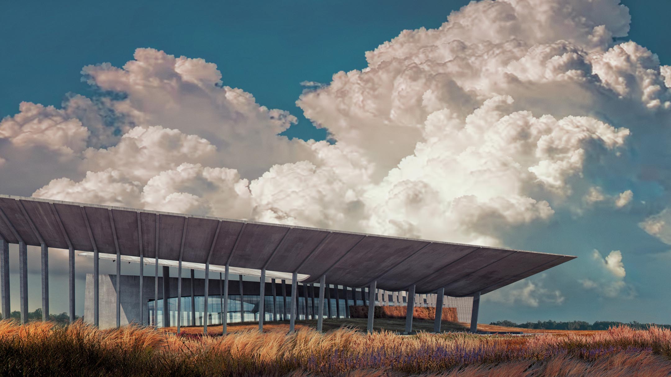
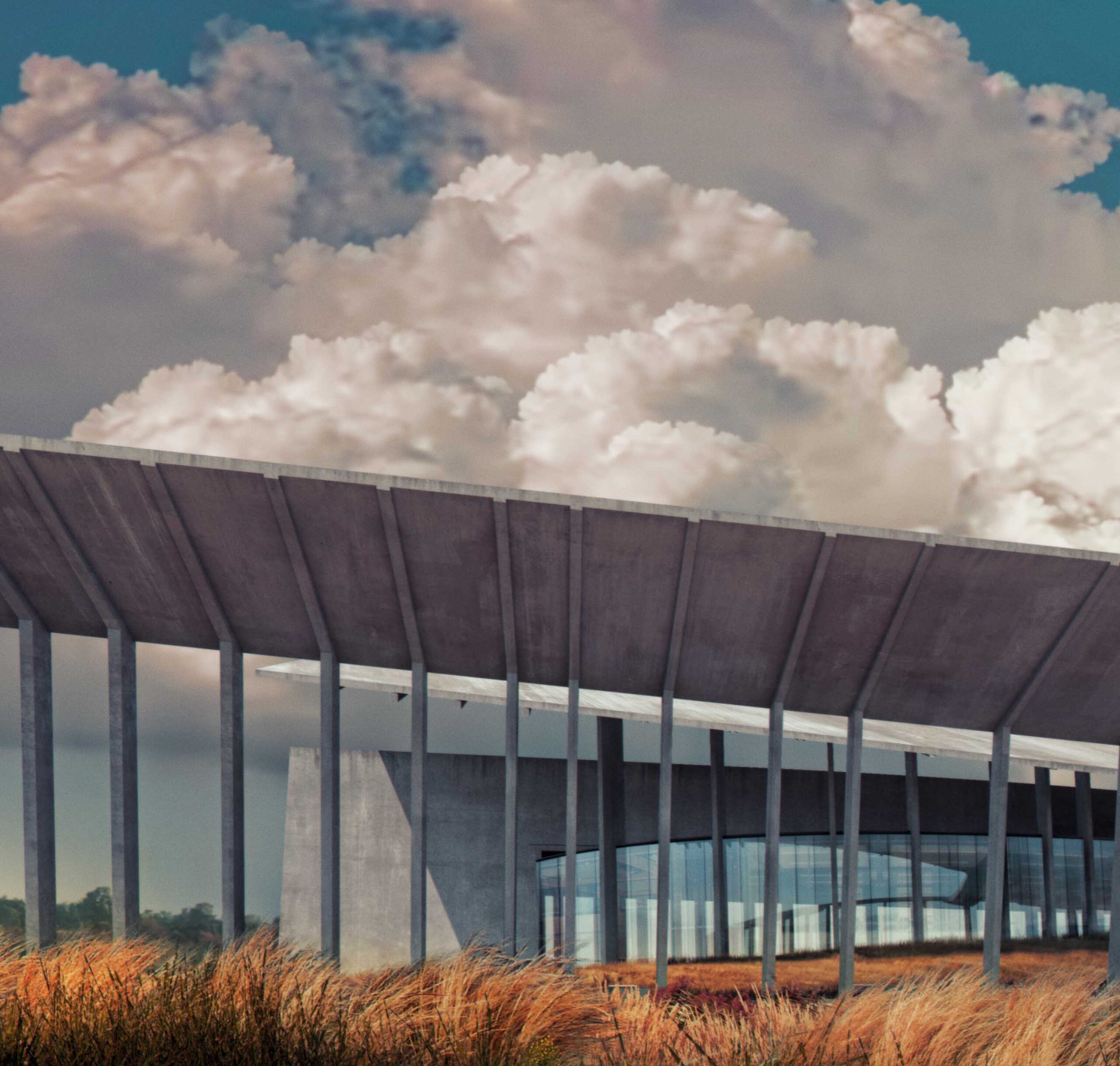
The two images in this post below perhaps represent a more aggressive approach that I am taking on things such as color grading. I played around with increased color saturation, slightly unnatural toning, highly textured sky’s, etc. The illustrations took on a sort of vintage vibe but I like the look and plan to continue exploring some of these ideas in future images. Below is a super quick break down.
Sketchup and Vray
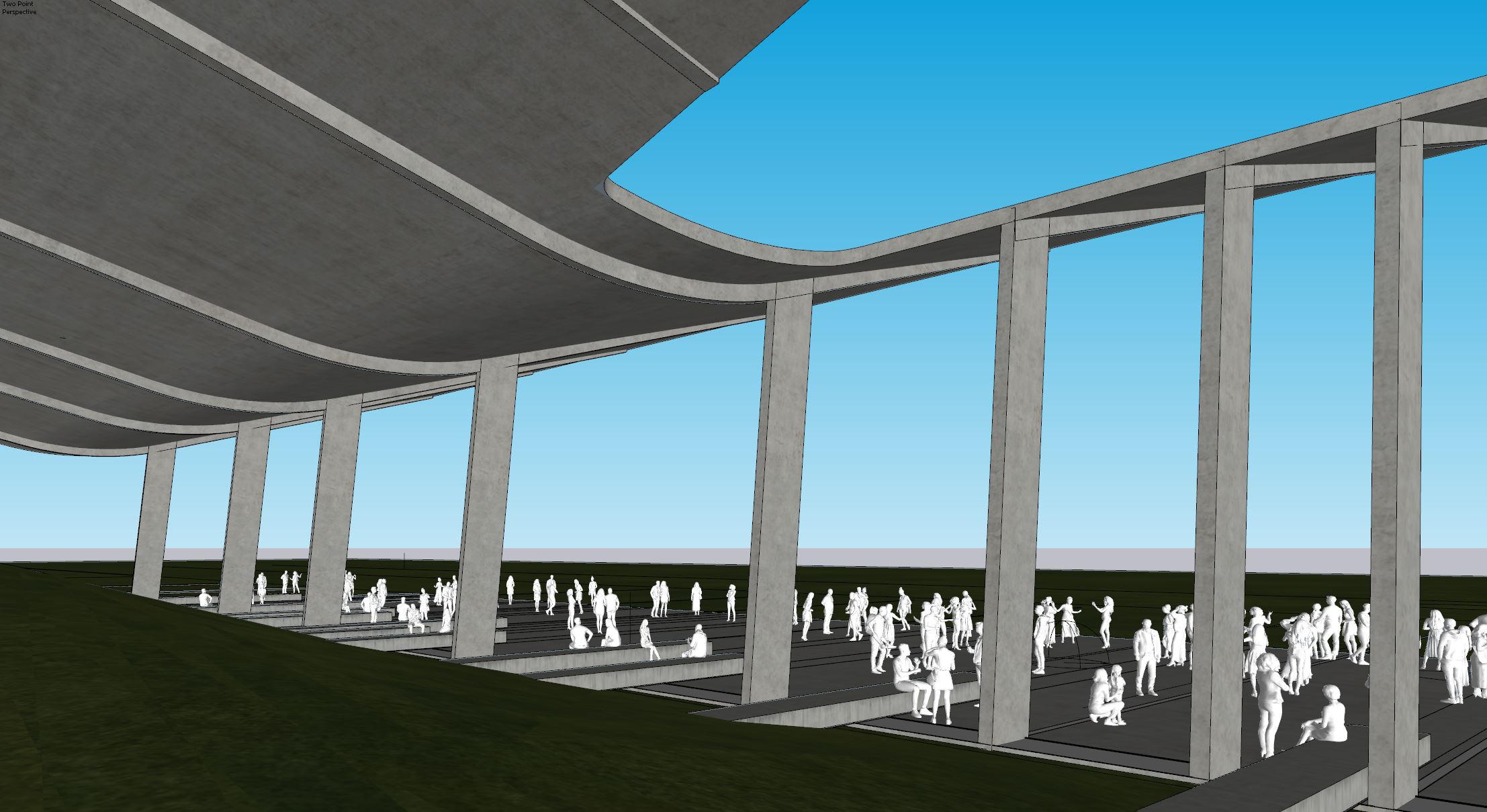
The first thing you may notice is the 3D people. I rarely use 3D people because of how unnatural they can sometime feel in images. However, they are all distant from the camera and I ended up giving them a little blur so the “3Dness” isn’t felt as much and this saved me a lot of time in Photoshop. All of the 3D people came from V-Ray Cosmos.
Textures
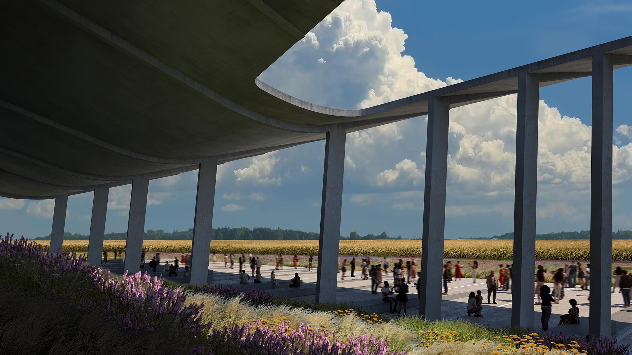
Most of my time went into refining the concrete textures and building a nice sky. I was struggling to setup a good concrete texture in 3D that had the look I was going for so I focused my efforts in Photoshop. I tested out many different styles of concrete before arriving to the look above. I probably combined four or five different concrete textures in Photoshop as well as add the dirt leaks on all of the edges. I am more interested in illustrating how the architecture will look in 20 or 40 years vs how it looks right after construction.
Clouds
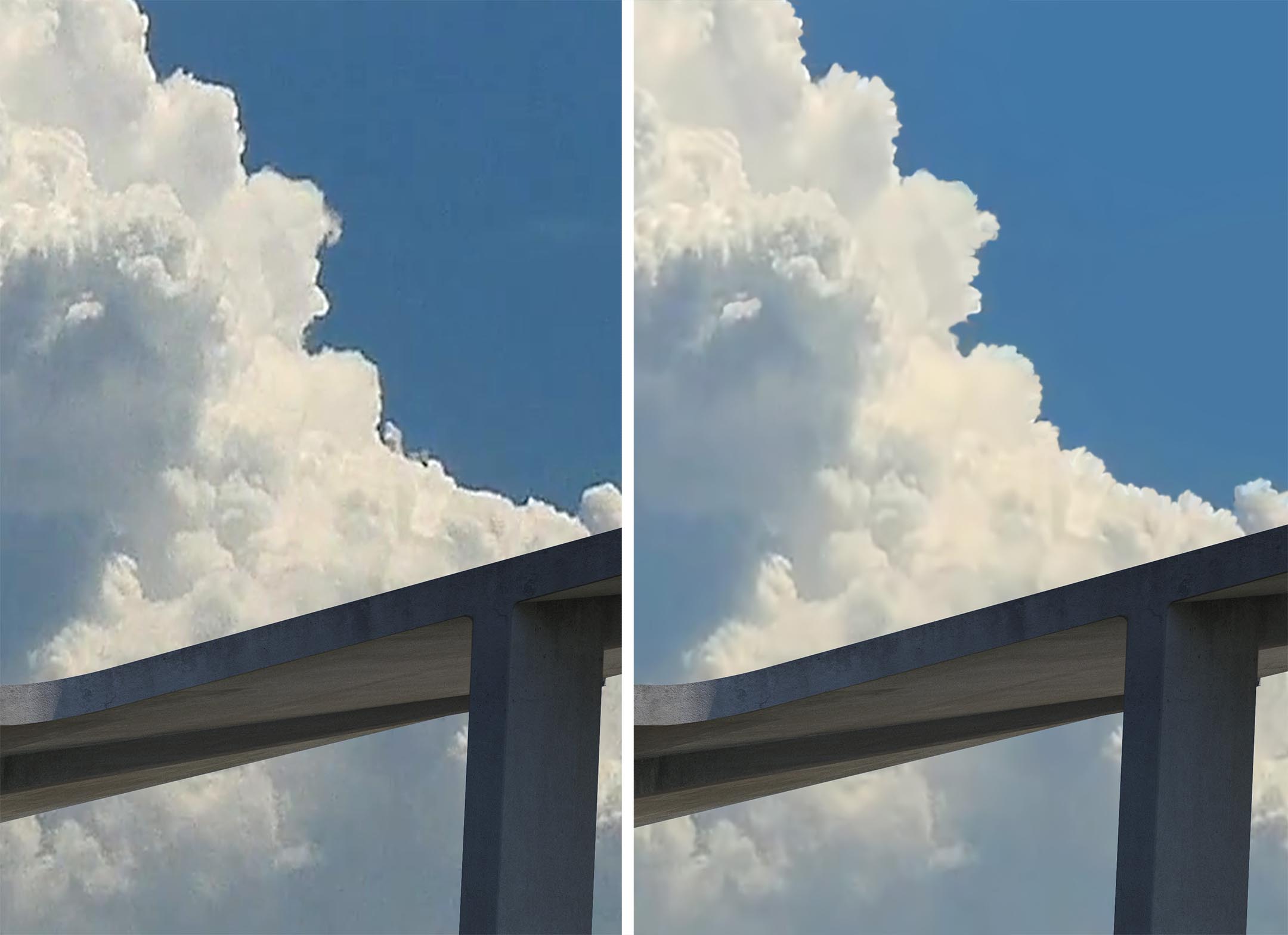
I talked a few posts back about a technique I have been using to cleanup cloud images. Here is another example of a cloud image that had the right look for my illustration, but contained all sorts of artifacts and noise and was very low quality. I ran some denoiser filters on it and then rebuilt the edge using the smudge tool. It is not perfect but miles better than the original image.
Color Grading
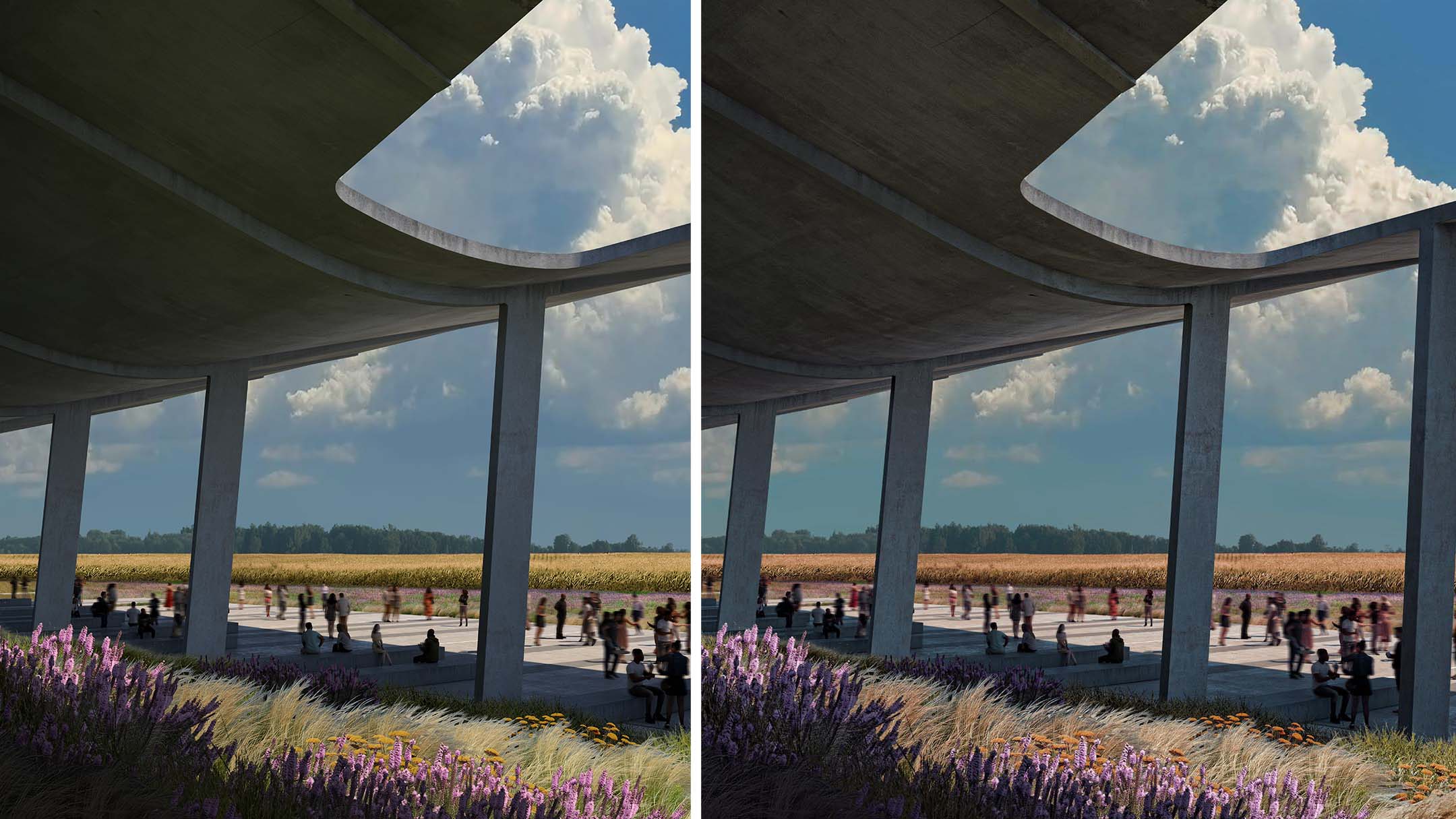
This is where I started to get a little experimental. Normally, I prefer a much lighter sky but decided to keep this one dark and very saturated. The greens shifted to oranges and browns and the blues shifted more towards cyan. I also amplified the detail of the concrete textures and vegetation.
Saturation
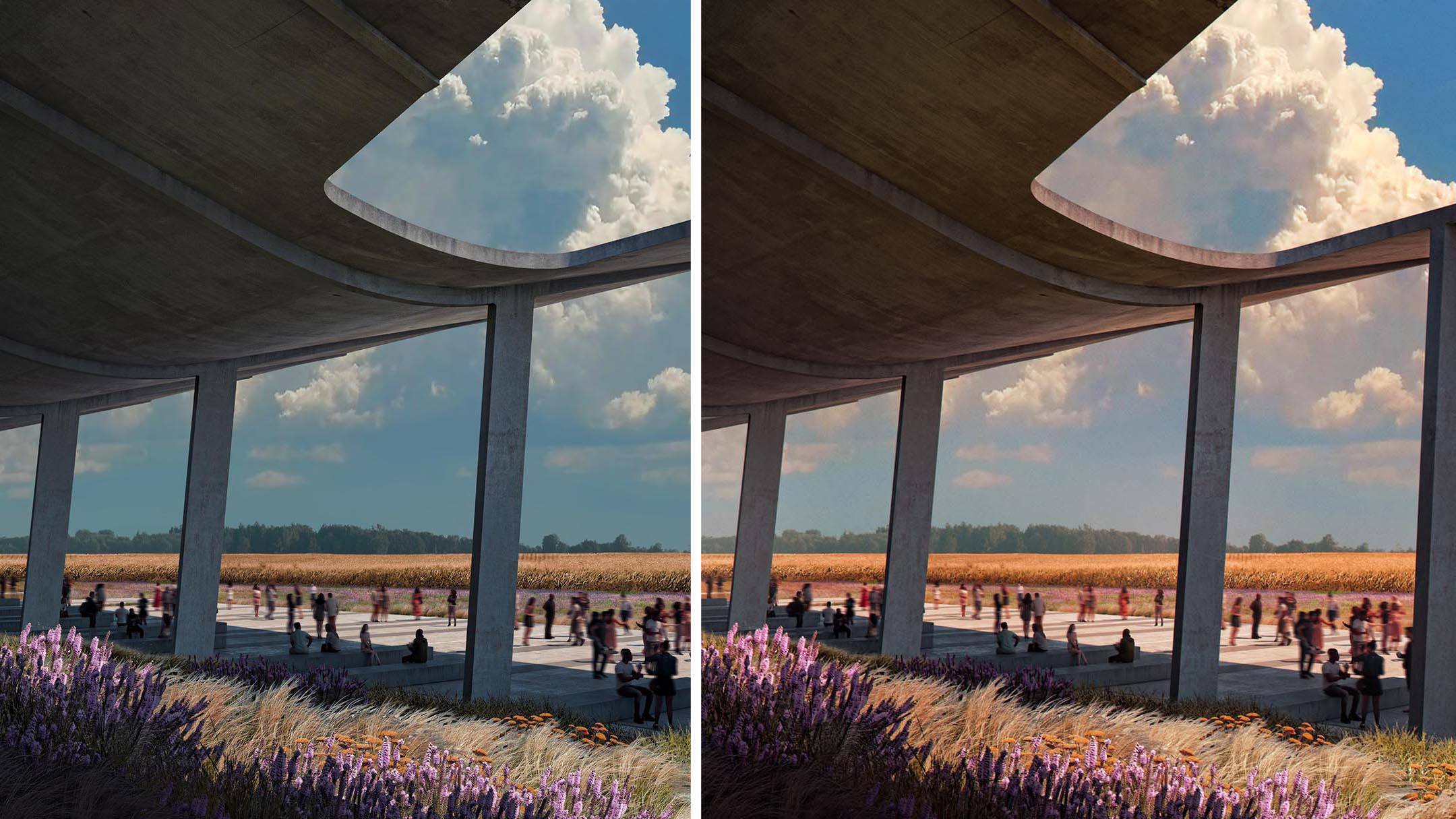
I added several warm color overlays which helped pop the highlights. Finally, the color saturating was bumped up in the sky and over the foreground vegetation areas.
Final Images
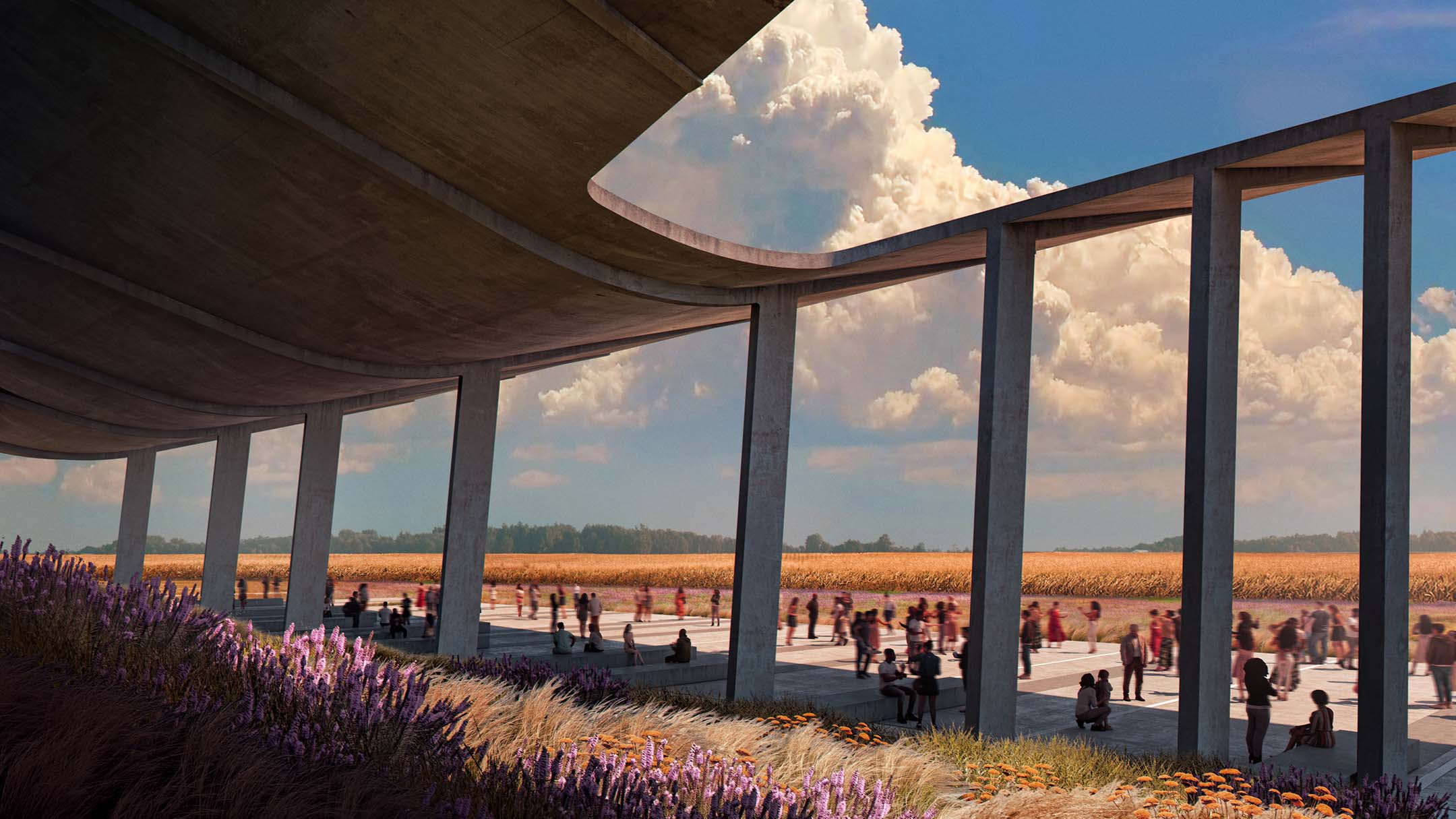
It’s always very interesting to see all the stages of your renderings even if I prefer the warmth version but not saturated.
I have some doubts with the front view and the size or scale of the clouds in relation to the building.
I agree with the scale issue, funny enough, I learned that from one of Alex’s videos 😛
It’s always very interesting to see all the stages of your renderings even if I prefer the warmth version but not saturated.
I’m less convinced by the front view because of the size or scale of the clouds compared to the building.
This is awesome! I have been following your blog since 2013 and was not aware that you make things in the shop as well!!! You’re and awesome designer and I’d be super interested if you did a “visualizing architecture” post on some of your physical projects!
This pavilion looks truly amazing. The step-by-step guide that you followed while creating seems very interesting.