A thought that is often running through my head when working on architectural illustrations is how can I bring more of a human touch to the image. The answer is almost always through texturing in Photoshop.
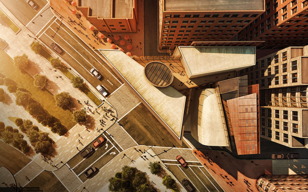
I have spent the last week illustrating an aerial perspective for my latest personal project. For this particular work, I wanted to hit almost every surface of the image with a strong texture to see what would happen. There were many areas that I would normally skip over in other illustrations but didn’t in this one. The result is an image with imperfections that shows age.
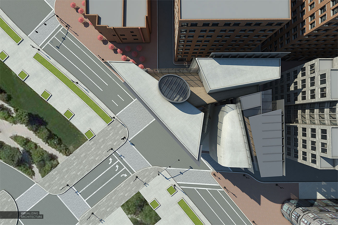
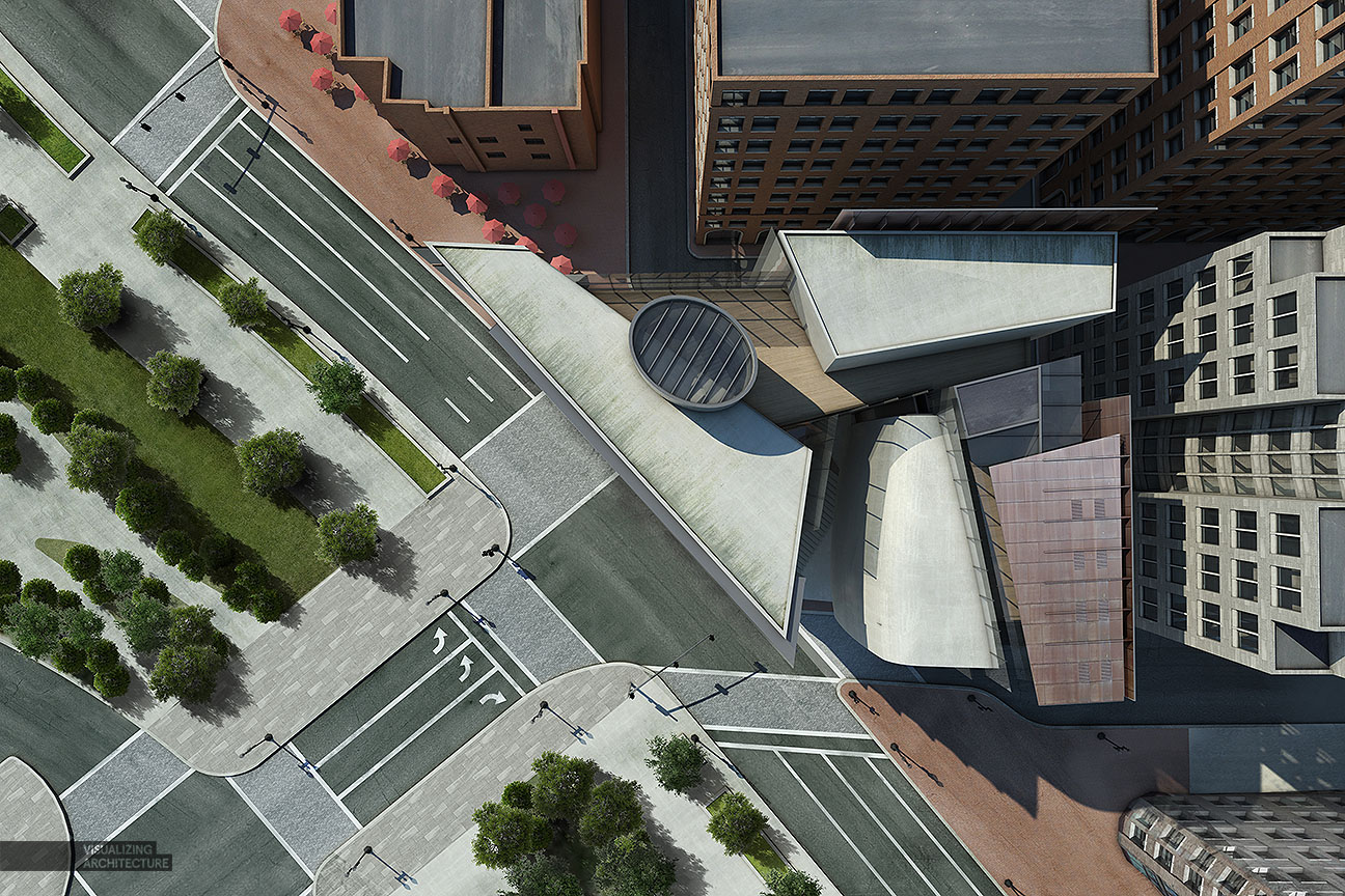
Base Rendering
Texturing in the 3D environment is important but it can be difficult to avoid “tiling” of textures. Often, my base renderings come out looking flat and “perfect” meaning the texture has no flaws. This is because there is only so much I can do with bump maps and texture attributes. At a certain point, time spent texturing in the 3D environment could be done much faster in Photoshop. After producing so many illustrations over the years, I am starting to get a sense of what that threshold is and when I need to get out of 3D and into 2D post processing. In many cases, I need both a good texture in the 3D model combined with a good texture in Photoshop to get the right look.
Texture Zones
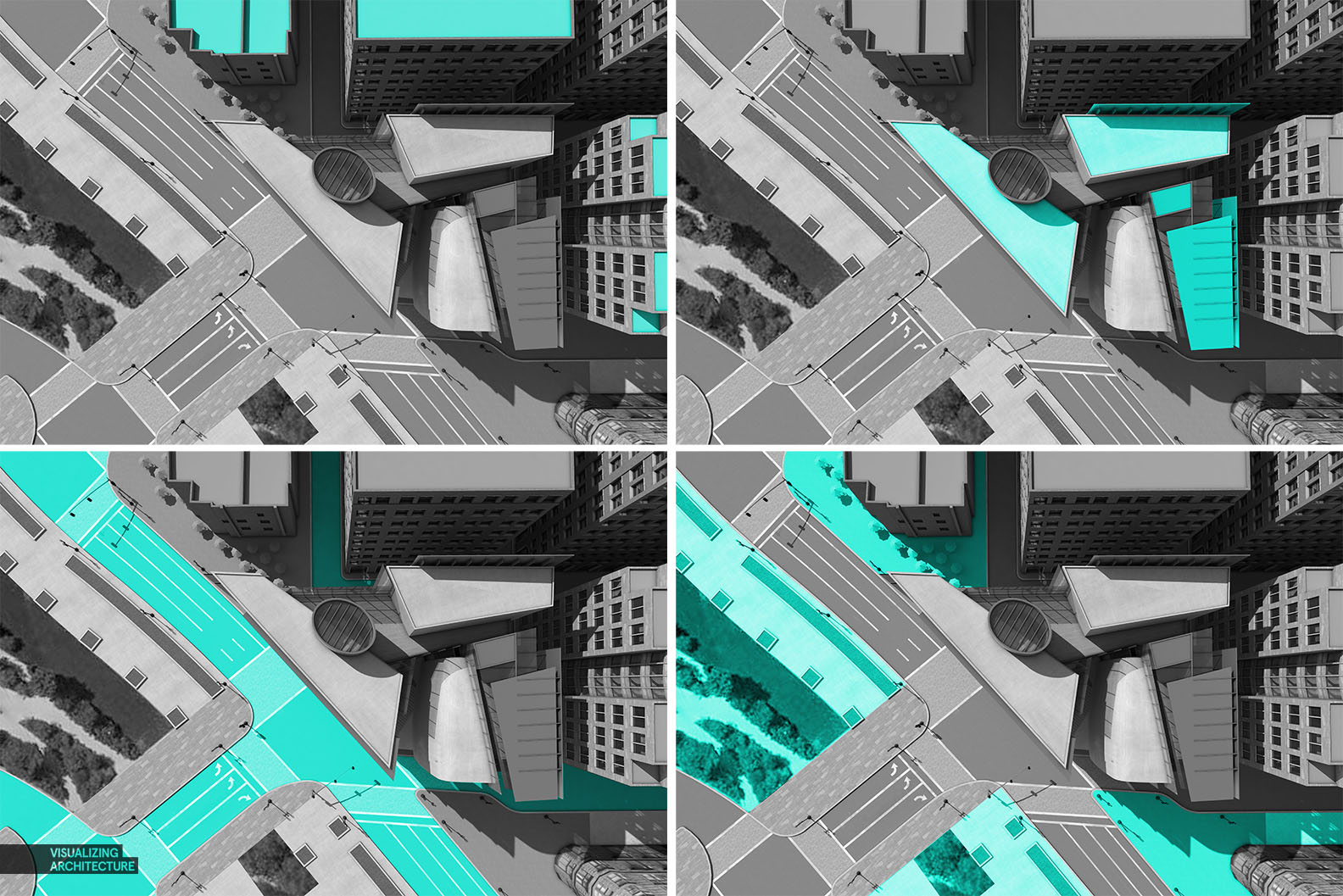
For this illustration, there were four areas that I focused on: the roofs of the surrounding context, the textures of my design, the streets, and the sidewalks/landscape. All four of these areas feed off of one another and if one is left untouched, then the computer’s plastic feel is revealed and the effect is lost.
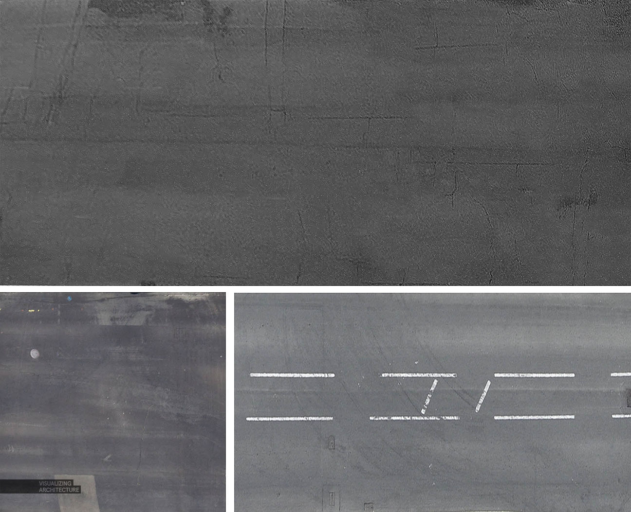
I used several images of asphalt roads to apply textures to my illustration in Photoshop. These have the right amount of grunge and imperfection and can be used in areas other than the streets. In this case, I used the asphalt textures for the roofs of the buildings and lowered the opacity and applied them to the concrete and brick sidewalks.
The Comparison
A side by side comparison reveals how powerful a little bit of texturing in Photoshop can be. It’s elements like roads and roof tops that I often see people ignoring in their illustrations that I have come to realize make a big difference in giving an image that human touch. Building in these little imperfections start to trick the eye into thinking this is not a computer generated image.
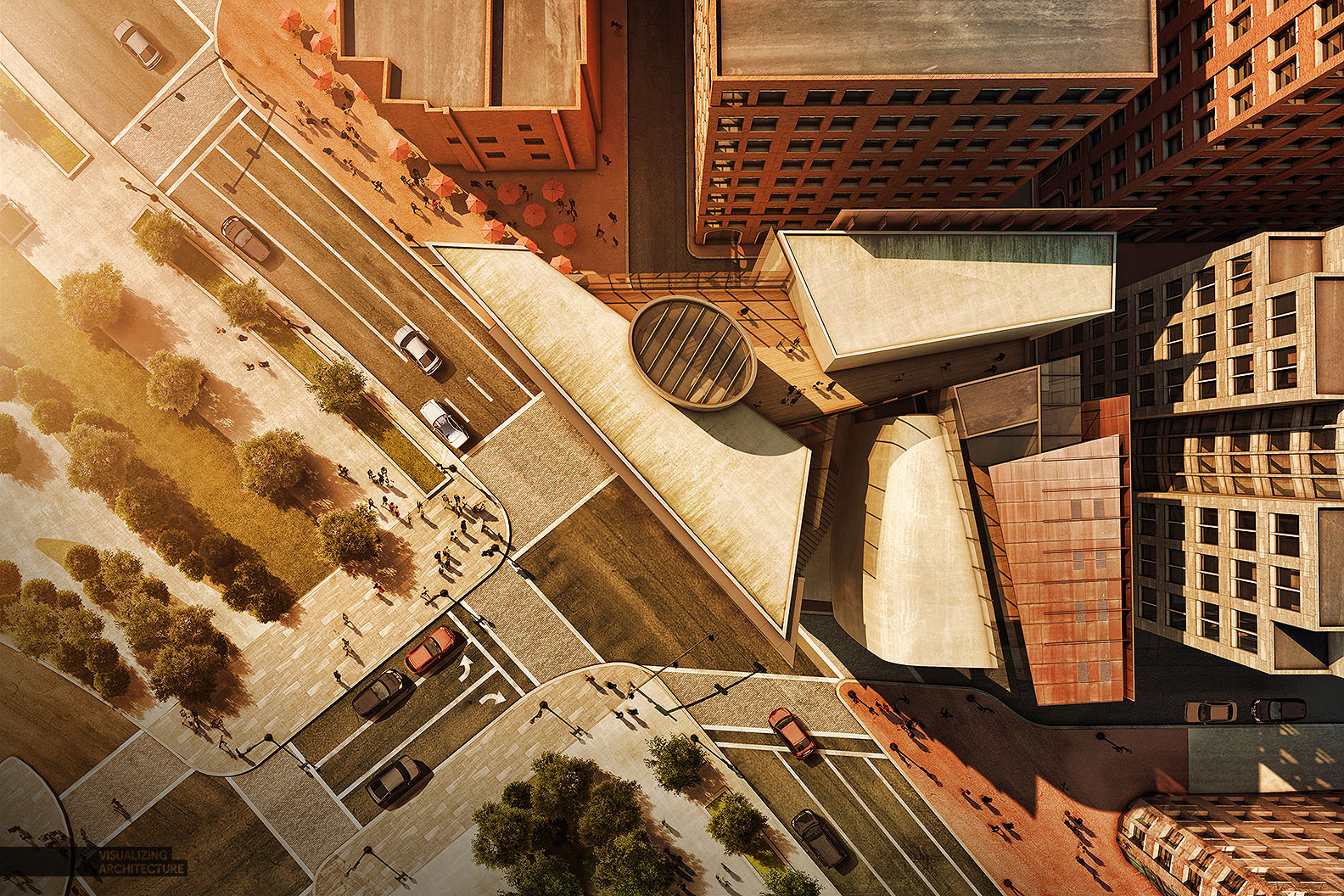
The Final Image
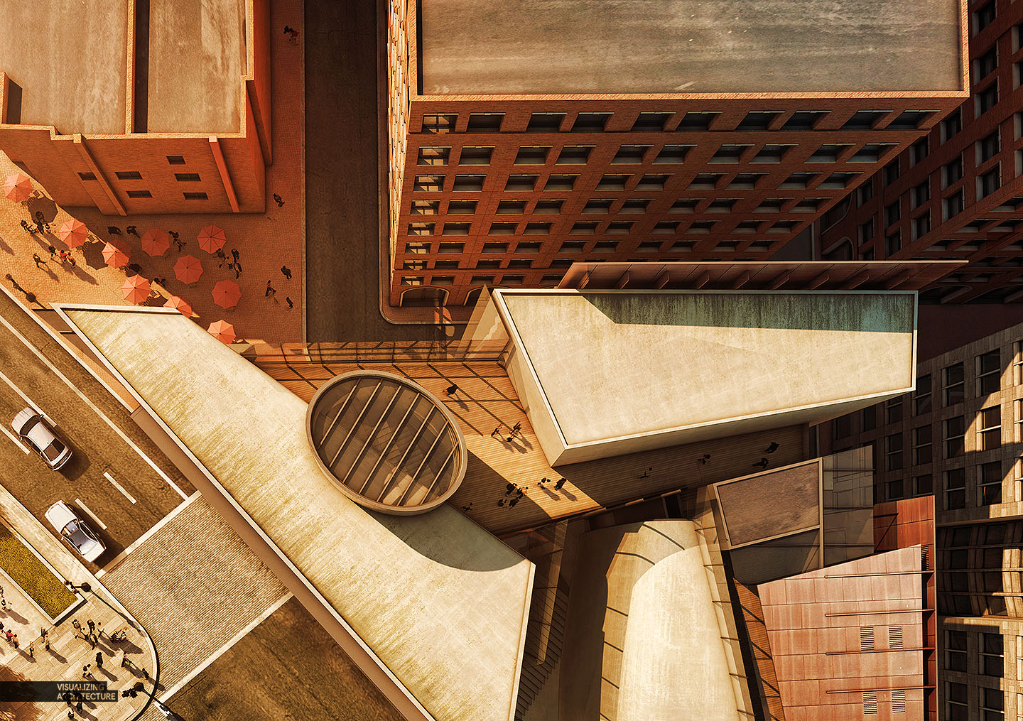
In this final image, I moved the colors to the warm side by using orange color overlays. As with a lot of my illustrations, I bumped up the detail and sharpness using plugins like Topaz Labs Adjust. For aerials, I typically turn off the perspective but in this case I left it on and increased the field of view in Sketchup to make the buildings feel taller. The perspective works here because it draws the eye to the center of the image and puts more focus on the design.


Awesome work as always. A post or posts showing how you use Vray / Textures in Vray I think would be appreciated by everyone that follows your blog. I personally have found your Kerkythea tutorials valuable and would assume Vray tutorials will allow a smoother transition for a lot of us.
Hi Jason, I think someone has asked the same question for every post I have made since switching to Vray haha. I will see about compiling my notes and creating a post soon about the topic. Thanks for the comment.
Fabulous illustration as usual, great work Alex!
I have a same request with Jason that whether you can share some thought on vray adjustment, i think it will benefit us more than just the ps post processing.
Hi Alex !! Great post…I was wondering…the textures applied within photoshop during post processing…is the layer on overlay, multiplied or (i.t.o the blending mode of the texture layer) what in order to achieve a proper and realistic texturing effect ?
Thank you in advance !!!
Its often a mix between Multiply, Overlay, and Screen depending on the situation. I use multiply to only keep the darks, overlay to use both dark and lights of the texture, and screen to use the light parts of the texture.
wow! o_o nts. weather environments. they make renders magical.
Alex,
I really appreciate your work and they are such inspiration for me.
Would you mind sharing with us where you get the realistic people plan views from?
Thanks,
Plan Views of people and cars, I mean
There are plenty of free 3-d cars and trees. You can render them in top view with shadows and alpha plane and then use them as cut outs.
I just did many Google searches for aerial views of cars and people and cut them out manually. The big thing here is proper shadows. You will notice I only used two different shadows for the people, just copied many times over. Same with the cars.
great job! (: but where is the garden in front of the building?
It’s there in your blue circle but you don’t see it :))
I’m under a microscope! The problem with designing projects as I render is that I’m constantly changing the design as I go. I was originally thinking about rerouting the road to make room for the garden, but changed my mind. Nice eye.
Nice job!, I only want to know where do you get the top people or cars? if you use some web side or something.
Thanks!
Hi Johnny, see my response to Beck Above.
Inspiring and bright! The illustrations amaze me every time but behind the stunning look I find also very clever design decisions in the architecture itself! Thank you so much for sharing your work!
Thank you for the kind words!
Awesome!
Love the image! Quick question – where do you get your plan view trees? Always struggle to find good ones and you seem to have an excellent variety there 🙂
Thanks for sharing. I’m a big fan, nicely done! :))
really awesome
Hey Alex, appreciate all the posts and info! I was wondering, some of your modeled scenes look to have quite a bit of detail. Do you run into issues with SketchUp and Vray crashing or just generally acting up! I’ve had models that literally just would NOT render, or were super laggy, some of which were not all that detailed. This occurs on my MacBook as well as University SOA specific lab computers. Do you have any general tips, from a modeling standpoint? How much of context do you model, how detailed do you make it? Any 3d components (like trees) you like to use or that you stay away from? Etc. Lastly, I feel like you’ve mentioned at some point before, what operating system(s) you typically use. I just hate to run into these issues, it’s really frustrating especially when you’ve spent so much time modeling. I don’t know what it is between SketchUp and Vray specifically, but all I know is Vray is was too expensive a plugin to be crashing upon render.
I found your homepage awesome and it is a great help to me and I want to thank you sharing your work with us!
I am looking for good designed ground floor plans for my presentation boards, so I still didn’t find the kind of look in which direction I would like to go. Would you recomand doing a similar editing to ground floor plans as well? Or how are you editing your plans? Or maybe somebody can link me some examples? I can’t find anything or am I overlooking something?
regards Lucas!
Can you provide a tutorial on how to insert this texture, or if one similar already exists, reference it?
You can do it in different ways. Search for lasso tool or selection by pentool in youtube and clipping mask tutorial to make it easier. Hope this helps.
Thank you very much for this wonderful and inspiring tutorials. I started to learn photoshop first long before doing 3d projects. Reading your blog makes it easier for me to improve myself and have something to look up to everyday.
I love your blog! It’s amazing! Can you give us the kig of orange you use? RGB? I never get a good tone in the final image. Thank you in advance!