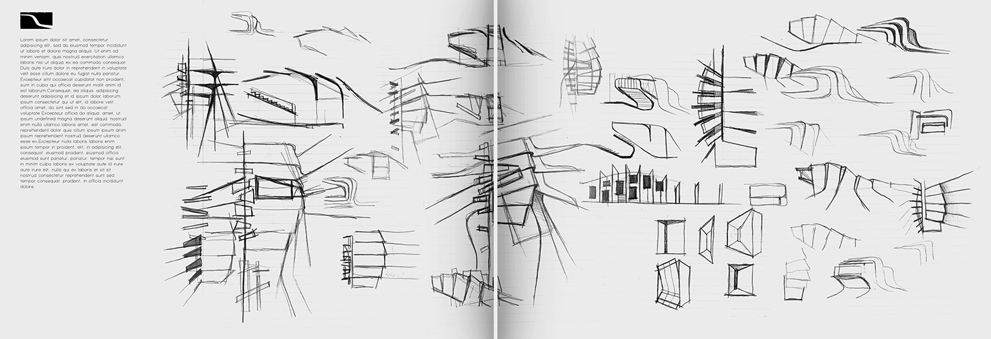
The long weekend has given me a chance to catch up on some things, one of them being project portfolio upgrade. I have been spending time developing a new 3D model from scratch and it still is nowhere close to being completed. However, I wanted to get the page layouts started and I knew I had the shell of the design in a good place to begin the exterior illustrations. The good thing about this project is that I have a ton of process work to include with the design so less pressure is put on the final illustrations. Process work is always a good thing to include in portfolios and I plan to play it up for this particular project.
Below are the portfolio pages that I have started:
I’m a big fan of black and white images. I decided I would try to go all black and white for this project. Typically, I would not suggest jumping around with different styles in a portfolio to the extreme that I am. However, this portfolio is more experimental for me. It’s a way to test out a lot of ideas that I have while at the same time hopefully providing some inspiration to others.
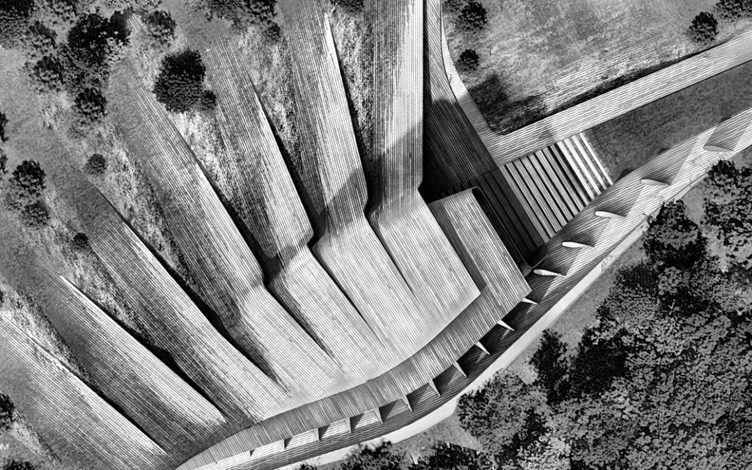
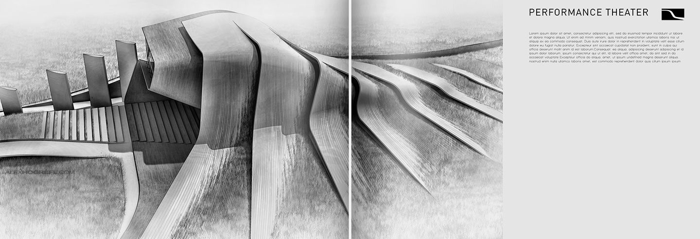
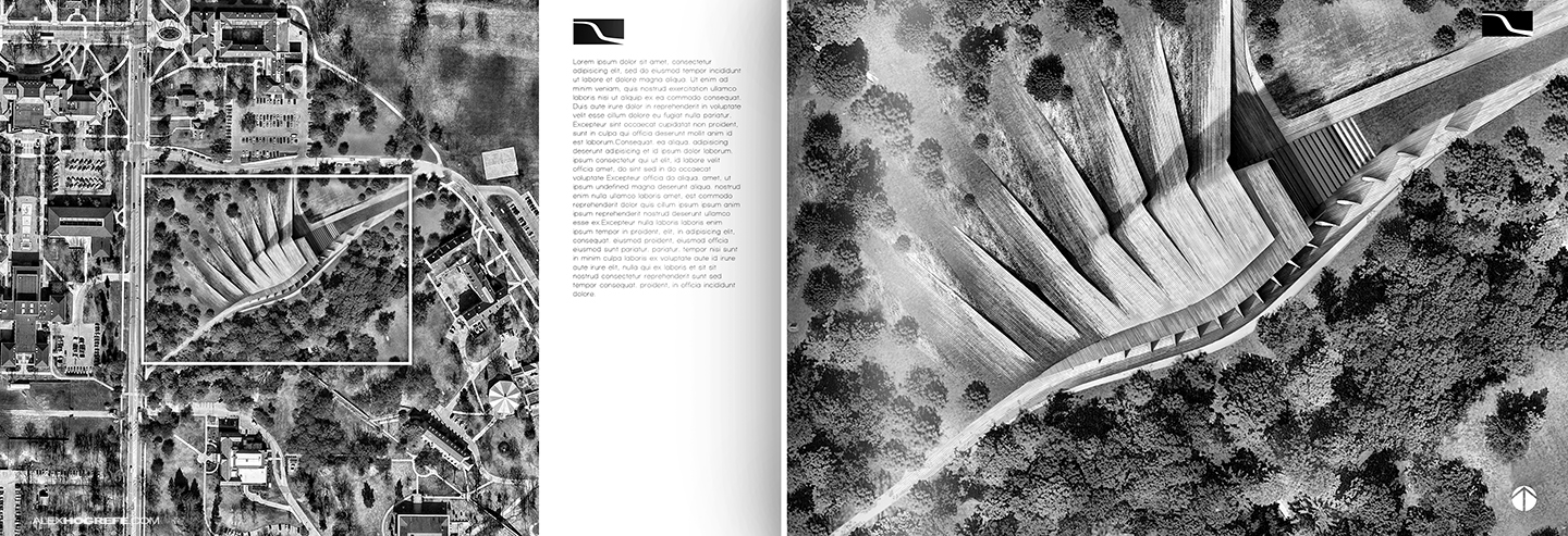
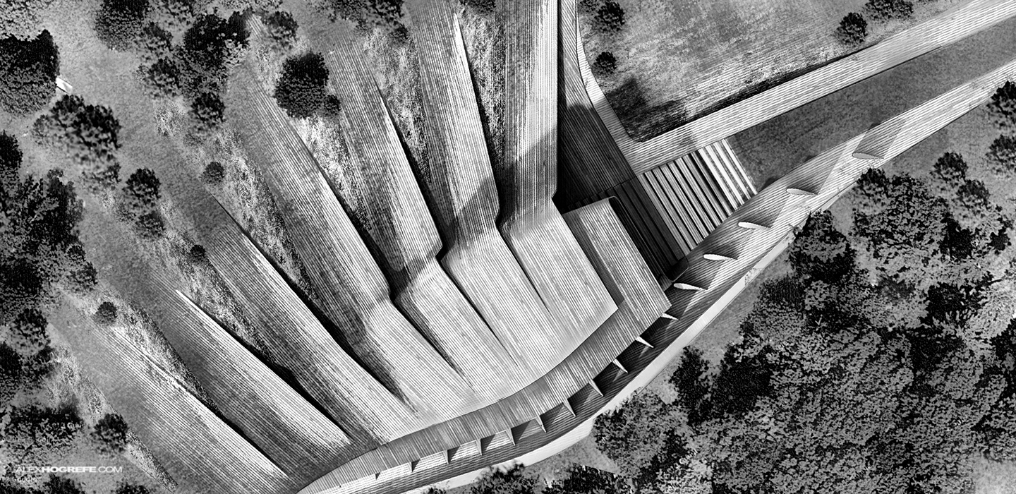
The site plan was fun to develop. One of the main goals was to get the building to morph with the ground in an interesting way. I wanted the illustration to have the effect of the ground pealing away around the built form. I went through a lot of trial and error before settling on style that seemed to work.
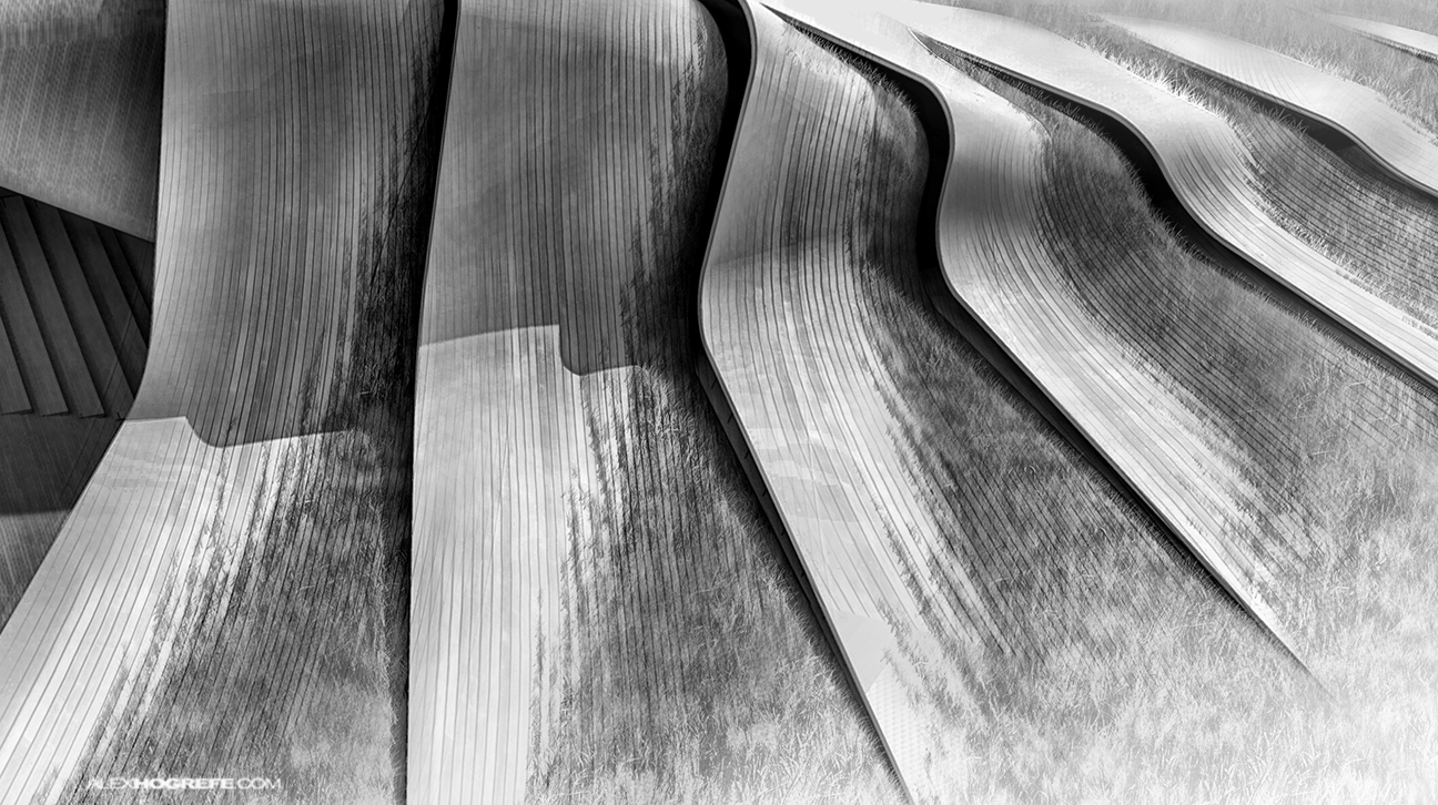
Since I went the black and white route, texture became more important than ever. Since I don’t have color to distinguish material, texture became my only means of communicating all of the different surfaces. Ultimately, I think the design benefited from this way of thinking.
More portfolio pages to come so check back soon.


We always love your project updates!
Yeah, really nice renderings, as always. When are we getting a new video-tut? 😀
What a beautiful work ! The pealing effect on the buiding is simply amazing !
Alex your work is always inspirational. I appreciate the fact that you are using so many different techniques in your portfolio just inspire others. You are the go to guy when I am working on renderings for work and free lancing jobs. Thank you so much.
As usual, I am always impressed by your work and try to follow most of them. And also give reference to my friends about your techniques..
A very unique and sophisticated way of visual experience..
just want to thank you for such inspirational sharing!!
Congratulations! I follow you from San Marino Republic (Italy) ! Great work, man.
Hey Alex, nice work again!
I was wondering about the textures.. Do you put them directly in Sketch Up or via Photoshop? Because I can't get such nice textures in my models..
(Sorry for my bad English 🙂 )
Kenny.
So really nice designed and presented