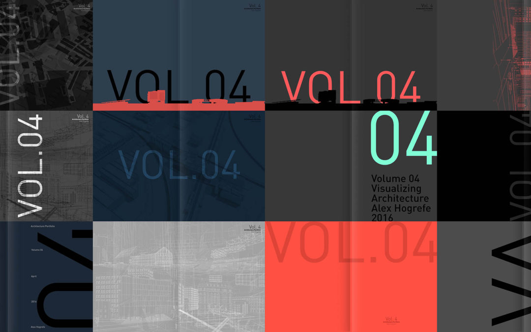
I have been working on some of the different design elements of Portfolio Volume 4 and this week I am focusing on the cover design. I wrote a post a few years ago on the cover design for Portfolio Volume 3 seen here. Not much has changed with the way that I am approaching this new cover. It’s hard for me to accept the first or second design I come up with no matter how much I am in love with it. I instead force myself to test out several ideas as a way to keep the design process a little more relaxed and free flowing. For the Vol. 4 cover, I have been jumping back and forth between going minimal versus a more aggressive textured background. I also experimented with color palettes, text size, text location, text orientation, etc. Beyond some of these more general layout strategies are thoughts of how to relate the cover to the rest of the content and the overall tone of the portfolio. I am still exploring ideas and have not yet made a decision of what design I want to go with. Below are some of the options I am leaning towards.
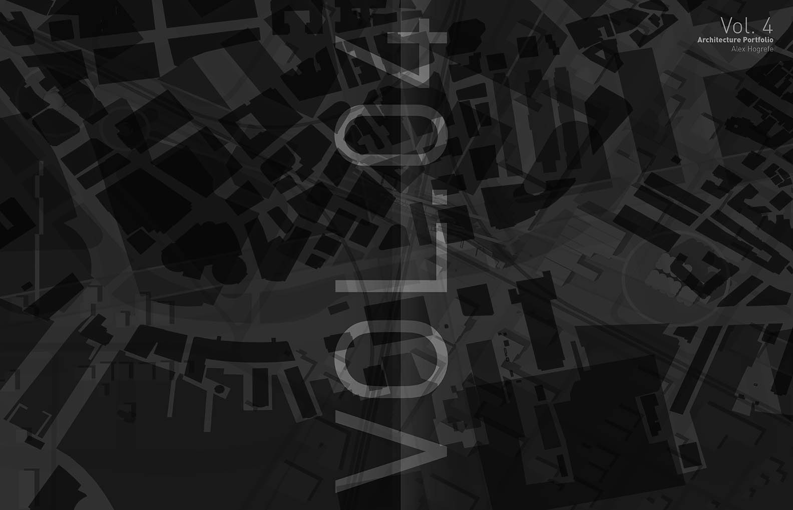
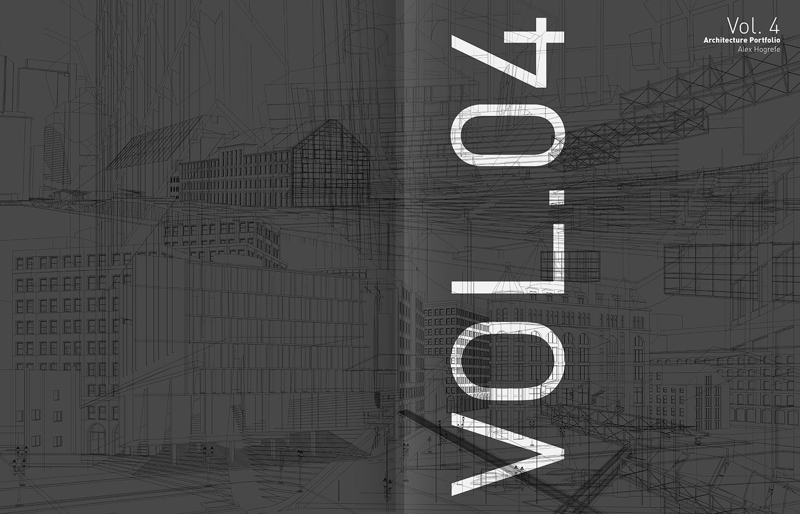
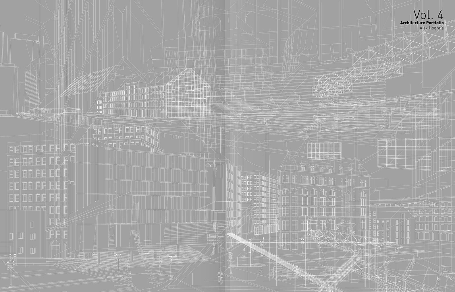



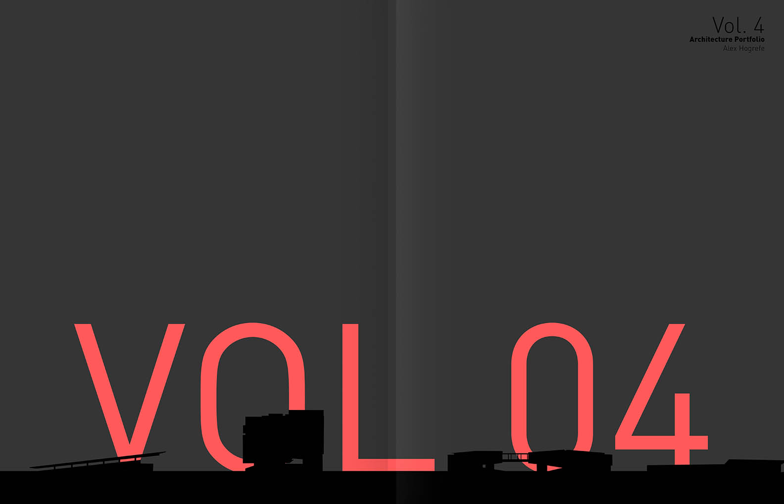
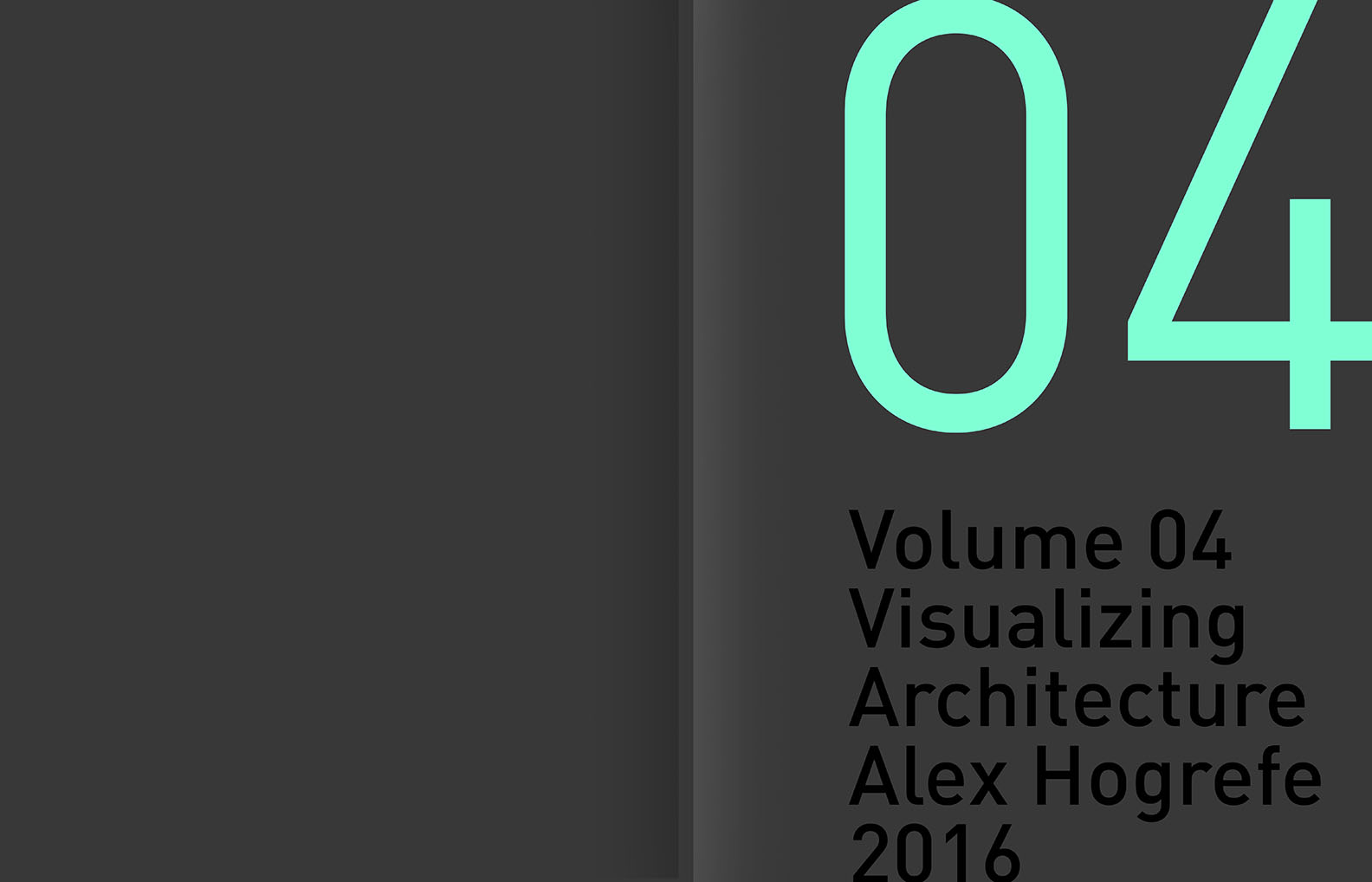
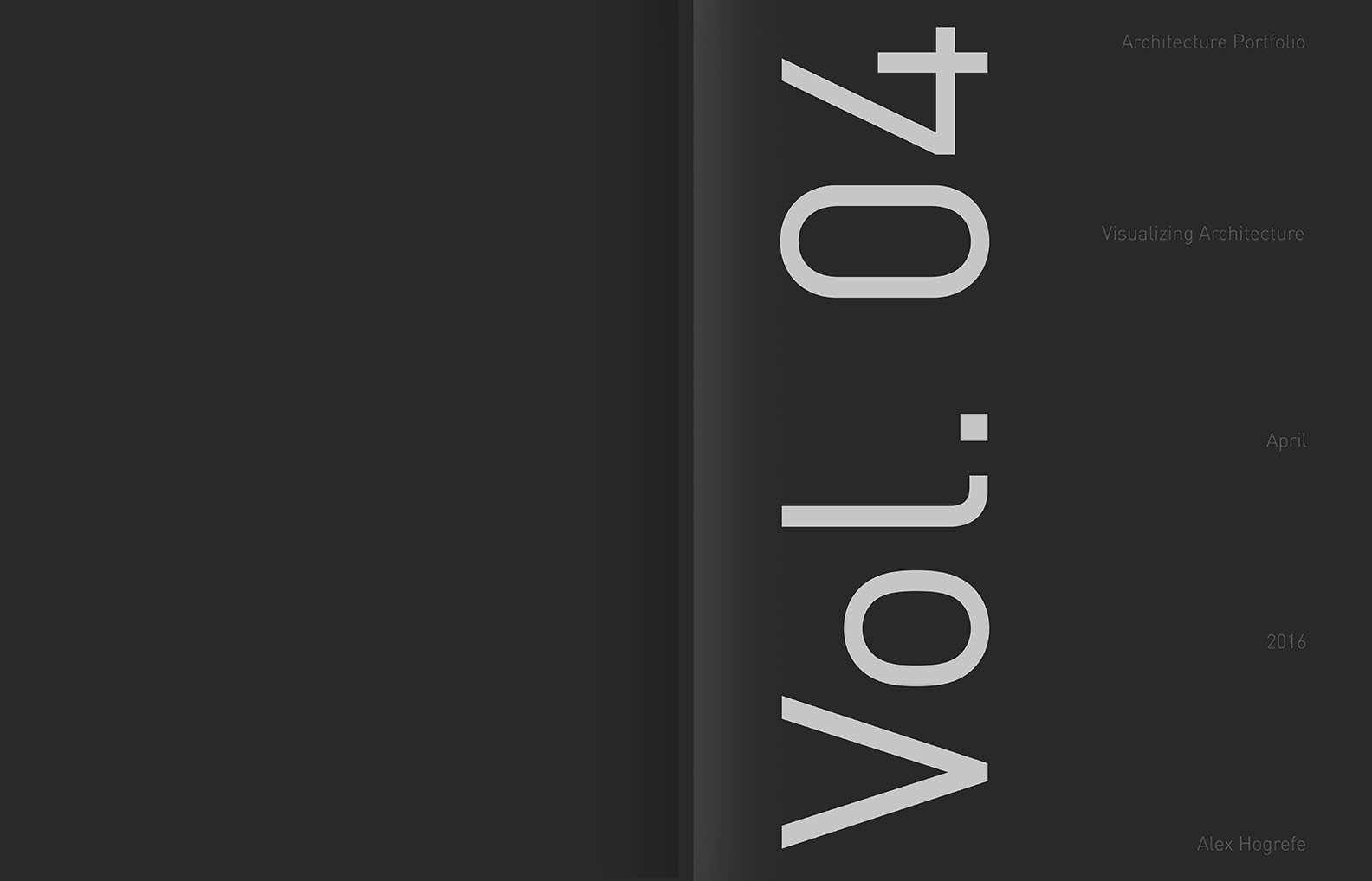
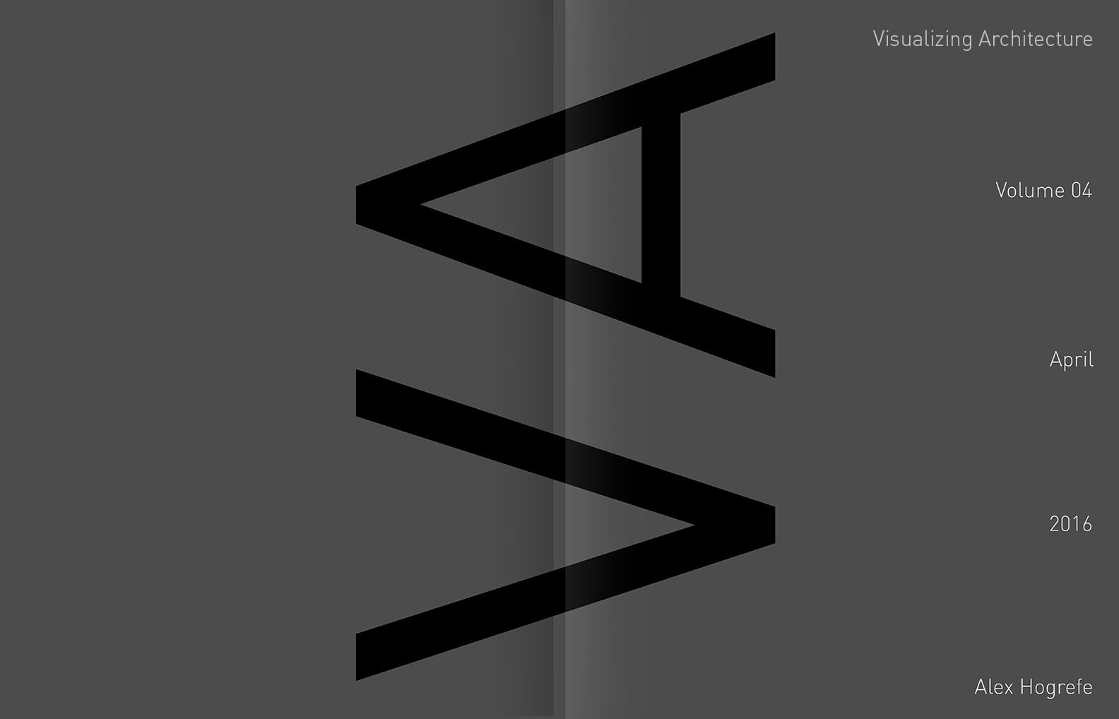



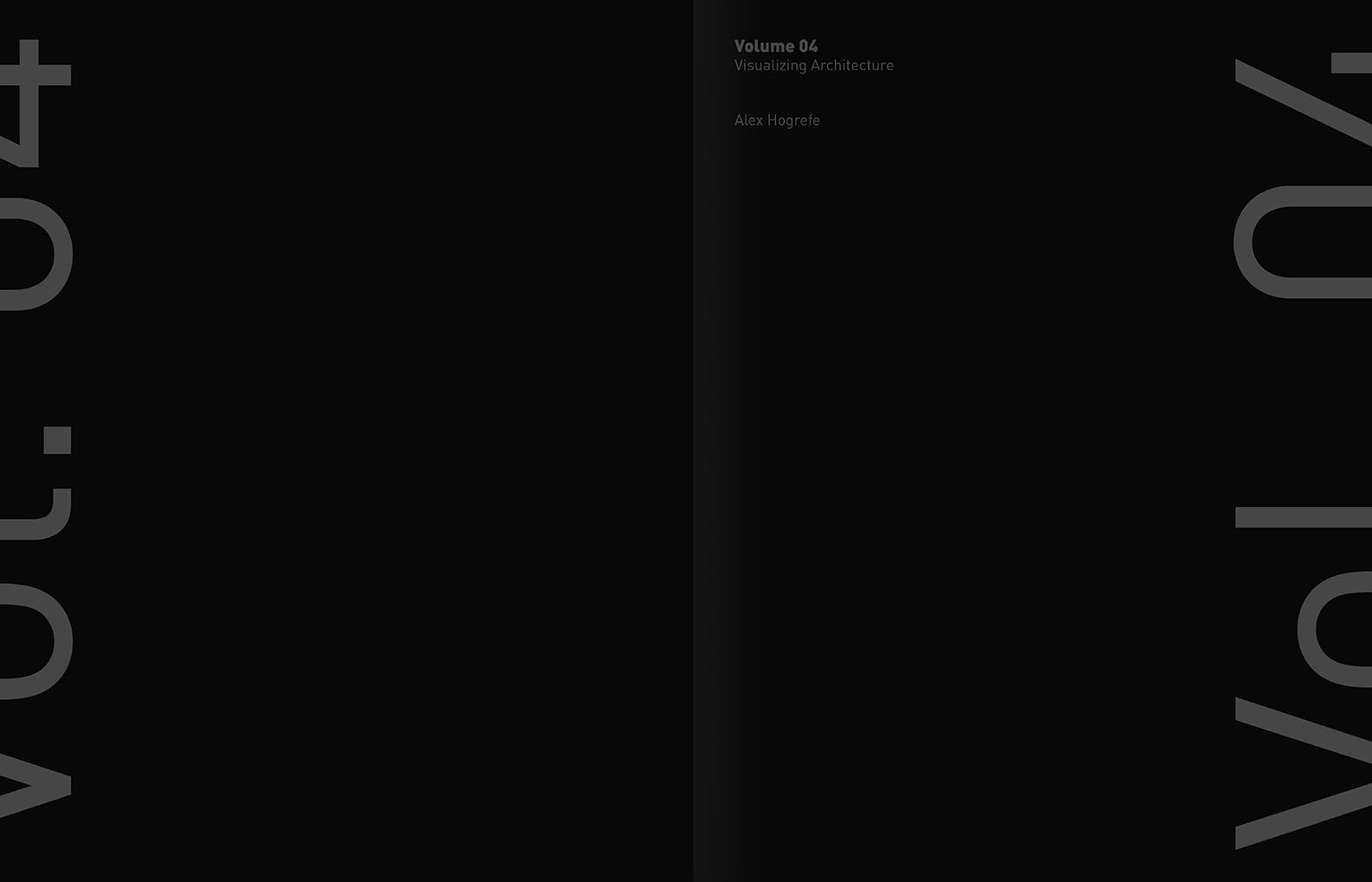


I prefer 8, 12, and 14. I like the minimalist approach.
I’m a big fan of 5-7. #5 has a certain cleanliness to it with the clay underlay, and I really like the red contrast on #6-7. I feel like on many of your recent projects (mainly in the train pavilion) you’ve used either red, green, or 1 color to make your images pop. This makes me think that #6 and #7 fit that graphic style really well!
Definitely last two
Hi Alex! I thought the cover was actually the first image with all of them together! (https://visualizingarchitecture.com/wp-content/uploads/2016/04/portfolio4_Cover_banner1-1080×675.jpg)
I actually really dig that one. I think it represents the graphical variety and vivid colors in your spreads.
Just my opinion, but that mosaic approach with all of those VOL.04 all over the place really catches my eye. Maybe you should try an option with that concept.
Cheers!
I thought the same thing! I like the collage as the cove, just fold the image in half and you have a front and a back!
Hi Alex, I like 5, 6 and 11.
Hi Alex, I’d go with no.5 and 12.
(Your work has always been my inspiration by the way.)
Hi Alex, I thought the image of mixing all covers is really cool and eyecatching.
The contrast of 7 is powerful while being subtle. Surprisingly loved 1 and 2 also. Would love to know how you went about them. Good work as always. An inspiration.
I love number 2, tells a lot about your history and process.
At first glance I thought the mosaic was your cover, it looked cool. And I liked all of them. 3, 5 and 7 are my favorite. Your work always inspires me. Thanks
Master!
5,6, 7 or 11. Sick.
Great!Alex,please tell me that what font do you use in your layout?
What font are you using?
On covers 2-3, are those drawings you made?
What font did you use for that cover? It looks very clean but I cannot seem to find it.
Alex, May I ask the font size you use in your portfolio volume 4? what types of font used?