I have been working hard to wrap up the illustrations for the Porter Square project with only a few more illustrations remaining. Life has been getting busier and busier outside of this website. My visualization office and family are demanding more of my time than ever. With that said, the images I have been creating on this site lately have been a lot of fun to work on and have allowed me to study specific ideas and details that I don’t normally get to do at the office. Case in point, the images I am posting today are two very different graphic styles, but both are telling a very different story. The platform perspective illustration was especially challenging because I had to figure out a quick way to illustrate a somewhat iconic commuter train car. Given the little amount of time I have to create these images, about a day per illustration, I have to make decisions quick and choose a path that will get the images to a level of quality that I am happy with. I have around two more images to create for this project before starting on the next design.
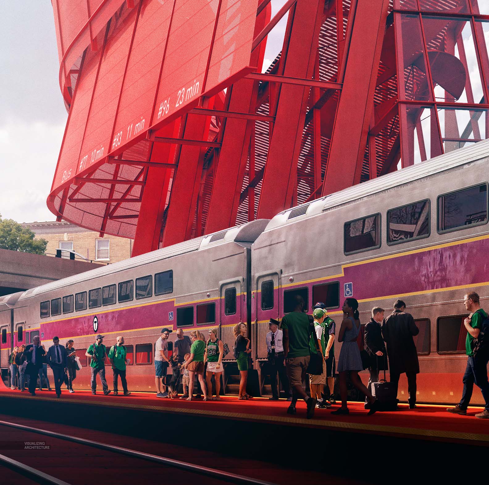
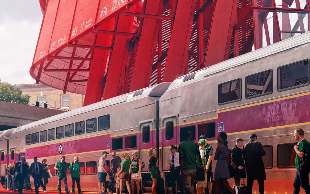
First up, the commuter rail platform illustration was an important image in this series because it was the first illustration that really shows the new experience at the platform level. This meant rendering the train as accurately as possible. I had to make a decision early on to either go all 3D or try to handle it in Photoshop. While I was able to find lots of reference photos, nothing was at a high enough resolution or at the correct angle to simply cutout and Photoshop into the image. I also didn’t have time to fully model and detail out the car in 3D. I did, however, have a rough and low quality model of the train that I downloaded off of Sketchup Warehouse that gave a me a base to start with. I ended up taking a hybrid approach by modeling in some details and then stitching in the remaining details via Photoshop. The train cars had an abundance of subtle patina and aged qualities to it that I knew had to be approached through Photoshop. But, I needed reflections and high resolution that could only come from the 3D model.
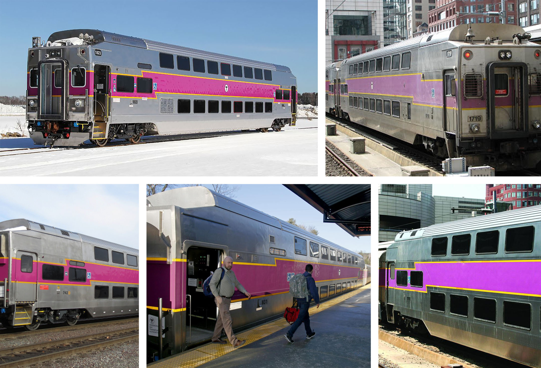
I researched online for as many images of the train car as I could find so that I not only could build up a library of textures but also get a sense of how light was reflecting and reacting to the metal and painted areas.
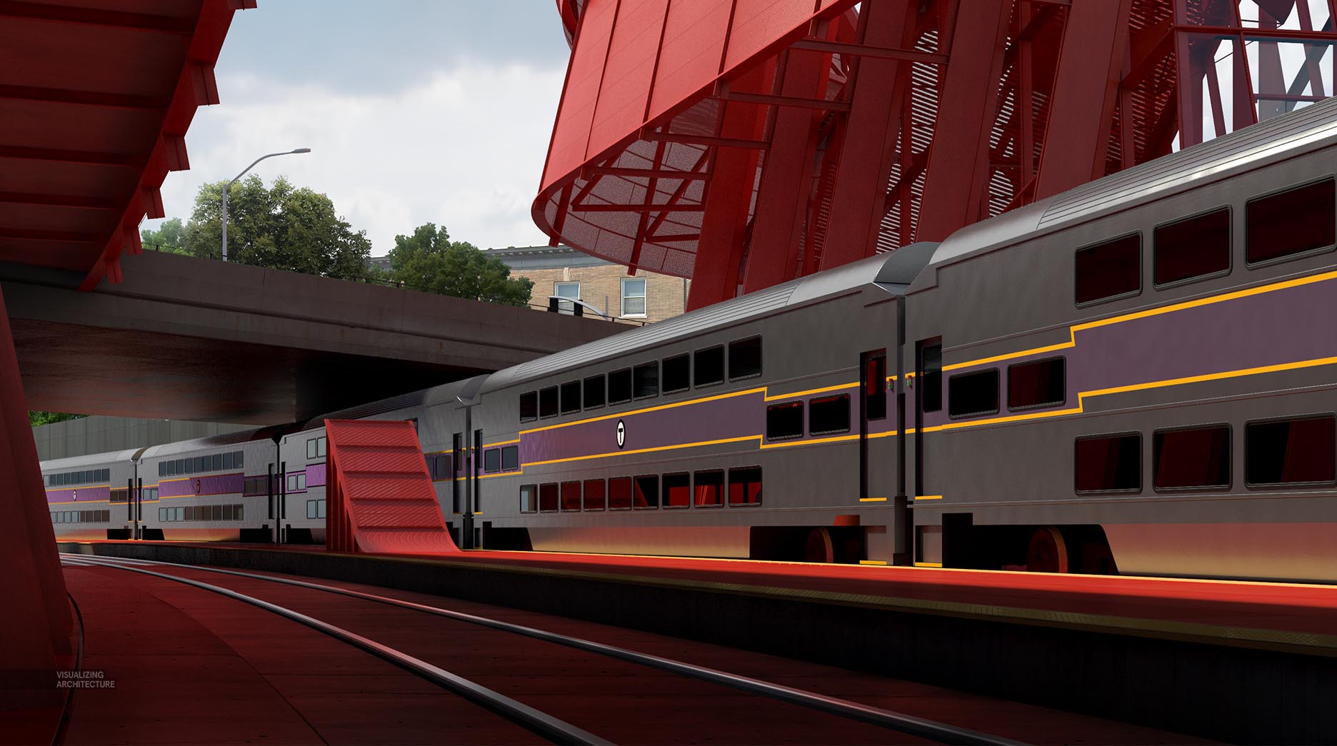
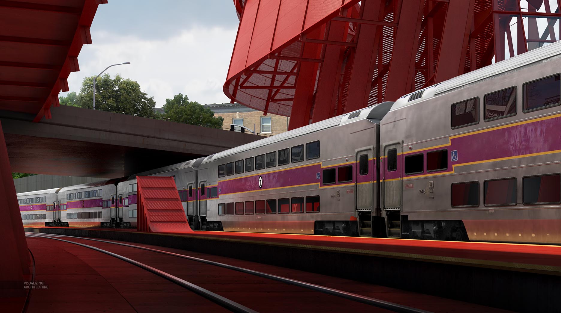
For the 3D side of things, I focused my efforts on modeling some of the details such as window frames and roof corrugation as well as adding a slight ripple to the metal texture. Once in Photoshop, I added the doors, wheel systems, mechanical details, and lots of patina to get the cars feeling like they have been used for years.
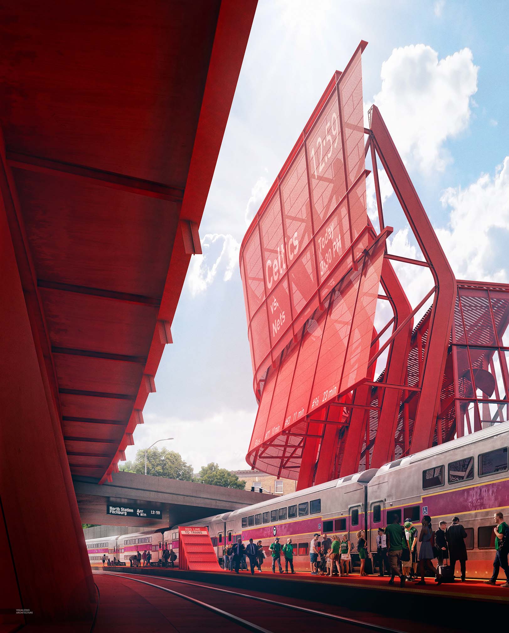
Originally, I had the top of the image cropped with a focus on the platform. But switching to a vertical orientation and revealing the totality of the station amplified the drama of the image. The focal point is still the platform, with all of the activity of a Celtics game day.
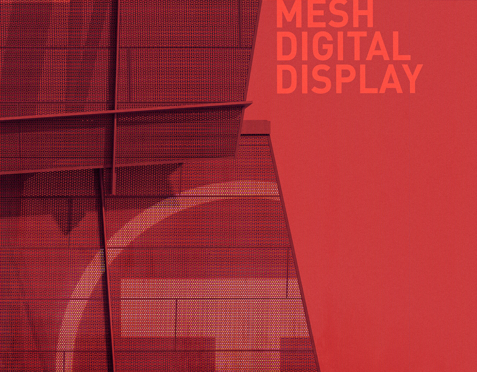
Digital Mesh Display
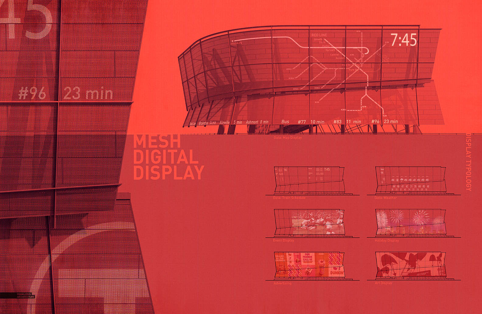
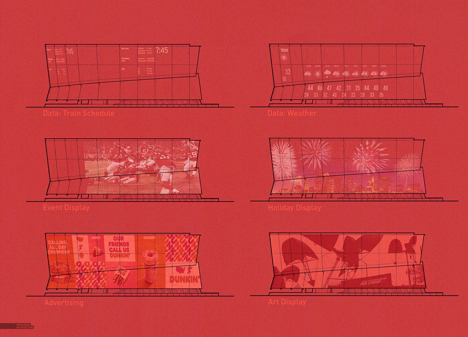
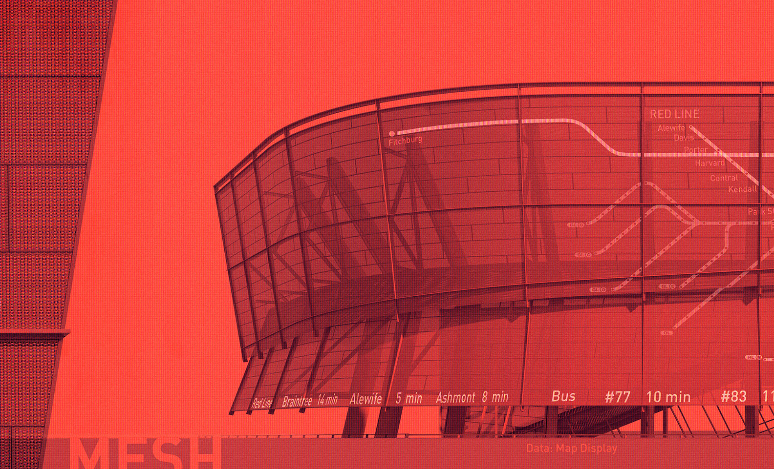
One of the elements of the station design that I have hinting at is this idea of digital mesh display system turning the facade of the station into a digital billboard. This spread looks at several scales and display typologies to help explain the potential uses of the system.
There will most likely be quite a bit of text that will be added later on, but for now, this gets the idea out of my head. I am also realizing that I will probably need to create a perspective rendering of this system at some point too.


Do you still use the Topaz Labs plugin? Any advice or tricks that you could share when using…..I find I always over do the the level of detail you can add to the image…..even if I reduce the opacity in photoshop
Thank you. I’ve seen several of your articles and learned a lot.
Wow cant tell if this is real or a render. The Train looks like a quickshot from a trainstation. Real and clean. Salute
Thank you. Many of your articles were discussed and much was learned.
The Train looks like a quick shot from a train station. Real and clean.